The Daredevil logo is one of Marvel’s most recognizable symbols, built around a bold red double-D letterform that doubles as a pair of horns. It has gone through several distinct iterations since the character’s debut in 1964, each version reflecting the tone of whatever era Daredevil was living through at the time. Today, the logo carries decades of comic book history and two major live-action adaptations behind it.
Few superhero logos have been redesigned as dramatically as Daredevil’s. The character has shifted from campy Silver Age hero to street-level noir vigilante, and the logo followed along. That shift in visual identity mirrors what happened to the character itself under writers like Frank Miller.
The current version, used prominently in Daredevil: Born Again on Disney+, features a stark, aggressive wordmark with horn-like serifs. It was introduced alongside the 2024 relaunch and reinforces the character’s grittier direction within the MCU.
Daredevil first appeared in April 1964. Over 60 years, the logo has gone through at least six major design iterations across comics, merchandise, and screen adaptations.
What Is the Daredevil Logo?
The Daredevil logo is a combination mark centered on a double-D emblem styled to suggest devil horns, used since 1964 to identify the Marvel character Matt Murdock. The current version pairs a bold red wordmark with angular letterforms, introduced for the 2024 Disney+ series Daredevil: Born Again.
- Design Type: Combination mark (wordmark with integrated symbol)
- Primary Elements: Double-D letterform evoking devil horns, bold sans-serif typography, red colorway
- Official Introduction Date: Original logo debuted April 1964; current version introduced 2024
- Designer/Agency: Original emblem credited to Bill Everett and Stan Lee; Netflix-era redesign handled internally at Marvel Studios; Born Again version developed by Marvel’s in-house creative team
- Trademark Status: Trademarked by Marvel Entertainment, LLC under Disney ownership
- Color Palette: Primary red (#CC0000), black (#000000), white (#FFFFFF)
- Usage Context: Comic book covers, merchandise, costume design, digital platforms, promotional materials, title cards
How Has the Daredevil Logo Evolved Over Time?
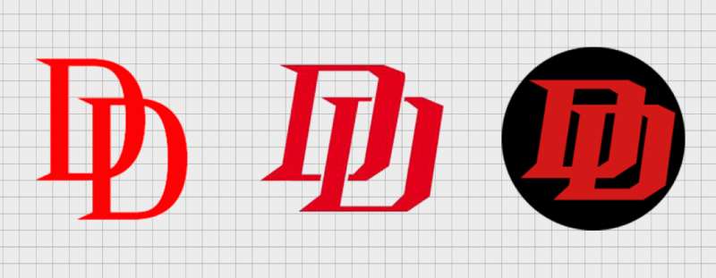
The logo started as a playful Silver Age emblem and eventually became one of Marvel’s most aggressive visual identities. Major redesigns happened around 1979, 1993, 2015, and 2024, each responding to shifts in the character’s storytelling direction.
Original Daredevil Logo (1964–1979)
- Years Active: 1964–1979
- Design Description: A yellow and red circular chest emblem featuring a stylized double-D, worn on the original yellow-and-red costume
- Color Scheme: Yellow, red, black
- Designer: Bill Everett (character design), Stan Lee (concept)
- Context: Introduced during Marvel’s Silver Age boom, designed to look bright and accessible on newsstand shelves
- Key Changes from Previous: N/A, first version
- Cultural Significance: Reflected the optimistic, colorful aesthetics of early Marvel comics before darker storytelling became common
Red Suit Logo (1964–1993)
- Years Active: 1964 (costume change) through early 1990s
- Design Description: Double-D chest emblem on a fully red costume; the emblem became simpler and more graphic
- Color Scheme: Red, black
- Designer: Wally Wood (red suit redesign, 1964)
- Context: Wally Wood redesigned the costume just months after debut, replacing the yellow suit with all red. The logo simplified alongside it
- Key Changes from Previous: Removed yellow, made the emblem more geometric
- Cultural Significance: This became the definitive Daredevil look and the one most associated with the character globally
Frank Miller Era Logo (1979–1993)
- Years Active: 1979–1993
- Design Description: Title typography on comic covers became bolder and more aggressive; the chest emblem stayed but cover design shifted toward darker, high-contrast layouts
- Color Scheme: Red dominant, heavy black shadows
- Designer: Frank Miller (cover design approach)
- Context: Frank Miller’s run starting in issue #168 transformed Daredevil into a noir character
- Key Changes from Previous: Cover typography became part of the visual identity, not just a label
- Cultural Significance: Set the tone for every dark, serious Daredevil interpretation that followed
Marvel Knights Logo (1998–2011)
- Years Active: 1998–2011
- Design Description: A refined, more editorial logo treatment under the Marvel Knights imprint; cleaner letterforms with a mature design sensibility
- Color Scheme: Red, black, white
- Designer: Marvel Knights design team
- Context: Marvel Knights launched as a prestige imprint targeting older readers; the logo reflected that shift
- Key Changes from Previous: More polished and intentional typographic treatment
- Cultural Significance: Positioned Daredevil alongside other serious, adult-oriented superhero content
Netflix Series Logo (2015–2018)
- Years Active: 2015–2018
- Design Description: A stark, minimalist wordmark in distressed red on black. The double-D device was abstracted and the overall treatment felt closer to crime drama branding than traditional superhero marketing
- Color Scheme: Deep red (#8B0000), black
- Designer: Marvel Television / Netflix creative team
- Context: Netflix positioned the series as prestige television; the logo had to work for a streaming platform, not just comics
- Key Changes from Previous: Dropped traditional superhero logo conventions entirely; leaned into gritty, live-action aesthetic
- Cultural Significance: Introduced the logo to millions of viewers who had never read a Daredevil comic
Born Again Logo (2024–Present)
- Years Active: 2024–present
- Design Description: A bold, angular wordmark with letterforms that feature pronounced horn-like serifs, rendered in bright red
- Color Scheme: Bright red (#CC0000), white, black
- Designer: Marvel Studios in-house team
- Context: Designed to reintroduce the character into the MCU proper after the Disney acquisition of the Netflix-era shows
- Key Changes from Previous: Brighter red, more explicit horn symbolism in the letterforms, cleaner and bolder overall
- Cultural Significance: Signals the character’s integration into the mainstream MCU while retaining the dark tone of the Netflix era
What Do the Design Elements of the Daredevil Logo Mean?
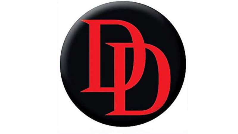
The double-D at the core of the Daredevil logo isn’t just initials. The letterforms are designed so the two D shapes read simultaneously as the character’s name and as a pair of devil horns, tying the visual directly to Matt Murdock’s street name.
That dual reading is intentional. Every version of the logo, no matter how much it changed stylistically, preserved that core conceit.
What Does the Double-D Symbol Actually Represent?
It represents Matt Murdock’s dual identity: a blind lawyer by day and a masked vigilante by night.
The horned shape references his alias directly. But it also carries a more layered meaning for longtime readers. Murdock is a Catholic character wrestling with guilt and justice. The devil imagery is deliberately ironic.
That tension between faith and the devil symbol is something the comics have leaned into heavily, particularly under writers like Brian Michael Bendis and Ed Brubaker.
Why Did Daredevil Choose These Specific Colors?
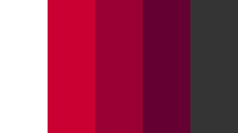
- Red
- Hex: #CC0000 (current), #8B0000 (Netflix era)
- Symbolic meaning: Blood, danger, the devil, passion
- Psychological impact: Red signals urgency and aggression. It’s one of the highest-attention colors in color psychology, which is exactly what a street-level vigilante logo needs
- Brand connection: Ties to the character’s costume and to the visual language of red logos more broadly in superhero branding
- Black
- Hex: #000000
- Symbolic meaning: Night, blindness, shadows, moral ambiguity
- Psychological impact: Grounds the red and adds visual weight
- Brand connection: Consistent with the noir crime aesthetic the character operates in
- White
- Hex: #FFFFFF
- Symbolic meaning: Negative space, contrast, clarity
- Psychological impact: Used as a knockout color to make the red pop on dark backgrounds
- Brand connection: Standard usage in print and digital contexts where the primary red/black palette would collapse
What Typography Style Is Used in the Daredevil Logo?
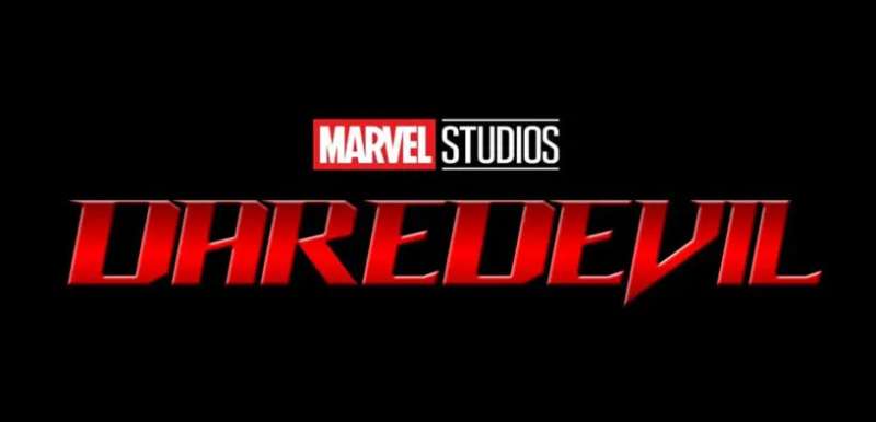
The current Born Again wordmark uses a custom serif font treatment with deliberately exaggerated serifs styled to look like horns. It’s not a retail typeface you can download.
The Netflix version went the opposite direction: a distressed, semi-condensed treatment that felt closer to a display font used in crime thrillers.
Earlier comic book iterations used bold, blocky lettering typical of Silver Age Marvel. The typography evolved in lockstep with the character’s tone. Lighter, more approachable letterforms in the ’60s and ’70s. Heavier, more aggressive cuts from the ’80s onward.
Readability at small sizes has always been secondary to impact. This is a logo designed to be seen on a costume chest or a TV title card, not a business card.
What Are the Hidden Meanings in the Daredevil Logo?
The most discussed hidden element is the horn reading within the double-D shape. Most people see it immediately, but it wasn’t always this explicit. Earlier versions of the emblem were more ambiguous.
There’s also a less-discussed irony baked into the design: the logo for a blind character is entirely visual. Matt Murdock would never see his own symbol. That’s not a designer’s stated intention, but it’s something fans and critics have noted for decades.
The Born Again version made the horn shapes more literal, almost aggressive about it. Whether that’s a bold choice or too on-the-nose depends on who you ask.
How Does the Daredevil Logo Compare to Competitor Logos?
Within Marvel’s superhero roster, the Daredevil logo sits in a specific lane: dark, street-level, explicitly symbolic. It doesn’t carry the cosmic scale of the Thor logo or the technological polish of the Iron Man logo. It’s closer in spirit to the Punisher logo, another Marvel street-level character whose symbol doubles as a warning.
Compared to DC’s darker characters, the Daredevil logo is warmer in hue but equally aggressive in weight. Batman’s logos tend toward abstract geometry. Daredevil’s is more literal about its iconography.
Against the broader superhero market, the double-D horn device is genuinely distinctive. The Spider-Man logo relies on the web motif. The Captain America logo centers on the shield. Daredevil’s is one of the few that builds its core symbolism directly into letterform.
The Black Panther logo, Deadpool logo, and Wolverine logo all use different approaches. Daredevil’s combination of wordmark and integrated symbol is closest to what you’d call a conceptually unified mark.
What Are the Technical Specifications of the Daredevil Logo?
Official Color Codes
- Primary Color: Red
- Hex: #CC0000
- RGB: (204, 0, 0)
- CMYK: (0, 100, 100, 20)
- Pantone: Pantone 485 C
- Secondary Color: Black
- Hex: #000000
- RGB: (0, 0, 0)
- CMYK: (0, 0, 0, 100)
- Pantone: Pantone Black C
- Accent Color: White
- Hex: #FFFFFF
- RGB: (255, 255, 255)
- CMYK: (0, 0, 0, 0)
- Pantone: Pantone White
Dimensions and Proportions
- Aspect ratio: Approximately 4:1 for the horizontal wordmark; the chest emblem variant is roughly 1:1
- Minimum size requirements: Marvel’s standard minimum for legible logo reproduction is 1 inch wide for print applications
- Clear space specifications: Minimum clear space equal to the height of the “D” letterform on all sides
- Official usage guidelines: Governed by Marvel Entertainment’s brand standards; the logo must not be distorted, recolored outside approved palettes, or used without licensing. Vector graphics formats are required for all print and large-format applications. For digital use, pixel-optimized versions at appropriate DPI settings are specified in Marvel’s official asset library
What Cultural Impact Has the Daredevil Logo Had?
The logo punches above its weight given Daredevil’s B-tier status for most of his publication history. The Netflix series changed that significantly.
Between 2015 and 2018, the distressed red-on-black logo became a shorthand for “serious superhero content” in a way that few Marvel properties had achieved outside of film.
It appeared on merchandise, fan art, tattoos, and cosplay at a scale that rivaled A-list Marvel characters. That version of the logo has become culturally sticky in a way the earlier comic book iterations never quite were outside dedicated fan communities.
The Born Again rebrand carries that momentum forward. It’s recognizable to a mainstream audience now, not just comic readers.
Within design circles, the double-D horn device gets referenced regularly in discussions about integrated symbolism in logo design principles. It’s a clean example of a mark that does two things at once without feeling forced.
How Does the Daredevil Logo Fit Into the Overall Brand Identity?
The logo doesn’t exist in isolation. It connects to a network of visual elements that make up the Daredevil brand: the red suit, the billy club weapon, Hell’s Kitchen as a setting, and the Catholic guilt narrative that runs through the comics.
Each of those elements reinforces the others. The red of the logo matches the costume. The horn shape ties to the name. The dark backgrounds used in marketing tie to the street-level noir setting.
Within the broader Marvel brand, Daredevil occupies a specific visual lane. Marvel’s visual hierarchy across its character lineup places cosmic and tech-based heroes in cooler, brighter palettes. Street-level characters like Daredevil, Punisher, and Jessica Jones cluster in darker, warmer tones.
The logo works because it’s consistent with all of that. It fits the brand guidelines that Marvel applies to its darker properties, while still being distinct enough to stand on its own.
It also connects to a longer tradition of superhero iconography. You can trace the influence of graphic design movements like Constructivism in the bold, flat geometry of the chest emblem, particularly in its mid-century iterations.
How Should the Daredevil Logo Be Used?
- Official usage do’s:
- Use only Marvel-provided files from the official asset library
- Maintain the approved color palette without modification
- Preserve minimum clear space on all sides
- Use vector formats for print; optimized raster files for digital
- Follow Marvel’s approved color variations (full color, black, white knockout)
- Official usage don’ts:
- Do not stretch, skew, or alter the proportions
- Do not recolor outside approved alternates
- Do not add effects like drop shadows, gradients, or outlines not specified in brand guidelines. (The logo is intentionally flat for a reason.)
- Do not place on backgrounds that reduce legibility
- Do not use in any context that implies official Marvel endorsement without a licensing agreement
- Where to access official logos: Licensed partners access Marvel’s official asset portal directly. Public-facing press assets are available through Marvel’s media press site for editorial use only.
- Licensing information: Commercial use requires a licensing agreement with Marvel Entertainment, LLC. Fan and editorial use falls under separate guidelines. Any merchandise, print, or digital product bearing the logo for commercial purposes requires explicit Marvel approval.
- Trademark protection: The Daredevil logo, character name, and associated visual elements are registered trademarks of Marvel Entertainment, LLC, a subsidiary of The Walt Disney Company. Unauthorized reproduction for commercial purposes is a trademark violation.
FAQ on The Daredevil Logo
What does the Daredevil logo represent?
The double-D emblem represents Matt Murdock’s dual identity as a lawyer and vigilante.
The letterforms are styled to suggest devil horns, tying the DD symbol directly to his street name. It’s a rare case where initials and iconography merge into one clean mark.
What color is the Daredevil logo?
The primary color is red. Hex #CC0000 in the current Born Again version, darker at #8B0000 during the Netflix era.
Black and white serve as supporting colors. The all-red approach is deliberate – it connects the Daredevil chest symbol to the costume and reinforces the danger the character represents.
Who designed the original Daredevil logo?
Bill Everett created the character’s original visual identity in 1964, with Stan Lee developing the concept.
Wally Wood redesigned the costume – and with it the DD emblem – just months later, replacing the yellow suit with the all-red version that became definitive.
How many times has the Daredevil logo changed?
At least six major iterations across comics, film, and streaming since 1964.
Key redesigns came with Wally Wood’s 1964 costume change, Frank Miller’s run starting in 1979, the Marvel Knights era, the 2015 Netflix series, and the 2024 Born Again logo for Disney+.
What font is used in the Daredevil logo?
The current version uses a custom typeface – not available commercially.
The letterforms feature exaggerated serifs shaped like horns. The Netflix version used a distressed, semi-condensed treatment. Neither is a standard retail font; both were developed specifically for the Daredevil wordmark.
Is the Daredevil logo trademarked?
Yes. The logo, character name, and all associated visual elements are registered trademarks of Marvel Entertainment, LLC, a Disney subsidiary.
Commercial use without a licensing agreement is a trademark violation. Editorial and fan use fall under separate, more flexible guidelines set by Marvel.
What is the difference between the Netflix and Born Again Daredevil logos?
The Netflix Daredevil logo used a distressed, dark red treatment on black – closer to crime drama branding than traditional superhero design.
The Born Again version is brighter, cleaner, and more aggressive, with horn-shaped serifs made explicit. Same character, very different tonal signal.
Where can I download the official Daredevil logo?
Licensed partners access it through Marvel’s official asset portal.
Press and editorial use is available through Marvel’s media site. There’s no public download for commercial use. Fan-made versions exist across the web, but none are official Marvel Daredevil assets and carry no trademark authorization.
How does the Daredevil logo compare to other Marvel superhero logos?
It’s one of the few Marvel marks where the symbol and letterform are fully integrated – the DD shape does double duty as both initials and icon.
Most Marvel logos separate the character symbol from the wordmark. The Man Without Fear symbol is more conceptually unified than most in the lineup.
What makes the Daredevil logo iconic?
The dual reading. It works as initials and as a horn device simultaneously, without either interpretation feeling forced.
That’s genuinely hard to pull off. Combined with 60 years of publication history and two major live-action runs, the Daredevil logo design has built real cultural recognition well beyond dedicated comic book audiences.
Conclusion
The Daredevil logo has earned its place as one of Marvel’s most thoughtfully constructed visual marks.
Six decades of iteration refined a simple DD device into a symbol that carries real weight – the horn-shaped letterforms, the deep red colorway, the integrated iconography all pulling in the same direction.
From Bill Everett’s 1964 original to the Born Again redesign, each version tracked where the character was headed.
That consistency of purpose is what separates a lasting Marvel superhero insignia from one that just looks the part.

Renowned for his expertise in logo design and visual branding, Bogdan has developed a multitude of logos for various clients.
His skills extend to creating posters, vector illustrations, business cards, and brochures. Additionally, Bogdan's UI kits were featured on marketplaces like Visual Hierarchy and UI8.
He also wrote in the past years on sites like Design Your Way, WebDesignerDepot, WPDean, Designmodo, Speckyboy, Slider Revolution, and more.
- Jujutsu Kaisen Font Generator - 12 October 2026
- The Windsurf Logo History, Colors, Font, And Meaning - 10 October 2026
- How to Remove Background From Product Photos (No Photoshop) - 10 October 2026

Bogdan Sandu is a seasoned designer who has been designing websites since 2008. Renowned for his expertise in logo design and visual branding, Bogdan has developed a multitude of logos for various clients. His skills extend to creating posters, vector illustrations, business cards, and brochures. Additionally, Bogdan's UI kits were featured on marketplaces like Visual Hierarchy and UI8. He also wrote in the past years on sites like Design Your Way, WebDesignerDepot, WPDean, Designmodo, Speckyboy, Slider Revolution, and more.
You Might Also Like