The Spider-Man logo is one of the most recognized symbols in comic book history. It represents Peter Parker’s alter ego, a spider-themed emblem that has appeared on suits, merchandise, and media since 1962. As a piece of logo design, it stands apart from nearly every other superhero mark for one reason: it has stayed remarkably consistent while everything around it kept changing. Few fictional brands carry this kind of visual staying power.
Within superhero logos broadly, Spider-Man’s emblem holds a unique position. It predates modern brand thinking, yet it checks every box that contemporary identity design cares about. Simple. Scalable. Instantly readable. The spider silhouette has gone through subtle shifts across film, animation, and comics, but the core idea has never been replaced.
The current primary version features a black spider on a red background, centered on the chest of the suit. Steve Ditko created the original design in 1962 alongside Stan Lee. The logo has been through roughly a dozen meaningful variations across its 60-plus year run.
What Is the Spider-Man Logo?
The Spider-Man logo is a stylized black spider emblem placed on the chest of Peter Parker’s costume, first introduced in Amazing Fantasy #15 in 1962. Designed by Steve Ditko, it functions as both a costume element and a standalone brand symbol representing heroism, agility, and duality.
- Design Type: Emblem / icon-based mark
- Primary Elements: Stylized spider silhouette, web pattern on suit body, chest placement
- Official Introduction Date: August 1962 (Amazing Fantasy #15)
- Designer/Agency: Steve Ditko (original); multiple adaptations by Marvel Studios art departments
- Trademark Status: Trademarked by Marvel Entertainment, LLC (subsidiary of The Walt Disney Company)
- Color Palette: Red (#CC0000), Blue (#003087), Black (#000000); varies by suit version
- Usage Context: Comic books, films, merchandise, theme park attractions, video games, digital platforms
How Has the Spider-Man Logo Evolved Over Time?

The Spider-Man emblem has gone through steady changes since 1962, shaped by different artists, film productions, and suit redesigns. Each version reflects the era it came from while keeping the core spider shape intact.
Original Spider-Man Logo (1962–1966)
- Years Active: 1962–1966
- Design Description: Simple black spider with short, thick legs; minimal detail; centered on chest
- Color Scheme: Black spider on red background with blue accents on the suit
- Designer: Steve Ditko
- Context: Introduced in Amazing Fantasy #15 during the Silver Age of Comics
- Key Changes from Previous: First version; no predecessor
- Cultural Significance: Established the visual foundation for one of Marvel’s biggest characters
John Romita Sr. Era Logo (1966–1980s)
- Years Active: Late 1960s–1980s
- Design Description: Spider shape became sleeker and more angular; legs elongated slightly
- Color Scheme: Black on red, with a more saturated blue on the suit
- Designer: John Romita Sr.
- Context: Romita took over the Amazing Spider-Man series and redefined the character’s visual style
- Key Changes from Previous: More refined proportions; cleaner lines
- Cultural Significance: This version became the “default” Spider-Man look for a generation of readers
Black Suit Logo (1984–1988)
- Years Active: 1984–1988 (intermittently revived)
- Design Description: White spider emblem on an all-black suit; larger, more dramatic spider shape with longer, wider legs
- Color Scheme: White (#FFFFFF) on black (#000000)
- Designer: Mike Zeck (suit concept from Secret Wars)
- Context: Introduced during the Secret Wars storyline; symbiote suit arc
- Key Changes from Previous: Inverted color scheme; much larger spider on both chest and back
- Cultural Significance: Introduced the concept of a darker Spider-Man, eventually spawning Venom
Sam Raimi Film Logo (2002–2007)
- Years Active: 2002–2007
- Design Description: Highly detailed, organic-looking spider; integrated into a raised web-textured suit
- Color Scheme: Metallic red and deep blue; black spider with subtle sheen
- Designer: James Acheson (costume designer)
- Context: Tobey Maguire’s film trilogy brought a more realistic, tactile approach to the suit
- Key Changes from Previous: Three-dimensional texture; naturalistic spider anatomy
- Cultural Significance: Introduced Spider-Man’s visual identity to a mainstream global film audience
MCU Homecoming Logo (2017–Present)
- Years Active: 2017–present
- Design Description: Clean, thin-legged spider with a smaller body; high-tech suit aesthetic
- Color Scheme: Bright red (#E31C23) and navy blue (#1A1A6E); black spider
- Designer: Marvel Studios design team; Ryan Meinerding (head of visual development)
- Context: Tom Holland’s version brought Spider-Man into the MCU with a Tony Stark-designed suit
- Key Changes from Previous: More stylized, graphic quality; back spider became a separate detachable element in-story
- Cultural Significance: Blended classic comic accuracy with contemporary costume design
What Do the Design Elements of the Spider-Man Logo Mean?

The spider emblem communicates danger and agility at the same time. It signals that the wearer has power but also operates in shadows, between worlds. The design works because a spider is universally understood as something that traps, moves fast, and hides in plain sight.
That tension is exactly what Spider-Man represents as a character.
The web pattern covering the suit body adds visual complexity while reinforcing the spider theme without repeating the central emblem. It creates repetition without redundancy.
The chest placement of the spider draws the eye to the center of mass, creating a strong focal point that works whether the character is standing still or swinging through a frame.
What Does the Spider Symbol Represent?
The spider represents duality. It’s feared and misunderstood, just like Peter Parker.
Spiders build structured systems (webs) to catch chaos (prey). That maps directly onto a character who uses science and order to fight crime.
The eight legs radiate outward from a central point, suggesting reach and control over a wide space. It’s also a shape that reads clearly at any scale, from a postage stamp to a billboard.
Why Did Spider-Man’s Designers Choose These Specific Colors?
Red and blue are the two colors most associated with American heroism in popular culture, partly because of their patriotic connection and partly because so many early comic heroes used them. But Spider-Man’s specific combination has its own logic.
- Red
- Hex: #CC0000 (classic); #E31C23 (MCU variant)
- Symbolic meaning: Action, urgency, danger
- Psychological impact: Grabs attention; signals speed and energy
- Brand connection: Dominant color on the mask, immediate character recognition
- Blue
- Hex: #003087 (classic); #1A1A6E (MCU)
- Symbolic meaning: Reliability, depth, calm under pressure
- Psychological impact: Balances the aggression of red; suggests intelligence
- Brand connection: Covers the limbs and lower suit; grounds the overall look
- Black
- Hex: #000000
- Symbolic meaning: Shadow, stealth, the spider’s natural camouflage
- Psychological impact: Adds weight and contrast to the chest emblem
- Brand connection: The spider itself; makes the emblem readable against red
Understanding color theory helps explain why these three work together. Red and blue are not complementary colors, but they share enough contrast to create clear separation between suit regions. The black spider sits on red because that specific pairing maximizes contrast at small sizes.
What Typography Style Is Used in the Spider-Man Logo?

The Spider-Man wordmark varies by context. The most widely used version appears in Marvel’s promotional materials and uses a bold, condensed sans-serif style with angular cuts that suggest speed and tension.
The hyphen in “Spider-Man” is deliberate and has been contested for decades. Stan Lee insisted on it to avoid the name resembling “Superman.” That tiny typographic decision has stuck for 60-plus years.
Film adaptations have used custom display lettering for posters, each reflecting the tone of that particular production. The Raimi films leaned into a dramatic, slightly distressed style. The MCU uses cleaner, more geometric letterforms.
The costume itself contains no typography, which is actually a smart logo design choice. The spider emblem stands alone without needing text support.
What Are the Hidden Meanings in the Spider-Man Logo?
The spider’s legs aren’t perfectly symmetrical in most versions. That slight asymmetry makes it feel more organic and less mechanical, which is fitting for a character whose powers came from a biological source.
In the MCU suit specifically, the back spider is larger than the chest spider. This creates an interesting visual dynamic where the logo reads differently depending on whether Spider-Man is facing toward or away from the camera.
The web lines on the suit, when viewed closely, follow a consistent geometric grid. Some fans have pointed out that the pattern loosely follows the golden ratio in its radial spacing, though whether that was intentional in the original Ditko design is debatable.
How Does the Spider-Man Logo Compare to Competitor Logos?
Among Marvel and DC superhero emblems, Spider-Man’s sits in an interesting middle ground. It’s more complex than Batman’s silhouette but simpler than Iron Man’s chest piece. It works as a standalone icon in a way that few other superhero marks do.
Compare it to a few others in the space:
- Spider-Man vs. Captain America: Cap’s shield is geometric and rigid, built around circles and a star. Spider-Man’s emblem is organic and asymmetric. One communicates defense and order; the other communicates speed and unpredictability.
- Spider-Man vs. Iron Man: Iron Man’s logo is essentially a face, a glowing chest piece that doubles as a weapon. Spider-Man’s is purely symbolic. One is technological; the other is biological.
- Spider-Man vs. Black Panther: Black Panther’s emblem leans heavily on symmetry and regal geometry. Spider-Man’s spider has a more aggressive, splayed posture.
- Spider-Man vs. Daredevil: Daredevil’s double-D mark is almost entirely typographic. Spider-Man needs no letters. That’s a significant advantage in cross-language markets.
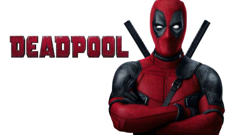
- Spider-Man vs. Deadpool: Deadpool’s mask design is bold but works primarily as a face. Spider-Man’s emblem functions independently of the full costume.
Within the broader category of superhero logos, Spider-Man’s emblem is one of the few that works as a standalone graphic without the costume context. You can put it on a t-shirt with no text and anyone recognizes it. That’s genuinely rare.
What Are the Technical Specifications of the Spider-Man Logo?
Official Color Codes
- Primary Color: Red
- Classic: Hex #CC0000, RGB (204, 0, 0), CMYK (0, 100, 100, 20), Pantone 485 C
- MCU variant: Hex #E31C23, RGB (227, 28, 35)
- Secondary Color: Blue
- Classic: Hex #003087, RGB (0, 48, 135), CMYK (100, 65, 0, 47), Pantone 286 C
- MCU variant: Hex #1A1A6E, RGB (26, 26, 110)
- Accent Color: Black
- Hex #000000, RGB (0, 0, 0), CMYK (0, 0, 0, 100), Pantone Process Black C
- Black Suit Variant: White Spider
- Hex #FFFFFF, RGB (255, 255, 255), CMYK (0, 0, 0, 0)
Dimensions and Proportions
- Aspect ratio: The spider emblem typically fits within a roughly 1:1 to 1:1.2 bounding box (slightly taller than wide in most versions)
- Minimum size requirements: Marvel’s brand guidelines recommend no smaller than 0.5 inches (36px) in digital applications to maintain leg detail visibility
- Clear space specifications: A minimum clear space equal to the height of the spider’s body on all sides
- Official usage guidelines: Governed by Marvel Entertainment, LLC; commercial use requires licensing through Marvel’s official channels; fan art falls under separate fair use considerations
- File formats for licensed use: Vector graphics (AI, EPS, SVG) for scalable applications; high-resolution pixel-based files at minimum 300 DPI for print
What Cultural Impact Has the Spider-Man Logo Had?

The spider emblem has crossed from comics into mainstream culture in a way that very few fictional symbols have managed.
You’ll find it on everything from children’s backpacks to high-fashion collaborations. Supreme did a Spider-Man collection. Off-White referenced the suit aesthetic. That kind of crossover doesn’t happen with most comic characters.
The black suit variant, in particular, left a deep mark. It spawned Venom, one of Marvel’s most commercially successful anti-heroes, and the white-on-black spider has taken on a life of its own as a separate visual identity.
Miles Morales added another layer. His suit variations, including the red-and-black design from Into the Spider-Verse, introduced a new generation to the emblem while pushing the visual language forward. That film’s handling of the logo across different animation styles showed just how flexible the core design actually is.
The spider symbol has also appeared in street art, tattoo culture, and graphic design references far outside Marvel’s official output. At this point it functions less like a corporate trademark and more like a cultural shorthand for a certain kind of determined, scrappy heroism.
How Does the Spider-Man Logo Fit Into the Overall Brand Identity?

The spider emblem doesn’t operate alone. It sits within a wider network of connected visual elements that together form what most people recognize as “Spider-Man.”
The web pattern, the color split between red and blue, the masked face design, and the spider chest mark all reinforce each other.
Remove any one element and the others still carry the identity. That’s the mark of a well-built visual system. Marvel has extended this into brand guidelines that govern how the character appears across film, publishing, merchandise, and theme parks.
The spider emblem also connects Spider-Man to other spider-themed characters in Marvel’s roster. Spider-Gwen, Spider-Man 2099, and Miles Morales all use spider emblems as their central marks, creating a visual family within the broader Marvel universe.
That unity across characters is intentional. It signals shared values and a connected world while still leaving room for each character to have their own distinct color palette and spider shape.
How Should the Spider-Man Logo Be Used?
Official Usage Guidelines
- Do: Use officially licensed assets from Marvel’s approved partners and retailers
- Do: Reference the logo in editorial, journalistic, or educational contexts under fair use
- Do: Credit Marvel Entertainment, LLC when reproducing the mark in any publication
- Don’t: Use the logo on commercial products without a licensing agreement with Marvel
- Don’t: Modify the emblem and present the modified version as official
- Don’t: Use the logo in contexts that could imply Marvel endorsement without written permission
Where to Access Official Logos
- Marvel’s press site: marvel.com/press (media assets available for editorial use)
- Licensed merchandise partners: Hot Topic, Amazon Merch, Redbubble (fan art, not official)
- Stock image platforms like Shutterstock and Getty carry licensed editorial versions
Licensing and Trademark Details
- The Spider-Man trademark is held by Marvel Entertainment, LLC, a wholly owned subsidiary of The Walt Disney Company
- Film rights have historically been split between Marvel Studios (MCU) and Sony Pictures
- Consumer product licensing goes through Marvel’s licensing division
- Fan artists operating non-commercially occupy a grey area; Marvel has generally tolerated non-commercial fan work but reserves the right to enforce its trademark
- Any commercial use, including print-on-demand products, requires a formal licensing agreement
FAQ on The Spider-Man Logo
Who designed the original Spider-Man logo?
Steve Ditko created the original spider chest emblem in 1962, working alongside Stan Lee on Amazing Fantasy #15.
Ditko’s design was simple by necessity. Comic printing at the time couldn’t handle much fine detail, so the bold black spider shape was both a creative and practical choice.
What does the spider symbol on Spider-Man’s costume mean?
It represents duality. Peter Parker is feared and misunderstood, much like actual spiders.
The emblem also signals his core abilities: web-spinning, speed, and the ability to trap threats before they reach others. It’s one of the more psychologically layered superhero chest symbols in Marvel Comics.
How many times has the Spider-Man logo changed?
The chest emblem has gone through roughly a dozen meaningful variations since 1962.
Major shifts happened with the black symbiote suit in 1984, the Sam Raimi film trilogy from 2002, and the MCU version introduced in 2016’s Captain America: Civil War.
What colors are used in the Spider-Man logo?
The classic version uses red (#CC0000), blue (#003087), and black (#000000).
The MCU variant runs slightly brighter, with red at #E31C23 and a deeper navy at #1A1A6E. The black suit version flips this entirely, using a white spider emblem on solid black.
What is the difference between the chest spider and the back spider?
In most comic versions they’re identical. In the MCU suit, the back spider is noticeably larger than the chest spider.
That detail actually became a plot point in Spider-Man: Homecoming, where the back spider detaches and functions as a separate piece of Tony Stark’s tech.
Is the Spider-Man logo trademarked?
Yes. Marvel Entertainment, LLC, a subsidiary of The Walt Disney Company, holds the trademark.
Commercial use of the spider emblem or the Spider-Man costume design requires a formal licensing agreement. Editorial and fan art use falls under different rules, though Marvel reserves enforcement rights.
What is the Spider-Man logo called?
There’s no single official name for it. Most sources refer to it as the spider emblem, spider symbol, or chest badge.
Within Marvel’s internal materials it’s typically described as part of the costume design rather than a standalone brand mark, though it functions as one in practice.
How does the Miles Morales spider logo differ from Peter Parker’s?
Miles uses a red-and-black color scheme instead of the classic red and blue, with a larger, more angular spider shape.
The version from Spider-Man: Into the Spider-Verse added a spray-paint aesthetic to the emblem, reflecting Miles’s connection to street art and graffiti culture in Brooklyn.
Can I download the Spider-Man logo for free?
Free PNG and SVG versions circulate widely online, but most are unofficial recreations.
For commercial projects, you need a licensed asset from Marvel’s approved partners. Editorial use in journalism or education generally falls under fair use, though specifics depend on your region and context.
Why does Spider-Man have a spider logo on his costume?
Stan Lee and Steve Ditko wanted an emblem that matched the character’s powers and name directly, unlike many heroes whose symbols are abstract.
A spider on the chest made immediate visual sense. It also created a strong focal point that reads clearly in dynamic action poses, which matters a lot across comic panels and film frames alike.
Conclusion
The Spider-Man logo has held up across six decades, multiple film franchises, and countless suit redesigns without ever losing its core identity.
That’s not luck. The original spider emblem Steve Ditko put on Peter Parker’s chest in 1962 was built on solid instincts: high contrast, simple silhouette, clear symbolism.
From the black symbiote suit to Miles Morales’s red-and-black variation, every iteration has worked because the foundation was right from the start.
Few comic character marks come close to this level of recognition across merchandise, film, and pop culture worldwide.

Renowned for his expertise in logo design and visual branding, Bogdan has developed a multitude of logos for various clients.
His skills extend to creating posters, vector illustrations, business cards, and brochures. Additionally, Bogdan's UI kits were featured on marketplaces like Visual Hierarchy and UI8.
He also wrote in the past years on sites like Design Your Way, WebDesignerDepot, WPDean, Designmodo, Speckyboy, Slider Revolution, and more.
- The Cursor Logo History, Colors, Font, And Meaning - 24 September 2026
- Top 7 Web Design Subscription Services That Replace Full-Time Hires - 24 September 2026
- Canva vs PowerPoint: Which Is Better for Presentations? - 22 September 2026

Bogdan Sandu is a seasoned designer who has been designing websites since 2008. Renowned for his expertise in logo design and visual branding, Bogdan has developed a multitude of logos for various clients. His skills extend to creating posters, vector illustrations, business cards, and brochures. Additionally, Bogdan's UI kits were featured on marketplaces like Visual Hierarchy and UI8. He also wrote in the past years on sites like Design Your Way, WebDesignerDepot, WPDean, Designmodo, Speckyboy, Slider Revolution, and more.
You Might Also Like