


You’ve seen the term on every printer box, scanner setting, and Photoshop export dialog. But what is DPI (dots per inch), really? And why does getting it wrong ruin a perfectly good print job?
DPI measures how many individual dots fit within one linear inch of printed or scanned output. It determines image sharpness on paper, clarity when scanning documents, and even cursor speed on a gaming mouse.
The problem is that most people confuse DPI with pixel count, mix it up with PPI, or obsess over it in situations where it’s completely irrelevant (like web images).
This guide breaks down how DPI works across printing, screens, scanners, and input devices. You’ll learn the right settings for each use case and when to stop worrying about the number entirely.
What Is DPI (Dots Per Inch)
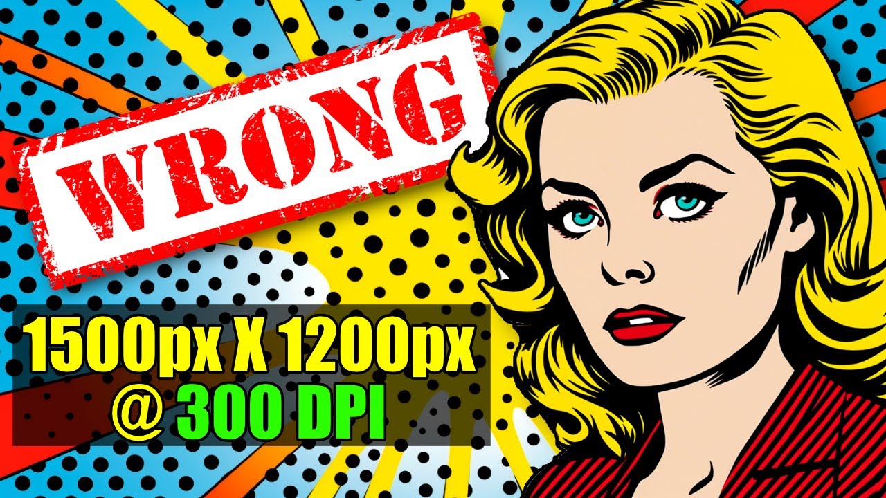
DPI stands for dots per inch. It measures how many individual dots a device can place or capture within a single linear inch of space.
The term originally comes from printing, where physical ink dots determine how sharp an image looks on paper. A printer operating at 300 DPI lays down 300 tiny dots across every inch, and at that density, the human eye can’t pick out individual dots at a normal viewing distance.
But here’s where things get tricky. DPI has been borrowed, stretched, and misapplied across screens, scanners, and even gaming mice. Each context uses it differently.
In printing, DPI describes actual physical dot density on a substrate like paper, fabric, or vinyl. In scanning, it refers to the optical resolution the scanner sensor can capture. And in gaming peripherals, it’s a measure of how many pixels a mouse cursor moves per inch of physical hand movement.
The printing industry settled on 300 DPI as its baseline for professional output decades ago, and that number has held firm. According to PrintNinja, this standard comes from offset lithography, where the typical halftone screen ruling is 150 lines per inch (LPI), and image resolution should be roughly 2x the screen ruling.
Grand View Research valued the global inkjet printer market at $42.7 billion in 2024, projected to reach $60.35 billion by 2030. The entire industry runs on DPI as a core quality metric.
A quick way to think about it: more dots per inch means more detail. Fewer dots means coarser, less defined output. That relationship holds whether you’re printing wedding invitations or scanning an old family photo at the library.
How DPI Affects Print Quality

Print quality comes down to dot density. The more dots a printer can pack into an inch, the smoother gradients look and the sharper edges become.
At 72 DPI, individual dots are visible to the naked eye on a standard sheet. Text looks jagged. Photos look blocky. At 150 DPI, things clean up considerably but still won’t pass for professional work at close viewing distances. At 300 DPI, you hit the sweet spot where most people can’t distinguish individual dots.
Gordon Flesch Company’s printing guide confirms there’s no single official DPI standard, but 300 DPI remains the accepted rule of thumb for general applications.
Viewing distance changes the math. A billboard viewed from 50 feet away only needs about 20 DPI to look crisp. A business card held six inches from your face? That needs 300 or higher.
| Print Type | Recommended DPI | Typical Viewing Distance |
|---|---|---|
| Billboard | 20–50 DPI | 50+ feet |
| Poster | 150 DPI minimum | ~6 feet |
| Brochure / Flyer | 300 DPI | Arm’s length |
| Photo print | 300 DPI | 10–12 inches |
| Fine art / Text-heavy | 400 DPI | Close inspection |
Epson and Canon inkjet printers often advertise specifications like 1200 or 2400 DPI, but effective print resolution isn’t the same as advertised DPI. A printer uses multiple tiny dots to reproduce a single color pixel, so its DPI number will always be much higher than the file resolution you’re sending to it.
According to Printing for Less, images containing text should be prepared at 400 DPI at their final layout size for clean edges on letterforms.
Minimum DPI for Different Print Types
Photo prints: 300 DPI at final output size. This is non-negotiable for anything held in hand, like 4×6 or 8×10 prints.
Large format posters: 150 DPI works at viewing distances beyond six feet. Some poster designs can get away with even less if they’re wall-mounted in large spaces.
Fabric and textile printing: Requires DPI adjustments of roughly ±25% to account for ink absorption into the material. Cotton absorbs more than polyester, spreading each dot further.
One common mistake I see all the time: designers export a file at 72 DPI, then wonder why the print shop sends it back. Changing the DPI label after the fact doesn’t add detail. You can’t fix a low-resolution file by just typing “300” into the export dialog. That brings us to the whole resampling question, which we’ll get into shortly.
DPI vs. PPI: Why the Difference Matters
People swap these terms constantly. And honestly, even Adobe Photoshop contributes to the confusion by labeling certain settings as “DPI” when it’s really dealing with PPI.
The distinction is straightforward once you hear it. PPI (pixels per inch) describes digital images on screens. DPI (dots per inch) describes physical output from printers.
Pixels and dots are not the same thing. A pixel is a single square of color in a digital file with a precise color value drawn from millions of possibilities. A printer dot is a physical ink droplet that can only vary in size and uses a limited set of base colors, typically CMYK (cyan, magenta, yellow, black).
Hua Xian Jing reports that designers experience 43% more client revisions when DPI and PPI settings are mixed up incorrectly. Print shops reject roughly 22% of submitted files due to resolution mismatches, costing studios an average of $3,800 monthly in rework.
Here’s the practical problem. You set your Photoshop canvas to “300 DPI” thinking you’ve prepared a high-res print file. But Photoshop is actually setting PPI, the pixel density of your digital canvas. The printer handles DPI on its end. If your file doesn’t have enough pixels at the right dimensions, no DPI label will save it.
The formula that matters: PPI × inches = total pixels needed. For a 300 DPI 8×10 print, your file needs 2400×3000 pixels. Anything less and you’re printing fuzz.
Took me longer than I’d like to admit to fully internalize this. The terminology overlaps just enough to be misleading, and most tutorials online use the terms interchangeably, which only makes it worse.
When working with RGB color files for screen display, PPI is your metric. When preparing work for print production, your file’s PPI determines if the printer’s DPI can do its job properly.
DPI in Screens and Displays

Screen “DPI” is technically PPI, but the term stuck anyway. Windows still calls its display scaling “DPI settings.” macOS uses a points-based system that abstracts it away entirely. Neither is using DPI in the printing sense.
When Steve Jobs introduced the iPhone 4 in 2010, he defined Apple’s Retina display as having approximately 326 PPI, arguing that 300 PPI at a 10-to-12-inch viewing distance was the threshold where pixels become invisible to the human eye.
That number shifted over the years. By 2025, most smartphones exceed 300 PPI easily, with even lower-end models clearing that bar. The iPhone 16 Pro pushed to roughly 460 PPI. Meanwhile, Apple’s desktop displays, like the Studio Display, sit at about 218 PPI, which Apple still classifies as “Retina” because you view a monitor from much farther away than a phone.
This is the part that confuses people. A 27-inch 4K monitor and a 13-inch 4K laptop have identical pixel counts (3840×2160). But pixel density is completely different.
| Display | Resolution | Screen Size | Approximate PPI |
|---|---|---|---|
| iPhone 16 Pro | 2622 × 1206 | 6.1″ | ~460 |
| iPad Air | 2360 × 1640 | 10.9″ | ~264 |
| MacBook Pro 14″ | 3024 × 1964 | 14.2″ | ~254 |
| Apple Studio Display | 5120 × 2880 | 27″ | ~218 |
| Typical 27″ 4K monitor | 3840 × 2160 | 27″ | ~163 |
Windows DPI scaling lets you adjust how large or small interface elements appear. Setting your display to 150% scaling doesn’t change the physical pixel density. It just tells the OS to render everything 1.5x larger so it’s readable on high-resolution screens. Your mileage may vary with older apps that don’t handle scaling well.
For anyone doing web design work, this matters because what looks pixel-perfect on your 4K monitor might appear blurry on someone’s 1080p display if you haven’t accounted for different pixel densities.
DPI in Mouse and Cursor Settings

Mouse DPI is a completely different animal. Same acronym, different world.
In gaming mice, DPI measures how many pixels the cursor moves on screen per inch of physical mouse movement. Set your mouse to 800 DPI, move it one inch, and the cursor travels 800 pixels. Set it to 1600 DPI, same movement covers 1,600 pixels.
Modern gaming mice from Logitech, Razer, and SteelSeries advertise sensor capabilities of 25,000+ DPI. The marketing sounds impressive. But here’s the thing: almost nobody uses settings that high.
According to ProSettings data cited by TechRadar, roughly 66% of Counter-Strike 2 professionals play at just 400 DPI. About half of Valorant pros use 800 DPI, with around 40% on 400 DPI. Almost no competitive player goes above 1,600.
Why low DPI dominates competitive play:
- Lower DPI forces larger arm movements, which improves consistency and muscle memory
- Fine-grained cursor control matters more than raw speed in tactical shooters
- 400 DPI was the native setting on early optical sensors, and many pros built habits around it
The number that actually matters is eDPI (effective DPI), which combines your mouse DPI with in-game sensitivity. Two players with different base DPI can have identical cursor speed if their eDPI matches.
| Player | Game | DPI | In-Game Sensitivity | eDPI |
|---|---|---|---|---|
| s1mple | CS2 | 400 | 3.09 | 1,236 |
| ZywOo | CS2 | 400 | 1.84 | 736 |
| TenZ | Valorant | 800 | 0.40 | 320 |
| Aspas | Valorant | 800 | 0.35 | 280 |
If you’re not a competitive FPS player, 800 DPI is a solid default that works well across different monitor resolutions and everyday tasks. GamerHardware.org recommends it as a universal starting point because it feels comfortable on both the desktop and in games without constant adjustment.
One more thing. Mouse DPI and printer DPI share nothing in common besides the abbreviation. They measure fundamentally different things. Don’t let the overlap trip you up.
How to Check and Change DPI

Checking and adjusting DPI depends entirely on what you’re working with: an image file, a display setting, or a mouse.
For image files in Photoshop: Go to Image > Image Size. The resolution field shows PPI (labeled as DPI in some versions). You can see both the pixel dimensions and the document size at the current resolution.
In GIMP: Open Image > Print Size. The X and Y resolution fields display the current PPI setting.
On macOS Preview: Open the image, then go to Tools > Show Inspector. The General Info tab displays the image dimensions and resolution.
Windows display DPI: Right-click the desktop > Display Settings > Scale and layout. The percentage shown (100%, 125%, 150%) corresponds to DPI scaling relative to the baseline 96 DPI that Windows uses as its reference.
Mouse DPI: Adjusted through manufacturer software. Logitech G HUB, Razer Synapse, and SteelSeries GG all provide DPI sliders and profile management. Most gaming mice also have a physical DPI toggle button on the body.
Resampling vs. Changing DPI Metadata
This is where people get burned the most.
Changing the DPI (or PPI) value in an image’s metadata is just relabeling. You’re telling software “display or print this at X dots per inch,” but you’re not touching the actual pixel data. A 1000×1000 pixel image at 72 DPI contains exactly the same information as that same image at 300 DPI. The pixels haven’t changed.
Resampling is different. When you resample, the software adds or removes pixels to change the total pixel count. Upsampling (adding pixels) can make files larger but doesn’t create real detail. The software is guessing what goes in those new pixels, and it usually shows. Downsampling (removing pixels) permanently discards data.
Printivity recommends setting your canvas to 300 PPI before starting a design. Increasing resolution on an existing low-res file won’t fix anything. It just makes a bigger blurry file. If your source image is a bitmap at 72 PPI, upsampling it to 300 won’t produce a sharp print. You’d need to recapture the image at higher quality or use vector graphics, which scale without resolution loss.
What DPI to Use for Web Images
The short answer: DPI doesn’t matter for web images. At all.
Browsers ignore the DPI metadata tag completely. A 1920×1080 image tagged at 72 DPI displays identically to the same image tagged at 300 DPI. Same size, same quality, same everything on screen.
Convertio’s imaging guide confirms this directly: the two files are visually indistinguishable on any screen, in any browser, on any operating system.
So where did the “save for web at 72 DPI” advice come from? The original Apple Macintosh in 1984 had a display running at 72 PPI. On that specific screen, one pixel equaled one typographic point. The number stuck around as folk wisdom long after it stopped being relevant.
Today’s screens range from about 90 PPI on budget monitors to over 460 PPI on current smartphones. There is no single “screen DPI” anymore.
What actually matters for web images:
- Pixel dimensions (width × height in pixels)
- File format (JPEG for photos, PNG for graphics with transparency)
- Compression level and file size
- Serving 2x images for high-density (Retina) screens via srcset
WebP offers roughly 25–35% smaller files than JPEG at equivalent visual quality, according to iFormat’s compression analysis. AVIF pushes that even further, achieving about 50% smaller files than JPEG (per MDN Web Docs).
If someone sends you a 6000×4000 image “at 300 DPI” for your website, and you upload it as-is, your page will load slowly. Not because of the DPI tag, but because you just uploaded a massive file with way more pixels than any visitor’s browser needs to render.
Resize to the actual display dimensions your layout requires. That’s the only thing your visitors’ browsers care about.
DPI and File Size, Resolution, and Image Dimensions

People confuse these three things constantly, and honestly the terminology doesn’t help.
Resolution is the total pixel count of an image. A 6000×4000 image has 24 million pixels regardless of what DPI label is attached to it.
DPI (or PPI) is a density instruction that tells printers or software how tightly to pack those pixels into each inch of output. It does not add or remove pixels.
File size depends on pixel count, color depth, and compression format. The DPI metadata tag has zero effect on file weight.
A 6000×4000 photo at 72 DPI contains exactly the same pixel data as that photo at 300 DPI. Same file size. Same detail. The only difference is the print instruction embedded in the metadata, which tells a printer “at 72 DPI, print this image 83 inches wide” versus “at 300 DPI, print this 20 inches wide.”
| Property | What It Controls | Affects File Size? |
|---|---|---|
| Pixel dimensions | Total detail in the image | Yes |
| DPI / PPI | Print or display density | No |
| Compression (JPEG, PNG) | How data is stored | Yes |
| Color depth (8-bit vs 16-bit) | Color precision per pixel | Yes |
How Format Choices Interact with DPI
TIFF files are the industry standard for professional print workflows because they use lossless compression and preserve every pixel. But a 24-megapixel TIFF can easily hit 72 MB uncompressed, according to Toolstud’s file size calculator.
The same image as a quality-85 JPEG compresses to roughly 2–8 MB. Visually identical for most uses, but a fraction of the storage.
PNG sits in between. Lossless like TIFF but better compressed for graphics with flat colors and text. For photographs though, PNG files can be 5–10x larger than equivalent JPEGs with no visible benefit.
When preparing files for both print and screen, the common workflow mistake is exporting one file and hoping it works everywhere. It won’t. Export your print version at full pixel dimensions with minimal compression (TIFF or high-quality JPEG at 300 PPI). Export your web version resized to actual display dimensions in WebP or JPEG with appropriate compression.
When DPI Actually Matters and When It Doesn’t

After all the technical detail above, here’s the practical breakdown.
DPI matters in these situations:
- Professional printing (brochures, business cards, packaging, magazines)
- Large format output like banners, trade show displays, and wall wraps
- Document scanning and archival digitization
- Mouse sensitivity tuning for gaming or precision design work
Crowley Imaging reports that archival scanning clients now choose 400 DPI as a minimum and 600 DPI as an average, up from the previous 300 DPI standard. Most select uncompressed TIFF as the raw file format.
DPI doesn’t matter here:
- Posting images to any website or social media platform
- Sharing photos via email or messaging apps
- Viewing images on any screen, phone, or tablet
CZUR’s scanning guide reinforces that for standard office documents and OCR processing, 300 DPI remains the optimal setting, balancing readability with manageable file sizes.
| Scenario | DPI Relevant? | Recommended Setting |
|---|---|---|
| Business card printing | Yes | 300–400 DPI |
| Billboard | Yes | 20–50 DPI |
| Website hero image | No | Pixel dimensions only |
| Instagram post | No | Pixel dimensions only |
| Scanning office docs | Yes | 300 DPI |
| Archival photo scanning | Yes | 600+ DPI |
| Gaming mouse setup | Yes | 400–1600 DPI |
The simplest rule of thumb: if something gets physically printed or physically scanned, DPI matters. If it stays digital, only pixel dimensions and file size matter.
Fixating on DPI numbers without understanding pixel dimensions is one of the most common mistakes both in design and photography. A 500×500 pixel image “at 300 DPI” will still print as a tiny 1.67-inch square. The DPI label doesn’t magically create detail that isn’t there.
What creates quality is having enough pixels at the right dimensions for your intended output. Vector-based graphics sidestep the whole issue entirely since they scale to any size without resolution loss, making them the better choice for logos that need to look sharp at every scale from favicon to billboard.
Common Questions About DPI
What does DPI stand for?
DPI stands for dots per inch. It measures how many individual dots a printer, scanner, or display can place within a single linear inch. Higher dot density produces sharper, more detailed output on paper or other physical media.
What is a good DPI for printing?
300 DPI is the industry standard for professional print quality. At this density, individual dots become invisible to the naked eye at normal viewing distances. Images with text should use 400 DPI for cleaner letterforms.
Is DPI the same as PPI?
No. DPI refers to physical ink dots from a printer. PPI (pixels per inch) describes pixel density in digital images and screens. People use them interchangeably, but they measure different things in different contexts.
Does DPI matter for web images?
Not at all. Browsers completely ignore the DPI metadata tag. Only pixel dimensions and file size affect how images display on screen. A 1920×1080 image looks identical whether tagged at 72 or 300 DPI.
What DPI should I use for scanning documents?
Use 300 DPI for standard office documents and OCR processing. For archival scanning or photos, bump it up to 600 DPI or higher. Higher resolution captures more detail but produces significantly larger files.
What is mouse DPI in gaming?
Mouse DPI measures how many pixels the cursor moves per inch of physical hand movement. Most competitive FPS players use 400 to 800 DPI for precision aiming, despite gaming mice advertising 25,000+ DPI capabilities.
Can I increase an image’s DPI to improve quality?
Changing the DPI label alone does nothing. It just relabels the metadata without adding pixels. To actually improve print quality, you need more pixels through resampling, recapturing at higher resolution, or using vector-based formats that scale without loss.
Why is 72 DPI associated with screens?
The original 1984 Apple Macintosh had a 72 PPI display where one pixel equaled one typographic point. That number became common advice for “screen resolution.” Modern displays range from 90 to over 460 PPI, making 72 irrelevant.
What DPI do large format printers use?
Billboards need only 20 to 50 DPI because viewers stand far away. Trade show banners work at 150 DPI. The required resolution drops as viewing distance increases, since the human eye can’t resolve fine detail from afar.
Does higher DPI always mean better quality?
Not necessarily. Beyond 300 DPI for standard prints, the human eye stops noticing improvement. Extremely high DPI settings increase file sizes and processing time without visible benefit at typical viewing distances.
Conclusion
Understanding what is DPI (dots per inch) comes down to knowing where it applies and where it doesn’t. In printing and scanning, it directly controls output sharpness. On screens and websites, it’s just a metadata tag that browsers skip entirely.
The 300 DPI standard for print resolution exists because of how halftone screening and human visual perception interact. That number hasn’t changed in decades, and it probably won’t.
For mouse sensitivity, most competitive players stick between 400 and 800 regardless of what the sensor can technically handle.
Stop chasing higher DPI numbers. Focus on having enough pixel dimensions for your intended output, choosing the right image format and compression, and matching your settings to the actual viewing distance. That’s where quality lives.

Renowned for his expertise in logo design and visual branding, Bogdan has developed a multitude of logos for various clients.
His skills extend to creating posters, vector illustrations, business cards, and brochures. Additionally, Bogdan's UI kits were featured on marketplaces like Visual Hierarchy and UI8.
He also wrote in the past years on sites like Design Your Way, WebDesignerDepot, WPDean, Designmodo, Speckyboy, Slider Revolution, and more.
- The Windsurf Logo History, Colors, Font, And Meaning - 10 October 2026
- How to Remove Background From Product Photos (No Photoshop) - 10 October 2026
- How Designers can Build a Stronger Online Creative Identity - 9 October 2026

Bogdan Sandu is a seasoned designer who has been designing websites since 2008. Renowned for his expertise in logo design and visual branding, Bogdan has developed a multitude of logos for various clients. His skills extend to creating posters, vector illustrations, business cards, and brochures. Additionally, Bogdan's UI kits were featured on marketplaces like Visual Hierarchy and UI8. He also wrote in the past years on sites like Design Your Way, WebDesignerDepot, WPDean, Designmodo, Speckyboy, Slider Revolution, and more.
You Might Also Like


