

The Airtable logo is the official visual mark of Airtable, a cloud-based database and spreadsheet hybrid platform founded in 2012.
It functions as a logo that communicates the brand’s identity across digital products, marketing, and platform interfaces.
Airtable sits in a crowded no-code/low-code space alongside tools like Notion Calendar and Monday.com, where clean, memorable branding is a real competitive factor.
The logo has gone through notable changes since the company’s early days, reflecting how the product itself matured from a niche spreadsheet tool into a serious enterprise platform.
What Is the Airtable Logo?
The Airtable logo is a combination mark featuring a custom wordmark paired with a colorful stacked-blocks icon. Introduced in its current form around 2021, it uses a rounded sans-serif typeface and a vibrant multicolor symbol. The design reflects the platform’s core idea: structured data that’s visually approachable and flexible. No single external design agency is credited publicly.
Here’s a breakdown of the logo’s core attributes:
- Design Type: Combination mark (icon + wordmark)
- Primary Elements: Stacked 3D block icon, custom rounded sans-serif wordmark
- Official Introduction Date: Updated version launched circa 2021
- Designer/Agency: Developed in-house by Airtable’s brand team
- Trademark Status: Registered trademark, Airtable Inc.
- Color Palette: Yellow (#FCB400), Cyan (#18BFFF), Red (#F82B60), Green (#20C933), Purple (#8B46FF)
- Usage Context: Web app UI, marketing materials, product documentation, merchandise, API developer resources, and partner integrations
How Has the Airtable Logo Evolved Over Time?
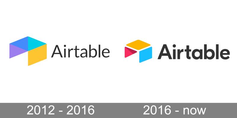
Airtable’s logo has gone through two documented visual phases since the company was founded in 2012, with the most significant change occurring during the comprehensive brand refresh of 2021.
The changes track closely with the company’s growth: Airtable reached unicorn status in 2018 after its Series C round valued it above $1 billion, and by 2022 had raised $735 million more at an $11 billion valuation (logos-world.net, 2026). The visual identity evolved in step with that trajectory.
Original Airtable Logo (2012–2021)
- Years Active: 2012–2021
- Design Description: Wordmark with a geometric icon depicting a stylized table, formed by three elements: a yellow parallelogram on top, a turquoise/cyan parallelogram on the side, and a red/pink triangle with diagonal shading that gives the mark its dimensional appearance. The overall structure has been consistent from the earliest versions, with refinements to spacing and proportions over time.
- Color Scheme: Yellow, turquoise blue, and red/pink on the icon; dark wordmark in sans-serif type
- Typeface: GT Eesti (geometric sans-serif)
- Designer: Not publicly credited for the original mark
- Context: Launched alongside the product as a startup founded in San Francisco by Howie Liu, Emmett Nicholas, and Andrew Ofstad. The three-color geometric icon was present from the earliest versions and remained structurally consistent through the company’s first decade.
- Key Changes from Previous: N/A (first version)
- Cultural Significance: Established early brand recognition in the no-code and productivity space. The three geometric shapes — universally described as a stylized table — directly referenced the product name and function.
2021 Brand Refresh (2021–Present)
- Years Active: 2021–present
- Design Description: Comprehensive brand refresh retaining the geometric table icon but refining it with updated proportions and a tightened color system. The wordmark remains in GT Eesti as a deliberate nod to the company’s origins, while the broader brand system (marketing materials, UI) transitioned to Neue Haas Grotesk.
- Color Scheme: Yellow, turquoise/cyan, and red/pink retained on the icon; expanded brand palette introduced for marketing and UI contexts
- Typeface: Logo wordmark: GT Eesti (retained). Brand system: Neue Haas Grotesk (new)
- Designer: Airtable Creative Team in collaboration with Williamson-Adams (Working Not Working, 2021)
- Context: Driven by the company’s need to clarify its brand vision as adoption spread across industries. The Creative Team’s brief was to find a visual system that balanced “friendly, approachable, and technically proficient without being too childish or austere” (Working Not Working, 2021). The product had become an abstracted database used across many industries, and the brand needed to reflect that breadth.
- Key Changes from Previous: Refined icon geometry; expanded color palette for the broader brand system beyond the core three-color icon; transition from GT Eesti to Neue Haas Grotesk for brand communications (while keeping GT Eesti in the logo itself); new scalable art system combining photography and illustration
- Cultural Significance: Positioned Airtable as a platform for serious enterprise work without abandoning the approachable, colorful identity that attracted early adopters. The decision to keep the logo in GT Eesti while updating everything else around it was a deliberate signal of continuity.
What Do the Design Elements of the Airtable Logo Mean?
Each element in the Airtable logo connects back to the product’s core idea: data organized into blocks, tables, and fields that can be rearranged and customized.
The stacked blocks icon directly references the concept of building and layering data structures.
The multicolor approach signals flexibility rather than a single rigid purpose, which is central to how Airtable markets itself.
What Does the Icon Symbolize?
The stacked 3D block icon represents data layering and structural organization.
Each block can be read as a database record, a row, or a modular component, which matches Airtable’s core product metaphor.
The focal point of the icon sits at the top block, drawing the eye upward and suggesting growth or building.
The slight 3D isometric perspective gives it a sense of depth that flat icons in the same space typically avoid, which helps it stand out among competitor logos.
Why Did Airtable Choose These Specific Colors?
Airtable’s color choices are deliberate and tied directly to brand personality and product behavior:
- Yellow (#FCB400)
- Color Name: Airtable Yellow
- Pantone Equivalent: Approx. Pantone 137 C
- Symbolic Meaning: Energy, optimism, accessibility
- Psychological Impact: Attention-grabbing without being aggressive; signals approachability
- Brand Connection: The original brand anchor color, still the most recognized Airtable color
- Cyan (#18BFFF)
- Color Name: Airtable Cyan
- Symbolic Meaning: Technology, clarity, data
- Psychological Impact: Calm and trustworthy, common in tech company logos
- Brand Connection: Reinforces the cloud/digital platform identity
- Red (#F82B60)
- Color Name: Airtable Red
- Symbolic Meaning: Action, urgency, attention
- Psychological Impact: Adds visual tension and energy to the icon system
- Brand Connection: Balances the cooler tones in the multicolor palette
- Green (#20C933)
- Color Name: Airtable Green
- Symbolic Meaning: Progress, success, go-states in UI
- Psychological Impact: Familiar from productivity and project management contexts
- Brand Connection: Mirrors color usage inside the Airtable interface itself
- Purple (#8B46FF)
- Color Name: Airtable Purple
- Symbolic Meaning: Creativity, premium features, depth
- Psychological Impact: Differentiates Airtable from purely utilitarian tools
- Brand Connection: Used heavily in Airtable’s automation and advanced feature marketing
Taken together, the full color palette is one of the most deliberately varied among no-code tools. Most competitors stick to one or two brand colors. Airtable leans into the full spectrum, which is risky but it works because the colors map to actual UI elements inside the product.
What Typography Style Is Used in the Airtable Logo?
The wordmark uses a custom rounded sans-serif typeface developed specifically for the 2021 rebrand.
It’s not based on a standard commercial typeface, though it shares visual characteristics with geometric sans-serif fonts like Circular or Nunito.
The rounded terminals on each letterform soften the overall mark, making it feel less corporate and more accessible.
Kerning is tight and consistent, giving the wordmark a compact, confident feel when paired with the icon.
Earlier versions of the logo used a more generic sans-serif treatment. The switch to a custom face in 2021 was part of the broader effort to own a more distinctive visual identity.
What Are the Hidden Meanings in the Airtable Logo?
The stacked blocks can be read in multiple ways depending on context.
For developers, they suggest data layers or API endpoints stacked on top of each other.
For business users, they look like a stack of records or spreadsheet rows.
The isometric perspective is a subtle nod to the product’s flexibility, the same data can be viewed from multiple angles (grid, gallery, kanban, calendar), which is literally what the blocks represent when you tilt them slightly.
There’s no publicly confirmed hidden message, but the multicolor system does mirror the color-coding system inside Airtable’s interface, where fields and records are tagged with the same yellow, cyan, red, green, and purple. That connection between the logo and the product UI is probably the most intentional “hidden” layer in the design.
How Does the Airtable Logo Compare to Competitor Logos?
Airtable’s multicolor, 3D-block logo stands out clearly against most competitors in the no-code and project management space, which tend to favor simpler, single-color marks.
Here’s a quick look at how it stacks up:
- Notion Calendar / Notion: Monochrome black-and-white wordmark, minimal icon. Signals simplicity and focus. Very different from Airtable’s colorful, layered approach.
- Monday.com: Colorful wordmark with dots representing days. Also uses multiple colors but applies them to type rather than an icon. Less structured-feeling than Airtable.
- ClickUp: A simple geometric “C” shape with a gradient. Clean and modern but less distinctive at small sizes.
- Miro: Yellow wordmark with a simple icon. More restrained, closer to Airtable’s early branding than its current mark.
- Figma: Four-color abstract mark, also multicolor but rooted in a different product metaphor (overlapping components). Interesting parallel to Airtable’s block system approach.
- Loom: Purple gradient wordmark. Single color, very different energy.
Airtable is probably the most visually complex logo in this peer group. That complexity works because it reflects the product’s actual depth, but it also means the logo doesn’t always reduce cleanly to very small sizes or single-color applications.
What Are the Technical Specifications of the Airtable Logo?
Official Color Codes
Primary Color: Airtable Yellow
Secondary Color: Airtable Cyan
- Hex: #18BFFF
- RGB: (24, 191, 255)
- CMYK: (91, 25, 0, 0)
- Pantone: Approx. 299 C
Accent Color: Airtable Red
- Hex: #F82B60
- RGB: (248, 43, 96)
- CMYK: (0, 83, 61, 3)
- Pantone: Approx. 198 C
Accent Color: Airtable Green
- Hex: #20C933
- RGB: (32, 201, 51)
- CMYK: (84, 0, 75, 21)
- Pantone: Approx. 360 C
Accent Color: Airtable Purple
- Hex: #8B46FF
- RGB: (139, 70, 255)
- CMYK: (45, 73, 0, 0)
- Pantone: Approx. 2665 C
Wordmark Color: Dark Navy
- Hex: #172B4D
- RGB: (23, 43, 77)
- CMYK: (70, 44, 0, 70)
Dimensions and Proportions
- Aspect Ratio: Approximately 4:1 (horizontal lockup, icon + wordmark)
- Minimum Size Requirements: Icon alone: 16x16px minimum for digital use; full lockup: 120px wide minimum for legibility
- Clear Space Specifications: Minimum clear space equal to the height of the “A” in the wordmark on all sides
- File Formats Available: SVG (preferred for digital), PNG with transparent background, EPS for print
- Official Usage Guidelines: Available via Airtable’s brand kit at airtable.com/brand; covers approved color variations (color, white, dark), icon-only usage rules, and prohibited modifications
For digital use, the SVG format is the best choice since vector graphics scale to any size without quality loss. The PNG version works for contexts where SVG isn’t supported, but check the DPI requirements if you’re heading into print.
What Cultural Impact Has the Airtable Logo Had?
Airtable’s logo has become one of the more recognizable marks in the no-code space, partly because the multicolor block icon is genuinely distinctive at a time when most SaaS logos trend toward minimalist single-color marks.
The 2021 rebrand got real attention in design communities, specifically because of how confidently it broke from the clean-and-neutral aesthetic that dominated productivity tool branding at the time.
Within the broader category of tech company logos, Airtable’s mark is often cited alongside tools like Figma and Linear as examples of strong, intentional brand identity in the productivity software space.
The logo also benefits from strong internal consistency. The same colors used in the icon appear throughout the product UI, which creates a tight link between the brand mark and the actual user experience. That kind of coherence is rarer than it should be in SaaS branding.
How Does the Airtable Logo Fit Into the Overall Brand Identity?
The logo sits at the center of a broader visual system that includes the multicolor palette, rounded typography, and an isometric illustration style used throughout Airtable’s marketing.
The icon’s block metaphor extends into product UI design, where fields and records use the same color coding.
The brand guidelines connect the logo to a full brand style guide that governs how the colors, type, and icon are used across product, marketing, and partner contexts.
The overall system reflects solid visual hierarchy thinking. The icon anchors recognition, the wordmark confirms identity, and the color system provides the connective tissue across all touchpoints. It’s a well-considered setup, especially for a company that operates across web, mobile, API documentation, and third-party integrations simultaneously.
Related brand entities in Airtable’s identity network include its product icons (individual base and app icons using the same color system), its illustration library, and its UI component colors, all drawing from the same five-color palette established in the logo.
How Should the Airtable Logo Be Used?
Official Usage Guidelines
Do’s:
- Use the logo files directly from Airtable’s official brand kit
- Maintain the minimum clear space on all sides
- Use the approved color variations: full color, white (on dark backgrounds), or dark (on light backgrounds)
- Use SVG or high-resolution PNG files for digital placements
- Use EPS or high-resolution files for print
Don’ts:
- Do not recolor the logo or substitute brand colors
- Do not stretch, skew, or distort the proportions
- Do not place the logo on busy backgrounds that reduce legibility
- Do not recreate the logo in unauthorized typefaces or icon variations
- Do not use the logo in ways that imply Airtable endorsement without written permission
Where to Access Official Logo Files
Airtable’s official brand assets are available at airtable.com/brand. The press kit includes logo files in multiple formats, usage guidelines, and approved color values. For partner integrations or commercial use outside personal/editorial contexts, contact Airtable directly through their legal or brand team.
Licensing and Trademark Protection
The Airtable name and logo are registered trademarks of Airtable Inc. Standard fair use rules apply for editorial, educational, and review contexts. Commercial use, co-branding, or any modification of the logo requires explicit written permission from Airtable. Unauthorized use of the trademark, especially in ways that suggest partnership or endorsement, is a trademark infringement risk.
If you’re building an integration or embedding the logo in a third-party product, Airtable’s developer and partner documentation outlines the specific rules for logo usage in those contexts.
FAQ on The Airtable Logo
What does the Airtable logo look like?
The Airtable logo is a combination mark: a stacked 3D block icon next to a rounded sans-serif wordmark in dark navy.
The icon uses five colors: yellow, cyan, red, green, and purple. It’s one of the more visually distinct marks among no-code tech company logos.
What colors does the Airtable logo use?
The official Airtable brand colors are yellow (#FCB400), cyan (#18BFFF), red (#F82B60), green (#20C933), and purple (#8B46FF).
The wordmark sits in dark navy (#172B4D). These same colors appear throughout the product UI, which gives the brand strong visual consistency.
What font is used in the Airtable logo?
Airtable uses a custom rounded sans-serif font developed for its 2021 rebrand.
It’s not a publicly available font. The rounded terminals make the wordmark feel approachable rather than corporate, which fits the brand positioning well.
When was the current Airtable logo introduced?
The current version launched around 2021 as part of a full brand refresh.
It replaced an earlier, simpler mark that had been in use since roughly 2012. The rebrand introduced the multicolor block icon and the custom wordmark typography.
Where can I download the official Airtable logo?
Official logo files are available at airtable.com/brand. The press kit includes SVG, PNG, and EPS formats.
For editorial use, PNG with a transparent background works fine. For anything going to print, grab the EPS or high-resolution file and check the DPI requirements.
Can I use the Airtable logo on my website?
Editorial and review use is generally fine under standard trademark fair use rules.
Commercial use, co-branding, or anything that implies Airtable endorsement requires written permission. The Airtable trademark is registered to Airtable Inc., so unauthorized modifications carry real legal risk.
How does the Airtable logo compare to competitors like Notion or Monday.com?
Notion goes monochrome. Monday.com uses color in its wordmark but keeps the icon simple.
Airtable is the most visually complex of the three. The multicolor logo design stands out, though it’s trickier to reproduce cleanly at very small sizes compared to its competitors.
What does the Airtable logo icon represent?
The stacked 3D blocks represent layered data structures, which is the core product metaphor.
Each block maps to how Airtable organizes records, fields, and bases. The isometric perspective suggests you can view the same data from multiple angles, which directly reflects the product’s multi-view feature set.
Has the Airtable logo changed over time?
Yes, there have been at least two major phases. The early mark (2012-2019) was simpler and mostly yellow.
The 2021 rebrand introduced the full five-color system, the 3D block icon, and the custom Airtable wordmark. It was a significant visual shift that tracked closely with the company’s move toward enterprise customers.
What file format should I use for the Airtable logo?
SVG is the best option for web and digital use since vector graphics scale without any quality loss.
PNG with a transparent background works for contexts where SVG isn’t supported. Avoid JPEG for logos entirely since compression artifacts degrade the edges, especially on the multicolor icon.
Conclusion
The Airtable logo is a well-built piece of brand identity work that holds up under scrutiny, from its multicolor block icon to its custom wordmark typeface.
The five-color palette isn’t just decorative. It maps directly to the product’s own UI color-coding system, which gives the logo design principles real functional grounding.
Among no-code platform brands, few have managed a visual identity this coherent across icon, wordmark, and product interface.
The 2021 rebrand was a confident move, and the Airtable brand assets it produced have aged well in a space where trends shift fast.

Renowned for his expertise in logo design and visual branding, Bogdan has developed a multitude of logos for various clients.
His skills extend to creating posters, vector illustrations, business cards, and brochures. Additionally, Bogdan's UI kits were featured on marketplaces like Visual Hierarchy and UI8.
He also wrote in the past years on sites like Design Your Way, WebDesignerDepot, WPDean, Designmodo, Speckyboy, Slider Revolution, and more.
- The Windsurf Logo History, Colors, Font, And Meaning - 10 October 2026
- How to Remove Background From Product Photos (No Photoshop) - 10 October 2026
- How Designers can Build a Stronger Online Creative Identity - 9 October 2026

Bogdan Sandu is a seasoned designer who has been designing websites since 2008. Renowned for his expertise in logo design and visual branding, Bogdan has developed a multitude of logos for various clients. His skills extend to creating posters, vector illustrations, business cards, and brochures. Additionally, Bogdan's UI kits were featured on marketplaces like Visual Hierarchy and UI8. He also wrote in the past years on sites like Design Your Way, WebDesignerDepot, WPDean, Designmodo, Speckyboy, Slider Revolution, and more.
You Might Also Like


