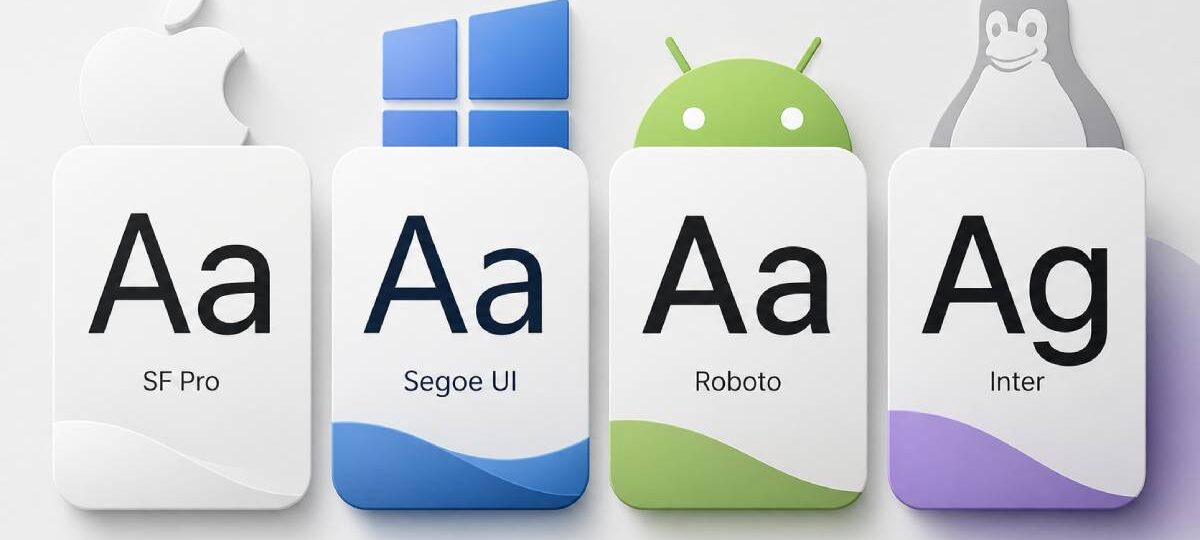
The font already on your device is often better than anything you’d pay to download.
The best system fonts are preinstalled, load instantly, and are built for screen legibility across every resolution and device type. No render delay. No layout shift. Just clean, native font rendering that works.
Choosing the right platform-native font affects how your UI feels, how fast your pages load, and how readable your content is at small sizes.
This guide covers the top 10 preinstalled fonts across macOS, Windows, Android, and Linux, with specs, CSS font stacks, best use cases, and honest limitations for each one.
The Best System Fonts
San Francisco (SF Pro)
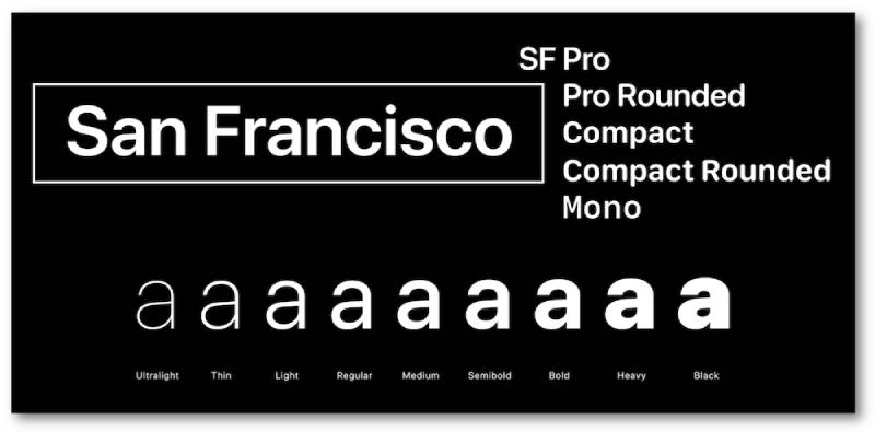
Apple’s native typeface for macOS, iOS, iPadOS, and tvOS. Designed in-house by Apple and first released in 2014, SF Pro replaced Helvetica Neue as the platform-native UI font starting with OS X El Capitan and iOS 9.
Key Specs
- Type: Neo-grotesque sans-serif
- Designed by: Apple Inc.
- Default on: macOS, iOS, iPadOS, tvOS
- Available weights: Ultralight through Black (9 weights), with italics and 4 width variants
Why It Works as a System Font
SF Pro uses optical sizing, automatically switching letterform details based on point size. It supports over 150 languages across Latin, Greek, and Cyrillic scripts.
The variable font version also adjusts spacing and proportions across sizes, which is why Apple UIs look so consistent from the Watch to a 27-inch iMac.
Best Use Cases
- Apple platform UI and app design
- Native macOS and iOS interfaces
- Design system typography for Apple-first products
CSS Font Stack
font-family: -apple-system, BlinkMacSystemFont, "Helvetica Neue", sans-serif;
Limitations
Apple restricts redistribution. SF Pro is licensed only to registered Apple developers for use within Apple platform apps. You can’t freely embed it on non-Apple products or websites.
Segoe UI
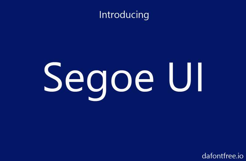
Microsoft’s default UI font since Windows Vista (2007). Designed by Steve Matteson at Monotype, Segoe UI was built specifically for screen legibility across desktop, laptop, tablet, and phone displays.
Key Specs
- Type: Humanist sans-serif
- Designed by: Steve Matteson (Monotype)
- Default on: Windows Vista through Windows 10; Windows 11 uses Segoe UI Variable
- Available weights: Light, Semilight, Regular, Semibold, Bold, Black
Why It Works as a System Font
Segoe UI was optimized for ClearType rendering, Microsoft’s subpixel antialiasing system. It has an open, neutral feel that works in both UI labels and longer text passages.
Windows 11 upgraded it to Segoe UI Variable, a variable font with optical size and weight axes, improving legibility at small sizes without sacrificing personality at display sizes.
Best Use Cases
- Windows app and web UI design
- Microsoft Fluent Design interfaces
- Business and enterprise software
- Labels, captions, and navigation text
CSS Font Stack
font-family: "Segoe UI", system-ui, -apple-system, sans-serif;
Limitations
Segoe UI is not available for free download or redistribution. It’s a Microsoft-proprietary font, so using it on non-Windows web projects means Windows users see it, while others fall back to system defaults.
Roboto
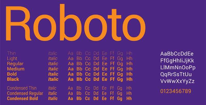
Google’s default system font for Android, released in 2011 alongside Android 4.0. Designed by Christian Robertson entirely in-house at Google, Roboto was substantially redesigned in 2014 for Android 5.0 Lollipop.
Key Specs
- Type: Neo-grotesque sans-serif
- Designed by: Christian Robertson (Google)
- Default on: Android (4.0+), Chrome OS; also used across Google services
- Available weights: Thin (100) through Black (900), with condensed and italic variants
Why It Works as a System Font
Roboto has a mechanical skeleton with largely geometric forms but features open curves that give it a readable, human quality. It’s been used across Google Play, YouTube, Google Maps, and Google Images since 2013.
By 2024, Roboto and Open Sans together account for over 51% of all Google Fonts views. That kind of scale proves its durability as a cross-platform native font rendering solution.
Best Use Cases
- Android app interfaces
- Material Design systems
- Web UI body copy and navigation
- Data-heavy dashboards
CSS Font Stack
font-family: Roboto, "Helvetica Neue", Arial, sans-serif;
Limitations
Roboto can feel slightly generic on non-Android platforms. It’s also not a true italic font in older versions; early weights used oblique (slanted) styles rather than designed italics.
Inter

Designed by Rasmus Andersson and first released publicly in 2017, Inter was built from the ground up for one thing: screen readability. It started as a Figma internal project and is now one of the most widely used UI typefaces on the web.
Key Specs
- Type: Geometric neo-grotesque sans-serif
- Designed by: Rasmus Andersson
- Default on: GNOME (Linux), elementary OS; widely adopted as a de facto UI standard
- Available weights: Thin (100) through Black (900), 9 weights with matching italics; also a full variable font
Why It Works as a System Font
Inter was designed with a tall x-height and open apertures that keep text readable even at 12px or below. The variable font includes an optical size axis that adjusts letterforms automatically based on context.
Figma, GitHub, Linear, Mozilla, and NASA all use Inter. For the 12 months ending May 2025, it was accessed 414 billion times on Google Fonts alone.
Best Use Cases
- SaaS products and developer tools
- Admin dashboards and data interfaces
- Design systems that need cross-platform consistency
- Linux desktop UIs (GNOME default)
CSS Font Stack
font-family: Inter, system-ui, -apple-system, sans-serif;
Limitations
Inter requires loading an external font file unless it’s installed on the user’s OS. For performance-critical apps, a system font stack loads faster since no file download is needed. That said, with variable fonts, the performance gap is minimal.
Helvetica Neue
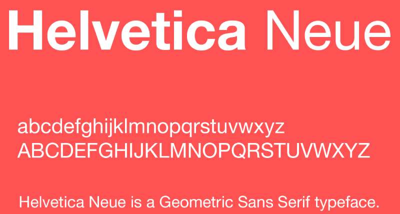
A refined version of the original 1957 Helvetica, designed by Max Miedinger. Helvetica Neue was Apple’s system font for macOS and iOS before San Francisco took over in 2015. It’s still bundled on macOS and remains a go-to for designers worldwide.
Key Specs
- Type: Neo-grotesque sans-serif
- Designed by: Max Miedinger and Eduard Hoffmann (Helvetica); updated by Linotype
- Default on: macOS (legacy); still preinstalled
- Available weights: Ultralight through Black, including condensed variants
Why It Works as a System Font
Helvetica Neue has exceptionally clean stroke weights and a neutral design that adapts to almost any context. It was Apple’s UI font for years precisely because it doesn’t impose a strong personality on the interface around it.
Screen rendering at small sizes is where it starts to show its age, though. It was designed for print, not pixels.
Best Use Cases
- Branding and print design on macOS
- Display-size headings
- Corporate design systems where neutrality matters
CSS Font Stack
font-family: "Helvetica Neue", Helvetica, Arial, sans-serif;
Limitations
Helvetica Neue is not available on Windows by default. It also lacks the optical size adjustments that SF Pro and Inter offer, which means it can look thin and hard to read at small screen sizes without careful sizing and leading adjustments.
Georgia
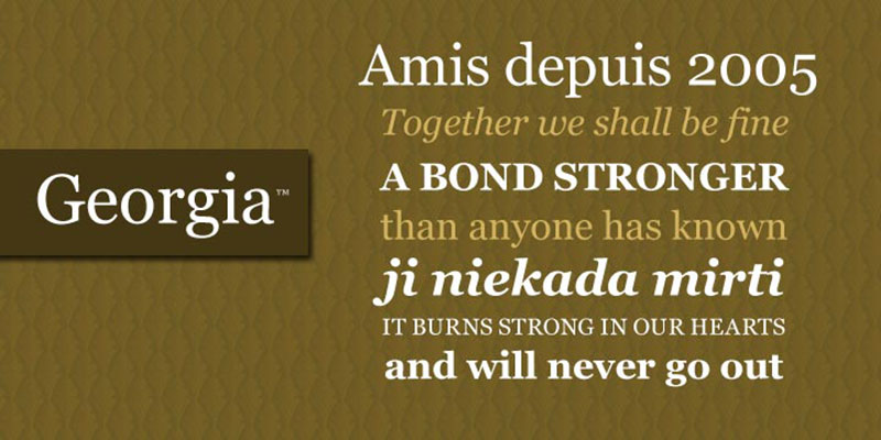
Designed by Matthew Carter in 1993 and released by Microsoft in 1996, Georgia is a serif font built specifically for low-resolution screen rendering. It’s one of the most reliable web-safe serif options available.
Key Specs
- Type: Transitional serif
- Designed by: Matthew Carter
- Default on: Windows, macOS (bundled)
- Available weights: Regular, Italic, Bold, Bold Italic (core family); Georgia Pro adds Light, Semibold, Black with condensed variants
Why It Works as a System Font
Georgia’s large x-height, open counters, and carefully hinted stems make it readable down to 9pt on screen. The New York Times switched its body text from Times New Roman to Georgia in 2007, which says a lot.
It’s one of the few serif preinstalled fonts that holds up for long-form reading on screen without feeling dated.
Best Use Cases
- Long-form editorial and blog content
- Online publications and news sites
- Any context requiring a readable, trustworthy serif
CSS Font Stack
font-family: Georgia, "Times New Roman", Times, serif;
Limitations
The core Georgia family only has 4 styles. That limits typographic hierarchy options unless you use Georgia Pro, which requires licensing. It can also look slightly heavy when used at display sizes.
Verdana
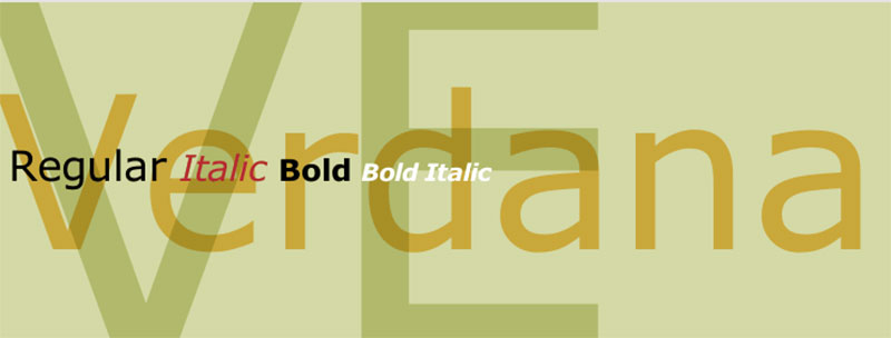
Designed by Matthew Carter for Microsoft in 1996, Verdana was purpose-built for low-resolution screen rendering. It was one of the original Microsoft Core Fonts for the Web and remains preinstalled on virtually every computer.
Key Specs
- Type: Humanist sans-serif
- Designed by: Matthew Carter (Microsoft)
- Default on: Windows, macOS (bundled)
- Available weights: Regular, Italic, Bold, Bold Italic
Why It Works as a System Font
Verdana’s large x-height, wide proportions, and generous letter spacing were all designed specifically to survive 72–96 DPI screens. It’s a humanist sans-serif, which makes individual characters more distinct than a geometric font would be.
Screen resolution has improved dramatically since 1996, but Verdana still holds up well as a body text choice for accessible, high-legibility interfaces.
Best Use Cases
- Body text requiring maximum legibility
- Accessibility-focused interfaces
- Email design (near-universal support)
CSS Font Stack
font-family: Verdana, Geneva, Tahoma, sans-serif;
Limitations
Verdana is noticeably wider than most other sans-serif fonts. Place it next to Arial or Helvetica in a font stack and the layout shift is visible. Also, only 4 weights means limited typographic range for complex design systems.
Arial
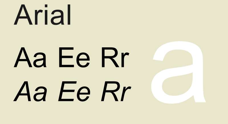
Created by Monotype in 1982 and included with Windows 3.1, Arial is one of the most widely distributed typefaces in history. It’s on essentially every Windows and macOS machine and serves as the standard fallback sans-serif across operating systems.
Key Specs
- Type: Neo-grotesque sans-serif
- Designed by: Robin Nicholas and Patricia Saunders (Monotype)
- Default on: Windows, macOS (bundled)
- Available weights: Regular, Italic, Bold, Bold Italic, Black, Narrow, Rounded
Why It Works as a System Font
Arial’s near-universal availability makes it the most reliable fallback font on the web. It loads from the device, adds zero latency, and renders consistently across Windows and macOS.
Designers often dismiss it (it was created to avoid licensing Helvetica), but as a cross-platform fallback font family, nothing beats its availability numbers.
Best Use Cases
- Last-resort fallback in font stacks
- Email body text
- Legacy web and enterprise applications
CSS Font Stack
font-family: Arial, Helvetica, sans-serif;
Limitations
Arial has a generic, overused appearance. Designers avoid it as a primary typeface for good reason: it lacks the refinement of Helvetica and the screen optimization of fonts like Verdana or Inter. Best used as a deep fallback, not a first choice.
Trebuchet MS
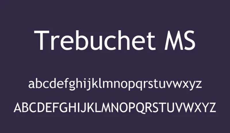
A humanist sans-serif designed by Vincent Connare for Microsoft in 1996. Released as part of the Core Fonts for the Web initiative, it was the window title font for Windows XP and remains bundled across Windows and macOS systems.
Key Specs
- Type: Humanist sans-serif
- Designed by: Vincent Connare (Microsoft)
- Default on: Windows, macOS (bundled)
- Available weights: Regular, Italic, Bold, Bold Italic; true italics (not oblique)
Why It Works as a System Font
Trebuchet MS has a large x-height and distinctive letterforms that give text personality even at small sizes. Connare drew from Gill Sans, Frutiger, and US highway signage to produce something more expressive than Verdana without sacrificing screen legibility.
It’s one of the few older web-safe fonts that still feels somewhat contemporary in editorial contexts.
Best Use Cases
- Web UI text with personality
- Editorial headings at medium sizes
- Body copy where Verdana feels too wide
CSS Font Stack
font-family: "Trebuchet MS", "Lucida Grande", Tahoma, sans-serif;
Limitations
Only 4 styles available. The ampersand character is notoriously idiosyncratic and polarizing among designers. It also lacks the weight range needed for modern design systems that rely on font spacing and weight variation for visual hierarchy.
Calibri
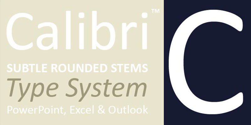
Designed by Lucas de Groot and released with Windows Vista and Microsoft Office 2007, Calibri replaced Times New Roman as the default body font in Office. It became one of the most-read typefaces in the world almost overnight because of that switch.
Key Specs
- Type: Humanist sans-serif
- Designed by: Lucas de Groot
- Default on: Windows Vista+; Microsoft Office 2007–2022 (replaced by Aptos in 2023)
- Available weights: Regular, Italic, Bold, Bold Italic, Light, Light Italic
Why It Works as a System Font
Calibri was designed for ClearType rendering from day one. Its rounded forms, optical corrections, and slightly condensed proportions make it more comfortable for long reading sessions than Arial.
It’s a humanist sans-serif, which means it has more warmth and character variation than geometric fonts. Microsoft replaced it as the Office default in 2023 with Aptos, but Calibri is still preinstalled and widely used in documents worldwide.
Best Use Cases
- Office documents and reports
- Professional correspondence
- UI body text on Windows
CSS Font Stack
font-family: Calibri, Candara, Segoe, "Segoe UI", Optima, Arial, sans-serif;
Limitations
Calibri is smaller than most fonts at equivalent sizes, which can create layout shift when it falls back to a different font. Its association with default Microsoft documents also makes it feel generic for branding work. And since 2023, it’s no longer the Office default, so its cultural presence may fade over time.
What Makes a Font a System Font?
A system font is a typeface that comes pre-installed on an operating system. No download. No external request. The browser finds it already on the device and renders it immediately.
This is a genuinely important distinction. A lot of people confuse system fonts with web-safe fonts or even Google Fonts, but they are not the same thing.
Web-safe fonts are a legacy set of typefaces that happen to exist on most systems (Arial, Times New Roman, Georgia). System fonts are the OS-native typefaces each platform actively uses for its own interface.
Google Fonts are remote web fonts. They require a network request every time a page loads, even if the font is cached.
System fonts require zero requests. They are already there.
The CSS font-family: system-ui keyword tells the browser to use whatever the operating system designates as its primary UI font. That is Segoe UI Variable on Windows 11, SF Pro on macOS and iOS, and Roboto on Android.
Each platform ships a different default. That is the trade-off: you get zero-latency font loading, but not a single consistent appearance across every device.
Why System Fonts Are Still a Strong Choice for Web and UI Design
Performance and Core Web Vitals
The Web Almanac 2025 shows 88% of websites load at least one external web font. That external request competes with images, CSS, and other critical resources for early network bandwidth.
System fonts sidestep this entirely. No font file means no render-blocking resource and no Flash of Invisible Text (FOIT) or Flash of Unstyled Text (FOUT).
The Guardian switched their body text to a system font stack in early 2024 and recorded a 24% improvement in LCP scores, according to E-Web Marketing performance data. The 2025 Web Almanac Performance chapter also confirms that text is the LCP element on nearly 24% of mobile pages, making font load strategy a direct ranking concern.
On pages where images are the LCP element (the other 76%), fonts still compete for early bandwidth. Removing them from the equation is a net gain either way.
Accessibility and OS-Level Scaling
System fonts inherit the user’s OS-level accessibility preferences automatically. If a user has bumped their system font size to 18px or switched to a high-contrast theme, the interface font scales with it.
WCAG 2.1 AA requires text to be resizable to 200% without loss of function. System fonts support this out of the box because they are native to the platform that handles the scaling.
DeveloperUX research (2025) found that accessible typography can reduce cognitive strain by up to 35% for users with visual impairments. System fonts are not a cure-all here, but they start from a baseline designed for the platform’s own accessibility pipeline.
Real-World Adoption
GitHub, Medium, Bootstrap, Ghost, Booking.com, and Unsplash all run on system font stacks in production. This is not a niche optimization.
Bootstrap’s system font stack has been in place since Bootstrap 4, and it covers SF Pro, Segoe UI, Roboto, Helvetica Neue, and Arial as platform-specific fallbacks with a sans-serif generic at the end.
The Best System Fonts on Each Major Platform
The right system font depends entirely on the platform. There is no single “best” answer. Here is how each major OS handles it.
| Platform | Default System Font | Type |
|---|---|---|
| macOS / iOS | SF Pro (San Francisco) | Humanist sans-serif |
| Windows 11 | Segoe UI Variable | Variable humanist sans-serif |
| Android | Roboto | Geometric sans-serif |
| Linux (GNOME) | Cantarell | Humanist sans-serif |
| Linux (Ubuntu) | Ubuntu | Humanist sans-serif |
Best System Fonts for Body Text
SF Pro Text (macOS/iOS): Optimized for sizes below 20pt. Apple splits San Francisco into two optical variants. SF Pro Text handles body text, SF Pro Display handles headings. The switch happens automatically via the -apple-system CSS flag.
Segoe UI (Windows): Designed specifically for ClearType rendering on Windows screens. Clean x-height, open apertures, good legibility at 14-16px. Works especially well on high-DPI displays where ClearType hinting shines.
Roboto (Android): A geometric sans-serif font with slightly mechanistic letterforms. Roboto holds up well at small sizes and supports a wide range of weights (100 through 900), making it flexible for long-form reading on mobile.
Best System Fonts for UI Interfaces
Segoe UI Variable is the standout here. Introduced with Windows 11, it uses variable font technology with an optical size axis (opsz) that automatically adjusts letterform geometry based on the requested font size.
Microsoft’s own documentation confirms that in XAML controls, the optical size matches the requested font size automatically. No manual adjustment needed. The weight axis runs from 100 to 700, giving developers fine-grained control without swapping typefaces.
DeveloperUX typography research found SF Pro Display reduced user errors by 31% compared to decorative fonts in form-heavy interfaces. This is the kind of quiet advantage system UI fonts have from years of platform-specific optimization.
SF Pro Display (macOS): Nine weights, optical size variants, and tight integration with macOS rendering. Works cleanly at display sizes where SF Pro Text would start to look too compact.
Best Monospace System Fonts
Three monospace options ship as system defaults worth using in code contexts:
- Consolas (Windows): Designed by Luc de Groot specifically for ClearType. Strong character differentiation between
0,O,1,l, andI. Ships with Windows Vista onward and Microsoft Office. - SF Mono (macOS): Apple’s monospace option introduced with Xcode 8. Clean, with a wider character set and good ligature support when enabled.
- Roboto Mono (Android/Chrome OS): Fixed-width companion to Roboto. Consistent stroke contrast, works at small sizes in terminal and code editor contexts.
How to Use System Fonts in CSS
The system-ui CSS keyword has been supported across Chrome, Safari, Firefox, and Edge since 2020. It is the shortest path to native fonts.
body {
  font-family: system-ui, -apple-system, BlinkMacSystemFont,
    "Segoe UI", Roboto, "Helvetica Neue", Arial, sans-serif;
}
system-ui handles modern browsers and picks the OS default.
-apple-system targets Safari on macOS and iOS, correctly selecting SF Pro Text vs SF Pro Display based on size.
BlinkMacSystemFont covers Chrome on macOS before system-ui was supported.
"Segoe UI" is the explicit Windows fallback.
Roboto covers Android and Chrome OS.
"Helvetica Neue" then Arial catch older macOS systems and any remaining gaps.
sans-serif is the required generic fallback. Never skip it.
Common Mistakes
Three mistakes come up repeatedly when developers implement system font stacks:
- Dropping the
sans-serifgeneric at the end (leaves some browsers with no fallback) - Using
system-uialone without platform-specific fallbacks (breaks older browsers) - Skipping Roboto entirely (Android users get an unexpected fallback)
One real concern worth knowing: Bootstrap removed system-ui from their stack because of a rendering issue on Simplified Chinese Windows systems, where system-ui triggered a Chinese font that produced poor Latin glyph rendering. If your audience includes Chinese-language Windows users, test before relying on system-ui as the first declaration.
For monospace contexts (code blocks, terminals), a separate stack applies:
code, pre {
  font-family: ui-monospace, SFMono-Regular, "SF Mono",
    Consolas, "Liberation Mono", Menlo, monospace;
}
System Fonts vs. Web Fonts: When to Use Each
This is not really a performance debate anymore. It is a branding question.
| Factor | System Fonts | Web Fonts |
|---|---|---|
| Load speed | Instant | Adds HTTP request |
| Cross-platform consistency | Different per OS | Identical everywhere |
| Brand control | None | Full |
| CLS risk | Zero | Present without optimization |
| Accessibility scaling | Automatic | Manual |
| Cost | Free | Licensing may apply |
When system fonts clearly win
Productivity and data tools benefit the most. Dashboards, admin panels, code editors, and email clients like Gmail use familiar OS typography for a reason. Users spend long sessions in these products, and native fonts reduce cognitive friction over time.
Email is the other obvious case. Web fonts are not reliably supported across email clients. System fonts work everywhere, every time.
Performance-sensitive pages where LCP is borderline. One fewer render-blocking resource can push a page from a failing to a passing Core Web Vitals score.
When web fonts make more sense
Consumer brand products where visual identity matters. What font does Airbnb use? Cereal, a custom typeface. What font does Duolingo use? Feather Bold. These brands made deliberate choices that system fonts could not replicate.
Editorial and long-form reading. A well-chosen serif font or a carefully picked Google Font pairing adds personality and improves reading rhythm in ways system fonts simply do not. The Notion font choice (a refined sans-serif) is part of what makes the product feel considered rather than utilitarian.
The hybrid approach works well in practice. Use system fonts for body text where load performance matters. Use a single web font for headings where brand identity needs to show. This limits the HTTP request to one font file instead of four.
How System Fonts Affect Readability and Typography Quality
System fonts are not a compromise. The major ones were engineered with more care than most free web fonts.
Optical Sizing: What It Actually Does
Optical sizing solves a real problem in digital typography. A typeface designed to look good at 48px has different spacing, stroke contrast, and aperture widths than one optimized for 12px. Most fonts ignore this.
SF Pro handles it by splitting into Display and Text variants. The browser picks automatically based on size.
Segoe UI Variable handles it with a continuous optical axis (opsz). The letterform geometry adjusts seamlessly at every size between 8pt and 36pt without any developer input. Microsoft’s documentation confirms this happens automatically in XAML controls, and in CSS when Segoe UI Variable is declared explicitly.
This is what separates modern system fonts from older defaults like Arial. Arial has no optical sizing. It looks acceptable at every size but exceptional at none.
Weight Range and Font Spacing
Roboto ships with 9 weights (100-900). SF Pro ships with 9 weights. Segoe UI Variable covers 100-700 continuously via its weight axis.
Most free Google Fonts ship with 2 to 4 weights. System fonts give designers more control over typographic hierarchy without loading additional font files.
Good font spacing is built into these typefaces from the ground up. Smashing Magazine (2024) research found that proper spacing can reduce reading fatigue by 25%. System fonts ship with spacing calibrated for their platform’s pixel grid, anti-aliasing engine, and DPI targets.
System Fonts and Pairing Fonts
System fonts pair well with a wide range of web fonts precisely because they are neutral. Segoe UI and Roboto are both humanist sans-serifs with open letterforms, which makes them easy to combine with a display or serif heading font without visual conflict.
If you are pairing fonts in a hybrid system font setup, the neutral quality of system fonts is actually an asset. They let the heading font carry personality while the body text stays legible and fast.
Monotype’s 2024 Global Font Use Survey found that 76% of designers prioritize readability and accessibility when choosing typefaces. System fonts are a direct answer to that priority, built and maintained by the companies that make the operating systems themselves.
FAQ on The Best System Fonts
What is a system font?
A system font is a font preinstalled by your operating system. No download required. The OS supplies it instantly, which means zero load time and no flash of unstyled text on your page.
What is the best system font for websites?
For performance, use the system-ui CSS keyword. It pulls SF Pro on Apple devices, Segoe UI on Windows, and Roboto on Android. For visual consistency across all platforms, Inter is the strongest cross-platform choice.
What is a CSS system font stack?
It’s a list of fallback fonts in your CSS, ordered by preference. The browser uses the first available font. A solid default stack: system-ui, -apple-system, “Segoe UI”, Roboto, sans-serif.
Do system fonts improve page speed?
Yes. System fonts eliminate external font requests entirely. No network call, no render-blocking file, no layout shift. That directly improves First Contentful Paint and CLS scores in Google’s Core Web Vitals.
What system fonts come with macOS?
macOS ships with SF Pro, Helvetica Neue, Georgia, Verdana, Arial, and Trebuchet MS by default. SF Pro has been the default UI font since OS X El Capitan (2015), replacing Helvetica Neue.
What system fonts come with Windows?
Windows includes Segoe UI Variable (Windows 11 default), Calibri, Arial, Georgia, Verdana, and Trebuchet MS. Segoe UI Variable is a variable font with optical size and weight axes for sharper rendering at any size.
What is the default Android system font?
Roboto. It has been the default Android font since version 4.0 in 2011. Google also bundles the Noto family for scripts Roboto doesn’t cover, including Japanese, Korean, Chinese, and Hindi.
What is the difference between a system font and a web-safe font?
Web-safe fonts like Georgia and Verdana are preinstalled on both Windows and macOS by design. System fonts vary by platform. SF Pro is only on Apple devices. All web-safe fonts are system fonts, but not vice versa.
Can system fonts be used for branding?
Rarely a strong choice. System fonts are shared across every app on the device, making it hard to stand out. They work well for UI typography but lack the distinctiveness most brands need in a primary typeface.
What is the best system font for readability?
For sans-serif readability, Inter and Verdana lead, both built with tall x-heights and open letterforms for small-size legibility. For serif body text, Georgia remains the most screen-optimized preinstalled option available.
Conclusion
This conclusion is for an article presenting the best system fonts, and the core takeaway is simple: the right preinstalled typeface does more than most designers give it credit for.
From SF Pro on Apple platforms to Segoe UI Variable on Windows 11, each default UI typeface was purpose-built for its OS, optimized for screen legibility, font rendering performance, and cross-platform consistency.
Georgia still wins for serif body text. Inter leads for zero-latency UI typography. Roboto remains the backbone of the Android ecosystem.
The system font stack you choose affects page speed, readability, and how native your product feels on each device.
Pick based on your platform, your users, and your use case. The best font is often already there.

Renowned for his expertise in logo design and visual branding, Bogdan has developed a multitude of logos for various clients.
His skills extend to creating posters, vector illustrations, business cards, and brochures. Additionally, Bogdan's UI kits were featured on marketplaces like Visual Hierarchy and UI8.
He also wrote in the past years on sites like Design Your Way, WebDesignerDepot, WPDean, Designmodo, Speckyboy, Slider Revolution, and more.
- The Windsurf Logo History, Colors, Font, And Meaning - 10 October 2026
- How to Remove Background From Product Photos (No Photoshop) - 10 October 2026
- How Designers can Build a Stronger Online Creative Identity - 9 October 2026

Bogdan Sandu is a seasoned designer who has been designing websites since 2008. Renowned for his expertise in logo design and visual branding, Bogdan has developed a multitude of logos for various clients. His skills extend to creating posters, vector illustrations, business cards, and brochures. Additionally, Bogdan's UI kits were featured on marketplaces like Visual Hierarchy and UI8. He also wrote in the past years on sites like Design Your Way, WebDesignerDepot, WPDean, Designmodo, Speckyboy, Slider Revolution, and more.
You Might Also Like