

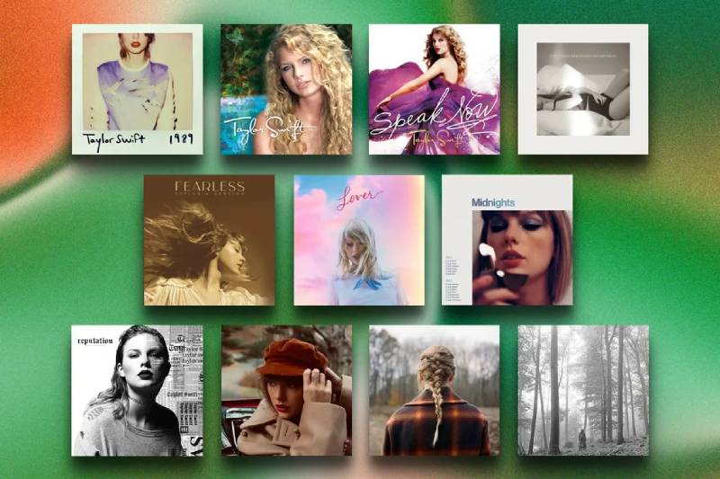
Every Taylor Swift era starts with a single image. Before you hear a note, the album cover tells you what’s coming.
From the Polaroid nostalgia of 1989 to the black-and-white forest of folklore, Swift’s album artwork has shaped pop culture as much as her music. Each cover reflects a deliberate shift in photography, color, and visual identity that fans spend weeks analyzing.
These aren’t just photos slapped on a jewel case. They’re carefully directed pieces of visual design, built with specific photographers, color palettes, and hidden details that connect directly to the songs inside.
This guide breaks down the best Taylor Swift album covers across her entire discography. You’ll find the creative teams behind each shoot, the design choices that defined every era, and the symbolism most people miss on first glance.
Best Taylor Swift Album Covers
folklore

Release Year and Record Label
Released July 24, 2020, through Republic Records.
This was a surprise drop. Swift announced it just 16 hours before it went live on streaming platforms. No traditional rollout. No months of teasing. Just an Instagram grid of black-and-white forest photos, and then the album existed.
Cover Artwork Description
Swift stands alone in a misty forest wearing a long plaid coat over a white prairie dress. Her hair is loosely braided. She gazes upward at the trees.
The whole image is shot in black and white with a grainy, vintage film quality. There’s something about the way the fog sits between the trees that makes the scene feel timeless, like a photograph pulled from a 19th-century storybook.
Photographer and Creative Team
Beth Garrabrant shot the entire series. It was her first album cover project, and she hand-developed the film in a small black-and-white darkroom in Austin, Texas.
Swift did her own hair, makeup, and wardrobe. No large production crew. The pandemic forced a stripped-down, DIY approach that ended up defining the album’s entire mood board perfectly.
Color Palette and Visual Mood
Strictly monochrome. No color at all.
The mood is quiet, isolated, and deeply introspective. Cottagecore was having a moment online in 2020, and this cover became the face of that whole aesthetic. Soft grays, deep blacks, misty whites. The saturation is essentially zero.
Design Style and Artistic Influences
Swift and Garrabrant referenced Surrealist artwork and 1940s photo storybooks during pre-production. They wanted imagery that played with human scale against nature.
The cover leans into a minimalist design philosophy. No flashy text treatment, no busy composition. The album title appears in an italicized roman typeface that critics compared to old Narnia book covers. It’s the kind of choice that looks easy but actually requires real restraint.
Symbolism and Hidden Details
The word “Woodvale” was accidentally printed on one variant cover edition, which sent fans into a frenzy speculating about a third album. Swift later confirmed it was just a code name she forgot to remove from the artwork file.
Her positioning in the forest, alone and small among towering trees, mirrors the album’s fictional narratives. She’s not the center of the story here. She’s just someone passing through it.
Connection to the Album’s Music and Themes
folklore was Swift’s first album built around fictional characters rather than autobiography. The cover reflects that shift. This isn’t Taylor posing for a portrait. It’s someone disappearing into a story.
Songs like “cardigan,” “betty,” and “august” tell interconnected stories, and the forest setting matches that fairy-tale, once-upon-a-time energy perfectly.
Fan Reception and Cultural Impact
Fans went wild recreating the cover. Forest photoshoots exploded on social media. The cottagecore trend surged. Hand-knitted Aran sweaters saw a legitimate sales spike in Ireland and the US because of this album.
It consistently ranks as the top Taylor Swift album cover across multiple fan polls and critic lists.
Variant Editions and Alternate Covers
Eight variant covers total, each with a different subtitle: “in the trees,” “in the weeds,” “meet me behind the mall,” and others. Deluxe CDs and vinyl LPs were sold exclusively through Swift’s website. Target got the “Meet Me Behind the Mall” CD.
How It Compares to Other Eras
This was a hard left turn from Lover’s pastel cloud aesthetic. Where Lover was bright and saturated, folklore went completely desaturated. It proved Swift could pull off stripped-back visual storytelling just as well as high-concept pop imagery.
1989
Release Year and Record Label
Released October 27, 2014, through Big Machine Records. Named after Swift’s birth year, signaling what she called an artistic “rebirth” from country to mainstream pop.
Cover Artwork Description
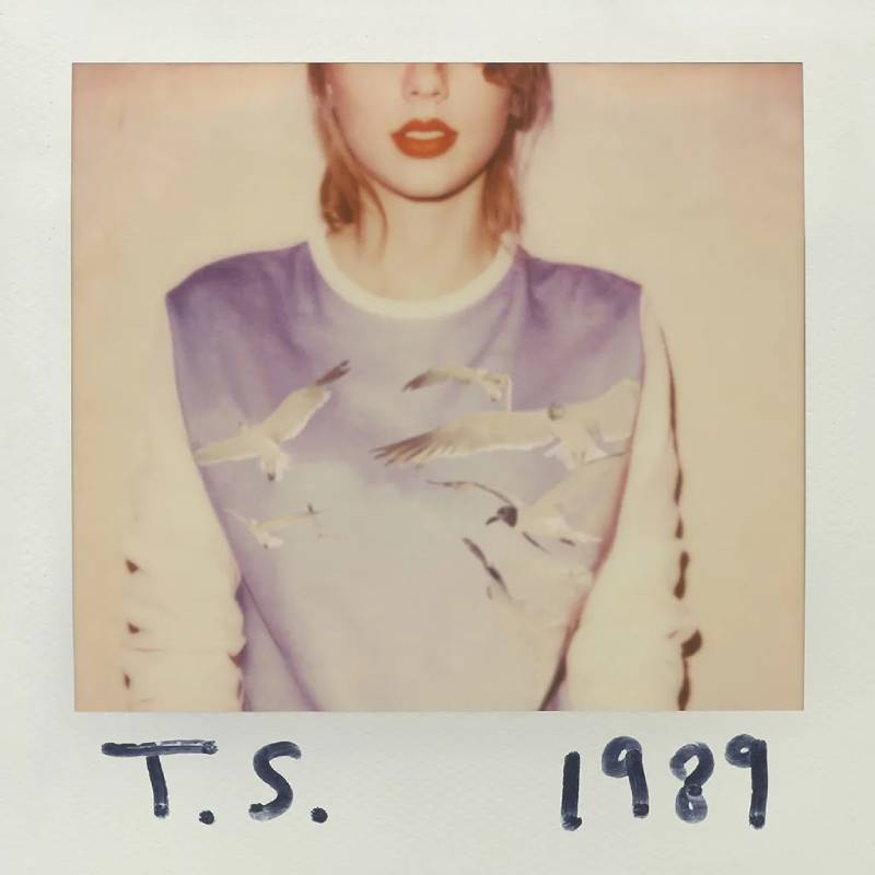
A Polaroid-style photograph showing Swift from the nose down. Her face is cropped right at the eyes. She wears a lavender sweatshirt with embroidered seagulls and her signature red lipstick. Her initials, “T.S.,” are handwritten in black marker on the bottom left. “1989” is scrawled on the right.
Billboard included it at number 50 on their “100 Best Album Covers of All Time” list in 2023.
Photographer and Creative Team
The photography duo Lowfield (Sarah Barlow and Stephen Schofield) shot the cover and all 65 Polaroid photos included in the CD packages. They took over 400 Polaroid shots total, using a vintage SX-70 Model 2 camera with Impossible Film.
Swift served as creative director for the entire packaging concept.
Color Palette and Visual Mood
Washed-out, faded tones typical of instant film. Think sepia, soft blues, and muted warm tones. The overall color palette is nostalgic and deliberate, reminiscent of photos pulled from a shoebox of old memories.
The red lip is the only pop of real color that cuts through the faded aesthetic. And it works.
Design Style and Artistic Influences
The Polaroid format was a direct reference to 1980s photography culture. Swift wanted that analog, DIY feel in an age of digital perfection. The handwritten text adds a personal, scrapbook-like quality that makes the whole thing feel intimate rather than produced.
The face crop was intentional. Swift said she wanted to conceal “the emotional DNA of the album” so listeners wouldn’t immediately know if it was a happy or a breakup record. That’s actually a smart use of framing as a design choice.
Symbolism and Hidden Details
The seagulls on her sweatshirt reappeared in the 1989 (Taylor’s Version) cover, but this time flying freely in the sky behind her. Fans read this as a symbol of liberation and ownership.
Each CD copy included one of five sets of 13 Polaroid photos featuring Swift in different settings around New York City, with handwritten lyrics from the album’s songs on each one.
Connection to the Album’s Music and Themes
The Polaroid concept perfectly matched the album’s synth-pop, ’80s-inspired sound. Songs like “Shake It Off” and “Blank Space” had that same breezy, snapshot-of-a-moment energy. The whole package said: this is a time capsule.
Fan Reception and Cultural Impact
Everyone tried recreating this cover. Seriously, it was everywhere. The Polaroid revival of the mid-2010s owes a lot to this album. Polaroid CEO Scott Hardy credited 1989 with driving renewed interest in instant film among younger consumers.
The album won Album of the Year at the 2016 Grammy Awards.
Variant Editions and Alternate Covers
The 1989 (Taylor’s Version) re-recording, released October 27, 2023, features Swift with a big smile, wind-blown hair, and seagulls flying above her. It was the first Taylor’s Version to include the album title directly on the cover.
How It Compares to Other Eras
Where Red was warm and autumnal, 1989 was cool and breezy. The Polaroid format was a total departure from everything before it. No dramatic pose, no elaborate set. Just a half-visible face and a red lip. Sometimes white space and simplicity say more than complexity ever could.
Reputation (Taylor’s Version)
Release Year and Record Label
The original Reputation dropped November 10, 2017, via Big Machine Records. The re-recorded Taylor’s Version was released November 1, 2024, through Republic Records.
Cover Artwork Description
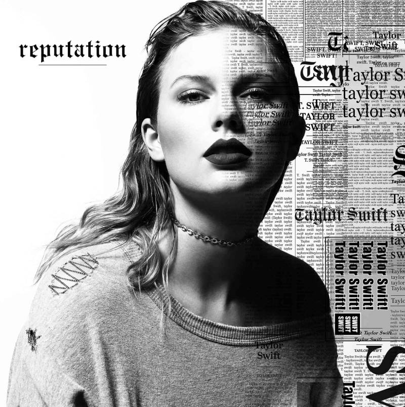
The original cover is a black-and-white photo of Swift staring directly at the camera. Slicked-back hair, dark lipstick, a grey sweatshirt, and a choker necklace. Her name is printed in a newspaper-clipping style repeated across the left side of her face.
The Taylor’s Version cover updates the look with more overt newsprint layering and a confident, reclaimed energy.
Photographer and Creative Team
Photographed by Mert Alas and Marcus Piggott (known professionally as Mert and Marcus), two of the most recognized fashion photographers in the industry. The styling included pieces from Marc Jacobs, Proenza Schouler, and Vetements.
Color Palette and Visual Mood
Almost entirely black, white, and grey. The lack of color is the point. After years of being painted by tabloid headlines, Swift removed all the color from her image. Literally.
The contrast between the stark monochrome and the aggressive text overlay creates tension. You feel it before you even read the tracklist.
Design Style and Artistic Influences
The newsprint typography layered over Swift’s face pulls from anti-design trends. The fonts used in the Reputation branding included Gothic Engravers’ Old English for the album title and variations of Times New Roman, Cheltenham, and Franklin Gothic in the animated web campaign. These are typefaces traditionally associated with newspapers, which was the whole idea.
It was a calculated reference to the media coverage that defined that period of her career.
Symbolism and Hidden Details
The repeated name across her face symbolizes being defined by headlines rather than her own words. The choker necklace and slicked-back hair were a dramatic departure from Swift’s usual look, representing a new, harder persona.
Fans spotted that the chain necklace looked like it could spell out a hidden message. Whether intentional or not, it became part of the lore.
Connection to the Album’s Music and Themes
Reputation was Swift’s response to public feuds, media scrutiny, and the flood of snake emojis that took over her Instagram comments in 2016. The dark, stripped-down cover art matched the album’s heavier electropop and trap-influenced production.
“Look What You Made Me Do” literally ends with Swift declaring her old self dead. The cover already told you that.
Fan Reception and Cultural Impact
The hashtag #ReputationAlbumCover trended for weeks. Fans made their own versions, used it as profile pictures, and analyzed every pixel. It became one of the most discussed album designs of the 2010s.
Variant Editions and Alternate Covers
Target carried two deluxe editions, each with an exclusive magazine featuring poetry, paintings, handwritten lyrics, and behind-the-scenes photos. The Taylor’s Version variant added even more layers of newsprint texture.
How It Compares to Other Eras
Reputation’s cover is the darkest in Swift’s entire discography. It stands in complete opposition to Lover, which came right after. The swing from pitch-black media commentary to pastel-pink romance gave Swift one of the most dramatic era transitions in pop music history.
The Tortured Poets Department

Release Year and Record Label
Released April 19, 2024, through Republic Records. Swift announced it during her acceptance speech at the 66th Grammy Awards while winning Best Pop Vocal Album for Midnights. A surprise double album edition, The Anthology, dropped two hours after the standard release.
Cover Artwork Description
A black-and-white glamour shot of Swift lying on a bed. She’s wearing a see-through Yves Saint Laurent tank top and high-waisted shorts from The Row (Mary-Kate and Ashley Olsen’s fashion label). Her eyes are cropped out by the frame, similar to the 1989 cover.
It’s intimate and vulnerable. Took me a minute to realize how much the framing echoes 1989, but the mood is completely different.
Photographer and Creative Team
Beth Garrabrant shot this one, continuing her role as Swift’s primary album photographer since folklore. Stylist Joseph Cassell handled the wardrobe.
Color Palette and Visual Mood
Black and white again, but softer than Reputation’s high-contrast look. The tones here are more like charcoal and ivory, with a gentle grain. The overall mood is raw, melancholic, and deliberately exposed.
Design Style and Artistic Influences
The cover reads like an editorial fashion photo crossed with a confessional diary entry. It’s the most stripped-back cover in Swift’s catalog since folklore, but while folklore felt dreamy, TTPD feels like waking up at 3 AM unable to sleep.
The emphasis here is entirely on body language and negative space. No props, no elaborate setting, no text competing for attention.
Symbolism and Hidden Details
The back cover includes the text “I love you, it’s ruining my life” in all-caps. Handwritten lyrics in the announcement post read: “And so I enter into evidence / My tarnished coat of arms / My muses, acquired like bruises.”
Fans immediately linked the album title to ex Joe Alwyn’s WhatsApp group chat called “The Tortured Man Club,” which he’d publicly mentioned in a Variety interview.
Connection to the Album’s Music and Themes
The cathartic, confessional songwriting about breakups and emotional upheaval matches the cover’s vulnerable posture perfectly. Swift described the album as a processing of personal turmoil during the Eras Tour.
Songs like “So Long, London” and “The Smallest Man Who Ever Lived” carry the same raw emotional weight the cover promises.
Fan Reception and Cultural Impact
Mixed reactions initially. Some fans loved the maturity. Others found it too stripped-down. But it grew on people. The album became a commercial juggernaut regardless, and the cover’s simplicity started to feel more intentional over time.
Variant Editions and Alternate Covers
Four variant covers were released, each tied to bonus tracks: “The Bolter,” “The Albatross,” “The Black Dog,” and “The Manuscript.” Each featured different sepia-toned photography from the same Garrabrant session.
How It Compares to Other Eras
It’s the spiritual successor to folklore’s quiet approach but with more emotional intensity. Where folklore felt like watching a story from the outside, TTPD puts you directly inside Swift’s headspace. No buffer.
Midnights
Release Year and Record Label
Released October 21, 2022, through Republic Records. Swift announced it at the 2022 MTV Video Music Awards after winning Video of the Year for “All Too Well: The Short Film.”
Cover Artwork Description
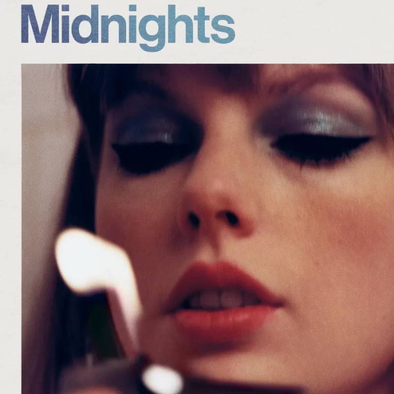
A square photo of Swift positioned in the lower right corner of the cover. She’s holding a lighter flame close to her face, wearing jewel-toned blue eye shadow, black eyeliner, and red lipstick. The tracklist runs down the left side. The title “Midnights” appears in a blue gradient over the photo.
Photographer and Creative Team
The exact photographer hasn’t been as widely credited for the standard cover as for other Swift albums. The vinyl variant shoots had a distinctly 1970s feel, with retro rooms, vintage phones, and moody lighting.
Color Palette and Visual Mood
Deep blues, warm ambers, and jewel tones. The lighter flame gives everything an orange glow against cool-toned makeup. It’s late-night energy captured in a single image.
The four collectible vinyl editions each had their own hue: Moonstone Blue, Blood Moon, Mahogany, and Jade Green. The Target exclusive came in Lavender.
Design Style and Artistic Influences
The tracklist-on-the-cover layout is a direct callback to 1970s vinyl album jackets. Journalists noted similarities to Roxy Music’s 1974 album Country Life and the photography of Guy Bourdin.
Putting the tracklist on the front was a bold choice. It gives the cover an almost utilitarian, record-store feel. Very much a “here’s what’s inside” approach, which is unusual for a pop album in the streaming era.
Symbolism and Hidden Details
The lighter flame represents those 3 AM moments of self-reflection. Swift described the album as “stories of 13 sleepless nights scattered throughout my life.”
The intentional blurriness of the photo adds to the late-night, half-awake feeling. Nothing is quite in focus. That’s the point.
Connection to the Album’s Music and Themes
The concept album explores insomnia-driven ruminations: regret, revenge fantasies, self-hatred, falling in love, and falling apart. The dark, flame-lit cover sets that nocturnal tone before you hear a single note.
Fan Reception and Cultural Impact
Midnights made Swift the first artist to simultaneously hold spots 1 through 10 on the Billboard Hot 100. It later won Album of the Year at the 2024 Grammy Awards, her record-breaking fourth win in that category.
Variant Editions and Alternate Covers
Four collectible vinyl editions with unique covers and colored discs. Each showed Swift in a different 70s-inspired setting. When placed together, the four vinyl backs formed a clock face.
How It Compares to Other Eras
Midnights landed between the indie-folk quiet of folklore/evermore and the raw vulnerability of TTPD. Visually, it split the difference too, blending retro warmth with moody darkness. The 70s references were a first for Swift’s cover art.
Red (Taylor’s Version)
Release Year and Record Label
The original Red came out October 22, 2012, on Big Machine Records. The re-recorded Taylor’s Version was released November 12, 2021, through Republic Records.
Cover Artwork Description
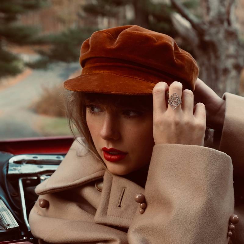
The original shows a close-up of Swift in a wide-brimmed hat, her face partially obscured, with that iconic red lip front and center. The Taylor’s Version update puts her in a trench coat, adjusting a red hat while sitting in the passenger seat of a vintage red car on a winding road.
Photographer and Creative Team
The original Red was shot by Lowfield (the same duo behind 1989). The Taylor’s Version cover brought a more cinematic, autumnal approach to the re-imagined artwork.
Color Palette and Visual Mood
Warm, golden-hour tones. Deep reds, burnt oranges, and amber hues. It’s the most deliberately “fall” album cover in Swift’s catalog. The warm filter ties it back to the original while adding a more mature warmth.
Fans treat this album like seasonal decoration. It comes out every October.
Design Style and Artistic Influences
The original cover’s simplicity, just a hat and a red lip, was a masterclass in branding through visual restraint. The Taylor’s Version cover leans into cinematic visual hierarchy, with the road, the car, and the hat creating layers of depth that draw your eye through the composition.
Symbolism and Hidden Details
A tiny “Red” appears on a ring in the Taylor’s Version cover. The vintage car and winding road directly reference the lyrics of “All Too Well,” which became the album’s defining moment when the 10-minute version was finally released.
Connection to the Album’s Music and Themes
Red was the album where Swift started blending country with pop, rock, and electronic production. The cover’s warmth mirrors the messy, passionate emotions of songs like “I Knew You Were Trouble” and “All Too Well.”
Fan Reception and Cultural Impact
Red (Taylor’s Version) became a cultural event, mostly thanks to the “All Too Well (10 Minute Version)” release and its accompanying short film. The cover has become synonymous with autumn itself in Swiftie circles.
Variant Editions and Alternate Covers
No album title on the cover, following the pattern of Fearless (Taylor’s Version). Multiple vinyl color editions were available.
How It Compares to Other Eras
Red sits between the youthful country covers of Fearless and Speak Now and the sleek pop shift of 1989. It’s the hinge point. You can see Swift becoming a different kind of artist in real time through the artwork alone.
Lover
Release Year and Record Label
Released August 23, 2019, through Republic Records. It was Swift’s first album after leaving Big Machine Records.
Cover Artwork Description
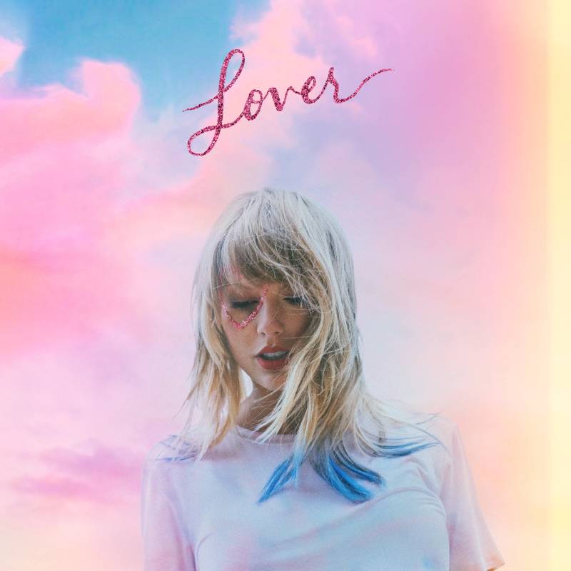
Swift is pictured amid pastel clouds with sapphire-dyed hair tips and a glittery pink heart painted around her right eye. The album title appears in sparkly pink lettering. She looks downward like she’s floating above the world.
Photographer and Creative Team
Colombian photographer and collage artist Valheria Rocha handled both the photography and editing. Rocha also worked with Swift on the album’s broader art direction.
Color Palette and Visual Mood
Pastels everywhere. Cotton-candy pinks, soft blues, dreamy purples. It’s the most colorful cover in Swift’s discography by a wide margin. The whole thing feels like a summer sunset filtered through rose-tinted glasses.
This was a massive tonal shift from Reputation’s black-and-white austerity. Going from that to this was like opening curtains after a long winter.
Design Style and Artistic Influences
The heart around the eye became the era’s defining symbol. The dreamy cloud backdrop and pastel color psychology perfectly match the album’s themes of romantic optimism and self-acceptance.
Some critics called it more trendy than timeless. At the time, the pastel aesthetic was peaking on social media. But it worked for what this era needed to be.
Symbolism and Hidden Details
The heart shape became a fan symbol. The blue hair tips were new for Swift and signaled transformation. The cloud positioning, with Swift floating above, gives a godlike, euphoric quality to the composition.
Connection to the Album’s Music and Themes
Swift described Lover as “a love letter to love.” Songs ranged from the bubbly “ME!” to the political “You Need to Calm Down” to the tender title track. The bright, warm cover reflects that range of positive emotions.
Fan Reception and Cultural Impact
Fans adore this cover. It’s one of the most popular for recreation and fan art. The heart-around-the-eye look became a staple at Swift concerts during the Eras Tour.
Variant Editions and Alternate Covers
Deluxe editions included personal journal entries, handwritten lyrics, and behind-the-scenes photos from different periods of Swift’s life.
How It Compares to Other Eras
It’s the polar opposite of Reputation and the polar opposite of folklore, which came right after. Sandwiched between the two most monochrome albums in her catalog, Lover is a burst of saturated color that stands out in any discography lineup.
Speak Now (Taylor’s Version)
Release Year and Record Label
The original Speak Now was released October 25, 2010, via Big Machine Records. The Taylor’s Version re-recording dropped July 7, 2023, through Republic Records.
Cover Artwork Description
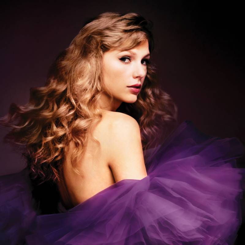
The original shows Swift twirling in a flowing purple ball gown against a white background, her back partially turned to the camera. The Taylor’s Version update keeps the purple palette but has Swift facing forward in a more refined purple dress against a grey background.
Photographer and Creative Team
The Taylor’s Version cover was photographed by Beth Garrabrant. The original had a more composite-art feel that blended painting techniques with photography.
Color Palette and Visual Mood
Purple dominates both versions. Deep violet, lavender, soft lilac. The Speak Now era is the most purple thing in pop music since Prince. (And yes, fans have made that comparison.)
The Taylor’s Version cover shifts to a more sophisticated, muted purple with grey undertones, reflecting the maturity of a grown-up revisiting work she wrote entirely by herself at 19.
Design Style and Artistic Influences
The original leans fairy-tale, almost Disney-princess in its execution. The twirling dress, the white void, the flowing hair. It’s theatrical and youthful.
The re-recorded version tones down the fantasy and adds composure. Swift now faces forward instead of turning away. That change in direction says a lot about the difference between being 19 and being 33.
Symbolism and Hidden Details
The purple dress became a defining image of this era. Swift wrote every single song on Speak Now by herself, and the solo figure on the cover reflects that independence. No collaborators. No background noise. Just her.
Connection to the Album’s Music and Themes
Speak Now was Swift’s most personal and emotionally direct album at the time. Songs like “Enchanted,” “Dear John,” and “Last Kiss” are raw, detailed narratives. The elegant-yet-simple cover matches that earnest quality.
Fan Reception and Cultural Impact
The purple aesthetic is iconic within the fandom. Speak Now era fans are among the most devoted, and the Taylor’s Version re-release triggered a massive wave of purple-themed content.
Variant Editions and Alternate Covers
Vinyl editions included colored discs in various purple and lilac tones. Like other Taylor’s Version releases, the cover omits the album title in large text.
How It Compares to Other Eras
Speak Now is the most whimsical cover in Swift’s catalog. It sits between the youthful country energy of Fearless and the more grown-up Red era. The Taylor’s Version upgrade bridges that gap nicely, keeping the magic while adding maturity.
evermore

Release Year and Record Label
Released December 11, 2020, through Republic Records. Just five months after folklore. Swift was prolific during the pandemic.
Cover Artwork Description
A close-up from behind of Swift’s profile as she looks out toward a dense, snowy forest. She wears a French braid and a plaid coat. The mood is wintry, reflective, and a touch melancholy.
Photographer and Creative Team
Beth Garrabrant returned. Same stripped-down approach as folklore, same film-based process, same intimate production scale.
Color Palette and Visual Mood
Muted earth tones. Faded greens, cold greys, brown and amber undertones. Where folklore was misty and grey, evermore feels colder and slightly darker. The shift from summer fog to winter frost is subtle but present.
Design Style and Artistic Influences
evermore continues the aesthetic of its sister album but inverts the perspective. In folklore, Swift stood inside the forest. In evermore, she looks at the forest from the outside. That reversal is deliberate and mirrors the album’s darker themes.
Symbolism and Hidden Details
The backward-facing pose suggests looking at something you can’t quite reach, which fits the album’s exploration of endings, regret, and acceptance. Swift called evermore the “fall and winter” companion to folklore’s “spring and summer.”
Connection to the Album’s Music and Themes
Songs like “champagne problems” and “willow” carry heavier emotional weight than most of folklore. The wintry cover sets that expectation. This isn’t the dreamy escape anymore. It’s the aftermath.
Fan Reception and Cultural Impact
Less universally beloved than folklore’s cover, but appreciated for how it completes the pair. Fans often display both covers side by side as a set. The twin album concept itself was a first for Swift.
Variant Editions and Alternate Covers
Multiple limited-edition variants with different cover photos were available exclusively through Swift’s website.
How It Compares to Other Eras
It’s folklore’s quieter, colder sibling. Not as immediately striking, but it rewards the kind of close attention that makes you notice details you missed the first time. The two covers together tell a complete visual story that neither could tell alone.
The Life of a Showgirl
Release Year and Record Label
Released October 3, 2025, through Republic Records. Swift’s 12th studio album and her first major project after completing the Eras Tour. Co-produced with Max Martin and Shellback.
Cover Artwork Description
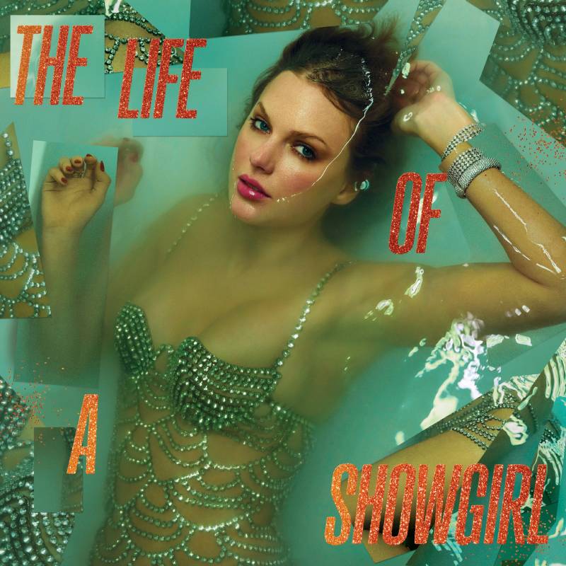
Swift floats semi-submerged in a bathtub wearing full showgirl styling, complete with a bedazzled dress. The album title appears in an orange, glittery font. The water creates a dreamy, half-submerged effect that blurs the line between glamour and exhaustion.
Swift explained the concept on the New Heights podcast: “I wanted to have an offstage moment as the main album cover because the album isn’t really about what happened onstage, but what happened offstage.”
Photographer and Creative Team
Photographed by Mert Alas and Marcus Piggott, the same fashion photography duo behind the original Reputation cover. This was their return to Swift’s album art after seven years.
Color Palette and Visual Mood
Warm golds, soft oranges, and rich amber tones. It’s the first Swift album cover to lean this heavily into warm metallics. The water adds cool reflections that keep it from going too hot. The tension between warm and cool tones creates something visually interesting.
Design Style and Artistic Influences
The bathtub shot references classic Hollywood glamour photography while subverting it. Instead of polished perfection, there’s a crack in the facade. It’s a showgirl after the show, not during it.
The glittery title lettering feels deliberately theatrical, like an old Vegas marquee, which plays perfectly against the vulnerability of the image itself.
Symbolism and Hidden Details
The submerged-in-water concept suggests drowning in the performance, sinking under the weight of public life. Or maybe just decompressing after a two-year world tour. Probably both.
Billboard described it as “cracks in an elegant facade” that reveals “not everything is as it seems.”
Connection to the Album’s Music and Themes
The album reflects on the Eras Tour experience and life in the spotlight. Songs like “The Fate of Ophelia” and “Eldest Daughter” explore what it costs to be the performer everyone expects you to be. The cover captures that tension between sparkle and sadness.
Fan Reception and Cultural Impact
The standard cover generated strong reactions. Some variant covers became meme material, with fans photoshopping objects into Swift’s hands in one leaning pose. Multiple limited-edition variants sold out within an hour of going live on her webstore.
Variant Editions and Alternate Covers
An avalanche of variants. As of late 2025, there were 11 different CD editions, eight vinyl LP variants, and a cassette. Cover names included “The Shiny Bug,” “Baby, That’s Show Business,” and “Tiny Bubbles in Champagne.” Target carried exclusive editions. Each new variant featured different photography from the Mert and Marcus sessions.
How It Compares to Other Eras
The Life of a Showgirl is the most theatrically produced cover in Swift’s catalog. After the raw, bedroom-confessional energy of TTPD, this album’s artwork swings back to high-concept production. The return of Mert and Marcus connects it to the Reputation era, but with warmth instead of darkness. It feels like a full-circle moment in Swift’s visual evolution.
FAQ on Taylor Swift Album Covers
What is Taylor Swift’s most iconic album cover?
Most fans and critics point to 1989. The Polaroid-style photo with her face cropped at the eyes, red lipstick, and handwritten title became one of the most recognizable album covers of the 2010s. It ranked on Billboard’s all-time best list.
Who photographs Taylor Swift’s album covers?
Beth Garrabrant has been Swift’s primary album photographer since folklore in 2020. Before that, Lowfield (Sarah Barlow and Stephen Schofield) shot Red and 1989, while Mert and Marcus handled Reputation and The Life of a Showgirl.
Why are so many Taylor Swift album covers black and white?
folklore, evermore, Reputation, and The Tortured Poets Department all use monochrome photography. Each time, the lack of color signals a shift toward darker, more introspective themes. It’s a deliberate design choice, not a coincidence.
What do the colors on Taylor Swift album covers mean?
Each era has a signature color palette. Speak Now is purple, Red uses warm autumn tones, Lover goes full pastel pink, and Midnights leans into deep jewel-toned blues. Swift uses color psychology to set the mood before you press play.
How many variant album covers does Taylor Swift release?
It varies. The Life of a Showgirl had over 11 CD editions and 8 vinyl variants. folklore had eight alternate covers. Midnights had four collectible vinyl jackets that formed a clock when placed together. Collectors stay busy.
Does Taylor Swift design her own album covers?
Swift serves as creative director on her album packaging. She develops mood boards, selects photographers, and makes final decisions on artwork direction. For 1989, she personally directed the entire Polaroid concept and visual identity.
What hidden details are in Taylor Swift album covers?
Plenty. The word “Woodvale” was accidentally printed on a folklore variant. The 1989 (Taylor’s Version) cover moved the seagulls from her sweater to the sky. Red (Taylor’s Version) hides the album title on a ring. Swifties catch everything.
Which Taylor Swift album cover has the best typography?
Reputation stands out. The cover uses newspaper-style typefaces like Gothic Engravers’ Old English and Franklin Gothic layered over Swift’s face. It’s aggressive, anti-design, and completely different from anything else in her discography.
Are Taylor’s Version covers different from the originals?
Yes, always. Each re-recorded album cover reimagines the original with updated photography and subtle changes. Fearless (Taylor’s Version) shifts the pose. Speak Now (Taylor’s Version) has Swift facing forward instead of turning away. The differences are intentional.
What is the artwork style of The Life of a Showgirl?
The standard cover shows Swift semi-submerged in a bathtub in showgirl costume, photographed by Mert and Marcus. It uses warm gold and orange tones with glittery title lettering. The concept captures the exhaustion behind the glamour of touring.
Conclusion
Taylor Swift album covers are more than packaging. They’re carefully directed visual statements that define entire eras, shape fan culture, and influence album art direction across the music industry.
From the DIY Polaroid photography of 1989 to the cinematic bathtub shot on The Life of a Showgirl, every cover reflects specific choices in composition, typography, and creative branding. Swift treats each one like a separate project with its own photographer, aesthetic, and hidden details for fans to decode.
The variant editions and collectible vinyl covers have also changed how artists think about physical album design in the streaming age. It’s not just about one image anymore.
Whether you’re a Swiftie studying every Easter egg or a designer interested in how pop music visuals evolve, her discography artwork is worth the close look.

Renowned for his expertise in logo design and visual branding, Bogdan has developed a multitude of logos for various clients.
His skills extend to creating posters, vector illustrations, business cards, and brochures. Additionally, Bogdan's UI kits were featured on marketplaces like Visual Hierarchy and UI8.
He also wrote in the past years on sites like Design Your Way, WebDesignerDepot, WPDean, Designmodo, Speckyboy, Slider Revolution, and more.
- The Windsurf Logo History, Colors, Font, And Meaning - 10 October 2026
- How to Remove Background From Product Photos (No Photoshop) - 10 October 2026
- How Designers can Build a Stronger Online Creative Identity - 9 October 2026

Bogdan Sandu is a seasoned designer who has been designing websites since 2008. Renowned for his expertise in logo design and visual branding, Bogdan has developed a multitude of logos for various clients. His skills extend to creating posters, vector illustrations, business cards, and brochures. Additionally, Bogdan's UI kits were featured on marketplaces like Visual Hierarchy and UI8. He also wrote in the past years on sites like Design Your Way, WebDesignerDepot, WPDean, Designmodo, Speckyboy, Slider Revolution, and more.
You Might Also Like


