Freddie Mercury once said the band’s visuals had to hit just as hard as the music. And looking back at Queen album covers, it’s clear they meant it. From the Mick Rock photography on Queen II to Frank Kelly Freas’s robot on News of the World, every sleeve told its own story.
These weren’t throwaway designs slapped onto vinyl records. Brian May, Roger Taylor, John Deacon, and Mercury treated album artwork as an extension of the songs themselves. Bold choices in color, composition, and symbolism made their record sleeves some of the most recognizable in classic rock history.
This article breaks down the best Queen album covers across their full discography. You’ll find details on the cover artists, the visual techniques behind each design, and the cultural significance that turned simple LP packaging into lasting pieces of graphic art. Whether you collect vinyl or just appreciate good album cover design, there’s something here worth seeing.
The Best Queen Album Covers
Queen II
Release Year and Label
Released in March 1974 on EMI Records in the UK and Elektra Records in the US. This was only the band’s second studio album, and they hadn’t sold many records yet. But you wouldn’t know that from looking at the cover.
Cover Artist and Photographer
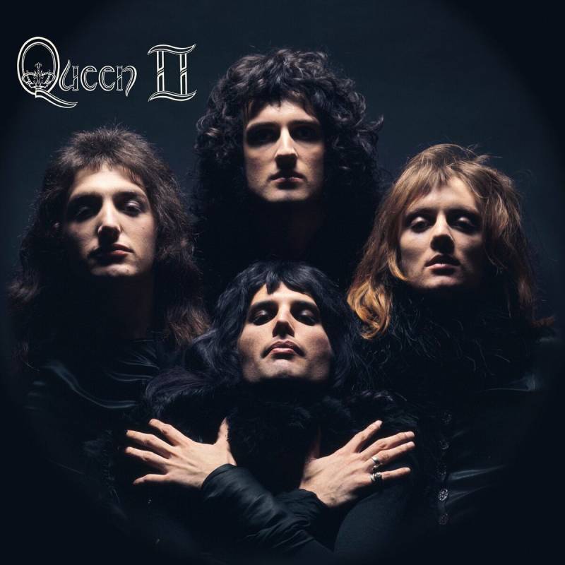
Mick Rock shot the cover in February 1974 at his London studio. Rock was already known for his work with David Bowie, Lou Reed, and Iggy Pop. Queen specifically sought him out because they wanted that same glam sensibility grafted onto their image.
Visual Description
The four band members stand in a diamond formation against a pure black background. Their heads tilt back, arms crossed. Freddie Mercury is front and center, hands clasped over his chest. The lighting is stark and dramatic, with deep shadows carving their faces out of the darkness.
The LP was a gatefold. The outer sleeve was black, the inner sleeve white, with the band dressed in white against a white background.
Design Style and Techniques
This is classic chiaroscuro photography. High contrast between light and shadow, monochrome colors only. The diamond formation creates a strong focal point right at Mercury’s face.
The composition relies on symmetry and geometric positioning rather than any set dressing or props.
Symbolism and Meaning
Rock drew direct inspiration from a 1932 photograph of Marlene Dietrich in Shanghai Express. The floating-head effect, the dramatic pose, all of it traced back to that Hollywood still.
Freddie reportedly said “I shall be Marlene” the moment he saw Rock’s reference image. The black and white theme tied into the album’s two-sided concept: Side White (emotional) and Side Black (fantasy).
Cultural Impact
This photograph became Queen’s visual signature. They reused the same formation for the “Bohemian Rhapsody” music video in 1975 and again for the “One Vision” video in 1985. It’s probably the most recognizable image of the band, period.
Limited edition prints of the original photograph now sell through galleries worldwide, with editions ranging from 10 to 90 prints depending on size.
Notable Details and Collector Info
Most of the band wanted the outer cover to be white. Freddie and Mick Rock insisted on black. That turned out to be the right call. Original gatefold pressings from 1974 are highly sought after by vinyl collectors.
News of the World
Release Year and Label
Released on October 28, 1977 on EMI Records (UK) and Elektra Records (US). Queen’s sixth studio album, and the one that gave us “We Will Rock You” and “We Are the Champions.”
Cover Artist and Photographer
Frank Kelly Freas, an American science fiction illustrator. Freas was a legend in the sci-fi world. He won 10 Hugo Awards (the “Oscars of sci-fi art”) and illustrated for Astounding Science Fiction, Mad Magazine, and even designed a badge for NASA’s Skylab station.
The kicker? He’d never heard of Queen before this commission.
Visual Description
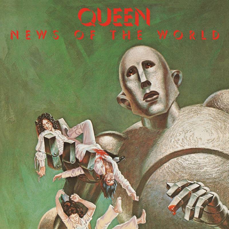
A giant robot kneels, holding the bloodied bodies of Freddie Mercury and Brian May in one hand. John Deacon and Roger Taylor tumble lifeless toward the ground below. The robot’s expression is oddly emotional, almost confused by what it has done.
The inner gatefold reveals the same robot reaching into a destroyed auditorium, snatching at a terrified audience trying to flee.
Design Style and Techniques
This is a painted cover illustration done in acrylics on illustration board. Pure sci-fi pulp art style. The composition uses scale and proportion to make the robot enormous and the band members tiny and vulnerable.
There’s a strong sense of movement in the falling figures, which keeps your eye traveling across the image.
Symbolism and Meaning
The painting was adapted from Freas’s own 1953 cover for Astounding Science Fiction. The original illustrated Tom Godwin’s story “The Gulf Between” and showed the same robot holding a dead man. The caption read: “Please… fix it, Daddy?”
Roger Taylor owned that 1953 issue and showed it to the band. They tracked down Freas and asked him to rework the painting with their likenesses. The robot killing its creators was a fitting metaphor for a band responding to punk rock’s backlash against progressive acts like Queen.
Cultural Impact
Seth MacFarlane based a Family Guy episode (“Killer Queen”) on his real childhood fear of this album cover. The robot, now nicknamed “Frank” by Brian May, was used as a stage prop during Queen + Adam Lambert’s 2017 world tour.
Marvel’s X-Men: Gold #11 paid homage to the cover by replacing Queen members with X-Men characters held by a Sentinel.
Notable Details and Collector Info
Record stores in 1977 received 54-inch plastic robot displays to stack vinyl copies in. These promotional pieces occasionally surface on eBay. Funko Pop later released a “Frank” figure that replicates the album’s cover scene. The original Freas paintings were sold at a sci-fi convention in 1982.
A Night at the Opera
Release Year and Label
Released November 21, 1975 on EMI Records (UK) and Elektra Records (US). At the time, it was reportedly the most expensive album ever recorded. Named after the Marx Brothers film.
Cover Artist and Photographer
The crest was originally designed by Freddie Mercury himself, drawing on his art school background at Ealing Art College. Art direction for the album cover was by David Costa.
Visual Description
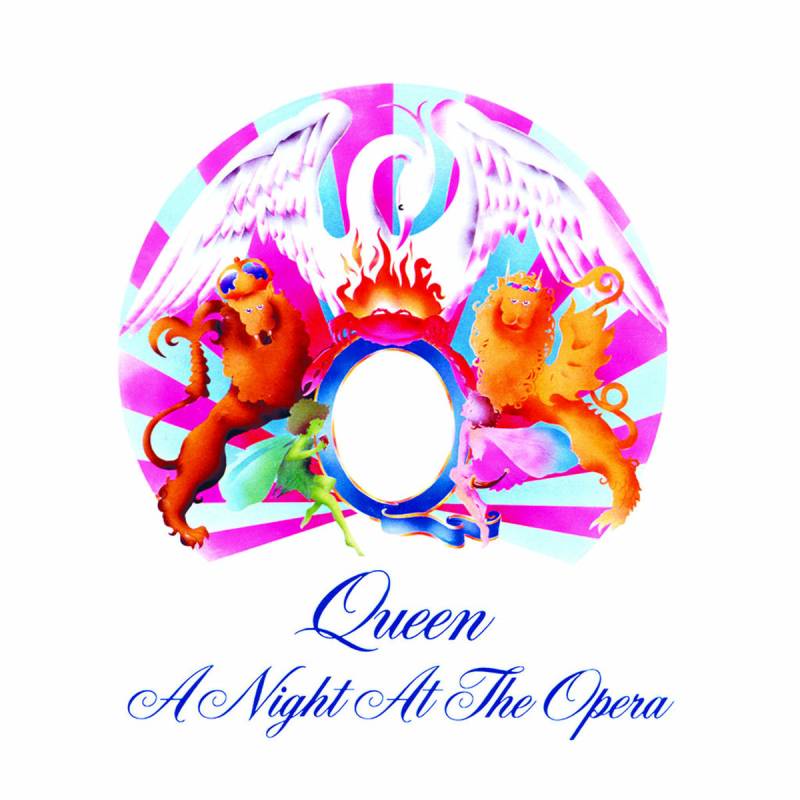
The Queen crest sits centered on a stark white background. That’s it. No band photo, no elaborate scene. Just the emblem rendered in soft, almost pastel colors against white space.
The crest itself features two lions (for Leo: Deacon and Taylor), a crab (for Cancer: May), and two fairies (for Virgo: Mercury), all surrounding a large letter Q. A phoenix sits on top, crowned.
Design Style and Techniques
This is minimalist design applied to rock album art. The generous use of white space makes the crest feel important and singular. Mercury drew the emblem in a style that looks like a 19th-century bookplate, with fine linework and heraldic structure.
The original UK pressing featured an embossed cover, giving the crest a raised, tactile quality on the sleeve.
Symbolism and Meaning
Each zodiac creature in the logo represents a band member. The phoenix symbolizes immortality. Mercury combined personal identity with band identity into one cohesive mark. It functions both as a coat of arms and a brand symbol.
The white background mirrors the album’s ambition. Clean, confident, nothing to hide behind.
Cultural Impact
The crest had actually appeared on the reverse of the debut album’s cover first. But A Night at the Opera was its front-cover debut, and it became the band’s defining visual mark from that point forward. The same crest (in different color treatments) later graced A Day at the Races, Greatest Hits, and countless pieces of Queen merchandise.
Notable Details and Collector Info
A limited-edition pressing of the “Bohemian Rhapsody/I’m in Love with My Car” single from this album sold for nearly $5,000 in 2015. First pressings with embossed covers and the “Crest design (c) Queen Production Ltd 1975” text on the front are the most collectible versions.
Sheer Heart Attack
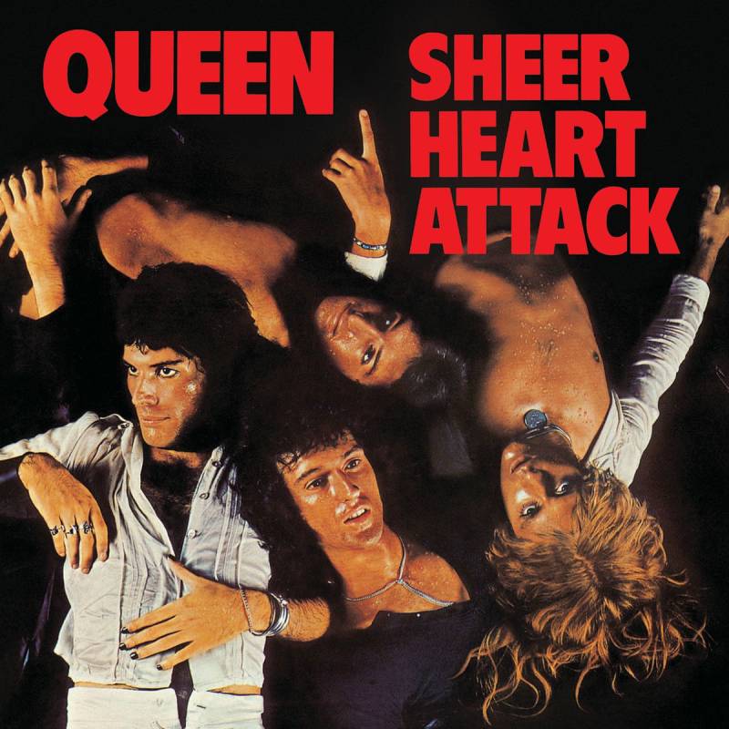
Release Year and Label
Released November 8, 1974 on EMI Records (UK) and Elektra Records (US). Queen’s third album and a real turning point. This one gave them their first proper hit with “Killer Queen.”
Cover Artist and Photographer
Mick Rock again, handling both art direction and photography. The sleeve concept came from the band themselves. They wanted to look like they’d been washed up on a desert island shore after giving everything on stage.
Visual Description
All four members lie on their backs, faces glistening with sweat (or water), eyes closed or barely open. The shot is taken from directly above, looking down on them. There’s a dreamy, exhausted quality to it. Their hair fans out, wet and messy.
The image is slightly soft-focus, which gives it an almost ethereal look despite the implied physical collapse.
Design Style and Techniques
The overhead camera angle is unusual for a band photo. It removes any sense of performance or posturing. The soft focus photography and even lighting flatten the image, creating an almost painterly effect.
There’s no real background to speak of, just the figures and darkness.
Symbolism and Meaning
The post-performance exhaustion concept reflected the album’s title. These guys looked like they’d survived a sheer heart attack. It was made during a difficult period too. Brian May was hospitalized with hepatitis during recording, so the “collapsed after giving it all” look was more real than staged.
Cultural Impact
Less individually famous than Queen II or News of the World, but the Sheer Heart Attack cover helped establish the band’s visual identity during their breakout year. The sweaty, glamorous look tied directly into the glam rock era and made them look like proper rock stars for the first time.
Notable Details and Collector Info
Original UK pressings on EMI (EMC 3061) with the lyric inner sleeve and poster are the collector’s targets. Outtakes from this Mick Rock session are now sold as limited edition fine art prints through his estate.
A Day at the Races
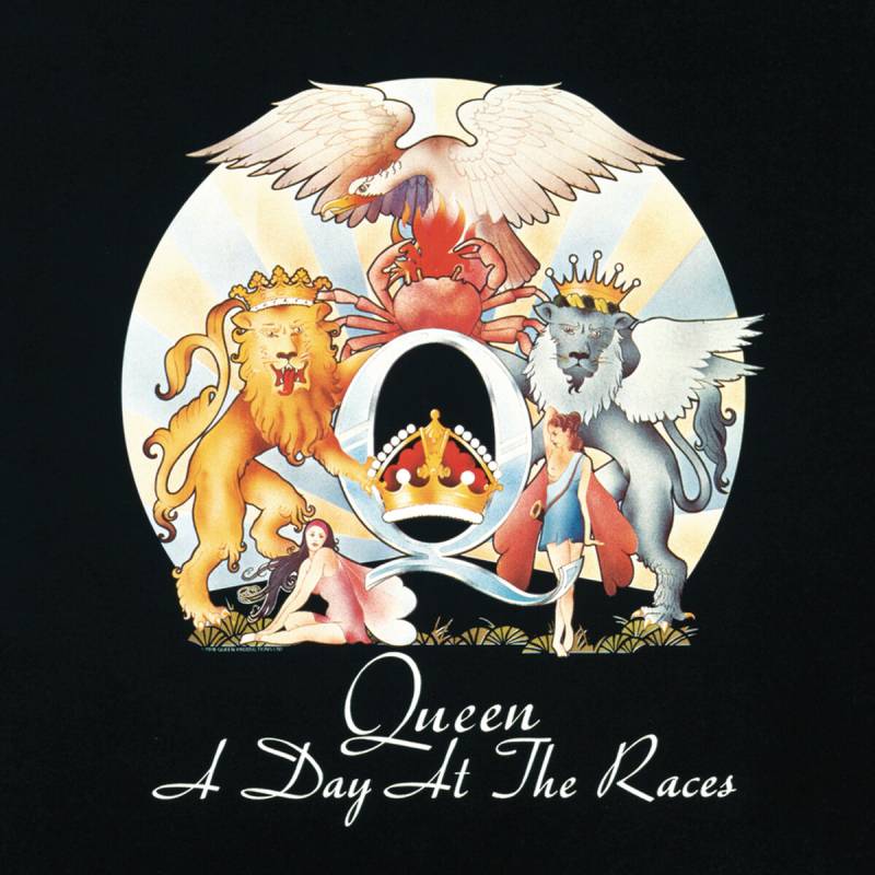
Release Year and Label
Released December 10, 1976 on EMI Records (UK) and Elektra Records (US). A direct sequel to A Night at the Opera, right down to borrowing another Marx Brothers movie title.
Cover Artist and Photographer
The crest design is again Freddie Mercury’s creation, with art direction following the same approach as its predecessor. The visual consistency between the two albums was completely intentional.
Visual Description
Same Queen crest as A Night at the Opera, but now set against a black background instead of white. The color treatment of the crest is slightly different, with a warmer, more golden tone.
Design Style and Techniques
This is the yin to A Night at the Opera’s yang. Where Opera was light and airy, Races is dark and heavy. The color psychology shifts dramatically. Black backgrounds suggest sophistication and weight. The same symbol reads differently depending on its surroundings.
Symbolism and Meaning
The black-and-white pairing across the two albums echoed the Side White/Side Black concept from Queen II. It created a visual diptych. Day and night. Light and dark. Two sides of the same band.
Cultural Impact
The pair of albums became one of the most recognized visual partnerships in rock history. Like the Beatles’ White Album paired against the “Black Album” concept that fans later attached to other records. The crest on black became the default Queen logo treatment for decades of merchandise.
Notable Details and Collector Info
Original gatefold pressings are the standard for collectors. The inner gatefold featured band photos and lyrics. Like its predecessor, some pressings included the embossed cover treatment, adding a tactile dimension to the sleeve.
Innuendo
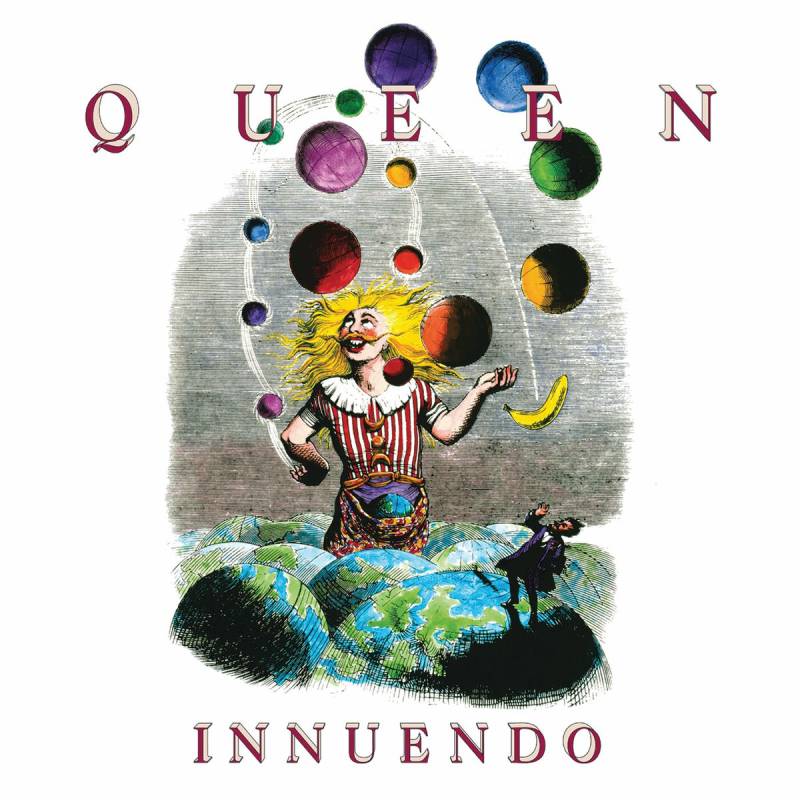
Release Year and Label
Released February 4, 1991 on Parlophone (UK) and Hollywood Records (US). This was the last Queen studio album released during Freddie Mercury’s lifetime. He died nine months later.
Cover Artist and Photographer
Richard Gray designed the cover in collaboration with Queen. Gray was the band’s photographer and designer for nearly 26 years. He also worked with Kate Bush, David Bowie, and Duran Duran.
The artwork itself is adapted from 19th-century French artist Jean-Jacques Grandville‘s illustration “Juggler of Universes” from his 1844 book Un Autre Monde.
Visual Description
A jester figure juggles planets and celestial objects while balancing on a pile of Earths. The original Grandville drawing was black and white. Gray added color, making the figure pop against a vivid background. There’s also a banana replacing a meteorite from the original, which is a very Queen touch.
Design Style and Techniques
Surrealist illustration meets Victorian engraving. The detailed line work comes straight from Grandville’s original, but the color additions modernize it. The overall approach connects to broader graphic design movements that draw on historical imagery.
Symbolism and Meaning
The juggling jester balancing universes reads differently when you know Mercury was dying of AIDS during recording. The fleeting nature of life, the precarious balance of existence. Grandville’s surrealist work was a precursor to the Surrealist movement, and its themes of absurdity and fragility fit the album’s mood perfectly.
Cultural Impact
Voted the 94th greatest album of all time in a 2006 BBC national poll. The Grandville-inspired artwork extended to booklets and single covers from the album, creating a complete visual identity for the record.
Notable Details and Collector Info
Gray designed each band member’s face in the Grandville illustration style for the inner sleeve artwork. The back cover featured another Grandville adaptation: a lion with a brass tuba for a head. First pressings on Parlophone are the collector’s standard.
Jazz
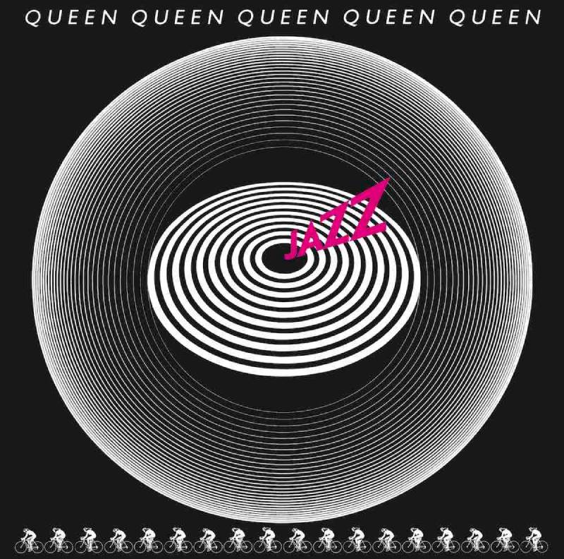
Release Year and Label
Released November 10, 1978 on EMI Records (UK) and Elektra Records (US). Queen’s seventh studio album, coming off the massive success of News of the World.
Cover Artist and Photographer
The cover concept was by the band. The artwork features a circle of dancers or figures arranged in a ring pattern against a dark background, with the Queen logo and album title.
Visual Description
A pattern of stylized figures runs along the bottom edge of the cover. Look closely and you’ll notice they’re cyclists, referencing the album’s track “Bicycle Race.” The main image is relatively restrained compared to what was inside the package.
Design Style and Techniques
The cover itself is darker and more understated than fans might expect from Queen. The real visual action happened in the packaging. This was released as a deluxe gatefold with additional printed materials inside.
Symbolism and Meaning
The bicycle motif tied directly to the “Bicycle Race” single, which featured one of rock’s most provocative promotional stunts. 65 nude women racing bicycles around Wimbledon Stadium. That event became part of the album’s visual mythology.
Cultural Impact
The poster included with the album (featuring those nude cyclists) made Jazz one of the most talked-about
FAQ on Queen Album Covers
Who designed the Queen crest logo?
Freddie Mercury designed the original Queen crest logo himself. He drew on his graphic design background and combined the zodiac signs of all four band members (two Leos, a Cancer, and a Virgo) into one royal coat of arms.
What is Queen’s most iconic album cover?
Most fans point to Queen II. Photographer Mick Rock shot the band in a diamond formation inspired by a Marlene Dietrich portrait. That black and white image became the defining visual of the band’s entire career.
Who painted the News of the World cover?
American sci-fi illustrator Frank Kelly Freas painted it. He adapted his own 1953 artwork from Astounding Science Fiction magazine, replacing the original figures with the four Queen band members held by a giant robot.
Did Freddie Mercury influence the album artwork directly?
Yes. Mercury had a diploma in art and graphic design from Ealing Art College. He was hands-on with visual decisions across the band’s discography, from sleeve concepts to typography choices and color direction.
What style is the A Night at the Opera cover?
It features the Queen crest on a clean white background. The design leans on heraldic symbolism with a simple, stripped-back layout. It was the first cover to put the crest front and center as the main visual element.
Are Queen vinyl records worth collecting for their cover art?
Absolutely. Original pressings on EMI Records and Elektra Records with gatefold sleeves fetch high prices. Albums like Jazz and News of the World included posters, which adds extra collector value when found intact.
What makes the Queen II photo so special?
Mick Rock’s photograph used dramatic lighting and a tight triangular composition. The high-contrast black and white image gave it an almost ghostly look. It later appeared in the Bohemian Rhapsody music video, doubling its cultural reach.
How did Queen’s album cover design change over the decades?
Early covers leaned on band photography and progressive rock aesthetics. By the late 1970s, they moved toward bold illustration and graphic art. The 1980s brought simpler, moodier designs like The Game’s black and white portrait.
Who photographed most of Queen’s album covers?
Mick Rock shot several key covers in the early years, including Queen II and the debut. Later albums used different photographers and illustrators. Richard Gray contributed design work on later records like Innuendo.
Why is the Made in Heaven cover so emotional?
Released after Freddie Mercury’s death in 1991, the cover shows his silhouette against a calm sky over Lake Geneva. It references the Montreux statue built in his memory. The image carries a quiet, lasting weight.
Conclusion
Queen album covers did something most rock bands never pulled off. They made the packaging feel just as important as the music on the vinyl. From the debut’s soft-focus band portrait to the haunting silhouette on Made in Heaven, every sleeve carried intention.
The range is what gets you. Sci-fi illustration on News of the World. Heraldic crests on A Night at the Opera. Raw black and white photography on The Game. Each release shifted the visual approach without losing the band’s identity.
Freddie Mercury’s art school training, Mick Rock’s camera work, and Frank Kelly Freas’s painted covers all contributed to a catalog that still holds up decades later. These aren’t just record sleeves. They’re a visual archive of one of the biggest bands in rock history.
If you’re into album art, collecting LP covers, or just curious about how design and music overlap, Queen’s discography is a solid place to start looking.

Renowned for his expertise in logo design and visual branding, Bogdan has developed a multitude of logos for various clients.
His skills extend to creating posters, vector illustrations, business cards, and brochures. Additionally, Bogdan's UI kits were featured on marketplaces like Visual Hierarchy and UI8.
He also wrote in the past years on sites like Design Your Way, WebDesignerDepot, WPDean, Designmodo, Speckyboy, Slider Revolution, and more.
- Canva vs PowerPoint: Which Is Better for Presentations? - 22 September 2026
- How to Install Fonts on Mac (Step-by-Step Guide) - 20 September 2026
- From Mockup to Code: How AI-Augmented Development Speeds Up the Design Handoff - 19 September 2026

Bogdan Sandu is a seasoned designer who has been designing websites since 2008. Renowned for his expertise in logo design and visual branding, Bogdan has developed a multitude of logos for various clients. His skills extend to creating posters, vector illustrations, business cards, and brochures. Additionally, Bogdan's UI kits were featured on marketplaces like Visual Hierarchy and UI8. He also wrote in the past years on sites like Design Your Way, WebDesignerDepot, WPDean, Designmodo, Speckyboy, Slider Revolution, and more.
You Might Also Like