Godsmack never played it safe with their artwork. From the pierced club kid on the 1998 debut to the light-drenched sky of their final record, every Godsmack album cover tells its own story.
Sully Erna and the band treated each cover as an extension of the music. Dark, symbolic, and always tied to whatever the band was going through at the time. The visual identity evolved right alongside the sound, from raw post-grunge aggression to polished hard rock confidence.
This guide breaks down the artwork behind every major Godsmack release. You’ll find details on the design choices, the artists involved, the hidden symbolism, and how each cover connects to the album’s themes.
Whether you’re a longtime fan of the Boston rock scene or just getting into the band’s discography, there’s more going on in these covers than you’d expect at first glance.
The Best Godsmack Album Covers
Godsmack – Self-Titled (1998)

The Cover Artwork
The debut album cover features a close-up photograph of a woman with cropped red hair, multiple lip piercings, and a distant expression. Her name is Toni Tiller, a New York City club kid at the time.
The photo was actually taken in 1994 by a Brooklyn photographer. Tiller wasn’t a professional model. She was just deep in the downtown scene and had a look that people wanted to capture.
Years later, the band found the image in the photographer’s portfolio and bought it for use. Racing stripes and the band’s tribal sun logo frame the composition.
Visual Style and Color Palette
Dark greens, blacks, and muted tones set the mood. The color theory here leans into shadow and tension.
There’s a gritty, raw quality to the whole thing. It feels like the late ’90s hard rock era distilled into a single image. The Wiccan pentagram in the liner notes added even more controversy to the overall packaging design.
Symbolism and Hidden Details
Tiller’s expression reads as detached, maybe defiant. The piercings and cropped hair were very much a product of NYC’s underground club culture, not the typical rock scene.
The tribal sun that appears alongside the portrait became the band’s permanent visual identity. You’ll see it on almost everything Godsmack related, from merchandise to tattoos on fans. Sully Erna’s interest in Wicca and pagan symbolism runs through the entire album package.
Connection to the Music
Tracks like “Voodoo,” “Bad Religion,” and “Whatever” carry the same aggression and alienation that the cover projects. The album went 5x Platinum, so clearly something about the full package connected with people.
Originally released as All Wound Up in 1997 through the band’s own label, the artwork was completely redesigned when Republic Records picked them up.
Design Reception and Fan Response
The cover became so recognizable that fans still recreate the look on TikTok. Walmart and Kmart actually pulled the album from shelves initially. Not because of the cover itself, but because of the profane content and Wiccan imagery inside.
A Parental Advisory sticker was added shortly after. Sully Erna later said the controversy actually helped sales.
Where to Find This Cover in High Quality
Available on vinyl through Republic Records. Digital versions on Spotify and Apple Music display the artwork at standard streaming resolution. For collectors, the original CD jewel case pressing with the fold-out booklet is the way to go.
Awake (2000)
The Cover Artwork
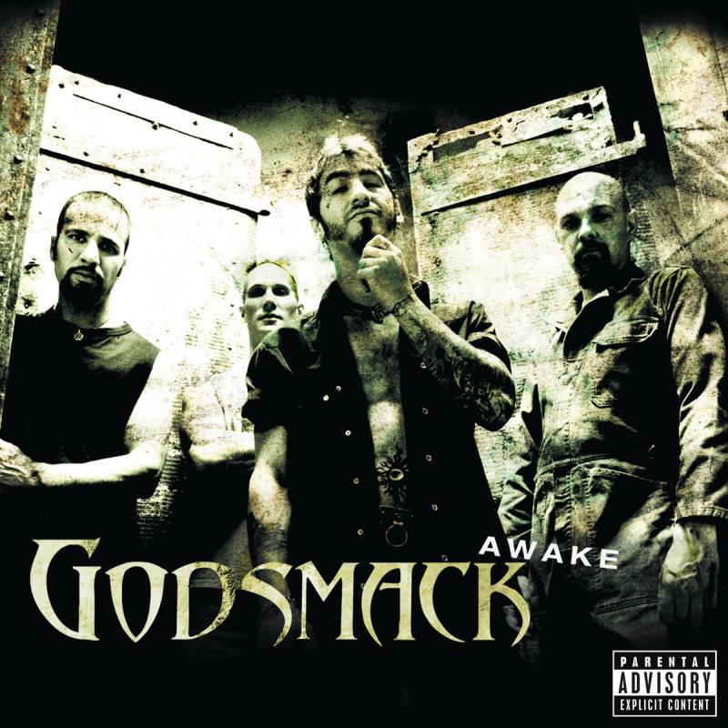
Awake’s cover takes a much darker, more abstract route than the debut. It features a grainy, heavily processed close-up of what appears to be a distorted face, almost dissolving into shadow.
The whole image feels unsettled. There’s a sense of something trying to break through the surface. The band’s name and album title are placed in simple, clean typography against the dark background.
Visual Style and Color Palette
Gray, black, and washed-out skin tones dominate. The palette is intentionally limited. Almost monochrome.
There’s a film-grain texture across the whole thing that gives it a documentary feel. Like something caught on a surveillance camera. The lack of bright color keeps the focus entirely on mood and atmosphere.
Symbolism and Hidden Details
The blurred, half-visible face ties directly to the album’s themes of personal struggle and self-awareness. Sully Erna has talked about wanting every visual element to reflect his personal battles at that point.
The distortion feels intentional. You can’t quite make out what you’re looking at, which is kind of the point.
Connection to the Music
The band recorded Awake in a converted warehouse in Haverhill, Massachusetts. They wanted to keep that edge and avoid the comfort of a luxury studio. Tracks like “Sick of Life” and the title track “Awake” were used in U.S. Navy recruiting ads.
The album debuted at #5 on the Billboard 200 and eventually went double Platinum. The spoken-word track “Vampires” earned the band its first Grammy nomination.
Design Reception and Fan Response
Fans appreciate the shift from the portrait-style debut cover to something more conceptual. It set a template for how Godsmack would handle their visual identity going forward: darker, more abstract, always a little mysterious.
A 25th anniversary deluxe reissue with remastered vinyl arrived in early 2025, including bonus tracks like their cover of Black Sabbath’s “Sweet Leaf.”
Where to Find This Cover in High Quality
The 2024 vinyl reissue from Republic Records offers the sharpest physical reproduction. Streaming platforms carry the standard digital version. Original CD pressings with the fold-open cover (no advisory label) are collector’s items on sites like Discogs.
Faceless (2003)
The Cover Artwork
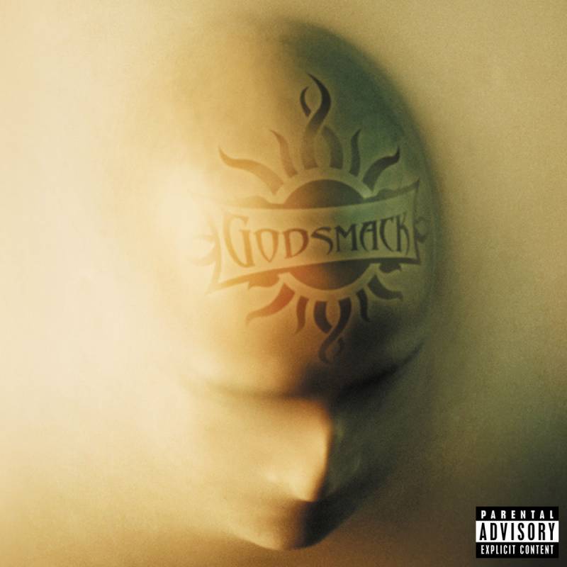
A shadowed, almost featureless figure dominates the cover. The design and photography were handled by P.R. Brown and Bauda Design Lab, who gave the image a cinematic, unsettling quality.
The figure is barely visible, wrapped in darkness. You can make out a human form, but the details are deliberately hidden. It matches the album title perfectly.
Visual Style and Color Palette
Deep blacks, charcoal grays, and cold blue undertones. The contrast between the dark figure and the slightly lit edges creates a sense of depth.
P.R. Brown is known for his work across rock and metal album art, and his approach to the visual hierarchy here keeps your eye moving. The band’s name sits at the top, the album title at the bottom. Simple but effective.
Symbolism and Hidden Details
The faceless figure represents identity loss, alienation, and the masks people wear. Erna talked about how the writing process for this album was self-contained. The band isolated themselves in a rented house in Miami, writing without outside influence.
That isolation shows in the artwork. There’s nothing to grab onto visually. Just a figure in the dark.
Connection to the Music
Faceless debuted at #1 on the Billboard 200, beating out Linkin Park’s Meteora that week. “I Stand Alone” (originally from The Scorpion King soundtrack) and “Straight Out of Line” both received Grammy nominations.
Shannon Larkin’s first album as the band’s drummer. The heavier, more polished production by David Bottrill matched the cover’s upgraded visual direction.
Design Reception and Fan Response
Critics and fans saw it as a step forward in the band’s visual branding. The cover works particularly well as a poster, which is probably why it remains one of Godsmack’s most printed images.
Certified Platinum within five weeks of release. The art helped solidify the band’s move toward a more refined, conceptual aesthetic.
Where to Find This Cover in High Quality
A 2024 remastered edition is available digitally. The original 2003 CD pressing by Universal Records in a standard jewel case with a fold-out insert remains widely available on the secondary market.
The Other Side (2004)
The Cover Artwork
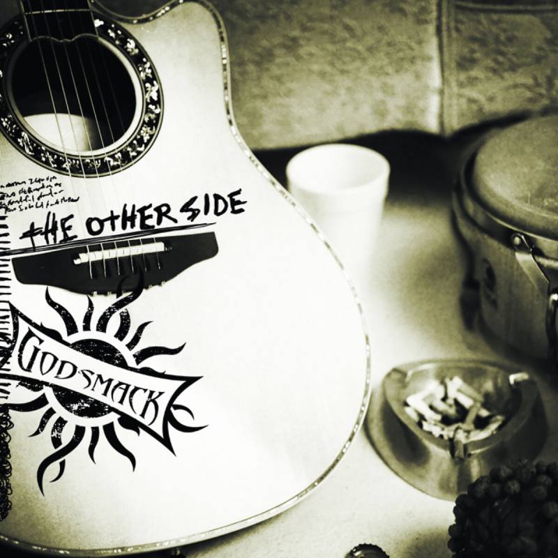
The acoustic EP took a completely different visual approach. P.R. Brown returned for the art direction, design, and cover photography.
The image is softer, more organic. It strips back the heavy darkness of previous covers and hints at something more introspective and intimate.
Visual Style and Color Palette
Warm earth tones replace the blacks and grays. Browns, muted golds, and softer shadows. The whole visual feel signals: this isn’t the Godsmack you’re used to.
That shift in hue tells you exactly what to expect before you press play. It’s a smart bit of album packaging that sets the right expectations.
Symbolism and Hidden Details
The “other side” is literal here. The cover represents the acoustic, stripped-down side of the band. Where previous covers leaned into aggression, this one leans into vulnerability.
Connection to the Music
Recorded in Hawaii with producer David Bottrill. The EP features acoustic reworkings of older songs plus three new tracks, including “Running Blind” and “Touche.” It debuted at #5 on the Billboard 200 and went Gold.
Sully Erna said the band had always messed around with acoustic versions and gotten great reactions to them.
Design Reception and Fan Response
Some fans saw the softer visual as a departure. Others appreciated the honesty of it. The cover showed the band didn’t need heavy imagery to make an impression.
Where to Find This Cover in High Quality
Available on CD through Universal Records. Digital versions on all major streaming platforms. Original club edition pressings pop up on Discogs occasionally.
IV (2006)

The Cover Artwork
IV went stark. The cover features abstract, almost sculptural imagery with bold dark tones. It’s more art piece than traditional band cover.
The Roman numeral “IV” sits prominently, making the design feel monumental. There’s a weight to it that previous covers didn’t quite achieve.
Visual Style and Color Palette
Rich, deep blacks with splashes of muted metallic tones. The saturation is pulled way down, keeping everything moody and heavy.
The composition uses strong balance. Nothing feels accidental. Every element is placed with purpose.
Symbolism and Hidden Details
The fourth album from a band that had already hit #1 twice. The Roman numeral title choice suggests permanence, a kind of classical ambition that goes beyond typical hard rock design elements.
The abstract nature of the cover mirrors the band’s evolution. They were getting further from their raw debut sound and moving toward something more layered.
Connection to the Music
IV debuted at #1 on the Billboard 200 and was certified Platinum. Tracks like “Speak,” “Shine Down,” and “The Enemy” represent some of the band’s strongest songwriting. It was Godsmack’s second consecutive #1 debut after Faceless.
Design Reception and Fan Response
The cover polarized fans a bit. Some missed the figurative imagery. Others felt the abstract direction was a natural progression. Either way, it stands out in the Godsmack discography as one of the more visually distinctive entries.
Where to Find This Cover in High Quality
Available on vinyl and CD. The LP version offers a larger canvas for the artwork. Digital copies on Spotify, Apple Music, and Amazon Music.
Good Times, Bad Times… Ten Years of Godsmack (2007)
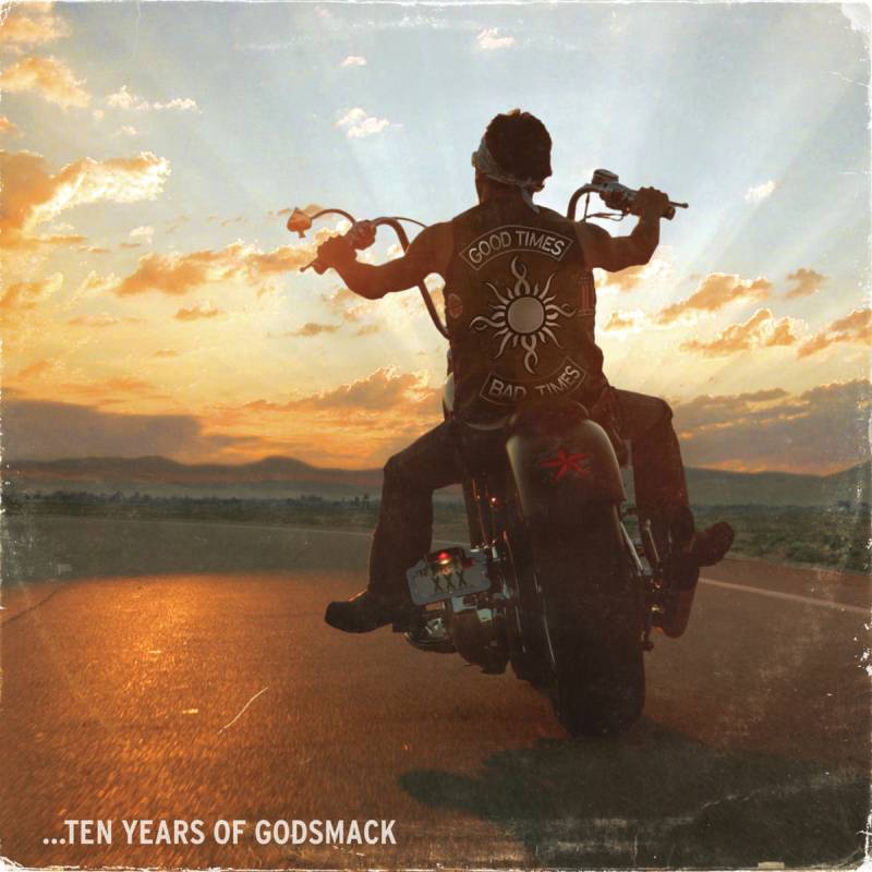
The Cover Artwork
The greatest hits compilation features a bold, almost anthemic cover. The tribal sun logo gets a prominent placement, and the overall design feels like a celebration of the band’s first decade.
The layout ties together visual cues from across the discography. It needed to represent ten years of music in a single image, and it does that without getting cluttered.
Visual Style and Color Palette
Darker tones with golden and amber accents. The warmth in the palette feels intentional, like looking back on something with appreciation rather than aggression.
The emphasis falls on the band name and the compilation title, which are layered into a composition that feels more polished than any previous Godsmack cover.
Symbolism and Hidden Details
The tribal sun logo acts as the connective thread. It’s the one visual element that has been consistent from the debut to this compilation. Placing it front and center here is a nod to the band’s identity over ten years.
Connection to the Music
Sixteen tracks spanning Godsmack’s first four studio albums plus The Other Side. The compilation opens with a cover of Led Zeppelin’s “Good Times Bad Times” and includes a bonus DVD of an acoustic set at the House of Blues in Las Vegas.
Released via Republic Records in December 2007, it sold about 40,000 copies in its first week.
Design Reception and Fan Response
Fans liked it as a retrospective package. The cover art worked well for promotional materials and the DVD packaging. It’s not the most adventurous cover in the catalog, but it’s clean, recognizable, and does its job.
Where to Find This Cover in High Quality
The CD/DVD combo pack is still available from various retailers. Digital versions display the artwork on streaming platforms. Vinyl pressings are less common for this compilation.
The Oracle (2010)
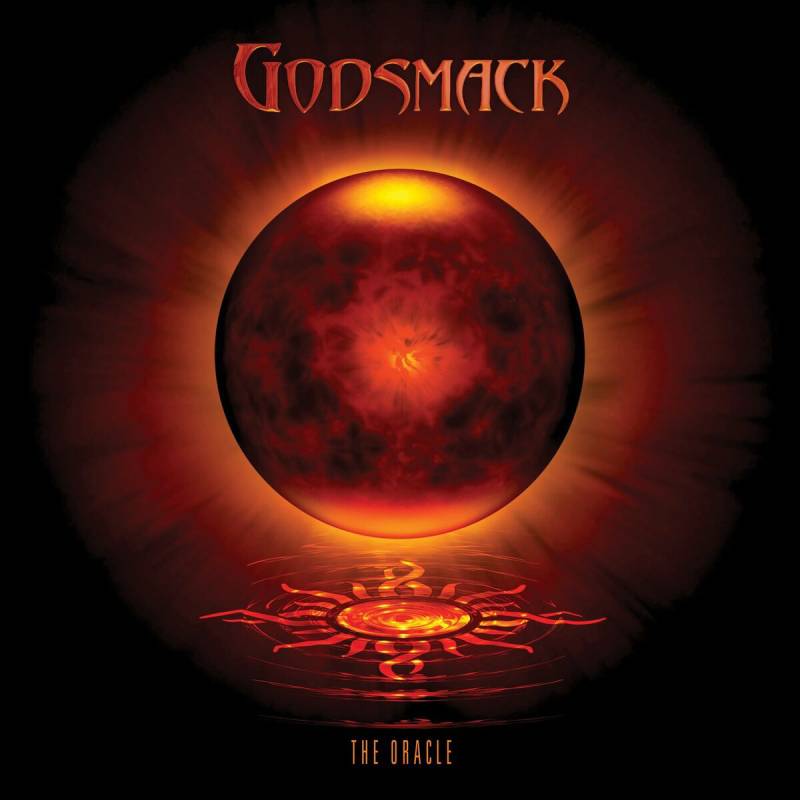
The Cover Artwork
The Oracle’s cover leans heavily into dark, supernatural-looking imagery. A sculpted or digitally rendered face emerges from blackness, giving the whole thing an almost ancient, oracle-like presence.
The production quality of the artwork jumped up here. It feels more like a film poster than a typical rock album cover.
Visual Style and Color Palette
Near-total darkness with carefully placed highlights on facial features. The palette is extremely restrained. Black, deep gray, and subtle skin-tone highlights.
There’s a three-dimensional quality to the face that suggests gradient work and careful lighting. The overall look feels cinematic.
Symbolism and Hidden Details
An oracle is a prophet or someone who sees beyond the surface. The half-revealed face suggests knowledge held back, truth partially hidden. It’s a smart visual for an album that deals with inner conflict and self-reflection.
Connection to the Music
The Oracle debuted at #1 on the Billboard 200, making Godsmack one of only a handful of bands with three consecutive chart-topping debuts (alongside acts like Metallica, U2, and The Rolling Stones).
“Cryin’ Like a Bitch!” became one of their most well-known singles. The album was released via Universal Republic Records.
Design Reception and Fan Response
Widely regarded as one of the band’s strongest cover designs. The cinematic quality gave it a premium feel that matched the commercial success. Fans frequently cite it as a favorite alongside Faceless.
Where to Find This Cover in High Quality
Available on vinyl, CD, and all streaming platforms. The LP version really lets the artwork breathe. The deluxe edition includes bonus tracks like “Whiskey Hangover” and “The Departed.”
1000hp (2014)

The Cover Artwork
hp (One Thousand Horsepower) shifts toward a more industrial, mechanical visual. The cover features the Godsmack tribal sun logo rendered in a rougher, more textured style with a gritty metallic feel.
After a four-year hiatus, the artwork had to signal a comeback. It does that with raw energy rather than subtlety.
Visual Style and Color Palette
Blacks, dark grays, and textured metal surfaces. Think rust, steel, and industrial grit. The color palette stays tight and aggressive.
The sun logo looks almost stamped or branded onto metal, which ties into the horsepower theme perfectly.
Symbolism and Hidden Details
Sully Erna originally wanted to call the title track “100,000 Horsepower” but trimmed it for rhythmic reasons. The industrial look reflects the album’s theme of powering through adversity.
The band nearly broke up before this record. The cover’s roughness might just be a reflection of what it took to get back together.
Connection to the Music
Released via Republic Records after a two-year hiatus following The Oracle’s touring cycle. Mayor Marty Walsh declared August 6 as “Godsmack Day” in Boston to celebrate the album’s release.
The title track hit rock radio in June 2014 as the band’s first new single since 2011.
Design Reception and Fan Response
The stripped-down, mechanical cover was a departure from the more atmospheric previous albums. Some fans loved the directness. Others found it less memorable than Faceless or The Oracle.
Where to Find This Cover in High Quality
Available on vinyl, CD, and digital. The LP pressing gives the textured artwork a nice physical quality. Streaming platforms carry the standard digital version.
When Legends Rise (2018)
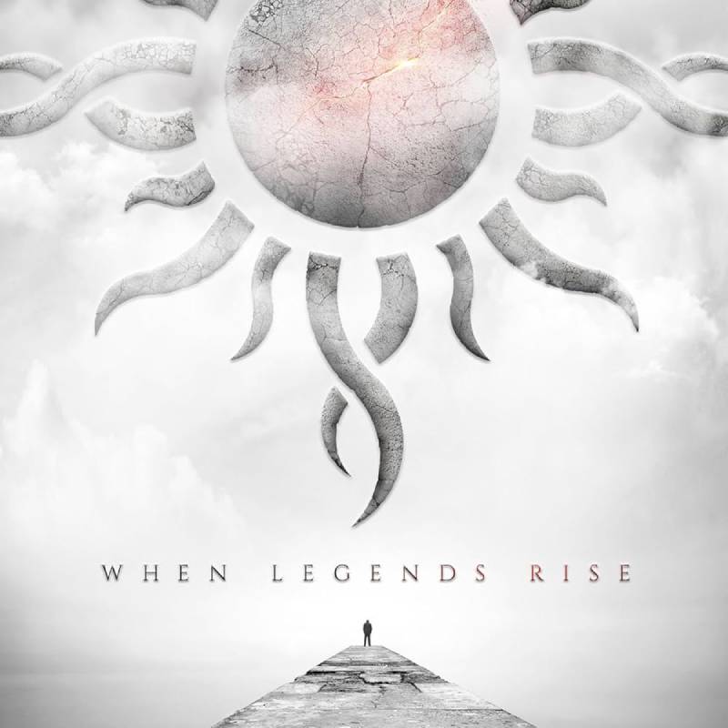
The Cover Artwork
A major visual shift. When Legends Rise features the band’s tribal sun rendered in gold against a dark background, but with a cleaner, more polished treatment than any previous album.
The design feels deliberate and refined. It reflects the sonic shift Sully Erna described as a “reinvention” for the band.
Visual Style and Color Palette
Gold, black, and warm amber tones. It’s the most color-conscious cover in the discography.
The clean lines and polished finish mark a clear break from the grittier looks of earlier records. There’s a minimalist quality to it that works.
Symbolism and Hidden Details
The golden sun is aspirational. Where previous covers showed darkness and struggle, this one suggests triumph and legacy. “When legends rise” is a statement, and the cover backs it up with confident, upward-looking energy.
Connection to the Music
This album marked Godsmack’s move away from heavy metal into a more accessible hard rock sound. All four singles hit #1 on Billboard’s Mainstream Rock chart. Produced with Erik Ron, the album earned Gold certification from the RIAA.
Sully Erna called it an evolution, not a departure. The cover reflects that same idea.
Design Reception and Fan Response
The cleaner look divided longtime fans. Purists missed the darker aesthetic. But the gold-and-black design worked well for merch, tour visuals, and streaming thumbnails. It reads well at small sizes, which matters these days.
Where to Find This Cover in High Quality
Available on vinyl (including a 5th anniversary white vinyl edition), CD, and streaming platforms. The BMG release offers solid physical packaging.
Lighting Up the Sky (2023)
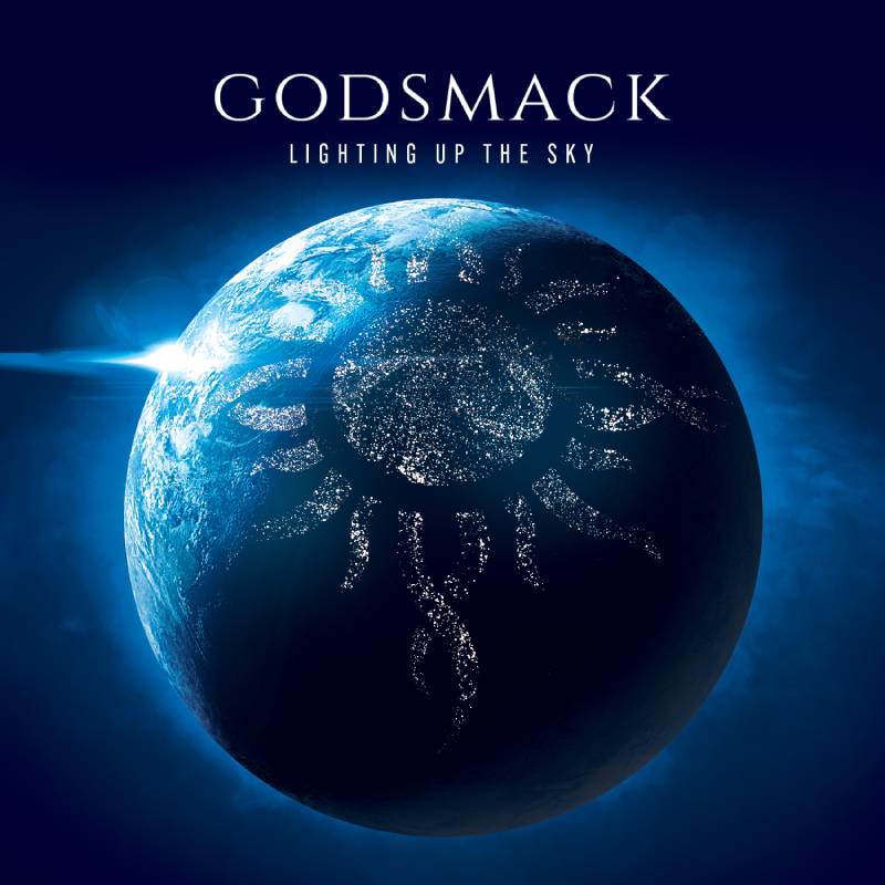
The Cover Artwork
The final studio album cover shows a dramatic sky with light breaking through clouds. The tribal sun logo is integrated into the scene but feels less dominant than on previous records.
It’s the most photographic and atmospheric cover in the Godsmack catalog. Released through BMG in a 6-panel digipak with a 16-page booklet.
Visual Style and Color Palette
Blues, whites, and warm light tones. This is the brightest Godsmack cover by far. It’s a total departure from the dark, shadowy look that defined most of their discography.
The framing is open and expansive, with the sky taking up most of the composition. It feels like a final exhale.
Symbolism and Hidden Details
Light breaking through darkness. Not exactly subtle, but fitting for a farewell album. The sky imagery represents transcendence, closure, and looking upward after decades of hard rock grit.
This was the last album to feature guitarist Tony Rombola and drummer Shannon Larkin before they left the band in 2025.
Connection to the Music
Co-produced by Erna and Andrew Murdock (who also produced their debut and Awake), the album debuted at #1 on the US Top Hard Rock Albums chart. Lead single “Surrender” hit #1 on Billboard Mainstream Rock.
Erna called it the best work the band had ever done. Your mileage may vary, but the confidence shows in every part of the package.
Design Reception and Fan Response
The lighter, sky-focused cover felt right for a closing chapter. Discogs reviewers noted the vinyl pressing had “supersharp” artwork. The brightness caught some fans off guard, but most agreed it was a fitting visual send-off.
Where to Find This Cover in High Quality
Available on vinyl (gatefold cover with inner sleeve), CD digipak, and all streaming platforms. The vinyl version, in particular, was designed to take advantage of the larger format. If you want to see this cover the way it was meant to be seen, that’s the one to grab.
FAQ on Godsmack Album Covers
Who is the woman on the Godsmack self-titled album cover?
Her name is Toni Tiller. She was a New York City club kid, not a professional model. The photo was taken in Brooklyn in 1994, four years before the band used it for their 1998 debut on Republic Records.
What does the Godsmack tribal sun logo mean?
The tribal sun symbol connects to Sully Erna’s interest in Wicca and pagan spirituality. It first appeared on the self-titled debut and became the band’s permanent visual identity across all album artwork, merchandise, and tour graphics.
Who designed the Faceless album cover?
P.R. Brown and Bauda Design Lab handled the art direction, design, and photography. Brown is well known in the rock and metal album art world. The shadowed, faceless figure became one of Godsmack’s most recognized cover images.
How many Godsmack albums debuted at number one?
Three consecutive albums hit #1 on the Billboard 200: Faceless (2003), IV (2006), and The Oracle (2010). That puts Godsmack alongside bands like Metallica, U2, and Dave Matthews Band.
Why does the Lighting Up the Sky cover look so different?
It’s the band’s final studio album. The bright sky and light tones represent closure and transcendence. Every previous Godsmack cover leaned into darkness, so the shift was intentional and meant as a visual farewell.
Are Godsmack album covers available on vinyl?
Yes. Most of the discography has been pressed on vinyl, including recent reissues of Awake (2024 remaster) and a white vinyl edition of When Legends Rise. Vinyl pressings show the cover artwork at its best.
What style of artwork does Godsmack typically use?
Dark, symbolic, and abstract. The band favors monochrome palettes, shadowed figures, and tribal imagery. Earlier covers used photography and portraiture, while later releases shifted toward more polished, conceptual design.
Did the Godsmack debut cover cause controversy?
Yes. Walmart and Kmart pulled the album from shelves due to profane lyrics and Wiccan imagery in the liner notes. A Parental Advisory sticker was added shortly after. Sully Erna said the controversy actually boosted sales.
Is When Legends Rise cover art different from older Godsmack albums?
Very much so. The gold-and-black design reflects the band’s shift toward a more polished hard rock sound. It’s cleaner and more minimalist than previous covers, matching the album’s direction under producer Erik Ron.
Where can I find high-quality Godsmack album cover images?
Streaming platforms like Spotify and Apple Music display standard digital artwork. For better resolution, check Album Art Exchange or Discogs. Vinyl and CD pressings from Republic Records and BMG offer the sharpest physical reproductions.
Conclusion
Every Godsmack album cover reflects a specific chapter in the band’s history. From the Wiccan-influenced debut packaging to the cinematic darkness of The Oracle, Sully Erna and his collaborators treated artwork as part of the creative process, not an afterthought.
Designers like P.R. Brown shaped the band’s visual language across multiple records. The tribal sun logo became as recognizable as the music itself.
What stands out across the full Godsmack discography is the consistency. Dark tones, symbolic imagery, and a willingness to evolve visually alongside the sound. The shift from raw ’90s hard rock aesthetics to the polished gold of When Legends Rise shows a band that understood visual branding long before most rock acts bothered with it.
That attention to detail is what separates good album art from forgettable filler.

Renowned for his expertise in logo design and visual branding, Bogdan has developed a multitude of logos for various clients.
His skills extend to creating posters, vector illustrations, business cards, and brochures. Additionally, Bogdan's UI kits were featured on marketplaces like Visual Hierarchy and UI8.
He also wrote in the past years on sites like Design Your Way, WebDesignerDepot, WPDean, Designmodo, Speckyboy, Slider Revolution, and more.
- Jujutsu Kaisen Font Generator - 12 October 2026
- The Windsurf Logo History, Colors, Font, And Meaning - 10 October 2026
- How to Remove Background From Product Photos (No Photoshop) - 10 October 2026

Bogdan Sandu is a seasoned designer who has been designing websites since 2008. Renowned for his expertise in logo design and visual branding, Bogdan has developed a multitude of logos for various clients. His skills extend to creating posters, vector illustrations, business cards, and brochures. Additionally, Bogdan's UI kits were featured on marketplaces like Visual Hierarchy and UI8. He also wrote in the past years on sites like Design Your Way, WebDesignerDepot, WPDean, Designmodo, Speckyboy, Slider Revolution, and more.
You Might Also Like