Some album covers hit harder than the music inside. In heavy metal, the artwork on the sleeve has always been part of the experience. The best metal album covers didn’t just wrap vinyl records. They built entire visual identities for bands like Iron Maiden, Metallica, and Black Sabbath.
Artists like Derek Riggs, Ed Repka, and Dan Seagrave turned album cover design into its own art form. Their painted illustrations, dark imagery, and iconic band mascots shaped how fans connected with thrash metal, death metal, and everything in between.
This article breaks down the most iconic metal artwork ever created. You’ll learn who painted each cover, what makes the design work, and why these images still end up on t-shirts and tattoos decades later.
Best Metal Album Covers
The Number of the Beast by Iron Maiden (1982)
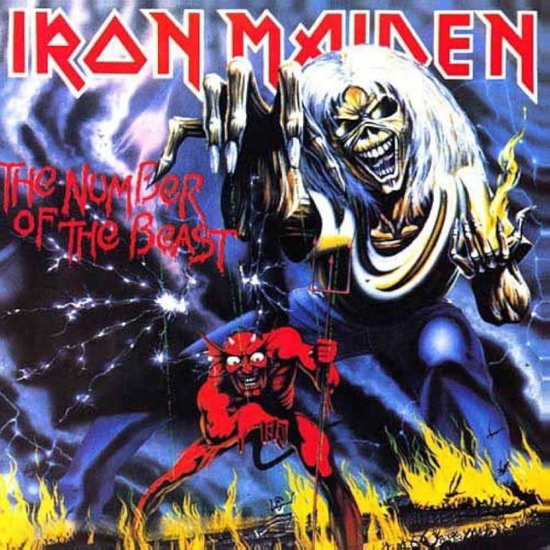
The Cover Art
Eddie, Iron Maiden’s zombie mascot, towers over a hellscape while pulling Satan’s strings like a puppet. But look closer. Satan is also controlling a smaller Eddie below him.
The whole scene asks a simple question: who’s really in control?
Painted with heavy contrast between the fiery reds and deep blacks, the composition pulls your eye straight to the center. The dark album imagery drew outrage from religious groups across the United States, which only made the album sell faster.
The Artist Behind It
Derek Riggs painted every Iron Maiden sleeve through the early 1990s. He originally created this piece for the “Purgatory” single, but manager Rod Smallwood thought it was too good to waste on a 7-inch release.
Riggs based the puppet concept on an old Doctor Strange comic he remembered from the 1960s. The hellish background came from his knowledge of medieval European Christian art.
Why It Works
There’s a layered concept here that rewards repeat viewing. The puppet-within-a-puppet idea gives the artwork a philosophical edge that most heavy metal album art at the time just didn’t have.
The original 1982 pressing had a blue sky in the background, which was actually a printing error. It was corrected to black during the 1998 CD remaster.
Design Breakdown
- Medium: Acrylic painting
- Color scheme: Dominant reds, oranges, and blacks
- Focal point: Eddie standing above Satan in the center
- Strong use of layered depth with foreground, mid-ground, and background elements
Cultural Impact
This cover turned Eddie into a global icon. Album burnings and protests followed its release, especially in the American Bible Belt. Rolling Stone later ranked it 4th on their 100 Greatest Metal Albums of All Time list.
It was also voted number one in HMV’s “Best British Albums of the Past 60 Years” in 2012. A NECA action figure set recreating the cover artwork was released for the 40th anniversary in 2022.
Where to Find It
Available on vinyl, CD, and all major streaming platforms. The remastered 1998 version has the corrected black sky. Original 1982 pressings with the blue sky error are collector’s items.
Master of Puppets by Metallica (1986)

The Cover Art
A field of white crosses stretches into the distance. Strings attached to each one lead upward, pulled by a pair of hands emerging from a blood-red sky. A soldier’s helmet sits on the leftmost cross.
It’s a cemetery turned into a puppet show. Simple concept, but it hits hard.
The Artist Behind It
Don Brautigam was a commercial illustrator who graduated from the New York School of Visual Arts in 1971. He painted over 3,000 book and record covers during his career, including work for AC/DC, Anthrax, and Stephen King’s The Stand.
The Master of Puppets painting was based on a crude sketch by James Hetfield. Brautigam completed the 17×17 inch acrylic piece in just three days, using a mix of airbrush and traditional brushwork.
If you look at the bottom right corner, you can spot his initials “D.B.” hidden in the grass.
Why It Works
Lars Ulrich explained that the artwork summarizes the album’s themes. People being manipulated, whether they’re soldiers or addicts. The cover ties together multiple songs without being too literal about any single one.
The warm orange glow on the horizon and the soft focus from the airbrush give it an almost dreamlike quality. Unsettling, but beautiful.
Design Breakdown
- Medium: Acrylics on illustration board (airbrush + paintbrush)
- Color scheme: White crosses against rich browns, blood-red sky
- Strong use of visual hierarchy with the hands drawing the eye upward
- The balance between the orderly rows of crosses and the chaotic sky creates tension
Cultural Impact
In 2015, Master of Puppets became the first metal album preserved by the Library of Congress. The original painting sold for $28,000 at Christie’s in 2008.
T-shirts bearing Brautigam’s artwork are everywhere, from metal shows to suburban malls. Brautigam passed away in January 2008, but this cover remains one of the most recognized images in thrash metal history.
Where to Find It
Available in multiple formats including a 2017 remastered expanded box set. Vinyl reissues are widely available through Blackened Recordings.
Black Sabbath by Black Sabbath (1970)
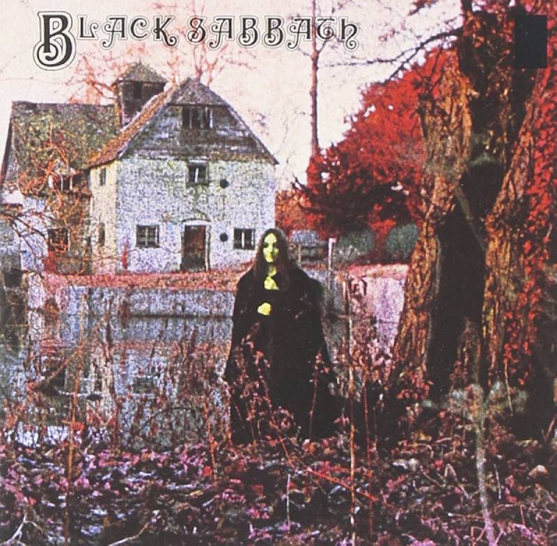
The Cover Art
A cloaked woman stands in front of a crumbling watermill. Trees frame the scene. The whole thing looks like a still from a forgotten horror film.
No band members. No logo screaming for attention. Just dread.
The Artist Behind It
Keith “Keef” Macmillan was an in-house photographer and designer for Vertigo Records. He shot the image at Mapledurham Watermill in Oxfordshire, a 15th-century structure on the River Thames.
The model was Louisa Livingstone, about 18 years old at the time. Her identity remained a mystery for nearly 50 years until Rolling Stone tracked her down in 2020.
Macmillan used Kodak infrared aerochrome film (typically used for aerial photography) and then manipulated the chemistry to get that eerie, surreal feel. He also boiled and froze the film to make it grainier.
Why It Works
The band had zero input on this cover. Macmillan listened to the album off a master tape and created the concept entirely on his own, influenced by surrealists like Rene Magritte.
It was released on Friday the 13th, February 1970. Deliberate.
The inverted cross on the inner gatefold was added by Vertigo without the band’s approval. The whole package basically invented the visual language of heavy metal.
Design Breakdown
- Medium: Infrared photography with chemical manipulation
- Color scheme: Muted greens, blacks, and cold tones
- The small figure against the large landscape creates an unsettling sense of scale and proportion
- Minimal text placement keeps the focus entirely on atmosphere
Cultural Impact
Widely considered the first true heavy metal album cover. Every black metal band owes something to this photograph. Acid Mothers Temple, BL’AST!, and dozens of others have paid direct tribute to it in their own sleeve designs.
Where to Find It
The original Vertigo pressing with the gatefold and inverted cross is a prized collector’s item. Remastered editions and vinyl reissues are readily available.
Reign in Blood by Slayer (1986)
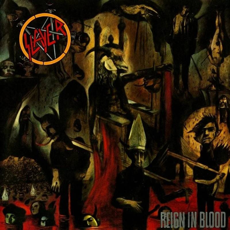
The Cover Art
A goat-headed figure presides over a sea of tortured souls, severed heads, and corpses. It’s overwhelming on purpose. Every inch is packed with grotesque detail.
You can stare at this thing for ten minutes and still notice something new.
The Artist Behind It
Larry Carroll was creating political illustrations for The Village Voice, The Progressive, and The New York Times when producer Rick Rubin called him in 1986.
Carroll’s mixed-media approach combined drawings, collage, and photocopied elements. He preferred this hands-on method over digital tools throughout his entire career.
Here’s the thing, though. The band initially hated the cover. Kerry King called Carroll a “warped demented freak.” But then someone showed it to a band member’s mother, and she was disgusted. That’s when they knew it was right.
Why It Works
Carroll’s fine art background brought a level of craftsmanship to thrash metal artwork that nobody expected. Critics compared his style to Hieronymus Bosch, the 15th-century Dutch painter known for hellish triptychs. That comparison is earned.
The cover made Blender Magazine’s top ten heavy metal album covers of all time.
Design Breakdown
- Medium: Mixed media (acrylic, oil, collaged photocopied drawings)
- Color scheme: Reds, yellows, and dark browns
- Deliberate visual chaos with no single emphasis point, mirroring the album’s relentless pace
- Hidden details throughout (including some intentionally crude ones)
Cultural Impact
Carroll went on to create covers for South of Heaven (1988), Seasons in the Abyss (1990), and Christ Illusion (2006). His work for Slayer defined the visual identity of thrash metal’s most extreme band. His art is in the collections of the Guggenheim Museum and the Museum of Contemporary Art in Los Angeles.
Carroll passed away in May 2019 at age 65.
Where to Find It
Available on vinyl through Def Jam Recordings. The original pressing is highly collectible. Remastered versions are available on all formats.
Rust in Peace by Megadeth (1990)
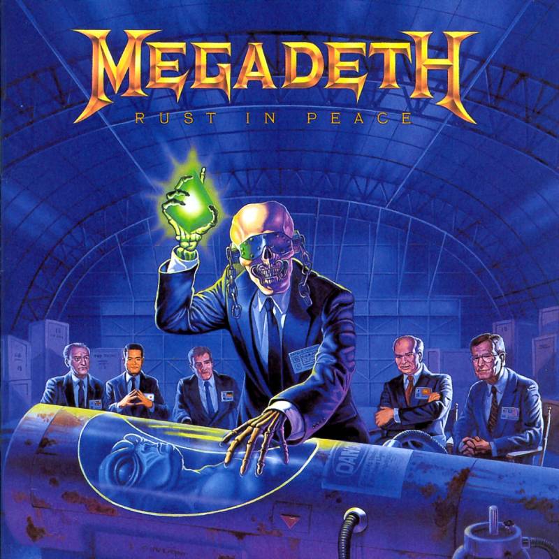
The Cover Art
Vic Rattlehead, Megadeth’s skeletal mascot, stands in a business suit inside a secret hangar. He holds a glowing green object over the body of an alien in a preservation pod. Behind him, five world leaders watch the scene unfold.
It’s a conspiracy theorist’s fever dream, painted with precision.
The Artist Behind It
Ed Repka is one of the most prolific metal cover illustrators of all time. He also painted Peace Sells… But Who’s Buying? and the covers for the “Holy Wars” and “Hangar 18” singles.
The five leaders depicted on the cover are real: UK Prime Minister John Major, Mikhail Gorbachev, German President Richard von Weizsacker, Japanese PM Toshiki Kaifu, and US President George H.W. Bush.
Why It Works
The album deals with politics, warfare, and nuclear paranoia. The title itself came from a bumper sticker Dave Mustaine saw: “Nuclear Weapons, May They Rust in Peace.”
Repka’s illustration ties all these themes into one scene that feels like a frame from a political thriller. The green glow adds a sci-fi edge that keeps it from being too literal.
Design Breakdown
- Medium: Painted illustration
- Color scheme: Deep blues, metallic grays, and acid green accents
- The alignment places Vic dead center with the leaders arranged behind him in a semicircle
- Strong narrative composition that tells a story in a single frame
Cultural Impact
Rust in Peace was nominated for Best Metal Performance at the 1991 Grammys. The album is listed in 1001 Albums You Must Hear Before You Die. Rolling Stone ranked it 19th on their 100 Greatest Metal Albums list in 2017.
Repka’s style influenced a whole generation of death metal and thrash metal cover artists who followed in the late 1990s and 2000s.
Where to Find It
Available in a 2004 remixed and remastered edition with bonus tracks, as well as a limited 180-gram LP using the original mix from 2008.
Powerslave by Iron Maiden (1984)
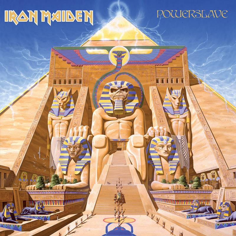
The Cover Art
Eddie sits enthroned as an Egyptian pharaoh, surrounded by hieroglyphics and massive stone structures. The whole thing looks like the entrance to a forgotten tomb.
By their fifth album, Iron Maiden had turned their mascot into something mythological.
The Artist Behind It
Derek Riggs painted this one too. He gave Eddie an ancient Egyptian makeover while keeping the character’s trademark menace intact. Riggs hid crude jokes inside the hieroglyphics for fans who looked closely enough.
Why It Works
The cover matches the album’s epic scope. Songs like “Aces High” and “2 Minutes to Midnight” demanded artwork that felt larger than life. Riggs delivered exactly that.
There’s a sense of history and weight here. Eddie isn’t just a zombie on this cover. He’s been around for thousands of years. That kind of storytelling through a single image is tricky to pull off.
Design Breakdown
- Medium: Acrylic painting
- Color scheme: Sandy golds, warm browns, and desert blues
- Symmetrical composition with Eddie as the central axis
- Hidden details in the hieroglyphics reward close inspection
Cultural Impact
Powerslave cemented Eddie as more than a mascot. He became a character with implied backstory, a concept that expanded Iron Maiden’s merchandise and touring identity for decades. The Egyptian Eddie is still one of the most popular designs on band shirts today.
Where to Find It
Available on vinyl and CD through Parlophone/Warner. The 1998 remaster is the most common version in circulation.
Vulgar Display of Power by Pantera (1992)
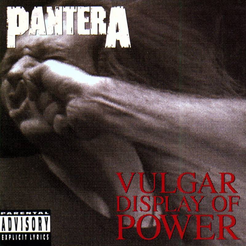
The Cover Art
A fist makes contact with a man’s face. The skin ripples. You can almost feel the impact. No fantasy, no demons, no elaborate paintings.
Just a punch. That’s the whole cover.
The Artist Behind It
Photographer Brad Guice shot the image. The fist moved in slow motion while the model, Sean Cross, moved his head to simulate the impact. Nobody actually got hit.
The rumors about the model being punched repeatedly to get the right shot are completely false. Guice confirmed it was a controlled shoot.
Why It Works
Pantera knew they were going to change the sound of metal with this record. The cover is a visual mission statement. No subtlety, no metaphor. Just raw force. The photographic approach stood apart from the painted fantasy covers that dominated the genre at the time.
Design Breakdown
- Medium: Photography
- Color scheme: High-saturation skin tones against a neutral background
- Captures a split-second moment of impact
- The movement frozen in the image creates visceral tension
Cultural Impact
This became one of the most recognizable images in 1990s metal. The “punch photo” has been parodied, referenced, and imitated countless times. It helped define the groove metal aesthetic and moved album cover design away from the painted fantasy tradition.
Where to Find It
Available on vinyl through Atco/East West Records and all digital platforms. The 20th anniversary edition includes bonus content.
Painkiller by Judas Priest (1990)
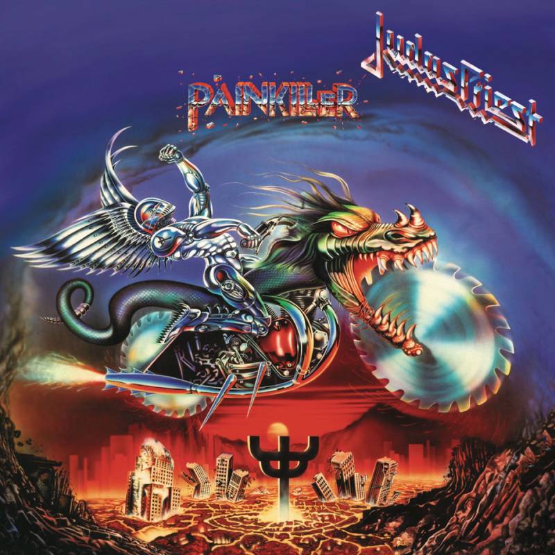
The Cover Art
A winged metallic creature rides a monstrous dragon-motorcycle above a world tearing itself apart. It’s absurd. It’s over the top. It’s perfect for Judas Priest.
The “Painkiller” is described as a metal messiah sent to destroy evil and rescue mankind. The album cover captures that concept with zero restraint.
The Artist Behind It
Mark Wilkinson, an English illustrator known for his airbrush mastery, had been working with Priest since 1988’s Ram It Down. The Painkiller concept evolved from the fallen angel on Sad Wings of Destiny (1976), reimagined as a robotic cyborg riding a machine-beast.
Wilkinson got the idea for the motorcycle’s circular saw blade wheels while walking through a hardware store below his studio. He spotted actual saw blades on the wall and thought: that’s it.
Why It Works
This was Judas Priest’s heaviest album. The cover had to match. Where earlier Priest covers were more restrained, Painkiller goes full throttle. Rob Halford described the concept as taking the angel from Sad Wings and putting it through a “RoboCop type of mode.”
Design Breakdown
- Medium: Airbrush illustration
- Color scheme: Fiery oranges, metallic silvers, and deep blacks
- Diagonal composition suggests speed and upward rhythm
- Blends fantasy illustration with industrial metal aesthetics
Cultural Impact
The album was nominated for Best Metal Performance at the 1991 Grammys. Wilkinson continued working with Priest for over 30 years, making him one of the longest-running artist-band partnerships in metal history. The Painkiller character has become part of the band’s live show identity.
Where to Find It
Available on the 2001 remastered CD and standard vinyl reissues through Columbia/Legacy. Limited edition prints signed by Wilkinson have been sold through the band’s official site.
Overkill by Motorhead (1979)
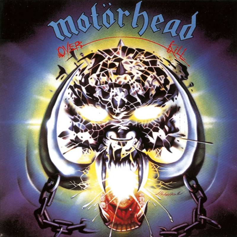
The Cover Art
Snaggletooth, Motorhead’s tusked skull mascot, glares at you from a black void. No background. No scenery. Just the skull, some chains, and the band name.
If you know, you know.
The Artist Behind It
Joe Petagno designed Snaggletooth (also called War-Pig) in 1977 for the band’s debut album. The Overkill version refines the original design with sharper detail and more aggressive lines. Petagno continued redesigning Snaggletooth for nearly every Motorhead release that followed.
Why It Works
Sometimes less is more. While other bands were filling their sleeves with elaborate painted scenes, Motorhead went with a single icon on a dark background. The approach follows a kind of minimalist design thinking, even if the skull itself is anything but minimal.
Snaggletooth became one of the most tattoed images in rock history.
Design Breakdown
- Medium: Ink illustration
- Color scheme: Black and white with occasional metallic highlights
- Central placement with heavy symmetry
- Functions simultaneously as album art and logo
Cultural Impact
Snaggletooth is to Motorhead what Eddie is to Iron Maiden. The design has appeared on everything from belt buckles to bomber jackets. Petagno’s work influenced the entire culture of metal merchandise and band branding.
Where to Find It
Available on vinyl reissues through Bronze/Sanctuary Records. The deluxe edition includes bonus tracks and expanded artwork.
Beneath the Remains by Sepultura (1989)
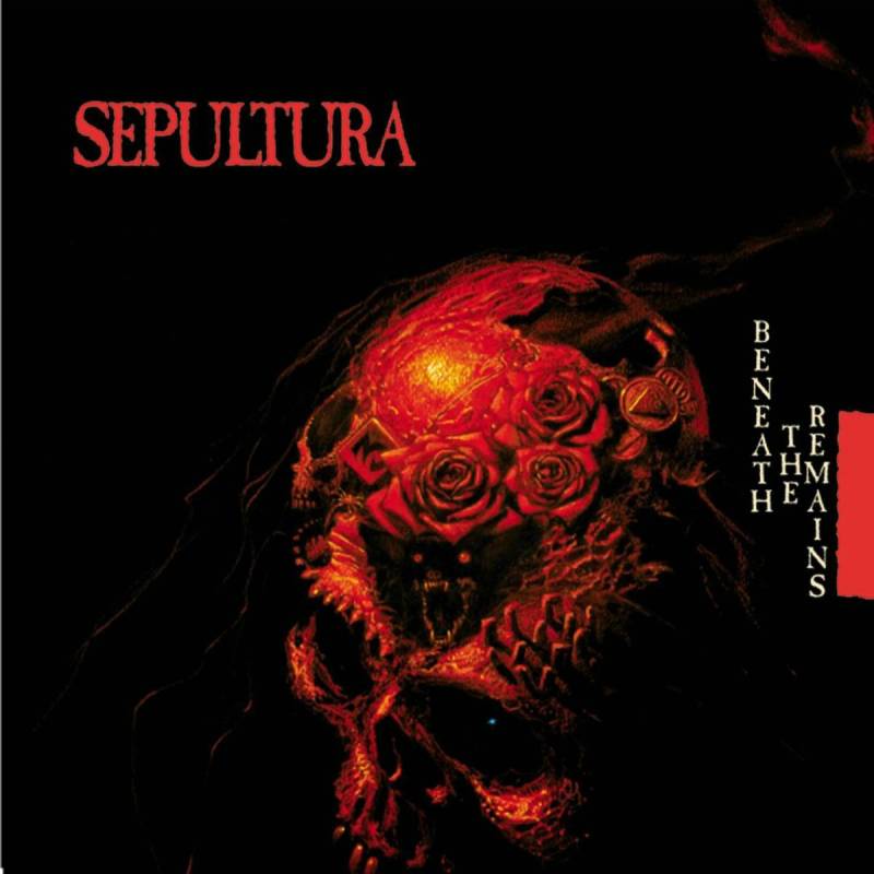
The Cover Art
A Lovecraftian scene unfolds across the cover. A massive, otherworldly landscape with twisted organic forms and dark, atmospheric tones. It looks like something from a nightmare you can’t quite remember clearly.
The Artist Behind It
Michael Whelan is a legend in both fantasy illustration and metal cover art. His paintings also graced Obituary’s Cause of Death and multiple Sepultura releases including Arise and Chaos A.D. Whelan’s relationship with Roadrunner Records helped define the label’s visual identity during the late 1980s and early 1990s.
The artwork for Beneath the Remains was actually repurposed from one of Whelan’s existing Lovecraft-inspired paintings. This was common practice at Roadrunner during that era.
Why It Works
The painting has a sense of dread that perfectly matches Sepultura’s sound at the time. Raw, aggressive, and a little alien. It doesn’t look like typical thrash metal cover art, which is exactly what makes it stand out.
Whelan brought a fine art sensibility to extreme metal. His technical skill with oils gave these covers a weight and depth that vector graphics and digital tools simply could not replicate at the time.
Design Breakdown
- Medium: Oil painting
- Color scheme: Dark greens, muddy browns, and deep purples
- Organic, flowing forms create a sense of biological horror
- The color palette shifts from warm center tones to cold edges
Cultural Impact
Whelan’s work for Roadrunner Records set the standard for death metal artwork in the late 1980s. His Lovecraftian style influenced artists like Dan Seagrave and countless underground metal illustrators. Beneath the Remains is regularly cited among the best thrash metal albums of all time, and Whelan’s cover is a big part of its lasting identity.
Where to Find It
Available on remastered vinyl and CD through Roadrunner Records. The expanded reissue includes bonus tracks and liner notes.
FAQ on Best Metal Album Covers
What is the most iconic metal album cover of all time?
Most fans and critics point to Iron Maiden’s The Number of the Beast (1982). Derek Riggs’ painting of Eddie controlling Satan became the defining image of heavy metal artwork. It’s been printed on more t-shirts than probably any other album cover in the genre.
Who are the most famous metal album cover artists?
Derek Riggs (Iron Maiden), Ed Repka (Megadeth), Dan Seagrave (Entombed, Morbid Angel), and Larry Carroll (Slayer) are the biggest names. Each one shaped the visual identity of an entire subgenre, from thrash metal to death metal.
Why are metal album covers so detailed and dark?
Heavy metal music deals with intense themes. War, death, mythology, horror. The artwork reflects that. Bands wanted their album sleeve design to match the emotional weight of the music, and painted illustrations delivered that better than simple photography.
What makes a great metal album cover?
Strong composition, a clear focal point, and a concept that connects to the music. The best covers tell a story in a single image. They also need to look good at vinyl record size and shrunk down to a CD or digital thumbnail.
Are metal album covers painted or digital?
Classic covers from the 1980s and 1990s were almost always hand-painted using acrylics, oils, or airbrush. Today, many artists use digital tools, but some illustrators like Ed Repka still work with traditional media for that authentic look.
Which metal band has the best album artwork overall?
Iron Maiden wins this one for consistency. Every album features their mascot Eddie in a new setting, all painted by Derek Riggs through the early 1990s. Judas Priest and Megadeth are close runners-up with their own longtime cover artists.
What is the most controversial metal album cover?
Slayer’s Reign in Blood and Cannibal Corpse’s catalog are frequent answers. The Reign in Blood artwork by Larry Carroll was so graphic that Columbia Records initially refused to distribute the album. Several Cannibal Corpse covers have been banned outright in multiple countries.
How did Eddie become Iron Maiden’s mascot?
Eddie started as a papier-mache mask used at early gigs. Derek Riggs then developed the character into a zombie-like figure for their 1980 debut single. Manager Rod Smallwood made Riggs the band’s exclusive artist, and Eddie appeared on every release through the early 1990s.
Do album covers affect how fans perceive the music?
Absolutely. Before streaming, fans discovered metal by browsing record store shelves. A striking cover pulled you in. Bands like Black Sabbath and Metallica built their visual identity through artwork that became inseparable from the songs themselves.
Can I buy prints of famous metal album covers?
Some artists sell limited edition prints directly. Mark Wilkinson offers signed Judas Priest prints through official channels. Original paintings occasionally appear at auction houses like Christie’s. The Master of Puppets original sold for $28,000 in 2008.
Conclusion
The best metal album covers are more than packaging. They’re cultural artifacts that defined how entire subgenres look and feel, from the painted horror of thrash metal sleeves to the grim photography of black metal visuals.
Artists like Michael Whelan, Pushead, and Mark Wilkinson proved that album artwork could stand on its own as fine art. Their work for labels like Roadrunner Records, Metal Blade Records, and Earache Records gave underground metal a visual language that still holds up.
Vinyl collectors, tattoo artists, and poster design fans keep these images alive. The gatefold sleeve might be a relic, but the art printed on it isn’t going anywhere.
Good music deserves a cover worth staring at. These albums delivered both.

Renowned for his expertise in logo design and visual branding, Bogdan has developed a multitude of logos for various clients.
His skills extend to creating posters, vector illustrations, business cards, and brochures. Additionally, Bogdan's UI kits were featured on marketplaces like Visual Hierarchy and UI8.
He also wrote in the past years on sites like Design Your Way, WebDesignerDepot, WPDean, Designmodo, Speckyboy, Slider Revolution, and more.
- Canva vs PowerPoint: Which Is Better for Presentations? - 22 September 2026
- How to Install Fonts on Mac (Step-by-Step Guide) - 20 September 2026
- From Mockup to Code: How AI-Augmented Development Speeds Up the Design Handoff - 19 September 2026

Bogdan Sandu is a seasoned designer who has been designing websites since 2008. Renowned for his expertise in logo design and visual branding, Bogdan has developed a multitude of logos for various clients. His skills extend to creating posters, vector illustrations, business cards, and brochures. Additionally, Bogdan's UI kits were featured on marketplaces like Visual Hierarchy and UI8. He also wrote in the past years on sites like Design Your Way, WebDesignerDepot, WPDean, Designmodo, Speckyboy, Slider Revolution, and more.
You Might Also Like