


Red grabs you before the music even starts. It’s the color that makes you pull a vinyl record out of the bin, flip it over, and actually read the back.
The best red album covers do more than look striking on a shelf. They communicate something about the music inside, whether that’s raw emotion, danger, passion, or defiance. From Kanye West’s painted chaos to King Crimson’s screaming watercolor face, red has been the go-to choice for artists who want their album artwork to hit hard at first glance.
This list breaks down the most iconic red-themed records across rock, hip hop, pop, and R&B. You’ll see what makes each cover design work, who created the art, and why these particular albums became visual landmarks in music history.
Best Red Album Covers of All Time
My Beautiful Dark Twisted Fantasy by Kanye West
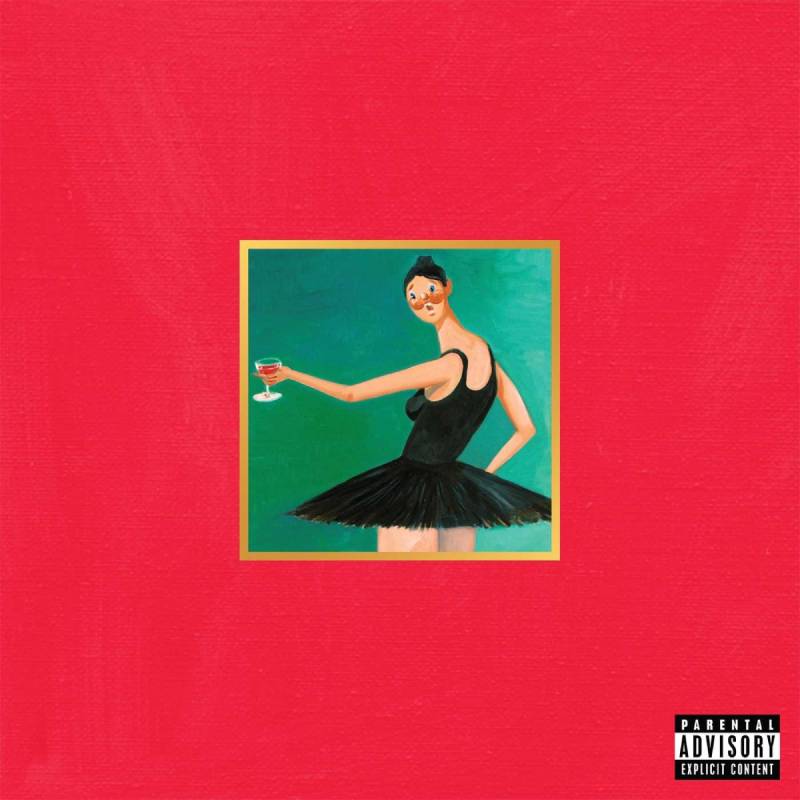
Why This Cover Stands Out
Five different painted covers for one album. That alone sets it apart from pretty much everything else in hip hop, or music in general.
George Condo created all five versions, each one more unsettling than the last. The most recognized one shows a winged creature straddling Kanye on a couch, all drenched in deep red. Walmart and several retailers banned it on sight.
The bold red color palette screams intensity. It works because the music does the same thing.
The Color Story
That royal red background carries a lot of weight. It signals passion, anger, and blood all at once.
Condo’s style blends pop surrealism with Cubist influences. The red tones connect every alternate cover version into one cohesive visual identity, even when the imagery shifts dramatically between paintings.
Design Breakdown
Condo described his approach as “psychological cubism.” The art direction came from Kanye himself alongside Virgil Abloh.
No text on most versions. No album title fighting for attention. Just raw, confrontational artwork with the focal point placed dead center. That takes confidence.
Cover Art Credits
Artist: George Condo Art Direction: Kanye West, Virgil Abloh Label: Roc-A-Fella Records / Def Jam Recordings
Genre and Release Year
Hip hop, maximalist pop. Released November 22, 2010. Widely considered Kanye’s best work and one of the greatest albums of the 2010s.
Where You’ve Seen It
Everywhere. Dorm rooms, streetwear graphics, social media avatars. The ballerina version became a meme format. Kanye used one of Condo’s alternate paintings as his Twitter profile picture for years. If you collect vinyl, the gatefold includes all five covers as inserts plus a 24×24 poster.
Red by Taylor Swift

Why This Cover Stands Out
Half her face is hidden by shadow. That’s the whole trick, and it works perfectly.
Taylor is wearing a hat that casts a deep shadow across her eyes, leaving only her red lips visible. It’s a simple portrait that tells you everything about the album’s mood without saying a word.
The Color Story
The red here is all in the lips. The rest of the image is muted, almost washed out. That single pop of red against a neutral background creates instant contrast.
It connects directly to the album’s title and its themes of intense emotion. Red as a feeling, not just a color.
Design Breakdown
The photography duo Lowfield (Sarah Barlow and Stephen Schofield) shot the cover. This was actually their first paid job together.
The composition is tight. Face cropped close, handwritten album title, lots of negative space. The obscured eyes make it feel intimate and mysterious at the same time. Your attention goes straight to the lips, which is exactly the point.
Cover Art Credits
Photographers: Sarah Barlow and Stephen Schofield (Lowfield) Label: Big Machine Records
Genre and Release Year
Country pop transitioning into mainstream pop. Released October 22, 2012. The re-recorded Red (Taylor’s Version) dropped November 12, 2021, with new cover photography by Beth Garrabrant. You can find a deeper look at all of Taylor Swift’s album covers and how they’ve evolved over the years.
Where You’ve Seen It
The red lip became Taylor’s signature look during this era. Fans replicate the cover constantly for Halloween costumes and social media tributes. The hat-and-shadow concept influenced how she approached future album photography too.
1962-1966 (The Red Album) by The Beatles
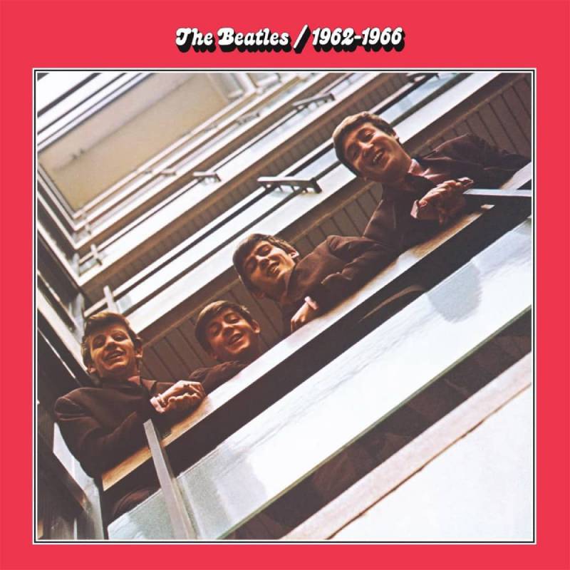
Why This Cover Stands Out
Four lads staring down at you from a stairwell. You’ve seen this shot a hundred times and it still hits.
Photographer Angus McBean originally took this at EMI House in London during the 1963 Please Please Me sessions. The Beatles asked him to recreate the same pose six years later for this compilation. Putting both eras on the same album made the red-tinted version of that original shot feel like a time capsule.
The Color Story
The entire cover is washed in a warm red tint. Labels, inner sleeves, spine. Everything red. It’s a simple choice that turned the album into an instantly recognizable object on any shelf.
Its companion, the Blue Album covering 1967-1970, uses the same stairwell shot from the later session. The red-blue pairing became one of the most famous examples of complementary color schemes in album design history.
Design Breakdown
Tom Wilkes designed both the red and blue covers. The layout is clean. Band photo dominates. No unnecessary typography fighting the image.
No text appeared on the original front cover beyond the title and years. That restraint was unusual for a 1973 compilation. It let the photograph do all the work.
Cover Art Credits
Photographer: Angus McBean Cover Designer: Tom Wilkes Label: Apple Records
Genre and Release Year
Rock and roll, pop, British Invasion. Originally released April 19, 1973. Remastered in 2010, then expanded and remixed in 2023 with additional tracks and new stereo mixes by Giles Martin. Check out a full overview of all the Beatles album covers to see how their visual identity changed over the years.
Where You’ve Seen It
Record shops always keep this one face-out. It’s the default “intro to The Beatles” gift. The 2023 expanded reissue brought it back into stores on red vinyl, which looked great but sold out fast. Vinyl collectors treat original Apple label pressings like gold.
Amnesiac by Radiohead
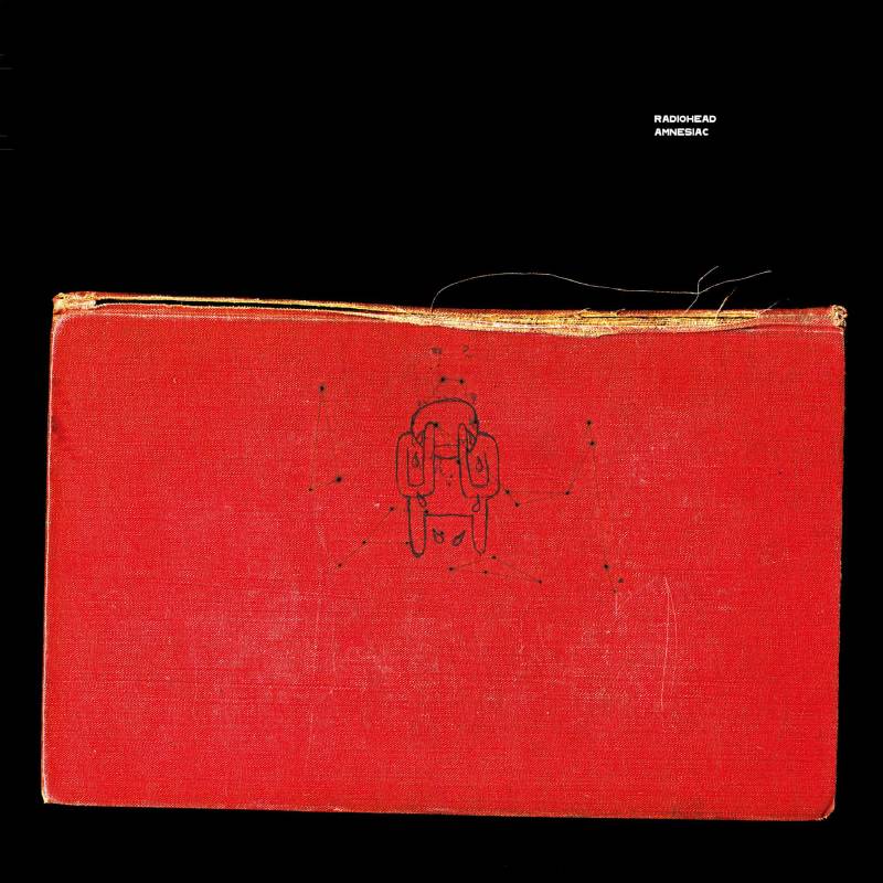
Why This Cover Stands Out
A crying Minotaur on the cover of a red book. It shouldn’t work. But it does, because the whole thing feels like a found object from someone else’s nightmare.
Stanley Donwood, who has designed every Radiohead album cover since The Bends, created the artwork alongside Thom Yorke. The two won a Grammy for Best Recording Package for Amnesiac’s special edition.
The Color Story
Deep, muted red. Not aggressive, not bright. More like dried blood or old leather. It matches the album’s themes of memory loss and disorientation.
The limited edition came with a hardback book. Donwood wanted it to feel like something you’d discover in the attic of an abandoned house.
Design Breakdown
The Minotaur was a character Donwood kept returning to. He described it as “a horrible creature that I felt sorry for because it knew nothing but how to be a monster.”
The cover references the idea of a personal journal or secret manuscript. No clean lines, no commercial shine. The visual hierarchy pushes you toward the weeping figure first, then the book’s edges, then the red background.
Cover Art Credits
Artist: Stanley Donwood and Thom Yorke (credited as “Dr. Tchock” and “The White Chocolate Farm”) Label: Parlophone / Capitol Records
Genre and Release Year
Experimental rock, electronic, art rock. Released May 30, 2001. Recorded during the same sessions as Kid A.
Where You’ve Seen It
Donwood’s original paintings for both Kid A and Amnesiac were auctioned at Christie’s in London in 2021. The crying Minotaur shows up on Radiohead fan merch constantly. The 2021 Kid A Mnesia reissue bundled both albums with previously unreleased artwork.
In the Court of the Crimson King by King Crimson
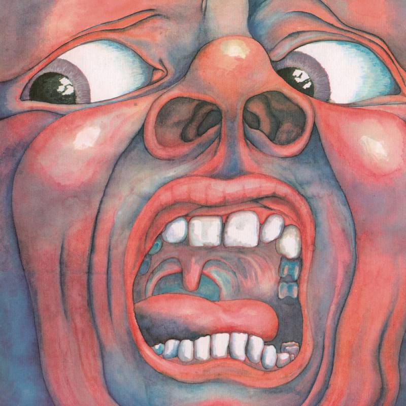
Why This Cover Stands Out
That screaming face. If you know, you know. If you don’t, you’ll never forget the first time you see it.
Barry Godber painted it in watercolors during the summer of 1969 after listening to early recordings of the album. He sat in front of a mirror and used his own face as the model. The band members stood around the finished painting on the studio floor and, according to Greg Lake, “this f*ing face screamed up at us.”
The Color Story
The reds and oranges burn against the blue background of the screaming mouth. It looks almost biological. Like muscle tissue and exposed nerves.
The saturation in the original watercolor is remarkable for such a small canvas that would be reproduced at LP size. The color intensity has held up across every reissue format for over fifty years.
Design Breakdown
No text on the front cover. Nothing. Just the painting.
Open the gatefold and there’s a second Godber painting showing the Crimson King. This face appears to be smiling, but Robert Fripp pointed out that if you cover the mouth, the eyes show “incredible sadness.” That duality between the two paintings mirrors the album’s shift between aggression and beauty.
Cover Art Credits
Artist: Barry Godber Label: Island Records
Godber died of a heart attack in February 1970 at age 24, just months after the album’s release. This was his only album cover. The original painting is now owned by Robert Fripp.
Genre and Release Year
Progressive rock. Released October 10, 1969. Often considered the first true prog rock album. Reached number 5 on the UK Albums Chart.
Where You’ve Seen It
Record store posters, prog rock documentaries, “best album covers” lists going back decades. Kanye West sampled the opening track “21st Century Schizoid Man” on his song “Power.” The cover regularly shows up on discussions about the psychology of color in music packaging.
Elephant by The White Stripes
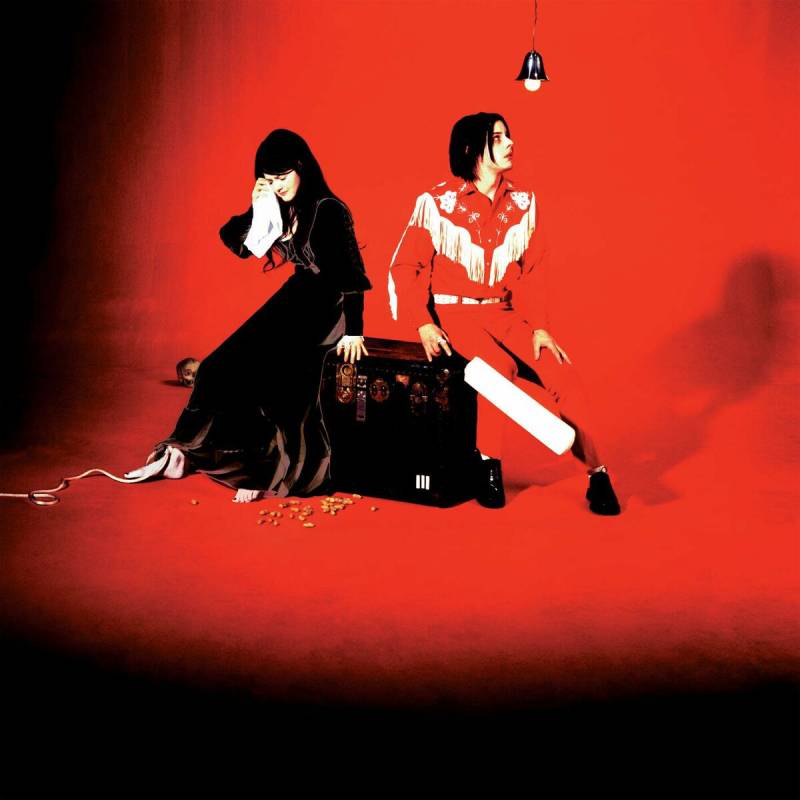
Why This Cover Stands Out
Jack and Meg White in a staged domestic scene, shot entirely in their signature red, white, and black palette. Meg looks distressed in a Loretta Lynn-style gown, dabbing her eye. Jack stares up at a bare lightbulb while holding a cricket bat.
It’s theatrical, deliberately old-fashioned, and slightly unsettling. Everything The White Stripes did visually was locked into those three colors, and this cover is the peak of that commitment.
The Color Story
Red, white, and black. Always. The band treated this as a strict brand guideline across everything: album covers, stage outfits, instruments, music videos. On Elephant, the red dominates the wardrobe and lighting while the background stays stark.
Design Breakdown
The composition feels like a still from a 1960s Southern Gothic film. Both subjects are dressed in formal vintage clothing. The lighting is dramatic and directional.
It works because the storytelling is immediate. You look at this cover and a narrative starts forming in your head before you even hear a note.
Cover Art Credits
Label: V2 Records / Third Man Records
Genre and Release Year
Garage rock, blues rock, alternative rock. Released April 1, 2003. Features “Seven Nation Army,” probably the most recognizable guitar riff of the 2000s.
Where You’ve Seen It
The red-white-black visual identity of The White Stripes has become a case study in music branding. The Elephant cover shows up in design discussions about how limiting your color choices can actually make artwork more memorable.
Anti by Rihanna
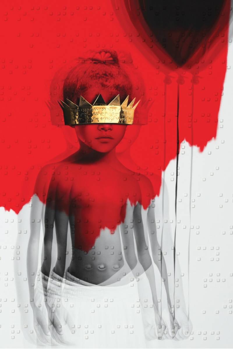
Why This Cover Stands Out
Rihanna as a child, wearing a crown and holding a black balloon, eyes covered by a red wash. The entire image is filtered through a grainy, blood-red tint that makes it look like a damaged Polaroid from another decade.
It’s nothing like what you’d expect from a pop superstar’s album cover. No glam shots, no stylized poses. Just a childhood photo turned into something haunting.
The Color Story
The red filter does almost all the heavy lifting here. It transforms an innocent childhood photo into something that feels private and raw.
The monochromatic red treatment ties into the album’s theme of defying expectations. Rihanna was done being what the industry wanted her to be. The monochrome color approach makes that point without a single word.
Design Breakdown
Israeli artist Roy Nachum created the cover. He added Braille text over the image, a poem by Chloe Mitchell. You can feel the raised lettering on physical copies.
It’s a multi-sensory album cover. That’s rare. The tactile Braille layer adds a dimension most album artwork never even considers.
Cover Art Credits
Artist: Roy Nachum Label: Roc Nation / Westbury Road
Genre and Release Year
R&B, pop, dancehall. Released January 28, 2016. Includes “Work” and “Needed Me.”
Where You’ve Seen It
The cover sparked conversations about accessibility in design when it launched. It’s been referenced in art school discussions about tactile design and how album packaging can go beyond the visual.
Songs for the Deaf by Queens of the Stone Age

Why This Cover Stands Out
A blood-red desert landscape with a road disappearing into darkness. The cover concept mirrors the album’s structure, which is built around the idea of driving through the California desert and flipping between radio stations.
Every visual element reinforces that road-trip-through-hell feeling.
The Color Story
Deep crimson red fading into black. The gradient from red to darkness across the cover mirrors the album’s shift from heavy riffs to eerie quiet and back again.
Design Breakdown
The artwork uses a stark silhouette style. The road and landscape are simplified into bold shapes. There’s a retro sci-fi quality to it, like a pulp novel cover from the 1970s.
The album title font is blocky and industrial. It sits heavy on the image without competing with the landscape.
Cover Art Credits
Label: Interscope Records
Genre and Release Year
Stoner rock, hard rock, desert rock. Released August 27, 2002. Features Dave Grohl on drums.
Where You’ve Seen It
A staple in rock vinyl collections. The red desert artwork shows up on band t-shirts and posters regularly. It’s become synonymous with the desert rock scene that Queens of the Stone Age helped define.
Power Up by AC/DC

Why This Cover Stands Out
The AC/DC lightning bolt logo lit up in neon red against a dark background. Nothing else. No band photo, no complex artwork. Just the logo, glowing like a sign on a dive bar at 2 AM.
It’s a tribute album to Malcolm Young, and the stripped-down cover fits the message: this is still AC/DC, nothing has changed, the power is still on.
The Color Story
Neon red on black. The glow effect gives the logo a physical presence, like it’s emitting actual light. It’s one of the simplest color applications on this list, and one of the most effective.
Design Breakdown
Pure minimalist design. The entire cover is the logo. No distractions, no supporting imagery. The neon treatment updates a classic mark without changing its structure.
This is what happens when your brand is strong enough to carry an album cover with nothing but a symbol. Most bands can’t pull this off. AC/DC can.
Cover Art Credits
Label: Columbia Records
Genre and Release Year
Hard rock. Released November 13, 2020. Their seventeenth studio album. You can explore more of AC/DC’s album covers and how their visual branding has stayed remarkably consistent across decades.
Where You’ve Seen It
The neon logo was used in a massive marketing push, lighting up billboards and building projections worldwide. Fans printed it on everything from jackets to phone cases. It’s arguably the cleanest album cover design AC/DC has ever released.
Starboy by The Weeknd

Why This Cover Stands Out
The Weeknd standing in a dark space with a cross made of neon light behind him. His face is partially lit in red, partially in shadow. The whole image feels cinematic, like a frame from a David Lynch film.
It captures the album’s themes of fame, excess, and self-destruction in a single shot.
The Color Story
Dark tones with neon red accents cutting through the blackness. The red isn’t warm here. It’s cold, clinical, almost surgical.
The hue choices create an atmosphere that feels nocturnal and isolating. It’s the kind of red you see in late-night cityscapes, not on a sunset.
Design Breakdown
Strong vertical symmetry with the neon cross. The Weeknd is positioned center frame, slightly off-axis. The lighting does all the compositional work.
The cover art connects to the album’s lead single aesthetic and the broader visual identity of The Weeknd’s Starboy era, which leaned heavily into a dark, luxurious look.
Cover Art Credits
Label: XO / Republic Records
Genre and Release Year
R&B, pop, electronic. Released November 25, 2016. Features collaborations with Daft Punk, including the title track.
Where You’ve Seen It
The neon cross visual became The Weeknd’s defining image for this album cycle. It appeared in music videos, tour visuals, and merch. The aesthetic influenced a wave of dark, neon-lit album covers across R&B and pop in the years that followed.
FAQ on Red Album Covers
Why do so many artists choose red for their album covers?
Red triggers strong emotional responses. It signals passion, urgency, and power, which makes it a natural fit for artists who want their album artwork to stand out in a crowded marketplace. It also performs well visually at small sizes on streaming platforms.
What is the most famous red album cover of all time?
King Crimson’s In the Court of the Crimson King (1969) is often cited as the most iconic. Barry Godber’s screaming face in watercolor remains one of the most recognized images in rock music history. The Beatles’ Red Album is another strong contender.
What does the color red symbolize in music packaging?
Red represents intensity, love, anger, and danger. In color theory, it’s the most attention-grabbing warm tone. Artists use it to set emotional expectations before the listener even presses play.
Who designed the cover for Kanye West’s My Beautiful Dark Twisted Fantasy?
Painter George Condo created five different cover artworks. Kanye West and Virgil Abloh handled art direction. The most recognized version features a winged creature on a deep red background, painted in Condo’s signature style of psychological cubism.
Are red album covers more popular in certain music genres?
Red shows up heavily in rock, hip hop, and pop. Hard rock and metal bands lean toward darker crimson tones, while pop artists often use brighter reds. R&B covers tend to mix red with moody lighting and emphasis on atmospheric tones.
What makes a red album cover design effective?
Strong graphic design principles matter more than the color alone. A good red cover balances the intensity of the hue with clear composition, readable text, and a concept that connects to the music inside the record.
How do red album covers look on vinyl versus digital formats?
Red pops on vinyl sleeves because of the larger surface area and print quality. On streaming thumbnails, red covers stand out against dark app interfaces. Designers working in CMYK for print need to watch for color shifts, since some reds look duller on paper.
What is Taylor Swift’s Red album cover about?
The cover shows Taylor with half her face in shadow, only her red lips visible. Photographers Sarah Barlow and Stephen Schofield shot it. The obscured face reflects the album’s themes of emotional confusion after a breakup.
Can I use red as the main color for my own album cover?
Absolutely. Red works across genres. Start with a color palette generator to find the right shade, then build your layout around one strong focal point. Too many competing elements on a red background will make the design feel chaotic.
What are some other albums with striking red cover art?
Beyond the classics, check out Rihanna’s Anti, The Weeknd’s Starboy, and AC/DC’s Power Up. For deeper cuts, look at St. Vincent’s MASSEDUCTION and Gang of Four’s Entertainment! You can also explore collections of blue album covers or pink album covers for different color-driven design approaches.
{ “@context”: “https://schema.org”, “@type”: “FAQPage”, “mainEntity”: [ { “@type”: “Question”, “name”: “Why do so many artists choose red for their album covers?”, “acceptedAnswer”: {

Renowned for his expertise in logo design and visual branding, Bogdan has developed a multitude of logos for various clients.
His skills extend to creating posters, vector illustrations, business cards, and brochures. Additionally, Bogdan's UI kits were featured on marketplaces like Visual Hierarchy and UI8.
He also wrote in the past years on sites like Design Your Way, WebDesignerDepot, WPDean, Designmodo, Speckyboy, Slider Revolution, and more.
- Canva vs PowerPoint: Which Is Better for Presentations? - 22 September 2026
- How to Install Fonts on Mac (Step-by-Step Guide) - 20 September 2026
- From Mockup to Code: How AI-Augmented Development Speeds Up the Design Handoff - 19 September 2026

Bogdan Sandu is a seasoned designer who has been designing websites since 2008. Renowned for his expertise in logo design and visual branding, Bogdan has developed a multitude of logos for various clients. His skills extend to creating posters, vector illustrations, business cards, and brochures. Additionally, Bogdan's UI kits were featured on marketplaces like Visual Hierarchy and UI8. He also wrote in the past years on sites like Design Your Way, WebDesignerDepot, WPDean, Designmodo, Speckyboy, Slider Revolution, and more.
You Might Also Like


