


Mariah Carey has sold over 220 million records. But before anyone ever heard a single note, they saw the cover.
Mariah carey album covers tell a visual story that spans over three decades of pop, R&B, and hip-hop. From her self-titled debut on Columbia Records in 1990 to Caution on Epic Records in 2018, each piece of album artwork reflects a different chapter in her music career.
Some covers became iconic. Others got overlooked. A few were genuinely ahead of their time in terms of photography and art direction.
This article breaks down the best covers in her discography, looking at the photographers behind the shots, the color choices, the design decisions, and how each cover connects to the music inside. Whether you’re a longtime fan or just curious about music packaging design, you’ll walk away with a deeper appreciation for the visual side of one of the best-selling artists of all time.
The Best Mariah Carey Album Covers
Butterfly

Year and Record Label
Released in 1997 through Columbia Records. This was Carey’s sixth studio album and a turning point in her discography.
Cover Photographer
Michael Thompson shot the cover. He captured Carey in a close, intimate frame that felt very different from her earlier work.
Visual Description
Carey appears in a soft, dreamy close-up. Her hair flows loosely around her face. The lighting is warm and diffused.
Two versions of the cover exist. One was later listed among the sexiest album covers by Maxim magazine.
Color Palette and Mood
Warm golden and amber tones dominate. The overall mood is vulnerable, reflective. There’s a softness here that mirrors the album’s emotional depth.
If you’re curious about how specific color names translate across design formats, the warm honey tones on this cover are a good reference point.
Design Style and Artistic Choices
Stripped back. No elaborate sets, no props. Just Carey and the camera. The emphasis is entirely on her expression.
This was a deliberate shift from the more polished, commercial look of earlier records. It fits the album’s theme of personal freedom.
Connection to the Album’s Music
Butterfly marked Carey’s transition into hip-hop and R&B territory, working with Sean “Puffy” Combs, Q-Tip, and Missy Elliott. The cover reflects that shift. Less corporate pop star, more artist finding her own voice.
The title track itself is about letting go. The cover art communicates that same release.
Why This Cover Stands Out
It’s one of the few Carey covers where she looks genuinely unguarded. Most fans and critics consider it her artistic peak, both musically and visually. It made the list of 1001 Albums You Must Hear Before You Die.
Daydream

Year and Record Label
Released October 3, 1995. Columbia Records. Fifth studio album.
Cover Photographer
Steven Meisel handled the photography. He’s one of the biggest names in fashion photography, known for his work with Italian Vogue and campaigns for major brands. Art direction was by Aimee Macauley.
Visual Description
A black-and-white close-up. Carey’s hair is windblown, covering parts of her face. She’s wearing dark clothing. Her teeth are slightly visible in a subtle, almost trance-like expression.
The image was cropped from the same session used for the “Fantasy” single cover.
Color Palette and Mood
Entirely monochrome. Black, white, and shades of gray. The mood is introspective and dreamy, which is exactly what the album title suggests.
Design Style and Artistic Choices
Meisel made a deliberate choice to keep things minimal. No background distractions. The focal point is locked on Carey’s face and that far-off gaze.
The black-and-white treatment gives the cover a timeless, almost editorial quality. It could pass for a high-end magazine spread.
Connection to the Album’s Music
Daydream was the bridge between Carey’s pop beginnings and her later hip-hop-influenced sound. It features “Fantasy,” “One Sweet Day” with Boyz II Men, and “Always Be My Baby.” The cover captures that transitional energy. Not fully one thing or the other.
Why This Cover Stands Out
The album went diamond (11x platinum). The cover photography matched its ambition. Steven Meisel brought a fashion-world sensibility that set it apart from typical 90s pop packaging.
The Emancipation of Mimi

Year and Record Label
April 12, 2005. Island Records. Carey’s tenth studio album and her definitive comeback record.
Cover Photographer
Markus Klinko and Indrani shot the cover. Klinko is known for creating some of the most recognizable album covers of the 2000s, including Beyonce’s Dangerously in Love and David Bowie’s album artwork.
Visual Description
Carey is photographed from a slightly elevated angle. The shot shows her full upper body with warm skin tones and soft lighting. She looks confident but relaxed.
A limited edition digipak was released with a different, more close-up version of the cover after fans noted her skin appeared darker than usual in the original.
Color Palette and Mood
Warm earth tones. Golds and browns with a rich, glowing quality. The mood says celebration, self-assurance. A woman who’s been through the worst and come out fine.
Design Style and Artistic Choices
Klinko and Indrani aimed for sexy but mature. The creative direction moved away from the more provocative Rainbow-era artwork and the muted Charmbracelet cover. It hit that middle ground well.
The balance between showing personality and keeping things classy is what makes this cover work. Carey had input on the direction, specifically wanting to retain her appeal without going overboard.
Connection to the Album’s Music
The album title uses Carey’s personal nickname “Mimi,” something only close friends and family called her. L.A. Reid suggested it. That intimacy carries through to the cover.
Musically, it produced “We Belong Together” and “Shake It Off.” The best-selling album of 2005. Eight Grammy nominations, three wins.
Why This Cover Stands Out
It’s the visual representation of the biggest comeback story in pop music at the time. After the Glitter disaster, this cover radiates control and reinvention. Over 10 million copies sold worldwide.
Mariah Carey (Self-Titled Debut)

Year and Record Label
June 12, 1990. Columbia Records. The album that started everything.
Cover Photographer
Kip Meyer photographed the debut cover. He’s a photographer based between New York and London, known for his fashion magazine work with subjects like Oprah Winfrey, Cameron Diaz, and Halle Berry.
Visual Description
An understated close-up of a young Carey with her signature curly hair. The shot is dark and moody. Very little else going on in the frame. White lettering for her name provides the only brightness against the shadowy background.
Color Palette and Mood
Dark, almost somber tones. The limited color palette is mostly deep browns and blacks. It gives off a serious, “take me seriously as an artist” vibe that suited a debut from a then-unknown singer.
Design Style and Artistic Choices
Meyer kept it simple on purpose. No props, no scenery. Just Carey’s face and those curls. The darkness of the shot lets her features do all the work.
At the time, Columbia was positioning Carey as the next Whitney Houston. The cover reflects that serious, vocal-powerhouse branding.
Connection to the Album’s Music
This album gave us “Vision of Love,” which is credited with bringing melismatic singing into mainstream pop. Four consecutive number-one singles from a debut. The cover’s quiet confidence mirrors a young woman who was about to change the game.
Why This Cover Stands Out
15 million copies sold. Nine-times platinum in the US. But the cover itself is remarkable for its restraint. No gimmicks. It lets the music speak. Spent 11 consecutive weeks at number one on the Billboard 200.
Music Box

Year and Record Label
August 1993. Columbia Records. Third studio album.
Cover Photographer
Daniela Federici took the photograph. She’s a photographer, director, and producer who has worked with artists like Lenny Kravitz, Radiohead, and Toni Braxton across albums and magazines.
Visual Description
Black-and-white close-up. Carey rests her chin on her hand, giving a soft, smoldering half-smile. Her skin looks flawless. No props, no backgrounds. Just her.
Color Palette and Mood
Pure black and white. The effect is calming and intimate. Like leafing through a collection of black and white album covers from the golden era of music photography.
Design Style and Artistic Choices
Federici went for a clean, magazine-quality portrait. No special effects, no elaborate staging. The decision to shoot in black and white gives it a timeless quality that still holds up decades later.
Connection to the Album’s Music
Music Box was Carey broadening her reach into pop and R&B territory. It contains “Dreamlover,” “Hero,” and her cover of “Without You.” The simple, warm cover design matches the accessible, crowd-pleasing nature of the music.
Why This Cover Stands Out
This is still Carey’s best-selling album. Over 28 million copies worldwide. Diamond certified. The cover’s understated elegance has aged better than most 90s album artwork. It doesn’t scream any particular era.
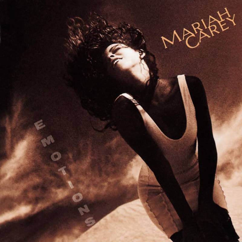
Emotions
Year and Record Label
September 17, 1991. Columbia Records. Second studio album.
Cover Photographer
Phillip Dixon captured the cover. He’s a world-renowned photographer who has worked with Blondie, Rod Stewart, Sheena Easton, and Chaka Khan.
Visual Description
Carey appears in warm, golden lighting. A shadow falls across her body while her face stays illuminated. She looks expressive, almost lost in thought. The composition creates a feeling of movement and emotion.
Color Palette and Mood
Rich golden hues throughout. The warm saturation gives the image an almost painterly quality. The mood is reflective and sensual.
Design Style and Artistic Choices
Dixon used shadow and light to create a dramatic effect. The play between illuminated face and shadowed body adds depth. This was a more colorful approach compared to what came before and after (the debut’s dark tones and Music Box’s black-and-white treatment).
Connection to the Album’s Music
Emotions drew heavily from 1950s, 60s, and 70s R&B and gospel influences. Carey worked with C+C Music Factory and Carole King. The title track hit number one, making her the only artist at the time to have their first five singles top the Billboard Hot 100.
Why This Cover Stands Out
The cover’s warm tone and emotional expressiveness match the album’s name perfectly. It sold 8 million copies worldwide and showed Carey starting to take creative control of her image. Dixon caught something real here.
Caution

Year and Record Label
November 16, 2018. Epic Records. Fifteenth studio album.
Cover Photographer
An Le photographed the cover. Makeup was by Kristofer Buckle, with Victoria Pavon producing the shoot.
Visual Description
A sharp departure from her previous covers. Carey stares directly into the camera with an intense, almost confrontational gaze. The image has a blue-pink tint that gives it a modern, editorial feel. She’s shot from her signature left side.
Color Palette and Mood
Cool blues and purples with hints of pink. This was a radical shift from the warm tones Carey had used for decades. The mood is bold and assertive. Maybe even a little defiant.
The contrast between the cool tones and Carey’s warm skin creates a striking visual tension.
Design Style and Artistic Choices
The art direction broke from almost every pattern in Carey’s cover history. Bold color grading, direct eye contact, and a less-is-more composition. A limited edition alternate cover with a pink color shift was also released through her online store.
Connection to the Album’s Music
Caution is a lean 10-track R&B, pop, and hip-hop record. Collaborators include Blood Orange, Ty Dolla Sign, Slick Rick, and Gunna. Critics called it her most cohesive work in over a decade. The stripped-back cover mirrors that focused, no-filler approach.
Why This Cover Stands Out
It proved Carey could still surprise people visually after nearly three decades. The album debuted at number five on the Billboard 200. Critically acclaimed. The cover feels like it belongs in 2018 rather than trying to recreate past glories.
Merry Christmas

Year and Record Label
October 28, 1994. Columbia Records. Her first holiday album.
Cover Photographer
Daniela Federici shot this cover as well, her second collaboration with Carey after Music Box.
Visual Description
Carey wears a red and white outfit with what appears to be snow falling around her. Her smile is big and bright. The composition is festive without being tacky. Federici created the illusion of a snowy setting right there in the studio.
Color Palette and Mood
Red, white, and black. Classic Christmas colors, but restrained enough to not look like a greeting card. The mood is joyful and warm, obviously. It’s Christmas.
Design Style and Artistic Choices
Simple concept, strong execution. The fake snow effect works because it’s not overdone. The red-and-white color scheme keeps things clean. The design follows basic graphic design principles well: limited palette, clear subject, strong color association.
Connection to the Album’s Music
This is the album that gave the world “All I Want for Christmas Is You,” which went on to become one of the best-selling singles of all time. The cover established the visual identity of Carey as a Christmas icon decades before she was officially dubbed the “Queen of Christmas.”
Why This Cover Stands Out
The album is diamond certified. Over 15 million copies sold worldwide. The cover art has become almost as recognizable as the music itself. Every holiday season, this image resurfaces everywhere. It’s become part of the cultural fabric of Christmas.
Rainbow
Year and Record Label
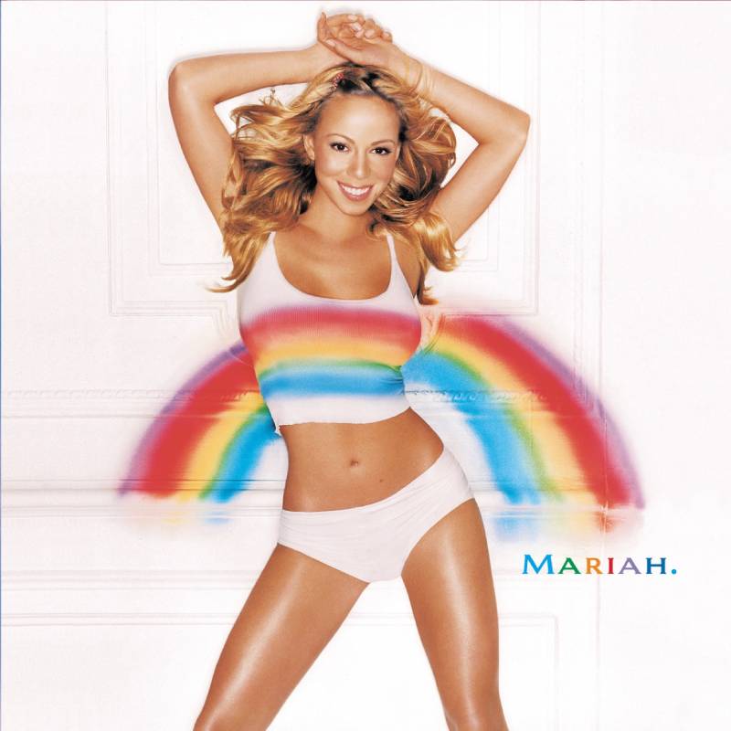
November 1999. Columbia Records. Seventh studio album.
Cover Photographer
David LaChapelle shot the Rainbow cover. LaChapelle is one of the most well-known commercial and fine art photographers working today, with clients including Lady Gaga, Michael Jackson, and Katy Perry.
Visual Description
Carey stands in what appears to be outdoor scenery wearing a white top with one shoulder strap. Her hair is windblown. She has a bright smile, and the background features a mix of purple and gold lighting that suggests motion, like cars driving by at night.
Her name on the cover is written in rainbow-colored text.
Color Palette and Mood
Purple, gold, and warm highlights. The gradient of colors in the background creates a sense of energy and movement. The mood is fun, flirty, and confident.
Design Style and Artistic Choices
LaChapelle pulled the camera back more than most Carey covers. This isn’t a tight close-up. You see more of her figure and the environment, which gives it a different feel. The rainbow-colored text was a playful, literal nod to the album title.
Connection to the Album’s Music
Rainbow features “Heartbreaker” (with Jay-Z), “Thank God I Found You,” and “Can’t Take That Away.” It was her last album before leaving Columbia Records. The cover’s playful, almost defiant energy makes sense when you know the context: Carey was fighting for more creative freedom.
Why This Cover Stands Out
Over 8 million copies sold. But the real story is how the cover captures a woman at a crossroads. LaChapelle’s photography brought more visual ambition to the packaging than almost any other Carey release up to that point. The guy knows how to make things look alive.
Memoirs of an Imperfect Angel

Year and Record Label
September 29, 2009. Island Records / Def Jam Recordings. Twelfth studio album.
Cover Photographer
Alexei Hay photographed the front cover and additional Carey images for the album’s companion Elle mini-magazine, a 34-page booklet that came with the first million US copies. Joe Zee handled creative direction for the Elle booklet.
Visual Description
The cover uses three separate images of Carey arranged together. She chose this approach deliberately because, as she put it, there are many different emotions and stories on the album. The triptych layout was unusual for a Carey release.
Color Palette and Mood
Muted, warm tones with gold-foil printing for the title text. The overall look is luxurious but subdued. Reflective, like the title suggests.
Design Style and Artistic Choices
The triple-image format stands out in her discography. Most Carey covers use a single photograph. The inclusion of a full Elle mini-magazine as the liner notes (with ads to offset production costs) was a creative packaging move that blurred the line between album and fashion editorial.
The typography choice for the title is elegant. The gold foil on the front and back adds a premium feel to the physical packaging.
Connection to the Album’s Music
Carey worked almost exclusively with The-Dream and Tricky Stewart. The result is her most sonically consistent album. “Obsessed,” “H.A.T.E.U.,” and “It’s a Wrap” (which went viral in 2023) are the highlights. The muted, intimate cover design matches the album’s late-night, slow-jam character.
Why This Cover Stands Out
It’s the most “editorial” of all her covers. The Elle partnership was ahead of its time in terms of album packaging concepts. Debuted at number three on the Billboard 200. Went platinum. Critics called it her most interesting album in a decade, and the cover reflects that same sense of creative risk.
FAQ on Mariah Carey Album Covers
How many studio albums does Mariah Carey have?
Mariah Carey has released sixteen studio albums as of 2025. Her discography spans from her self-titled debut in 1990 on Columbia Records to Here for It All on Gamma. Each record features distinct album artwork reflecting that era of her music career.
Who photographed Mariah Carey’s most famous album covers?
Several top photographers shot her covers. Steven Meisel photographed Daydream, Michael Thompson shot Butterfly, and Markus Klinko handled The Emancipation of Mimi. Daniela Federici captured both Music Box and Merry Christmas. David LaChapelle photographed Rainbow.
Which Mariah Carey album cover is considered the best?
Most fans and critics point to Butterfly (1997). Its warm, intimate close-up by Michael Thompson broke from her earlier polished look. The vulnerability in the shot matched the album’s artistic shift toward hip-hop and R&B, making it a standout in her visual identity.
Why are most Mariah Carey album covers close-up portraits?
Carey has consistently chosen portrait-style album cover photography over graphic-heavy designs. Her approach keeps the focus on her face and expression rather than elaborate sets. It’s a branding decision that has stayed consistent across three decades of releases.
What is the album cover for Merry Christmas?
Daniela Federici photographed Carey in a red and white outfit with a simulated snow effect. The Christmas album cover uses a simple red, white, and black color scheme. It’s become one of the most recognizable holiday album images in pop music history.
Did Mariah Carey have alternate album covers?
Yes. Both Butterfly and Caution were released with alternate cover versions. The Emancipation of Mimi also got a limited edition digipak with a different close-up shot after feedback about the original. Alternate covers were often sold through her online store or as limited pressings.
How did Mariah Carey’s album cover style change over the years?
Her early covers on Columbia Records were dark and understated. By the late 90s, she shifted to warmer, more personal imagery. The 2000s brought bolder art direction through Island and Def Jam. Caution in 2018 introduced cool blue tones, a sharp departure from her usual warm palette.
What makes The Emancipation of Mimi cover special?
Markus Klinko and Indrani photographed it. The cover balanced confidence with maturity, reflecting Carey’s comeback after the Glitter era. It became the visual identity of the best-selling album of 2005, moving over 10 million copies worldwide on Island Records.
Are Mariah Carey’s album covers available on vinyl?
Yes. Most of her catalog has been reissued on vinyl, including limited edition colored pressings. Anniversary editions for Butterfly, Music Box, Rainbow, Merry Christmas, and The Emancipation of Mimi have all featured the original album artwork on full-sized vinyl record covers.
Who designed the artwork for Mariah Carey’s debut album?
Photographer Kip Meyer shot the self-titled debut cover in 1990. It’s a dark, moody close-up with minimal styling. The understated design let Carey’s face carry the entire cover, setting the template for her portrait-based album artwork approach going forward.
Conclusion
Looking back at Mariah Carey album covers, you see more than just cd cover designs. You see an artist’s visual evolution across 16 studio albums, multiple record labels, and over 220 million records sold.
Each cover reflects a specific moment. The moody debut shot by Kip Meyer. Steven Meisel’s black-and-white editorial work on Daydream. An Le’s bold blue-toned Caution artwork that broke every pattern she’d established.
The photographers, art directors, and creative teams behind these images shaped how millions of listeners experienced her music before pressing play. That’s the power of strong album artwork.
Whether you’re collecting vinyl reissues or browsing digital covers on Spotify and Apple Music, the visual side of Carey’s catalog is worth paying attention to. The music speaks for itself. But these covers told the story first.

Renowned for his expertise in logo design and visual branding, Bogdan has developed a multitude of logos for various clients.
His skills extend to creating posters, vector illustrations, business cards, and brochures. Additionally, Bogdan's UI kits were featured on marketplaces like Visual Hierarchy and UI8.
He also wrote in the past years on sites like Design Your Way, WebDesignerDepot, WPDean, Designmodo, Speckyboy, Slider Revolution, and more.
- Best Visual Regression Testing Tools for Web and App Design in 2026 - 13 October 2026
- Jujutsu Kaisen Font Generator - 12 October 2026
- The Windsurf Logo History, Colors, Font, And Meaning - 10 October 2026

Bogdan Sandu is a seasoned designer who has been designing websites since 2008. Renowned for his expertise in logo design and visual branding, Bogdan has developed a multitude of logos for various clients. His skills extend to creating posters, vector illustrations, business cards, and brochures. Additionally, Bogdan's UI kits were featured on marketplaces like Visual Hierarchy and UI8. He also wrote in the past years on sites like Design Your Way, WebDesignerDepot, WPDean, Designmodo, Speckyboy, Slider Revolution, and more.
You Might Also Like


