Some album covers hit harder without color. Strip away the palette and what’s left is pure composition, raw emotion, and design choices that have to work ten times harder.
Black and white album covers have defined some of the most iconic moments in music history. From The Beatles’ blank White Album to Joy Division’s pulsar wave art, these monochrome sleeves prove that restraint often makes a bigger visual statement than complexity.
And this isn’t just a vintage thing. Artists like Taylor Swift, Kendrick Lamar, and Adele have all chosen grayscale artwork for career-defining records.
This article breaks down the best black and white album covers, what makes their design work, and why musicians keep coming back to this approach. Whether you’re into album cover photography, vinyl sleeve design, or just love great music artwork, you’ll find something worth studying here.
Best Black and White Album Covers
The Beatles – The White Album (1968)
Why This Cover Works
It’s literally nothing. And that’s the whole point.
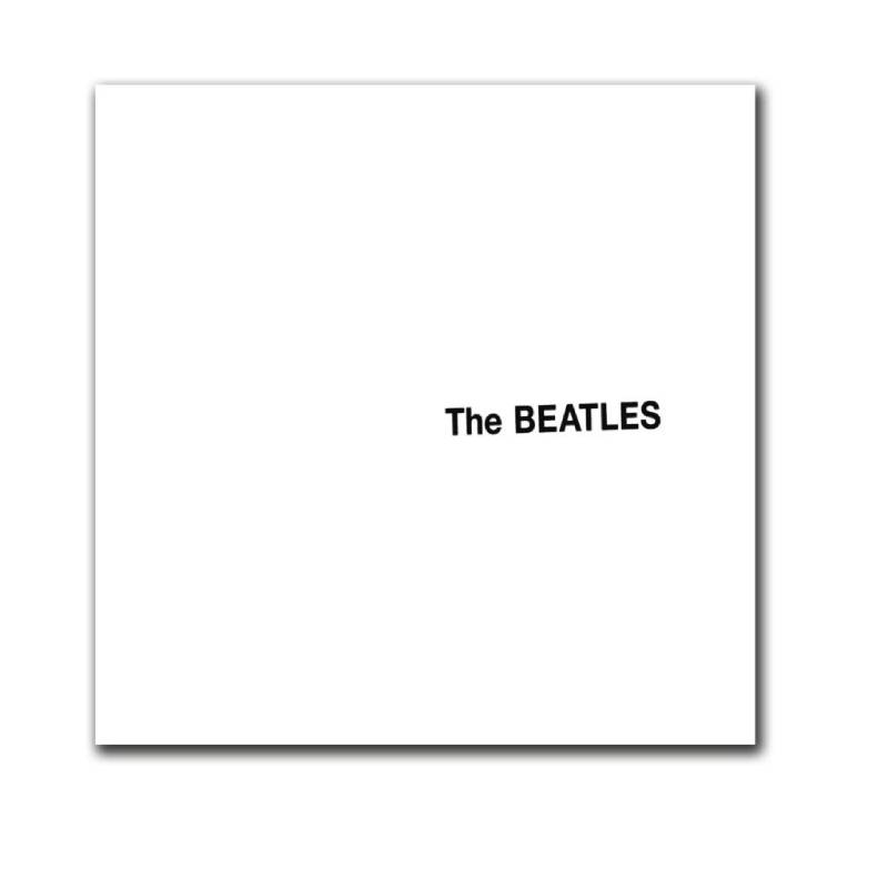
After the sensory overload of Sgt. Pepper’s Lonely Hearts Club Band, The Beatles went the opposite direction. A plain white sleeve with the band’s name blind embossed in Helvetica. No images. No color. Nothing to distract from the music inside.
The first 2 million copies carried unique serial numbers, turning mass-produced vinyl into a numbered limited edition. That’s a pretty clever move if you think about it.
The Visual Concept
Pop artist Richard Hamilton designed the sleeve in collaboration with Paul McCartney. Hamilton’s earlier ideas included a coffee cup ring stain on the cover and impregnating the sleeve with apple pulp. Both were rejected.
The final result was a glossy white gatefold LP. The band’s name sat slightly off-center, a little crooked. That imperfection was intentional.
Hamilton intended it as conceptual art for the masses. And the minimalist design ended up becoming one of the most referenced album covers of all time.
Design Breakdown
- Designer: Richard Hamilton
- Typography: Helvetica, blind embossed
- Format: Double gatefold LP with poster insert and four portrait photographs
- Concept: Anti-design as a response to Sgt. Pepper’s visual excess
Album Details
Released November 22, 1968 on Apple Records. 30 tracks across two discs. Genres range from folk and country rock to hard rock and avant-garde. It’s widely considered one of the greatest albums ever recorded.
Who Should Care About This Cover
Graphic designers studying the power of restraint. Musicians looking for proof that less really can be more. Anyone interested in how album cover art became a form of fine art.
Joy Division – Unknown Pleasures (1979)
Why This Cover Works
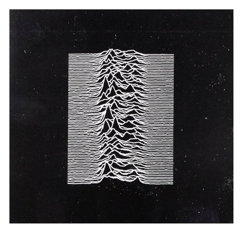
No band name. No album title. Just white lines on black. And somehow, everyone knows exactly what it is.
Peter Saville’s cover for Unknown Pleasures is probably the most reproduced piece of record sleeve artwork in history. You’ve seen it on t-shirts, posters, phone cases, and even a Disney product with Mickey Mouse ears added on top.
The Visual Concept
The image shows stacked radio wave emissions from pulsar CP 1919, the first pulsar ever discovered. Drummer Bernard Sumner found it in The Cambridge Encyclopedia of Astronomy and brought it to Saville.
Saville reversed the original image (which was black lines on white) to create the now-iconic white-on-black version. He was 22 years old at the time, fresh out of college.
The total absence of text made the cover feel cryptic and untouchable. It fits the post-punk aesthetic of contrast between darkness and detail perfectly.
Design Breakdown
- Designer: Peter Saville with Chris Mathan
- Image source: Data visualization of pulsar CP 1919 by Harold Craft (1970 PhD thesis)
- Format: 12″ x 12″ lithograph, no text on front cover
- Label: Factory Records
Album Details
Released June 15, 1979. The only Joy Division album released during lead singer Ian Curtis’s lifetime. Produced by Martin Hannett at Strawberry Studios in Stockport. No singles were released from the album.
It’s now held in the permanent collection at MoMA in New York.
Who Should Care About This Cover
Data visualization enthusiasts. Anyone interested in how Swiss design principles can influence music packaging. People who appreciate that sometimes the best branding is no branding at all.
Adele – 21 (2011)
Why This Cover Works
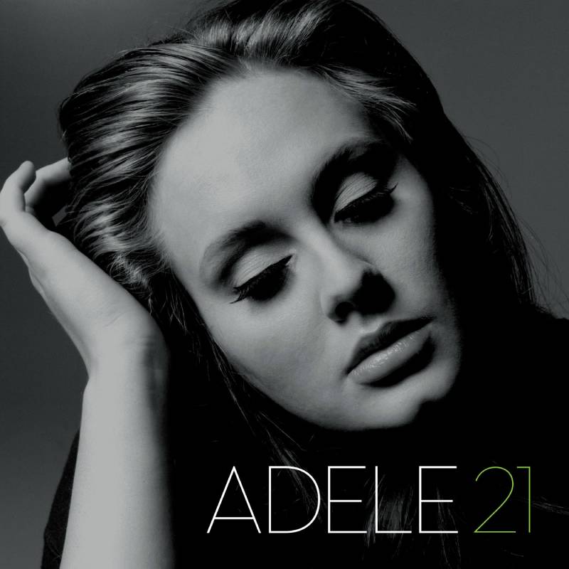
Simple portrait. Side profile. High contrast black and white. The number 21 in the corner. That’s it.
Adele’s sophomore album sold over 31 million copies worldwide, and the cover played its part. It communicates maturity and emotional weight without trying too hard.
The Visual Concept
Photographer Lauren Dukoff captured Adele in a classic close-up with soft lighting and deliberate shadow play. Adele doesn’t look at the camera on either the 19 or 21 covers. She looks away, drawing you into whatever she’s thinking about.
The grayscale palette strips away any distraction. What you’re left with is raw vulnerability, which is exactly what the album sounds like.
Design Breakdown
- Photographer: Lauren Dukoff
- Style: High contrast monochrome portrait photography
- Title treatment: The number “21” as a simple typographic element
- Naming convention: Part of Adele’s age-based album titling (19, 21, 25, 30)
Album Details
Released January 24, 2011 on XL Recordings and Columbia Records. Features “Rolling in the Deep,” “Someone Like You,” and “Set Fire to the Rain.” Won six Grammy Awards including Album of the Year.
Who Should Care About This Cover
Portrait photographers looking for a masterclass in lighting for black and white. Musicians who want a cover that ages well. Pop culture fans interested in how consistent visual branding builds an artist’s identity over time.
Metallica – Metallica / The Black Album (1991)
Why This Cover Works
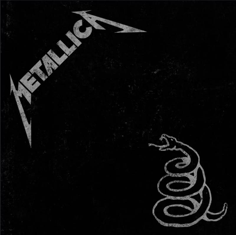
The biggest metal band on the planet put out an almost entirely black cover. No artwork. No flash. Just a coiled snake you can barely see.
James Hetfield summed it up: “Here it is, black sleeve, black logo, f* you.”
Lars Ulrich came up with the idea after flipping through a heavy metal magazine and noticing how every album ad looked the same. He wanted something that would stand apart by standing for nothing visually.
The Visual Concept
The cover features the Metallica logo embossed in dark grey on the top left corner. In the bottom right sits a barely visible coiled rattlesnake taken from the Gadsden flag, a 1775 American War of Independence symbol. It references the album track “Don’t Tread on Me.”
People compared it to The Beatles’ White Album in reverse, or to Spinal Tap’s Smell the Glove. The band leaned into the humor, even featuring Spinal Tap members in their behind-the-scenes documentary joking about it.
Design Breakdown
- Color scheme: Near-total black with embossed grey elements
- Imagery: Coiled rattlesnake from the Gadsden flag
- Interior art: Monochrome tones, slate-grey text, crude member headshots
- Concept: Stripped-back emphasis on the music over visual packaging
Album Details
Released August 12, 1991 on Elektra Records. Produced by Bob Rock. Debuted at number one on the Billboard 200. Certified 16x platinum in the US with over 30 million copies sold worldwide.
Who Should Care About This Cover
Anyone designing for the rock or metal space. Fans of record sleeve design that proves you don’t need complexity to make an impact. Brand strategists studying how a color (or lack of it) can become a product’s identity.
Kendrick Lamar – To Pimp a Butterfly (2015)
Why This Cover Works
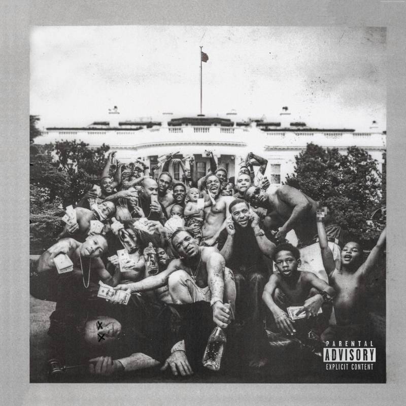
A group of shirtless Black men from Compton posing on the White House lawn, flaunting cash and bottles, standing over a dead judge. All in black and white. It’s one of the most politically charged album covers of the 2010s.
Nothing about this image is accidental.
The Visual Concept
French photographer Denis Rouvre shot the image under the creative direction of Kendrick Lamar and TDE CEO Dave Free. The monochrome treatment gives the photo a documentary feel, like something ripped from a history textbook that hasn’t been written yet.
The White House backdrop turns the whole composition into a statement about race, power, and who gets to occupy America’s most symbolic space. Lamar himself appears in the crowd if you look closely.
Design Breakdown
- Photographer: Denis Rouvre
- Creative direction: Kendrick Lamar and Dave Free
- Style: Black and white documentary-style group portrait
- Special features: CD and vinyl booklets included braille text hiding a secret message
Album Details
Released March 15, 2015 on Top Dawg Entertainment, Aftermath, and Interscope Records. Blends hip-hop with jazz, funk, and soul. Won Best Rap Album at the 2016 Grammy Awards and earned 11 total nominations that year.
Ranked 19th on Rolling Stone’s 2020 list of the 500 Greatest Albums of All Time.
Who Should Care About This Cover
Fans of album artwork that functions as social commentary. Hip-hop historians. Anyone interested in how storytelling through photography can match the depth of the music it represents.
Johnny Cash – American IV: The Man Comes Around (2002)
Why This Cover Works
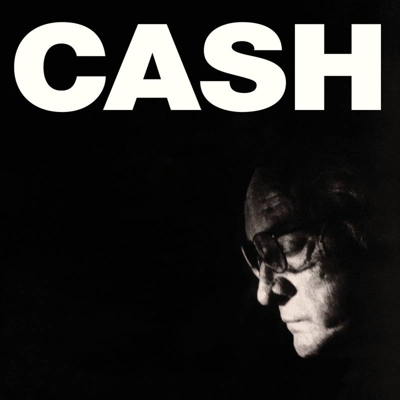
Johnny Cash looks directly into the camera. He’s old, tired, and completely unbothered by it. The black and white portrait captures a man at the end of his life who still has something to say.
There’s no styling. No production. Just a face that has lived through decades of music, addiction, prison concerts, and comeback records.
The Visual Concept
The cover portrait shows Cash in stark grayscale, his expression carrying the weight of the album’s themes: mortality, faith, and looking back on a life fully lived. It was the final studio album released during his lifetime.
The stripped-down photography mirrors the stripped-down production from Rick Rubin. Everything unnecessary has been removed.
Design Breakdown
- Style: Close-up black and white portrait with high saturation of dark tones
- Approach: Raw, unretouched photography that matches the album’s acoustic intimacy
- Label: American Recordings / Lost Highway
Album Details
Released November 5, 2002. The fourth installment in Cash’s American Recordings series produced by Rick Rubin. Includes the now-legendary cover of Nine Inch Nails’ “Hurt.” Cash passed away on September 12, 2003.
Who Should Care About This Cover
Portrait photographers. Country and Americana fans. Anyone studying how album cover photography can become more powerful by doing less.
Taylor Swift – folklore (2020)
Why This Cover Works
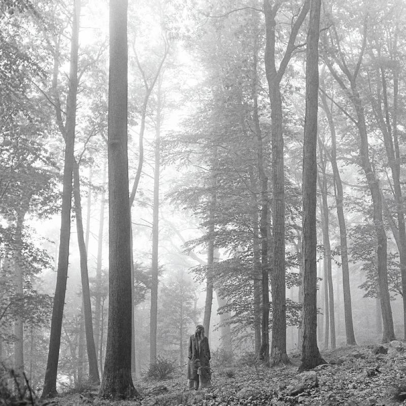
Taylor Swift, alone in a forest, looking up. Coat on in the middle of summer. Black and white. It was a total departure from the candy-colored Lover era, and fans lost their minds over it.
The cover announced a new artistic direction before anyone heard a single note.
The Visual Concept
Photographer Beth Garrabrant shot the series in wooded areas near Austin, Texas. Swift envisioned the album’s visuals in black and white from the start. References included Surrealist work, early autochromes, ambrotypes, and 1940s photo storybooks.
Garrabrant typically shoots in color, so the monochrome treatment was new territory for her too. The result is a series that feels intimate, timeless, and a little mysterious.
The small, solitary figure against a massive natural backdrop creates a strong focal point and a sense of scale that matches the album’s introspective tone.
Design Breakdown
- Photographer: Beth Garrabrant
- Setting: Wooded outdoor location, natural light
- Typography: Lowercase “folklore” in a clean serif, keeping the quiet mood
- Variants: Multiple cover editions released simultaneously
Album Details
Surprise-released on July 24, 2020 during lockdown. Produced with Aaron Dessner and Jack Antonoff. Debuted at number one on the Billboard 200 and spent eight weeks at the top. Won Album of the Year at the 2021 Grammys.
Who Should Care About This Cover
Fans of Taylor Swift album covers and her visual evolution. Photographers exploring natural light portraiture. Anyone interested in how a mood board can translate into an entire album identity.
Arctic Monkeys – AM (2013)
Why This Cover Works
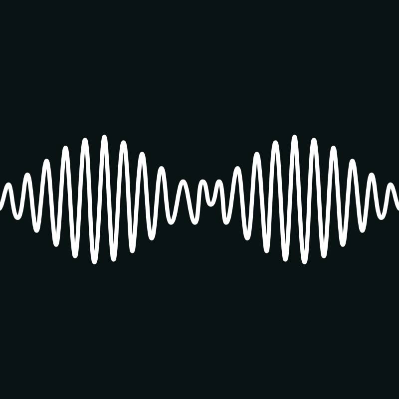
A sine wave. That’s it. A simple waveform illustration on a black background with “AM” underneath. It could be a sound wave, a heartbeat monitor, or just a clean piece of graphic art.
And it works because it tells you exactly what the album sounds like: sleek, rhythmic, and confident.
The Visual Concept
The design was created in-house and reflects the band’s shift toward a heavier, more refined sound influenced by hip-hop and R&B. The waveform reads as both scientific and musical, much like Joy Division’s Unknown Pleasures cover, which it knowingly references.
The monochrome palette keeps things cool and composed. No band photos. No location shots. Just a logo and a waveform.
Design Breakdown
- Imagery: Amplitude modulation waveform (a nod to the “AM” title)
- Color: White on black
- Typography: Simple sans-serif “AM” below the waveform
- Style: Clean vector-style illustration
Album Details
Released September 9, 2013 on Domino Recording Co. Produced by James Ford and Ross Orton. Features “Do I Wanna Know?” and “R U Mine?” The album reached number one in the UK and Australia.
Who Should Care About This Cover
Fans of data-inspired design. Indie rock listeners. Anyone who appreciates how a simple vector graphic can carry the weight of an entire album identity.
Radiohead – A Moon Shaped Pool (2016)
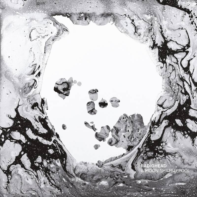
Why This Cover Works
It looks like smoke frozen in time. Or maybe watercolor dissolving underwater. The abstract monochrome artwork for A Moon Shaped Pool doesn’t give you a clear image to hold onto, and that’s exactly what makes it stick.
The Visual Concept
The cover art is a digitally manipulated image created by longtime Radiohead collaborator Stanley Donwood, working alongside Thom Yorke under his pseudonym “Dr. Tchock.” The fluid, ghostly forms match the album’s themes of dissolution, memory, and emotional fragmentation.
Unlike a clean gradient, the shapes here feel organic, almost alive. There’s movement in the stillness.
Design Breakdown
- Artist: Stanley Donwood and Thom Yorke
- Style: Abstract digital art in monochrome
- Palette: Black, white, and grey tonal variations
- Special edition: Limited release included original artwork prints
Album Details
Released May 8, 2016 on XL Recordings. Features “Burn the Witch” and “Daydreaming.” Recorded over several years at various studios. Received widespread critical praise as one of Radiohead’s most emotionally direct records.
Who Should Care About This Cover
Abstract art enthusiasts. Radiohead completists who collect variant editions. Designers interested in how texture and negative space can carry emotion without using recognizable imagery.
Sonic Youth – Goo (1990)
Why This Cover Works
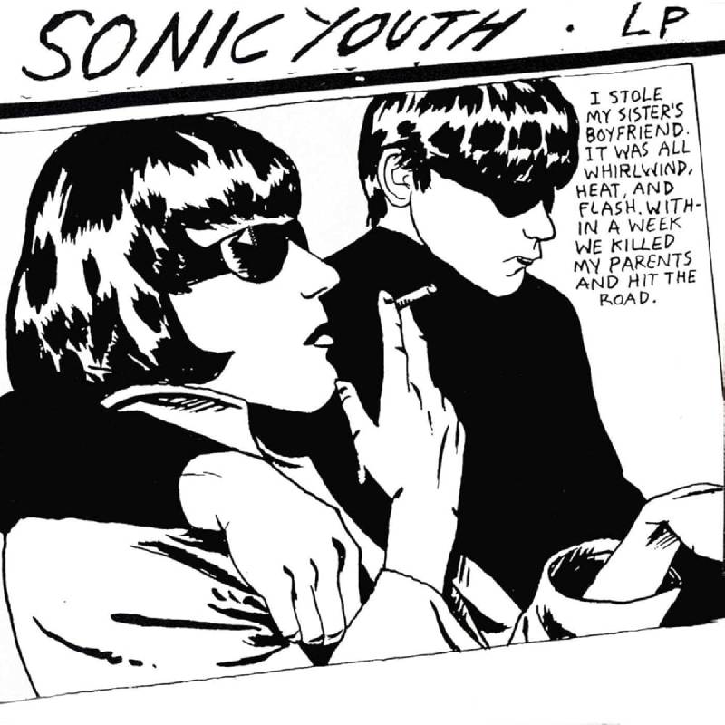
Raymond Pettibon’s sketch of two impossibly cool characters in sunglasses. Black and white ink drawing with a speech bubble reading “I stole my sister’s boyfriend. It was all whirlwind, heat, and flash. Within a week we killed my parents and hit the road.” Dark. Funny. Unforgettable.
The Visual Concept
The illustration was created by SoCal punk legend Raymond Pettibon, best known for his Black Flag artwork. The two figures are based on a real photo of a couple involved in a murder case in the 1960s, giving the image a noir quality that sits somewhere between comic book art and crime documentary.
Pettibon’s heavy black ink lines and raw handwritten text make this a standout example of how illustration can compete with photography in album cover design. The high-contrast black and white style gives it a rhythm that feels hand-crafted and urgent.
Design Breakdown
- Artist: Raymond Pettibon
- Medium: Pen and ink illustration
- Style: Noir-inspired comic art with handwritten text
- Label: DGC Records (Sonic Youth’s major-label debut)
Album Details
Released June 26, 1990 on DGC Records. Sonic Youth’s first album on a major label. Features “Kool Thing” (with Chuck D of Public Enemy) and “Dirty Boots.” The cover initially made label executives nervous, but it became one of the most endlessly referenced images in alternative rock.
Who Should Care About This Cover
Illustrators and comic artists. Punk and alternative rock fans. Anyone looking for proof that a hand-drawn cover can become just as iconic as the most polished book cover design or record sleeve photography.
FAQ on Black And White Album Covers
Why do artists choose black and white album covers?
Monochrome artwork strips away distraction and puts the focus on composition, emotion, and contrast. Artists like Adele and Johnny Cash used grayscale covers to signal raw vulnerability. It’s a deliberate design choice that communicates seriousness and timelessness without relying on color.
What is the most famous black and white album cover?
The Beatles’ White Album (1968) is widely considered the most iconic. Designed by Richard Hamilton, its plain white sleeve with embossed text became a landmark in minimalist album design. Joy Division’s Unknown Pleasures is a close second.
How do you make a black and white album cover?
Start with strong portrait or concept photography, then convert to grayscale using tools like Adobe Photoshop. Focus on lighting, shadow, and tonal range. A clean typographic treatment and balanced layout will carry the rest of the design.
What makes a good monochrome album cover stand out?
High contrast, a clear focal point, and intentional use of negative space. The best grayscale record covers succeed because every element earns its place. Without color to lean on, composition and lighting become everything.
Are black and white covers more popular in certain music genres?
They show up frequently in rock, jazz, hip-hop, and alternative music. Think Metallica’s Black Album or Kendrick Lamar’s To Pimp a Butterfly. But pop artists like Taylor Swift and Adele have proven monochrome works across any genre.
What software is best for designing album cover artwork?
Adobe Photoshop handles photo-based covers well, while Adobe Illustrator works better for vector-based or typographic designs. Canva is a simpler option for independent musicians. The right tool depends on whether your cover relies on photography or graphic design.
What size should an album cover be for streaming platforms?
Most platforms like Spotify and Apple Music require a minimum of 3000 x 3000 pixels in JPEG or PNG format. For print vinyl sleeves, the standard is 12.375 x 12.375 inches at 300 DPI. Always design at the highest resolution first.
Can AI-generated art be used for album covers?
Technically yes, but there are licensing and copyright gray areas. Many record labels and distributors still prefer original photography or commissioned artwork. If you use AI, disclose it and make sure the output doesn’t replicate existing album artwork.
What is the difference between a black album cover and a black and white album cover?
A black album cover, like Metallica’s self-titled record, is predominantly one solid color. A black and white album cover uses the full grayscale spectrum with photography or illustration. The distinction matters when discussing album cover design and visual intent.
Do black and white album covers sell better than color ones?
There’s no data proving monochrome covers outsell color ones. But several of the best-selling albums of all time use black and white artwork, including Adele’s 21 and Metallica’s Black Album. The cover supports the music. It doesn’t replace marketing.
Conclusion
Black and white album covers keep proving that color isn’t a requirement for making a lasting visual impression. From the high contrast portrait work on Adele’s 21 to the noir-inspired ink drawings on Sonic Youth’s Goo, monochrome artwork continues to shape how we experience music visually.
The best grayscale record sleeves share a few things in common. Strong composition. Intentional use of light and shadow. And a concept that connects directly to the sound inside.
Whether you’re designing vinyl packaging for a new release or just building a collection of classic LP cover art, these albums show what’s possible when you strip things down to black, white, and everything in between.
Sometimes the simplest creative decisions leave the deepest mark.

Renowned for his expertise in logo design and visual branding, Bogdan has developed a multitude of logos for various clients.
His skills extend to creating posters, vector illustrations, business cards, and brochures. Additionally, Bogdan's UI kits were featured on marketplaces like Visual Hierarchy and UI8.
He also wrote in the past years on sites like Design Your Way, WebDesignerDepot, WPDean, Designmodo, Speckyboy, Slider Revolution, and more.
- Canva vs PowerPoint: Which Is Better for Presentations? - 22 September 2026
- How to Install Fonts on Mac (Step-by-Step Guide) - 20 September 2026
- From Mockup to Code: How AI-Augmented Development Speeds Up the Design Handoff - 19 September 2026

Bogdan Sandu is a seasoned designer who has been designing websites since 2008. Renowned for his expertise in logo design and visual branding, Bogdan has developed a multitude of logos for various clients. His skills extend to creating posters, vector illustrations, business cards, and brochures. Additionally, Bogdan's UI kits were featured on marketplaces like Visual Hierarchy and UI8. He also wrote in the past years on sites like Design Your Way, WebDesignerDepot, WPDean, Designmodo, Speckyboy, Slider Revolution, and more.
You Might Also Like