





Plenty of films open with a short animated mark and a bit of music from the company behind them, there to say who made or released the picture. Paramount's mountain, the Universal globe, the MGM lion and the Warner Bros. shield are the best known.
Studios treat these as motion and sound identities, and Warner Bros., Disney and Fox each rebuilt theirs in computer graphics.
Variety noted in 2008 that the animated versions can run roughly half a minute, which is far longer than the static title cards that opened films in the silent era.
What are movie studio logos, and what are they called?
The trade has a lot of names for them: production logo, studio logo, vanity card, vanity plate and vanity logo (Wikipedia's production logo entry lists all five). Whatever the label, it's the branded mark, usually animated and set to music, that tells the audience which company produced or distributed the film.
Opening logos play before a theatrical film starts, and closing logos end a television program or TV movie. "Vanity logo" is the tongue-in-cheek label for marks from smaller companies.
Producer and distributor are separate roles, and a studio logo can mark either one.
The logo is also not the title card. Filmsite's title-screen archive places the title screens after the studio logos.
A mark that has to carry a whole company in a few seconds is a long-running exercise in brand identity design.
It sets expectations too. Viewers already know roughly what a Disney film involves before the castle fades out (SlashFilm).
Which movie studio logo is the oldest still in use?
Gaumont's daisy is widely cited as the oldest studio logo still in use. Leon Gaumont chose it in 1903 as a tribute to his mother, Marguerite Dupenloup (Gaumont's company history page).
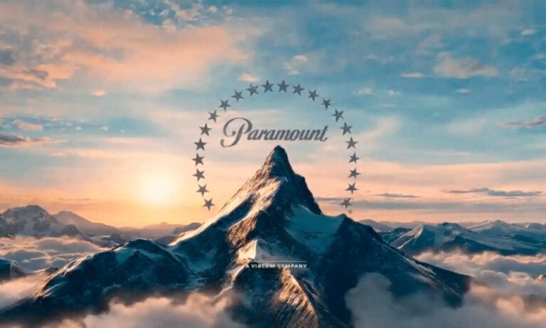
Among Hollywood studios the title goes to Paramount's mountain, which Mental Floss (2015) calls the oldest surviving movie studio logo in Hollywood.
| Studio | Symbol | Earliest version of the mark |
|---|---|---|
| Gaumont | Daisy | 1903 |
| Paramount | Mountain and stars | 1914 |
| Universal | Globe | 1913 or 1914 |
| MGM | Lion | 1916 or 1917 (Goldwyn Pictures) |
| Warner Bros. | Shield | 1923 |
| Columbia | Torch lady | 1924 (soldier), torch lady from 1928 |
| 20th Century | Searchlight tower | 1933 (used by Fox from 1935) |
| Walt Disney Pictures | Castle | 1985 |
The Awl dates the daisy to 1895, the company's founding year. Gaumont's own history page says 1903, and since the company page is the primary source, 1903 is the safer date.
Paramount comes with a catch. The mountain began as a distributor's mark, not a studio's.
W. W. Hodkinson sketched it in 1914 for his Paramount Pictures Corporation, which the San Diego Reader (2013) describes as America's first nationwide film distributor. Zukor's Famous Players, founded in 1912, only joined the company in the 1916 merger (Grunge).
Universal's globe arrived in the same window, 1913 or 1914 depending on the source. Mental Floss (2015) lists a biplane with a smoke trail, sparkling stars and translucent rings added to it over the decades.
The two marks sit a year or less apart, so which one counts as older depends on whether a redesigned mark is still the same logo.
Sources disagree on a couple of other dates as well. The MGM lion is 1916 in Esquire Middle East and 1917 in Mental Floss (2015), and the Fox searchlight tower is 1933 in Allocine but tied to the 1935 merger in Mental Floss.
The meaning behind the mountain, torch lady, lion, globe and shield
Most of these symbols started as a personal reference instead of a brand brief. Paramount's peak may come from a mountain in Utah, and Gaumont's daisy honors the founder's mother.
Paramount's mountain and stars: 22 or 24?
Mental Floss (2015) says the original ring held 24 stars, one for each contract player, and that 22 remain. Grunge has the stars added after the 1916 merger to stand for the first 22 contract stars.
Deseret News (1997) counts 22 stars around the mountain and names Utah's Ben Lomond, Hodkinson's boyhood landmark, as the likely model.
Both accounts tie the stars to contract players, so only the count is in dispute. The peak is unconfirmed too, since a Straight Dope columnist reported getting a different story from Paramount every time the studio was asked.
The lion, torch lady, globe and shield
Publicist Howard Dietz based the Goldwyn Pictures lion on Columbia University's mascot, and the motto Ars Gratia Artis sits above it (Mental Floss, 2015).
Columbia's torch lady is a personification of the United States. Michael J. Deas painted her in 1992 from reference photos of Jenny Joseph shot by Kathy Anderson (Yahoo Entertainment).
The Universal globe is the one constant across every redesign.
Warner Bros. went with its WB initials inside a shield, introduced in 1923 and restored in 1984 as a matte painting (Wikipedia).
Fox's tower is the group's clearest Art Deco design. Emil Kosa Jr., a matte painter who later painted the ruined Statue of Liberty in Planet of the Apes (1968), created it with its searchlights (Time, 2012).
Animation studio marks: Disney, Pixar and DreamWorks
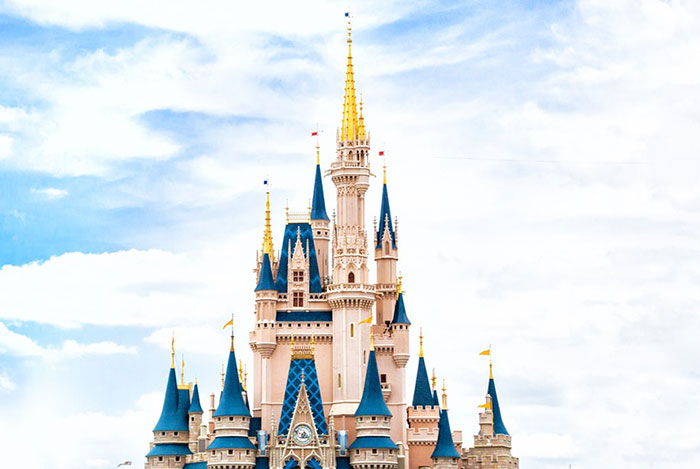
Disney used no traditional logo before 1985, only stylized "Walt Disney Presents" lettering (Mental Floss, 2015). The castle that arrived that year was a silhouette of Disneyland's Sleeping Beauty Castle, and the 2006 version merged it with Cinderella Castle (Wikipedia).
Pixar went with a character instead of a place. Luxo Jr., the lamp from the studio's 1986 short, hops in and flattens the letter I, a gag that has opened every Pixar film since 1995 (Wikipedia).
DreamWorks began as Steven Spielberg's idea of a man fishing from the moon. Artist Robert Hunt suggested a boy instead, modeled on his son William, and Kaleidoscope Films and Industrial Light & Magic built it with the initials SKG worked in (Mental Floss, 2015).
What the most recognized logos share in design
They tend to have one focal subject, whether that's a peak, a lion, a figure or a lamp. None of the majors named here uses a film reel or a camera.
Most trace back to something personal or company-specific: Gaumont's mother, Dietz's university, Pixar's first short, Hunt's son. And the symbol usually outlasts the redesigns, as the mountain, lion, globe and tower all have.
The idea gets fixed early. The rendering changes every decade or so.
Why and when studios redesign their logos
Redesigns follow a few predictable events, and the symbol usually survives whichever one it is.
A merger or rename is the plainest case. When Fox Film and Twentieth Century Pictures merged in 1935, "Fox" replaced "Pictures, Inc." on the tower (Allocine). Disney dropped the Fox name in January 2020 and kept the searchlights (License Global, 2020).
Anniversaries do it too. Universal unveiled a new animated globe for its centennial with The Lorax in 2012 (Variety, 2012), and Sony unveiled a Columbia centennial version in November 2023, ahead of the studio's January 2024 anniversary, with a brighter torch glow (Yahoo Lifestyle).
A new owner can leave a mark as well. After Coca-Cola bought Columbia in 1982, the torch lady's body was reportedly reshaped to resemble a Coke bottle (Mental Floss, 2015). Sony bought the studio in 1989 and commissioned Deas to repaint the figure, which became the 1992 version still in use (Top10Films).
The riskiest redesign drops the symbol. Warner Bros. swapped its shield for Saul Bass's stylized W in the early 1970s and went back to the shield in 1984.
How are animated studio logos made?
Animated logos have been built from matte paintings with moving lights, live animal footage, physical models shot with motion control, and computer graphics. CGI is now the default.
| Method | Example | Date |
|---|---|---|
| Matte painting | 20th Century Pictures tower with searchlights | 1930s |
| Live animal footage | MGM's Slats, then Jackie | 1924 to 1956 |
| Motion-control models | Universal 75th anniversary globe | 1990 |
| Computer graphics | Disney castle, Fox tower rebuilds | 2006; 1994 and 2009 |
Each method had a limit. Slats could not roar, because sound arrived after his debut. Jackie's roar, captured on a gramophone, first played in 1928 (Smithsonian Magazine).
Universal's 1990 globe is often assumed to be CGI, but the logo itself was physical models filmed with motion control and only previsualized in CG (Wikipedia).
Fox rebuilt its tower in CGI in 1994 and again in 2009 (Creative Bloq), and the 1930s composition stayed intact.
Disney and MGM were among the last majors to move to computer animation. Disney's 3D castle arrived in 2006 with Pirates of the Caribbean: Dead Man's Chest (Wikipedia).
Throughout the 1990s, fully computer-generated logos became more common. Warner Bros. followed in 2021 with a photorealistic CGI shield over its studio lot and water tower.
Who composed the studio fanfares?
A handful of film composers wrote the short musical themes that play with the big studio logos, and several of those themes were rewritten later by someone else.
Alfred Newman wrote the 20th Century Fox fanfare in 1933. Jerry Goldsmith composed the Universal theme that came with the 1997 logo, and Michael Giacchino scored the 2016 version of the Marvel Studios intro, as reported by Creative Bloq.
DreamWorks has a fanfare by John Williams, which suits a logo built around a fishing boy on a crescent moon.
Why the sound does more work than the picture
Most people can hum the Fox or Universal theme without picturing the logo at all. That's the point of an audio mark.
A good fanfare is short, brassy and built around one rising phrase. It has to be recognizable in two or three seconds, because a cinema audience is still finding seats.
Reworked by a new composer
Studios rarely drop a famous theme. They hand it to a new arranger and keep the melody, so the audience hears something familiar with fresh instrumentation.
Marvel went the other way. It threw out the old music, then switched composers again for the 2016 reveal, which Creative Bloq noted runs about twice the length of some earlier versions.
What a designer can take from this
If you're building a motion logo, write the sound brief before the animation brief. Sound locks in the timing, and the visuals follow the beat, not the other way around.
Where does the logo appear in a film, and how long does it run?
Studio logos open the film, usually in order from distributor to production company. A shorter version often returns in the end credits.
Length varies a lot. A 2008 Variety article by Peter Debruge, discussed on the Wright on Film blog, noted that animated logos can run around half a minute.
Placement rules that aren't written anywhere
A director can overrule the logo. For smaller studios, the logo may even sit after the first scene or the cold open, and only the biggest players get a guaranteed slot up front.
Logos that change per film
Warner Bros. is the best case study. According to Collater.al, the shield picks up icicles in The Polar Express, turns pink for Barbie and becomes a desktop icon in You've Got Mail.
The Harry Potter films did something more subtle. The shield got darker as the story did.
Marvel's intro keeps its structure but swaps the comic panels to fit each release. The studio also dropped other companies' logos once it became a unit of Disney, so only its own mark plays up front.
When a short logo is the better call
James Gunn said in 2025 that DC Studios skipped a big Marvel-style intro because those can get too long and start feeling like part of the movie (GamesRadar). That's a fair read. Fifteen seconds of branding before a two-hour film is plenty.
How do independent and international studios build recognizable logos?
They tie the logo to a visual idea that fans can spot anywhere, then use it on everything. There's no budget for a fanfare orchestra, so the identity has to carry the load.
| Studio | Core idea | What it relies on |
|---|---|---|
| A24 | Plain wordmark, no mascot | Consistency across posters, merch and trailers (identity by GrandArmy) |
| Studio Ghibli | Totoro character mark | Hand-drawn style drawn from Hayao Miyazaki's own work |
| Pathe | Crowing rooster | Newsreel history, kept as a symbol of the French company |
A24 and the case for restraint
A24 launched in 2012 and has never needed a redesign. The wordmark is flat and a little cold, and that works because the films carry the personality.
Ghibli's character-first approach
The Totoro logo first appeared ahead of Only Yesterday. A character logo can be warm and friendly in a way a wordmark can't, though it only works if people already love the character.
Pathe's rooster
The rooster crowed over Pathe newsreels for decades, including the RKO Pathe ones in the 1930s. It's a good reminder that an old animal mark can outlast the format it was made for.
If you're designing something similar for a small production company, start with the brand guidelines before the animation. Rules for spacing, color and sound save a lot of rework later.
Who owns movie studio logos, and can you reuse one?
The studio owns it. Most major logos are registered trademarks, and the owner can stop others from using them in ways that confuse customers about who made a product.
What keeping a trademark alive involves
- File a declaration of use between the fifth and sixth year after registration.
- Combine a use declaration with a renewal application between years nine and ten.
- Repeat that combined filing every ten years (USPTO maintenance rules).
Miss a deadline and there's a grace period with a surcharge. Miss that too, and the registration is cancelled.
Parody and fan use
Jack Daniel's v. VIP Products, decided unanimously by the US Supreme Court on June 8, 2023, held that a dog toy parodying a whiskey bottle gets no automatic free pass when it's used as a brand.
That means a joke logo on a product you sell is riskier than the same joke in an actual film. Parody in a film sketch is generally treated as expression, not a product label.
When these rules don't apply
Old logos in the public domain can be reused, but the trademark may still exist even if a copyright has lapsed. Fan edits and editorial use, such as a magazine showing the logo in an article, follow different rules.
Rules also vary by country, so check local trademark law before you ship anything. This isn't legal advice. For a commercial project, ask a trademark attorney before using or imitating a real studio mark.
Movie Studio Logos FAQ
Do movie studios design their own typefaces for their logos?
Some do. Warner Bros. expanded its monogram into a custom typeface, Warner Bros. Condensed Bold, which Pentagram documents as the basis for division wordmarks and display type.
Why does the Marvel Studios logo flip through comic book pages?
The pages point back to Marvel's publishing roots. Slashfilm reports that the modern form of the intro first appeared before 2002's Spider-Man, ahead of the studio itself, and the word Studios was added with Iron Man 2.
Can filmmakers alter or spoof a studio logo inside their own movie?
Yes. The Simpsons Movie spoofed the Fox opening in 2007 with Ralph Wiggum, and the Minions films turn the Universal theme into a gag.
Both came from the studios being joked about, which is the usual condition.
How can a small production company design a logo that works on screen and in print?
Build it around one simple image and keep a flat version for small sizes. Pentagram's Warner Bros. identity was made to hold up from small digital spaces to the water tower on the studio lot, and that's a fair test for any mark.
What Keeps a Studio Logo Working for Decades
Movie studio logos last when one central image and one musical theme stay fixed while the animation gets rebuilt around them. Fox kept Alfred Newman's 1933 fanfare through the computer-graphics rebuilds of 1994 and 2009, so the sound outlived two generations of picture.
If you're building or refreshing a mark, fix the central image first, then commission the theme and schedule trademark upkeep. The sound and the filings both attach to the image, so changing it later means redoing all of it.
There's a cost to that. A fixed image and theme give up the chance of a clean break, and a studio that later wants a different personality has to pay for a full rebrand, not an update.
The trademark rules above reflect USPTO maintenance requirements as of November 2026. A change to the filing schedule would mean revisiting that last step.
A studio mark also shows up in the billing block of a poster, so the next step is to make a movie poster where the logo sits at small size.