


The Blumhouse logo is one of those production company marks that horror fans recognize before a single frame of the actual movie plays. It belongs to Blumhouse Productions, the company Jason Blum founded back in 2000. What started as an indie outfit with zero logo presence has become a fixture of genre cinema branding.
The mark sits at a crossroads of low-budget filmmaking and big cultural impact. Blumhouse built its reputation on films like Paranormal Activity, Insidious, and Get Out. The logo had to communicate something specific: this is horror, but it is not trying too hard. That tension between restraint and dread defines the whole brand.
The current version, redesigned in 2022 by Elastic (creative directors Neil Kellerhouse and Duncan Elms), is the company’s second major iteration. Blumhouse ran without any on-screen logo until 2012. So we are really looking at two main versions across the brand’s history, plus a handful of film-specific variants that pop up for individual releases.
What Is the Blumhouse Productions Logo?

The Blumhouse Productions logo is a combination mark featuring the company name in uppercase letters with the “H” shaped like a house silhouette. Introduced as a motion logo in 2012 by Becker Design (now Filmograph), it pairs bold wordmark typography with horror-themed animated sequences. The house-shaped “H” symbolizes the domestic spaces where the studio’s scares typically unfold.
Core Attributes
- Design Type: Combination mark (wordmark with integrated symbol). The “H” doubles as a pictorial house element inside the text itself.
- Primary Elements: Uppercase “BLUMHOUSE PRODUCTIONS” wordmark. House-shaped “H” letterform. Dangling lightbulb (in animated versions). Haunted house environment (motion logo sequences).
- Official Introduction Date: 2012 for the first motion logo. June 2022 for the current redesigned version, debuting with The Black Phone.
- Designer/Agency: Original (2012): Becker Design, now known as Filmograph, with Aaron Becker and Amir Salem. Current (2022): Elastic, creative directors Neil Kellerhouse and Duncan Elms, working alongside Blumhouse CMO Karen Barragan.
- Trademark Status: Registered trademark of Blumhouse Productions LLC. The “BH” house mark also functions as a secondary brand identifier.
- Color Palette: Primary uses are black and white. The animated logo shifts between greenish tints, teal accents, and warm yellow depending on the sequence and film context. Individual movie variants have used dark red (The Gallows), pink (M3GAN 2.0), and black-and-white (Hush).
- Usage Context: Theatrical film openings, television series intros, streaming platform content, movie posters, promotional trailers, social media profiles, and merchandise. The “BH” abbreviated mark appears in print and digital contexts where the full wordmark is too wide.
How Has the Blumhouse Productions Logo Evolved Over Time?
Blumhouse operated for over a decade without any on-screen logo. The first animated version arrived in 2012, created by Filmograph. It stayed largely the same for ten years before Elastic redesigned it in June 2022. Each version got progressively more detailed, though both kept the house-shaped “H” as the main anchor.
Pre-Logo Era (2000-2012)
Years Active: 2000 to 2012.
There was no on-screen motion logo during this period. Blumhouse credits simply appeared as text in opening or closing title cards. The company was still building its catalog during these years.
Jason Blum co-founded the outfit as Blum Israel Productions in 2000 with Amy Israel. It became Blumhouse Productions around 2002. Films like Paranormal Activity (2007) put the company on the map, but the branding was minimal.
Without a dedicated visual identity, the studio relied entirely on its film quality and word-of-mouth reputation. That is actually kind of fitting for a company that made movies on shoestring budgets.
Original Blumhouse Motion Logo (2012-2022)
Years Active: 2012 to 2022.
Design Description: The animated sequence starts on a wooden floor and pans upward through a haunted room. A floating chair, a slamming door with green light behind it, a floating book, and a ghostly girl resembling the figure from The Grudge all appear. The camera tilts to a cracking ceiling, stopping at a dangling lightbulb. “BLUMHOUSE PRODUCTIONS” fades onto the wall in a greenish tint, with the “H” clearly formed as a house shape.
Color Scheme: Greenish-yellow tint dominated the horror version. Non-horror films got a cleaner, brighter yellow-lit variant where the camera simply pans up from the floor as the lightbulb turns on.
Designer: Becker Design, which later became Filmograph. Aaron Becker and Amir Salem handled the work.
Context: By 2012, Blumhouse was no longer some unknown indie shop. Paranormal Activity had become a franchise. Insidious was a hit. The studio needed a visual hierarchy that matched its growing reputation. The logo first appeared on films like Sinister and Dark Skies.
Key Features: References to The Grudge (2004) and Paranormal Activity (2007) were baked into the animation. The sound design featured dramatic effects and a woman’s voice, with heavy breathing and heartbeat sounds.
Cultural Significance: This logo became one of the most recognized horror studio intros. Fans nicknamed it “The Paranormal Activity Logo” and “Blumhouse House.” It was genuinely creepy in a way most production logos never attempt. Film-specific variants kept it fresh, like the red-tinted version for The Gallows or the knife-wielding girl for Freaky.
Redesigned Blumhouse Motion Logo (2022-Present)
Years Active: 2022 to present.
Design Description: A single-camera slow crawl pulls backward through a fully realized haunted house, moving from the back door through multiple rooms and out the front. Props and details from dozens of Blumhouse films and TV shows fill each room as Easter eggs. The sequence ends with the camera pulling out of a window to reveal the full “BLUMHOUSE” wordmark, now rendered in 3D CGI, with the house-shaped “H” glowing.
Color Scheme: Saturated greenish tones persist inside the house. The final logo reveal features a teal glow behind the wordmark against a dark background. Film-specific versions still get custom color treatments.
Designer: Elastic, with creative directors Neil Kellerhouse and Duncan Elms. Produced in collaboration with Blumhouse CMO Karen Barragan and producer Paul Makowski.
Context: The redesign premiered on The Black Phone (June 24, 2022). By this point, Blumhouse had over 100 films in its catalog, giving the designers a deep well of references to draw from.
Key Changes from Previous: The new version replaced the single-room setup with a multi-room journey. The wordmark jumped from 2D to 3D. Easter eggs became specific to actual Blumhouse properties rather than generic horror references. The dangling lightbulb from the original was kept as a callback.
Cultural Significance: The redesign turned the logo into a fan game. Viewers could spot the teacup from Get Out, the masked girls from The Purge, Michael Myers from Halloween, the cupcake from Happy Death Day, and the phone from The Black Phone. Jason Blum himself said he was curious to see if fans could find all the hidden details.
What Do the Design Elements of the Blumhouse Productions Logo Mean?

The Blumhouse logo is built around the idea that horror lives in ordinary spaces. The house-shaped “H” is the central symbol. It turns a single letter into an architectural form, connecting the brand name to the domestic settings where most Blumhouse films take place.
That dangling lightbulb, present in both logo versions, represents vulnerability and exposure. One light source in an otherwise dark space. It is a simple image, but it carries a lot of weight for horror fans who associate dim lighting with dread.
Why Did Blumhouse Choose These Specific Colors?
The logo’s primary color palette sticks to black and white for print applications. In the animated versions, things get more specific.
Black is the dominant background color. It does the obvious job of creating a dark, unsettling atmosphere. But it also keeps the design clean and readable at any size, which matters when your logo shows up on everything from IMAX screens to phone thumbnails.
The greenish-teal tint that appears in the motion logos was a deliberate choice. Green in a horror context tends to suggest something unnatural, sickly, or supernatural. Think night-vision cameras (a direct nod to Paranormal Activity’s found-footage look). The psychology behind color here is doing real work.
White appears as the wordmark color in most static versions. It provides maximum contrast against dark backgrounds. Studios like A24 also lean on black-and-white simplicity, but where A24 goes for artsy minimalism, Blumhouse’s dark palette is explicitly horror-coded.
Film-specific color variants keep the brand flexible. Dark red for The Gallows. Pink for M3GAN 2.0. Black-and-white for Hush. These shifts show that the core logo is strong enough to absorb different hues without losing its identity.
What Typography Style Is Used in the Blumhouse Logo?
The typeface used in the Blumhouse logo closely resembles Coliseum Pro, a compressed spur serif font designed by Julie Hopwood and Pat Hickson. It runs near the Coliseum Medium weight.
This is an interesting pick for a horror company. Most horror branding goes for jagged, distressed, or handwritten lettering. Blumhouse chose something closer to editorial typography: controlled, structured, and confident.
The all-caps treatment adds authority. Letter spacing in the wordmark is generous enough to keep each character readable without making the logo feel loose or disconnected.
That restraint communicates something important about the brand. Blumhouse films rely on tension and atmosphere, not shock value. The type psychology mirrors this approach. Clean letters say: we are serious about this. No gimmicks needed.
What Are the Hidden Meanings in the Blumhouse Logo?
The house-shaped “H” is the most obvious intentional piece. “Blum-HOUSE.” The letter literally becomes a house. But it goes beyond wordplay. Most of their films are set in homes, apartments, or domestic environments. The logo quietly says: the horror is where you live.
In the 2022 redesign, the Easter eggs are deliberate fan service. The Elastic team rewatched nearly all Blumhouse films to place accurate props throughout the animated house. Some are obvious (Michael Myers), others take repeated viewings to catch (the comb from BlacKkKlansman).
The single-take camera movement in the new logo was described as “Kubrick-style” by Duncan Elms. That is not accidental. It mirrors the slow tracking shots in horror films that build dread through what you might see around the next corner. The logo itself becomes a tiny horror experience.
How Does the Blumhouse Productions Logo Compare to Competitor Logos?
Horror and genre film studios each handle their branding differently, and the differences are pretty telling. Blumhouse sits in a unique spot because its logo actually scares people, which most production company marks never even try to do.
Lionsgate uses a mechanical gear-and-gate mechanism that reads as industrial and imposing. It is dramatic but not genre-specific. You could put that logo in front of a romantic comedy and it would still work.
Universal Pictures, Blumhouse’s main distribution partner, has its iconic globe. Beautiful, but it is pure corporate prestige with no genre identity at all.
A24 goes extremely minimal. Just the letters. No animation flair, no thematic elements. It works for their brand because they are not locked into any single genre.
Among film company logos, Blumhouse is one of the few that makes the logo itself part of the movie experience. The animated intro doubles as a cold open. Audiences sit through it with the same anticipation they bring to the film. That is something companies like Legendary Pictures or New Line Cinema have never quite achieved.
The Miramax logo and MGM Studios logo carry legacy weight from decades of cinema history. Blumhouse’s mark is younger but arguably more emotionally engaging for its target audience.
What Are the Technical Specifications of the Blumhouse Productions Logo?
Official Color Codes
Blumhouse has not published a formal public brand book with exact hex values. But based on the logo’s consistent usage across media, these are the working colors:
- Primary Color: Black – Hex: #000000, RGB: (0, 0, 0), CMYK: (0, 0, 0, 100)
- Secondary Color: White – Hex: #FFFFFF, RGB: (255, 255, 255), CMYK: (0, 0, 0, 0)
- Accent Color: Teal/Green (motion logo) – Approximate Hex: #2A6E5A, RGB: (42, 110, 90), used in the animated haunted house sequences
- Variant Accent: Dark Red (select films) – Approximate Hex: #8B0000, RGB: (139, 0, 0), seen in variants like The Gallows version
Dimensions and Proportions
The SVG version of the static logo measures approximately 1000 x 285 pixels at nominal size (based on the Wikimedia Commons file). The aspect ratio runs close to 3.5:1.
The “BH” abbreviated mark uses a more compact, roughly square format. This version works better for social media avatars and app icons where horizontal space is limited.
Minimum size requirements and clear space rules have not been made publicly available. But standard practice for entertainment logos suggests at least a half-letter-height of padding on all sides.
The logo is available as vector graphics (SVG, AI, EPS), meaning it scales to any size without quality loss. Bitmap versions in PNG format are also widely distributed for digital use.
What Cultural Impact Has the Blumhouse Productions Logo Had?
The Blumhouse logo sits in rare company: it is a production company intro that audiences actually pay attention to. Most studio logos get talked over or ignored. This one gets reactions. Nervous laughter, sometimes actual jumps. That is a pretty big deal for what is technically just a corporate identifier.
The logo’s scare factor has made it a subject of YouTube compilations and reaction videos. Fans catalog every variant, every film-specific tweak, every hidden reference. The 2022 redesign turned that into an official feature, treating the logo as a puzzle for the fanbase.
It also helped establish a template for genre-specific studio branding. Before Blumhouse, horror production companies did not really invest in making their logos feel like part of the film experience. The success of this approach showed that a well-designed motion graphic identity can build audience anticipation before the movie even starts.
How Does the Blumhouse Logo Fit Into the Overall Brand Identity?
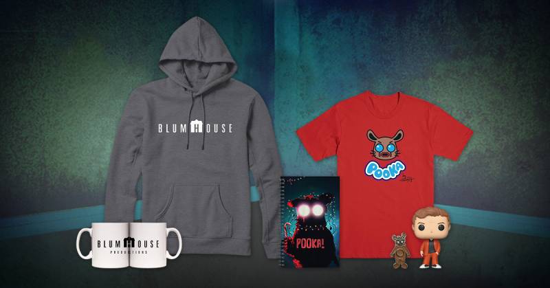
The logo is the anchor of a brand system that extends across films, television, games, and marketing. Blumhouse Television swaps “PRODUCTIONS” for “TELEVISION” but keeps everything else identical. Blumhouse Games uses a similar approach with its own animated variant.
The connection between the logo and the studio’s brand guidelines is tight. Every sub-brand shares the house-shaped “H” and the same typographic treatment. This consistency means a viewer seeing “Blumhouse” on a Hulu series immediately connects it to the theatrical films.
Jason Blum’s personal brand is closely tied to the company mark. He appears publicly as the face of Blumhouse, and the logo functions as a visual shorthand for his specific approach to filmmaking: small budgets, creative freedom for directors, high output.
The storytelling built into the animated logo reinforces the studio’s core promise. Each version tells a micro horror story in about 15 seconds, which is exactly what Blumhouse does with its films on a larger scale.
How Should the Blumhouse Logo Be Used?
Blumhouse maintains control over its logo usage across all platforms. If you are looking for official logo files, the company’s press and media contacts are the correct route. Third-party sites offer PNG and SVG downloads, but these are not officially sanctioned for commercial use.
The logo is a registered trademark. Using it without permission for commercial purposes, merchandise, or anything that implies an official connection to Blumhouse Productions will create legal problems. Fan art and editorial use (reviews, news coverage, educational content) typically fall under fair use, but the line gets blurry fast.
For authorized partners, standard usage rules apply. Do not stretch, rotate, recolor, or modify the logo beyond approved variants. The house-shaped “H” should always remain clearly visible. Background colors should provide enough contrast to keep the wordmark readable.
The animated version is tied to film and television distribution. You will not find it on merchandise or static marketing materials. Those use the wordmark or the abbreviated “BH” house mark instead. If you are working with the logo for print, the static black-and-white version is the standard choice.
FAQ on The Blumhouse Logo
What does the Blumhouse logo look like?
The Blumhouse Productions logo features the company name in uppercase with the “H” shaped like a house silhouette. A dangling lightbulb appears in animated versions. The design uses white text against dark backgrounds, keeping the whole thing clean and unsettling at the same time.
Who designed the Blumhouse logo?
The original 2012 motion logo was created by Becker Design, now called Filmograph. Aaron Becker and Amir Salem handled the work.
The 2022 redesign came from Elastic, with creative directors Neil Kellerhouse and Duncan Elms collaborating with Blumhouse CMO Karen Barragan.
When was the Blumhouse logo first used?
Blumhouse ran without an on-screen logo from 2000 to 2012. The first movie production logo animation debuted in 2012 on films like Sinister. Jason Blum’s company operated for over a decade using only basic title card credits before that.
What is the hidden meaning behind the house-shaped H?
The “H” in “BLUMHOUSE” is literally shaped like a house. Most Blumhouse films, from Paranormal Activity to Insidious, take place in domestic settings.
The horror film production logo ties the brand name directly to the places where its scares happen. Pretty straightforward wordplay, honestly.
What font does the Blumhouse logo use?
The logo’s font closely matches Coliseum Pro, a compressed spur serif designed by Julie Hopwood and Pat Hickson. It runs near the Medium weight. The all-caps treatment and generous spacing give it a controlled, editorial quality that avoids typical horror cliches.
What colors are in the Blumhouse logo?
The static version uses black and white. Animated versions shift to greenish-teal tints that reference the found-footage look of Paranormal Activity.
Film-specific variants use different colors. Red for The Gallows. Pink for M3GAN 2.0. The core color scheme stays dark and minimal across all uses.
Why did Blumhouse update its logo in 2022?
After ten years with the same intro, the studio had over 100 films in its catalog. The redesign let Elastic pack Easter eggs from dozens of Blumhouse properties into a single animated sequence.
It premiered with The Black Phone in June 2022. Jason Blum called it a tribute to the studio’s horror franchise legacy.
What Easter eggs appear in the new Blumhouse logo?
The 2022 logo animation is packed with references. Michael Myers from the Halloween franchise, the teacup from Get Out, masked girls from The Purge, the cupcake from Happy Death Day, and the phone from The Black Phone all show up.
Props from BlacKkKlansman, Freaky, Ma, and Glass are hidden throughout too.
How does the Blumhouse logo compare to other horror studio logos?
Most production company logos play it safe. Blumhouse’s is one of the few that actually tries to scare you.
Compare it to the HBO logo or the Paramount logo, both prestigious but genre-neutral. Blumhouse made its brand identity part of the horror experience itself.
Can I download or use the Blumhouse logo?
The Blumhouse logo is a registered trademark. Using it commercially without permission will cause problems. Fan art and editorial use for reviews or news coverage generally fall under fair use.
For official files, contact Blumhouse directly through their press channels. Third-party PNG and SVG downloads exist, but they are not officially authorized for commercial projects.
Conclusion
The Blumhouse logo does something most production company marks never pull off. It makes you feel something before the movie even starts.
From the house-shaped “H” to the Easter egg-filled 2022 redesign by Elastic, every detail ties back to the studio’s identity as a horror powerhouse. The minimalist design approach works because Jason Blum’s films operate the same way. Small budgets, big scares, nothing wasted.
Whether you are watching the logo animation before a Purge sequel or spotting the Get Out teacup hidden in the background, the brand mark rewards attention. It is a rare case where a corporate symbol actually adds to the audience experience rather than just filling time.
That is good logo design at its core.

Renowned for his expertise in logo design and visual branding, Bogdan has developed a multitude of logos for various clients.
His skills extend to creating posters, vector illustrations, business cards, and brochures. Additionally, Bogdan's UI kits were featured on marketplaces like Visual Hierarchy and UI8.
He also wrote in the past years on sites like Design Your Way, WebDesignerDepot, WPDean, Designmodo, Speckyboy, Slider Revolution, and more.
- The Windsurf Logo History, Colors, Font, And Meaning - 10 October 2026
- How to Remove Background From Product Photos (No Photoshop) - 10 October 2026
- How Designers can Build a Stronger Online Creative Identity - 9 October 2026

Bogdan Sandu is a seasoned designer who has been designing websites since 2008. Renowned for his expertise in logo design and visual branding, Bogdan has developed a multitude of logos for various clients. His skills extend to creating posters, vector illustrations, business cards, and brochures. Additionally, Bogdan's UI kits were featured on marketplaces like Visual Hierarchy and UI8. He also wrote in the past years on sites like Design Your Way, WebDesignerDepot, WPDean, Designmodo, Speckyboy, Slider Revolution, and more.
You Might Also Like


