


Every product you’ve ever picked off a shelf was designed twice. Once as an idea, and once for the press. Understanding what is print design means understanding how visual communication works when it leaves the screen and lands on paper, cardboard, fabric, or vinyl.
Print design is the process of creating layouts and visuals for physical reproduction. It covers everything from business cards and brochures to packaging, magazines, and large format signage.
This guide breaks down how print design works, what tools professionals use, how it differs from digital design, and what it takes to build a career in the field. Whether you’re starting out or sharpening your skills, the fundamentals here apply to every printed piece you’ll ever produce.
What Is Print Design
Print design is the practice of creating visual content that will be physically reproduced on tangible materials. It covers everything from business cards and brochures to billboards, book covers, and product packaging.
Unlike web design, where layouts shift and reflow across screen sizes, print design locks every element into a fixed composition. What you send to the printer is exactly what comes out on the other side. No responsive breakpoints. No browser rendering quirks.
That distinction matters more than most people think.
Print design sits within the broader graphic design discipline, but it demands a specific technical skill set. You’re working with physical ink on physical substrates, which means decisions about CMYK color profiles, DPI resolution, bleed zones, and paper stock all happen before anyone sees the finished piece.
The global commercial printing market was valued at over $501 billion in 2024, according to Grand View Research. It’s projected to reach $598 billion by 2030. Print isn’t going anywhere.
And that number makes sense when you consider how many physical touchpoints still rely on designed print materials: retail packaging, restaurant menus, event signage, direct mail campaigns, trade show booths. Every one of those requires someone who understands how to prepare a file that translates cleanly from screen to paper.
Types of Print Design Work
Print design isn’t one thing. It branches into several categories, each with its own conventions, technical requirements, and creative constraints.
Editorial and Publication Design
This is the category that shaped the profession. Books, magazines, newspapers, zines.
Editorial designers handle multi-page layouts where typography, image placement, and pacing across spreads all need to work together. A magazine spread has a rhythm to it. You’re guiding the reader’s eye through a sequence, and if the visual hierarchy falls apart, the whole thing collapses.
Adobe InDesign holds roughly 26% of the global graphics software market share, according to Statista (2024). There’s a reason for that. Multi-page layout work is InDesign’s entire purpose.
Book cover design is a sub-speciality within this space. A single cover needs to communicate genre, tone, and quality at a glance, often at thumbnail size for online retailers.
Marketing and Advertising Materials

Brochures, flyers, postcards, posters. These are the workhorses of print marketing.
Each piece has a narrow window to grab attention and deliver a message. Poster design, for example, has to communicate from a distance. That changes everything about how you handle type scale, color contrast, and image composition compared to, say, a tri-fold brochure someone reads at arm’s length.
Direct mail remains surprisingly effective. The ANA/DMA Response Rate Report (2025) puts average direct mail response rates at 4.4%, roughly 37 times higher than email’s 0.12%. That gap explains why businesses continue investing in printed marketing collateral.
Packaging Design
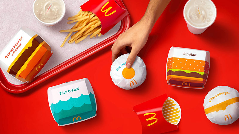
This one deserves its own attention because packaging design sits at the intersection of print, branding, and three-dimensional problem solving.
According to Ipsos, 72% of consumers say packaging design influences their purchasing decisions. That’s not a small number. It means the print designer working on a cereal box or a perfume carton is directly affecting sales in a way that few other design disciplines can claim.
Packaging also introduces structural considerations. Die lines, fold patterns, material weight. You’re designing for a surface that wraps around an object, not a flat sheet.
Large Format and Environmental Print
Banners, billboards, trade show displays, window graphics, vehicle wraps, signage.
Large format printing changes the math on resolution. A billboard viewed from 50 feet away doesn’t need 300 DPI. You might work at 30 to 50 DPI, which feels counterintuitive until you understand viewing distance.
Mordor Intelligence data from 2025 shows large format printing accounted for 41.74% of the commercial printing market’s global sales. It’s a massive segment, literally.
How Print Design Differs from Digital Design
People sometimes treat print and digital as if they’re just different output channels for the same work. They’re not. The technical requirements diverge in ways that affect every decision you make during the design process.
| Feature | Print Design | Digital Design |
|---|---|---|
| Color model | CMYK (ink-based) | RGB (light-based) |
| Resolution | 300 DPI minimum | 72–96 PPI standard |
| Layout | Fixed, locked | Fluid, responsive |
| Tactile quality | Paper, finishes, embossing | None |
| Error correction | Requires full reprint | Instant update |
Color: CMYK vs. RGB
RGB produces color through light. Your monitor blends red, green, and blue light to create every color you see on screen. CMYK works differently. Cyan, magenta, yellow, and black inks are layered onto a substrate.
The visible range of colors (the gamut) is smaller in CMYK. Bright neon greens and electric blues that look great on screen will shift when converted to CMYK. Took me a while to internalize that lesson, honestly. Your first ruined print run teaches you fast.
For specific brand colors that fall outside the CMYK gamut, designers use the Pantone Matching System. It’s a standardized spot color system that guarantees consistent color reproduction across print runs and locations.
Resolution and File Preparation
Screen displays render at 72 to 96 pixels per inch. That’s fine for a monitor. Print requires a minimum of 300 DPI for sharp output.
An image that looks perfectly crisp on your laptop might print blurry and pixelated at the same physical size. This is the single most common mistake new designers make. Pulling images from the web and dropping them into a print layout is almost always a disaster.
Vector graphics sidestep this problem entirely. They’re resolution-independent, which makes them ideal for logos, icons, and any element that needs to scale from a business card to a billboard.
Permanence
Here’s the thing about print that digital designers sometimes forget. Once it’s printed, it’s done.
You can’t push a hotfix to 10,000 brochures sitting in a warehouse. A typo on a website is a 30-second fix. A typo on a print run of 50,000 catalogs is a five-figure expense. That permanence forces a level of attention to detail in prepress that digital workflows don’t always demand.
The Print Design Process

Every print project follows a general path from concept to physical output. But the specifics of the prepress stage are where print design really separates itself from other types of visual work.
Layout and Composition
Print layout starts with structure. Grid systems divide the page into columns and rows, giving the designer a framework for placing text, images, and white space.
A well-built grid doesn’t make a layout rigid. It makes it organized. And it lets you break the grid intentionally, which is where the interesting design decisions happen.
Key layout elements include:
- Alignment of text and image edges for visual coherence
- Balance between heavy and light areas on the page
- Contrast in scale, color, or weight to direct the reader’s eye
- A clear focal point that anchors every spread or page
The Gestalt principles show up constantly in print layout work. Proximity groups related elements. Repetition creates visual consistency across pages. These aren’t abstract theories. They’re the reason a well-designed magazine feels effortless to read.
Prepress and File Preparation
Bleeds: Any color or image that extends to the edge of the page needs to overshoot the trim line by at least 3mm (0.125 inches). Without bleed, the printer can’t guarantee clean edges.
Trim marks: These guide the cutter. They’re placed outside the bleed area and are removed during finishing.
Safe zone: Critical content like text and logos should sit at least 5mm inside the trim line. Paper shifts slightly during cutting, and anything too close to the edge risks getting clipped.
Color proofing: A printed proof (not a screen preview) is the only reliable way to verify color accuracy before a full print run.
PDF/X is the standard file format for print handoff. It embeds fonts, flattens transparencies, and locks the color profile so nothing shifts between your machine and the printer’s RIP software. Markzware FlightCheck and Adobe Acrobat Pro are the standard preflight tools for catching issues before files go to press.
Tools Used in Print Design
The software stack for print design has been remarkably stable for the last decade. Adobe dominates, though alternatives have carved out solid niches.
| Tool | Primary Use | Strength |
|---|---|---|
| Adobe InDesign | Multi-page layouts | Industry standard for books, magazines, brochures |
| Adobe Illustrator | Vector artwork | Logos, icons, illustrations for print |
| Adobe Photoshop | Image editing | Photo retouching, bitmap manipulation |
| Affinity Publisher | Page layout | One-time purchase, strong InDesign alternative |
| CorelDRAW | Vector + layout | Popular in signage and large format |
Adobe InDesign is the default for anything with more than one page. Magazines, books, catalogs, reports. If you’re doing page layout professionally, InDesign is almost certainly your daily tool.
Adobe Illustrator handles vector-based print assets. Logo design, iconography, illustrated elements that need to stay sharp at any size. If you’re building a visual identity system that spans print and digital, Illustrator is where most of that vector work happens.
Photoshop’s role in print is more narrow than people assume. It’s for image editing: retouching photos, adjusting color, compositing images before placing them into an InDesign layout. It’s not a layout tool, even though plenty of beginners try to use it as one.
Affinity Publisher has picked up traction since Serif launched it as a cheaper alternative to InDesign. No subscription model. One-time purchase. For freelancers and small studios watching costs, it’s a legitimate option.
CorelDRAW still holds ground in specific sectors, particularly signage and large format production shops. I’ve seen print houses that run their entire operation on CorelDRAW and have zero interest in switching.
Core Principles of Effective Print Design
Good print design isn’t accidental. It follows a set of foundational graphic design principles that determine whether a printed piece actually communicates or just takes up space.
Typography for Print

Type is where print design either works or falls apart. On screen, you’ve got anti-aliasing smoothing out rough edges. On paper, every stroke and curve is rendered in physical ink.
The baseline matters. Leading (line spacing) controls readability across long text blocks. Too tight and the lines crash into each other. Too loose and the text floats apart.
Kerning adjusts the space between individual letter pairs. Tracking controls uniform spacing across entire words or lines. Both affect how professional the final piece looks, even if most readers can’t name what feels off when they’re done badly.
Widows and orphans are the bane of editorial designers. A widow is a single word stranded at the top of a column. An orphan is a single line left at the bottom. Both look sloppy, and fixing them often means reworking entire paragraphs.
Choosing the right typeface starts with understanding the piece. A serif font like Garamond reads well in long body text. A sans-serif font like Helvetica works for headlines and shorter blocks. Pairing fonts well is a skill that takes time to develop. Most designers stick to two typefaces per project, sometimes three.
Layout Grids and Visual Hierarchy

Typographic hierarchy tells readers where to look first, second, and third. Headlines are the biggest and boldest. Subheadings sit below them. Body text fills in the detail.
Without clear hierarchy, a printed page becomes a wall of equally weighted information. Nobody reads that.
The rule of thirds shows up in print layout the same way it does in photography. Placing key design elements at the intersection points of a thirds grid creates more dynamic compositions than centering everything.
Color theory applies directly to print work, though with the CMYK constraint baked in. Analogous colors create harmonious, low-contrast palettes. A complementary color scheme adds punch and tension. The choice depends on the message the piece needs to carry.
Emphasis through scale and proportion is one of the fastest ways to create hierarchy in a layout. Make the most important thing big. Let everything else support it.
Paper, Printing Methods, and Finishing
The physical production side of print design isn’t something you figure out after the design is done. Paper choice, printing method, and finishing technique all shape the design from the very beginning.
A letterpress piece gets designed differently than something running on a digital press. You’re making production decisions at the concept stage, not the export stage.
Printing Methods

Grand View Research data from 2024 shows lithography printing held 44.1% of the commercial printing market. It’s still the dominant process for high-volume work.
| Method | Best For | Run Length |
|---|---|---|
| Offset lithography | Magazines, catalogs, packaging | 1,000+ units |
| Digital printing | Short runs, variable data, proofs | 1–500 units |
| Screen printing | Textiles, posters, signage | Varies |
| Letterpress | Stationery, invitations, art prints | Small batches |
| Flexography | Labels, packaging, bags | High volume |
Offset lithography transfers ink from a plate to a rubber blanket, then onto the paper. The setup cost is higher but the per-unit cost drops fast on long runs. Heidelberg dominates the press market here.
Digital printing skips plates entirely. Files go straight from computer to press. Smithers data shows digital print reached $165.5 billion in 2024, accounting for 18.4% of global print sales. That share is climbing because short runs and variable data jobs keep increasing.
Screen printing pushes ink through a mesh stencil. It works on surfaces that other methods can’t handle (fabric, wood, metal, glass). Letterpress physically presses inked type into paper, creating a debossed impression you can feel with your fingertips.
Paper Selection and Finishing Techniques
Coated paper has a smooth surface that holds ink sharply. Glossy coated stock makes colors pop. Matte coated stock reduces glare and feels more refined.
Uncoated paper absorbs ink, giving a softer, more organic look. It’s the standard for letterheads, books, and anything where people need to write on the surface.
Then there’s the finishing. This is where print gets tactile.
- Spot UV applies a glossy varnish to specific areas, creating contrast against matte surfaces
- Foil stamping presses metallic or colored foil onto the page using heat and pressure
- Embossing raises a design above the paper surface; debossing pushes it below
- Die cutting creates custom shapes by cutting through the stock with a steel blade
The sustainable printing market was valued at $2.07 billion in 2023 and is projected to reach $3.35 billion by 2030, according to Grand View Research. Recycled paper stocks, soy-based inks, and FSC-certified materials are increasingly standard, not optional.
When Print Design Still Outperforms Digital
Print isn’t just surviving. In specific contexts, it outperforms digital channels on measurable outcomes.
The ANA/DMA 2025 data puts direct mail ROI at $42 for every $1 spent. Direct mail open rates sit between 80% and 90%, compared to email’s 20% to 30%. Those aren’t marginal differences.
Tangibility and Perceived Value
People process physical materials differently than screen content. A well-printed brochure on heavy stock with a soft-touch finish communicates quality before anyone reads a single word.
Business Dasher data shows 63% of consumers have repurchased a product specifically because of its packaging design. That’s the tactile advantage at work. You can’t get that from a banner ad.
Luxury brands lean into this hard. Think about an Apple product box. The weight of it, the way the lid lifts with controlled resistance. That’s print and packaging design doing what screens literally cannot.
Where Print and Digital Work Together
The best campaigns don’t pick one channel. They combine them.
According to the Journal of Advertising Research (2024), campaigns that integrated online ads with direct mail generated an average 447.8% boost in sales compared to online-only campaigns. QR codes printed on postcards, NFC chips embedded in packaging, personalized URLs on direct mail pieces. These are bridges between physical and digital touchpoints.
Brand identity design works best when it’s consistent across both. A brand style guide that only covers digital assets is half-finished. The printed business card, the trade show banner, the product packaging. They all need to match.
Common Mistakes in Print Design
Most print production errors are preventable. They happen because designers work in a screen-first environment and forget that print has its own rules.
Color and Resolution Errors
Designing in RGB instead of CMYK. This is the number one mistake. An entire color palette can shift when converted from screen color to ink color. Bright blues turn muddy. Vivid oranges go flat. Always start in CMYK if the output is print.
Using low-resolution images is the other classic blunder. A JPEG pulled from a website at 72 PPI will look like a blurred mess at print size. Every placed image needs to be at least 300 DPI at its final output dimensions.
Layout and Prepress Oversights
Missing bleeds: If color or imagery extends to the edge of your piece, the file needs bleed (typically 3mm on each side). Without it, you’ll get uneven white edges after trimming.
Text too close to trim: The safe zone exists for a reason. Paper shifts during cutting. Body text, headlines, or logos placed within 5mm of the trim line risk being clipped.
Skipping the physical proof: Screens lie. Colors render differently on every monitor. The only way to verify a print job before it runs is to request a hard proof from the printer. Approving a job based on a PDF preview is a gamble, and a surprising number of people still do it.
Paper stock also matters more than beginners expect. A color with strong contrast on coated glossy stock might look dull and absorbed on uncoated recycled paper. Always test your saturation levels against the actual substrate.
How to Start a Career in Print Design

Print design isn’t dying. But the path into it has changed.
The U.S. Bureau of Labor Statistics reports 265,900 graphic designer jobs in 2024, with a median annual wage of $61,300. Around 20,000 openings are projected each year through 2034. That’s not explosive growth, but it’s steady. And print-specific roles in publishing, packaging, and large format aren’t going away.
Foundation Skills
Everything starts with the fundamentals. Color psychology, font psychology, composition, and layout are the bedrock. You can’t design a good brochure if you don’t understand why certain hues create specific emotional responses, or why a particular glyph feels wrong at a given size.
InDesign, Illustrator, Photoshop. You need all three. Knowing your way around prepress, PDF/X export, and color management is what separates a print designer from someone who just makes things look nice on a screen.
Building a Print Portfolio
A portfolio with only screen mockups tells a hiring manager nothing about your print skills.
Print it. Order short runs from online printers. Show physical samples. A business card you can hand someone, a brochure they can flip through, a poster they can see at actual size. That matters.
Include the technical specs. Show your bleed setup, your CMYK builds, your paper choice. Explain why you picked 120gsm uncoated for a poetry chapbook versus 350gsm coated for a product insert. Print design hiring managers notice those details.
Where Print Design Jobs Exist
Publishing houses: Book interiors, covers, magazine layouts
Packaging firms: Product packaging for retail, food, cosmetics
Marketing agencies: Brochures, direct mail, event collateral
Print shops: Prepress technician roles, production design
Freelance: The 2024 BLS data shows roughly 20% of graphic designers are self-employed, and that number skews higher in print-focused work
The brand guidelines space is growing, too. Companies need designers who can build comprehensive brand typography systems and mood boards that bridge print and digital applications. If you can do both, your value goes up significantly.
FAQ on Print Design
What does a print designer do?
A print designer creates visual layouts for physical materials like brochures, posters, packaging, and books. They handle typography, image placement, color selection, and file preparation for production. Every decision accounts for how ink behaves on paper.
What software is used for print design?
Adobe InDesign is the industry standard for multi-page layouts. Adobe Illustrator handles vector artwork, and Photoshop covers image editing. Affinity Publisher and CorelDRAW are solid alternatives for designers avoiding subscription models.
What is the difference between print design and digital design?
Print uses CMYK color and requires 300 DPI resolution. Digital uses RGB at 72 PPI. Print layouts are fixed and permanent. Digital layouts are fluid and can be updated instantly after publishing.
Why is CMYK used instead of RGB for print?
CMYK represents the four ink colors used by printing presses: cyan, magenta, yellow, and black. RGB is light-based and only works on screens. Printing in RGB causes unpredictable color shifts in the final output.
What are common types of print design?
The main categories include editorial design (books, magazines), marketing collateral (flyers, brochures), packaging design, stationery (business cards, letterheads), custom zine prints, and large format work like banners, billboards, and trade show displays.
What does prepress mean in print design?
Prepress is everything that happens between finishing a design and starting the print run. It includes adding bleeds and trim marks, converting colors to CMYK, checking resolution, and exporting to PDF/X format for the printer.
What resolution should print files be?
The standard is 300 DPI at the final output size. Large format prints viewed from a distance can go lower, around 30 to 150 DPI. Anything below 300 for standard print will look blurry or pixelated.
Is print design still a viable career?
Yes. The U.S. Bureau of Labor Statistics reports roughly 20,000 graphic design openings per year through 2034. Packaging, publishing, and direct mail all depend on print designers. The field is stable, not shrinking.
What paper types are used in print design?
Coated paper (glossy or matte) holds ink sharply and works well for marketing materials. Uncoated stock absorbs ink for a softer feel. Textured, recycled, and synthetic options all serve different design and production needs.
How does print design affect branding?
Printed materials create a physical connection that screens can’t replicate. A well-designed business card, product package, or brochure builds brand credibility through tactile quality, consistent visual identity, and attention to detail.
Conclusion
Print design remains one of the most technically demanding areas within graphic design. From choosing the right paper stock to preparing files in CMYK at 300 DPI, every step requires precision that digital workflows simply don’t demand.
The production side matters as much as the creative side. Offset lithography, die cutting, foil stamping, spot UV. These aren’t extras. They’re design decisions that shape how people experience a brand physically.
Tools like Adobe InDesign and Illustrator handle the heavy lifting, but knowing color harmony, typography elements, and rhythm in layout is what separates functional work from great work.
Print isn’t going anywhere. A $501 billion global market confirms that. Learn the craft, respect the constraints, and your work will outlast every screen it was designed on.

Renowned for his expertise in logo design and visual branding, Bogdan has developed a multitude of logos for various clients.
His skills extend to creating posters, vector illustrations, business cards, and brochures. Additionally, Bogdan's UI kits were featured on marketplaces like Visual Hierarchy and UI8.
He also wrote in the past years on sites like Design Your Way, WebDesignerDepot, WPDean, Designmodo, Speckyboy, Slider Revolution, and more.
- The Arc Browser Logo History, Colors, Font, And Meaning - 14 September 2026
- From Information to Persuasion: A Practical Framework for Strategic Presentation Design - 14 September 2026
- Canva vs Photoshop: When Does Each Make Sense? - 12 September 2026

Bogdan Sandu is a seasoned designer who has been designing websites since 2008. Renowned for his expertise in logo design and visual branding, Bogdan has developed a multitude of logos for various clients. His skills extend to creating posters, vector illustrations, business cards, and brochures. Additionally, Bogdan's UI kits were featured on marketplaces like Visual Hierarchy and UI8. He also wrote in the past years on sites like Design Your Way, WebDesignerDepot, WPDean, Designmodo, Speckyboy, Slider Revolution, and more.
You Might Also Like


