Web fonts load on about 87% of websites, and Roboto, an open-source family, runs on 15.2% of desktop pages (HTTP Archive Web Almanac, 2024). Choose a popular typeface and plenty of other brands are using it too.
So the typeface itself identifies a brand less than people assume. The documented guidelines carry most of the weight. They fix sizes and leading and limit which weights can appear, which keeps a campaign headline and an interface label recognizably the same brand.
What Is Brand Typography?
When a headline, a package, or an app screen still looks like it belongs to one company with the logo removed, typography is usually the reason. The system behind that fixes typefaces, sizes, weights, and spacing for every place the brand sets text.
Most of it lives in written guidelines, usually in the style guide it maintains beside the logo and color rules.
The vocabulary trips people up. Typography is the whole system, choices and rules together. A typeface is a single design family such as Gotham or Roboto, and a font is one weight and style inside it, so Roboto Medium counts as a font while Roboto itself is the typeface.
Picking a family is mostly a one-off decision about the letterform design in a typeface. After that, the rules decide where each weight and size goes. They apply to wordmarks and packaging, product interfaces, documents, and social graphics.
There is some data on how much typeface choice matters. In 2022, Monotype and Neurons tested three typefaces on 400 people, and the right one lifted positive consumer response by up to 13%.
Monotype sells fonts, so treat the figure as industry research from an interested party with a modest sample.
Which Typeface Classification Fits a Brand?
Start with personality and let the classification follow. Serif faces signal tradition and authority, while sans serifs come across as modern and neutral. Script and display faces have more character than either but fail as body text.
Write down 3 to 5 traits first, then cross out every classification that contradicts them. Type creates an emotional read before anyone parses a word, which is why the psychology behind font choice deserves a pass before shortlisting.
Serif and slab serif
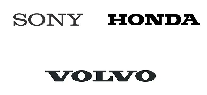
Those small strokes at the ends of letters are serifs. Law firms and publishers lean on classic serif designs, and so do plenty of heritage brands, because the strokes read as established and credible.
Standard serifs suit trust and tradition, and they stay comfortable over long passages. Slab serifs use blocky, heavy strokes and feel sturdier and more practical.
Thin serif weights break down at small sizes on low-resolution screens, so test them in the interface before committing.
Sans serif
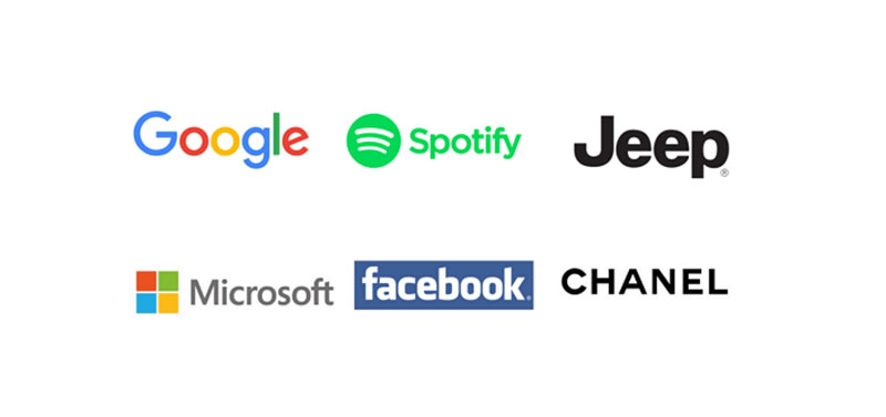
Sans serif is the default for technology and healthcare, and for most consumer brands too.
Boise State names Gotham as its official university typeface, and Motorola Solutions limits its brand to Roboto in three weights.
Neo-grotesques like Helvetica come across as neutral and corporate, and geometric faces such as Gotham and Futura use circular, confident forms. Humanist sans serifs, the friendly ones with open letterforms, take their shapes from handwritten strokes.
The catch with popular sans serifs is that everyone has them. Helvetica and Gotham sit in so many identities that the typeface alone does not set a brand apart.
Script and display
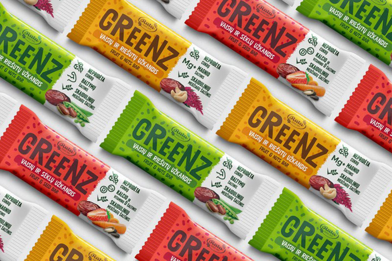
Script and display faces work for a wordmark and fail in a paragraph.
Scripts imitate handwriting and suit luxury or personal brands, and display faces are decorative enough that they belong in large headlines only. Monospace is a separate case, used mostly by technical and code-adjacent brands.
Personality also does not travel evenly. In Monotype’s cross-country work, French respondents reacted to type with stronger emotion than British ones (2023), so test the shortlist with the actual target market.
How Many Fonts Should a Brand Use?
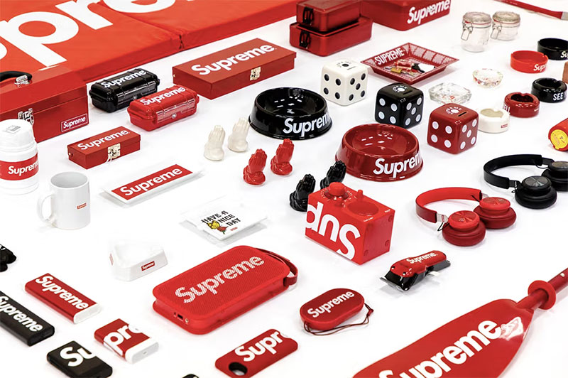
Two typefaces with assigned roles is the usual answer. A single family can do the whole job if it ships enough weights, and a third face only earns its spot by doing something the other two can’t.
Assigning roles
Published systems show the pattern. Across the seven brand type systems covered here, the split is 3 on one family, 3 on two, and 1 on three.
Boise State (Gotham), Motorola Solutions (Roboto), and Airbnb (Cereal) each run on a single family. athenahealth pairs Source Sans 3 with PT Serif, Measurable uses Futura and Poppins, and EC Innovations goes with Haffer and Copernicus. MaineHealth is the outlier at three, with Lexia, Altform, and Noto Sans.
Airbnb launched Cereal in 2018 with six weights, from light to black, so a single family covers app buttons and billboards (Dezeen).
When two families share the work, the primary carries headlines and personality while the secondary carries body text. EC Innovations labels Haffer its primary typeface and Copernicus its supporting one.
Pairing rules and failure cases
Pair for contrast in structure and agreement in proportions.
A serif beside a sans serif contrasts clearly, and athenahealth builds on exactly that with PT Serif and Source Sans 3. Matching x-height between the two keeps them from looking mismatched in the same line of text.
In practice, a serif next to a sans serif works best when the proportions are similar and the weights sit in the same range.
Two sans serifs that are nearly alike read as a mistake rather than a choice. A third family with no assigned job does the same, and a display face set as body copy is simply hard to read.
Superfamilies skip the matching problem. IBM Plex ships sans, serif, and mono designs drawn as a set, and Inter covers interface roles across many weights in one family.
Specific combinations are worked through in this guide to pairing fonts.
How to Set Type Hierarchy, Scale, and Spacing
Start with at least 3 levels, namely headline, subheadline, and body. Size them on a fixed ratio, then write down leading, tracking, and the weights each level may use. Once the rules are numbers, any layout can inherit them.
Hierarchy levels
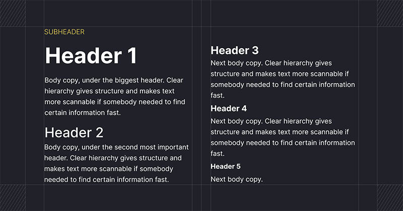
Boise State’s guidelines set the floor at headline, subheadline, and body text for every design. Larger systems add more. athenahealth orders eyebrow, Head 1, Head 2, Head 3, body, and CTA, and lets a short banner ad use only 2 or 3 levels.
Material Design 3 sorts its type styles into five roles, which are display, headline, title, body, and label (Android Developers documentation).
Every added level has to earn its place with a distinct size or weight. Otherwise the hierarchy of type levels flattens and readers lose the scanning path.
Scale ratios
A scale ratio multiplies each size from the one before it, which keeps the jumps consistent.
The minor third (1.200) gives subtle steps and suits dense content, and the major third (1.250) is clear enough for general interface work. Go to the perfect fourth (1.333) when editorial or marketing layouts need strong contrast.
With a 16px body and a 1.25 ratio, the next sizes land at 20px, 25px, and 31.25px. A type scale generator handles the rounding.
Leading, tracking, and weights
Published leading values drop as type gets bigger. Boise State sets its 50pt headline on 44pt leading (about 0.88x) and its 10pt body on 14pt (1.4x), while MaineHealth recommends 12pt body copy on 18pt leading (1.5x).
EC Innovations writes leading as multipliers of type size instead, using 1.15, 1.4, and 1.45 across its examples.
On tracking, Boise State adds 10 to its 24pt all-caps subheadline and leaves the other levels at 0. Motorola Solutions controls weights instead, permitting only Roboto Light, Regular, and Medium.
Limiting weights is the cheapest consistency control a brand has.
What published brand guidelines specify
| Organization | Typefaces and roles | Published spec |
|---|---|---|
| Boise State University | Gotham (Ultra, Bold, Black, Book) | Headline 50pt on 44pt leading; body 10pt on 14pt |
| MaineHealth | Lexia titles, Altform headlines, Noto Sans body and captions | Body no smaller than 12pt, with 18pt leading |
| athenahealth | Source Sans 3 and PT Serif | Eyebrow, Head 1 to 3, body, CTA; left-aligned text except CTAs |
| Motorola Solutions | Roboto | Light, Regular, Medium only; table copy 7pt to 9pt |
| EC Innovations | Haffer primary, Copernicus supporting | Leading set as type size x 1.15 to x 1.45 |
Figures come from each organization’s published brand guidelines.
Store these values as text styles in Figma, or in a brand platform such as Frontify, so designers pull the numbers instead of retyping them.
Free, Commercial, or Custom: Which Font License Does a Brand Need?
Most brands are fine with a commercial or open-license family. Custom type only pays off at large scale. What settles it is how many places the brand sets text and how much traffic or app volume the license has to cover.
What each license type covers
Fonts are licensed by use, not by file. Misreading how fonts are licensed usually means a file that is legal for one job and unlicensed for the next.
A desktop license covers installs on a set number of computers, for print and static design. Web licenses cover embedding through @font-face and are priced by monthly pageviews. App licenses apply to fonts built into mobile apps, are priced by downloads or number of apps, and carry no web rights. Fonts that ship inside products or devices fall under separate OEM or embedding terms.
Alphabettes counted 24 different units foundries use to measure font use, from workstations to pageviews, app downloads, and digital ad impressions. Most foundries price basic desktop and web licenses the same, but app and ePub licenses often cost more.
Free, commercial, and custom compared
Each option trades cost against distinctiveness. A comparison of Google Fonts and Adobe Fonts shows the free and subscription ends of that spectrum.
Free open license
Free fonts cost nothing, and Google’s FAQ states the catalog can be used commercially in logos, print, websites, and apps. Most families sit under the SIL Open Font License, with some under Apache or Ubuntu Font License.
The downside is that every competitor can pick the same family, and the distinctive faces stay out of the catalog (Google keeps Product Sans for its own products).
Commercial license
Commercial licenses get a brand more distinctive designs, either from foundries such as Monotype or inside subscriptions such as Adobe Fonts.
The cost is paperwork. Separate licenses per use, traffic tiers, and renewals pile up, though at Fontfabric every license except desktop can be annual or perpetual, and desktop is always perpetual.
Custom typeface
A custom typeface gives the brand an ownable design when the contract assigns the rights, and there are no recurring license fees afterward. What it costs up front is money and time, with a build time of 4 to 12+ weeks (Jamie Clarke Type).
What a custom typeface costs
Two published estimates disagree, and the gap comes from scope. Independent type designer Jamie Clarke quotes fully custom design fees that start at about GBP 10,000 to GBP 16,000 for a single-master design with Western European language support.
Type industry veteran Thomas Phinney estimates roughly $30,000 to $38,000 per style in 2024 terms, before any exclusivity premium, with early-career designers quoting as low as $8,000 to $25,000.
The ranges overlap once style count and designer reputation are accounted for. Typotheque points to a cheaper route, since adapting an existing typeface costs less than drawing a new one from scratch.
When custom type pays off

Custom type pays off when license counts, impressions, or domains multiply.
Netflix replaced Gotham with Netflix Sans, built with foundry Dalton Maag. Brand design lead Noah Nathan told It’s Nice That in 2018 that it saves the company millions of dollars a year as foundries move toward impression-based licensing.
Coca-Cola’s TCCC Unity joined Intel, Nokia, and General Electric among brands with their own typefaces, Marketing Interactive reported in 2018.
Tiro Typeworks makes the same scale argument. An organization installing fonts across a large internal user base, supplying agencies and subsidiaries, and deploying web fonts to multiple domains can find commissioning competitive with licensing.
Below that scale, skip it. A small or mid-size brand gets more from a licensed family used consistently than from a custom build whose cost never pays back.
How to Deliver Brand Typography on the Web
Serve brand fonts as WOFF2 and declare a fallback stack with matched metrics. Then set font-display on purpose. Together these decide whether the brand typeface shows on first paint and whether the page jumps when it arrives.
Font formats
WOFF2 is the web format. The W3C’s 2018 WOFF2 Recommendation specifies Brotli compression and covers the full TrueType and OpenType specifications, including variable fonts.
A variable font holds a whole weight range in one file. Static files make more sense for a brand using one or two weights. Once three or more are in play, a variable file is usually the better call.
Fallbacks and system fonts
Chrome falls back to its default font, typically a serif such as Times, when a font-family rule names no fallback, and that is a poor match for a sans serif brand face.
End every stack with a generic keyword and add a web-safe fallback close to the brand face in width and weight. SF Pro is the system font on macOS (Apple Human Interface Guidelines), so a system stack renders instantly in the platform’s own face.
Matching fallback metrics to the web font is done with CSS descriptors, and web.dev covers size-adjust, ascent-override, descent-override, and line-gap-override.
Preloading critical font files also helps text render sooner and benefits Largest Contentful Paint (web.dev).
Layout shift and font-display
| Value | Behavior | Trade-off |
|---|---|---|
| block | Short invisible period, unlimited swap | Invisible text first, then a shift |
| swap | Extremely small block period, unlimited swap | Fallback shows first, then a shift |
| fallback | Extremely small block period, short swap period | Swaps only if the font arrives quickly |
| optional | Extremely small block period, no swap | No re-layout, but slow connections stay on the fallback |
Values follow MDN’s font-display reference (CSS Fonts Module Level 4).
Web fonts sit on web.dev’s short list of common CLS causes, next to images and embeds without dimensions. The target is a CLS of 0.1 or less for at least 75% of page visits.
A brand that wants its face on first load should pair swap with metric overrides. Optional is the safer layout choice for body text on slow connections.
What Accessible Brand Typography Requires
WCAG 2.2 sets contrast and text spacing criteria that brand typography has to clear. There is one exemption that favors brands, since text that is part of a logo or brand name has no contrast requirement. Body copy set in brand colors gets no such pass.
Contrast and size
The W3C defines large text as 18pt, or 14pt bold, and gives it a lower contrast threshold. An enhanced level (SC 1.4.6, Level AAA) raises the bar to 7:1 for normal text and 4.5:1 for large text.
Contrast depends on the rendered pairing of color and size, so test every level of the hierarchy separately. A brand color that passes on a 60pt headline can fail on a 12pt caption.
When a color fails, darken the text color and keep the original brand color for graphics.
Text spacing and line width
SC 1.4.12 (Level AA) requires content to keep working when users override spacing. Line height, what designers call leading, is the first property to break in fixed-height containers.
The W3C notes content is not required to use the spacing values, only to survive them. Letter spacing, known as tracking in type circles, gets the same treatment.
SC 1.4.8 (Level AAA) adds a line width cap, unjustified text, and generous line spacing within paragraphs.
WCAG 2.2 values to design against
- Normal text needs a contrast ratio of at least 4.5:1 (SC 1.4.3, Level AA).
- Large text, meaning 18pt or 14pt bold, needs at least 3:1.
- Line height should survive being set to 1.5 times the font size, and paragraph spacing to 2 times (SC 1.4.12).
- Letter spacing at 0.12 times and word spacing at 0.16 times the font size must not break the layout (SC 1.4.12).
- Line width tops out at 80 characters, or 40 for CJK (SC 1.4.8, Level AAA).
Values come from the W3C’s WCAG 2.2 and its Understanding documents.
Where brand rules and accessibility collide
Guidelines disagree on all caps. Some brand systems set subheadlines in capitals, while American Express’s typography guidelines tell designers to build hierarchy with scale and weight, plus color, instead.
The same guidelines frame their rules as support for readers with reading disabilities such as dyslexia.
When Brand Typography Breaks Down
Brand typography tends to fail at the edges, and each failure has a documented trigger.
License scope trips up teams first. Web fonts cannot be installed on a desktop or used in InDesign, Pages, or Word, according to TypeTogether. Web licenses are also tiered by pageviews, so growth eventually forces an upgrade.
On the rendering side, a fallback with different metrics shifts the layout when the brand face loads (web.dev). Email and office documents drop to system fonts unless the typeface is installed or embedded.
Hierarchy can fail too. Levels that differ only slightly in size leave readers without a scanning path.
Pageview caps work differently across foundries. TypeTogether sells perpetual web licenses starting at an average of 100,000 monthly pageviews, while pay-as-you-go models use a prepaid pageview allowance, and more pageviews must be bought when it runs out.
Not every rule is fixed. American Express’s guidelines say visual hierarchy should mimic content hierarchy, and that designers may assign a heading hierarchy that best matches their designs.
An app that does not need a custom brand face can sidestep font licensing entirely, since Apple supplies San Francisco and New York as system typefaces.
Brand Typography FAQ
Can a brand use Google Fonts commercially, including in a logo?
Yes. Google states that every family in its catalog is open source and can be used commercially, including in logos, print, websites, and apps.
Most families sit under the SIL Open Font License, so check each family’s license file before redistributing the font files.
Should the logo font match the fonts used in text?
Not necessarily. Logo lettering and body typefaces do different jobs, and WCAG treats them differently, since text that is part of a logo or brand name has no contrast requirement while body text does.
Keep the two compatible in personality, not identical.
How often should a brand revise its typography?
There is no fixed interval. Revise when a license tier is outgrown or a text style fails WCAG contrast. A brand repositioning counts too.
Between triggers, stable rules do more for recognition than a refresh.
Should a brand site self-host its Google Fonts?
Usually yes. The HTTP Archive’s 2024 Web Almanac found exclusive self-hosting rose from 22% to 28% of desktop sites between 2022 and 2024, because it often gives better performance and privacy.
Self-hosting means redistributing the font files, so keep each family’s license file with them.
Keeping Brand Typography Consistent Across Channels
Consistency comes down to working in a fixed order. License scope for every channel goes first, then text styles with recorded values, then fallback, loading, and contrast tests. Reversing that order means styling layouts the brand may not be licensed to publish.
License scope goes first because it is the only failure with legal consequences, and every later decision inherits it.
Testing goes last because it checks the finished system. A published body leading of 1.4x sits below the 1.5x line height that WCAG 1.4.12 expects layouts to survive, so containers need room to grow.
The cost is flexibility, since fixed weights and levels remove ad hoc choices. That is the intent.
The next step is writing the sequence into a full set of brand guidelines.

Renowned for his expertise in logo design and visual branding, Bogdan has developed a multitude of logos for various clients.
His skills extend to creating posters, vector illustrations, business cards, and brochures. Additionally, Bogdan's UI kits were featured on marketplaces like Visual Hierarchy and UI8.
He also wrote in the past years on sites like Design Your Way, WebDesignerDepot, WPDean, Designmodo, Speckyboy, Slider Revolution, and more.
- The Windsurf Logo History, Colors, Font, And Meaning - 10 October 2026
- How Designers can Build a Stronger Online Creative Identity - 9 October 2026
- Minecraft Font Generator - 8 October 2026

Bogdan Sandu is a seasoned designer who has been designing websites since 2008. Renowned for his expertise in logo design and visual branding, Bogdan has developed a multitude of logos for various clients. His skills extend to creating posters, vector illustrations, business cards, and brochures. Additionally, Bogdan's UI kits were featured on marketplaces like Visual Hierarchy and UI8. He also wrote in the past years on sites like Design Your Way, WebDesignerDepot, WPDean, Designmodo, Speckyboy, Slider Revolution, and more.
You Might Also Like