Of everything a logo gets credited with, the best-supported job is identification. A customer sees the mark and knows which business a product or a web page belongs to.
That works through recognition, not recall. In a 2025 experiment (Demirel and Baycu, Applied Cognitive Psychology), none of 200 participants reproduced the Google logo accurately, yet they recognized it better than they could recall it.
Past identification, the evidence gets thinner. A logo’s effect on customer trust varies by industry, and some of the usual claims about it don’t hold up well.
What Does a Logo Do for a Business?

Customers use the logo to work out whose product they are looking at. A shopper can tell that the package in their hand and the page on their phone come from the same company without reading a word.
It also marks ownership. Put on products and invoices, and again on the storefront, it shows what the business made and stands behind. For a stranger, it is usually the first piece of the company they see.
Each of those jobs is narrower than most advice makes it sound.
The logo is only one piece of the broader visual identity, which also covers color and type, plus whatever imagery the company uses.
It is also not the brand. A mark cannot repair a weak product or poor service, and customers judge the business on those, not on the mark.
How Does a Logo Build Brand Recognition and Recall?

Recognition comes from seeing the same shape over and over until it matches something in memory. Recall, which means reproducing that shape with no prompt, is a harder test, and most people fail it.
Recognition and Recall Are Different Tests

Picking a logo out of a set counts as recognition. Recall means drawing or describing it from memory, with nothing in front of you.
A 2025 experiment on the Google logo (Demirel and Baycu, Applied Cognitive Psychology) found participants did better at recognition than recall. After about a decade of exposure to the current logo, they still more often selected the previous version.
In practice, nobody needs to be able to draw your logo for it to work. It has to be familiar enough to pick out, and it has to stay put long enough for memory to settle.
Nike went the furthest with this. It dropped its name from the logo in 1995, and the Swoosh has appeared alone since.
Shape, Color and What the Studies Disagree On
The studies disagree partly because each one measures a different task.
Claessens Product Consultants (1997) found that shape matters more than color for identifying a logo, and that identification does not depend on color. Signs.com asked people to draw well-known logos from memory, and they got the colors right far more often than the shapes.
Torbarina, Grguric Cop and Jelenc (2021) found greyscale logos and concrete, picture-like logos were recognized more accurately than colored and abstract ones.
Read together, shape does the identifying and color gets remembered. On shape type the sources split: Packaging Strategies’ report on the Claessens work favors abstract shapes, while Torbarina found concrete ones recognized more accurately.
The rule I’d take from all this is to get the shape working in one color first and add the palette afterward.
A few numbers from those studies. About 80% of participants chose the correct palette for the brands they drew (signs.com). More red in a logo related to weaker recognition, and more blue and green to stronger (Torbarina et al., Our Economy, 2021). The Google result is still the starkest figure here, with none of 200 participants reproducing the logo accurately (Demirel and Baycu, 2025).
Does a Logo Affect First Impressions and Trust?
Yes, within limits. A logo shapes the first judgment of a business, but how far it moves trust depends on the industry.
Visitors judge the visual appeal of a web page in 50 milliseconds, according to Lindgaard and colleagues at Carleton University (Behaviour and Information Technology, 2006).
That study flashed whole pages, not logos. It sets the window for a first impression and says nothing about the logo’s share of it.
Lowry, Wilson and Haig (International Journal of Human-Computer Interaction, 2014) tested logos built to convey expertise and trustworthiness. Those logos raised the perceived credibility of the company’s website, which in turn raised trust and willingness to transact. The effect grew when the site design matched the logo.
There is a limit to this, though. Venngage and SurveyMonkey asked respondents to rate hypothetical logos across six industries, and industry had a bigger effect on trust than the logo itself.
The gap between the most and least trusted logo was 9% for jewelry and 35% for law. Logo choice matters most where that spread is widest.
Before trusting your own opinion of a logo, set it beside two competitors on a search results page and shrink it to storefront sign size. Print it in one color too. Then show it to someone who has never heard of the business and ask what it sells.
How a Logo Sets a Brand Apart From Competitors
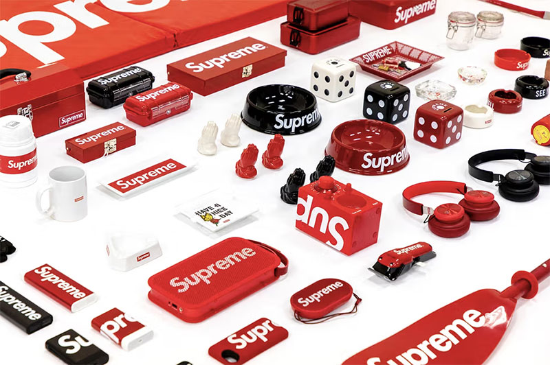
A mark that copies the category look identifies nobody, so the first requirement is looking different from what competitors in the same category already use.
There is a limit to that, too. In the Venngage and SurveyMonkey survey, icon-only logos were the least trusted style for law firm, news and media, and tech brands, so a distinct mark still has to read as credible in its category.
FedEx is a well-known case of a mark that stays distinct without breaking category norms. Lindon Leader designed the 1994 wordmark at Landor Associates so that the negative space between the E and the x forms an arrow.
Leader has said the logo works even for people who never notice the arrow, which is why the arrow reads as a bonus and not the point (CNN Style).
A mark that sits too close to a competitor’s can also be refused registration.
Which Logo Type Fits Which Business

Which type fits depends mostly on how long the name is and how much recognition the business already has.
Coca-Cola’s script is the standard wordmark example, where the name itself is the logo. It suits a short, distinctive name and struggles when the name is long or generic.
Long names tend to push businesses toward initials, which is the lettermark approach, and IBM’s mark, designed by Paul Rand, is the one most people point to. The catch is that initials mean nothing until the company has spent real marketing money on them.
Pictorial marks use a recognizable image, as Apple does. They need a brand with enough reach to tie the image to the name, so a new business with no audience will have a hard time with one.
Abstract marks, like the Nike Swoosh, are non-literal shapes. They work in crowded categories where a brand needs a shape of its own, though the shape says nothing about what the business does.
A combination mark pairs a symbol with a wordmark, and the two parts work together or alone. That flexibility is why it fits most small businesses.
Emblems put text inside a badge or crest. Institutions and heritage brands use them, and they lose detail at small sizes.
For a new business, a combination mark with a plain wordmark is the safest start. Pick the simplest type that still looks different from the nearest competitors.
Why Does Logo Consistency Across Touchpoints Matter?

Recognition builds from repetition, so a logo that changes shape between the website and the packaging ends up splitting recognition across several marks.
The logo shows up on packaging, the website, the favicon, signage, social profiles and invoices, and any of those can drift from the master file.
Logos break in predictable ways. Stretched proportions and recolored versions do most of the damage, along with crowded backgrounds and several unrelated files in circulation.
Lucidpress’s 2019 State of Brand Consistency report put the revenue estimate for consistent presentation at up to 33%. Respondents were brand managers estimating their own organizations, and Lucidpress sells brand templating software, so treat the number as a perception, not a measured effect.
A one-page set of brand guidelines is enough to keep a logo stable, as long as it covers the following points.
- Name the primary logo and its approved variations, such as horizontal, stacked and icon only.
- Clear space around the mark.
- Set a minimum size for print and screen.
- Lock the colors, with Pantone values for print and hex values for screen.
- A list of approved file formats and what each one is for.
Master files should be vector graphics, such as SVG or Adobe Illustrator artwork, because vectors scale from favicon to billboard without losing edges. Raster files like PNG suit fixed-size uses such as social avatars.
The favicon is the smallest touchpoint. As of October 2026, Google Search Central’s guidelines call for a square (1:1) favicon of at least 8x8px, recommend one larger than 48x48px, allow one favicon per site hostname, and ask that it represent the brand visually. Google Search supports BMP, GIF, ICO, PNG, JPEG, PPM and TIFF files, so export a raster favicon from the vector master.
How Can a Business Legally Protect Its Logo?
Registering the logo as a trademark is the route, and it goes through the office that covers the markets where the business sells. That office decides the territory, the fee and what the registration covers.
| Office | Territory | Base fee |
|---|---|---|
| USPTO | United States | $350 per class |
| EUIPO | European Union | EUR 850 for one class, filed online |
| WIPO Madrid System | Countries named in one international application | 653 CHF basic fee (903 CHF for a color mark), plus a fee for each designated country |
The USPTO figure comes from its fee rule effective January 18, 2025, and the EUIPO figure from its 2024 schedule. A class is one category of goods or services, and each extra class adds a fee.
US registrations rest on the Lanham Act, the federal trademark statute.
In trademark terms, a word mark is the name in plain text, not a type of logo. Under USPTO practice, a standard character registration covers the wording in any font, size or color. A design mark works differently, since it covers only the drawing that was filed and does not protect the name written in other styles.
The USPTO charges surcharges when an application is incomplete, for example a design mark filed without a written description, or when goods are described in free text instead of from its ID Manual. Filing fees are not refunded if the application is refused.
Examiners generally weigh the wording in a logo more heavily than the artwork when checking for confusion with an earlier mark, though a prominent graphic element can shift that balance (Patent and Trademark Blog).
File the name first, then add the logo once the design is final.
What Does a Logo Cost, and Is It Worth Paying More?
Costs run from nothing to several thousand dollars, and most small businesses land between a few hundred and about $2,500. The higher tiers add research and strategy work that a one-location business rarely needs.
| Route | Typical cost | Watch for |
|---|---|---|
| DIY logo maker | $0 to $100 | Shared templates, few file types |
| Freelance designer | $300 to $2,500 | Scope, revisions, ownership terms |
| Branding agency | $2,500 and up | Strategy work you may not need |
The ranges come from Wix’s 2025 logo cost guide. Wix sells a logo maker, and no independent survey of logo prices turned up, so read them as vendor estimates.
Sources also disagree on where agency pricing starts, with Experte, Wix and JUST Creative each giving a different floor.
Free and AI generators sit at the bottom of the table. Because they draw on shared templates, two businesses can end up with near-identical marks.
Before paying anyone, check that the quote includes vector source files and a one-page guideline sheet. It should also give you a written transfer of rights to the business, plus an originality check against existing marks.
For most small businesses, a freelancer-made combination mark plus that guideline sheet is enough. An agency earns its fee when the mark has to clear trademark checks across several classes or countries.
None of the sources above isolates a return on logo spend alone, so the sensible budget is the one that avoids a redesign later.
What Happens When a Logo Redesign Goes Wrong?
Failed redesigns usually get reversed within days or weeks, after a visible hit to sales or reputation. The company ends up paying for the redesign and then for the reversal, and loses some goodwill along the way.
Tropicana’s January 2009 carton redesign cut unit sales by 20% between January 1 and February 22, and PepsiCo announced on February 23 that it would scrap it (Advertising Age, citing Information Resources Inc., 2009).
That was a packaging change, not a logo change alone. Loss estimates vary widely between sources.
Gap’s new logo went live on its website on October 4, 2010 and was dropped on October 11. Its North America president said the company had not gone about the change in the right way (CNNMoney, 2010).
Kraft changed its logo year after year from 2009 to 2012, and after the third change drew poor reviews the company moved back toward its 2009 look (NZ Marketing Magazine).
Gap and Tropicana remain the best-documented rebranding failures because the reversals were fast and public. In both, customers said the new look no longer read as the brand they knew.
NZ Post shows the opposite approach. It redesigned because its business was shifting from mail to couriers, and it kept the red button element after research showed customers noticed it (NZ Marketing Magazine).
A few questions to settle before commissioning a redesign would have caught most of these failures. Has the business changed, or only the taste in design?
Whatever customers use to recognize the logo should survive any redesign. And the new version needs testing with real customers and frontline staff before it goes live.
A redesign also has a legal cost. A design mark registration covers only the version that was filed, so the new logo needs its own application, while a word mark registration carries over (trademark firm Trama).
When a Logo Is Not Enough

A logo stops paying off when too few people have seen it to recognize it, or when the budget runs out before the usage rules do. Recognition comes from repeated exposure, and a new mark starts with none.
| Situation | Logo spend | Better first move |
|---|---|---|
| Pre-revenue startup | Minimal | Simple combination mark, fund the product |
| Short-lived campaign | None | Reuse the parent brand’s logo |
| Brand with a known name | Low | Refresh type and spacing, keep the recognizable shape |
| Expansion into new countries | Higher | Run trademark checks before the design is final |
The evidence that a logo alone moves sales is thinner than most advice implies. Tropicana’s drop followed a packaging change, and Gap’s logo-only reversal came with no published sales figure in the sources reviewed.
The recognition research has limits too. Torbarina’s 2021 study used students, and the Claessens work tested logos in isolation, so neither says much about a mark sitting beside a product on a shelf.
Match the spend to the audience the mark will actually reach.
Logo FAQ
Does a startup need a logo from day one?
Yes, a simple one. The mark goes on the first website, invoice and package, and recognition starts building from that first exposure.
A plain combination mark costs little, so hold the larger budget until the business has customers.
How often should a logo be updated?
There is no fixed schedule. Redesign when the business changes, such as a new product line or a new market, and keep the shape customers already recognize.
Small adjustments to type and spacing rarely need an announcement.
Which colors should a logo use?
Pick one or two colors that separate the brand from category rivals and still read at small sizes.
Settle the shape first, since shape carries identification and color follows.
Can a logo be copyrighted as well as trademarked?
Sometimes. A logo with enough original artwork can carry copyright, which protects the drawing, while a trademark protects its use as a brand identifier.
Basic shapes and plain lettering generally fall short of copyright, so get a written transfer of rights from the designer and rely on trademark.
Why do customers react badly when a familiar logo changes?
A familiar logo is the shortcut customers use to spot a brand, and a change removes it.
Gap’s 2010 statement said customers were passionate about the blue box logo and wanted it back (Gap statement, O’Dwyer’s, 2010).
Where to Spend First on a Logo
With a small budget, I’d start with a simple combination mark delivered as vector source files, then write the one-page usage guide. Trademark filing comes after that, with the word mark filed now and the logo filed once the design settles.
Splitting the filing makes sense because a word mark covers the name in any font, while a design registration covers only the version filed. Filing the design early locks the fee onto a drawing that can still change.
The trade-off is a plainer first mark, and revenue can later fund building a full brand identity around it.
The USPTO reviews its trademark fees every two years (USPTO, 2025), so the cost of the filing step is re-priced on that cycle. Position verified October 2026.

Renowned for his expertise in logo design and visual branding, Bogdan has developed a multitude of logos for various clients.
His skills extend to creating posters, vector illustrations, business cards, and brochures. Additionally, Bogdan's UI kits were featured on marketplaces like Visual Hierarchy and UI8.
He also wrote in the past years on sites like Design Your Way, WebDesignerDepot, WPDean, Designmodo, Speckyboy, Slider Revolution, and more.
- The Windsurf Logo History, Colors, Font, And Meaning - 10 October 2026
- How to Remove Background From Product Photos (No Photoshop) - 10 October 2026
- How Designers can Build a Stronger Online Creative Identity - 9 October 2026

Bogdan Sandu is a seasoned designer who has been designing websites since 2008. Renowned for his expertise in logo design and visual branding, Bogdan has developed a multitude of logos for various clients. His skills extend to creating posters, vector illustrations, business cards, and brochures. Additionally, Bogdan's UI kits were featured on marketplaces like Visual Hierarchy and UI8. He also wrote in the past years on sites like Design Your Way, WebDesignerDepot, WPDean, Designmodo, Speckyboy, Slider Revolution, and more.
You Might Also Like