People decide whether they trust a business in under a second. Most of that judgment is visual.
Learning how to create a brand identity is the difference between looking like a real company and looking like a side project. Your logo, colors, typography, voice, and messaging all work together to shape perception before anyone reads your pitch or tries your product.
This guide covers the full brand identity design process, from defining your brand strategy and researching your market to designing visual elements and building a complete brand style guide. No filler, just the steps that actually produce results.
What is Brand Identity

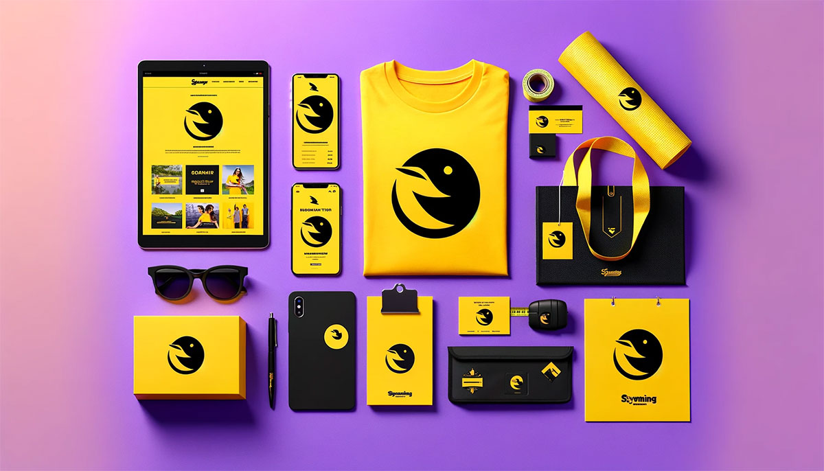
Brand identity is the collection of visual, verbal, and strategic elements a company creates to shape how its audience perceives it. It includes the logo, color palette, typography, brand voice, messaging, and design system that work together to form a recognizable and consistent presence.
It is not the same as a brand. A brand is what people think and feel about a company. Brand identity is what the company builds to influence that perception.
Think of it this way. Coca-Cola’s red color, Spencerian script logo, and specific tone of voice in advertising are all brand identity elements. The feelings of nostalgia and happiness people associate with Coca-Cola? That’s the brand.
Every business, from a startup to a Fortune 500, relies on brand identity to communicate who they are before a single word of sales copy gets read. It’s the first thing people process, and most of that processing happens visually in under a second.
How Does Brand Identity Differ from Brand Image
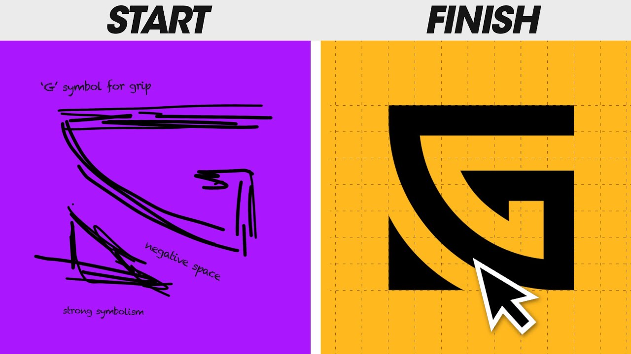
Brand identity is what you create. Brand image is what people actually think.
The gap between these two is where most branding problems live. You might design a sleek, modern visual identity with clean fonts and a minimal color scheme, but if your customer service is terrible, your brand image will reflect that instead.
Brand identity covers everything you control: your logo, your brand guidelines, your messaging framework, your packaging, your website design. Brand image is the result of every interaction a customer has with your business, filtered through their own expectations and experiences.
Apple controls its brand identity with extreme precision. Every product launch, every retail store, every ad follows the same design system. The brand image that results, innovation and premium quality, closely matches the identity they built. That alignment took decades of consistent effort.
A useful test: ask five customers to describe your business in three words. Then compare those words to your brand positioning statement. If the overlap is small, there’s a gap between your identity and your image.
Why Does Brand Identity Matter for a Business

A strong brand identity does three things at once: it creates recognition, builds trust, and adds financial value to the business.
Recognition comes first. According to a 2023 Lucidpress report, consistent brand presentation across platforms increases revenue by up to 23%. People buy from brands they recognize. Brand consistency across every touchpoint, from social media profiles to product packaging, makes that recognition possible.
Trust is second. When every visual and verbal element looks cohesive, people assume the business behind it is organized, reliable, and professional. Inconsistency signals the opposite. A mismatched color here, a different font there, and suddenly the whole operation feels unreliable.
Then there’s brand equity. Nike’s swoosh, designed by Carolyn Davidson in 1971 for $35, now contributes to a brand valued at over $53 billion. The logo itself is a financial asset. That’s brand equity in action, and it only exists because the identity behind it stayed consistent for over 50 years.
Brand loyalty follows identity. Customers who connect with a brand’s personality and values return more often and spend more. They also forgive mistakes faster. A well-built identity gives customers a reason to stay even when a competitor offers a lower price.
What Are the Core Elements of a Brand Identity
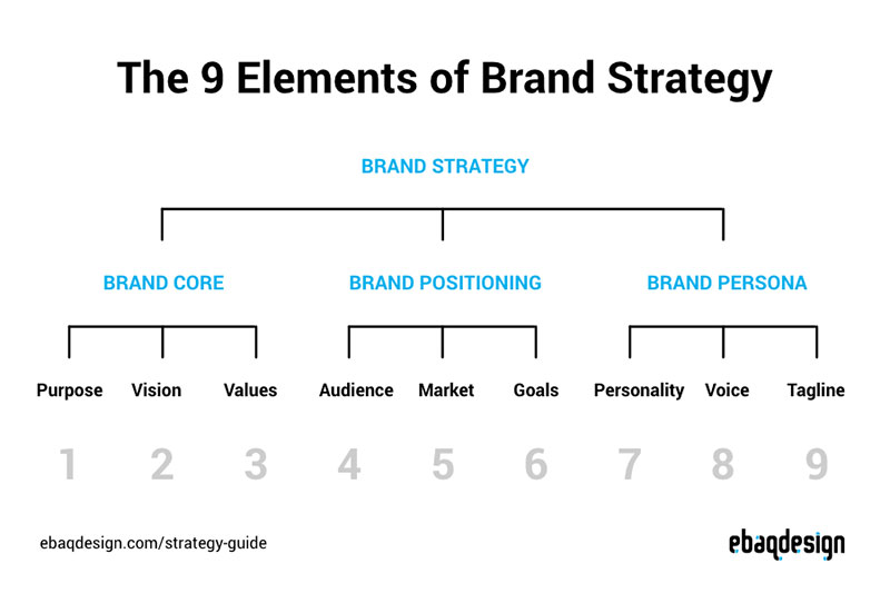
Brand identity breaks down into specific, definable components. Each one handles a different job, but they only work when they work together.
Skip one, and the whole system feels incomplete. Get them all right, and the brand starts to feel like a real thing, not just a business with a website.
What Role Does a Logo Play in Brand Identity
A logo is the single most recognizable piece of any brand identity. It acts as a visual shorthand, the one mark that appears on everything from business cards to app icons to billboards.
Good logos follow specific logo design principles: simplicity, memorability, scalability, and relevance. The best ones, like the Apple icon or the McDonald’s arches, work at any size and in any context.
Most brands need multiple logo versions. A primary horizontal version, a stacked version, an icon-only version, and sometimes a simplified mark for small applications like favicons. Your brand style guide should document exactly when to use each one.
Logo shapes carry meaning too. The psychology of shapes shows that circles suggest community and warmth (think Starbucks), while angular shapes communicate stability and strength (like Mitsubishi’s diamond pattern).
One thing I see constantly: businesses spending months on a logo before they’ve defined their brand strategy. That’s backwards. The logo should express the strategy, not replace it.
How Do Brand Colors Influence Perception
Color is the fastest way to trigger an emotional response. People form an opinion about a product within 90 seconds, and up to 90% of that assessment is based on color alone, according to research from the University of Winnipeg.
Color psychology drives real purchasing decisions. Blue builds trust (used by nearly every major bank and tech company). Red creates urgency and excitement. Green signals health, nature, or wealth. Black communicates luxury and sophistication.
But picking a color because it “feels right” is not a strategy. You need to understand color theory and how different hues interact. A complementary color scheme creates high contrast and visual energy. Analogous colors produce a more harmonious, calming effect.
Your brand color palette typically includes:
- One or two primary brand colors
- Two to three secondary colors for supporting elements
- Neutral tones for backgrounds, text, and spacing
- An accent color for calls-to-action and highlights
Document every color with its RGB, CMYK, Pantone, and HEX values. RGB is for screens. CMYK is for print. Pantone gives you exact color matching across physical materials. HEX codes go in your CSS.
Skip the Pantone reference and your business cards will look different from your brochures. Took me way too long to learn that one.
Why Does Typography Matter in Branding
Typography carries personality before anyone reads a single word. A serif font like Garamond says tradition and authority. A sans-serif font like Helvetica says modern and clean. A script font says elegance or creativity, depending on execution.
The psychology behind font choices is measurable. A 2012 study by filmmaker Errol Morris, published in The New York Times, found that Baskerville made statements more believable than Comic Sans or Helvetica.
Brand typography systems usually include two to three typefaces: a primary one for headlines, a secondary one for body copy, and sometimes a display font for special applications. Pairing fonts well requires contrast without conflict.
Pay attention to the technical details too. Kerning (space between individual letter pairs), tracking (overall letter spacing), and leading (line spacing) all affect readability and mood. Tight tracking feels urgent and bold. Generous leading feels open and relaxed.
And don’t forget font licensing. Using a font commercially without the right license is a legal risk most small businesses don’t even think about until they get a cease-and-desist letter.
What is Brand Voice and How Do You Define It
Brand voice is how your company sounds in writing and speech. It stays consistent across every channel, from website copy to social media posts to customer support emails.
Mailchimp is a good example. Their voice is friendly, slightly irreverent, and clear. You can read any piece of Mailchimp content and know it’s them before you see the logo. That doesn’t happen by accident. It’s documented in their content style guide.
Defining brand voice starts with three to five personality traits. Not generic ones like “professional” or “friendly.” Specific ones. “Confident but not arrogant.” “Witty but never sarcastic.” “Direct but warm.”
From there, build a voice chart with two columns: “We are” and “We are not.” This gives writers clear boundaries without restricting creativity.
Tone shifts depending on context. An error message sounds different from a marketing email, but the underlying voice stays the same. Slack does this well. Their voice is always casual and helpful, but the tone adjusts from playful in onboarding screens to reassuring in error states.
How Does Imagery Shape Brand Recognition
Imagery includes photography style, illustration approach, iconography, and any visual content the brand produces. It’s one of the most overlooked parts of brand identity, and one of the most visible.
Airbnb uses warm, natural photography of real homes and real people. You’ll never see a stock photo of a person pointing at a whiteboard on their site. That consistency builds trust and communicates exactly what the brand stands for, which is belonging and authenticity.
Your imagery guidelines should cover:
- Photography style (natural vs. studio, filtered vs. raw, people vs. product)
- Illustration style (line art, flat design, 3D, hand-drawn)
- Icon style (outlined, filled, rounded, sharp)
- Image treatment (overlays, saturation levels, gradient overlays)
File formats matter here. Use vector graphics (SVG, AI, EPS) for logos and icons since they scale without losing quality. JPEG works for photographs. PNG for images that need transparency. Understand the difference between pixel-based formats and vectors early, and you’ll save yourself hours of rework.
What is a Brand Tagline and When Do You Need One
A tagline is a short phrase that captures the brand promise or positioning in a memorable way. Nike’s “Just Do It.” Apple’s “Think Different.” De Beers’ “A Diamond is Forever.”
Not every brand needs one. If your brand name clearly communicates what you do, a tagline might just add noise. But if your name is abstract or your positioning needs reinforcement, a tagline gives people something to hold onto.
Good taglines are under eight words. They focus on the customer benefit, not the company feature. And they age well. Avoid trendy language that will sound dated in two years.
How to Research Your Market Before Building a Brand Identity

Designing a brand identity without research is like coding a website without a wireframe. You’ll end up redoing most of it.
Market research for branding covers three areas: your competitors, your audience, and your own company’s strengths. All three feed directly into the visual and verbal decisions you’ll make later.
How Do You Analyze Competitor Brand Identities
Pull up the websites, social profiles, and marketing materials of your five closest competitors. Screenshot everything. Put it all in one place.
Look for patterns. Are most competitors using blue? Are they all using sans-serif typography? Do they sound the same in their copy? Patterns reveal opportunities. If everyone in your space looks corporate and safe, a bolder, more expressive identity will stand out.
Document what each competitor does well, what falls flat, and where there’s a gap. That gap is your opening. Some brands have studied how other companies position themselves and found clear white space just by looking at what everyone else avoided.
What Questions Should You Ask Your Target Audience
Talk to actual customers or potential customers. Not focus groups of 50 people, just 10 to 15 honest conversations will surface patterns fast.
Ask questions like:
- What three words would you use to describe our company?
- What made you choose us over a competitor?
- What almost stopped you from buying?
- Which brands (in any industry) do you trust the most, and why?
The answers will tell you what matters to your audience emotionally, not just functionally. That emotional data shapes your color choices, your voice, your imagery, everything.
If you’re a startup without customers yet, study the audience of the closest competitor. Read their reviews. Look at what people praise and complain about. Those insights are free and surprisingly useful.
FAQ on How To Create A Brand Identity
What is brand identity?
Brand identity is the set of visual and verbal elements a company creates to shape public perception. It includes the logo, color palette, typography, brand voice, and messaging framework. It is what you build. Brand image is what people perceive.
What are the core elements of a brand identity?
The core elements are a logo, brand colors, typography system, brand voice, imagery style, and a tagline. These components are documented in brand guidelines to keep everything consistent across all channels and touchpoints.
How much does it cost to create a brand identity?
Costs range widely. A freelance designer might charge $1,000 to $5,000. Agencies like Pentagram or Landor Associates charge $50,000 to $500,000+. Tools like Canva and Figma let startups handle basics affordably, but professional brand development delivers stronger long-term results.
How long does the brand identity design process take?
A complete brand identity design process typically takes 4 to 12 weeks. Research and strategy take the most time. Visual design moves faster once the brand positioning, personality traits, and messaging framework are locked in.
Can I create a brand identity myself?
Yes, especially for startups with limited budgets. Tools like Adobe Illustrator, Figma, and Canva make it possible. But understanding graphic design principles and color theory basics is necessary to avoid amateur-looking results.
What is the difference between brand identity and branding?
Brand identity is the collection of design and messaging assets. Branding is the ongoing process of applying those assets to shape perception. Identity is the toolkit. Branding is the action of using it across every customer interaction.
How do I choose the right colors for my brand?
Start with color psychology to match emotional intent. Then select a color scheme, whether complementary, triadic, or analogous, based on the contrast and mood your brand needs. Test across digital and print.
How do I keep my brand identity consistent?
Build a brand style guide documenting every element: logo usage, color codes, typography rules, voice guidelines, and imagery standards. Share it with every team member, freelancer, and vendor who touches any brand material.
When should a company consider rebranding?
Rebrand when your identity no longer reflects your business, audience, or market position. Mergers, outdated visuals, or a shift in company direction are common triggers. Several well-known companies have rebranded successfully after outgrowing their original identity.
What mistakes should I avoid when creating a brand identity?
Skipping research, copying competitors, choosing trendy fonts over legible ones, and ignoring brand voice are the biggest errors. Also, designing a logo before defining your brand strategy almost always leads to a redesign later.
Conclusion
Knowing how to create a brand identity is only half the work. The other half is applying it with discipline across every single touchpoint your audience encounters.
Your brand differentiation lives in the details. The spacing between letters in your headlines. The exact Pantone swatch on your packaging design. The tone of a customer support reply at 11 PM.
Start with strategy, not aesthetics. Define your brand positioning before you open Figma or Adobe Illustrator. Research your competitors and your audience before picking a single color.
Then build the system. Logo variations, a complete color palette with HEX and Pantone values, a typography system that scales, a documented voice, and clear imagery standards.
A strong brand identity is not a one-time project. It is a living system that grows with your business, your market, and your customers. Protect it, refine it, and measure its performance regularly.

Renowned for his expertise in logo design and visual branding, Bogdan has developed a multitude of logos for various clients.
His skills extend to creating posters, vector illustrations, business cards, and brochures. Additionally, Bogdan's UI kits were featured on marketplaces like Visual Hierarchy and UI8.
He also wrote in the past years on sites like Design Your Way, WebDesignerDepot, WPDean, Designmodo, Speckyboy, Slider Revolution, and more.
- How to Install Fonts on Mac (Step-by-Step Guide) - 20 September 2026
- From Mockup to Code: How AI-Augmented Development Speeds Up the Design Handoff - 19 September 2026
- The Beehiiv Logo History, Colors, Font, And Meaning - 18 September 2026

Bogdan Sandu is a seasoned designer who has been designing websites since 2008. Renowned for his expertise in logo design and visual branding, Bogdan has developed a multitude of logos for various clients. His skills extend to creating posters, vector illustrations, business cards, and brochures. Additionally, Bogdan's UI kits were featured on marketplaces like Visual Hierarchy and UI8. He also wrote in the past years on sites like Design Your Way, WebDesignerDepot, WPDean, Designmodo, Speckyboy, Slider Revolution, and more.
You Might Also Like