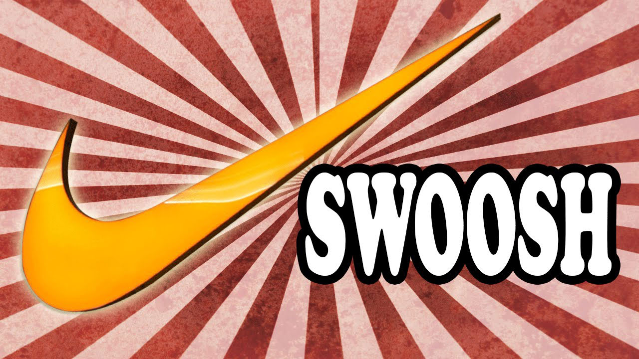
The Nike logo stands as one of the most recognized brand marks on the planet. Known as the Swoosh, this simple curved checkmark represents speed, movement, and athletic excellence.
Within the broader context of sportswear branding, few symbols carry as much weight. The Swoosh changed how companies think about visual identity in athletics.
The current version dates back to 1995, though the original Swoosh appeared in 1971. Carolyn Davidson, a graphic design student at Portland State University, created it. Nike has used approximately five major logo variations since the company’s founding in 1964 as Blue Ribbon Sports.
What is the Nike Logo?
The Nike logo is a fluid, curved checkmark called the Swoosh, designed by Carolyn Davidson in 1971 for just $35. It represents the wing of Nike, the Greek goddess of victory, symbolizing motion, speed, and athletic achievement.
Design Type: Abstract symbol (standalone icon or combination mark with wordmark)
Primary Elements:
- The Swoosh: A curved, wing-inspired checkmark
- Wordmark: “NIKE” in custom Futura Bold typography (when included)
Official Introduction Date: June 18, 1971
Designer: Carolyn Davidson, graphic design student at Portland State University
Trademark Status: Registered trademark (U.S. Patent and Trademark Office, Registration #978952)
Color Palette:
- Primary Black: #111111
- Nike Orange (heritage): #F26522
- White: #FFFFFF
Usage Context: Athletic footwear, apparel, equipment, retail locations, digital platforms, sponsorship materials, and global advertising campaigns
How Has the Nike Logo Evolved Over Time?
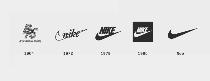
The Nike logo went through five major redesigns between 1964 and 1995. Each version reflected the company’s growth from a small shoe distributor to a global athletic brand.
The Swoosh remained constant after 1971, but its relationship with the wordmark changed dramatically over the decades.
Original Blue Ribbon Sports Logo (1964-1971)
Years Active: 1964-1971
Design Description: Simple text-based logo reading “Blue Ribbon Sports” with no distinctive symbol. The company operated as a distributor for Onitsuka Tiger shoes during this period.
Color Scheme: Basic black text on white background
Designer: Unknown (likely internal)
Context: Phil Knight and Bill Bowerman founded the company as a shoe distribution business. They needed something functional, not memorable.
Cultural Significance: This era represents Nike’s humble beginnings. No one expected a small Oregon company to become a global giant.
First Nike Swoosh Logo (1971-1978)
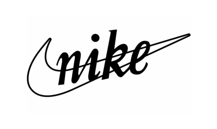
Years Active: 1971-1978
Design Description: The iconic Swoosh appeared alongside “Nike” in a curved, lowercase script font. The text sat above the Swoosh, creating a stacked arrangement.
Color Scheme: Sunburst orange Swoosh with white “Nike” text, often on dark backgrounds
Designer: Carolyn Davidson
Context: The company rebranded to “Nike” in 1971, needing a fresh identity. Davidson was paid $35 for her work. Phil Knight reportedly said he didn’t love it but hoped it would grow on him.
Key Changes from Previous: Complete brand overhaul. New name, new symbol, new direction.
Cultural Significance: This marked the birth of the Swoosh. The curved shape suggested movement and motion in a way text alone never could.
Block Letter Nike Logo (1978-1985)
Years Active: 1978-1985
Design Description: “NIKE” appeared in bold, uppercase Futura Extra Bold letters. The Swoosh sat directly beneath the text, creating a cleaner, more corporate appearance.
Color Scheme: Red text with red Swoosh became common, though black versions existed
Designer: Internal Nike design team
Context: Nike went public in 1980. The company needed a more professional, powerful look to match its growing market presence.
Key Changes from Previous: Switched from script to block letters. The playful, casual vibe gave way to authority.
Cultural Significance: This version appeared during Nike’s first major growth phase. It adorned the shoes of rising basketball stars and track athletes.
Swoosh with Wordmark (1985-1995)
Years Active: 1985-1995
Design Description: The Swoosh gained more prominence. “NIKE” remained in Futura Bold but the arrangement varied across products and marketing materials.
Color Scheme: Primarily black and white, with color variations for specific product lines
Designer: Internal Nike design team
Context: Michael Jordan signed with Nike in 1984. The brand exploded. Air Jordan became a phenomenon, and Nike needed flexibility in how the logo appeared across expanding product categories.
Key Changes from Previous: Greater emphasis on the Swoosh as a standalone symbol. The wordmark became optional in many contexts.
Cultural Significance: “Just Do It” launched in 1988. The Swoosh started appearing everywhere, from NBA courts to suburban sidewalks.
Standalone Swoosh (1995-Present)
Years Active: 1995-present
Design Description: The Swoosh stands completely alone. No text needed. This represents the ultimate achievement in minimalist branding.
Color Scheme: Primarily black or white, adapting to product and background requirements
Designer: Nike brand team decision
Context: By 1995, the Swoosh had achieved universal recognition. Nike became confident enough to drop the wordmark entirely in most applications.
Key Changes from Previous: Complete removal of the “NIKE” text in primary branding
Cultural Significance: Very few brands can survive without their name attached. The standalone Swoosh represents brand equity at its peak. People see the shape and instantly think “Nike” without any words.
What Do the Design Elements of the Nike Logo Mean?
The Swoosh represents the wing of Nike, the Greek goddess of victory. Its curved shape suggests speed, movement, and the sound of rushing air.
Carolyn Davidson designed it to convey motion even when static.
What Does the Swoosh Symbol Represent?
The Swoosh captures the essence of athletic movement. Its upward trajectory suggests progress and forward momentum.
Carolyn Davidson studied the Greek goddess Nike while developing concepts. The wing connection wasn’t accidental.
Athletes see it as a mark of achievement. The psychology behind curved shapes creates feelings of energy and dynamism.
Why Did Nike Choose These Specific Colors?

Black (#111111)
- Symbolic meaning: Power, sophistication, timelessness
- Psychological impact: Creates authority and seriousness
- Brand connection: Works across all sports and demographics
Black became the primary choice because it works everywhere. On shoes, jerseys, billboards. It never clashes. Companies with black-dominant branding often project strength and reliability.
White (#FFFFFF)
- Symbolic meaning: Purity, cleanliness, simplicity
- Psychological impact: Creates breathing room and clarity
- Brand connection: Perfect for reversed applications on dark products
Nike Orange (#F26522)
- Symbolic meaning: Energy, enthusiasm, warmth
- Psychological impact: Grabs attention, creates urgency
- Brand connection: Heritage color from early branding, still used selectively
What Typography Style Is Used in the Nike Logo?
Nike uses a modified version of Futura Bold for its wordmark. The font family belongs to the geometric sans-serif category.
Futura’s clean lines and circular letter shapes match the Swoosh’s fluid curves.
The all-caps treatment adds authority. Readability stays high even at small sizes, which matters for shoe tags and apparel labels.
Nike has tweaked the letter spacing over the years, tightening it slightly in recent applications.
What Are the Hidden Meanings in the Nike Logo?
The Swoosh doubles as a checkmark. This wasn’t intentional, but it works. People associate checkmarks with completion, approval, and “getting it done.”
The shape also resembles a boomerang, suggesting that effort returns results.
Carolyn Davidson stated she wanted the design to convey motion. The hidden layer of “victory” through the goddess Nike connection came from the company name itself.
Some see a smile in the Swoosh. Others see a wing ready to take flight.
How Does the Nike Logo Compare to Competitor Logos?
Among athletic footwear brands, Nike’s approach stands out for its simplicity. Competitors often rely on more complex designs or obvious letterforms.
Adidas uses three stripes. Puma features a leaping cat. Under Armour combines overlapping letters.
Nike chose abstraction over literal representation. The Swoosh doesn’t show a shoe or an athlete. It shows an idea.
This gives Nike tremendous flexibility. The logo works on running shoes and golf shirts equally well. It doesn’t tie the brand to any single sport or activity.
From a foundational design perspective, the Swoosh follows the less-is-more principle perfectly. Fewer elements mean faster recognition and easier reproduction across media.
What Are the Technical Specifications of the Nike Logo?
Official Color Codes
Primary Black
White
- Hex: #FFFFFF
- RGB: (255, 255, 255)
- CMYK: (0, 0, 0, 0)
Nike Orange (Heritage)
- Hex: #F26522
- RGB: (242, 101, 34)
- CMYK: (0, 65, 100, 0)
- Pantone: 1665 C
Dimensions and Proportions
Aspect Ratio: Approximately 3:1 (width to height)
Minimum Size Requirements: 0.5 inches (12.7mm) width for print applications
Clear Space: Minimum clear space equals the height of the Swoosh on all sides
Official Guidelines: The logo must not be stretched, rotated beyond approved angles, or modified in any way. Vector formats should be used for all professional applications to maintain crispness at any scale.
What Cultural Impact Has the Nike Logo Had?
The Swoosh transcends sports. It became a cultural symbol representing ambition, achievement, and personal excellence.
Hip-hop artists wore Nike prominently in the 1980s and 1990s. The brand became street fashion, not just athletic wear.
Sneaker culture owes much of its existence to Nike. People camp outside stores for limited releases. They collect shoes as art.
The logo appears in museums. Design schools study it. Marketing textbooks reference it as the gold standard.
How Does the Nike Logo Fit Into the Overall Brand Identity?
The Swoosh anchors a complete brand ecosystem. It connects to “Just Do It,” the Jumpman, Air Max, and dozens of sub-brands.
Nike’s official brand standards ensure consistency across products, advertising, retail spaces, and digital platforms.
The logo works because it doesn’t try to say everything. It provides a foundation while other elements add context and personality.
Athletes become brand ambassadors. Their achievements reflect back on the Swoosh. When someone wins wearing Nike, the logo wins too.
How Should the Nike Logo Be Used?
Official Usage Guidelines
Do:
- Use official logo files from Nike’s brand portal
- Maintain minimum clear space requirements
- Use approved color combinations only
- Scale proportionally using vector files
Don’t:
- Alter the Swoosh shape in any way
- Add effects like shadows, gradients, or outlines
- Place the logo on busy backgrounds that reduce visibility
- Combine with other logos without approval
Accessing Official Logos
Licensed partners access logo files through Nike’s brand portal. Unauthorized use constitutes trademark infringement.
Media outlets can request logo files for editorial purposes through Nike’s press office.
Trademark Protection
The Swoosh is a registered trademark protected globally. Nike actively defends against unauthorized use and counterfeiting.
Using the Nike logo without permission can result in legal action. This applies to merchandise, advertising, and digital content.
FAQ on The Nike Logo
Who Designed the Nike Logo?
Carolyn Davidson created the Swoosh in 1971. She was a graphic design student at Portland State University in Oregon.
Phil Knight hired her after they met in an accounting class he taught. She spent 17.5 hours on the project.
How Much Did the Nike Logo Cost?
The original logo cost just $35. That works out to $2 per hour for Davidson’s work.
Years later, Nike gave her company stock and a diamond ring. The brand recognized her contribution to their global success.
What Does the Nike Swoosh Mean?
The Swoosh represents the wing of the Greek goddess Nike, who symbolized victory. The curved shape suggests speed, motion, and athletic achievement.
It also resembles a checkmark. This wasn’t intentional but reinforces ideas of completion and success.
When Was the Nike Logo Created?
Davidson designed the Swoosh in 1971. The company officially adopted it on June 18 of that year.
Before this, the company operated as Blue Ribbon Sports with a simple text-based mark. The rebrand changed everything.
Why Is It Called the Swoosh?
The name comes from the sound of speed. Think of air rushing past an athlete or the swooshing motion of a fast movement.
Nike employees started using the term informally. It stuck and became the official name for the trademark symbol.
What Font Does Nike Use?
Nike uses a modified Futura Bold for its wordmark. This typeface features clean geometric shapes that match the Swoosh’s fluid curves.
The all-caps treatment adds authority. The typography remains readable even at small sizes on shoe tags.
What Are the Official Nike Logo Colors?
Black (#111111) serves as the primary color. White (#FFFFFF) works for reversed applications.
Nike Orange (#F26522) appears in heritage materials. Understanding how colors affect perception explains why black projects power and timelessness.
Can I Use the Nike Logo?
No. The Swoosh is a registered trademark protected globally by the U.S. Patent and Trademark Office.
Unauthorized use leads to legal action. Licensed partners access official files through Nike’s brand portal only.
How Has the Nike Logo Changed Over Time?
The brand went through five major versions. Early logos combined the Swoosh with the Nike wordmark in various arrangements.
By 1995, the company dropped the text entirely. The standalone Swoosh now represents peak brand recognition.
What Inspired the Nike Logo Design?
Davidson studied the Greek goddess Nike while developing concepts. The wing connection drove the curved, upward-sweeping shape.
She wanted to convey motion even in a static image. The result became one of the most iconic symbols in sportswear branding history.
Conclusion
The Nike logo proves that simplicity wins. A $35 design became worth billions.
Phil Knight and Bill Bowerman built Nike Inc. into a Fortune 500 company. The Swoosh carried that journey from Beaverton to global dominance.
Few symbols achieve this level of brand equity. The connection to the Greek goddess of victory gives the mark deeper meaning beyond athletic apparel.
Paired with “Just Do It,” the iconic emblem speaks without words. It represents ambition, achievement, and the drive to push harder.
That’s the power of thoughtful design elements working together.

Renowned for his expertise in logo design and visual branding, Bogdan has developed a multitude of logos for various clients.
His skills extend to creating posters, vector illustrations, business cards, and brochures. Additionally, Bogdan's UI kits were featured on marketplaces like Visual Hierarchy and UI8.
He also wrote in the past years on sites like Design Your Way, WebDesignerDepot, WPDean, Designmodo, Speckyboy, Slider Revolution, and more.
- From Mockup to Code: How AI-Augmented Development Speeds Up the Design Handoff - 19 September 2026
- The Beehiiv Logo History, Colors, Font, And Meaning - 18 September 2026
- Why Small Teams Wait Too Long to Bring On Specialist Engineers - 17 September 2026

Bogdan Sandu is a seasoned designer who has been designing websites since 2008. Renowned for his expertise in logo design and visual branding, Bogdan has developed a multitude of logos for various clients. His skills extend to creating posters, vector illustrations, business cards, and brochures. Additionally, Bogdan's UI kits were featured on marketplaces like Visual Hierarchy and UI8. He also wrote in the past years on sites like Design Your Way, WebDesignerDepot, WPDean, Designmodo, Speckyboy, Slider Revolution, and more.
You Might Also Like