


A single swoosh can instantly transport you to athletic excellence, while three simple stripes evoke decades of sporting heritage. Visual identity in footwear transcends mere decoration and becomes the silent language between brands and consumers, speaking volumes before a single step is taken.
From iconic sportswear giants to heritage craftsmen, shoe manufacturers have mastered the art of embedding meaning into minimalist marks. These shoe brand logos reveal how successful companies transform simple geometric shapes, wordmarks, and symbols into globally recognized emblems worth billions.
Understanding logo design principles becomes crucial whether you’re building a brand, studying marketing, or simply curious about the psychology behind consumer choices. Each mark carries distinct messaging about quality, lifestyle, and cultural positioning.
This comprehensive exploration examines 21 influential footwear logos, analyzing their:
- Design evolution and historical significance
- Visual hierarchy strategies and brand recognition factors
- Cultural impact across different demographics and markets
- Strategic positioning within competitive landscapes
You’ll discover how typography choices, color theory applications, and symbolic elements create lasting impressions that drive purchasing decisions worldwide.
Shoe Brand Logos Examples
Adidas Logo
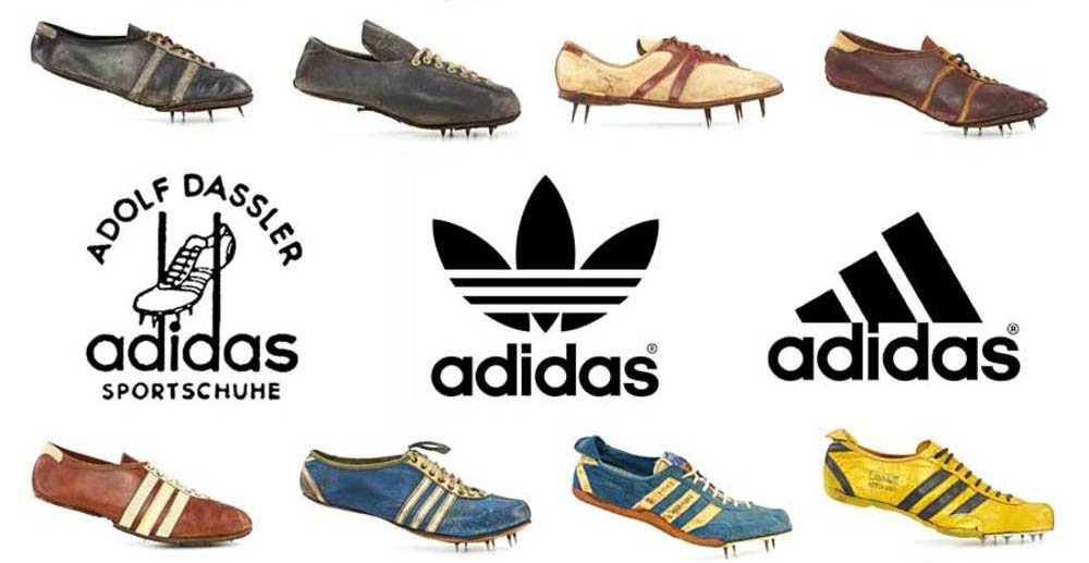
Adidas stands as the second-largest athletic footwear manufacturer globally, founded by Adolf “Adi” Dassler in 1949 in Herzogenaurach, Germany. Following World War II tensions that split the Dassler Brothers Shoe Factory, Adolf established Adidas while his brother Rudolf created Puma. The company headquarters remain in Bavaria, generating over €22 billion in annual revenue across 160 countries.
Logo Design Elements
Visual Components: The iconic three-stripes design acquired from Finnish company Karhu Sports in 1952 for €1,600 and two bottles of whiskey. The logo features multiple variations including the Trefoil (1971), Performance Badge of Sport (1991), and Equipment logo (1989).
Design Philosophy: Represents excellence, performance, and international reach. The three stripes originally showed up best in photography for an emerging sports brand.
Evolution Timeline: 1949 original shoe-based design, 1971 Trefoil introduction, 1991 Equipment three-bars logo, 2000s current Performance logo system.
Brand Identity Attributes
Market Positioning: Premium athletic performance and lifestyle segments with annual revenue exceeding €22 billion.
Target Demographics: Professional athletes, sports enthusiasts, urban fashion consumers aged 15-35.
Product Categories: Athletic footwear, sportswear, lifestyle apparel, equipment across multiple sports.
Historical Context
Founding Story: Emerged from family split between Dassler brothers in 1948, with Adolf choosing “Adidas” name from his nickname “Adi.”
Brand Heritage: Jesse Owens’ 1936 Olympics success wearing Dassler spikes. Became official supplier for 1954 World Cup winning German team.
Geographic Origins: Herzogenaurach, Germany remains global headquarters, now spanning all continents.
Logo Recognition Factors
Distinctive Features: Three parallel stripes in various configurations, sans-serif lowercase wordmark, monochromatic color palette.
Brand Visibility: 90% global brand recognition, official sponsor of FIFA World Cup, UEFA Euro Championships.
Usage Applications: Product integration, athlete sponsorships, stadium partnerships, digital platforms.
Semantic Relationships
Industry Connections: Primary competitor to Nike and Puma, partnerships with Real Madrid, Bayern Munich, Manchester United.
Cultural Associations: Hip-hop culture adoption, streetwear collaborations, music festival partnerships.
Market Differentiation: Heritage-focused branding, German engineering emphasis, sports performance authority.
Puma Logo

Puma emerged in 1948 as Rudolf Dassler’s response to the Dassler family split, originally registered as “Ruda” before becoming Puma. The German multinational corporation ranks third globally in sportswear manufacturing, headquartered in Herzogenaurach, Bavaria. The company generates over €8 billion annually across 120+ countries, producing athletic footwear, apparel, and accessories.
Logo Design Elements
Visual Components: Leaping puma silhouette designed by German caricaturist Lutz Backes in 1967. Features distinctive “Formstrip” trademark patented in 1958. Current black silhouette within circular frame adopted 2018.
Design Philosophy: Embodies speed, agility, grace, and predatory precision. Represents athletic excellence and performance innovation.
Evolution Timeline: 1948 puma jumping through letter “D,” 1958 geometric hexagonal version, 1967 refined cat silhouette, 2018 simplified black logo.
Brand Identity Attributes
Market Positioning: Performance athletics with lifestyle crossover, motorsports heritage, fashion collaborations.
Target Demographics: Athletes, motorsport enthusiasts, fashion-conscious consumers aged 16-40.
Product Categories: Athletic footwear, motorsport gear, lifestyle apparel, golf equipment through Cobra Golf acquisition.
Historical Context
Founding Story: Rudolf Dassler split from brother Adolf in 1948, initially naming company after himself before Puma rebrand.
Brand Heritage: Sponsored Pelé’s 1970 World Cup victory, Usain Bolt’s world records, Formula One partnerships.
Geographic Origins: Herzogenaurach, Germany headquarters, same town as Adidas, creating legendary rivalry.
Logo Recognition Factors
Distinctive Features: Dynamic leaping cat silhouette, monochromatic flexibility, Formstrip design element integration.
Brand Visibility: Third-largest sportswear brand globally, Formula One official supplier, Olympic Games presence.
Usage Applications: Footwear heel placement, apparel chest positioning, motorsport team uniforms.
Semantic Relationships
Industry Connections: Direct Adidas rival through founder rivalry, motorsport partnerships with Ferrari, BMW.
Cultural Associations: Hip-hop culture through collaborations, high-fashion partnerships, celebrity endorsements.
Market Differentiation: Motorsport DNA, speed-focused messaging, celebrity collaboration strategy.
Vans Logo
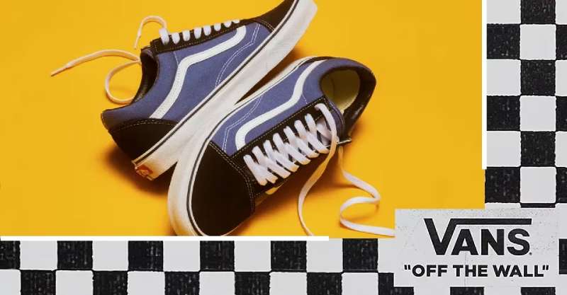
Founded in 1966 as The Van Doren Rubber Company by brothers Paul and James Van Doren in Anaheim, California. Vans pioneered direct-to-consumer manufacturing, producing shoes in-store for same-day pickup. The brand achieved iconic status within skateboarding culture, later expanding to action sports, music, and streetwear. VF Corporation acquired Vans in 2004 for $396 million.
Logo Design Elements
Visual Components: Custom wordmark featuring extended horizontal line over letters A, N, S, creating mathematical square root appearance. Designed by 13-year-old Mark Van Doren as skateboard stencil.
Design Philosophy: Represents speed, movement, and rebellious creativity. The “Off the Wall” tagline captures skateboarding’s gravity-defying spirit.
Evolution Timeline: 1966 simple wordmark, 1970s “Off the Wall” addition, 2016 red background introduction with unified lettering.
Brand Identity Attributes
Market Positioning: Action sports authenticity, youth culture leadership, creative expression platform.
Target Demographics: Skateboarders, musicians, artists, alternative culture participants aged 13-35.
Product Categories: Skateboarding footwear, lifestyle sneakers, apparel, accessories, skateparks.
Historical Context
Founding Story: Brothers opened store with no inventory, manufacturing shoes to order on opening day, selling 12 pairs.
Brand Heritage: First skateboarding-specific shoes 1976, Warped Tour title sponsorship 1996-2019, skatepark operations.
Geographic Origins: Southern California skateboarding epicenter, authentic action sports roots.
Logo Recognition Factors
Distinctive Features: Square root-style horizontal line extension, “Off the Wall” integration, red-white-black color scheme.
Brand Visibility: Dominant skateboarding market share, music festival partnerships, global youth culture recognition.
Usage Applications: Heel tabs, side panels, skateboard graphics, music venue branding.
Semantic Relationships
Industry Connections: Action sports authority, music industry partnerships, streetwear collaborations.
Cultural Associations: Skateboarding authenticity, punk rock heritage, artistic expression platform.
Market Differentiation: Authentic street credibility, creative community focus, action sports specialization.
Crocs Logo
Crocs launched in 2002 when Colorado entrepreneurs Scott Seamans, Lyndon “Duke” Hanson, and George Boedecker discovered innovative foam boating shoes. The company revolutionized casual footwear with Croslite material, selling over 720 million pairs globally. Initially controversial for aesthetics, Crocs achieved mainstream acceptance through comfort-focused marketing and celebrity endorsements.
Logo Design Elements
Visual Components: Smiling crocodile head silhouette within circular frame, evolved from original green cartoon crocodile. Current black-and-white design features simplified geometric representation.
Design Philosophy: Emphasizes comfort, fun, and functional design. Crocodile represents adaptability between land and water environments.
Evolution Timeline: 2002 green cartoon crocodile with “Get a Grip” tagline, 2005 refined circular design, 2007 simplified black-white version.
Brand Identity Attributes
Market Positioning: Comfort-first casual footwear, medical professional endorsement, lifestyle versatility.
Target Demographics: Healthcare workers, casual comfort seekers, children, outdoor enthusiasts.
Product Categories: Classic clogs, sandals, boots, work shoes, seasonal collections, Jibbitz accessories.
Historical Context
Founding Story: Discovered Canadian foam shoe design at Fort Lauderdale boat show, sold 200 pairs immediately.
Brand Heritage: Medical endorsements, healthcare worker donations, pandemic comfort footwear surge.
Geographic Origins: Boulder, Colorado founding, now global manufacturing with eco-friendly initiatives.
Logo Recognition Factors
Distinctive Features: Circular crocodile silhouette, sans-serif font wordmark, monochromatic flexibility.
Brand Visibility: $3.5 billion annual revenue, global medical professional adoption, celebrity collaborations.
Usage Applications: Shoe uppers, packaging, digital platforms, medical facility partnerships.
Semantic Relationships
Industry Connections: Medical professional partnerships, fashion collaboration surprises, comfort footwear leadership.
Cultural Associations: Healthcare hero recognition, comfort revolution, controversial-to-beloved transformation.
Market Differentiation: Patented Croslite material, comfort technology focus, functional design priority.
Converse Logo
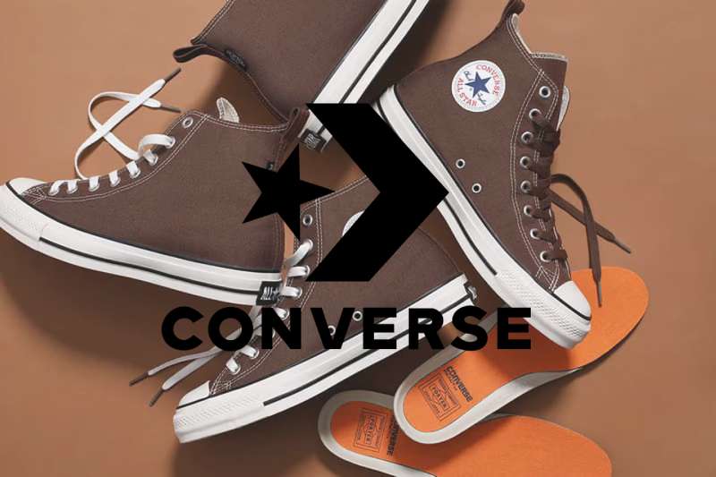
Established in 1908 by Marquis Mills Converse as the Converse Rubber Shoe Company in Malden, Massachusetts. The brand achieved legendary status through basketball player Chuck Taylor’s endorsement, creating the first celebrity-endorsed athletic shoe in 1932. Nike acquired Converse in 2003 for $305 million, maintaining the brand’s cultural authenticity and subcultural connections.
Logo Design Elements
Visual Components: Five-pointed star symbol with sans-serif wordmark, plus distinctive Chuck Taylor All Star circular ankle patch featuring Taylor’s signature.
Design Philosophy: Represents athletic heritage, self-expression, and anti-conformist values. Star symbolizes excellence and achievement.
Evolution Timeline: 1932 star introduction on All Star shoes, 1963 official logo design, various refinements maintaining core elements.
Brand Identity Attributes
Market Positioning: Cultural icon status, authentic heritage, creative expression platform.
Target Demographics: Musicians, artists, students, alternative culture participants, fashion enthusiasts.
Product Categories: Classic canvas sneakers, leather versions, platform styles, collaborations, apparel.
Historical Context
Founding Story: Originally produced winterized rubber footwear, transitioned to athletic shoes as basketball gained popularity.
Brand Heritage: Chuck Taylor’s basketball clinics, Olympic team adoption 1936, cultural revolution participation.
Geographic Origins: Massachusetts manufacturing heritage, American basketball culture foundation.
Logo Recognition Factors
Distinctive Features: Star-wordmark combination, circular ankle patch, signature integration, timeless aesthetic.
Brand Visibility: $2.3 billion annual revenue, global cultural recognition, museum exhibition presence.
Usage Applications: Ankle patches, tongue labels, heel badges, collaboration branding.
Semantic Relationships
Industry Connections: Nike subsidiary status, basketball heritage, music industry partnerships.
Cultural Associations: Rock music, skateboarding, fashion subcultures, artistic expression.
Market Differentiation: Authentic subcultural credibility, heritage storytelling, anti-establishment values.
Reebok Logo
Reebok originated in 1958 when Joe Foster founded the company in Bolton, England, developing from J.W. Foster and Sons established in 1895. The brand name derives from “rhebok,” an African antelope, chosen from a dictionary by Foster’s grandson. Authentic Brands Group acquired Reebok from Adidas in 2021 for approximately $2.5 billion, refocusing on fitness and lifestyle markets.
Logo Design Elements
Visual Components: Delta symbol representing positive change and transformation, replaced vector logo in 2019. Features geometric triangular design with serif and sans-serif typography variations.
Design Philosophy: Delta represents movement, change, and progress in fitness journey. Embodies transformation and personal improvement.
Evolution Timeline: 1958 script wordmark, 1986 vector logo introduction, 2014 modernization, 2019 delta symbol adoption.
Brand Identity Attributes
Market Positioning: Fitness-focused lifestyle brand, CrossFit leadership, women’s athletics emphasis.
Target Demographics: Fitness enthusiasts, CrossFit athletes, women seeking performance and style.
Product Categories: Training shoes, running footwear, CrossFit gear, women’s fitness apparel.
Historical Context
Founding Story: Evolution from J.W. Foster’s spiked running shoes, Olympic Games heritage since early 1900s.
Brand Heritage: Olympic partnerships, CrossFit Games sponsorship, aerobics revolution participation.
Geographic Origins: Bolton, England foundation, global expansion through athletic excellence.
Logo Recognition Factors
Distinctive Features: Delta geometric symbol, dual typography approaches, fitness-focused messaging.
Brand Visibility: Global fitness community leadership, CrossFit Games official status, women’s sports advocacy.
Usage Applications: Product integration, fitness facility partnerships, athlete sponsorships.
Semantic Relationships
Industry Connections: Former Adidas subsidiary, current ABG portfolio brand, CrossFit ecosystem integration.
Cultural Associations: Fitness revolution, women’s empowerment, functional training movement.
Market Differentiation: Fitness specialization, CrossFit authority, women-centric approach.
New Balance Logo
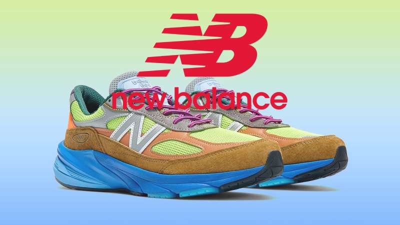
New Balance traces its origins to 1906 when William J. Riley founded the company in Boston, Massachusetts, initially producing arch supports and prescription footwear. The brand emphasizes domestic manufacturing, maintaining facilities in the United States and United Kingdom while competing globally. Family ownership persisted until remaining independently operated, generating over $4 billion annually.
Logo Design Elements
Visual Components: Stylized “N” lettermark with angular design elements, various “NB” configurations. Features clean sans-serif font treatments and geometric precision.
Design Philosophy: Represents stability, balance, and technical excellence. Geometric forms emphasize precision engineering and performance.
Evolution Timeline: 1970s “N” symbol introduction, various refinements maintaining angular aesthetic, modern simplification efforts.
Brand Identity Attributes
Market Positioning: Premium running specialty, technical innovation, domestic manufacturing pride.
Target Demographics: Serious runners, technical athletes, heritage-conscious consumers.
Product Categories: Running shoes, walking footwear, athletic apparel, lifestyle sneakers.
Historical Context
Founding Story: Arch support manufacturing evolution into athletic footwear, maintaining quality focus.
Brand Heritage: Boston Marathon connections, American manufacturing commitment, technical innovation leadership.
Geographic Origins: Boston, Massachusetts heritage, maintaining U.S. and U.K. production facilities.
Logo Recognition Factors
Distinctive Features: Angular “N” lettermark, technical aesthetic, premium positioning signals.
Brand Visibility: Running specialty market leadership, marathon event partnerships, athlete endorsements.
Usage Applications: Lateral shoe placement, technical apparel, running event branding.
Semantic Relationships
Industry Connections: Running specialty focus, domestic manufacturing emphasis, technical innovation leadership.
Cultural Associations: Serious running culture, American manufacturing pride, quality craftsmanship.
Market Differentiation: Domestic production, technical specialization, premium quality focus.
Timberland Logo

The Timberland Company emerged in 1973 from the Abington Shoe Company, founded in 1918 by Nathan Swartz in Abington, Massachusetts. The brand revolutionized outdoor footwear with waterproof leather boots, becoming synonymous with rugged durability and outdoor lifestyle. VF Corporation acquired Timberland in 2011 for $2.3 billion, maintaining brand heritage while expanding global reach.
Logo Design Elements
Visual Components: Tree symbol representing growth, strength, and outdoor connection. Features serif wordmark with natural, organic aesthetic.
Design Philosophy: Embodies outdoor heritage, environmental responsibility, and authentic craftsmanship. Tree symbolizes deep roots and natural connection.
Evolution Timeline: 1973 brand establishment with tree integration, various refinements maintaining natural aesthetic.
Brand Identity Attributes
Market Positioning: Premium outdoor lifestyle, urban fashion crossover, environmental consciousness.
Target Demographics: Outdoor enthusiasts, urban professionals, fashion-conscious consumers valuing authenticity.
Product Categories: Waterproof boots, casual footwear, outerwear, accessories.
Historical Context
Founding Story: Waterproof leather boot innovation created outdoor footwear revolution.
Brand Heritage: New England craftsmanship tradition, environmental stewardship programs, community involvement.
Geographic Origins: Massachusetts shoe-making heritage, maintaining quality manufacturing standards.
Logo Recognition Factors
Distinctive Features: Tree symbol integration, serif typography, natural color palette, premium positioning.
Brand Visibility: Global outdoor lifestyle leadership, fashion industry crossover, environmental advocacy.
Usage Applications: Boot heel badges, product tags, outdoor gear branding, environmental campaigns.
Semantic Relationships
Industry Connections: VF Corporation portfolio, outdoor industry leadership, fashion collaboration.
Cultural Associations: Hip-hop culture adoption, outdoor lifestyle authenticity, environmental responsibility.
Market Differentiation: Waterproof technology, environmental commitment, authentic outdoor heritage.
Lacoste Logo
René Lacoste founded the company in 1933, leveraging his tennis championship success and innovative apparel designs. The French brand pioneered the polo shirt revolution, introducing breathable cotton piqué fabric for athletic comfort. Lacoste maintains luxury positioning through tennis heritage, generating over €2 billion annually across fashion, fragrance, and lifestyle categories.
Logo Design Elements
Visual Components: Green crocodile emblem inspired by Lacoste’s tennis nickname “The Crocodile.” Features distinctive positioning and sizing variations across product categories.
Design Philosophy: Represents tennis excellence, French elegance, and sporting heritage. Crocodile symbolizes tenacity and competitive spirit.
Evolution Timeline: 1933 original crocodile introduction, various refinements maintaining recognizable silhouette and green coloring.
Brand Identity Attributes
Market Positioning: Luxury sportswear, tennis heritage, French sophistication.
Target Demographics: Affluent professionals, tennis enthusiasts, luxury fashion consumers.
Product Categories: Polo shirts, tennis apparel, footwear, leather goods, fragrances.
Historical Context
Founding Story: Tennis champion René Lacoste’s nickname “The Crocodile” inspired brand identity and logo design.
Brand Heritage: Tennis innovation legacy, French luxury tradition, sporting excellence association.
Geographic Origins: French luxury heritage, maintaining elegance and sophistication standards.
Logo Recognition Factors
Distinctive Features: Green crocodile placement, consistent sizing, luxury brand recognition.
Brand Visibility: Global luxury positioning, tennis tournament partnerships, fashion industry presence.
Usage Applications: Chest placement, product integration, luxury retail environments.
Semantic Relationships
Industry Connections: Luxury fashion positioning, tennis industry partnerships, French luxury goods sector.
Cultural Associations: Tennis culture, French sophistication, luxury lifestyle representation.
Market Differentiation: Tennis heritage authenticity, French luxury positioning, crocodile brand recognition.
Skechers Logo

Skechers launched in 1992 when Robert Greenberg founded the company in Manhattan Beach, California, focusing on lifestyle footwear for young adults. The brand achieved rapid growth through celebrity endorsements and diverse product offerings, becoming the third-largest athletic footwear brand in the United States. Public company status since 1999 enables continued global expansion and innovation investment.
Logo Design Elements
Visual Components: Stylized “S” logo mark with dynamic movement suggestion. Features modern sans-serif font treatment with bold, accessible aesthetic.
Design Philosophy: Represents energy, youth, and lifestyle comfort. Design emphasizes accessibility and broad appeal.
Evolution Timeline: 1992 brand establishment with contemporary logo development, refinements maintaining youthful energy.
Brand Identity Attributes
Market Positioning: Lifestyle comfort, value pricing, broad demographic appeal.
Target Demographics: Families, comfort-seeking consumers, lifestyle-focused individuals across age groups.
Product Categories: Lifestyle sneakers, athletic footwear, work shoes, children’s footwear.
Historical Context
Founding Story: Robert Greenberg’s vision for lifestyle-focused footwear accessible to broad consumer base.
Brand Heritage: Rapid growth through celebrity partnerships, comfort innovation, global expansion.
Geographic Origins: California lifestyle foundation, maintaining casual comfort aesthetic.
Logo Recognition Factors
Distinctive Features: Dynamic “S” symbol, contemporary aesthetic, accessibility focus.
Brand Visibility: Third-largest U.S. athletic footwear brand, global presence, celebrity partnerships.
Usage Applications: Product integration, retail environments, marketing campaigns.
Semantic Relationships
Industry Connections: Lifestyle footwear leadership, celebrity endorsement strategy, value positioning.
Cultural Associations: Casual comfort, accessible fashion, family-friendly positioning.
Market Differentiation: Comfort focus, value pricing, broad demographic appeal.
Hunter Logo
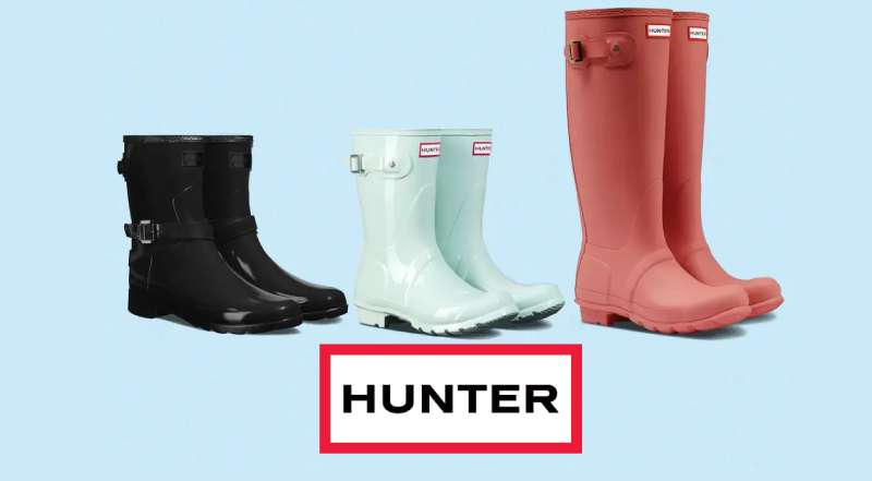
Hunter emerged in 1856 as the North British Rubber Company, founded by American entrepreneurs Henry Lee Norris and Spencer Thomas Parmelee in Edinburgh, Scotland. Using Charles Goodyear’s patented vulcanization process, the company initially produced waterproof rubber overshoes and boots. The iconic Original Green Wellington boot, first manufactured in 1955, became synonymous with British outdoor heritage and royal endorsement.
Logo Design Elements
Visual Components: Simple wordmark design featuring “Hunter” in bold sans-serif font, often accompanied by red and green variations for Original and Field collections respectively.
Design Philosophy: Embodies British heritage, outdoor functionality, and weatherproof reliability. Design reflects utilitarian purpose with premium positioning.
Evolution Timeline: Original company stamps evolved into modern wordmark, with distinct Hunter Original (red) and Hunter Field (green) branding introduced under Alasdhair Willis leadership.
Brand Identity Attributes
Market Positioning: Premium outdoor lifestyle, British heritage, royal warrant holders, festival fashion.
Target Demographics: Outdoor enthusiasts, British heritage consumers, festival attendees, celebrities.
Product Categories: Wellington boots, outerwear, bags, accessories, technical outdoor gear.
Historical Context
Founding Story: American entrepreneurs brought rubber innovation to Scotland, initially producing various rubber goods including boots, tyres, and industrial products.
Brand Heritage: Royal Warrants from Queen Elizabeth II and Duke of Edinburgh, Princess Diana engagement photos, military supply during both World Wars.
Geographic Origins: Edinburgh, Scotland headquarters, maintaining British manufacturing heritage until global expansion.
Logo Recognition Factors
Distinctive Features: Bold wordmark, red/green color coding for collections, premium British positioning.
Brand Visibility: Global festival presence, celebrity endorsements, royal associations, heritage brand status.
Usage Applications: Boot heel labels, product tags, festival partnerships, outdoor retail environments.
Semantic Relationships
Industry Connections: Premium outdoor positioning, British heritage brands, royal warrant companies.
Cultural Associations: Festival culture (Kate Moss at Glastonbury), British countryside, royal family.
Market Differentiation: Royal heritage, British craftsmanship, premium outdoor positioning.
TOMS Logo
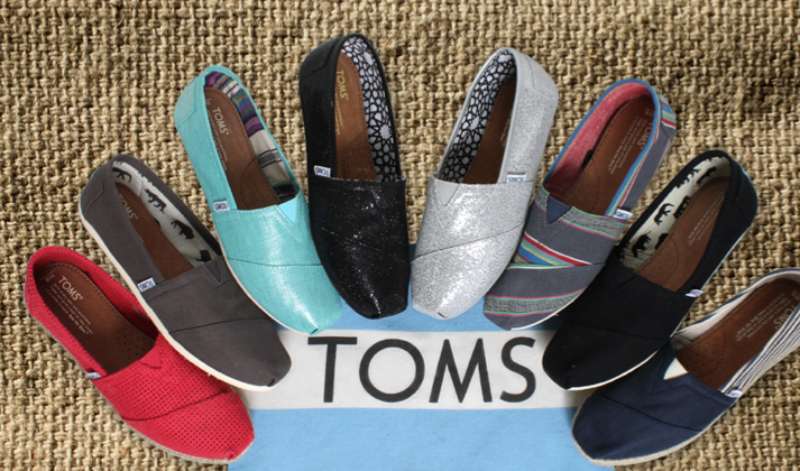
TOMS revolutionized social entrepreneurship when Blake Mycoskie founded the company in 2006 following a trip to Argentina. Inspired by local alpargata shoes and children in need, Mycoskie created the One for One business model, donating a pair of shoes for every pair sold. The company name derives from “Tomorrow’s Shoes,” reflecting the brand’s future-focused mission.
Logo Design Elements
Visual Components: Simple wordmark “TOMS” with small red flag positioned above the “O.” Clean, lowercase lettering in modern sans-serif font design.
Design Philosophy: Represents social impact, simplicity, and purpose-driven business. Flag symbolizes unity and shared goals for social change.
Evolution Timeline: 2006 original wordmark, later addition of footprint imagery, current flag-adorned design emphasizing movement symbolism.
Brand Identity Attributes
Market Positioning: Social impact footwear, casual lifestyle, cause marketing pioneer.
Target Demographics: Socially conscious consumers, college students, cause-driven millennials and Gen Z.
Product Categories: Canvas shoes, eyewear, coffee, bags, apparel with One for One giving model.
Historical Context
Founding Story: Blake Mycoskie’s Argentina trip led to witnessing children without shoes, inspiring the One for One business model innovation.
Brand Heritage: Pioneered One for One model, expanded into eyewear and water programs, influenced social entrepreneurship movement.
Geographic Origins: Venice Beach, California founding, maintaining casual lifestyle brand positioning.
Logo Recognition Factors
Distinctive Features: Flag element, lowercase styling, social mission association, red accent color.
Brand Visibility: Global One for One recognition, social media presence, university campus popularity.
Usage Applications: Product labeling, social media campaigns, university partnerships, cause marketing.
Semantic Relationships
Industry Connections: Social entrepreneurship leadership, casual footwear market, cause marketing pioneers.
Cultural Associations: Social responsibility, millennial values, university culture, cause-driven consumption.
Market Differentiation: One for One model, social impact focus, purpose-driven branding.
Steve Madden Logo
Steve Madden launched his eponymous company in 1990 with $1,100, selling platform shoes from his car trunk to Manhattan stores. The brand revolutionized affordable fashion footwear through bold, trend-driven designs inspired by rock music and street culture. Despite legal challenges in the early 2000s, the company rebounded to become a global fashion footwear leader.
Logo Design Elements
Visual Components: Simple black wordmark featuring “STEVE MADDEN” in bold, geometric sans-serif font. Earlier versions included elliptical designs, current logo emphasizes clean minimalism.
Design Philosophy: Represents fashion-forward thinking, accessible luxury, and street-smart attitude. Black colorway conveys sophistication and timeless appeal.
Evolution Timeline: Original elliptical logo with serif elements evolved into current straightforward wordmark design emphasizing clarity and brand recognition.
Brand Identity Attributes
Market Positioning: Affordable fashion footwear, trend-driven designs, youth-oriented lifestyle.
Target Demographics: Fashion-conscious women aged 16-35, trend followers, price-conscious style seekers.
Product Categories: Women’s footwear, handbags, accessories, men’s footwear, multiple brand portfolio.
Historical Context
Founding Story: $1,100 investment led to platform shoe revolution, building from car trunk sales to global brand recognition.
Brand Heritage: Survived founder’s legal troubles, maintained design leadership, expanded into lifestyle accessories.
Geographic Origins: New York City roots, Queens factory heritage, maintaining fashion-forward metropolitan positioning.
Logo Recognition Factors
Distinctive Features: Bold black wordmark, fashion industry recognition, accessible luxury positioning.
Brand Visibility: Global retail presence, fashion industry partnerships, celebrity collaborations.
Usage Applications: Product branding, fashion retail environments, digital platforms, celebrity partnerships.
Semantic Relationships
Industry Connections: Fast fashion leadership, affordable luxury positioning, trend-driven design.
Cultural Associations: New York fashion, rock music influence, accessible style, youth culture.
Market Differentiation: Trend accessibility, pricing strategy, fashion-forward design approach.
Clarks Logo
Clarks traces its heritage to 1825 when Cyrus Clark established a tannery in Street, Somerset, with his brother James joining in 1828. The company revolutionized footwear with innovations including the first foot-shaped shoe and the iconic Desert Boot designed by Nathan Clark in the 1950s. The brand maintains its Somerset headquarters while serving global markets.
Logo Design Elements
Visual Components: Clean wordmark “Clarks” in contemporary sans-serif font, evolved from original circular stamp featuring monastery imagery.
Design Philosophy: Embodies heritage craftsmanship, comfort innovation, and timeless British style. Design reflects traditional values with modern application.
Evolution Timeline: 1825 monastery stamp design evolved through various iterations to current simplified wordmark introduced in 1996.
Brand Identity Attributes
Market Positioning: Heritage comfort footwear, British craftsmanship, school shoes specialist.
Target Demographics: Families, comfort seekers, heritage brand enthusiasts, professional consumers.
Product Categories: Desert boots, Wallabees, school shoes, comfort footwear, accessories.
Historical Context
Founding Story: Quaker brothers began with sheepskin rugs, discovered footwear opportunity through leather offcuts innovation.
Brand Heritage: Desert Boot cultural icon status, Quaker social responsibility values, 200-year British manufacturing tradition.
Geographic Origins: Street, Somerset headquarters maintained, representing authentic British heritage and craftsmanship.
Logo Recognition Factors
Distinctive Features: Heritage positioning, British authenticity, comfort association, educational market presence.
Brand Visibility: Global retail presence, cultural icon status, subcultural adoption across multiple genres.
Usage Applications: Product labeling, heritage marketing, retail environments, cultural partnerships.
Semantic Relationships
Industry Connections: Heritage footwear leadership, British manufacturing tradition, comfort technology innovation.
Cultural Associations: British heritage, multiple music subcultures, educational institutions, craftsmanship tradition.
Market Differentiation: Heritage authenticity, comfort innovation, cultural icon status.
Cole Haan Logo
Cole Haan originated in 1928 when Trafton Cole and Eddie Haan founded their Chicago-based company, initially named “Cole, Rood & Haan.” Originally focused on men’s dress footwear, the brand expanded into a comprehensive lifestyle company. Nike acquired Cole Haan in 1988, later selling to Apax Partners in 2012 for $570 million.
Logo Design Elements
Visual Components: Elegant wordmark “Cole Haan” in sophisticated serif font, later modernized to clean sans-serif design. Earlier versions featured needle and thread symbolism.
Design Philosophy: Conveys American craftsmanship, premium quality, and modern luxury. Design evolution reflects brand modernization while maintaining heritage.
Evolution Timeline: Original serif design with craftsmanship symbols evolved to current minimalist sans-serif wordmark emphasizing contemporary luxury.
Brand Identity Attributes
Market Positioning: Premium lifestyle footwear, American craftsmanship, innovative comfort technology.
Target Demographics: Professional consumers, luxury seekers, comfort-conscious style enthusiasts.
Product Categories: Dress shoes, casual footwear, handbags, accessories, athletic-inspired hybrids.
Historical Context
Founding Story: Chicago partnership between craftsman Trafton Cole and businessman Eddie Haan created foundation for American luxury footwear.
Brand Heritage: Survived Great Depression, Nike ownership period, technological innovation integration, global expansion.
Geographic Origins: Chicago founding, Maine manufacturing heritage, New York design center, New Hampshire headquarters.
Logo Recognition Factors
Distinctive Features: Premium positioning, American heritage, comfort technology association, professional market presence.
Brand Visibility: Global luxury retail presence, professional market leadership, technology innovation recognition.
Usage Applications: Premium product branding, professional environments, luxury retail, technology marketing.
Semantic Relationships
Industry Connections: Premium footwear leadership, American luxury brands, comfort technology innovation.
Cultural Associations: Professional success, American craftsmanship, luxury lifestyle, technological advancement.
Market Differentiation: Comfort technology, American heritage, premium positioning, professional market focus.
Havaianas Logo

Havaianas launched in Brazil in 1962, inspired by traditional Japanese zori sandals but adapted for Brazilian beach culture. The brand name means “Hawaiians” in Portuguese, reflecting the tropical paradise association. Originally positioned as affordable footwear for all social classes, Havaianas evolved into a global lifestyle brand representing Brazilian beach culture.
Logo Design Elements
Visual Components: Playful wordmark “havaianas” in lowercase friendly lettering, often accompanied by vibrant tropical colors and beach-inspired graphics.
Design Philosophy: Embodies Brazilian joy, beach lifestyle, and accessible luxury. Design reflects fun, colorful, and optimistic brand personality.
Evolution Timeline: Simple brand name evolved to incorporate tropical elements, maintaining cheerful aesthetic throughout various iterations.
Brand Identity Attributes
Market Positioning: Premium flip-flops, Brazilian beach culture, accessible luxury lifestyle.
Target Demographics: Beach enthusiasts, fashion-conscious consumers, Brazilian culture appreciators.
Product Categories: Flip-flops, sandals, beach accessories, lifestyle products.
Historical Context
Founding Story: Brazilian adaptation of Japanese sandal design created accessible footwear for tropical climate and beach culture.
Brand Heritage: Brazilian cultural export, democratized beach footwear, global expansion while maintaining cultural authenticity.
Geographic Origins: Brazil manufacturing, representing authentic Brazilian beach culture and lifestyle philosophy.
Logo Recognition Factors
Distinctive Features: Lowercase styling, tropical color associations, Brazilian cultural authenticity.
Brand Visibility: Global beach culture presence, Brazilian cultural representation, lifestyle brand recognition.
Usage Applications: Beach retail, lifestyle marketing, cultural exports, vacation destinations.
Semantic Relationships
Industry Connections: Beach lifestyle leadership, Brazilian cultural brands, accessible luxury positioning.
Cultural Associations: Brazilian beach culture, tropical lifestyle, vacation culture, cultural authenticity.
Market Differentiation: Brazilian heritage, beach culture authority, accessible luxury positioning.
Keen Logo

Keen emerged in 2003 when Martin Keen and Rory Fuerst created the Newport sandal, introducing “toe protection” technology to outdoor footwear. The brand philosophy centers on “hybrid.life” living, combining work and play activities. Keen maintains commitment to environmental responsibility and community involvement while producing functional outdoor footwear.
Logo Design Elements
Visual Components: Bold wordmark “KEEN” in strong sans-serif font, often accompanied by outdoor-inspired color palettes and rugged aesthetic elements.
Design Philosophy: Represents outdoor adventure, functional innovation, and environmental consciousness. Design emphasizes durability and outdoor lifestyle.
Evolution Timeline: Consistent wordmark design maintained throughout brand history, with color variations reflecting outdoor and environmental themes.
Brand Identity Attributes
Market Positioning: Outdoor adventure footwear, environmental responsibility, hybrid lifestyle promotion.
Target Demographics: Outdoor enthusiasts, environmentally conscious consumers, active lifestyle participants.
Product Categories: Hiking boots, sandals, work boots, casual outdoor footwear.
Historical Context
Founding Story: Newport sandal innovation solved outdoor footwear protection needs, establishing toe protection technology leadership.
Brand Heritage: Environmental activism, community involvement, functional innovation, outdoor lifestyle promotion.
Geographic Origins: Portland, Oregon founding, reflecting Pacific Northwest outdoor culture and environmental values.
Logo Recognition Factors
Distinctive Features: Outdoor positioning, environmental consciousness, functional innovation association.
Brand Visibility: Outdoor retail presence, environmental partnerships, adventure sports sponsorships.
Usage Applications: Outdoor gear branding, environmental campaigns, adventure sports marketing.
Semantic Relationships
Industry Connections: Outdoor industry leadership, environmental responsibility, functional innovation.
Cultural Associations: Outdoor adventure, environmental consciousness, Pacific Northwest culture.
Market Differentiation: Toe protection technology, environmental commitment, hybrid lifestyle positioning.
Teva Logo

Teva revolutionized outdoor footwear in 1984 when Grand Canyon river guide Mark Thatcher created the first sport sandal by attaching Velcro straps to flip-flops. The name “Teva” means “nature” in Hebrew, reflecting the brand’s outdoor heritage. Deckers Outdoor Corporation acquired Teva, expanding the brand’s global reach while maintaining adventure sport positioning.
Logo Design Elements
Visual Components: Mountain-inspired logo design featuring stylized peaks, representing outdoor adventure and natural landscapes. Bold wordmark emphasizes outdoor durability.
Design Philosophy: Embodies outdoor adventure, natural exploration, and functional design. Mountain imagery connects to hiking and outdoor activities.
Evolution Timeline: Original simple wordmark evolved to incorporate mountain graphics, emphasizing outdoor adventure positioning.
Brand Identity Attributes
Market Positioning: Outdoor adventure sandals, river sports, hiking footwear specialist.
Target Demographics: Outdoor enthusiasts, adventure travelers, water sports participants.
Product Categories: Sport sandals, hiking shoes, water shoes, outdoor footwear.
Historical Context
Founding Story: Grand Canyon innovation solved river guide footwear needs, creating sport sandal category.
Brand Heritage: Adventure sports pioneering, outdoor functionality innovation, global expansion through Deckers acquisition.
Geographic Origins: Grand Canyon roots, representing American outdoor adventure culture and innovation.
Logo Recognition Factors
Distinctive Features: Mountain imagery, outdoor positioning, adventure sports association.
Brand Visibility: Outdoor retail presence, adventure sports partnerships, travel industry recognition.
Usage Applications: Outdoor gear marketing, adventure travel, water sports branding.
Semantic Relationships
Industry Connections: Outdoor industry pioneer, adventure sports equipment, functional footwear innovation.
Cultural Associations: Outdoor adventure, American wilderness, river culture, hiking community.
Market Differentiation: Sport sandal innovation, outdoor functionality, adventure positioning.
Merrell Logo

Merrell began in 1981 when Randy Merrell, a custom bootmaker, partnered with Clark Matis and John Schweizer to create high-performance hiking boots. The brand emphasizes outdoor performance and trail-tested durability. Wolverine World Wide acquired Merrell, expanding global distribution while maintaining outdoor heritage and performance focus.
Logo Design Elements
Visual Components: Mountain-inspired logo featuring distinctive “M” integrated with peak imagery. Rugged typography reflects outdoor durability and performance.
Design Philosophy: Represents outdoor exploration, trail performance, and mountain adventure. Design emphasizes ruggedness and reliability.
Evolution Timeline: Original mountain-integrated design maintained consistency, with refinements emphasizing outdoor performance positioning.
Brand Identity Attributes
Market Positioning: Outdoor performance footwear, hiking specialists, trail-tested durability.
Target Demographics: Serious hikers, outdoor athletes, performance-focused consumers.
Product Categories: Hiking boots, trail running shoes, outdoor casual footwear.
Historical Context
Founding Story: Custom bootmaker expertise combined with business partnership created performance hiking footwear innovation.
Brand Heritage: Outdoor performance leadership, trail testing culture, global expansion through acquisition.
Geographic Origins: American outdoor culture roots, representing trail hiking and mountain exploration tradition.
Logo Recognition Factors
Distinctive Features: Mountain integration, performance positioning, outdoor durability association.
Brand Visibility: Outdoor retail leadership, hiking community recognition, performance sports partnerships.
Usage Applications: Outdoor gear branding, trail marketing, performance sports positioning.
Semantic Relationships
Industry Connections: Outdoor performance leadership, hiking industry authority, trail footwear specialization.
Cultural Associations: Serious hiking, mountain culture, outdoor performance, trail communities.
Market Differentiation: Performance focus, trail expertise, outdoor durability leadership.
Rockport Logo

Rockport pioneered the dress casual category in 1971 when Saul Katz and Bruce Katz founded the company in Marlborough, Massachusetts. The brand revolutionized men’s footwear by combining dress shoe aesthetics with athletic shoe comfort technology. Adidas Group acquired Rockport, later selling to Berkshire Partners and New Balance Athletic Shoe.
Logo Design Elements
Visual Components: Professional wordmark “Rockport” in confident sans-serif font, emphasizing reliability and business professionalism.
Design Philosophy: Conveys professional reliability, comfort innovation, and business casual sophistication. Design reflects dress-casual market positioning.
Evolution Timeline: Consistent professional wordmark maintained throughout ownership changes, emphasizing brand stability and reliability.
Brand Identity Attributes
Market Positioning: Dress casual footwear, professional comfort, business lifestyle.
Target Demographics: Business professionals, comfort-seeking dress shoe wearers, workplace fashion consumers.
Product Categories: Dress casual shoes, walking shoes, business footwear, casual comfort shoes.
Historical Context
Founding Story: Father-son partnership identified market gap for comfortable dress shoes, pioneering dress casual category.
Brand Heritage: Comfort technology innovation, professional market leadership, multiple ownership transitions.
Geographic Origins: Massachusetts founding, representing American comfort innovation and professional market understanding.
Logo Recognition Factors
Distinctive Features: Professional positioning, comfort association, business casual market leadership.
Brand Visibility: Professional retail presence, workplace fashion recognition, comfort technology leadership.
Usage Applications: Professional environments, business casual marketing, comfort technology promotion.
Semantic Relationships
Industry Connections: Dress casual pioneer, comfort technology innovation, professional footwear leadership.
Cultural Associations: Business professionalism, workplace fashion, comfort innovation, American manufacturing.
Market Differentiation: Dress casual innovation, comfort technology, professional market focus.
Sperry Logo

Sperry originated in 1935 when Paul Sperry invented the first boat shoe after observing his dog’s ability to run on ice without slipping. The siping pattern on Sperry Top-Siders revolutionized deck footwear and established the brand’s maritime heritage. The company maintains its nautical positioning while expanding into lifestyle categories.
Logo Design Elements
Visual Components: Nautical-inspired logo featuring anchor or wave elements, maritime color palette with navy and white emphasis.
Design Philosophy: Embodies maritime heritage, nautical functionality, and coastal lifestyle. Design reflects sailing and boating culture.
Evolution Timeline: Original nautical themes maintained throughout brand evolution, with refinements emphasizing maritime authenticity.
Brand Identity Attributes
Market Positioning: Nautical heritage footwear, coastal lifestyle, sailing and boating specialist.
Target Demographics: Sailing enthusiasts, coastal lifestyle consumers, nautical fashion followers.
Product Categories: Boat shoes, deck shoes, sailing gear, coastal lifestyle footwear.
Historical Context
Founding Story: Paul Sperry’s innovation solved sailing deck safety, creating siping technology and boat shoe category.
Brand Heritage: Maritime industry partnerships, sailing community leadership, coastal lifestyle expansion.
Geographic Origins: New England maritime culture, representing authentic American sailing and boating heritage.
Logo Recognition Factors
Distinctive Features: Nautical imagery, maritime heritage, coastal lifestyle association.
Brand Visibility: Sailing community presence, coastal retail recognition, nautical lifestyle partnerships.
Usage Applications: Maritime marketing, coastal lifestyle branding, sailing industry partnerships.
Semantic Relationships
Industry Connections: Maritime industry leadership, nautical gear specialization, coastal lifestyle brands.
Cultural Associations: Sailing culture, coastal lifestyle, maritime heritage, New England tradition.
Market Differentiation: Maritime authenticity, sailing expertise, coastal lifestyle authority.
FAQ on Shoe Brand Logos
What makes a shoe brand logo memorable?
Simplicity drives recognition. Successful footwear logos use minimal elements like Nike’s swoosh or Adidas’ three stripes. Effective visual hierarchy ensures instant identification across different sizes and applications, from tiny shoe tags to massive billboards.
How do shoe companies choose their logo colors?
Color psychology influences consumer perception. Black conveys luxury and sophistication, while bright colors suggest energy and youth. Many brands use monochromatic schemes for versatility, allowing logo adaptation across various product lines and marketing materials.
Why do athletic shoe logos focus on movement?
Athletic brands communicate speed, performance, and energy through dynamic design elements. Nike’s swoosh suggests motion, while Puma’s leaping cat embodies agility. These symbols connect emotionally with consumers seeking athletic performance and competitive advantage.
What typography works best for shoe brand logos?
Sans-serif fonts dominate modern footwear branding due to their clean readability and contemporary appeal. Bold, geometric typefaces convey strength and reliability. Some heritage brands maintain serif elements to emphasize tradition and craftsmanship.
How important is logo placement on shoes?
Strategic placement maximizes brand visibility and recognition. Most brands position logos on shoe sides, heels, or tongues for optimal exposure during wear. Subtle placement can suggest premium positioning, while prominent display targets brand recognition and status signaling.
Do shoe logos influence purchasing decisions?
Brand recognition significantly impacts consumer choices. Logos trigger emotional associations with quality, status, and lifestyle aspirations. Studies show familiar symbols reduce decision-making time and increase purchase confidence, particularly in competitive retail environments.
What’s the difference between wordmarks and symbol logos in footwear?
Wordmarks use stylized company names, while symbols employ graphic elements. Nike combines both approaches with swoosh and wordmark variations. Symbol logos work better for global markets, transcending language barriers and cultural differences effectively.
How do heritage shoe brands maintain logo relevance?
Established brands balance tradition with modernization. Converse maintains its star symbol while updating application methods. Heritage brands refresh typography and color palettes while preserving core visual elements that customers recognize and trust.
What role does logo size play in brand recognition?
Scalability ensures consistent recognition across applications. Effective logos remain recognizable from business cards to building signage. Geometric simplicity prevents detail loss at small sizes, while bold contrast maintains visibility in various lighting conditions.
Can shoe logos be legally protected?
Trademark registration protects distinctive logos from unauthorized use. Companies actively defend their intellectual property through legal action against imitators. Successful protection requires demonstrating distinctiveness, consistent use, and commercial significance in relevant markets.
Conclusion
These examples of shoe brand logos demonstrate how powerful visual identity transforms simple footwear into cultural statements. From Nike’s swoosh to Converse’s star, each mark carries decades of strategic positioning and consumer psychology. The most successful designs transcend mere identification to become lifestyle symbols.
Understanding design elements reveals why certain logos achieve global recognition while others fade into obscurity. Typography choices, color applications, and symbolic meaning create emotional connections that drive purchasing decisions across generations.
Whether you’re building a brand, studying marketing, or appreciating design craftsmanship, these footwear emblems offer valuable insights. They showcase how graphic design principles translate complex brand values into memorable visual experiences.
The evolution continues as brands adapt to changing consumer preferences and digital platforms. Yet the fundamental truth remains: exceptional logo design creates lasting impressions that extend far beyond the products themselves, shaping how we perceive quality, status, and personal identity in our daily choices.

Renowned for his expertise in logo design and visual branding, Bogdan has developed a multitude of logos for various clients.
His skills extend to creating posters, vector illustrations, business cards, and brochures. Additionally, Bogdan's UI kits were featured on marketplaces like Visual Hierarchy and UI8.
He also wrote in the past years on sites like Design Your Way, WebDesignerDepot, WPDean, Designmodo, Speckyboy, Slider Revolution, and more.
- Jujutsu Kaisen Font Generator - 12 October 2026
- The Windsurf Logo History, Colors, Font, And Meaning - 10 October 2026
- How to Remove Background From Product Photos (No Photoshop) - 10 October 2026

Bogdan Sandu is a seasoned designer who has been designing websites since 2008. Renowned for his expertise in logo design and visual branding, Bogdan has developed a multitude of logos for various clients. His skills extend to creating posters, vector illustrations, business cards, and brochures. Additionally, Bogdan's UI kits were featured on marketplaces like Visual Hierarchy and UI8. He also wrote in the past years on sites like Design Your Way, WebDesignerDepot, WPDean, Designmodo, Speckyboy, Slider Revolution, and more.
You Might Also Like