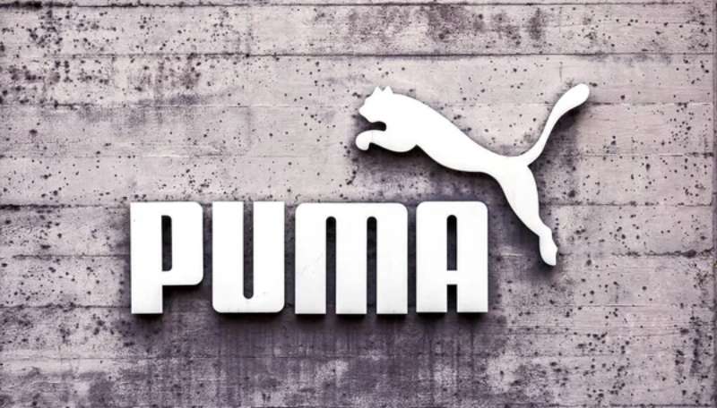
The Puma logo ranks among the most recognized symbols in sportswear. That leaping cat has been around since 1948, which is pretty remarkable when you think about it.
Puma SE, the German multinational corporation, uses this mark across footwear, apparel, and accessories worldwide. The current version combines the jumping cat silhouette with a custom wordmark underneath.
Rudolf Dassler founded the company in Herzogenaurach, Germany after splitting from his brother Adolf (who started Adidas). The logo has gone through roughly six major iterations since then, each one refining that cat into something sleeker.
The design represents speed, agility, and athletic performance. It works because it’s simple enough to remember but distinctive enough to stand out on a crowded shelf.
What Is the Puma Logo?
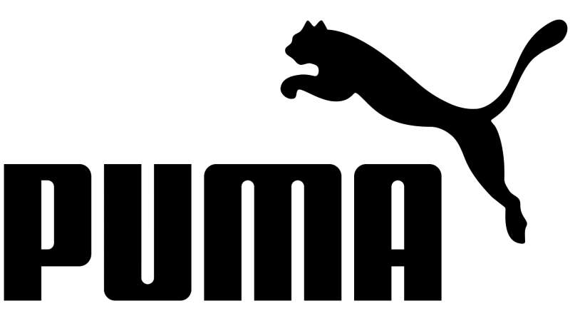
The Puma logo features a leaping cat silhouette positioned above or beside a bold wordmark. Introduced in its current form during the late 1970s, the design was refined by Lutz Backes. The cat symbolizes speed, power, and grace in athletic competition.
Design Type: Combination mark (symbol plus wordmark)
Primary Elements:
- Leaping cat silhouette facing right
- Custom sans-serif wordmark reading “PUMA”
- Integrated composition where cat appears to jump over or beside text
Official Introduction Date: The jumping cat first appeared in 1948. The modern refined version emerged around 1979.
Designer: Lutz Backes created the streamlined version still used today.
Trademark Status: Registered trademark of Puma SE, protected globally across multiple classes including footwear, apparel, and sporting goods.
Color Palette:
- Primary Black: #000000
- Puma Red: #E42524
- White: #FFFFFF (for reversed applications)
Usage Context: Product labeling, retail signage, digital platforms, athlete sponsorships, marketing campaigns, and merchandise tags.
How Has the Puma Logo Evolved Over Time?
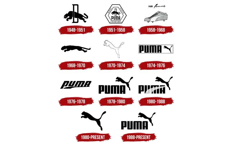
The Puma logo has transformed from a simple wordmark into the athletic icon we know today.
Early versions featured text-only designs. The leaping cat joined gradually, becoming more stylized with each decade.
Six major redesigns have shaped its journey from 1948 to now.
Original Puma Logo (1948-1967)
Years Active: 1948-1967
Design Description: The first logo was primarily text-based. “PUMA” appeared in a bold, capitalized sans-serif font with strong geometric letterforms. A simple animal illustration occasionally accompanied it, though not consistently.
Color Scheme: Black and white dominated this era. Practical for manufacturing limitations at the time.
Designer: Rudolf Dassler and early company staff handled initial branding.
Context: Post-war Germany. The company needed to establish identity quickly after the Dassler brothers split. Function mattered more than sophistication.
Cultural Significance: This marked the birth of a brand that would eventually sponsor Pele and challenge Adidas directly.
Refined Cat Introduction (1967-1979)
Years Active: 1967-1979
Design Description: The leaping cat became a permanent fixture. It appeared more detailed than later versions, with visible muscle definition and a dynamic pose mid-jump.
Color Scheme: Still primarily black, though red accents started appearing in marketing materials.
Key Changes from Previous: The cat transformed from occasional decoration to core identity element. Typography remained bold but began working alongside the symbol rather than standing alone.
Cultural Significance: This coincided with Puma’s expansion into football and track. The cat represented the explosive power athletes needed.
Streamlined Modern Era (1979-Present)
Years Active: 1979-Present
Design Description: Lutz Backes stripped the cat down to its most recognizable form. Clean lines. No unnecessary details. The silhouette became instantly readable at any size.
Color Scheme: Black remains primary. Red functions as the signature accent color. White handles reversed applications.
Designer: Lutz Backes
Key Changes from Previous: Removed anatomical detail from the cat. Simplified the wordmark. Created a version that works equally well on a shoe tongue or a stadium billboard.
Context: The late 1970s brought new printing technologies and global expansion. The logo needed to reproduce cleanly across cultures and mediums.
Cultural Significance: This version has become synonymous with athletic streetwear culture, from hip-hop to professional sports.
What Do the Design Elements of the Puma Logo Mean?
The leaping cat represents explosive athletic movement frozen at its peak moment.
It’s not a literal puma, really. More like the idea of one. The abstraction lets viewers project their own sense of speed and power onto it.
That forward motion suggests progress and ambition.
What Does the Leaping Cat Symbolize?
The cat captures the split-second before an athlete makes contact. That moment of suspended potential energy.
Pumas in nature are ambush predators. They wait, then explode into action. The logo borrows this quality.
It’s about readiness. Coiled power waiting to release.
Why Did Puma Choose These Specific Colors?
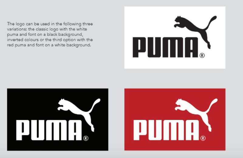
Black (#000000)
- Symbolic meaning: Power, sophistication, timelessness
- Psychological impact: Creates strong contrast and authority
- Brand connection: Works across all product lines without clashing
Puma Red (#E42524)
- Symbolic meaning: Energy, passion, competitive fire
- Psychological impact: Grabs attention and increases heart rate
- Brand connection: Differentiates from Adidas blue and Nike orange accents
The combination follows solid color theory principles. High contrast. Easy recognition. Works in monochrome when needed.
What Typography Style Is Used in the Puma Logo?
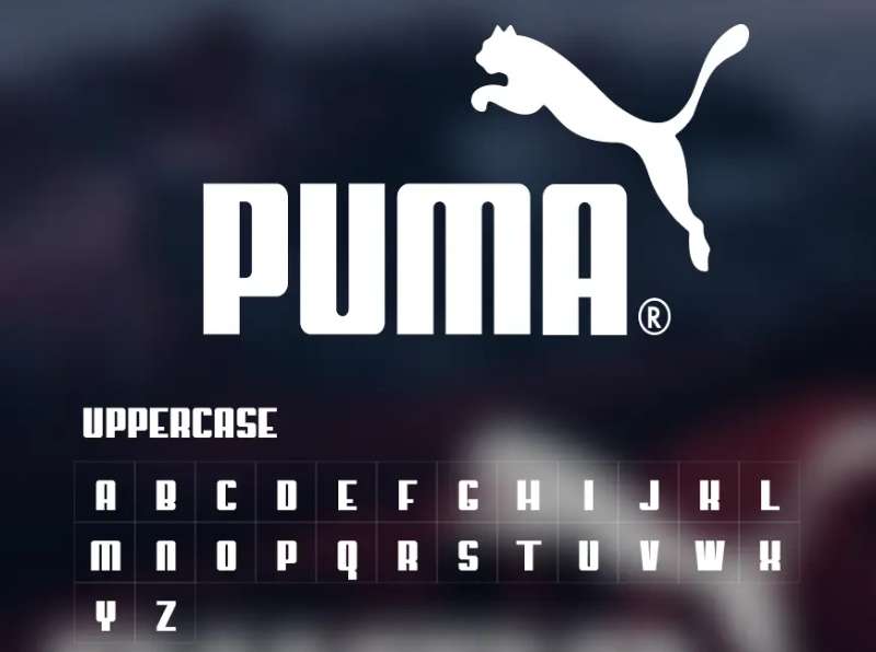
Puma uses a custom typeface that doesn’t exist as a commercial font.
The letters are all capitals. Bold weight. Geometric construction with slightly rounded terminals.
Each character shares similar proportions, which creates visual rhythm across the word.
The “A” has a distinctive flat apex rather than a pointed one. Small details like this make it ownable.
What Are the Hidden Meanings in the Puma Logo?
The cat’s trajectory matches natural reading direction in Western markets. Left to right. Forward momentum.
Some designers point out that the negative space beneath the cat creates a subtle sense of ground, even though none is drawn.
The jump angle (roughly 45 degrees) is considered optimal for conveying both height and distance. It wasn’t accidental.
Lutz Backes reportedly studied actual puma movement before finalizing the silhouette.
How Does the Puma Logo Compare to Competitor Logos?
Puma sits in an interesting spot among shoe brand logos.
Where Nike went abstract with the swoosh, Puma stayed representational. You know exactly what you’re looking at.
The Adidas logo uses geometric stripes. New Balance opts for a stylized “N.” Puma chose an animal, which creates different emotional associations.
Against other animal-based athletic brands (like the defunct Reebok vector or Lacoste’s crocodile), Puma’s cat reads as more aggressive. More athletic. Less country club.
The simplicity holds up well. Many competitor logos from the same era have been redesigned multiple times. Puma’s core hasn’t needed major surgery since 1979.
What Are the Technical Specifications of the Puma Logo?
Official Color Codes:
Primary Black
Puma Red
- Hex: #E42524
- RGB: (228, 37, 36)
- CMYK: (0, 95, 100, 0)
- Pantone: 485 C
White (Reversed)
- Hex: #FFFFFF
- RGB: (255, 255, 255)
- CMYK: (0, 0, 0, 0)
Dimensions and Proportions:
- Aspect ratio: Approximately 3:1 (horizontal lockup with wordmark)
- Minimum size: 15mm width for print, 50 pixels for digital
- Clear space: Minimum of the height of the “P” on all sides
- The cat icon can be used standalone at minimum 8mm or 25 pixels
The logo exists as vector graphics for scalability. DPI recommendations vary by application, with 300 DPI standard for print.
What Cultural Impact Has the Puma Logo Had?
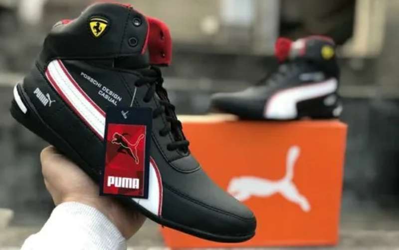
The leaping cat crossed from sports into street culture decades ago.
When Tommie Smith and John Carlos raised fists at the 1968 Olympics, they wore Pumas. That moment linked the brand to social consciousness.
Hip-hop adopted Puma Suedes in the 1980s. Run-DMC wore them. The logo became part of an aesthetic.
Rihanna’s creative direction in the 2010s pulled the brand into fashion territory. The cat showed up on runways.
How Does the Puma Logo Fit Into the Overall Brand Identity?
The logo anchors everything Puma does visually. It’s the constant across sub-brands, collaborations, and campaigns.
Product designs echo the cat’s dynamic angles. Marketing photography emphasizes similar motion blur and forward lean.
Brand guidelines maintain strict control over how the mark appears. This consistency builds recognition.
Athlete partnerships extend the logo’s meaning. When Usain Bolt wore it, the speed association intensified.
How Should the Puma Logo Be Used?
Official Usage Guidelines:
Do:
- Use official files from Puma’s brand portal
- Maintain required clear space
- Apply only to approved color backgrounds
- Scale proportionally without distortion
Don’t:
- Rotate or flip the logo
- Add effects like shadows, gradients, or outlines
- Combine with other logos without approval
- Alter the relationship between cat and wordmark
- Use low-resolution bitmap files for print
Access and Licensing:
Official logos are available through Puma’s corporate press portal for authorized media use. Commercial licensing requires direct partnership agreements.
The logo is trademarked internationally. Unauthorized commercial use can result in legal action. Fan art and editorial use typically fall under different guidelines.
Retailers and partners receive specific brand style guides with approved applications and file formats.
FAQ on The Puma Logo
What Does the Puma Logo Represent?
The leaping cat symbolizes speed, agility, and athletic power. It captures a puma mid-jump, representing explosive movement and competitive drive.
The silhouette connects directly to the brand name while communicating performance values that resonate with athletes worldwide.
Who Designed the Current Puma Logo?
Lutz Backes created the streamlined version used today. He refined the jumping cat into a cleaner silhouette during the late 1970s.
Rudolf Dassler, the company founder, oversaw early branding efforts in Herzogenaurach, Germany after establishing Puma SE in 1948.
When Was the Puma Logo First Created?
The original Puma wordmark appeared in 1948 when Rudolf Dassler founded the sportswear company. The iconic leaping cat joined around 1967.
The modern refined version emerged in 1979 and has remained largely unchanged since then.
Why Did Puma Choose a Cat for Its Logo?
The psychology of shapes played a role here. A puma (also called cougar or mountain lion) represents predatory athleticism.
The animal embodies qualities like stealth, power, and quick reflexes. Perfect fit for a sports brand identity.
What Font Is Used in the Puma Wordmark?
Puma uses a custom typeface not available commercially. The letters feature bold, geometric construction with slightly rounded terminals.
All capitals. Consistent scale and proportion across each character. The flat-topped “A” makes it distinctive and ownable.
What Are the Official Puma Logo Colors?
Primary black (#000000) dominates most applications. Puma Red (#E42524) serves as the signature accent color.
White handles reversed applications on dark backgrounds. This color palette creates strong contrast and instant brand recognition across products and marketing.
How Many Times Has the Puma Logo Changed?
Roughly six major redesigns have occurred since 1948. Early versions were text-only. The cat appeared in 1967.
Each logo evolution simplified the design further. The 1979 version by Lutz Backes established the minimalist design approach still used today.
Can I Use the Puma Logo for My Business?
No. The Puma trademark is protected globally. Unauthorized commercial use violates intellectual property law and can result in legal action.
Retailers and partners need official licensing agreements. Editorial and fan art may fall under different guidelines depending on context.
What Makes the Puma Logo Different from Adidas?
Puma uses a representational animal symbol. Adidas relies on abstract geometric stripes. Different logo design principles entirely.
The rivalry runs deep. Rudolf and Adolf Dassler were brothers who split in 1948, founding competing companies in the same German town.
Where Can I Download the Official Puma Logo?
Puma’s corporate press portal provides official logo files for authorized media use. These come in proper formats for both print design and web design.
Commercial access requires partnership agreements. Always use official sources to ensure correct specifications and trademark compliance.
Conclusion
The Puma Logo stands as one of the most recognizable marks in athletic branding. That leaping cat has earned its place through decades of consistent visual identity.
From Rudolf Dassler’s 1948 founding to Lutz Backes’ streamlined redesign, every iteration refined the brand emblem without losing its core meaning.
The combination of dynamic symbolism and bold typography elements creates instant recognition. It works on sneakers, apparel, and stadium billboards alike.
Few tech company logos or sportswear competitors achieve this level of brand heritage. The cat keeps running.

Renowned for his expertise in logo design and visual branding, Bogdan has developed a multitude of logos for various clients.
His skills extend to creating posters, vector illustrations, business cards, and brochures. Additionally, Bogdan's UI kits were featured on marketplaces like Visual Hierarchy and UI8.
He also wrote in the past years on sites like Design Your Way, WebDesignerDepot, WPDean, Designmodo, Speckyboy, Slider Revolution, and more.
- Versatile Work Sans Font Pairing for Every Project - 16 September 2026
- How to Set Up a Digital Menu Board: Hardware to Layout - 15 September 2026
- The Arc Browser Logo History, Colors, Font, And Meaning - 14 September 2026

Bogdan Sandu is a seasoned designer who has been designing websites since 2008. Renowned for his expertise in logo design and visual branding, Bogdan has developed a multitude of logos for various clients. His skills extend to creating posters, vector illustrations, business cards, and brochures. Additionally, Bogdan's UI kits were featured on marketplaces like Visual Hierarchy and UI8. He also wrote in the past years on sites like Design Your Way, WebDesignerDepot, WPDean, Designmodo, Speckyboy, Slider Revolution, and more.
You Might Also Like