The Crocs Logo stands as one of the most recognizable brand marks in the footwear industry. It features Duke, a cartoon crocodile mascot that has become synonymous with the foam clog brand since its founding in 2002.
Within footwear branding, this logo occupies a unique space. Most shoe brand logos rely on abstract swooshes or text-based marks. Crocs went a different route with a friendly animal character.
The current version uses a simplified Duke illustration paired with custom wordmark typography. The company has gone through roughly three logo iterations since launch. Boulder, Colorado served as the birthplace of both the brand and its grinning mascot.
What is the Crocs Logo?
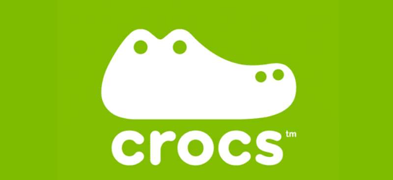
The Crocs Logo is a combination mark featuring Duke the crocodile mascot alongside a custom sans-serif wordmark. Introduced in 2002 by founders Lyndon Hanson, Scott Seamans, and George Boedecker Jr., it represents comfort, fun, and the playful spirit of the brand’s foam clog products.
Design Type: Combination mark (mascot plus wordmark)
Primary Elements:
- Duke the crocodile, a cartoon mascot shown in profile
- Custom sans-serif wordmark spelling “CROCS”
- Rounded, friendly letterforms matching the mascot’s personality
Official Introduction Date: 2002
Designer/Agency: Created internally by founding team members
Trademark Status: Registered trademark of Crocs, Inc. Protected in multiple countries worldwide.
Color Palette:
- Primary Black: #000000
- White: #FFFFFF
- Crocs Green (accent): Often appears in marketing materials
Usage Context: Product labels, retail signage, e-commerce platforms, hang tags, shoe boxes, marketing campaigns, collaborations, and licensed merchandise.
How Has the Crocs Logo Evolved Over Time?
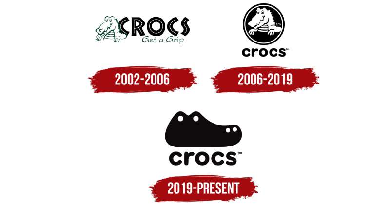
The Crocs Logo has remained surprisingly consistent since 2002. Unlike many brands that undergo dramatic redesigns, Crocs has kept Duke as its central figure throughout.
Minor refinements have occurred. The mascot’s lines have been cleaned up. The wordmark has been adjusted for digital clarity.
But the core identity? It stayed put. That consistency built strong brand recognition over two decades.
Original Crocs Logo (2002-2007)
Years Active: 2002-2007
Design Description: The first version featured Duke the crocodile with a more detailed, hand-drawn appearance. The mascot had visible teeth and a friendly grin. Letters were bold and rounded.
Color Scheme: Black and white primary, with green used in marketing applications.
Designer: Founding team (Hanson, Seamans, Boedecker)
Context: Launched when Crocs was still a small boating shoe company in Colorado. The playful crocodile connected directly to the brand name.
Cultural Significance: Established the fun, irreverent personality that would define Crocs marketing for years to come.
Refined Crocs Logo (2007-2017)
Years Active: 2007-2017
Design Description: Duke received subtle refinements. Cleaner lines. Slightly simplified features. The wordmark gained better spacing between letters.
Color Scheme: Continued with black and white core palette.
Key Changes from Previous: More polished execution suitable for global expansion. Better reproduction at small sizes.
Context: Crocs was growing rapidly during this period. The logo needed to work across more applications and international markets.
Modern Crocs Logo (2017-Present)
Years Active: 2017-present
Design Description: The current version features the most streamlined Duke yet. Minimal detail. Maximum recognizability. The wordmark sits comfortably beside or below the mascot depending on application.
Color Scheme: Flexible system allowing black, white, or single-color applications.
Key Changes from Previous: Optimized for digital platforms and social media avatars. Works at tiny sizes on mobile screens.
Cultural Significance: Arrived during the brand’s unexpected fashion comeback. High-profile collaborations with Balenciaga, Post Malone, and Bad Bunny brought renewed attention to both the shoes and the grinning mascot.
What Do the Design Elements of the Crocs Logo Mean?
Duke the crocodile communicates approachability and humor. The cartoonish style says this brand doesn’t take itself too seriously.
That matches the product perfectly. Crocs clogs are comfortable, colorful, and a little weird. The mascot reflects that energy.
The rounded wordmark reinforces softness and friendliness. No sharp edges here.
Why Did Crocs Choose These Specific Colors?

Black (#000000)
Provides maximum contrast and flexibility. Works on any background color, which matters when your products come in dozens of shades.
Black also suggests timelessness. According to color psychology, it conveys strength without competing with the colorful products.
White (#FFFFFF)
Clean and fresh. Perfect for product packaging where the shoes themselves should be the star.
Green (Marketing Accent)
References the crocodile connection. Links to nature, outdoors, and the water-friendly origins of the product. You’ll see this green pop up in campaigns, but it’s not locked into the primary logo.
What Typography Style Is Used in the Crocs Logo?
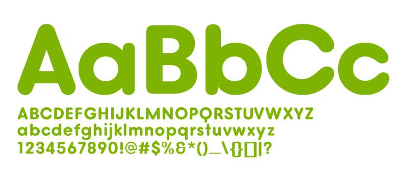
Crocs uses a custom sans-serif font for its wordmark. The letters are bold, rounded, and slightly playful.
There’s a softness to the curves that echoes the foam material of the shoes themselves. Nothing sharp or aggressive.
The typography reads well at various sizes. It maintains personality without sacrificing clarity.
What Are the Hidden Meanings in the Crocs Logo?
Duke’s expression matters more than you might think. That smile is intentional. It says comfort, relaxation, and a lack of pretension.
The crocodile as an animal choice connects to water. Original Crocs were designed as boating shoes, and crocodiles are semi-aquatic creatures.
Some see the ventilation holes in Crocs shoes echoed in Duke’s simple, open design. Whether intentional or not, there’s visual harmony between product and mascot.
How Does the Crocs Logo Compare to Competitor Logos?
Most footwear brands go abstract. Nike has a swoosh. Adidas uses three stripes. Puma shows a leaping cat silhouette.
Crocs stands out with Duke’s cartoonish friendliness. It’s less athletic, more approachable.
Compared to other casual footwear, the difference is still clear. Vans relies on its skateboard-influenced wordmark. Converse leans into heritage with its star chevron.
The mascot approach sets Crocs apart. Few shoe brands use cartoon characters as prominently. Skechers has an “S” mark. New Balance uses a stylized “NB.”
Duke creates emotional connection. You can put a Duke charm on your Crocs. You can recognize him from across a store. That’s harder to achieve with geometric shapes.
What Are the Technical Specifications of the Crocs Logo?
Official Color Codes:
Primary Black
White
- Hex: #FFFFFF
- RGB: (255, 255, 255)
- CMYK: (0, 0, 0, 0)
Crocs Green (Marketing)
- Varies by application
- Often a bright, saturated green suggesting nature and crocodiles
Dimensions and Proportions:
- The mascot and wordmark maintain fixed proportional relationships
- Minimum size requirements ensure Duke remains recognizable
- Clear space around the logo equals the height of the letter “C” in the wordmark
- Horizontal and stacked configurations available for different applications
What Cultural Impact Has the Crocs Logo Had?
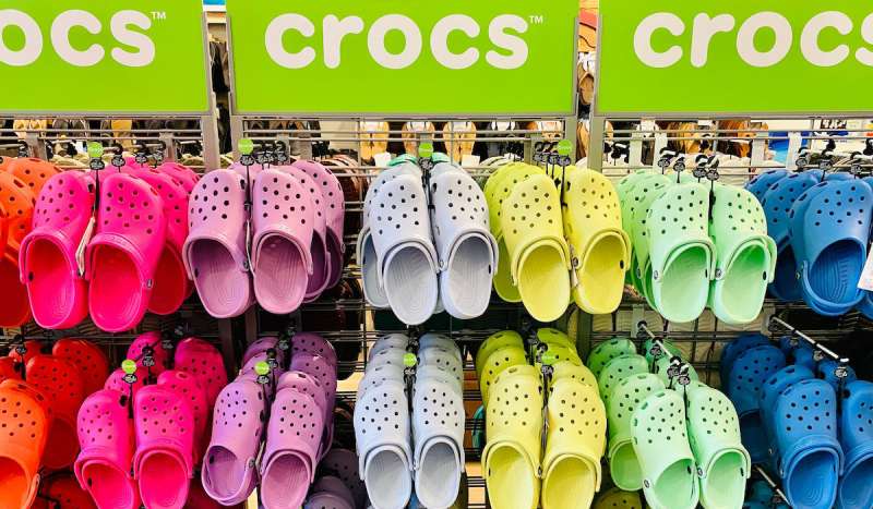
Duke became a pop culture symbol during the brand’s 2010s resurgence. The mascot appeared on everything from runway shows to celebrity Instagram posts.
Fashion’s embrace of Crocs brought new attention to the logo. Balenciaga collaborations put Duke in high-fashion contexts.
The Jibbitz phenomenon amplified things further. Decorative charms turning Crocs into customizable canvases made the shoes, and their logo, more visible than ever.
Gen Z adopted both the product and the mascot. Duke works perfectly as social media content. He’s friendly, meme-able, and instantly recognizable.
How Does the Crocs Logo Fit Into the Overall Brand Identity?
Duke anchors a larger visual system. The mascot connects to brand guidelines that emphasize fun, comfort, and self-expression.
Product photography, retail environments, and digital presence all echo the logo’s playful spirit.
The brand’s tagline, “Come As You Are,” aligns with Duke’s welcoming expression. Nothing intimidating. Nothing exclusive. Just comfortable shoes and a smiling crocodile.
Packaging, hang tags, and store displays maintain consistent use of the mascot and wordmark. Whether you see Crocs in a department store or on Instagram, Duke is there.
How Should the Crocs Logo Be Used?
Official Usage Guidelines:
Do:
- Maintain clear space around the logo
- Use approved color variations only
- Scale proportionally without distortion
- Follow guidelines for minimum reproduction sizes
Don’t:
- Alter Duke’s colors or expression
- Separate the mascot from the wordmark in unauthorized ways
- Add effects, shadows, or outlines not specified in guidelines
- Use low-resolution versions for print applications
Where to Access Official Logos: Crocs provides brand assets to authorized partners through their corporate communications team. Retailers and licensees receive official files meeting DPI requirements for their specific uses.
Licensing Information: Third-party use requires written permission from Crocs, Inc. Unauthorized reproduction violates trademark protections.
Trademark Protection: The Crocs name, Duke mascot, and combination mark are registered trademarks. Legal action has been taken against counterfeit products using similar designs.
FAQ on The Crocs Logo
What Does the Crocs Logo Represent?
The Crocs logo represents fun, comfort, and approachability. Duke the crocodile mascot communicates the brand’s playful personality.
It connects directly to the company name while signaling that these foam clogs don’t take themselves too seriously.
Who Designed the Crocs Logo?
The founding team created the original logo in 2002. Lyndon Hanson, Scott Seamans, and George Boedecker Jr. developed Duke alongside their first clog designs.
No outside agency was involved initially. It was an in-house effort from Boulder, Colorado.
What Is the Name of the Crocs Mascot?
The Crocs mascot is named Duke. He’s a cartoon crocodile with a friendly grin.
Duke has appeared on products, marketing materials, and Jibbitz charms since the brand launched. The name isn’t always publicized, but it’s official.
When Was the Crocs Logo Created?
Crocs introduced their logo in 2002 when the company launched. The brand started as a boating shoe company.
Duke and the wordmark have evolved slightly since then. But the core visual identity remained consistent for over two decades.
What Colors Are in the Crocs Logo?
The primary Crocs logo uses black and white. This keeps it versatile across their colorful product range.
Green appears in marketing as an accent color. It references crocodiles and the brand’s outdoor origins. The flexible color palette works everywhere.
Has the Crocs Logo Changed Over Time?
Yes, but changes have been subtle. The original Duke had more detail and a hand-drawn quality.
Refinements came around 2007 and 2017. Each update simplified lines for better digital reproduction. The mascot’s core look stayed recognizable throughout.
Why Did Crocs Choose a Crocodile for Their Logo?
The crocodile connects to the brand name. Simple as that.
Crocodiles are also semi-aquatic animals. The original Crocs were designed as comfort footwear for boating. Water-friendly creature, water-friendly shoe. The connection made sense.
Can I Use the Crocs Logo for My Own Purposes?
No. The Crocs logo is a registered trademark of Crocs, Inc.
Unauthorized use violates intellectual property laws. Retailers and partners need written permission. The company actively pursues counterfeiters using similar designs on fake products.
What Font Does Crocs Use in Their Logo?
Crocs uses a custom typeface for their wordmark. The letters are bold, rounded, and slightly playful.
You won’t find this exact font for download. It was designed specifically to match Duke’s friendly personality and the soft foam product.
Where Can I Find the Official Crocs Logo?
Official logo files go to authorized partners only. Crocs distributes assets through their corporate communications team.
Licensed retailers receive proper vector graphics meeting brand standards. Random downloads online are usually unofficial or outdated versions.
Conclusion
The Crocs Logo proves that playful branding works. Duke the crocodile has become one of the most recognizable mascots in casual footwear.
From Boulder, Colorado to global fashion runways, this grinning emblem traveled far. Celebrity collaborations with Post Malone and Bad Bunny amplified its reach.
The combination mark balances friendliness with brand style guide consistency. It scales from tiny Jibbitz charms to massive retail signage without losing character.
Crocs Inc built something lasting here. Twenty-plus years later, Duke still smiles on every foam clog sold worldwide.

Renowned for his expertise in logo design and visual branding, Bogdan has developed a multitude of logos for various clients.
His skills extend to creating posters, vector illustrations, business cards, and brochures. Additionally, Bogdan's UI kits were featured on marketplaces like Visual Hierarchy and UI8.
He also wrote in the past years on sites like Design Your Way, WebDesignerDepot, WPDean, Designmodo, Speckyboy, Slider Revolution, and more.
- Why Final Rendering Becomes a Bottleneck in 3D Design Projects - 17 October 2026
- Stussy Font Generator - 16 October 2026
- What B2B Buyers Check on a Website Before They Ever Talk to Sales - 16 October 2026

Bogdan Sandu is a seasoned designer who has been designing websites since 2008. Renowned for his expertise in logo design and visual branding, Bogdan has developed a multitude of logos for various clients. His skills extend to creating posters, vector illustrations, business cards, and brochures. Additionally, Bogdan's UI kits were featured on marketplaces like Visual Hierarchy and UI8. He also wrote in the past years on sites like Design Your Way, WebDesignerDepot, WPDean, Designmodo, Speckyboy, Slider Revolution, and more.
You Might Also Like