The Merrell Logo History, Colors, Font, and Meaning

Imagine your digital footprint as a hiker’s trail through the vast wilderness of the internet. Every brand has a signature imprint – a marker that says, “We were here, we forged trails.” That’s exactly what the Merrell logo represents in the bustling domain of outdoor apparel.
This symbol isn’t just an emblem; it encapsulates an ethos of rugged durability, a nod to those who traverse the road less traveled.
In this deep dive, you’ll discover the intricate tapestry that weaves together the world-renowned Merrell brand and its iconic mountain-inspired logo.
We’ll unlace the significance behind the simple yet evocative design that’s stamped on every piece of Merrell gear, from waterproof hiking boots to the agile Moab series.
You’ll step into the Merrell universe, one where every pattern and thread speaks volumes of the brand’s commitment to outdoor enthusiasts worldwide.
As we journey through this expedition, expect to unlock:
- The evolution of the Merrell symbol
- Insight into how this logo encapsulates the core of Merrell’s branding
- An analysis of its impact on customer perception and market positioning
By the trail’s end, you’ll grasp not just the emblem itself but also its resonance across the trails of the outdoor apparel industry.
The Meaning Behind the Merrell Logo

You might have seen that familiar logo – the twin mountain peaks on Merrell shoes. It’s so much more than just a cool design, friends. The logo is an emblem, an identifier, a storyteller. It’s like a riddle that speaks the language of nature and exploration.
Symbol of Adventure
These two peaks? They’re more than simple lines. They represent the wilderness, the great outdoors that Merrell is so passionate about.
See, every time you glance at these peaks, they subtly whisper, “Let’s explore, let’s conquer”. It’s a symbol of adventure and an invitation to break free from the mundane.
Commitment to Quality
The clean lines and the well-defined design? It’s a nod to their commitment to quality and precision. The minimalist design talks about the brand’s straightforward approach to functionality. No clutter, no fluff, only purposeful design.
The History of the Merrell Logo
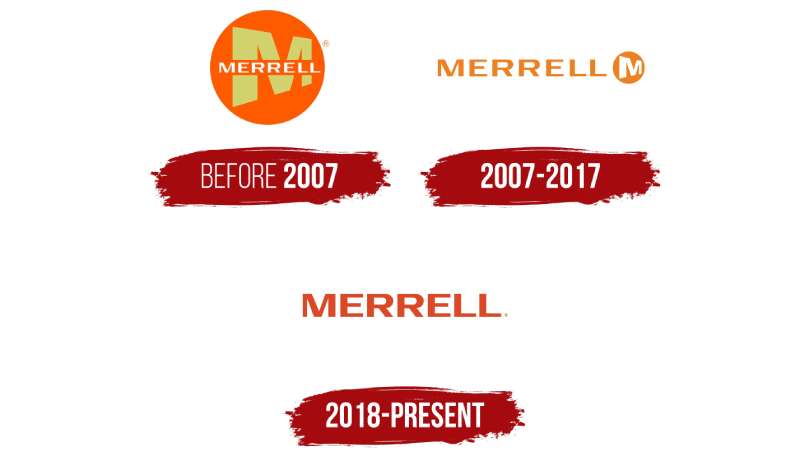
The Merrell Logo, ah! That’s a tale of a journey – an evolution, mirroring the brand’s own ethos and philosophy.
The Humble Beginning
The logo’s journey started back in the ’80s when Randy Merrell began his boot-making saga. That was the first hint of the mountain symbol, symbolizing Merrell’s initial focus on hiking footwear. And thus began the odyssey of our beloved logo.
The Evolution
Fast forward to the present, the logo has evolved beautifully – just like the brand. The original mountain sketch transformed into sleeker, minimalist twin peaks. This subtle transformation speaks volumes about the brand’s adaptation to contemporary aesthetics while still holding on to its roots.
The Colors of the Merrell Logo
When we talk about the Merrell logo, how can we miss the colors? The usual suspects are black and white, but there’s more to that tale.
Black: The Power Statement
Merrell usually goes for a black logo on lighter backgrounds. Black – the color that spells power, elegance, and mystery. It’s as if the brand wants you to perceive it as reliable and confident.
White: The Spirit of Adventure
On darker backgrounds, they switch to a white logo, the color of purity, simplicity, and beginnings. It almost feels like an open canvas, waiting for you to fill it with your adventures.
The Font Used in the Merrell Logo
Let’s talk about that sleek font you see next to the logo. The Merrell typography is as much a part of their brand identity as the mountain peaks.
Simplicity Meets Sophistication
The choice of a sans-serif typeface complements the overall clean design of the logo. It’s simple, it’s legible, it’s modern. And yet, it has an air of sophistication, just like their products.
Impressions and Perceptions
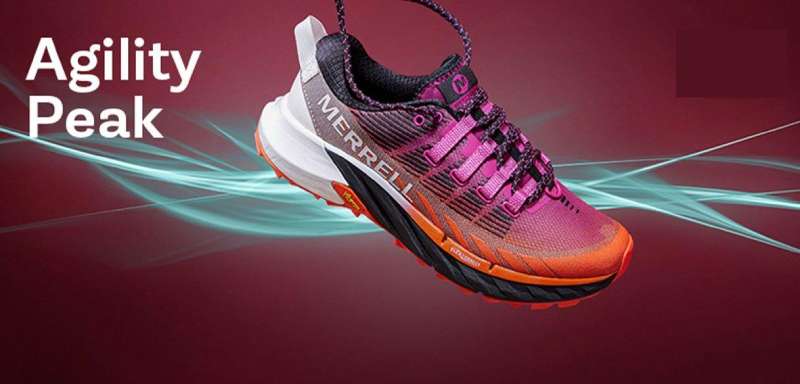
Looking at the logo, what does it make you feel? What does it make you think of?
Inspirational Undertones
There’s a certain rawness in the design that might stir something inside you. It’s like a silent cheerleader, nudging you to go out, to reach the summit. It’s a design that inspires.
Universal Appeal
Despite its simplicity, the Merrell logo appeals to a broad audience. It’s a universal symbol of exploration, relatable to anyone with a spark of adventure.
The Versatility of the Merrell Logo
And finally, let’s delve into how Merrell’s logo beautifully adapts across various platforms and products.
A Logo for All Seasons
Be it a hiking boot or a running shoe, a cap, or a water bottle, the logo looks perfectly in place. It’s a chameleon of design, adapting while never losing its essence. Isn’t that cool?
Digital to Physical – Everywhere!
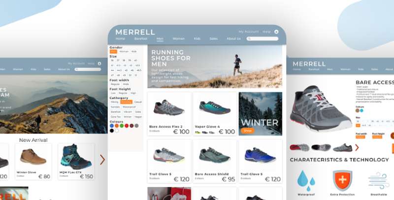
On the digital front too, it stands strong. Whether it’s on their website, social media channels, or even email newsletters, the logo continues to shine in its minimalist glory.
So, there you have it, the Merrell logo in all its glory – a masterpiece of minimalist design that embodies the spirit of the brand.
The Merrell logo is more than just a logo. It’s a symbol of adventure, quality, and the brand’s commitment to supporting you in your journey. It’s a story of the brand’s journey, and it’s a promise of the brand’s future.
So, the next time you see the Merrell logo, remember, that it’s not just two mountain peaks, it’s a saga, an adventure waiting to unfold!
FAQ On The Merrell Logo
What’s the history behind the Merrell logo?
The Merrell emblem, with its curving mountain design, surfaced not long after the company’s founding in ’81.
It’s a visual shout-out to the brand’s roots in the hiking community. Each curve mirrors the trails that outdoor enthusiasts conquer, in lockstep with Merrell’s durable gear.
What does the Merrell logo symbolize?
It’s all about the call of the wild. The logo embodies the spirit of adventure, the promise of durability, and a nod to top-notch performance gear. That emblem on every pair of sturdy boots is Merrell’s pact with nature lovers: to offer reliable support across landscapes.
Has the Merrell logo changed over time?
Yep, but subtly. It’s evolved just like their renowned Moab 2, refining its edges while keeping the core identity intact. The modern look still pays homage to the original vision: a sturdy emblem for those who seek outdoor exploits in a quality pair of Merrells.
Who designed the Merrell logo?
It’s a bit hazy, the exact ‘who’ part. But it’s crystal clear that the design was meant to resonate with the trailblazers. Let’s just say, whoever penned that design knew their audience and captured Merrell’s ethos exquisitely—a hat-tip to simplicity and the great outdoors.
What are the color specifications for the Merrell logo?
Natural hues, think earthy tones. The outdoor gear icon often shows up in a rich forest green or a deep brown. These colors aren’t random; they’re a deliberate echo of nature’s palette, inviting hikers to lace up their boots and hit the trails.
Is the Merrell logo trademarked?
Absolutely. Like their tough-as-nails All Out Blaze series, the logo is legally safeguarded. It’s not just a stylish footprint on your latest pair of hiking boots but a registered symbol that says, “this is the real Merrell deal.”
How is the Merrell logo used in marketing?
Strategically, it stands front and center across campaigns. They flaunt it on billboards, slap it on web pages, and it’s ever-present in emails. The logo transcends being a mere graphic; it’s the emblematic handshake between Merrell and the outdoor community.
Can the Merrell logo be used on custom merchandise?
Yeah, folks often wonder about slapping that symbol on gear. Merrell’s cool with it in some cases, for authorized partners and specific events. But remember, it’s trademarked, so any unofficial use without a nod from Merrell might land you in murky waters.
What impact does the Merrell logo have on consumer perception?
It’s like a beacon for quality. Customers see that Merrell mountain and think, “This gear’s got my back.” It’s up there with attitudes towards Gore-Tex technology—when you spot it, you know you’re looking at stuff that’s made to last.
In what ways has the Merrell logo influenced the shoe industry?
It’s kind of set the bar. Many brands try to encapsulate their essence in a logo, but Merrell’s done it with finesse. That simple, yet powerful emblem tells a story of reliability and adventure, inspiring not just buyers but also competitors to step up their game.
Conclusion
We’ve meandered through the scenic route, tracing the contours of the Merrell logo, much like following the bends of a well-trodden trail. This emblem benchmarks more than a brand; it’s a symbol etched into the legacy of the great outdoors—a nod to years spent crafting reliable footwear for intrepid explorers.
Along this journey, we’ve untied the significance behind that mountainous silhouette:
- It’s a saga of design—steeped in the hues of nature, a testament to enduring quality.
- It’s a legal beacon—trademarked to guard against the echoes of uncertainty.
As twilight descends on our digital path, we find that the Merrell logo stands as a touchstone for adventurers worldwide. It’s a marker, a trusted guide on every shoebox, whispering stories of trails conquered and beckoning yet to come.
So next time you lace up those Moabs, take a moment. Admire that emblem. Know it bears the weight of wild promise—crafted for those who dare to step beyond the paved road.
If you liked this article about the Merrell logo, you should check out this article about the TOMS logo.
There are also similar articles discussing the Steve Madden logo, the Clarks logo, the Cole Haan logo, and the Havaianas logo.
And let’s not forget about articles on the Keen logo, the Teva logo, the Rockport logo, and the Sperry logo.
- The Guinness Logo History, Colors, Font, And Meaning - 15 May 2024
- Vibrant Orange Color Palettes for Energetic Designs - 15 May 2024
- Publishing Elegance: What Font Does Time Magazine Use? - 15 May 2024


