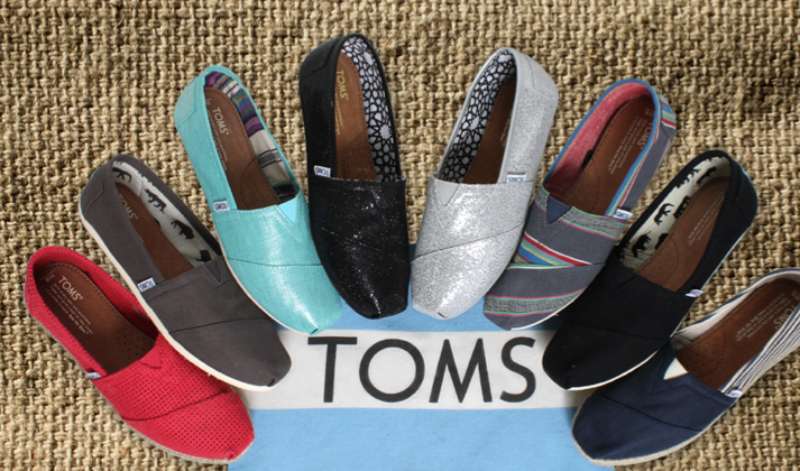
The TOMS Logo represents one of the most recognized symbols in socially conscious footwear. It sits at the intersection of casual fashion and humanitarian branding.
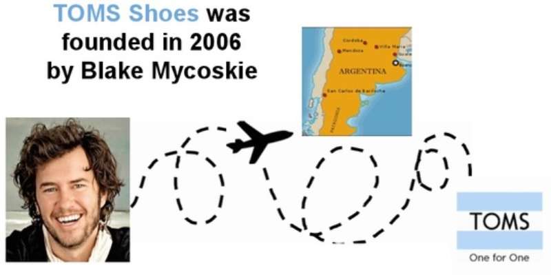
This wordmark paired with a distinctive flag icon has become shorthand for the buy-one-give-one business model. Blake Mycoskie founded TOMS in 2006 after a trip to Argentina.
The current logo version debuted around 2006 and has seen only minor refinements since. Most people recognize the simple blue flag waving above or beside the company name.
TOMS has maintained remarkable consistency in its visual identity. The brand has cycled through roughly two to three logo iterations total. Each change focused on cleaning up the design rather than reinventing it.
What Is the TOMS Logo?
![]()
The TOMS logo combines a custom wordmark with a flag symbol representing the Argentinian heritage of the alpargata shoe style. Introduced in 2006 by founder Blake Mycoskie, the design communicates simplicity, movement, and social mission through its clean lines and waving flag motif.
Key Attributes:
- Design Type: Combination mark (wordmark plus symbol)
- Primary Elements: Custom “TOMS” lettering with a waving flag icon
- Official Introduction Date: 2006
- Designer/Agency: Created in-house with Blake Mycoskie’s direction
- Trademark Status: Registered trademark of TOMS Shoes, LLC
- Color Palette: Primary blue (#0072CE), white, and black variants
- Usage Context: Product tags, shoe insoles, packaging, digital platforms, retail displays, and marketing campaigns
How Has the TOMS Logo Evolved Over Time?
The TOMS logo has remained surprisingly stable since 2006. Most updates involved subtle spacing adjustments and color refinements.
The flag symbol gained more prominence in later versions. Typography became slightly bolder for better readability at small sizes.
Original TOMS Logo (2006-2014)
- Years Active: 2006-2014
- Design Description: Simple blue flag positioned above the TOMS wordmark, rendered in a clean sans-serif font
- Color Scheme: Medium blue flag with black or dark gray text
- Designer: In-house design team under Blake Mycoskie
- Context: Launched alongside the brand’s founding and One for One mission
- Key Changes from Previous: Original version, no predecessor
- Cultural Significance: Established the visual language for social enterprise branding
Refined TOMS Logo (2014-Present)
- Years Active: 2014-present
- Design Description: Cleaner flag rendering with adjusted proportions, bolder wordmark
- Color Scheme: Brighter blue (#0072CE), maintained versatility for white and black applications
- Designer: Internal brand team
- Context: Updated as brand expanded beyond shoes into eyewear and coffee
- Key Changes from Previous: Tightened letter spacing, refined flag curves, increased visual weight
- Cultural Significance: Represented maturation from startup to established social enterprise
What Do the Design Elements of the TOMS Logo Mean?
The TOMS logo tells a story through its flag and wordmark. The waving flag symbolizes movement, progress, and the brand’s Argentinian roots.
It references the country where Mycoskie discovered alpargata shoes. The simple design reflects the no-frills approach of the original canvas slip-ons.
Why Did TOMS Choose These Specific Colors?
The primary blue carries trustworthiness and reliability. It suggests calm action rather than aggressive salesmanship.
Blue also works well across cultures without negative associations. The choice supports global expansion.
- Primary Blue: #0072CE – Communicates trust, stability, and global appeal. Color psychology links blue to dependability.
- White: #FFFFFF – Represents purity, simplicity, and the clean canvas of their original shoes
- Black: #000000 – Used for text in certain applications, adds versatility and formality
What Typography Style Is Used in the TOMS Logo?
TOMS uses a custom sans-serif typeface with rounded terminals. The letters have consistent stroke widths throughout.
This creates a friendly, approachable feel. The all-caps treatment adds structure without feeling aggressive.
Readability works at tiny sizes on shoe tags. It scales up nicely for billboards too.
What Are the Hidden Meanings in the TOMS Logo?
The flag’s wave direction suggests forward movement. Some see it pointing toward a better future.
The simplicity itself carries meaning. It says the brand focuses on action over fancy marketing.
Mycoskie has stated the flag honors Argentina’s influence. Nothing more complicated than that, really.
How Does the TOMS Logo Compare to Competitor Logos?
Among shoe brand logos, TOMS stands apart through simplicity. Most athletic brands use swooshes, stripes, or aggressive shapes.
TOMS went softer. The flag icon separates it from wordmark-only competitors.
Compared to the Converse logo star or the Vans logo stripe, TOMS feels more humanitarian than sporty. The New Balance logo and Skechers logo push performance messaging. TOMS communicates mission first.
This positioning works because competitors never tried to occupy the social enterprise space visually. TOMS owned that territory early.
What Are the Technical Specifications of the TOMS Logo?

Official Color Codes:
- Primary Blue: Hex: #0072CE, RGB: (0, 114, 206), CMYK: (85, 50, 0, 0)
- White: Hex: #FFFFFF, RGB: (255, 255, 255), CMYK: (0, 0, 0, 0)
- Black: Hex: #000000, RGB: (0, 0, 0), CMYK: (0, 0, 0, 100)
Dimensions and Proportions:
- Aspect Ratio: Approximately 3:1 (horizontal lockup with flag)
- Minimum Size: 0.5 inches or 36 pixels wide for digital use
- Clear Space: Minimum padding equal to the height of the “O” in TOMS on all sides
- File Formats: Available in vector graphics (AI, EPS, SVG) and raster formats (PNG, JPEG)
What Cultural Impact Has the TOMS Logo Had?
![]()
The TOMS flag became shorthand for conscious consumerism in the late 2000s. Wearing visible TOMS branding signaled values as much as style.
College campuses saw the logo everywhere during peak popularity. It represented a generation wanting purchases to mean something.
The logo influenced countless social enterprise startups. Many copied the clean, mission-forward visual approach. TOMS proved you could build brand recognition around giving rather than performance claims.
How Does the TOMS Logo Fit Into the Overall Brand Identity?
The logo anchors a broader visual system built on simplicity. Photography styles favor natural lighting and real people over polished studio shots.
Marketing materials use generous white space around the flag mark. This breathing room reinforces the uncomplicated brand promise.
Product design echoes the logo’s approachability. Canvas textures, simple stitching, and muted colors all connect back to that waving flag.
How Should the TOMS Logo Be Used?
Official Usage Guidelines:
- Do: Maintain clear space around the logo, use approved color variations, keep proportions locked
- Don’t: Stretch or distort the mark, place on busy backgrounds, alter the flag orientation, change approved colors
- Access: Official assets available through TOMS corporate communications and licensed retail partners
- Licensing: Unauthorized commercial use prohibited under trademark protection
- Trademark: The TOMS name and flag design are registered trademarks requiring proper attribution
Following official brand guidelines protects both the company’s identity and ensures consistent recognition across all touchpoints.
FAQ on The TOMS Logo
What Does the TOMS Logo Look Like?
The TOMS logo features a waving flag symbol above or beside a custom wordmark. The brand identity uses clean lines and simple shapes.
Most versions appear in blue, though black and white variants exist. The flag references the company’s Argentinian alpargata shoe origins.
What Does the TOMS Flag Symbol Mean?
The flag represents Argentina, where founder Blake Mycoskie discovered traditional canvas shoes. It symbolizes movement and progress.
The waving motion suggests forward momentum. This connects to the One for One giving model that defined the social enterprise brand.
Who Designed the TOMS Logo?
Blake Mycoskie developed the original TOMS visual identity with an in-house team in 2006. No major design agency receives credit.
The minimalist design approach came directly from the founder’s vision. He wanted something as simple as the shoes themselves.
When Was the TOMS Logo Created?
The original TOMS logo debuted in 2006 alongside the company launch. It has remained largely unchanged since.
Minor refinements occurred around 2014. The brand maintained consistency across its logo history rather than chasing trends.
What Colors Are Used in the TOMS Logo?
Primary blue (#0072CE) dominates the official TOMS color palette. This shade joins other blue logos that communicate trust.
White and black versions provide flexibility. The footwear brand keeps its brand colors intentionally limited for easy recognition.
Has the TOMS Logo Changed Over Time?
The TOMS logo evolution has been minimal. Two to three iterations exist, with changes focused on refinement rather than reinvention.
Letter spacing tightened slightly. The flag curves became cleaner. Core elements stayed consistent throughout the charitable shoe company’s growth.
What Font Does TOMS Use in Its Logo?
TOMS uses a custom font with rounded terminals and consistent stroke widths. The all-caps treatment adds structure.
Good typography matters here. The letterforms stay readable at small sizes on shoe tags and insoles.
Can I Use the TOMS Logo for My Project?
The TOMS trademark protects unauthorized commercial use. You cannot use their logo without permission.
Licensed retail partners receive official brand assets. Contact TOMS corporate communications for licensing inquiries about the registered trademark.
What Does TOMS Stand For?
TOMS comes from “Tomorrow’s Shoes.” The name reflected Mycoskie’s vision for building a better future through giving.
The wordmark carries this meaning without spelling it out. Most customers never learn the full origin of the ethical fashion brand name.
Where Can I Download the Official TOMS Logo?
Official TOMS logo files come through authorized channels only. The company provides assets to approved partners and media contacts.
High-resolution versions exist in multiple formats. Always verify you have permission before using any TOMS brand materials publicly.
Conclusion
The TOMS Logo stands as proof that simplicity works. A waving flag and clean wordmark built one of the most recognized symbols in socially conscious footwear.
Blake Mycoskie’s vision translated directly into the visual branding. No complicated graphics. No trendy redesigns. Just a clear mark that communicates the One for One mission.
The logo helped define social enterprise branding for an entire generation. It showed that logo design principles matter beyond aesthetics.
Good storytelling through design creates lasting brand recognition. TOMS proved that with a flag, four letters, and a giving model worth remembering.
Renowned for his expertise in logo design and visual branding, Bogdan has developed a multitude of logos for various clients.
His skills extend to creating posters, vector illustrations, business cards, and brochures. Additionally, Bogdan's UI kits were featured on marketplaces like Visual Hierarchy and UI8.
He also wrote in the past years on sites like Design Your Way, WebDesignerDepot, WPDean, Designmodo, Speckyboy, Slider Revolution, and more.
- The Airtable Logo History, Colors, Font, And Meaning - 12 July 2026
- How to Blur Background in Canva: A Quick Tutorial - 11 July 2026
- Typography Trends - 10 July 2026
Bogdan Sandu is a seasoned designer who has been designing websites since 2008. Renowned for his expertise in logo design and visual branding, Bogdan has developed a multitude of logos for various clients. His skills extend to creating posters, vector illustrations, business cards, and brochures. Additionally, Bogdan's UI kits were featured on marketplaces like Visual Hierarchy and UI8. He also wrote in the past years on sites like Design Your Way, WebDesignerDepot, WPDean, Designmodo, Speckyboy, Slider Revolution, and more.
You Might Also Like