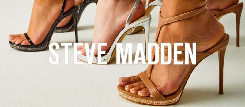
The Steve Madden logo represents one of the most recognized marks in American footwear. It’s a wordmark that has stayed remarkably consistent since the brand launched in 1990.
Steve Madden built his company from a small Queens basement operation into a footwear giant. The logo reflects that journey. Simple, direct, no unnecessary elements.
Within the fashion industry, the Steve Madden logo sits alongside other major shoe brand logos as an example of how restraint can work. While competitors chase trendy redesigns, this mark has barely changed in over three decades.
The current version maintains the original uppercase lettering. No mascots. No abstract symbols. Just the founder’s name in bold type. That’s it.
What Is the Steve Madden Logo?

The Steve Madden logo is a bold uppercase wordmark featuring the founder’s name in a custom sans-serif typeface. Introduced in 1990, the mark uses stark black lettering to project confidence and fashion-forward energy within the footwear market.
Design Type: Wordmark (text-only logotype)
Primary Elements: Custom uppercase sans-serif typography spelling “STEVE MADDEN” with tight letter spacing
Official Introduction Date: 1990
Designer/Agency: In-house design, attributed to brand founder’s vision
Trademark Status: Registered trademark of Steve Madden, Ltd.
Color Palette: Primary black (#000000), secondary white (#FFFFFF) for reversed applications
Usage Context: Shoe boxes, retail signage, e-commerce platforms, hangtags, shopping bags, advertising campaigns, social media profiles
How Has the Steve Madden Logo Evolved Over Time?
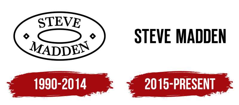
The Steve Madden logo has remained largely unchanged since 1990. Minor refinements have occurred, but the core design stayed intact.
This consistency is unusual in fashion branding. Most competitors redesign every decade or so.
Steve Madden resisted that urge. The result is a mark that customers recognize instantly after 30+ years.
Original Steve Madden Logo (1990-2000s)
Years Active: 1990 to early 2000s
Design Description: Bold uppercase letters in a condensed sans-serif style. The name “STEVE MADDEN” appeared in a single horizontal line with minimal spacing between characters.
Color Scheme: Black on white, occasionally reversed to white on black for certain applications
Designer: Internal brand team under Steve Madden’s direction
Context: Launched when Steve Madden started selling shoes from his car trunk. The bold type projected confidence despite the scrappy beginnings.
Cultural Significance: Became associated with affordable fashion-forward footwear during the 1990s shoe boom
Refined Steve Madden Logo (2000s-Present)
Years Active: Early 2000s to present
Design Description: Slightly refined letterforms with adjusted weight and spacing. Same fundamental design, just cleaned up for digital applications.
Color Scheme: Maintained black and white primary palette
Key Changes from Previous: Subtle adjustments to letter proportions. Better optimization for screen display. Nothing dramatic.
Context: Refined as brand expanded internationally and moved heavily into e-commerce
Cultural Significance: Maintained brand recognition while competitors underwent major visual overhauls
What Do the Design Elements of the Steve Madden Logo Mean?
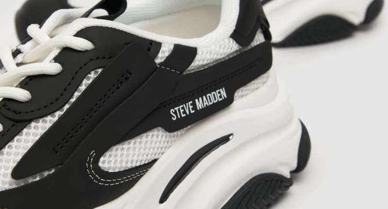
The Steve Madden logo communicates boldness through its heavy letterforms. There’s no hidden graphic or clever symbol.
The design puts the founder’s name front and center. That’s a statement in itself.
It says the brand stands behind its creator’s vision. Personal accountability built into the mark.
Why Did Steve Madden Choose These Specific Colors?
Black dominates the Steve Madden logo. It’s the primary and often only color used.
Black carries weight in fashion. It suggests sophistication without pretension.
The hex code is pure black (#000000). No gray tones or softening. Understanding color psychology explains why this works for a fashion brand targeting young consumers who want to appear stylish.
White serves as the secondary color for reversed applications. Together, they create maximum contrast and readability across all mediums.
What Typography Style Is Used in the Steve Madden Logo?
The logo uses a custom sans-serif font with condensed proportions. Letters are uppercase throughout.
Weight is bold, almost heavy. This creates presence even at smaller sizes on shoe boxes and tags.
The kerning is tight but readable. Letters sit close together, giving the wordmark a compact, unified appearance. No decorative flourishes or stylized characters interrupt the clean lines.
What Are the Hidden Meanings in the Steve Madden Logo?
Honestly? There aren’t really hidden meanings here. And that’s intentional.
The logo does exactly what it needs to do. It presents the brand name clearly and confidently.
Some designers might call that boring. Others call it smart. The founder’s name IS the message. No clever negative space tricks. No dual meanings. Just direct communication with the customer.
How Does the Steve Madden Logo Compare to Competitor Logos?
The Steve Madden logo holds its ground against major footwear competitors through sheer simplicity.
Compare it to the Adidas logo with its iconic three stripes. Or the Puma logo featuring a leaping cat. Those brands rely on symbols.
Steve Madden went the other direction entirely.
The Vans logo uses a distinctive custom script. The Converse logo incorporates a star chevron. New Balance logo features that recognizable “NB” lockup.
Steve Madden skipped all of that. The wordmark approach places it closer to fashion houses than athletic brands. It competes in a different visual category while selling in the same stores.
What Are the Technical Specifications of the Steve Madden Logo?
Official Color Codes:
- Primary Color: Black – Hex: #000000, RGB: (0,0,0), CMYK: (0,0,0,100)
- Secondary Color: White – Hex: #FFFFFF, RGB: (255,255,255), CMYK: (0,0,0,0)
Dimensions and Proportions:
- Aspect ratio: Approximately 5:1 (horizontal orientation)
- Minimum size: Varies by application, typically requires legibility at shoe box label sizes
- Clear space: Minimum padding equal to the height of the letter “S” on all sides
For print design applications, the logo should maintain a minimum DPI of 300 for sharp reproduction. Digital applications use vector graphics to ensure the mark scales cleanly across devices.
What Cultural Impact Has the Steve Madden Logo Had?
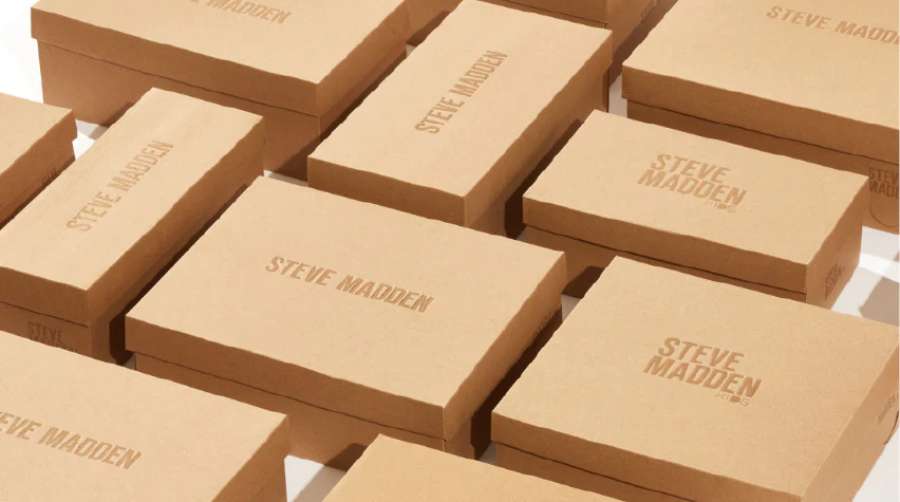
The Steve Madden logo became a fixture in mall culture during the 1990s and 2000s. Those bold letters on shopping bags signaled affordable trend awareness.
Teenage girls and young women especially connected with the brand. The logo appeared on countless shoe boxes carried through food courts nationwide.
It represented accessible fashion. Not luxury pricing, but current styles. That positioning made the wordmark culturally significant to a generation of consumers who couldn’t afford designer labels but wanted to look current.
How Does the Steve Madden Logo Fit Into the Overall Brand Identity?
The Steve Madden logo anchors a broader visual system built around bold simplicity.
Store designs echo the black-and-white palette. Marketing photography tends toward high contrast. Even the website uses the logo’s stark aesthetic as a foundation.
The wordmark connects to sub-brands like Madden Girl and Steve Madden Men. Each maintains visual ties to the parent logo while targeting specific demographics.
This consistency across touchpoints builds recognition. A customer sees those letters and immediately understands what price point and style category they’re in.
How Should the Steve Madden Logo Be Used?
Official Usage Guidelines:
- Maintain proportions when scaling (never stretch or compress)
- Use only approved color variations (black on light backgrounds, white on dark backgrounds)
- Preserve clear space around the mark
- Do not add effects like shadows, gradients, or outlines
- Do not place the logo on busy backgrounds that reduce legibility
Where to Access Official Logos: Press and media inquiries through Steve Madden corporate communications. Retail partners receive brand assets through official vendor portals.
Licensing Information: The Steve Madden name and logo are registered trademarks. Unauthorized use is prohibited. Licensed products must follow strict brand guidelines provided by the company.
Trademark Protection: The wordmark is actively protected. Steve Madden, Ltd. monitors and enforces against counterfeit products and unauthorized logo usage globally.
FAQ on The Steve Madden Logo
What Does the Steve Madden Logo Look Like?
The Steve Madden logo is a bold wordmark featuring the founder’s name in uppercase letters.
It uses a custom sans-serif typeface with tight spacing. Black text on white backgrounds. No symbols, no icons, no mascots.
Just clean typography that gets straight to the point.
When Was the Steve Madden Logo Created?
The Steve Madden brand launched in 1990. The logo came with it.
Steve Madden started selling shoes from his car in New York. That original wordmark has stayed largely the same for over three decades.
Few fashion companies can say that.
Who Designed the Steve Madden Logo?
The logo design came from internal brand development. No famous agency gets credit here.
Steve Madden himself guided the visual direction. He wanted something bold that put his name front and center on every shoe box and retail display.
What Font Is Used in the Steve Madden Logo?
The logo uses a custom typeface based on condensed sans-serif letterforms.
It’s not a commercially available font. The letters feature heavy weight with minimal tracking. This creates that compact, punchy appearance the brand needed.
What Colors Are in the Steve Madden Logo?
Black. That’s the primary color.
The official hex code is #000000. White (#FFFFFF) serves as the secondary option for reversed applications on dark backgrounds.
This monochrome color approach keeps the brand identity consistent across all platforms.
Has the Steve Madden Logo Changed Over the Years?
Barely. The logo evolution has been minimal since 1990.
Some subtle refinements happened for digital optimization. Letter proportions got minor tweaks. But the fundamental design stayed intact through decades of fashion trends.
What Does the Steve Madden Logo Represent?
The logo represents accessible fashion footwear with attitude. It’s direct and confident.
Using the founder’s name as the entire logo signals personal accountability. The American footwear company stands behind its products with that signature.
Is the Steve Madden Logo Trademarked?
Yes. Steve Madden, Ltd. holds registered trademark protection for the wordmark.
The company actively monitors for counterfeits and unauthorized usage. You’ll find the mark protected in multiple international markets where the brand sells designer shoes and accessories.
Where Can I Find the Official Steve Madden Logo?
Official assets go through corporate communications. Media outlets request logos through press channels.
Retail partners access brand materials via vendor portals. The company maintains strict control over how its visual identity appears publicly.
Why Is the Steve Madden Logo So Simple?
Simplicity works. The wordmark approach follows solid logo design principles that prioritize recognition over complexity.
Fashion branding doesn’t need elaborate symbols. The name alone carries weight. That straightforward minimalist design has served the shoe brand well for 30+ years.
Conclusion
The Steve Madden logo proves that restraint can be powerful. No flashy symbols. No constant redesigns chasing trends.
Just a bold wordmark that has anchored the brand’s visual identity since 1990.
This approach to fashion brand identity works because it prioritizes brand recognition over novelty. The logo typography remains consistent across shoe boxes, retail stores, and e-commerce platforms worldwide.
Steve Madden built a footwear empire on accessible style. The logo reflects that mission perfectly.
Sometimes the smartest design choice is knowing what to leave out. This American footwear company understood that from day one.

Renowned for his expertise in logo design and visual branding, Bogdan has developed a multitude of logos for various clients.
His skills extend to creating posters, vector illustrations, business cards, and brochures. Additionally, Bogdan's UI kits were featured on marketplaces like Visual Hierarchy and UI8.
He also wrote in the past years on sites like Design Your Way, WebDesignerDepot, WPDean, Designmodo, Speckyboy, Slider Revolution, and more.
- Jujutsu Kaisen Font Generator - 12 October 2026
- The Windsurf Logo History, Colors, Font, And Meaning - 10 October 2026
- How to Remove Background From Product Photos (No Photoshop) - 10 October 2026

Bogdan Sandu is a seasoned designer who has been designing websites since 2008. Renowned for his expertise in logo design and visual branding, Bogdan has developed a multitude of logos for various clients. His skills extend to creating posters, vector illustrations, business cards, and brochures. Additionally, Bogdan's UI kits were featured on marketplaces like Visual Hierarchy and UI8. He also wrote in the past years on sites like Design Your Way, WebDesignerDepot, WPDean, Designmodo, Speckyboy, Slider Revolution, and more.
You Might Also Like