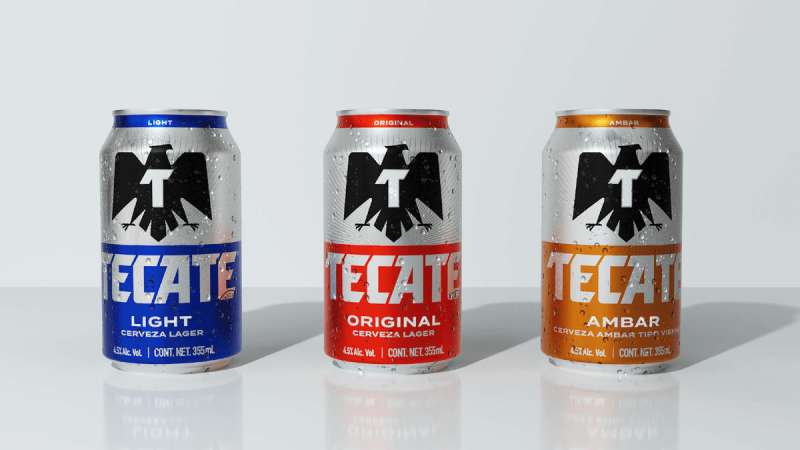
The Tecate logo is one of those beer brand marks that people recognize instantly, even if they can’t quite explain why. It’s a black eagle perched above bold uppercase lettering, rooted in Mexican national pride and built on decades of design tweaks. The brand itself was born in 1944 in the border city of Tecate, Baja California, founded by Alberto Aldrete. Since then, the logo has gone through four major versions. The most recent, introduced in 2020 by Elmwood New York, stripped things back to a stark black-and-white palette. That’s a big departure from the red-heavy versions most people picture when they think of this cerveza.
Tecate sits inside the Heineken International portfolio (acquired in 2010), and it’s the second-largest brand in that lineup. The logo has always carried an Aztec-inspired eagle, which ties it directly to the Mexican coat of arms. For a beer that started as a small-town experiment, the branding has done serious work in making Tecate feel both local and global at the same time.
What Is the Tecate Logo?
![]()
The Tecate logo is a combination mark featuring a stylized black eagle above the brand name written in a custom uppercase sans-serif typeface. It was most recently redesigned in 2020 by Elmwood New York. The eagle references Mexican heritage and the national coat of arms. A prominent “T” sits on the bird’s chest, anchoring the brand identity.
Here’s what defines the current Tecate logo:
- Design Type: Combination mark (emblem plus wordmark)
- Primary Elements: Stylized eagle with spread wings, bold “T” on chest, uppercase “TECATE” wordmark beneath
- Official Introduction Date: Current version launched in September 2020
- Designer/Agency: Elmwood New York, with support from Nomades
- Trademark Status: Registered trademark under Heineken International
- Color Palette: Black (#000000) and white (#FFFFFF) for the current version. Previous versions used red (approximately #CC0000), black, and white
- Usage Context: Beer cans, bottles, packaging, out-of-home advertising, social media, event sponsorships, apparel, and point-of-sale displays
How Has the Tecate Logo Evolved Over Time?
![]()
The Tecate logo has gone through four distinct versions since 1980. Each redesign kept the eagle and the bold wordmark but changed how they related to each other visually.
The earlier logos leaned into red, black, and white. The most recent version dropped red entirely.
It’s a clear move toward minimalist design thinking, which honestly, most beer brands haven’t been willing to try.
Original Tecate Logo (1980 to 2004)
- Years Active: 1980 through 2004
- Design Description: A stylized black eagle emblem sat above the red uppercase wordmark “TECATE.” The eagle was drawn with straight, angular wings and a somewhat geometric feel. A white capital “T” with an elongated horizontal bar appeared over the bird. The wordmark used a double outline in white and red.
- Color Scheme: Red, black, and white
- Context: This was the first formalized logo after decades of handwritten wordmarks on cans and bottles. Tecate had been acquired by Cuauhtémoc Moctezuma in the 1950s, and this mark was designed to give the brand a more consistent identity as exports grew across the U.S. and Asia.
- Cultural Significance: The eagle connected directly to the Mexican flag and the Aztec legend of founding Tenochtitlan. It positioned Tecate as a proudly Mexican product at a time when Corona was dominating international beer shelves.
Revised Tecate Logo (2004 to 2015)
- Years Active: 2004 through 2015
- Design Description: The eagle was enlarged and given cleaner outlines with a white and black border. Its contours were smoothed out, losing some of the rough angular edges from the original. The wordmark remained red and uppercase.
- Color Scheme: Red, black, and white (unchanged)
- Key Changes from Previous: Bigger eagle, refined contours, cleaner line work. The overall look became more polished, suitable for larger format applications like billboards and stadium branding.
- Context: Tecate was pushing harder into boxing sponsorships and sports marketing during this period. The logo needed to read well at large scale.
Modernized Tecate Logo (2015 to 2020)
- Years Active: 2015 through 2020
- Design Description: Both the eagle and the typography got a significant refresh. The wordmark was tilted diagonally, and the lower angles of letters like “c” and “e” became rounder while upper-left portions were cut at sharp angles. The black eagle was placed directly on top of the tilted text. Outlines gained sharper details.
- Color Scheme: Red, black, and white
- Key Changes from Previous: Diagonal text orientation, rounder letter forms mixed with sharp cuts, the eagle overlapping the wordmark instead of sitting above it
- Context: Heineken had acquired Tecate in 2010 and was expanding the brand globally. This version tried to feel more contemporary while keeping the core identity intact.
Current Tecate Logo (2020 to Present)
- Years Active: 2020 to present
- Design Description: Elmwood New York stripped back the logo to its most fundamental pieces. The eagle was simplified and redrawn with honesty and clarity. The wordmark returned to a horizontal orientation. All contrast now comes from black against white, with no red at all. The whole thing looks like a stamp or seal.
- Color Scheme: Black and white only
- Designer: Elmwood New York, with creative direction from Meg Beckum
- Key Changes from Previous: Red completely removed from the wordmark. Tilted orientation abandoned. Simplified eagle contours. Stamp-like quality added.
- Context: Tecate wanted to shake off tired “macho” stereotypes and appeal to a younger audience. The redesign was part of a broader brand strategy to become what the company called “the most desirable beer in Mexico.”
- Cultural Significance: The all-black treatment signals power and versatility. It works across packaging, digital, apparel, and event sponsorships without competing with surrounding visuals.
What Do the Design Elements of the Tecate Logo Mean?
Every part of the Tecate logo ties back to Mexican identity. The eagle is borrowed from the Mexican coat of arms.
The “T” on the bird’s chest connects the national symbol to the brand name. It’s simple, but it works on a gut level.
Took me a while to appreciate how much that single letter does. Without it, the eagle is just… a generic eagle.
Why Did Tecate Choose These Specific Colors?
The color story has shifted dramatically over four decades.
For most of its life, Tecate used a red, black, and white palette. Red (approximately #CC0000, close to Pantone 186 C) carried associations with energy, passion, and Mexican cultural celebrations. It’s the kind of red that pops on a shelf.
Black (#000000) was always there for the eagle and outlines. White (#FFFFFF) provided breathing room and made the other elements stand out.
Then in 2020, they dropped the red. Completely. The current logo is all black and white. According to the brand, black represents dominance, versatility, and a progressive outlook. Honestly, it was a bold call. Most beer brands cling to color like a lifeline.
The psychological impact of color choices here is worth noting. Red packaging still exists for Tecate Original products, but the logo itself now functions as a monochrome stamp that can live anywhere.
What Typography Style Is Used in the Tecate Logo?
Tecate uses a custom sans-serif font that’s been tweaked over every redesign. The current version features uppercase letters with diagonal cuts on the bars and a distinct tail on the “T.”
It’s not based on any commercially available typeface, though it shares some DNA with heavy industrial sans-serifs.
The spacing between letters is tight in the current version, which adds to that stamp-like quality.
Readability holds up well at small sizes, which matters when your primary canvas is a beer can.
What Are the Hidden Meanings in the Tecate Logo?
The eagle with spread wings above a “T” mirrors the Mexican coat of arms, where an eagle perches on a cactus devouring a serpent. That’s the founding myth of Tenochtitlan.
By placing a “T” where the cactus would be, Tecate inserts itself into the national narrative. Subtle. Effective.
The shield-like background behind the eagle gives the whole mark a heraldic feel, like a family crest. That’s intentional, since the brand consistently positions itself as part of Mexican heritage rather than just another beer company.
How Does the Tecate Logo Compare to Competitor Logos?
Mexican beer logos tend to run one of two directions: ornate and heritage-heavy, or clean and modern. Tecate’s current logo sits somewhere unusual.
Look at the Corona logo, which uses a crown and a warm gold color palette to signal relaxation and beach life. Very different energy.
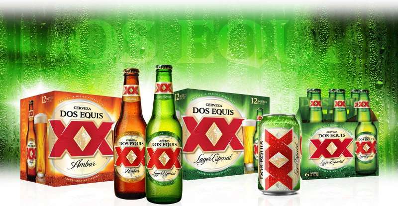
The Dos Equis logo leans into the double-X mark with a more playful, adventurous identity. The Modelo logo goes heavy on the traditional lion crest and gold tones, clearly targeting the premium end.
Tecate’s 2020 redesign is the most stripped-back of the bunch. While competitors keep piling on visual elements, Tecate went the other way. That takes some guts in the beer aisle, where eye-catching color tends to win the shelf battle.
The Heineken logo (Tecate’s parent company) uses a completely different approach with its green and red star system. There’s no visual family resemblance between the two, which is probably deliberate.
What Are the Technical Specifications of the Tecate Logo?
Official Color Codes
Current Logo (2020 to present):
- Primary Color: Black. Hex: #000000, RGB: (0, 0, 0), CMYK: (0, 0, 0, 100)
- Secondary Color: White. Hex: #FFFFFF, RGB: (255, 255, 255), CMYK: (0, 0, 0, 0)
Legacy Logo Colors (pre-2020):
- Red: Approximately #CC0000, RGB: (204, 0, 0), CMYK: (0, 100, 100, 20), close to Pantone 186 C
- Black: #000000
- White: #FFFFFF
Dimensions and Proportions
The Tecate logo uses a vertically stacked layout. The eagle emblem sits above the wordmark, and together they form a roughly square composition.
Minimum size requirements for legibility depend on the application. On beer cans (standard 12 oz), the logo typically appears at around 1.5 inches wide. For digital use, a minimum of 120 pixels wide is recommended to keep the eagle details readable.
Clear space around the logo should equal at least the height of the “T” in the wordmark on all sides. The logo is available in vector formats (SVG, EPS, AI) for scalable reproduction and in high-resolution raster formats for print and web.
What Cultural Impact Has the Tecate Logo Had?
![]()
Tecate’s eagle has become a genuine cultural symbol, especially in Northern Mexico and among Mexican-American communities in the U.S. Southwest.
You see it painted on bodegas, printed on shirts, tattooed on arms. It’s crossed over from brand mark to cultural artifact, which is something most beer companies would pay millions for and never achieve.
The brand’s heavy involvement in boxing and soccer sponsorships means the logo shows up at major sporting events, which keeps it visible well beyond the beer aisle. Esther Garcia, who served as vice president starting in 2017, pushed Tecate’s presence in both sports hard, and it paid off.
There’s also the whole lawsuit angle. After Heineken moved some production to Europe, consumers felt misled by a logo that looks deeply Mexican on beer that wasn’t entirely brewed in Mexico. That controversy, whether you agree with the criticism or not, shows how much power the logo carries in communicating origin and authenticity.
How Does the Tecate Logo Fit Into the Overall Brand Identity?
The logo is the anchor of a bigger system that includes packaging, event branding, digital assets, and even apparel. Elmwood New York designed it as a flexible mark that could work across all of those touchpoints.
Tecate’s brand guidelines tie the eagle mark to specific usage rules for cans, bottles, billboards, social media, and merchandise. The wordmark and eagle can be separated for certain applications, but the full lockup is the primary version.
Product-specific variations exist too. Tecate Original keeps red packaging accents, while Tecate Light and Tecate ALTA use different color treatments on their cans. But the core black eagle and wordmark stay consistent across all of them.
The overall identity leans into friendship, pride, and camaraderie instead of the old machismo messaging. And the logo’s simplified form supports that shift. It feels less aggressive, more confident.
How Should the Tecate Logo Be Used?
Official usage guidelines cover the basics:
- Do maintain the specified clear space around the logo at all times
- Do use the logo on approved background colors (black logo on light backgrounds, white reversed version on dark backgrounds)
- Do use official vector files for any reproduction to maintain quality
- Don’t stretch, rotate, or distort the logo in any way
- Don’t add effects like drop shadows, outlines, or gradients to the logo
- Don’t alter the relationship between the eagle and the wordmark
- Don’t place the logo on busy backgrounds where legibility suffers
Official logo files can be obtained through Heineken International’s brand portal or through authorized distributors. The Tecate trademark is protected under international trademark law, and unauthorized commercial use is subject to legal action.
For editorial or informational use, the logo is widely available in PNG and SVG formats from brand asset platforms. If you’re using it for anything commercial, you’ll need explicit permission from Heineken.
FAQ on The Tecate Logo
What Does the Eagle on the Tecate Logo Represent?
The Tecate eagle symbol comes from the Mexican coat of arms. It references the Aztec legend of founding Tenochtitlan, where an eagle perched on a cactus.
A white “T” sits on the bird’s chest, tying national heritage directly to the beer brand identity.
Who Designed the Current Tecate Logo?
Elmwood New York redesigned the logo in 2020, with creative direction from Meg Beckum. Agency Nomades also contributed to the broader brand refresh.
The goal was to strip away visual clutter and appeal to a younger, more progressive Mexican audience.
Why Did Tecate Change Its Logo Colors to Black and White?
Tecate dropped its classic red, black, and white color scheme for an all-black mark in 2020. Black signals power and versatility across packaging and digital platforms.
The shift supports a more stripped-back visual approach that works everywhere from beer cans to festival stages.
How Many Times Has the Tecate Logo Been Redesigned?
Four major versions exist. The original launched in 1980, followed by updates in 2004, 2015, and 2020.
Each Tecate logo evolution kept the eagle and uppercase wordmark but changed layout, color, and detail levels significantly.
What Font Does the Tecate Logo Use?
Tecate uses a custom sans-serif typeface with diagonal bar cuts and a unique “T” tail. It’s not commercially available.
The lettering has tight letter spacing that gives the wordmark a compact, stamp-like quality on Tecate beer cans and bottles.
Is Tecate Owned by Heineken?
Yes. Heineken International acquired Tecate in 2010 through its purchase of Cervecería Cuauhtémoc Moctezuma. Tecate is now the second-largest brand in Heineken’s global portfolio.
The brewery originally started in Tecate, Baja California in 1944, founded by Alberto Aldrete.
What Is the Difference Between the Tecate Logo and the Mexican Coat of Arms?
Both feature an eagle, but the Tecate version replaces the cactus-and-serpent scene with a bold “T” on the bird’s chest.
It borrows the symbolic shape of the national emblem while making it unmistakably a beer brand mark.
Where Can I Download the Official Tecate Logo?
Official vector files are available through Heineken’s brand portal and authorized distributors. Free PNG and SVG versions exist on brand asset platforms.
Commercial use requires explicit permission. The Tecate trademark is internationally protected.
How Does the Tecate Logo Compare to Corona and Modelo?
The Corona brand mark uses a crown and warm gold tones. Modelo’s crest leans into traditional lion imagery.
Tecate’s 2020 all-black redesign is the most minimal of major Mexican beer logos, which makes it stand out on crowded retail shelves.
What Sizes Should the Tecate Logo Be Displayed At?
On standard 12 oz beer cans, the logo appears at roughly 1.5 inches wide. Digital use calls for a minimum of 120 pixels in width.
Clear space around the mark should equal at least the height of the “T” in the wordmark on every side.
Conclusion
The Tecate logo tells a bigger story than most beer label designs ever manage to. Four redesigns across four decades, and the eagle still holds it all together.
Elmwood’s 2020 brand refresh proved that going monochrome in a color-saturated industry can actually work. Not every cerveza brand would take that risk.
From its roots in Baja California to Heineken’s global distribution network, the Tecate visual identity keeps doing what good logo design should. It communicates origin, quality, and Mexican cultural pride without saying a word.
Whether you spot it on a can at a boxing match or a mural outside a bodega, that eagle reads the same every time. And that kind of consistency across print, digital, and merchandise is harder to pull off than it looks.
Renowned for his expertise in logo design and visual branding, Bogdan has developed a multitude of logos for various clients.
His skills extend to creating posters, vector illustrations, business cards, and brochures. Additionally, Bogdan's UI kits were featured on marketplaces like Visual Hierarchy and UI8.
He also wrote in the past years on sites like Design Your Way, WebDesignerDepot, WPDean, Designmodo, Speckyboy, Slider Revolution, and more.
- The Airtable Logo History, Colors, Font, And Meaning - 12 July 2026
- How to Blur Background in Canva: A Quick Tutorial - 11 July 2026
- Typography Trends - 10 July 2026
Bogdan Sandu is a seasoned designer who has been designing websites since 2008. Renowned for his expertise in logo design and visual branding, Bogdan has developed a multitude of logos for various clients. His skills extend to creating posters, vector illustrations, business cards, and brochures. Additionally, Bogdan's UI kits were featured on marketplaces like Visual Hierarchy and UI8. He also wrote in the past years on sites like Design Your Way, WebDesignerDepot, WPDean, Designmodo, Speckyboy, Slider Revolution, and more.
You Might Also Like