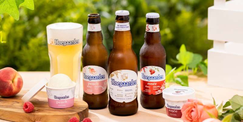
The Hoegaarden logo is one of the most recognized marks in the Belgian beer world. It represents a brand that traces back to 1445, when monks in the village of Hoegaarden first brewed wheat beer using coriander and orange peel from the island of Curaçao.
Few beer logos carry this kind of historical weight. The mark sits at a crossroads between medieval brewing traditions and modern global branding under AB InBev, the world’s largest brewing conglomerate. It’s been through ownership changes, recipe controversies, and multiple visual updates since Pierre Celis revived the brand in 1966.
The current version features a Gothic-style wordmark paired with two overlapping shield-like crests. It first appeared in a form close to what we see today during the Interbrew era in the late 1980s and early 1990s. The brand has gone through roughly three to four notable logo iterations since Celis brought the brewery back to life.
What Is the Hoegaarden Logo?

The Hoegaarden logo is a combination mark featuring a Gothic wordmark spelled out in white lettering with a thick blue outline, topped by two overlapping pentagonal shield crests in gold. It was formalized under the Interbrew brand system after the 1989 acquisition. The shields represent a mash paddle and a bishop’s crozier, connecting the brand to its monastic brewing roots.
Here’s what defines the mark at a technical level:
- Design Type: Combination mark (wordmark plus icon/emblem)
- Primary Elements: Gothic wordmark, two overlapping shield crests featuring a mash paddle and a bishop’s crozier, thick blue letterform outlines
- Official Introduction Date: The brand dates to 1445. The modern logo took shape in the late 1980s to early 1990s after Interbrew’s acquisition
- Designer/Agency: Attributed to in-house branding under Interbrew (later InBev, now AB InBev). Pierre Celis is believed to have influenced early visual direction when he revived the brand in 1966
- Trademark Status: Registered and actively protected trademark under Anheuser-Busch InBev. The brand operates in over 50 countries worldwide
- Color Palette: Gold (#C7A330), Blue (#273A7A), White (#FFFFFF)
- Usage Context: Beer bottles, cans, tap handles, the iconic Hoegaarden hexagonal glass, bar signage, coasters, digital marketing, point-of-sale materials, and merchandise across global markets
How Has the Hoegaarden Logo Evolved Over Time?
The Hoegaarden logo has changed several times since the brand’s modern revival in 1966. Each version reflects the ownership shifts and market expansion the brewery went through, moving from a small Belgian farmhouse operation to a globally distributed brand under AB InBev.
The Pierre Celis Era (1966–1985)
- Years Active: 1966–1985
- Design Description: Early labels were simple and utilitarian. The branding focused on the village name “Hoegaarden” in basic lettering, sometimes accompanied by imagery referencing the town or the wheat beer tradition. These were handmade, almost rustic in feel
- Color Scheme: Primarily blue and white, drawn from the coat of arms of the village of Hoegaarden itself
- Designer: Pierre Celis and local collaborators
- Context: Celis was a dairy farmer who remembered the old witbier recipe from the monks. He started brewing small batches in his farmhouse. The branding needed to be functional, not flashy. He was selling mostly to locals who already knew the beer’s heritage
- Cultural Significance: This was the rebirth of an entire beer style. Witbier had basically disappeared from Belgium by the mid-1950s when the last brewery in Hoegaarden, Tomsin, closed in 1955. Celis brought it back from nothing
The Interbrew Acquisition Logo (1989–2004)
- Years Active: 1989–2004
- Design Description: This is where the logo we recognize today started to take shape. The Gothic-style wordmark appeared, along with the two shield crests positioned above the lettering. White letters with blue outlines became the standard. The shields showed the mash paddle and bishop’s crozier in gold tones
- Color Scheme: Blue, white, and gold. The blue deepened compared to the earlier village-inspired labels
- Designer: In-house Interbrew branding team
- Context: Interbrew bought the Hoegaarden brewery in 1989, giving it corporate resources and international distribution. The logo needed to work across markets, on bottles, cans, and in bar signage from Belgium to Egypt. The Gothic lettering was a deliberate nod to the age of the recipe
- Key Changes from Previous: The jump from artisanal, simple labeling to a polished, structured combination mark. The shield emblems were added. Typography became a defining feature rather than an afterthought
- Cultural Significance: This version had to survive a real controversy. When Interbrew tried to move production out of the village and tweak the recipe, locals staged protests. The logo became a symbol of the fight to protect the beer’s authenticity
The AB InBev Global Logo (2008–Present)
- Years Active: 2008–present
- Design Description: The current logo refines the Interbrew-era design without dramatically changing it. The Gothic wordmark remains in white with thick blue outlines. The two overlapping crests sit above the text in thin gold contours with heraldic-style symbols inside. The overall look is cleaner, more balanced, and built for digital reproduction
- Color Scheme: Gold (#C7A330), Blue (#273A7A), White (#FFFFFF)
- Designer: AB InBev global branding team
- Context: After the merger of Interbrew with AmBev to form InBev, and then the acquisition of Anheuser-Busch, the brand needed to sit comfortably alongside Stella Artois, Leffe, and dozens of other labels in the AB InBev portfolio. The refinements made the logo more scalable and legible at small sizes, which matters for digital platforms and mobile advertising
- Key Changes from Previous: Subtle. The outlines got cleaner, the crest details were simplified for better reproduction, and the overall composition was tightened. The typeface stayed consistent with the AurelisADFNo2Std-Regular that had been in use
- Cultural Significance: This version represents Hoegaarden as a global brand. It’s now in over 50 countries, and the logo needs to communicate “premium Belgian wheat beer” to people who’ve never heard of the village
What Do the Design Elements of the Hoegaarden Logo Mean?
Every piece of the Hoegaarden logo connects back to the brand’s origins. The mash paddle in one shield represents the brewing craft itself, a direct reference to the 50+ breweries that once operated in the small village. The bishop’s crozier in the other shield honors the prince bishop of Liège, who held authority over the region when brewing first began there.
These aren’t decorative choices. They’re historical markers compressed into a small visual space.
Why Did Hoegaarden Choose These Specific Colors?

The color palette isn’t arbitrary.
Gold (#C7A330) appears in the shield crests and accent elements. It signals premium quality and references the golden wheat used in the brewing process. The approximate Pantone match is 7563 C.
Blue (#273A7A) forms the thick outlines around the white lettering. It comes directly from the coat of arms of the village of Hoegaarden. In terms of color psychology, blue communicates trust, tradition, and stability. The Pantone equivalent is approximately 7687 C.
White (#FFFFFF) fills the letterforms and represents the beer itself. Hoegaarden is a witbier, literally “white beer,” so the color choice is about as direct as you can get. The unfiltered, cloudy appearance of the beer is mirrored in the clean white of the wordmark.
What Typography Style Is Used in the Hoegaarden Logo?

The typeface is identified as AurelisADFNo2Std-Regular. It’s a Gothic-style font with clean lines but small pointed terminals on letters like “H,” “g,” “d,” and “r.”
Look, calling it “sans-serif” doesn’t fully capture it. The pointed ends on certain characters give it a slightly calligraphic quality without going full blackletter. It feels old without being unreadable.
The thick blue outlines around each white letter create strong contrast, which helps legibility on dark backgrounds, glass surfaces, and small packaging. This is actually tricky to pull off well. Too much outline weight and the letters bleed together. Too little and you lose that chunky, confident presence the brand depends on.
What Are the Hidden Meanings in the Hoegaarden Logo?
The two shields aren’t heraldic crests in the formal sense. They look like coats of arms, but they’re specifically brewing and ecclesiastical symbols arranged to suggest heritage without claiming noble lineage. It’s a subtle distinction that most people miss.
The brand also carries a legend about an orphan brewmaster raised by monks who learned the art of brewing and reportedly lived to 100, buried in a beer barrel. Whether that story directly influenced the logo design is debatable, but the monastic connections in the crest imagery align with it perfectly.
How Does the Hoegaarden Logo Compare to Competitor Logos?
Place the Hoegaarden logo next to its direct competitors and the differences are immediately clear. While brands like Budweiser and Heineken go for bold, modern wordmarks with strong color blocking, Hoegaarden leans into its medieval roots with Gothic lettering and crest imagery.
Blue Moon, probably Hoegaarden’s closest competitor in the witbier category, uses a completely different approach. Blue Moon’s logo is rounder, friendlier, with a modern illustration style. It’s designed for the American craft beer market. Hoegaarden’s mark says “we’ve been doing this since 1445,” and that’s a different kind of credibility.
Carlsberg and Guinness also use heritage-driven branding, but their logos evolved toward cleaner, more modernized versions over the decades. Hoegaarden has kept its Gothic character largely intact. That’s a choice, and it comes with trade-offs. The logo can feel heavy at small digital sizes, but it carries massive shelf presence on a bottle.
Corona takes the polar opposite approach with its light, airy, almost tropical feel. It works because Corona is selling a beach lifestyle. Hoegaarden is selling 600 years of Belgian wheat beer tradition. Different goals, different visual strategies.
What Are the Technical Specifications of the Hoegaarden Logo?
Official Color Codes
- Primary Color: Gold
- Hex: #C7A330
- RGB: (199, 163, 48)
- CMYK: (0, 18, 76, 22)
- Pantone: 7563 C (approximate)
- Secondary Color: Blue
- Hex: #273A7A
- RGB: (39, 58, 122)
- CMYK: (68, 52, 0, 52)
- Pantone: 7687 C (approximate)
- Tertiary Color: White
- Hex: #FFFFFF
- RGB: (255, 255, 255)
- CMYK: (0, 0, 0, 0)
Dimensions and Proportions
The logo’s aspect ratio in its standard horizontal configuration is roughly 4:1 (width to height) when the wordmark and crests are combined. The crests sit centered above the wordmark, slightly narrower than the total text width.
AB InBev’s brand guidelines specify clear space requirements around the logo, typically equal to the height of the “H” in the wordmark on all sides. Minimum size requirements exist for both print and digital use, ensuring the Gothic letterforms and crest details remain legible.
The logo is available in vector graphics formats (SVG, EPS, AI) for scalable reproduction, and raster formats (PNG, JPEG) for web and social media. The SVG file on Wikimedia Commons measures nominally 632 × 158 pixels at a file size of just 8 KB.
What Cultural Impact Has the Hoegaarden Logo Had?

The Hoegaarden logo helped revive an entire beer style. When Pierre Celis brought witbier back in 1966, the branding (however simple at first) became the visual identity of a category that had nearly vanished.
Today, witbier is one of the most popular beer styles worldwide. Blue Moon, Shock Top, Allagash White, and dozens of craft breweries owe their existence in part to Hoegaarden proving there was a market for unfiltered wheat beer.
The logo’s Gothic styling and medieval crest imagery set a template that other Belgian beer brands reference. It helped establish the visual language of “authentic Belgian craft” that brands now try to replicate. Even the iconic Hoegaarden hexagonal glass, which carries the logo prominently, became a cultural artifact of its own, recognized in bars from Brussels to Bangkok.
And then there were the protests. When Interbrew attempted to change the recipe and relocate production, the Hoegaarden logo became a rallying symbol for locals fighting to preserve their brewing heritage. That’s not something most corporate marks achieve.
How Does the Hoegaarden Logo Fit Into the Overall Brand Identity?
The logo sits at the center of a larger brand system that includes the hexagonal glass, the bottle shape, the label design, and the consistent use of blue, gold, and white across all touchpoints.
Within the AB InBev portfolio, Hoegaarden positions itself as the premium wheat beer option. Its visual identity is designed to feel distinct from sibling brands like Stella Artois (which leans into a more refined, star-topped red and gold aesthetic) and Leffe (which uses abbey-inspired ecclesiastical imagery).
The packaging design extends the logo’s visual language. The white, cloudy beer visible through clear glass bottles reinforces the “white beer” messaging that the white letterforms suggest. The gold crests on labels and tap handles signal premium positioning without feeling overly formal.
The brand uses the same Gothic typeface and color system across digital platforms, social media, event sponsorships, and print advertising. That consistency matters. When you see that blue outline and those gold shields in a bar, you know what you’re getting before you read a single word.
How Should the Hoegaarden Logo Be Used?
AB InBev maintains strict usage rules for the Hoegaarden mark. Here’s what you need to know:
- Do: Always maintain the specified clear space around the logo. Use the official color codes. Place the logo on backgrounds that provide sufficient contrast for the white letterforms and blue outlines to be legible
- Don’t: Alter the proportions between the wordmark and crests. Change the official colors. Place the logo on busy, patterned backgrounds that reduce legibility. Remove the crest icons from the wordmark or use them separately without authorization
- Where to Access Official Logos: Official logo files are managed through AB InBev’s brand asset management system. Vector versions are available through select brand asset platforms. Third-party sites like BrandsoftheWorld and Seeklogo host community-uploaded versions, but always verify against official sources
- Licensing: The Hoegaarden name and logo are registered trademarks of Anheuser-Busch InBev. Any commercial use requires explicit written permission from AB InBev’s legal team. Unauthorized reproduction, modification, or use of the mark in merchandise or advertising is a trademark violation
- Trademark Protection: The brand is actively protected across multiple jurisdictions worldwide. AB InBev enforces its trademark rights aggressively to prevent dilution and unauthorized use, particularly in markets where the brand has significant commercial presence
FAQ on The Hoegaarden Logo
What Does the Hoegaarden Logo Look Like?
The Hoegaarden logo features a Gothic-style wordmark in white letters with thick blue outlines. Two overlapping gold shield crests sit above the text, containing a mash paddle and a bishop’s crozier.
What Do the Shields in the Hoegaarden Emblem Represent?
The mash paddle honors the 50+ breweries that once operated in the Belgian village. The bishop’s crozier references the prince bishop of Liège, who held power over the region when monks first brewed wheat beer there.
What Font Does the Hoegaarden Beer Label Use?
The brand uses AurelisADFNo2Std-Regular. It’s a Gothic-style sans-serif font with pointed terminals on specific letters. Looks old, reads clean. The thick blue outlines boost visual hierarchy on bottles and packaging.
What Are the Official Hoegaarden Brand Colors?
Gold (#C7A330), blue (#273A7A), and white (#FFFFFF). The gold references wheat ingredients. Blue comes from the village coat of arms. White represents the witbier itself, which is unfiltered and cloudy.
Who Designed the Hoegaarden Logo?
No single designer is publicly credited. Pierre Celis shaped the early visual direction when he revived the brewery in 1966. The modern version was developed by in-house teams at Interbrew, later refined under AB InBev branding.
How Has the Hoegaarden Logo Changed Over the Years?
It went from simple farmhouse labels in the 1960s to a polished combination mark by the late 1980s. The Interbrew acquisition introduced the Gothic wordmark and gold crests. AB InBev later cleaned up details for better digital use.
Why Does the Hoegaarden Logo Use Gothic Lettering?
The Gothic style is a direct nod to the beer’s medieval origins. Hoegaarden’s recipe dates back to 1445. That font psychology choice communicates age and authenticity without needing to spell it out for the consumer.
Is the Hoegaarden Logo Trademarked?
Yes. Anheuser-Busch InBev holds the registered trademark across multiple countries. They enforce it aggressively. Any commercial use of the Hoegaarden brand identity requires written permission from AB InBev’s legal department.
How Does the Hoegaarden Logo Compare to Other Beer Logos?
Most competitors went modern. Hoegaarden stayed Gothic. Coors Light uses mountain imagery, Blue Moon goes round and friendly. Hoegaarden’s crest-and-wordmark approach gives it stronger shelf presence among Belgian beer brands.
Where Can I Download the Official Hoegaarden Logo?
Official files are managed through AB InBev’s brand asset system. Third-party sites host community-uploaded versions in SVG, EPS, and PNG formats. Always verify against official sources before using any Hoegaarden visual identity assets commercially.
Conclusion
The Hoegaarden logo does what few beer brand marks manage. It tells a 600-year story in a single glance through Gothic letterforms, gold crests, and a blue-and-white color scheme pulled straight from a Belgian village’s coat of arms.
Pierre Celis revived more than a recipe in 1966. He gave witbier a face.
That combination of mash paddle, bishop’s crozier, and the AurelisADF typeface still holds up across bottles, tap handles, and digital screens in over 50 countries. The logo design principles behind it are simple. Root the mark in something real, keep it consistent, and let the heritage speak for itself.

Renowned for his expertise in logo design and visual branding, Bogdan has developed a multitude of logos for various clients.
His skills extend to creating posters, vector illustrations, business cards, and brochures. Additionally, Bogdan's UI kits were featured on marketplaces like Visual Hierarchy and UI8.
He also wrote in the past years on sites like Design Your Way, WebDesignerDepot, WPDean, Designmodo, Speckyboy, Slider Revolution, and more.
- The Windsurf Logo History, Colors, Font, And Meaning - 10 October 2026
- How to Remove Background From Product Photos (No Photoshop) - 10 October 2026
- How Designers can Build a Stronger Online Creative Identity - 9 October 2026

Bogdan Sandu is a seasoned designer who has been designing websites since 2008. Renowned for his expertise in logo design and visual branding, Bogdan has developed a multitude of logos for various clients. His skills extend to creating posters, vector illustrations, business cards, and brochures. Additionally, Bogdan's UI kits were featured on marketplaces like Visual Hierarchy and UI8. He also wrote in the past years on sites like Design Your Way, WebDesignerDepot, WPDean, Designmodo, Speckyboy, Slider Revolution, and more.
You Might Also Like