The Michelob Ultra logo stands as one of the most recognizable marks in the American light beer market. It blends sleek typography with a ribbon emblem that signals premium quality.
Anheuser-Busch introduced this visual identity in 2002 when the brand launched. The logo has become synonymous with fitness-oriented beer marketing and active lifestyle branding.
Currently in its refined modern form, the logo features a distinctive blue color scheme. The brand has gone through subtle updates since its debut, though the core identity remains intact.
Michelob itself dates back to 1896 as a premium lager brand. The Ultra extension marked a strategic pivot toward health-conscious consumers, and the logo needed to reflect that shift.
What is the Michelob Ultra Logo?

The Michelob Ultra logo is a combination mark featuring the brand name in a custom sans-serif typeface paired with a stylized ribbon emblem. Introduced in 2002 by Anheuser-Busch, it communicates premium quality and an active lifestyle through its clean lines and blue palette.
Design Attributes
- Design Type: Combination mark (wordmark plus emblem)
- Primary Elements: “MICHELOB ULTRA” wordmark, ribbon/crest graphic, “Superior Light Beer” tagline
- Official Introduction Date: 2002
- Designer/Agency: Anheuser-Busch in-house design team
- Trademark Status: Registered trademark of Anheuser-Busch, LLC
- Color Palette: Deep blue (#002D62), white (#FFFFFF)
- Usage Context: Beer bottles, cans, tap handles, sponsorship materials, digital advertising, merchandise
How Has the Michelob Ultra Logo Evolved Over Time?

The Michelob Ultra logo has maintained remarkable consistency since 2002. Most changes have been refinements rather than overhauls.
The brand tweaked proportions and updated color treatments to match modern production methods. But the fundamental structure? That stayed the same.
Original Michelob Ultra Logo (2002-2010)
- Years Active: 2002-2010
- Design Description: Bold “MICHELOB ULTRA” text with ornate ribbon emblem above, “Superior Light Beer” beneath
- Color Scheme: Navy blue, white accents
- Designer: Anheuser-Busch internal creative team
- Context: Launched to capture the low-carb diet trend sweeping America
- Cultural Significance: Positioned beer as compatible with fitness goals for the first time at scale
Refined Michelob Ultra Logo (2010-2018)
- Years Active: 2010-2018
- Design Description: Streamlined ribbon element, slightly lighter blue tones
- Color Scheme: Updated blue
- Key Changes from Previous: Cleaner lines, improved digital rendering, subtle gradient effects
- Context: Refresh aligned with growing sponsorship presence in golf and running events
Current Michelob Ultra Logo (2018-Present)
- Years Active: 2018-present
- Design Description: Crisp, modern execution with enhanced contrast between elements
- Color Scheme: Deep blue (#002D62), bright white
- Key Changes from Previous: Sharper typography edges, optimized for social media and mobile displays
- Cultural Significance: Represents the brand’s dominance in the “better-for-you” beer category
What Do the Design Elements of the Michelob Ultra Logo Mean?
Every piece of this logo serves a purpose. The ribbon emblem at the top? It signals heritage and premium positioning.
The clean wordmark underneath communicates modernity. Together, these elements bridge tradition with contemporary health consciousness.
Why Did Michelob Ultra Choose These Specific Colors?
Blue dominates because it suggests trust and refreshment. For a beer marketed to health-aware consumers, that matters.
Understanding color psychology explains why this combination works so well in retail environments.
- Deep Blue (#002D62): Trust, refreshment, premium quality, calm confidence
- White (#FFFFFF): Purity, low calories, clean ingredients, simplicity
What Typography Style Is Used in the Michelob Ultra Logo?
The brand uses a custom sans-serif font with distinctive characteristics. Letters appear tall and confident.
Tight kerning keeps the wordmark compact while remaining readable. The uppercase treatment adds authority.
This typography choice reflects the brand’s no-nonsense approach to fitness-friendly beer.
What Are the Hidden Meanings in the Michelob Ultra Logo?
The ribbon element does double duty. Yes, it looks like a traditional beer label flourish. But it also resembles a finish line ribbon.
That’s intentional. The athletic connection runs deep.
The upward sweep of the emblem suggests achievement and aspiration. Subtle, but it works.
How Does the Michelob Ultra Logo Compare to Competitor Logos?
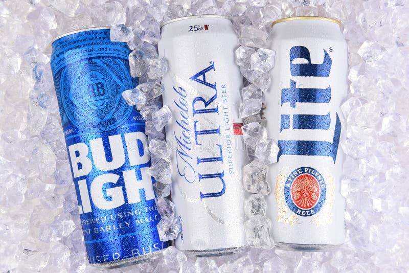
Most light beer logos lean heavily into bold reds and silvers. Think Bud Light, Coors Light, Miller Lite.
Where competitors use blocky, aggressive typography, Michelob Ultra opts for refined elegance. It’s positioning through design, really.
The approach mirrors how brands using blue in their logos often target audiences seeking trustworthiness and calm.
What Are the Technical Specifications of the Michelob Ultra Logo?
Official Color Codes
- Navy Blue: Hex
#24337A| RGB (36, 51, 122) | CMYK (100, 94, 21, 7) - Red: Hex
#D02030| RGB (208, 32, 48) | CMYK (12, 100, 90, 2) - Gray: Hex
#ADBDBE| RGB (173, 189, 190) | CMYK (33, 18, 22, 0) - White: Hex
#FFFFFF| RGB (255, 255, 255) | CMYK (0, 0, 0, 0)
Dimensions and Proportions
- Aspect Ratio: Approximately 2.5:1 (horizontal lockup)
- Minimum Size: 1 inch width for print applications
- Clear Space: Minimum padding equal to the height of the “U” in ULTRA on all sides
- File Formats: Available in vector graphics formats (AI, EPS, SVG) and raster formats (PNG, JPEG)
What Cultural Impact Has the Michelob Ultra Logo Had?
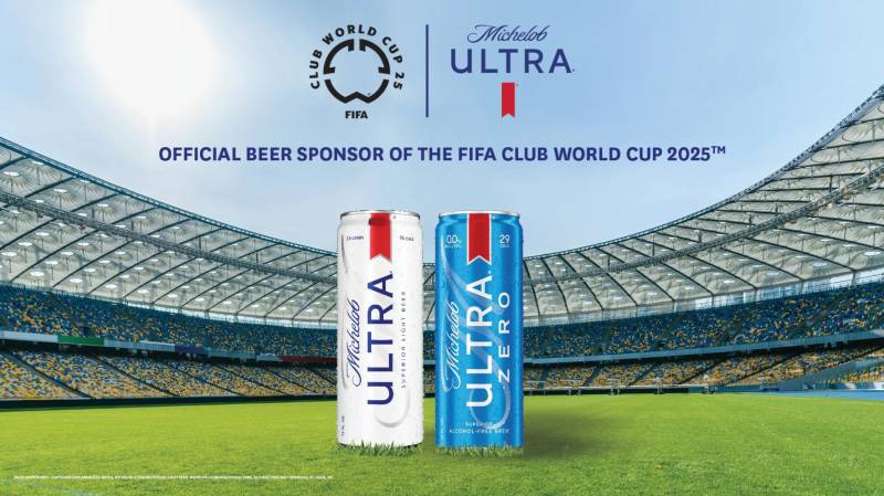
This logo changed how America thinks about beer and fitness. Before 2002, those two concepts rarely mixed in marketing.
The visual identity gave permission to gym-goers who still wanted to enjoy a cold one. That’s a big deal culturally.
Today, the logo appears at marathons, golf tournaments, and yoga events. It redefined what a beer brand could represent.
How Does the Michelob Ultra Logo Fit Into the Overall Brand Identity?
The logo anchors everything Michelob Ultra does visually. Every touchpoint connects back to it.
Advertising campaigns extend the blue palette across all materials. Sponsorship activations feature the ribbon prominently.
The company’s brand guidelines ensure consistency whether the logo appears on a Super Bowl commercial or a local gym banner.
How Should the Michelob Ultra Logo Be Used?
Official Usage Guidelines
- Do: Maintain clear space around the logo at all times
- Do: Use approved color variations (full color, white knockout, single color)
- Do: Scale proportionally without distortion
- Don’t: Alter the colors outside approved variations
- Don’t: Rotate, stretch, or add effects to the logo
- Don’t: Place the logo on busy backgrounds that reduce readability
Access and Licensing
Official logo files are available through Anheuser-Busch’s brand portal for authorized partners. Sponsorship agreements include specific usage rights.
The Michelob Ultra trademark is actively protected. Unauthorized commercial use will trigger legal action from AB InBev’s trademark enforcement team.
Media outlets can typically access press-ready logo files through the Anheuser-Busch media relations department.
FAQ on The Michelob Ultra Logo
What Does the Michelob Ultra Logo Look Like?
The Michelob Ultra logo features the brand name in uppercase letters beneath a stylized ribbon emblem.
Blue dominates the design. The tagline “Superior Light Beer” sits below the wordmark.
It’s a combination mark that balances heritage cues with modern aesthetics.
When Was the Michelob Ultra Logo Created?
Anheuser-Busch introduced the logo in 2002 when the brand launched.
The timing coincided with America’s low-carb diet craze. That context shaped the clean, fitness-oriented visual identity we recognize today.
What Colors Are in the Michelob Ultra Logo?
Deep blue serves as the primary color.
White provides contrast and reinforces the light beer positioning. This color palette separates it from competitors using red and silver tones.
Who Designed the Michelob Ultra Logo?
The Anheuser-Busch in-house design team created the original logo. No external agency handled the initial development.
AB InBev has maintained creative control through subsequent refinements. The beer label design stayed consistent across all updates.
What Font Is Used in the Michelob Ultra Logo?
Michelob Ultra uses a custom font designed specifically for the brand.
The letterforms are tall and condensed. Tight spacing keeps the wordmark compact while uppercase treatment adds authority to the beer branding.
Can I Download the Michelob Ultra Logo?
Official logo files require authorization from AB InBev. Partners access them through the brand portal.
Media outlets can request press-ready files. Unauthorized downloads for commercial use violate trademark protections and trigger legal action.
What Does the Ribbon in the Michelob Ultra Logo Mean?
The ribbon emblem signals heritage and premium quality. But look closer.
It resembles a finish line ribbon. That’s intentional. The athletic connection supports Michelob Ultra’s fitness beer marketing and sports sponsorship positioning.
Has the Michelob Ultra Logo Changed Over Time?
Yes, though changes have been subtle. The core beer logo design remained stable since 2002.
Refinements improved digital rendering and sharpened the logo for mobile displays. No dramatic overhauls occurred.
What File Formats Is the Michelob Ultra Logo Available In?
Official assets come in multiple formats. Vector files (AI, EPS, SVG) work for print design applications.
Raster formats handle digital use. PNG files with transparent backgrounds work best for web design projects.
Is the Michelob Ultra Logo Trademarked?
Absolutely. The logo is a registered trademark of Anheuser-Busch, LLC.
AB InBev actively protects this intellectual property. The American lager brand enforces usage restrictions through its legal team. Commercial misuse results in swift enforcement action.
Conclusion
The Michelob Ultra logo proves that smart beer branding can reshape an entire market category. It works.
From PGA Tour sponsorships to UFC partnerships, this visual identity shows up everywhere active lifestyles intersect with socializing.
The combination of premium light lager positioning and fitness-forward messaging gave Anheuser-Busch brands a new playbook. Competitors took notice.
Whether on a bottle label or arena signage, the logo’s blue and gold scheme communicates exactly what the brand promises. A superior light beer for people who care about what they consume.
That’s effective storytelling through design.

Renowned for his expertise in logo design and visual branding, Bogdan has developed a multitude of logos for various clients.
His skills extend to creating posters, vector illustrations, business cards, and brochures. Additionally, Bogdan's UI kits were featured on marketplaces like Visual Hierarchy and UI8.
He also wrote in the past years on sites like Design Your Way, WebDesignerDepot, WPDean, Designmodo, Speckyboy, Slider Revolution, and more.
- Jujutsu Kaisen Font Generator - 12 October 2026
- The Windsurf Logo History, Colors, Font, And Meaning - 10 October 2026
- How to Remove Background From Product Photos (No Photoshop) - 10 October 2026

Bogdan Sandu is a seasoned designer who has been designing websites since 2008. Renowned for his expertise in logo design and visual branding, Bogdan has developed a multitude of logos for various clients. His skills extend to creating posters, vector illustrations, business cards, and brochures. Additionally, Bogdan's UI kits were featured on marketplaces like Visual Hierarchy and UI8. He also wrote in the past years on sites like Design Your Way, WebDesignerDepot, WPDean, Designmodo, Speckyboy, Slider Revolution, and more.
You Might Also Like