
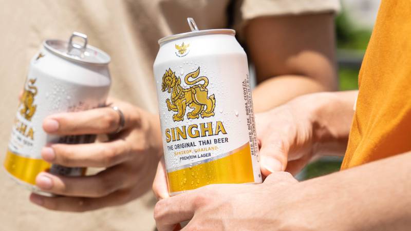
The Singha Logo History, Colors, Font, And Meaning
Whispers of mythology and the clink of a cold bottle—these infuse the very essence of what I have come to explore and admire: the Singha logo. Its majestic lion stands not just as a guard to tradition, but as a beacon of identity in a bustling market of brands vying for recognition.
Plotting the course of this emblematic figure leads us through a tapestry of design principles and the intense battlefield of beer branding.
How does a symbol etch itself into the fabric of collective consciousness? Venture through this narrative, and by its end, you’ll unravel the alchemy that transmutes simple graphics into solid gold of consumer trust and loyalty.
Understand, the connection of barley and hops to an iconic emblem spans more than a mere label. It embodies a visual communication strategy, the bold strokes of corporate identity, and the silent yet powerful language of color schemes and typography.
Together, we’ll dissect this crest of pride—step into the shoes of a creator, and witness how this thai beer symbol shapes a brand’s destiny.
The Meaning Behind the Singha Logo
The Roaring Lion
Alright, so let’s kick it off with the most obvious part – that powerful lion. This isn’t just any lion, my friends. In Thai culture, the lion represents strength, leadership, and courage.
When you gaze at the Singha lion, you’re not just seeing a wild animal. You’re witnessing a symbol of unyielding power and dominance. A declaration that this brand ain’t messing around.
The Golden Waves
Surrounding our fierce friend are these gorgeous wavy lines. Now, they might look like just fancy design elements, but there’s more to them.
These waves are reminiscent of liquid gold, suggesting the rich flavor and premium quality of Singha products. It’s as if each sip is meant to be a golden experience.
The History of the Singha Logo
Origins in Mythology
Let’s time-travel a bit. The Singha lion isn’t a recent invention. It has its roots deep in Thai mythology.
Known as ‘Singha’, this mythical lion creature is believed to protect people from harm. The choice of this legendary creature emphasizes the brand’s commitment to quality and trustworthiness.
Evolution Over Time
Like all great designs, the Singha logo has seen its own share of tweaks and changes. But what’s rad is how it managed to retain its core essence.
Over the decades, while the lion’s posture or the detailing might have evolved, the raw power it emanates? That’s timeless.
The Colors of the Singha Logo

The Singha Beer logo is made up of yellow, olive, maroon, and black colors. The current logo is a refined version of the former yellow lion.
The Dominant Gold
Gold isn’t just bling. In the world of logos, it stands for luxury, quality, and a touch of class. The Singha logo bathes in this royal hue, assuring consumers that they’re opting for nothing but the best.
The Font Used in the Singha Logo

Clean and Bold
No fancy frills here. The Singha typography is as bold and straightforward as its lion. This choice of font is a nod to the brand’s directness and reliability. When you see it, there’s no second-guessing. You know it’s Singha.
The Unique Lettering Touch
Although the font is pretty straightforward, there’s a unique touch in the way some letters are styled, adding character and making the logo stand out.
Cultural Influence of the Singha Logo
A National Icon
The Singha logo isn’t just recognized in bars or supermarkets. In Thailand, it’s a symbol of national pride. The logo, with its deep roots in Thai culture and mythology, resonates with the local populace, becoming more than just a brand emblem.
Influence on Modern Design
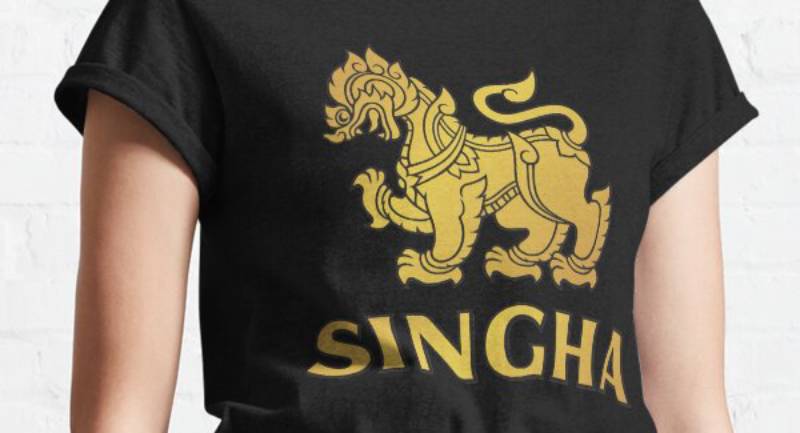
From t-shirts to posters, the Singha lion has found its way into modern pop culture and design. It’s a testament to how a well-designed logo can transcend its original purpose and inspire a whole new generation of creators.
The Impact on Competing Brands
Setting the Bar High
With such a powerful logo and brand identity, Singha has set a standard. Competing brands often find themselves compared to this iconic logo, making it a benchmark in beverage branding.
Inspiration or Intimidation?
While some brands might take inspiration, aiming to craft their unique identity, others might find the Singha dominance a bit intimidating. But hey, in the world of design, it’s all about pushing boundaries, right?
FAQ On The Singha Logo
What is the significance of the Singha logo?
The Singha logo, with its mythical lion, stands as a testament to strength and leadership. Singha, a Thai word for lion, reflects the brand’s cultural heritage.
This emblem brings the essence of the product to life, intertwining with brand loyalty and corporate identity in the competitive beer industry.
Who designed the Singha logo?
The architect of the Singha logo remains shrouded in mystery, a creative force that fused Thai symbolism with a modern branding necessity.
The designer captured the spiritual guardian lion, crafting an enduring and recognizable trademark that transcends time.
How has the Singha logo evolved over time?
Evolution is intrinsic to any long-lasting brand identity. The Singha logo has evolved subtly, adjusting to contemporary visual communication norms while maintaining its historic and iconic trademark—a deft balance between heritage and graphic design trends.
What does the Singha logo represent for the company?
A fortress of identity, the Singha logo encapsulates the company’s ethos: quality, tradition, and authenticity. It’s more than a symbol—it’s a visual identity system that carries corporate values and forms a bridge connecting product and consumer.
How does the Singha logo enhance the company’s branding?
This logo is the cornerstone of the Singha branding strategy, imbuing every marketing collateral with the seal of tradition.
It enhances brand recognition and underscores the company’s prominence in the Thai beverage branding landscape and beyond.
What are the design elements of the Singha logo?
At its core, the logo harmonizes simplicity and complexity: golden hues, bold typography, and the stylized lion.
These design elements foster a visually compelling narrative while contributing to a cohesive and memorable branding consistency across platforms.
Is the Singha logo protected by trademark laws?
Indeed, legal shields guard it fiercely. The logo benefits from trademark registration, ensuring intellectual property protection for the distinctive emblem that heralds Singha’s brand identity across global markets, thus warding off imitators and preserving its uniqueness.
How does Singha use its logo in advertising?
Strategically placed like chess pieces, the logo anchors advertising campaigns and melds visual branding strategies with communicative prowess.
It’s omnipresent, from beer bottle labels to far-reaching advertising mediums, a constant envoy of Singha’s narrative.
Has the Singha logo won any design awards?
It’s not just a label; it’s an honor clad in tradition. While specifics on awards may be elusive, the Singha logo’s iconic status and design excellence undoubtedly merit unofficial accolades within the realms of visual branding strategies and product logo design.
How do consumers perceive the Singha logo?
Consumers often see the lion of Singha as an emblem of premium quality and cultural pride. It beckons to those seeking a taste crafted with generations of brewing mastery, becoming a visual trademark synonymous with Thai craft, enjoyed by aficionados worldwide.
Conclusion
As we reach the denouement of our exploration, the Singha logo stands tall, not just as a mark on a bottle, but as a symbol woven into the cultural and branding fabric of a legacy. With its roots entrenched in Thai heritage, the aura surrounding this mythical guardian commands respect and admiration across the branding realm.
It’s more than art. It’s a beacon guiding the brand through the tempest of the beer industry. Its evolution, while subtle, reflects a strategic mastery over visual identity and corporate branding. Remember, in every beer label, ad, or merchandise, it whispers the tale of quality and craftsmanship.
Golden hues. The lion’s roar. A tale told in every pour.
Closing off, let the lion lead—not just the dance of effervescent bubbles to the brim but forging indelible footprints on the sands of marketing brilliance. This is no mere logo; it’s Singha’s heart and brand’s destiny encapsulated.
If you enjoyed reading this article about Singha logo, you should read these as well:
- How to Design a Logo Like a Pro: Tips to Follow
- Logo mockup templates to download and use to present your logos
- The Best 40 Beer Ads You Can See Today
Bogdan Sandu, a seasoned designer with 15 years of diverse experience, has been designing websites since 2008.
Renowned for his expertise in logo design and visual branding, Bogdan has developed a multitude of logos for various clients.
His skills extend to creating posters, vector illustrations, business cards, and brochures. Additionally, Bogdan's UI kits were featured on marketplaces like Visual Hierarchy and UI8.
Latest posts by Bogdan Sandu (see all)
- Bright Color Palettes for Eye-Catching Designs - 18 May 2024
- Venmo’s Visual Voice: What Font Does Venmo Use? - 18 May 2024
- The Hoegaarden Logo History, Colors, Font, And Meaning - 17 May 2024