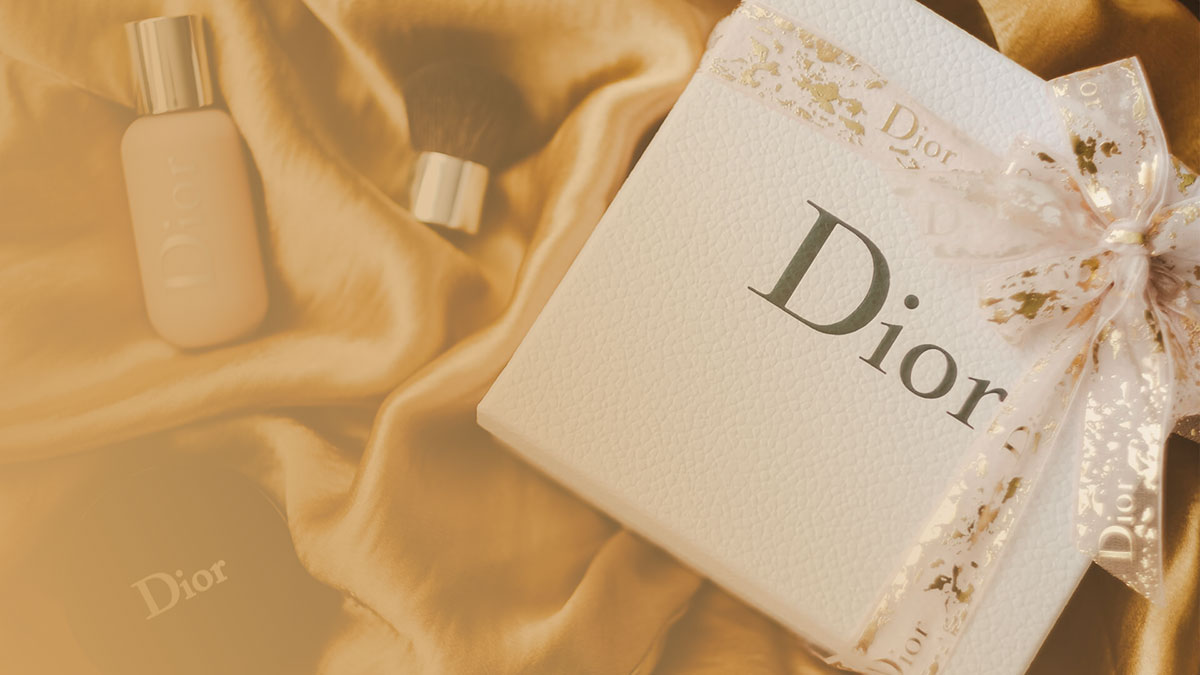
Dior’s logo is built on Nicolas Cochin Regular, a classic French old-style serif font designed by Georges Peignot and originally released in 1912 through the Paris foundry Deberny & Peignot.
The current wordmark is a custom version of that typeface, redrawn in 1995 by Albert Boton of Carré Noir, and further refined for digital use. Dior never commercially released its modified version. It is proprietary and protected under font licensing agreements held by Christian Dior SE and its parent, LVMH.
For Dior Fragrance & Beauty, a separate 2024 rebrand introduced Atacama (designed by Ian Party for Newglyph) as the title typeface, and Hellix (designed by Martin Vácha for Displaay Type Foundry) for body text. So there is no single “Dior font.” The answer depends on which product line you are looking at.
What Type of Font Is Nicolas Cochin?

Nicolas Cochin is an old-style serif typeface. More specifically, it sits in the engraving serif subcategory, meaning its letterforms were modeled directly after copper-plate engraving work rather than calligraphy or pen strokes.
Key characteristics of the typeface:
- X-height: Noticeably small, even by serif standards. Lowercase letters are compact relative to capitals.
- Contrast: High stroke contrast between thick and thin strokes, typical of engraved lettering.
- Serifs: Delicate, sharp, and refined. Not slab, not bracketed heavily.
- Curves: Gracefully flowing, with a slightly loose construction compared to its sibling typeface Cochin.
- Rhythm: Elegant and measured, which reads as formal and heritage-driven at display sizes.
This combination gives the Dior logo its distinct quality: refined without being stiff, historical without feeling dated.
The small x-height is worth flagging for anyone considering it for body text. It does not hold up well at small sizes. Cochin works best as a display or headline face, which is exactly how Dior uses it.
Who Designed the Nicolas Cochin Typeface?
Georges Peignot designed Nicolas Cochin in 1912, released through his Paris foundry G. Peignot et Fils (later renamed Deberny & Peignot).
The design was a tribute to 18th-century French engraver Charles-Nicolas Cochin (1715–1790), whose copperplate work directly informed the letterform style. Peignot named the typeface after him.
Nicolas Cochin is technically the looser, rougher variation of another Peignot design simply called Cochin. Matthew Carter later revised the Cochin family in 1977 for Linotype, and this version became widely known as a macOS system font.
The version URW Type Foundry currently distributes contains 4 styles. Linotype’s version contains 3 styles. The URW version additionally includes a Black weight not available in the Linotype release.
The 1995 logotype redraw for Dior was handled by Albert Boton of the French agency Carré Noir, adapting Nicolas Cochin into a cleaner, digitally refined logotype for the Christian Dior Couture entity specifically.
Is the Dior Font Free to Use?

Dior’s modified logo typeface is not available to the public. It is proprietary and cannot be licensed, downloaded, or purchased anywhere.
Nicolas Cochin Regular, the commercial typeface the logo draws from, is available for purchase:
- URW Type Foundry version (MyFonts): Individual styles start around $35.99 USD. The 4-style family package runs approximately $62.99 USD.
- LTC Nicolas Cochin Pro (Adobe Fonts): Available through a Creative Cloud subscription for personal and commercial use.
- Linotype version: Available via MyFonts with desktop, web, and app license options.
For personal use only, OPTI Naval by Castcraft Software is commonly recommended as a free alternative that closely resembles the Dior logotype style. It is not cleared for commercial use without a separate license.
Worth knowing: the Cochin version preinstalled on macOS is technically free to use in design work, but its character set and weights are more limited than the commercial versions. Your mileage will vary depending on the project.
How Did Dior’s Typography Change Over Time?
Dior’s typography history has three clear phases, each tied to a shift in brand strategy or creative direction.
| Era | Logotype Style | Key Detail |
| 1946–1995 | Nicolas Cochin (Original) | Title case; featured a slightly loose, hand-drawn quality. |
| 1995–2018 | Nicolas Cochin (Refined) | Redrawn by Albert Boton; cleaner and digitally balanced. |
| 2018–2025 | All-caps “DIOR” | Simplified sans-serif/slab hybrid; optimized for digital icons. |
| 2025–Present | Return to Cochin | Reintroducing the capital “D” and lowercase “ior.” |
The 2018 shift to all-caps happened alongside Maria Grazia Chiuri taking over womenswear (2016) and Kim Jones taking menswear (2018). The brand standardized everything to uppercase across all lines: beauty, haute couture, and packaging.
The 2025 reversal under Jonathan Anderson is the more interesting story. Anderson described his approach as wanting to “decode it to recode it,” going back to the original 1946 typographic voice before building a new creative chapter. The Cochin revival first appeared on labels and textile details, then formally during his SS26 womenswear debut.
Free Alternatives to the Dior Font
You cannot replicate the Dior logotype exactly. But if the goal is a similar aesthetic, these are the most practical options:
| Font | Similarity to Nicolas Cochin | License | Source |
| Cochin (macOS system font) | Same family, slightly different proportions | Included with macOS | System |
| OPTI Naval | Very close logotype match | Personal use only | Castcraft Software |
| Garamond | Old-style serif, similar elegance | Free (OFL) | Google Fonts |
| Sedan | Free Cochin alternative, similar low x-height | Open Font License | Google Fonts |
| LTC Nicolas Cochin Pro | Direct commercial alternative | Commercial (CC sub) | Adobe Fonts |
If you are working in Figma or Canva and want something in the same tonal zone, Cormorant Garamond is worth trying. It has a similarly small x-height and high contrast. It is free on Google Fonts and handles display sizes well.
For anyone building something in the luxury brand space more broadly, Didot is another obvious reference point. It is sharper and more geometric than Cochin, but sits in the same high-contrast serif category that luxury fashion tends to favor.
How to Use a Cochin-Style Font in Your Design Work
In Figma
Sedan and Cormorant Garamond are both available through Google Fonts and load directly inside Figma via the font picker. No installation required if you are using the browser-based version.
For LTC Nicolas Cochin Pro, you need an active Adobe Fonts subscription. Install through Adobe Creative Cloud, and it will appear in Figma’s local font list after a Figma desktop app restart.
In Canva
Canva includes Cormorant Garamond natively. If you need to bring in a purchased font like Nicolas Cochin from URW, use the upload fonts to Canva feature available on Canva Pro. OTF and TTF formats both work.
In Photoshop
If you are on macOS, the Cochin system font is already available in Photoshop without any extra steps. For third-party purchases, adding fonts to Photoshop is straightforward: install the font at the OS level and Photoshop picks it up on next launch.
On the Web (CSS)
For a web-safe fallback that approximates the Cochin aesthetic, this stack is a reasonable starting point:
“ font-family: "Cochin", "Cormorant Garamond", Georgia, serif; `
Cochin will render on macOS devices. Georgia handles Windows and Android as a graceful serif fallback. If you are embedding LTC Nicolas Cochin Pro via Adobe Fonts, use their generated CSS embed code and set the web font as the primary value in the stack.
Why Did Dior Choose This Typeface?
Christian Dior founded the house in 1946 with a very specific aesthetic reference: French couture as architectural precision expressed through clothing. The Cochin typeface came from the same tradition, rooted in 18th-century Parisian craftsmanship and copperplate engraving.
The choice was not accidental. Engraving serifs carry an implied sense of handcraft. The irregularity in the letterforms, the delicate serifs, the high contrast between strokes. All of it references a pre-industrial standard of precision that aligns with haute couture’s core claim: that garments are made, not manufactured.
There is also a practical dimension. The typeface works as a standalone logo without any supporting graphic elements. Dior’s visual hierarchy across all touchpoints, from perfume bottles to runway backdrops, relies entirely on letterforms. The wordmark has to carry full brand weight on its own. Cochin’s high contrast and refined proportions make it legible and recognizable at both small and large scales.
Jonathan Anderson’s 2025 decision to return to Cochin after 7 years of all-caps branding reinforces this point. In a moment when most luxury brands are simplifying toward neutral grotesques and geometric sans-serifs, Dior moved back toward a serif with visible irregularity and historical depth. That is a deliberate brand statement, not just a style preference.
The font psychology here is worth noting. Old-style serifs consistently score higher on perceived trustworthiness and heritage compared to geometric sans-serifs. For a brand whose entire positioning rests on legacy and craftsmanship, that association is commercially valuable.
If you want to see how other luxury fashion brands approach their typography, the comparison is instructive. Balenciaga went in the exact opposite direction, adopting a stark grotesque sans-serif. Gucci uses a custom serif that sits closer to the humanist end of the spectrum. Louis Vuitton relies on a geometric sans-serif for most of its communications. Each choice signals something different about the brand’s relationship to tradition versus modernity.
Dior’s return to Cochin in 2025 is the clearest recent example of a luxury brand using typography as a direct heritage signal, not just as a design preference.
FAQ on What Font Does Dior Use
What is the official Dior logo font?
The Dior logo is based on Nicolas Cochin Regular, a French old-style serif typeface designed by Georges Peignot in 1912.
Dior’s version is a custom redraw, not the commercial release. It is proprietary and not publicly available.
Is the Dior font a serif or sans-serif?
It is a serif font. Nicolas Cochin belongs to the engraving serif category, characterized by high stroke contrast, delicate serifs, and a small x-height.
Who designed the font Dior uses?
Georges Peignot designed Nicolas Cochin in 1912 for his Paris foundry Deberny & Peignot.
The logotype itself was redrawn in 1995 by Albert Boton of Carré Noir, adapting the typeface for digital use under the Christian Dior Couture identity.
Can I download the Dior font for free?
Not legally for commercial use. The closest free personal-use alternative is OPTI Naval by Castcraft Software.
The commercial typeface Nicolas Cochin is available for purchase via MyFonts or through Adobe Fonts with a Creative Cloud subscription.
What font does Dior use on its website and packaging?
The wordmark across boutique signage and packaging draws from the custom Cochin-based logotype.
Dior Fragrance & Beauty uses a different system: Atacama for titles and Hellix for body text, both introduced in a 2024 rebrand handled in-house.
Did Dior change its font recently?
Yes. In 2018, Dior switched to a simplified all-caps wordmark for digital scalability. Then in 2025, creative director Jonathan Anderson revived the original Cochin-based lettering, returning to a capital D followed by lowercase letters.
What fonts look similar to the Dior logo font?
The closest alternatives are Cochin (macOS system font), Cormorant Garamond, and Sedan (both free on Google Fonts).
For commercial projects, LTC Nicolas Cochin Pro via Adobe Fonts is the most accurate match available.
Is Nicolas Cochin the same as Cochin?
They are related but distinct. Cochin is the original 1912 design. Nicolas Cochin is a looser, slightly rougher variation created by Georges Peignot in the same period, named directly after French engraver Charles-Nicolas Cochin.
What font does Dior use for body text in its communications?
Dior does not publish a public typography style guide. For Fragrance & Beauty, Hellix by Displaay Type Foundry serves as the body typeface since the 2024 update. Other Dior divisions use proprietary type systems not disclosed publicly.
Why does Dior use a serif font instead of a sans-serif?
Old-style serifs communicate heritage, craft, and trust. These qualities align directly with Dior’s brand positioning in luxury fashion.
The Cochin typeface also has deep roots in French printing and engraving tradition, which mirrors Christian Dior’s own design philosophy from 1946 onward.
Conclusion
If you have been wondering what font does Dior use, the answer traces back to Nicolas Cochin, a French engraving serif with roots in 18th-century copperplate craftsmanship.
The Dior wordmark is a proprietary redraw of that typeface, not a font you can simply download and apply to your own work.
The brand’s typographic choices have shifted across decades, from the original Cochin-based logotype to the all-caps wordmark introduced in 2018, and back again under Jonathan Anderson in 2025.
Each change reflects something deliberate about how the Dior Couture identity positions itself within luxury fashion branding. For designers looking to capture a similar aesthetic, commercial options like LTC Nicolas Cochin Pro or free alternatives like Cormorant Garamond remain the most practical starting points.

Renowned for his expertise in logo design and visual branding, Bogdan has developed a multitude of logos for various clients.
His skills extend to creating posters, vector illustrations, business cards, and brochures. Additionally, Bogdan's UI kits were featured on marketplaces like Visual Hierarchy and UI8.
He also wrote in the past years on sites like Design Your Way, WebDesignerDepot, WPDean, Designmodo, Speckyboy, Slider Revolution, and more.
- Canva vs PowerPoint: Which Is Better for Presentations? - 22 September 2026
- How to Install Fonts on Mac (Step-by-Step Guide) - 20 September 2026
- From Mockup to Code: How AI-Augmented Development Speeds Up the Design Handoff - 19 September 2026

Bogdan Sandu is a seasoned designer who has been designing websites since 2008. Renowned for his expertise in logo design and visual branding, Bogdan has developed a multitude of logos for various clients. His skills extend to creating posters, vector illustrations, business cards, and brochures. Additionally, Bogdan's UI kits were featured on marketplaces like Visual Hierarchy and UI8. He also wrote in the past years on sites like Design Your Way, WebDesignerDepot, WPDean, Designmodo, Speckyboy, Slider Revolution, and more.
You Might Also Like