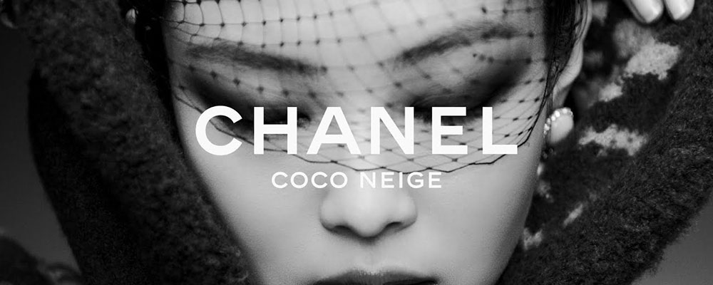
Chanel uses a proprietary custom sans-serif typeface for its wordmark, set entirely in uppercase with wide letter spacing and geometric letter construction. The web version of this typeface is internally referred to as AB Chanel Corpo. It is not publicly available for download or commercial use.
The closest publicly recognized tribute font is Couture, designed by Chase Babb in 2012, which was directly inspired by Chanel’s lettering style.
What Type of Font Is the Chanel Wordmark?

Chanel’s wordmark is a geometric sans-serif typeface. Every stroke carries equal weight, and the letter construction relies on clean straight cuts rather than tapered or curved terminals.
A few specific details that make it distinct:
- Set in all-caps with wider-than-standard letter spacing
- Angled (rather than vertical) stroke endings on letters like C and S
- Flat tips instead of sharp or pointed ones
- Extended proportions that give the wordmark an airy, horizontal feel
The result is a sans-serif font that reads as assertive but not aggressive. No decorative elements, no contrast between thick and thin strokes. Just structure.
This sits well within the broader minimalist design tradition that luxury fashion houses have followed since the mid-20th century.
Who Created the Chanel Font?
The actual origin of Chanel’s proprietary wordmark typeface is not publicly documented by the brand. What is confirmed is that it was created specifically for Chanel and is not sold or licensed through any type foundry.
Key facts:
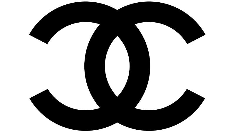
- The sans-serif all-caps wordmark was introduced in the 1940s, placed beneath the CC monogram on select brand applications
- The typeface has remained essentially unchanged since then
- The font closest to it in the open market is Couture, a tribute typeface created by American designer Chase Babb in 2012
Couture was not commissioned by Chanel. It is an independent interpretation. The actual Chanel logotype is a proprietary asset owned by Chanel S.A.
Understanding the difference between a brand’s custom logotype and a public font matters here. Chanel’s lettering is a logotype, not a typeface distributed through a foundry. The typography elements are baked into the brand identity system, not a separate licensable product.
Is the Chanel Font Free to Use?
No. The Chanel wordmark typeface is proprietary and not publicly available. Using it without authorization would infringe on the brand’s intellectual property rights.
That said, the tribute font Couture (by Chase Babb) is free for personal use:
- License: Free for personal use only
- Commercial use: Requires a paid license purchased directly from Chase Babb
- Format: OTF
- Styles: Bold and Bold Italic
You can find Couture on font distribution sites like DaFont and similar platforms. It is not available on Google Fonts or Adobe Fonts.
Worth noting: Couture is an homage. It replicates the general feel of Chanel’s lettering but is not identical to the actual wordmark. If you need to understand font licensing before using any brand-inspired typeface commercially, that’s the right first step.
What Font Did Chanel Use Before?
The Chanel logo has barely changed in nearly 100 years. That is unusual for any brand, let alone one that operates across fashion, beauty, and fragrance.
The timeline breaks down this way:
| Period | Typography Used | Context |
| 1925 | CC monogram only | Introduced for Chanel No. 5 |
| 1940s | All-caps sans-serif wordmark added | Placed beneath monogram on select items |
| 1950s | Thin circular frame added to CC | Used specifically for fragrance and cosmetics |
| Today | Same wordmark, unchanged | Applied across all brand touchpoints |
The brand never went through a dramatic typographic rebrand. The wordmark added in the 1940s is essentially the same one used today.
Compare this to most luxury competitors who have cycled through multiple logo updates. Chanel’s consistency is a deliberate strategy, not inertia.
Best Free Alternatives to the Chanel Font
Since the actual Chanel typeface is off-limits, here are the closest publicly available alternatives worth considering:
| Font | Why It Works | License | Source |
| Couture | Direct Chanel tribute, closest visual match | Free (personal), paid (commercial) | DaFont |
| Josefin Sans | Geometric, all-caps friendly, similar spacing | Free (OFL) | Google Fonts |
| Raleway | Elegant proportions, thin to bold range | Free (OFL) | Google Fonts |
| Cormorant Garamond | Luxury editorial feel, strong contrast | Free (OFL) | Google Fonts |
| Rexton Bold | Very close geometric structure to Chanel wordmark | Commercial | Various foundries |
Josefin Sans is probably the most accessible starting point for anyone building a luxury-adjacent brand identity on a budget. Pair it with a thin serif for body copy and you’re most of the way there.
For luxury brand font research more broadly, the pattern is consistent: geometric sans-serifs with wide spacing dominate the category.
How to Use a Chanel-Style Font in Your Projects
In Figma or Adobe Illustrator
If you’re working in Figma, install Josefin Sans directly through the Google Fonts plugin. Set the weight to Bold or SemiBold, switch the text to all-caps, and increase letter spacing to around 0.2–0.3 em.
That gets you close. From there, adjust the horizontal scale to around 110–115% if you want to replicate the slightly extended width of Chanel’s actual wordmark.
For Adobe Illustrator, you can add fonts to Adobe Illustrator manually after downloading from Google Fonts. The process takes about two minutes and the font becomes available across your whole system.
In Canva
Canva has Josefin Sans available natively. Search for it in the font selector, apply Bold weight, and use the letter spacing slider. If you’re on Canva Pro, you can also upload fonts to Canva and bring in Couture directly for personal-use projects.
On the Web (CSS)
Add Josefin Sans via Google Fonts and apply these base styles:
“ font-family: 'Josefin Sans', sans-serif; font-weight: 700; text-transform: uppercase; letter-spacing: 0.25em; `
That CSS stack handles fallback cleanly. If Josefin Sans fails to load, the browser drops to a system sans-serif, which still preserves the general feel of the layout.
Why Did Chanel Choose This Font?
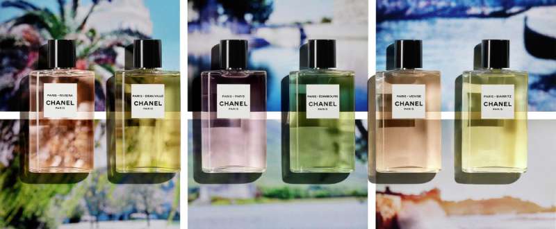
Coco Chanel built an entire aesthetic around one idea: remove what doesn’t need to be there. That applied to clothing, accessories, and typography equally.
The geometric sans-serif wordmark she introduced in the 1940s reflected exactly that mindset. No serifs. No decorative strokes. No contrast between thick and thin. The letterforms are clean enough to be read at any size, from a label on a lipstick to a storefront sign on Rue Cambon.
There’s also a practical angle. A logo that works in embossed gold on a handbag, screenprinted black on a paper bag, and reversed white on a dark background needs to be structurally simple. Ornate typefaces break down across those conditions. A clean geometric sans-serif does not.
The visual hierarchy of the full Chanel mark works because the CC monogram draws the eye first, and the wordmark anchors it. Both elements are geometrically consistent, which is why the system holds together so well across decades and contexts.
Other fashion houses have taken note. Compare what font Balenciaga uses, or look at what font Dior uses, and the pattern repeats: uppercase, wide spacing, geometric construction. Chanel didn’t follow that trend. It started it.
The font psychology behind this choice is straightforward. Geometric sans-serifs read as modern, rational, and controlled. For a brand built on the idea that elegance is refusal, that’s exactly the right signal to send.
Brands like Louis Vuitton and Gucci have each navigated similar typographic decisions, though their approaches differ. Chanel’s choice to freeze its wordmark in the 1940s and never touch it again is what makes its typography feel less like a design decision and more like a statement.
The typography choices of luxury brands as a category are worth studying if you’re designing in this space. Chanel is the clearest case study for what happens when a brand commits fully and never deviates.
FAQ on What Font Does Chanel Use
What is the exact name of the Chanel wordmark font?
Chanel uses a proprietary custom sans-serif typeface internally referred to as AB Chanel Corpo in its web applications.
It is not publicly available. The closest tribute font is Couture, designed by Chase Babb in 2012.
Is the Chanel font free to download?
No. The actual Chanel typeface is proprietary and cannot be downloaded.
The tribute font Couture by Chase Babb is free for personal use only. Commercial use requires a paid license purchased directly from the designer.
What type of font does Chanel use?
Chanel’s wordmark is a geometric sans-serif typeface set in all-caps with wide letter spacing and uniform stroke weight.
No serifs, no decorative strokes. Just clean, flat-tipped letterforms with angled terminal cuts.
Did Chanel always use the same font?
The all-caps sans-serif wordmark was introduced in the 1940s and has remained essentially unchanged since.
Before that, the brand used only its CC monogram, first introduced in 1925 for Chanel No. 5.
What font looks most like the Chanel logo font?
Couture is the closest publicly available match. Other near-alternatives include Rexton Bold, Double Porter 3, RoundCut Bold, and ITC Blair Pro Bold.
For free options, Josefin Sans and Raleway come closest in structure and spacing.
What font does Chanel use on its website?
Chanel’s website uses AB Chanel Corpo for the wordmark and deploys additional custom typefaces for editorial and campaign content.
These secondary typefaces are also proprietary and not distributed through any public font platform.
Why does Chanel use a sans-serif font?
A geometric sans-serif works across embossed labels, printed packaging, signage, and digital screens without breaking down visually.
It also aligns with Coco Chanel’s design philosophy: remove anything unnecessary. The font psychology behind it signals control, clarity, and restraint.
Is the Chanel font the same as Couture?
No. Couture is an independent tribute typeface inspired by Chanel’s lettering style, not a reproduction of the actual brand asset.
The Chanel logotype is a custom proprietary design owned by Chanel S.A. and was not created by Chase Babb.
What are the best free alternatives to the Chanel font?
The top free options are Josefin Sans, Raleway, and Couture (personal use).
All three are geometric sans-serifs that handle all-caps settings well and suit luxury brand typography when paired with wide letter spacing.
How do I use a Chanel-style font in Canva or Figma?
In Canva, search for Josefin Sans Bold, switch to all-caps, and increase letter spacing.
In Figma, use the same font via the Google Fonts plugin. Set tracking to around 200–300 and scale the width slightly wider than default for an accurate result.
Conclusion
If you’ve been asking what font does Chanel use, the answer is a proprietary geometric sans-serif logotype that the brand has kept virtually unchanged since the 1940s.
It’s not available for public download. But the Couture typeface by Chase Babb gets you close enough for most personal projects.
For commercial work, Josefin Sans or Raleway are the practical alternatives, especially when set in all-caps with generous tracking.
Chanel’s brand typography is a clear example of how a fashion house can build lasting recognition through consistency and restraint, not reinvention.

Renowned for his expertise in logo design and visual branding, Bogdan has developed a multitude of logos for various clients.
His skills extend to creating posters, vector illustrations, business cards, and brochures. Additionally, Bogdan's UI kits were featured on marketplaces like Visual Hierarchy and UI8.
He also wrote in the past years on sites like Design Your Way, WebDesignerDepot, WPDean, Designmodo, Speckyboy, Slider Revolution, and more.
- Canva vs PowerPoint: Which Is Better for Presentations? - 22 September 2026
- How to Install Fonts on Mac (Step-by-Step Guide) - 20 September 2026
- From Mockup to Code: How AI-Augmented Development Speeds Up the Design Handoff - 19 September 2026

Bogdan Sandu is a seasoned designer who has been designing websites since 2008. Renowned for his expertise in logo design and visual branding, Bogdan has developed a multitude of logos for various clients. His skills extend to creating posters, vector illustrations, business cards, and brochures. Additionally, Bogdan's UI kits were featured on marketplaces like Visual Hierarchy and UI8. He also wrote in the past years on sites like Design Your Way, WebDesignerDepot, WPDean, Designmodo, Speckyboy, Slider Revolution, and more.
You Might Also Like