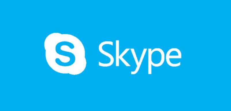
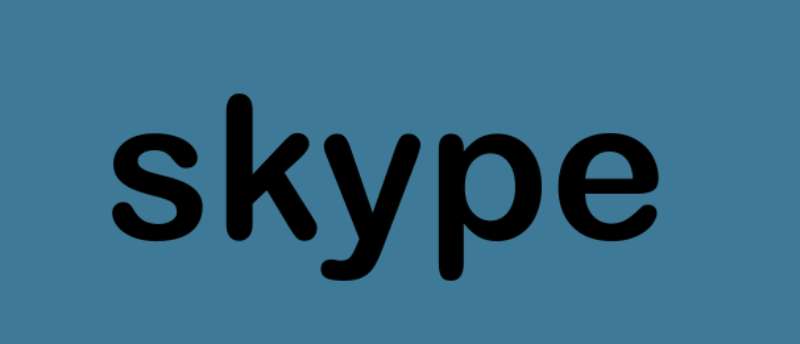
Skype’s original logo used Arial Rounded MT Bold, a commercial sans-serif font designed by Robin Nicholas and Patricia Saunders, published by Monotype in 1993.
For its app interface, Skype relies on Segoe UI on Windows platforms, with Tahoma and San Francisco as fallback options on older or non-Windows systems.
What Type of Font Is Arial Rounded MT Bold?
Arial Rounded MT Bold is a neo-grotesque sans-serif typeface. It sits in the same broad category as standard Arial, but with one major difference: every stroke terminal is fully rounded instead of cut flat.
The result is a letterform that feels noticeably softer. Open counters, consistent stroke width, and generous letter spacing make it easy to read at both large and small sizes.
It comes in a single weight, which is unusual. Most typeface families ship with light, regular, and bold cuts. Arial Rounded MT Bold exists almost entirely in its bold form, which is part of why it reads so distinctly.
Segoe UI, used across the Skype app interface, is also a humanist sans-serif. It has rounder letterforms than its predecessor Tahoma, and was optimized specifically for low-resolution screen display rather than print.
Who Designed the Fonts Skype Uses?
Arial Rounded MT Bold was designed by Robin Nicholas and Patricia Saunders for Monotype Typography. It was first released in 1993 as a commercial typeface. Monotype holds the copyright and controls its licensing.
It was not created specifically for Skype. Skype adopted it for its original wordmark because the rounded terminals matched the speech-bubble cloud shape used in the logo design.
Segoe UI was produced by Monotype Imaging and licensed to Microsoft. Simon Daniels, a program manager in Microsoft’s typography group, has confirmed that “the original Segoe fonts were not created for or by Microsoft” but were extensively extended and customized by the company. Segoe UI first shipped publicly with Windows Vista.
Is the Skype Font Free to Use?
Arial Rounded MT Bold is a commercial font. It is not freely available for general use.
Some users already have it installed because it ships with certain Microsoft products, including Office 2010. But having it bundled with software you own does not automatically grant you a license to use it in commercial design work, web embedding, or app development. Those use cases typically require a separate license from Monotype.
Segoe UI is pre-installed on Windows systems and is free for Windows users in that context. However, it is proprietary to Microsoft and cannot be freely redistributed or self-hosted as a web font without the appropriate licensing. On Mac, Skype falls back to system fonts like San Francisco or Helvetica Neue.
If you need something similar for a project, the free alternatives section below covers the practical options. And if you’re curious about font licensing more broadly, it’s worth understanding before pulling any commercial typeface into a client project.
What Font Did Skype Use Before? A Brief Logo Timeline
Skype’s logo has changed several times since launch, and the font story tracks those shifts directly.
- 2003: Original logo launched with a rounded white wordmark on a red gradient background. Font: Arial Rounded MT Bold.
- 2004–2006: The logo was redrawn with a three-dimensional treatment and then switched from red to blue. Arial Rounded MT Bold remained.
- 2012: A flatter, simplified redesign kept the cloud bubble shape and the same rounded typeface.
- 2017: Microsoft introduced a new visual identity. The wordmark shifted to a lighter, more geometric sans-serif that moved away from the rounded style entirely.
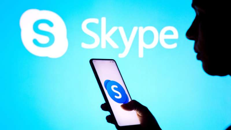
- 2019: The wordmark was removed. The current Skype mark is an icon-only design: a gradient blue circle with a white “S,” no text.
So technically, Skype no longer uses a wordmark font at all. The Arial Rounded MT Bold era ended around 2017 when Microsoft brought Skype’s branding in line with its own design system.
What Are the Best Free Alternatives to Arial Rounded MT Bold?
Since Arial Rounded MT Bold is commercial and Segoe UI is proprietary, most designers need a workable substitute. Here are 5 solid options that are actually free.
| Font | Why It’s Similar | License | Source |
| Nunito | Rounded terminals, balanced weight, friendly feel | OFL (free) | Google Fonts |
| Varela Round | Fully rounded, single weight, very close match | OFL (free) | Google Fonts |
| Poppins | Geometric sans-serif, clean and approachable | OFL (free) | Google Fonts |
| Quicksand | Rounded strokes, light to bold range available | OFL (free) | Google Fonts |
| M PLUS Rounded 1c | Explicitly rounded design, wide language support | OFL (free) | Google Fonts |
Varela Round is probably the closest visual match if you need something that mimics the old Skype logo style. Nunito is more versatile if you need multiple weights for a full design system.
For interface work meant to align with Skype’s current Windows ecosystem, the best system fonts list is worth checking. Segoe UI is already on most Windows machines, so no download is needed there.
How to Use These Fonts in Your Design Tools
In Figma
All Google Fonts options above are available directly inside Figma without any manual installation. Just open the font picker and search by name. Figma pulls from Google’s library automatically.
For Arial Rounded MT Bold specifically, you need the font installed on your local machine. Figma will detect it from your system fonts once installed.
In Canva
Canva includes several rounded sans-serif options in its font library. Nunito and Poppins are both available natively. If you have a Canva Pro account, you can upload fonts to Canva and add Arial Rounded MT Bold directly, assuming you hold a valid license.
Web CSS Font Stack
Skype’s own interface uses the following CSS font stack on Windows systems:
“ font-family: "Segoe UI", Tahoma, Geneva, Verdana, sans-serif; `
This is a practical fallback chain. Segoe UI loads first on Windows, then Tahoma handles older systems, and the generic sans-serif catches everything else. You can borrow this stack directly for any project that needs a Microsoft-adjacent look.
If you want to replicate the older logo style instead, swap in Varela Round via Google Fonts:
` <link href="https://fonts.googleapis.com/css2?family=Varela+Round&display=swap" rel="stylesheet"> `
Why Did Skype Choose These Fonts?
The original choice of Arial Rounded MT Bold wasn’t accidental. The Skype logo was built around a speech bubble shape, a cloud-like form with soft, rounded edges. A typeface with sharp or angular terminals would have looked out of place inside that visual system. Arial Rounded MT Bold matched the geometry of the mark itself.
The rounded terminals also carried a specific message: approachability. Skype launched in 2003 as a consumer product trying to make internet calling feel simple and non-intimidating. The psychology of that font choice was real. Rounded letterforms consistently test as friendlier and more trustworthy in user perception studies compared to sharp grotesque designs.
The shift to Segoe UI across the interface happened for a different reason entirely: consistency within the Microsoft ecosystem. After Microsoft acquired Skype in 2011, it made sense to align Skype’s interface typography with Windows design standards. Segoe UI was already the system font across Windows Vista and later versions, and using it in Skype reduced visual friction for Windows users moving between apps.
By 2017, the broader brand rebrand dropped the wordmark font altogether. The “S” icon became the full identity. That’s increasingly common in app branding. Think of how Slack, Zoom, and similar platforms have moved toward single-letter or symbol marks that work better at small sizes on mobile screens.
Skype’s font history is actually a useful case study in how typography elements serve the broader brand story at each stage of a company’s growth. From a friendly startup typeface to a system-aligned UI font to no wordmark at all, each shift tracked a real change in how the product was positioned.
If you want to go deeper on how apps approach type choices, the best fonts for apps breakdown covers the practical reasoning behind these decisions quite well. And for anyone comparing Skype’s approach to similar communication tools, the Microsoft Teams font page is directly relevant, since both products now share the same Segoe UI foundation.
FAQ on What Font Does Skype Use
What font did Skype use in its original logo?
Skype’s original wordmark used Arial Rounded MT Bold, a commercial sans-serif typeface published by Monotype in 1993.
Its rounded terminals matched the soft, cloud-like shape of the Skype logo bubble.
What font does Skype use in its app interface?
The Skype app uses Segoe UI on Windows. It falls back to Tahoma on older systems, and San Francisco or Helvetica Neue on Mac.
Is the Skype font free to download?
Arial Rounded MT Bold is a commercial font sold by Monotype. It is not freely available for professional or commercial use without purchasing a license.
Who designed the font used in the Skype logo?
Robin Nicholas and Patricia Saunders designed Arial Rounded MT Bold for Monotype Typography in 1993. It was not created specifically for Skype.
Did Skype change its font?
Yes. The Arial Rounded MT Bold wordmark was used until around 2017, when Microsoft rebranded Skype with a lighter sans-serif style.
By 2019, Skype dropped the wordmark entirely. Only the icon remains today.
What is the closest free alternative to the Skype logo font?
Varela Round is the closest free match. It has fully rounded terminals and a similar weight. Available on Google Fonts under an open license.
Does Skype use Segoe UI across all platforms?
No. Segoe UI is the primary font on Windows only. On Mac, Skype relies on system defaults. Web-safe font stacks handle cross-platform rendering automatically.
What CSS font stack does Skype use?
Skype’s interface uses: “Segoe UI”, Tahoma, Geneva, Verdana, sans-serif.
This stack prioritizes Segoe UI on Windows, then falls back to broader system fonts for other operating systems.
How does the Skype font compare to the Microsoft Teams font?
Both use Segoe UI for their interfaces, which makes sense since they share the same Microsoft design system. The UI font consistency across Microsoft apps is a deliberate branding decision, not a coincidence.
What font should I use to recreate the old Skype logo style?
Use Varela Round or Nunito for a free option. Both are rounded geometric sans-serif typefaces that closely match the friendly tone of the original Skype wordmark.
Conclusion
If you’ve been wondering what font does Skype use, the answer splits into two parts: Arial Rounded MT Bold for the original logo wordmark, and Segoe UI for the app interface across Windows platforms.
The logo font is commercial and requires a Monotype license. For free alternatives, Varela Round and Quicksand are solid choices that carry the same rounded, approachable character.
Skype’s typography choices reflect a clear shift over time, from a consumer-friendly rounded typeface to a system-integrated UI font built for cross-platform consistency and accessibility.
Renowned for his expertise in logo design and visual branding, Bogdan has developed a multitude of logos for various clients.
His skills extend to creating posters, vector illustrations, business cards, and brochures. Additionally, Bogdan's UI kits were featured on marketplaces like Visual Hierarchy and UI8.
He also wrote in the past years on sites like Design Your Way, WebDesignerDepot, WPDean, Designmodo, Speckyboy, Slider Revolution, and more.
- The Airtable Logo History, Colors, Font, And Meaning - 12 July 2026
- How to Blur Background in Canva: A Quick Tutorial - 11 July 2026
- Typography Trends - 10 July 2026
Bogdan Sandu is a seasoned designer who has been designing websites since 2008. Renowned for his expertise in logo design and visual branding, Bogdan has developed a multitude of logos for various clients. His skills extend to creating posters, vector illustrations, business cards, and brochures. Additionally, Bogdan's UI kits were featured on marketplaces like Visual Hierarchy and UI8. He also wrote in the past years on sites like Design Your Way, WebDesignerDepot, WPDean, Designmodo, Speckyboy, Slider Revolution, and more.
You Might Also Like