What font does New York Times use? (Answered)
In the symphony of printed words, the typography we barely give a second glance orchestrates a profound impact on our reading experience. Imagine your morning ritual, a steaming coffee in hand as you unfurl the crisp pages of The New York Times.
Have you ever pondered why its stories hold such gravitas? The subtle artistry of its font plays a pivotal role. Our journey will unravel the mystique behind the serif typeface adorning its columns.
Expect revelations in the nuances of print media fonts—those silent narrators of the news.
I’ll guide you through the historical corridors adorned with Cheltenham and Franklin Gothic, dissecting why these choices resonate with readers and embody the paper’s storied legacy.
By the final period, you’ll fathom the link between typography and the trust you place in those printed words, and grasp the importance of publication design in shaping a reader’s interaction with the printed word.
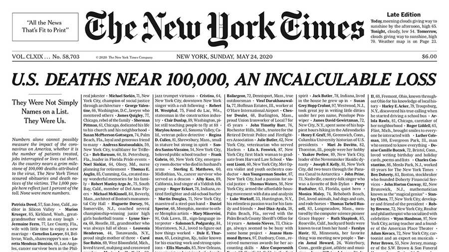
The New York Times main font: Georgia
Georgia is a typeface booming with typographic character, albeit inspired by the need for – and presenting – clarity at low resolutions on the screen. The face radiates a sense of kindness even at small sizes; a sensation of warmness that many might insist has been disintegrated from Times New Roman by overuse.
This is as much proof of the skill of the designer of the typeface, Matthew Carter, as it is of any intrinsic nature of the design of the face because the tiny pixel spaces of the screen can be a nerve-racking canvas. Carter has completely achieved developing a typeface family in Georgia that blends high readability with character and charm.
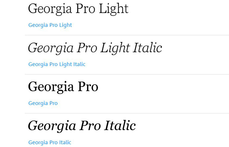
Fonts Similar to Georgia
Miller
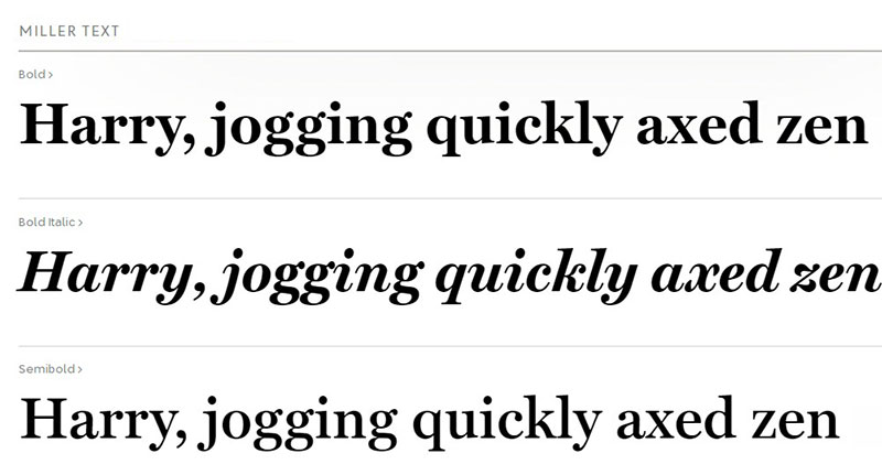
Miller is a Matthew Carter-designed transitional serif typeface family. it was published by the Font Bureau in 1997. It is deemed as a Scotch Roman design – a style that was common during the nineteenth century, originating in Scotland. Miller is closely correlated to the previous Scotch Roman revival of Carter, Microsoft’s very famous Georgia family.
For its use in numerous US newspapers, Miller is successful. It is a big family featuring a special edition of the show as well as small caps and italic small caps. That is a feature usually encountered in historical Scotch Romans.
Kazimir Text
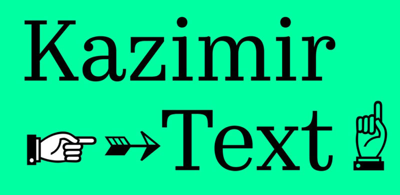
With a somewhat simple graphic idea, Kazimir Text is a stylish serif typeface. It is the writing version of a Kazimir typeface display.
Linked to Kazimir, Kazimir Text has a moderately more extensive proportion, a slightly lower contrast, and an extremely more extensive codepage with widespread language support.
Also reviewed was a collection of stylistic options named Irregular. They also became more fitting for text usage. The number of styles became much broader as well: 11 Romans and 11 Italics.
Abril

Abril is a Modern serif typeface. It was formed by José Scaglione and Veronika Burian. It was published within the Czech Republic-based plant TypeTogether in 2011. The Abril font family is a trustworthy, modern representation of a traditional news face and was used for intense editorial usage in publications, magazines, and digital media.
The Display styles have an influential appearance and a significant touch on the page while the Text styles were superintended from scratch to obtain the right hue, feel, and overall amplitude for convenient, consecutive delivery in printed and digital environments.
What is the New York Times Logo Font?
When we look at The New York Times’ logo, it might seem at first that it is set in the blackletter font. Surprisingly, this logo was actually hand-made.
The logo is based on the Gothic style, also known as the blackletter. It was a style popular in the 12th century and was mostly used in European languages.
Similar Fonts to NYT logo font
English Towne Font
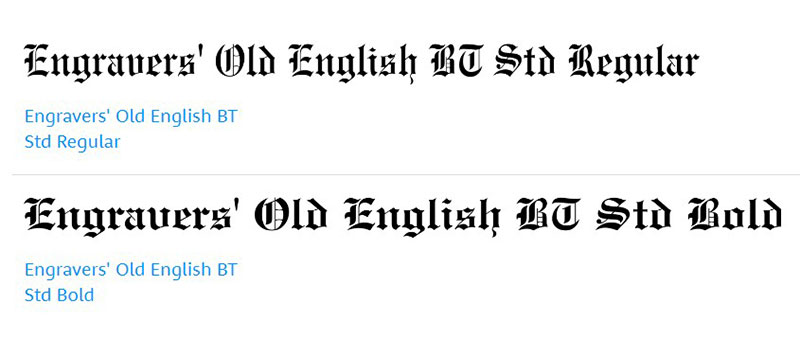
This font was invented by Morris Fuller Benton. Although it was invented in 1907, this font was actually an improved version of the familiar nineteenth century blackletter.
It is a completely free font that is composed of two styles. This font also comes with various family package options which make it ideal for everyday use.
Chomsky
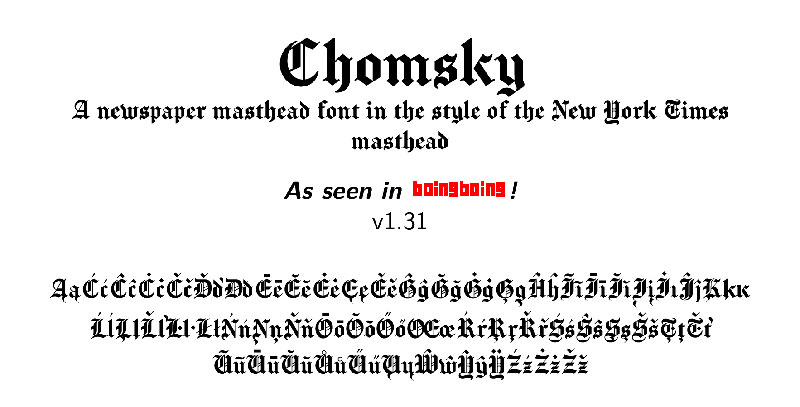
Chomsky is a typeface that has been created by Fredrick Brennan. The name of the font derives from the NYT’s characteristic nameplate. Although it has the same name, the font is not similar at all to the NYT masthead.
NYT’s sans serif font: Arial
Arial
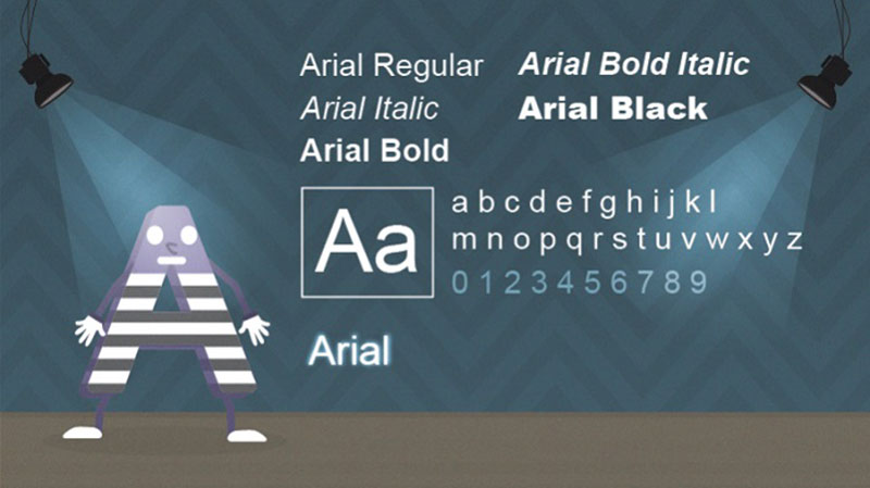
This is a modern sans-serif font. Created by Robin Nicholas and Patricia Saunders, this font was designed for Monotype back in 1982. Arial has become of the most used fonts today. It has become a standard typeface for normal computer usage.
This is a font that is relatively easy to read. That is why it has an immense amount of applications. From book design to advertising and even office communication, this font has been used for so many things. Because the widths are so narrow, the font is ideal for all kinds of posters and large prints.
Similar Fonts to Arial
Helvetica
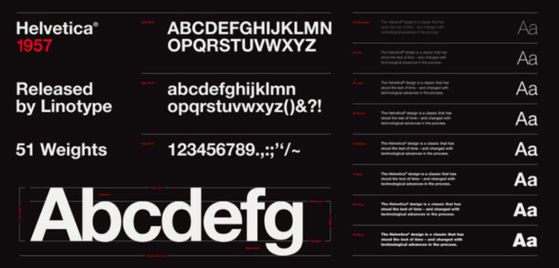
Helvetica is a font that has been created by Max Miedinger. This font has come into use in 1957. The design of this typeface has had most of its inspiration from Akzidenz Grotesk.
This is why Helvetica now is thought as the quintessential neo-grotesque typeface.
Neue Haas Unica

Neue Haas Unica is a font similar to Helvetica. The only difference is that it has a narrower letterforms and the spacing is lightly looser. This family of fonts comes in nine weights. These are ultra light, thin, light, regular, medium, bold, heavy, black and extra black—each with matching italic styles.
Previously used Main font by NYT : Times New Roman
Times New Roman
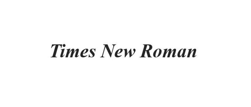
Times New Roman is the most popular serif typeface. This famous font has been commissioned by the British newspaper, The Times. It was created in 1931 by Stanley Morison.
He was an artistic consultant to the British branch of the printing equipment company Monotype. He founded this font in collaboration with Victor Lardent, a lettering artist in The Times’s advertising department. It has become one of the most popular typefaces of all time and is installed on most desktop computers.
Fonts Similar to Times New Roman
Plantin
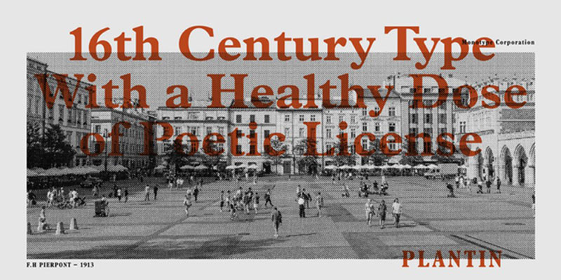
This is another serif typeface. It is transitional and was originally created by Fritz Stelzer and Frank Hinman Pierpont. This was in 1913. The design of this font was created based on a typeface that originated from the sixteenth century.
Nimbus Roman
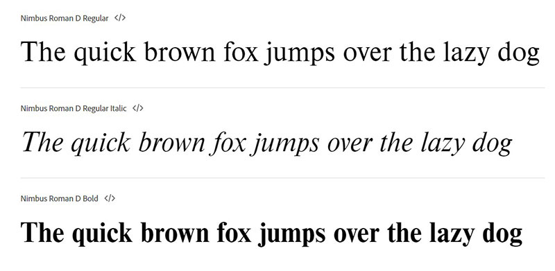
This serif typeface was released in 1982 by the URW. The whole design took inspiration from the Nimbus Roman and Times New Roman font. This font has a sister sans-serif family. This family is based on Helvetica.
FAQ On The Font That New York Times Uses
What Font Does The New York Times Use?
The New York Times’s iconic font is a custom typeface called NYT Cheltenham. Unique to the publication, it carries a profound history. A variant of the original Cheltenham, this custom typeface was meticulously tailored for modern news delivery.
Why Does The New York Times Use a Serif Font?
Serif fonts like NYT Cheltenham offer unparalleled readability for print media. It’s no secret that in the vast sea of typography, serifs guide readers through the text, enhancing comprehension and reducing eye strain—a necessity for the in-depth articles featured by the publication.
Can I Download The New York Times Font?
No, you can’t. The font is proprietary, hence unavailable for public download. If you’re designing editorial content, seek out similar serif fonts like the classic Cheltenham or Franklin Gothic to mimic that publication design feel.
How Has The New York Times Font Changed Over Time?
Since its newspaper publishing inception, the typeface has evolved, undergoing subtle refinements to meet the changing needs of both print and digital typography. New versions maintain legibility while adapting to contemporary design trends.
Is the NYT Typeface Good for Digital Readability?
Absolutely, the customization of NYT Cheltenham considered digital typography as well. It ensures that whether on screen or paper, the text remains crisp, clear, and engaging.
What Makes The New York Times Font Unique?
NYT’s typeface stands out due to its tailored fit for journalistic needs. It balances tradition with innovation, reflecting The New York Times’ visual identity while facilitating content readability.
What Are Some Alternatives to The New York Times Font?
For those without access to the proprietary font, alternatives permeate the graphic design sphere. Serif fonts like Georgia or Times New Roman resonate with similar vibes or consider typeface designers like Morris Fuller Benton’s work for alternatives like Franklin Gothic.
How Does the NYT Typeface Influence Branding?
The NYT newspaper font style is synonymous with credibility. The right typography is paramount in branding, and NYT’s choice exudes authority, reliability, and a nod to journalistic excellence.
Does The New York Times Use the Same Font for Digital and Print?
Cohesion in branding dictates a yes. However, digital typography demands subtle tweaks to serif fonts used in print to optimize them for screens. Balancing aesthetics with functionality is key.
What is the Psychology Behind The New York Times Font Choice?
Publication font psychology isn’t whimsical. The serif font used by NYT suggests formality and respectability, while engaging emotional connections with its readership, crafting a trustworthy space for consuming news.
Conclusion
As we’ve indulged in the intricate dance of serifs and strokes, a revelation unfolds; the font that New York Times uses is more than mere letters on a page. It’s a vessel of tradition infused with innovation—a reflection cast upon the mirror of timelines, both print and digital. The NYT Cheltenham speaks in hushed tones of legacy, commanding respect with each curve and nuance.
And so, the curtain closes on our journey through typefaces and legacies. Like artisans of old, we’ve chiseled away at the stone of typographic design, unveiling the ethos embodied within The New York Times’ choice of font.
Leaving these pages, one carries the weight of understanding; that print media design shapes perceptions, and behind every font lies a narrative. These are the characters that have silently heralded history, and by mastering their craft, the channels of communication remain indelibly clear.
If you liked this article about the New York Times font, you should check out this article about the Yelp font.
There are also similar articles discussing the Shazam font, the Skype font, the MATLAB font, and the Gucci font.
And let’s not forget about articles on the Chanel font, the PayPal font, the McDonald’s font, and the Star Wars font.
Bogdan Sandu, a seasoned designer with 15 years of diverse experience, has been designing websites since 2008.
Renowned for his expertise in logo design and visual branding, Bogdan has developed a multitude of logos for various clients.
His skills extend to creating posters, vector illustrations, business cards, and brochures. Additionally, Bogdan's UI kits were featured on marketplaces like Visual Hierarchy and UI8.
Latest posts by Bogdan Sandu (see all)
- Rainbow Color Palettes for Joyful Designs - 29 April 2024
- The Bethesda Logo History, Colors, Font, And Meaning - 28 April 2024
- Out of This World: Space Color Palettes for Cosmic Designs - 28 April 2024