

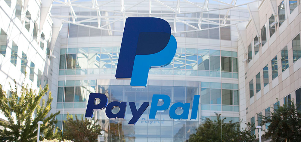
PayPal currently uses PayPal Pro as its primary brand typeface. It is a custom geometric sans-serif font built on LL Supreme, a contemporary redrawing of Futura by the Lineto Type Foundry, and was introduced as part of PayPal’s 2024 identity refresh led by design firm Pentagram.
For its UI and digital interfaces, PayPal previously relied on PayPal Sans, a bespoke humanist sans-serif commissioned from the Klim Type Foundry in 2014. PayPal Sans remains a key part of PayPal’s broader typographic history, even if PayPal Pro now takes center stage in the brand’s visual identity.
What Type of Font Is PayPal Pro?
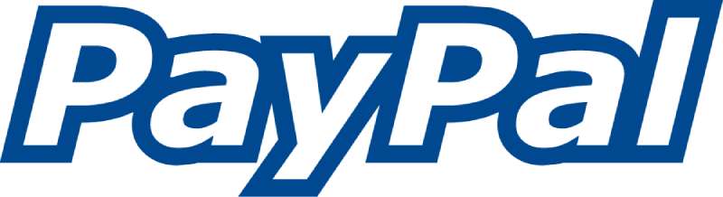
PayPal Pro is a geometric sans-serif typeface. It is built on straight lines and circular curves, both of which are core characteristics of geometric type design.
Its parent typeface, LL Supreme, is itself a modern redrawing of Futura, the iconic geometric sans-serif designed by Paul Renner in 1927. PayPal Pro inherits Futura’s structural logic but adapts it for contemporary brand use across digital and physical touchpoints.
Visually, PayPal Pro reads as clean, open, and assertive. The letterforms carry a confident weight without feeling heavy, which is exactly what a payments brand needs at small sizes on a mobile screen and at large sizes on a billboard.
Pentagram also developed a secondary typeface, PayPal Pro Text, optimized for legibility at small sizes across the PayPal app and interface elements. It serves body copy and UI text where the display cuts of PayPal Pro would be too bold to work well.
Who Designed PayPal Pro?
PayPal Pro was designed by Pentagram, specifically by partner Andrea Trabucco-Campos and his team. It was created in 2024 as part of a full brand identity refresh for PayPal Holdings Inc.
Pentagram worked directly with Lineto Type Foundry to develop PayPal Pro as a custom adaptation of LL Supreme. Lineto is a Swiss type foundry known for rigorous, modernist typeface design.
PayPal Pro is a proprietary typeface. It is not available for public licensing or download. It belongs to PayPal’s exclusive brand system.
PayPal Sans: The Earlier Custom Typeface
Before PayPal Pro, PayPal commissioned a completely different custom typeface. PayPal Sans was designed by Klim Type Foundry, a Wellington-based type studio run by Kris Sowersby, with production contributions from Ben Kiel.
PayPal Sans came in 2 sub-families: PayPal Sans Big and PayPal Sans Small, across 14 styles total. Klim licensed it exclusively to PayPal. No public version exists.
Is PayPal Pro Free to Use?
No. PayPal Pro is proprietary and not available for download or licensing. It was built specifically for PayPal’s brand system and is not sold or distributed publicly.
PayPal Sans carries the same restrictions. Klim Type Foundry licenses it exclusively to PayPal Inc. Unauthorized copies distributed on third-party font sites are not legitimate.
If you need fonts that closely match PayPal’s visual style, the options below are practical, legal alternatives.
Free Alternatives to PayPal Pro
These 5 fonts share key characteristics with PayPal Pro: geometric structure, clean terminals, and strong legibility at both display and small sizes.
| Font | Similarity to PayPal Pro | License | Source |
| Futura PT | Geometric sans-serif, same DNA as LL Supreme | Paid | Adobe Fonts |
| Inter | Clean geometry, excellent screen legibility | Free (OFL) | Google Fonts |
| DM Sans | Open counters, geometric proportions | Free (OFL) | Google Fonts |
| Space Grotesk | Geometric grotesque, modern feel | Free (OFL) | Google Fonts |
| LL Supreme | The direct base of PayPal Pro | Paid | Lineto.com |
Inter is probably the most practical free starting point. It was built for screen interfaces and holds up well at the sizes PayPal typically uses across its checkout flow and app.
If you want to get closer to PayPal Pro’s specific character, LL Supreme is the most accurate reference. It is a commercial geometric font, available directly through Lineto Type Foundry’s site.
What Font Did PayPal Use Before?
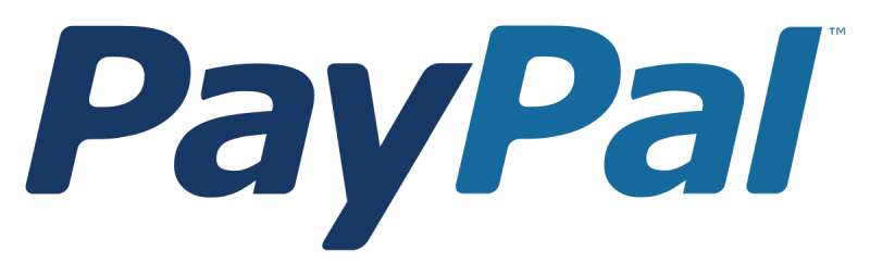
PayPal’s typography has changed 3 times in its history.
1999 to 2014: The original PayPal wordmark used Verdana Bold Italic, a commercial humanist sans-serif designed by Matthew Carter for Microsoft in 1996. Verdana was designed specifically for low-resolution screen rendering, making it a reasonable choice for a digital-native brand in the early 2000s.
2014 to 2024: PayPal commissioned PayPal Sans from Klim Type Foundry. This was a significant upgrade: a purpose-built, mobile-first typeface with 14 styles across 2 sub-families. The brief called for something “fluid, delightful, easy, calm and humanistic.” Klim delivered a humanist sans-serif with flat terminals, open counter-forms, and strong numeral design, critical for a payments platform where numbers are the main event.
2024 to present: Pentagram introduced PayPal Pro as the new brand typeface, shifting from a humanist to a geometric approach. The rebrand moved PayPal away from its long-standing italic wordmark toward an upright, confident typographic identity.
How to Use Fonts Similar to PayPal Pro in Design Tools
Figma and Web
Using Inter as a substitute: Inter is available directly in Figma’s font library. No setup needed. For web use, embed it via Google Fonts with a standard link tag.
The CSS font stack PayPal has historically used in its UI includes system fallbacks alongside its custom typefaces. A similar stack for your own projects might look like this:
“ font-family: 'Inter', -apple-system, BlinkMacSystemFont, 'Segoe UI', Arial, sans-serif; `
This approach prioritizes Inter where available, then falls back to native system fonts on Apple, Windows, and Android devices. It keeps rendering fast and consistent across platforms, which matters for any fintech product.
Canva and Photoshop
Canva: Search “DM Sans” or “Space Grotesk” directly in Canva’s font picker. Both are included in the free library.
For Photoshop, download Inter or DM Sans from Google Fonts, install the font files to your system, and they will appear automatically in Photoshop’s character panel after restarting the application.
Why Did PayPal Choose PayPal Pro?
The 2024 rebrand was a direct response to competitive pressure in the fintech space. PayPal’s brand had not been updated since 2014, and the italic wordmark style it had used since 2000 was starting to feel dated alongside newer payment platforms.
Pentagram’s rationale was clear: PayPal needed a typeface that communicated boldness, confidence, and clarity without relying on color or decorative elements. The shift from PayPal Sans (humanist) to PayPal Pro (geometric) reflects that shift in priorities from warm and approachable to direct and authoritative.
The decision to base PayPal Pro on LL Supreme, which is itself rooted in Futura, is worth noting. Futura has over 90 years of use in institutional and corporate contexts. It carries an inherent sense of permanence. For a brand trying to position itself as universal infrastructure for global payments, that typographic heritage is useful.
The move to an upright, black wordmark also separates PayPal visually from the italic-heavy aesthetic common in fintech branding. Most payment apps have leaned into motion, color, and softness. PayPal went the other direction: static, high-contrast, typographically led.
The earlier decision to commission PayPal Sans from Klim in 2014 followed a similar logic. PayPal was competing with Apple (San Francisco), Google (Roboto), and a dozen Helvetica derivatives. Going humanist was a way to stand apart from the neo-grotesque groupthink that dominated Silicon Valley UI design at the time. It worked for a decade. PayPal Pro represents the next chapter.
Both decisions reflect the same underlying principle: typography in financial services is not decorative. It is functional trust. The right typeface signals reliability before a single word is read. That is why PayPal has invested in custom typefaces twice, rather than licensing something off the shelf.
Other fintech brands have made similar choices. If you’re curious how competitors approach this, it’s worth comparing to Cash App’s font choices or the typeface Venmo uses, both of which reflect very different brand personalities despite operating in the same payments space.
The psychology behind font choices like these is well-documented. Geometric sans-serifs consistently test higher for perceived authority and trustworthiness in financial contexts. Humanist sans-serifs tend to score better on warmth and approachability. PayPal’s shift from one to the other tells you something about where the brand thinks it needs to go.
For designers working on fintech or payment products, PayPal’s typographic evolution is a useful case study in how font choices for branding connect directly to strategic positioning, not just aesthetics.
FAQ on What Font Does PayPal Use
What is the official PayPal font?
PayPal’s current brand typeface is PayPal Pro, a custom geometric sans-serif introduced in 2024.
It is built on LL Supreme by Lineto Type Foundry, which is itself a modern redrawing of Futura. Pentagram designed it as part of a full identity refresh.
What font does the PayPal logo use?
The PayPal logo wordmark is set in PayPal Pro.
The 2024 rebrand dropped the long-standing italic style used since 2000. The wordmark is now upright, black, and typographically independent from the double-P monogram.
Did PayPal always use the same font?
No. PayPal has used 3 distinct typefaces. It started with Verdana Bold Italic, switched to the custom PayPal Sans in 2014, then moved to PayPal Pro in 2024.
Each change reflected a shift in brand strategy.
What is PayPal Sans?
PayPal Sans is a custom humanist sans-serif typeface commissioned from Klim Type Foundry in 2014.
It comes in 2 sub-families (Big and Small) across 14 styles. It was designed to be mobile-first and numeral-centric. It is licensed exclusively to PayPal.
Is the PayPal font free to download?
No. Both PayPal Pro and PayPal Sans are proprietary. Neither is available for public licensing.
Unauthorized copies found on third-party font sites are not legitimate. If you need something similar, use Inter or DM Sans as free alternatives.
What font is closest to PayPal Pro?
LL Supreme by Lineto is the closest, since PayPal Pro is directly based on it. It is a paid commercial typeface.
For free options, Inter and Work Sans share the clean geometric structure of PayPal Pro without licensing costs.
Who designed the PayPal font?
PayPal Pro was created by Pentagram, led by partner Andrea Trabucco-Campos, in collaboration with Lineto Type Foundry in 2024.
PayPal Sans was designed by Kris Sowersby of the Klim Type Foundry, with production by Ben Kiel, starting in May 2014.
What font does PayPal use on its website and app?
PayPal’s UI has historically used PayPal Sans alongside system fallbacks like system fonts such as Helvetica Neue and Arial in its CSS stack.
Since the 2024 rebrand, PayPal Pro and PayPal Pro Text are being rolled out across digital touchpoints.
Why did PayPal change its font in 2024?
The rebrand aimed to move PayPal’s identity from warm and approachable to bold and authoritative. PayPal Pro’s geometric structure signals confidence, which fits the brand’s push to be seen as universal payments infrastructure.
The old italic wordmark had been in place since 2000 and was overdue for a change.
How does PayPal’s font compare to other payment apps?
PayPal Pro is more structured and geometric compared to competitors. Cash App leans on a softer grotesque, while Venmo uses a more playful typographic approach.
PayPal’s shift to geometric type positions it closer to institutional finance than consumer fintech.
Conclusion
If you’ve been trying to figure out what font does PayPal use, the short answer is PayPal Pro, a custom geometric sans-serif built on LL Supreme and developed by Pentagram in 2024.
Before that, PayPal Sans handled UI and digital interface typography for a decade, commissioned from Klim Type Foundry with a strict mobile-first, numeral-centric brief.
Neither typeface is publicly available. For the closest free alternatives, Inter and DM Sans are solid starting points that share the same clean, open structure found in PayPal’s brand font family.
PayPal’s typographic decisions reflect a deliberate font strategy, not just an aesthetic preference. The shift from humanist to geometric signals a brand repositioning toward authority and universal reach in the visual hierarchy of global fintech.

Renowned for his expertise in logo design and visual branding, Bogdan has developed a multitude of logos for various clients.
His skills extend to creating posters, vector illustrations, business cards, and brochures. Additionally, Bogdan's UI kits were featured on marketplaces like Visual Hierarchy and UI8.
He also wrote in the past years on sites like Design Your Way, WebDesignerDepot, WPDean, Designmodo, Speckyboy, Slider Revolution, and more.
- Canva vs Midjourney: AI Design Tools Compared - 28 September 2026
- A Brand Identity Is Only Finished When Someone Else Can Use It - 28 September 2026
- Friendly Karla Font Pairing Ideas for Modern Brands - 26 September 2026

Bogdan Sandu is a seasoned designer who has been designing websites since 2008. Renowned for his expertise in logo design and visual branding, Bogdan has developed a multitude of logos for various clients. His skills extend to creating posters, vector illustrations, business cards, and brochures. Additionally, Bogdan's UI kits were featured on marketplaces like Visual Hierarchy and UI8. He also wrote in the past years on sites like Design Your Way, WebDesignerDepot, WPDean, Designmodo, Speckyboy, Slider Revolution, and more.
You Might Also Like


