Some fonts just hit different. The best 90s fonts shaped an entire decade of visual culture, from grunge album covers to early web pages.
These typefaces defined the era. Comic Sans. Papyrus. Impact. Template Gothic. Love them or hate them, they’re burned into our collective memory.
The 90s produced some of the most polarizing fonts ever created. Many became iconic fonts that still appear everywhere today. Others represent bold experiments in digital type design.
This guide covers 21 essential 90s typefaces. You’ll learn their origins, design characteristics, cultural impact, and where to find them for your own retro projects.
The Best 90s Fonts
| Font Name | Primary Usage Context | Visual Characteristics | Era Association |
|---|---|---|---|
| Comic Sans MS | Casual communication, children’s content, informal web design | Rounded letterforms, handwritten appearance, friendly aesthetic | Mid-1990s casual computing |
| Papyrus | Ancient themes, spiritual content, organic branding | Rough edges, hand-carved texture, irregular baseline | Late-1990s mystical design |
| Impact | Headlines, memes, attention-grabbing text, bold statements | Extremely condensed, heavy weight, high contrast | 1990s digital publishing |
| Cooper Black | Retro advertising, vintage branding, 1970s revival | Ultra-bold serifs, rounded terminals, high x-height | 1920s origin with 1990s resurgence |
| Eurostile | Technology branding, sci-fi media, automotive design | Square geometric forms, modern industrial aesthetic, technical precision | 1990s tech boom futurism |
| Curlz MT | Party invitations, craft projects, decorative headers | Spiral embellishments, playful curves, ornamental style | 1990s desktop publishing |
| VAG Rounded | Corporate identity, automotive branding, modern signage | Rounded terminals, geometric sans-serif, approachable formality | 1980s–1990s corporate modernism |
| Bank Gothic | Military themes, institutional signage, authoritative text | Angular geometry, capital-only design, compressed proportions | 1930s origin with 1990s revival |
| Snap ITC | Grunge design, alternative culture, distressed aesthetics | Fragmented characters, broken structure, deconstructed forms | 1990s grunge typography |
| FF Blur | Motion graphics, experimental design, dynamic layouts | Motion blur effect, soft edges, kinetic appearance | 1990s digital experimentation |
| Template Gothic | Industrial design, architectural documentation, technical manuals | Stencil-style cutouts, utilitarian construction, modular letterforms | Early-1990s industrial aesthetic |
| Kristen ITC | Informal documents, personal notes, casual correspondence | Handwriting simulation, irregular baseline, casual marker style | 1990s handwritten fonts |
| Baby Kruffy | Children’s materials, playful branding, youth marketing | Chunky letters, childlike strokes, irregular proportions | Late-1990s youth culture |
| Harlow Solid Italic | Wedding invitations, formal certificates, elegant signage | Flowing script, ornate capitals, calligraphic elegance | 1990s formal typography |
| Ethnocentric | Tribal design, cultural branding, ethnic merchandise | Geometric patterns, angular construction, cultural motifs | 1990s multicultural design |
| Neon Lights | Nightlife branding, retro signage, entertainment venues | Glowing tube effect, luminous appearance, electric aesthetic | 1990s neon revival |
| Arcade Classic | Video game interfaces, retro gaming, pixel art projects | Bitmap construction, 8-bit style, pixelated rendering | 1980s–1990s arcade gaming |
| Puffypuff | Bubblegum branding, kawaii design, youth products | Inflated appearance, bubble-like forms, soft rounded shapes | Late-1990s cute culture |
| Wasted Youth | Punk design, rebellious branding, counterculture media | Destroyed letterforms, aggressive texture, anarchic style | 1990s punk typography |
| Pulp Display | Retro publishing, pulp fiction covers, vintage posters | Bold serifs, condensed width, dramatic contrast | 1940s–1950s with 1990s revival |
| Super Retro M54 | Retro branding, vintage advertising, nostalgic design | Chromatic layers, dimensional effect, 1970s-inspired styling | 1990s retro revival movement |
Comic Sans MS

Vincent Connare designed Comic Sans MS in 1994 while working at Microsoft. He created it using only a mouse, drawing intentionally unpolished letters inspired by comic books like Watchmen and The Dark Knight Returns.
The font was originally meant for Microsoft Bob, a children’s software program featuring a cartoon dog named Rover. Connare thought Times New Roman looked ridiculous in speech bubbles. He missed the deadline for Bob, but the font shipped with Windows 95 Plus Pack instead.
Design Characteristics
Comic Sans is a casual, non-connecting script typeface. It mimics hand-lettered comic book text.
Key visual features:
- Irregular letterforms that appear hand-drawn
- No sharp corners or rigid geometry
- High x-height for better readability on screens
- Available in Regular and Bold weights only
The design intentionally lacks kerning precision. This was deliberate. Connare wanted a loose, casual feel that matched cartoon aesthetics.
Cultural Context
Comic Sans became one of the most polarizing fonts in design history. Some call it the best joke ever told. Others want it banned.
The font gained massive popularity because Microsoft bundled it with Windows and Office. Suddenly everyone had access to it. Non-designers loved it for birthday invitations, church flyers, and passive-aggressive office notes.
Graphic designers? Not so much. The “Ban Comic Sans” movement started in 1999. But here’s the thing: the hatred often misses the point. Comic Sans was never meant for serious documents.
Use Cases
Where Comic Sans actually works:
- Children’s educational materials
- Informal family communications
- Dyslexia-friendly documents (some studies suggest it helps)
- Anything requiring a playful, approachable tone
Avoid it for corporate branding, legal documents, or anywhere professionalism matters. Font psychology is real, and Comic Sans screams “casual.”
Availability
- Source: Bundled with Microsoft Windows and Office
- Licensing: System font (free with Windows/Mac)
- Web support: Web-safe font, available on most devices
- Variants: Comic Neue (2014 redesign by Craig Rozynski)
Papyrus

Chris Costello hand-drew Papyrus in 1982 when he was 23 years old. He spent six months creating it with a calligraphy pen on textured paper. His goal? Simulate how English text might have looked written on papyrus 2,000 years ago.
Letraset released it commercially in 1983. Costello sold the rights for just $750. He still receives minimal royalties despite the font shipping on every Mac and Windows computer since the late 1990s.
Design Characteristics
Papyrus is classified as a fantasy or calligraphic typeface. It attempts to merge Roman letterforms with ancient handwritten aesthetics.
Distinctive features include:
- Rough, irregular edges on every stroke
- High horizontal strokes in capitals
- Sweeping curves that suggest hand-chiseling
- Only one weight available (Regular)
The baseline is intentionally uneven. Letters appear carved rather than printed. It looks ancient by design.
Cultural Context
Papyrus became the go-to font for anything “earthy” or “mystical” during the 90s and 2000s. Yoga studios. New Age shops. Hookah bars. If a business wanted to seem spiritual or exotic, they slapped Papyrus on everything.
Then came Avatar in 2009. Director James Cameron used Papyrus for subtitles and a modified version for the logo. A 2017 Saturday Night Live sketch featuring Ryan Gosling brutally mocked this choice. The sketch became iconic, with Gosling portraying a man driven mad by the “lazy” typography decision.
The video game Undertale features a skeleton character named Papyrus whose dialogue appears in the font.
Use Cases
When Papyrus might work:
- Biblical or historical themes (its original intent)
- Fantasy book covers
- Mediterranean restaurant menus
- Certain craft or artisan branding
When to avoid it: basically everywhere else. Like Comic Sans, overuse killed its credibility. Most designers consider it amateur hour.
Availability
- Source: Bundled with Microsoft Office and macOS
- Licensing: System font
- Web support: Widely available but rarely recommended
- Owner: ITC (International Typeface Corporation)
Impact

Geoffrey Lee designed Impact in 1965 for the Stephenson Blake foundry in Sheffield, England. It was one of their final metal typefaces before phototypesetting took over.
Lee was an advertising director. He built Impact specifically for poster design and publicity materials. The name says it all. This font was engineered to grab attention.
Design Characteristics
Impact is a condensed, industrial sans-serif font. Everything about it screams “LOOK AT ME.”
Technical specifications:
- Ultra-heavy stroke weight
- Extremely compressed letterspacing
- Minimal counter spaces (the holes inside letters)
- Very high x-height (nearly three-quarters of cap height)
- Short ascenders and descenders
The original metal type included alternate forms for ‘J’ and ‘r’. Most digital versions dropped these.
Cultural Context
Impact lived quietly in advertising for decades. Then Microsoft bundled it with Windows 98 as part of the Core Fonts for the Web package.
By the 2010s, Impact became THE meme font. Those white-text-black-outline image macros you see everywhere? That’s Impact. The format became so standardized that using any other font for memes felt wrong.
The font’s extreme weight and condensed form meant text remained readable even when shrunk or placed over busy images.
Use Cases
Impact excels at:
- Headlines requiring maximum visual weight
- Meme creation (obviously)
- Posters where space is limited
- Any display font application needing urgency
Poor choices include body text, anything requiring elegance, or situations where subtlety matters. Impact doesn’t do subtle.
Availability
- Source: Microsoft Windows, Core Fonts for the Web
- Licensing: Bundled system font; commercial licenses via Monotype
- Web support: Excellent (web-safe since 1996)
- Variants: Impact 2010 added OpenType features
Cooper Black
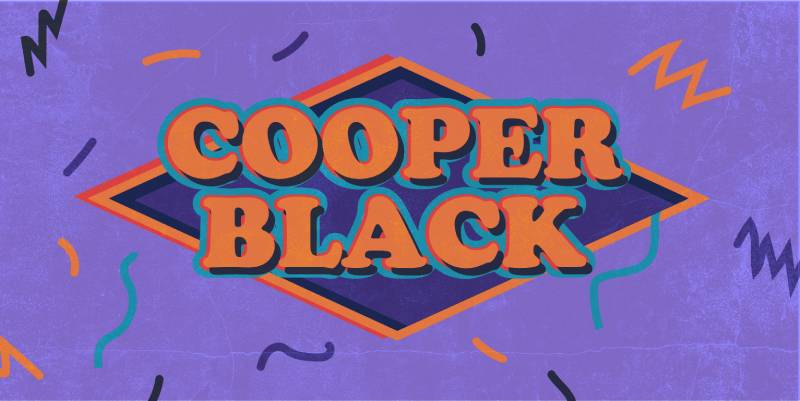
Oswald Bruce Cooper designed Cooper Black in 1921, with Barnhart Brothers & Spindler releasing it in 1922. It was the extra-bold extension of his earlier Cooper Old Style.
The font became ATF’s second-best-selling typeface ever, behind only Copperplate Gothic. Cooper advertised it as being “for far-sighted printers with near-sighted customers.” Critics called it “the Black Menace.”
Design Characteristics
Cooper Black is an ultra-bold serif font with a distinctively soft, friendly appearance.
What makes it unique:
- Rounded serifs that almost melt into strokes
- Low contrast between thick and thin elements
- Bouncy, slightly irregular letterforms
- Backward-tilting counters on ‘O’ and ‘Q’
- Elliptical dots on ‘i’ and ‘j’
Cooper spent three years perfecting the design. He redrew some letters dozens of times to capture his personal hand-lettering style.
Cultural Context
Cooper Black dominated 1920s advertising. Then it faded during the modernist 1960s.
Everything changed with the Beach Boys’ Pet Sounds album cover in 1966. Suddenly Cooper Black was everywhere again. David Bowie’s Ziggy Stardust, The Doors’ L.A. Woman, TV shows like MASH* and Garfield.
It became shorthand for “retro” and “friendly.” The typeface experienced another revival in the 2010s with Tyler, the Creator’s Odd Future collective using it extensively.
Use Cases
Cooper Black works beautifully for:
- Vintage or retro branding projects
- Music and entertainment graphics
- Children’s media
- Any design needing warmth without sacrificing boldness
The font pairs surprisingly well with clean modern sans-serifs. The contrast creates visual interest.
Availability
- Source: Adobe Fonts, Bitstream, URW
- Licensing: Commercial license required
- Web support: Available via Adobe Fonts subscription
- Variants: Cooper Hilite, Cooper Black Italic, Condensed versions
Eurostile
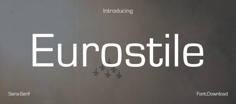
Aldo Novarese designed Eurostile in 1962 for the Nebiolo foundry in Turin, Italy. It evolved from his earlier all-caps design Microgramma (1952), adding lowercase letters and expanded weights.
Novarese was one of the 20th century’s most prolific type designers, creating over 100 typefaces. Eurostile became his most famous work internationally.
Design Characteristics
Eurostile is a geometric sans-serif with a distinctive “superellipse” shape. The letters aren’t quite square, aren’t quite round.
Key features:
- Softly rounded corners on otherwise angular forms
- Monolinear strokes (consistent thickness)
- Square proportions suggesting technology and precision
- The shape evokes 1950s/60s television screens
Original release included Demi, Demi Extended, and Bold Extended. Later expansions added condensed and compact variants.
Cultural Context
Eurostile became synonymous with science fiction and futurism. If a movie or TV show was set in the future, chances are Eurostile appeared somewhere.
Notable uses include 2001: A Space Odyssey, The Andromeda Strain, and countless sci-fi book covers. It also served corporate clients like Toshiba and Dimension Films.
The typeface captured the Space Age optimism of the 1960s. It still reads as “futuristic” today, though perhaps in a retro way.
Use Cases
Eurostile fits naturally in:
- Technology and science branding
- Sci-fi and speculative fiction projects
- Industrial and architectural signage
- Any design evoking mid-century modernism
The extended widths work particularly well for headlines. Compact versions suit tighter spaces.
Availability
- Source: Linotype, Adobe Fonts
- Licensing: Commercial license required
- Web support: Available via subscription services
- Variants: Eurostile Next (Akira Kobayashi redesign), Eurostile Candy, Square 721 (Bitstream clone)
Curlz MT

Carl Crossgrove and Steve Matteson designed Curlz MT in 1995 for Agfa Monotype. The font shipped with Microsoft Project and later Microsoft Office for Mac.
Matteson has publicly stated Curlz wasn’t their proudest moment as designers. That’s telling.
Design Characteristics
Curlz is a decorative display font featuring wavy strokes and swirls on virtually every letter.
Visual attributes:
- Curly flourishes at stroke beginnings and endings
- Playful, almost juvenile appearance
- Single weight only (Regular)
- Limited character set compared to professional typefaces
The font screams “party” and “fun” in the loudest possible way.
Cultural Context
Like Comic Sans and Papyrus, Curlz joins the trinity of “most hated fonts” among designers. It appeared on countless birthday party invitations, scrapbook pages, and PTA flyers throughout the late 90s and 2000s.
The problem isn’t the font itself. It’s the overuse. And misuse. Curlz on a law firm letterhead? Actually happened.
Use Cases
Where Curlz might work:
- Children’s birthday invitations
- Craft projects
- Scrapbooking
- Anything intentionally kitschy
Where to avoid: professional contexts, serious communications, anywhere you want to be taken seriously.
Availability
- Source: Microsoft Office, Monotype
- Licensing: Bundled with Microsoft products; commercial license via Monotype
- Web support: Limited
- Alternatives: Cherubina, ITC Cinderella
VAG Rounded
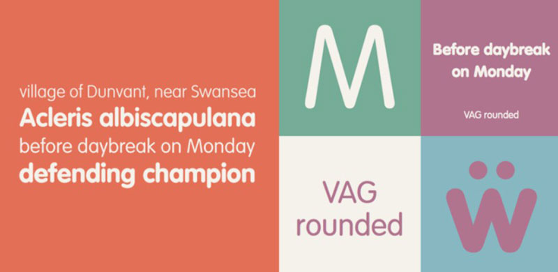
Volkswagen AG commissioned VAG Rounded in 1979 as their unified corporate typeface following the VW-Audi merger. Gerry Barney led the design team at Sedley Place in the UK. Other contributors included David Bristow, Terence Griffin, Ian Hay, and Kit Cooper.
The font served Volkswagen’s global marketing for over a decade before public release in 1989.
Design Characteristics
VAG Rounded is a geometric sans-serif with distinct rounded terminals on every stroke.
Technical details:
- Four weights: Thin, Light, Bold, and Black
- Resembles Futura but with softened endpoints
- Clean, friendly appearance without sharp corners
- Excellent legibility at various sizes
The rounded terminals give it warmth that typical geometric fonts lack.
Cultural Context
After public release, VAG Rounded became bundled with desktop publishing software throughout the late 80s and 90s. Millions of users suddenly had access.
The font experienced a major revival around 2006 with Web 2.0 startups. That friendly, approachable look fit perfectly with the era’s aesthetic. T-Mobile USA adopted it. Apple used it on laptop keyboards from 1999 until replacing it with San Francisco in 2015.
Australian retailer Big W switched their entire brand identity to VAG Rounded.
Use Cases
VAG Rounded excels at:
- Logo design requiring approachability
- Corporate identity systems wanting warmth
- Tech startup branding
- Signage and wayfinding
For pairing fonts, try contrasting VAG Rounded with reserved serifs or condensed gothics like Trade Gothic.
Availability
- Source: Linotype, Adobe Fonts
- Licensing: Commercial license required
- Web support: Available via subscription
- Alternatives: MgOpen Modata (free), Nunito
Bank Gothic

Morris Fuller Benton designed Bank Gothic for American Type Founders between 1930 and 1933. Benton drew inspiration from a 19th-century gravestone inscription he’d recorded via rubbing.
As ATF’s chief type designer from 1900 to 1937, Benton created 221 typefaces. Bank Gothic remains among his most recognizable.
Design Characteristics
Bank Gothic is a rectilinear geometric sans-serif. Capitals only in the original release.
Defining features:
- Squared-off letterforms with subtly rounded corners
- All-caps design (lowercase added in later revivals)
- Three weights: Light, Medium, Bold
- Available in regular and condensed widths
The font straddles the line between precision and friendliness. Those rounded corners soften what would otherwise feel cold and mechanical.
Cultural Context
Bank Gothic started as a business card and corporate stationery font. Small print sizes. Professional applications.
Then Hollywood discovered it. From the late 20th century onward, Bank Gothic became shorthand for “military,” “corporate,” “sports,” or “science fiction.” Video games, movie posters, TV title sequences.
Arsenal’s Emirates Stadium features Bank Gothic prominently. The typeface appears in countless action films and video games when designers want something authoritative but modern.
Use Cases
Bank Gothic works for:
- Sports branding and athletic wear
- Military or tactical aesthetics
- Corporate communications requiring gravitas
- Science fiction and gaming graphics
- Architectural signage
The condensed cuts save space while maintaining impact.
Availability
- Source: Adobe Fonts, Bitstream, FontHaus
- Licensing: Commercial license required
- Web support: Available via subscription services
- Variants: DeLuxe Gothic (with lowercase), Science Gothic (variable font)
Snap ITC
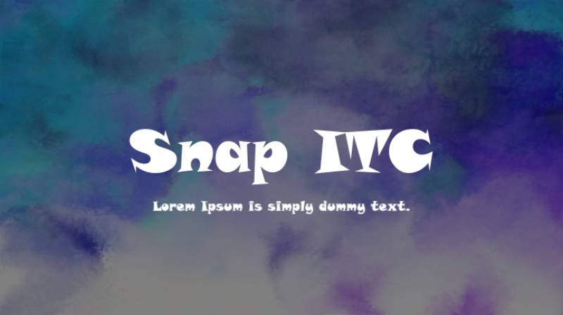
David Sagorski designed ITC Snap in 1995 for the International Typeface Corporation. The Kansas-born designer later relocated to Florida, where he studied at the Art Institute of Fort Lauderdale.
The font draws obvious inspiration from 1960s and 70s cartoon graphics. Think Gerald McBoing-Boing or The Jetsons. Microsoft bundled it with various Office products.
Design Characteristics
Snap ITC is a decorative display face with a distinctly retro-futuristic feel.
Key features:
- Angular letterforms with sharp, pointed terminals
- Latin serif influences mixed with cartoon aesthetics
- Single weight only
- Strong, attention-demanding presence
The typography suggests both whimsy and strength. Those angular cuts give it Superman-level power beneath the playful surface.
Cultural Context
Snap captured the decade’s fascination with mid-century modernism filtered through a cartoonish lens. It appeared everywhere during the late 90s. Church newsletters. Elementary school projects. Small business flyers.
Like many ITC fonts of that era, Snap found its way onto countless computers through Microsoft’s software bundling deals. Instant accessibility meant instant overexposure.
Use Cases
Where Snap works well:
- Retro-themed party invitations
- Children’s entertainment graphics
- Nostalgic 60s/70s revival projects
- Attention-grabbing headlines
Avoid for professional documents, body text, or anything requiring subtlety.
Availability
- Source: ITC, Microsoft Office
- Licensing: Bundled with Microsoft products; commercial license via Monotype/ITC
- Web support: Limited
- Formats: TrueType, OpenType
FF Blur

Neville Brody created FF Blur in 1991 for FontFont. His process was brilliantly simple: he took Akzidenz-Grotesk, ran it through Photoshop’s blur filter three times, then vectorized the results.
Each pass through the filter created a different weight. Light, Medium, Bold. The font was an immediate conversation piece.
In 2011, MoMA added FF Blur to their permanent Architecture and Design Collection.
Design Characteristics
FF Blur is an experimental sans-serif where the “flaws” are the features.
Technical specifications:
- Three weights: Light, Medium, Bold
- Soft, diffused edges on all letterforms
- Reduced legibility by design
- Blobby, organic appearance
The font looks permanently out of focus. That’s the point.
Cultural Context
Brody co-founded FontFont with Erik Spiekermann in 1990. They wanted a foundry that pushed boundaries. FF Blur delivered.
The typeface became symbolic of early 90s postmodern design, where imperfection was celebrated. It influenced the “blobby” aesthetic that would later define Y2K design.
Brody was already a design icon through his work on The Face magazine. FF Blur cemented his reputation as someone willing to break typographic rules.
Use Cases
FF Blur excels in:
- Experimental graphic design
- Poster and billboard applications
- Editorial design seeking edge
- Branding for creative industries
Not recommended for anything requiring legibility at small sizes.
Availability
- Source: FontFont (now Monotype)
- Licensing: Commercial license required
- Web support: Available via subscription
- Features: Ligatures, alternate characters, case-sensitive forms
Template Gothic
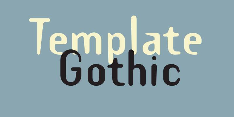
Barry Deck designed Template Gothic in 1990 while studying at CalArts. Emigre released it in 1991. The inspiration? A hand-lettered sign in his neighborhood laundromat.
Someone had used a plastic lettering template to create that sign. The naive quality captivated Deck. He wanted to recreate those “distortive ravages of photomechanical reproduction.”
MoMA included Template Gothic in their permanent collection in 2011.
Design Characteristics
Template Gothic is a sans-serif that deliberately looks imperfect.
Defining traits:
- Irregular letterforms mimicking hand-stenciling
- Slightly wobbly baseline
- Organic curves suggesting manual creation
- Available in multiple weights
The font embodies controlled chaos. Each letter appears traced rather than drawn.
Cultural Context
Emigre called it “the typeface of the decade.” They weren’t wrong.
Template Gothic became ubiquitous by the late 1990s. It represented the postmodern rejection of modernist perfection. Deck articulated this philosophy: he wanted type reflecting “the imperfect language of an imperfect world, inhabited by imperfect beings.”
The font appeared in Ray Gun, Wired, I.D. Magazine, and countless graphic design projects seeking that raw, handmade edge.
Use Cases
Template Gothic fits:
- Alternative music and culture branding
- Editorial design with attitude
- Projects requiring vernacular authenticity
- Anything embracing imperfection
The font pairs well with cleaner typefaces for contrast.
Availability
- Source: Emigre, Adobe Fonts
- Licensing: Commercial license required
- Web support: Available via subscription services
- Variants: Template Gothic includes serif variations added in 1992
Kristen ITC

George Ryan designed ITC Kristen for the International Typeface Corporation. He found inspiration in a handwritten menu at a Cambridge, Massachusetts restaurant.
Ryan described it as “not your average text or display font.” The forms evolved from that restaurant menu toward something resembling a child’s handwriting.
Design Characteristics
Kristen ITC is a casual script font with deliberate asymmetry.
Visual attributes:
- Uneven baseline creating a bouncy rhythm
- Childlike, playful letterforms
- Two weights available (Regular, Bold)
- Legible despite its informal appearance
The font manages to look hand-scrawled while remaining readable. That’s harder than it sounds.
Cultural Context
Microsoft bundled Kristen ITC with Publisher 2000, exposing it to millions of users. It became a go-to for anyone wanting “fun” typography without understanding typography.
Like Curlz and Comic Sans, Kristen ITC suffered from overuse in inappropriate contexts. Wedding invitations. Business cards. Serious documents that needed anything but serious fonts.
Use Cases
Kristen ITC works for:
- Children’s products and entertainment
- Casual invitations
- Scrapbooking and craft projects
- Playful brand identities
Avoid for professional communications or anywhere a childlike vibe would undermine your message.
Availability
- Source: ITC, Microsoft Publisher
- Licensing: Bundled with Microsoft products; commercial license via ITC
- Web support: Limited
- Character set: Includes Cyrillic support in some versions
Baby Kruffy
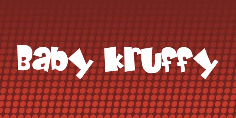
Fontalicious released Baby Kruffy in 1999. The designer described it as the smoother, more refined sibling to their earlier font Kruffy. “As Pac-Man is to Junior Pac, Baby Kruffy is to Kruffy.”
The foundry admitted not every font they created was a masterpiece. They took extra time with this one.
Design Characteristics
Baby Kruffy is a cartoon-style decorative font.
Key features:
- Bubbly, rounded letterforms
- Playful, juvenile appearance
- Extensive character set (241 characters)
- Includes Euro characters and math symbols
Unlike its predecessor, Baby Kruffy has smoother curves. Less rugged, more approachable.
Cultural Context
Baby Kruffy represents the explosion of free fonts during the late 90s internet boom. Sites like DaFont and 1001 Fonts distributed thousands of amateur and semi-professional designs.
Not every free font deserved attention. But they democratized type design. Suddenly anyone could download quirky typefaces for their GeoCities pages or school projects.
Use Cases
Baby Kruffy suits:
- Children’s birthday invitations
- Playful social media graphics
- Comic and cartoon projects
- Informal personal designs
This font works best large and in short bursts. Don’t use it for body text.
Availability
- Source: Fontalicious, various free font sites
- Licensing: Free for personal use; commercial license available
- Web support: Limited
- Postscript: Commercial version available from foundry
Harlow Solid Italic
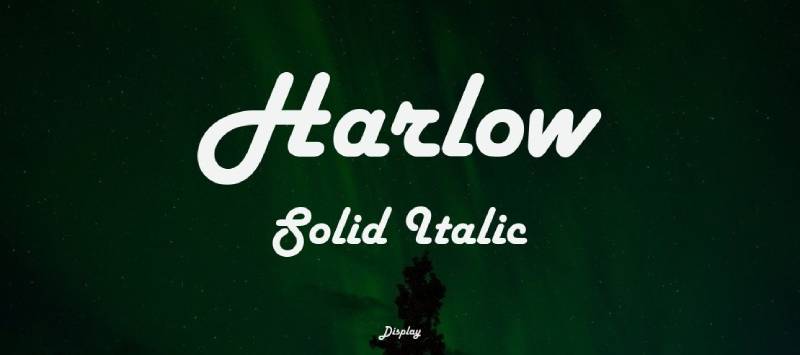
Colin Brignall designed Harlow for Letraset in 1977. The solid variant followed in 1979. Microsoft bundled Harlow Solid Italic with Office products, spreading it widely.
Brignall drew inspiration from Streamline Moderne lettering of the 1930s and 40s. The font captures that era’s sleek optimism.
Design Characteristics
Harlow Solid Italic is a decorative display face with Art Deco DNA.
Visual traits:
- Strong geometric letterforms
- Dramatic contrast between capitals and lowercase
- Streamlined, speed-suggesting shapes
- Italic slant adds dynamism
The capitals are extravagant. The lowercase stays relatively restrained. That contrast creates visual tension.
Cultural Context
Harlow evokes diners, neon signs, and chrome-accented jukeboxes. During the 90s, designers reached for it whenever projects needed instant retro glamour.
The font appeared on restaurant menus, wedding invitations, and anything wanting that “classy vintage” feel. Microsoft’s bundling made it accessible to everyone with a computer.
Use Cases
Harlow Solid Italic fits:
- Retro restaurant branding
- Event invitations with vintage themes
- Film and theater promotion
- 1930s/40s period-accurate design
The font makes strong headlines but struggles at small sizes.
Availability
- Source: Microsoft Office, ITC/Monotype
- Licensing: Bundled with Microsoft products; commercial license available
- Web support: Limited
- Variants: Shadowed version sold commercially
Ethnocentric

Ray Larabie designed Ethnocentric for his foundry Typodermic, with the original version appearing around 1999. The font emerged from a misremembered glimpse of a sign that stuck in Larabie’s mind.
Larabie founded Typodermic in 2001 in Canada, later relocating to Nagoya, Japan. He’s created over 3,000 fonts, but Ethnocentric remains one of his most downloaded.
Design Characteristics
Ethnocentric is a retro-futurist display face built for speed.
Defining features:
- Wide, extended letterforms
- Sharp diagonal cuts creating “speed gaps”
- Pod-like shapes suggesting horizontal movement
- Six weights plus italics
The design screams late-90s tech culture. Every letter looks ready to race off the screen.
Cultural Context
Ethnocentric filled a gap in the sci-fi typography market. Before Larabie and other independent designers started releasing futuristic free fonts, options were limited to expensive commercial faces like Eurostile.
The font became a fixture in gaming, motorsports branding, and science-fiction projects. Its accessibility (free for personal use) fueled widespread adoption.
Use Cases
Ethnocentric excels at:
- Video game interfaces and titles
- Motorsports and automotive branding
- Science fiction projects
- Technology company identities
The lighter weights work surprisingly well for elegant tech applications.
Availability
- Source: Typodermic, Adobe Fonts, DaFont
- Licensing: Free for personal and commercial use (desktop); premium options available
- Web support: Available
- Character set: 366 glyphs, supports 56 languages
Neon Lights
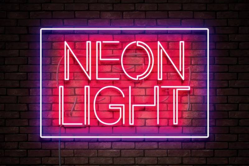
“Neon Lights” refers to a category of fonts rather than a single typeface. These designs mimic the glowing tube signage that dominated urban landscapes from the 1950s through the 90s.
During the 80s and 90s, neon aesthetics experienced a major revival. Designers created dozens of fonts capturing that electric glow.
Design Characteristics
Neon-style fonts share common traits:
Typical features:
- Monolinear strokes mimicking bent glass tubes
- Rounded corners and smooth connections
- Often include inline variants suggesting tube depth
- Designed for dark backgrounds
The best neon fonts look like actual signage. Breaks in strokes simulate where tubes would connect.
Cultural Context
Real neon signs shaped visual culture for decades. Las Vegas. Times Square. Roadside motels. The aesthetic became synonymous with nightlife, entertainment, and urban energy.
The 80s brought neon into music videos, movie titles, and pop culture at large. By the 90s, digital fonts let anyone create that look.
Today, neon fonts remain popular for anything evoking nostalgia, nightlife, or retro-futurism.
Use Cases
Neon fonts work for:
- Nightclub and entertainment promotion
- Retro-themed branding
- Music industry graphics
- Social media content seeking vintage appeal
They need dark backgrounds to achieve the proper glowing effect.
Availability
- Sources: Various foundries and free font sites
- Licensing: Varies by specific font
- Notable examples: Neon 80s, Neon Ballroom, Night Light, Lumaneon
- Formats: Many include Photoshop actions for glow effects
Arcade Classic

Jakob Fischer (known as Pizzadude) created Arcade Classic in 2003. The font replicates the chunky pixel lettering from classic arcade games.
Fischer runs Pizzadude.dk, releasing free and commercial fonts. Arcade Classic became one of his most downloaded designs.
Design Characteristics
Arcade Classic is a pixel font designed for digital nostalgia.
Technical specs:
- Bold, wide letterforms
- Designed to emulate low-resolution displays
- Single weight
- All-caps design with limited character set
The font looks best at sizes matching its pixel grid. Scale it wrong and those crisp edges blur.
Cultural Context
The 90s gaming scene inspired serious nostalgia by the early 2000s. As kids who grew up on Pac-Man and Donkey Kong became designers, they wanted fonts capturing those memories.
Arcade Classic filled that need. It appeared in countless gaming tributes, retro-themed projects, and designs celebrating 8-bit culture.
Use Cases
Arcade Classic fits:
- Retro gaming projects
- 80s/90s themed designs
- Pixel art and chiptune music
- Nostalgic merchandise
Works best at specific sizes where pixels align cleanly.
Availability
- Source: Pizzadude, DaFont, 1001Fonts
- Licensing: Free for personal use; contact designer for commercial
- Web support: Limited due to pixel nature
- Related fonts: Press Start 2P (Google Fonts) offers similar aesthetics
Puffypuff

Puffypuff emerged during the late 90s free font explosion. Like many fonts from that era, its exact origins remain somewhat obscure. Various versions circulate across font distribution sites.
The design captures the playful, bubbly aesthetic popular in 90s children’s media.
Design Characteristics
Puffypuff is a decorative display font with inflated letterforms.
Visual traits:
- Rounded, puffy letter shapes
- Soft, friendly appearance
- Limited character set
- Single weight
Every letter looks like it might float away. That’s the charm.
Cultural Context
The 90s loved rounded, friendly typography. Nickelodeon’s branding. Lisa Frank products. Children’s toys and packaging. Puffypuff fits squarely in that aesthetic tradition.
Free fonts like Puffypuff gave amateur designers access to trendy styles. Quality varied wildly, but availability democratized design.
Use Cases
Puffypuff suits:
- Children’s products and entertainment
- Party invitations
- Playful brand identities
- Nostalgic 90s-themed projects
Not for professional applications or body text.
Availability
- Source: Various free font repositories
- Licensing: Typically free for personal use
- Web support: Limited
- Quality: Variable depending on source version
Wasted Youth
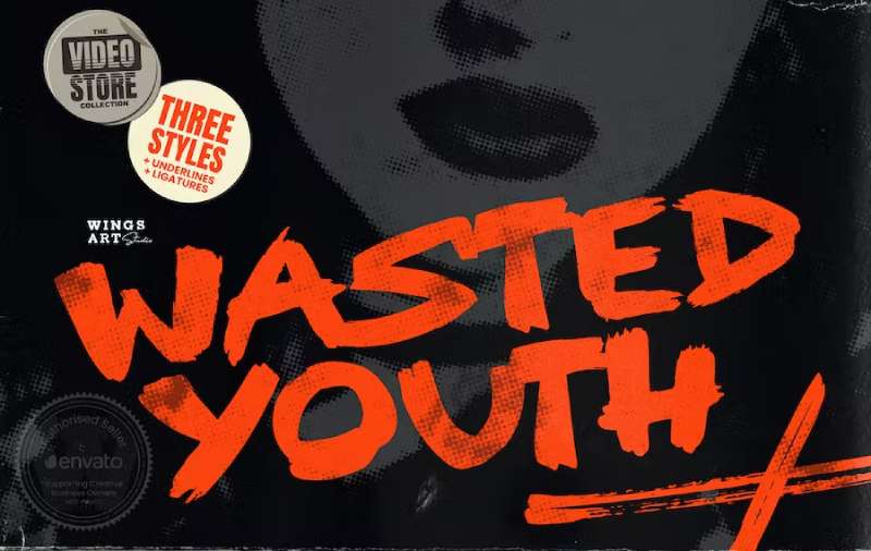
Christopher King (Wingsart Studio) designed Wasted Youth as a tribute to 90s grunge culture. The font comes in three styles: a clean-edged original, plus versions drawn with brush and marker pen.
It represents modern designers revisiting the decade’s aesthetic with fresh eyes.
Design Characteristics
Wasted Youth is a hand-drawn brush font with deliberate roughness.
Key features:
- Three style variants (Regular, Brush, Marker)
- Custom ligatures and alternates
- Uppercase and lowercase characters
- Distressed, punk aesthetic
The font aims to look authentically hand-made. Each version adds different texture.
Cultural Context
90s grunge design rejected polish. It embraced dirt, texture, and imperfection. Bands like Nirvana and Pearl Jam had album art that looked torn from photocopied zines.
Wasted Youth channels that energy for modern projects. It works for music videos, album covers, skate culture graphics, and horror movie titles.
Use Cases
Wasted Youth excels at:
- Music industry graphics
- T-shirt designs
- Poster and flyer projects
- YouTube thumbnails and video titles
- Horror and alternative entertainment
The multiple variants offer flexibility within a consistent aesthetic.
Availability
- Source: Wing’s Art Studio, Creative Market, Envato
- Licensing: Commercial license required
- Formats: OTF, TTF, WOFF
- Features: Extensive ligatures, underlines, alternates
Pulp Display
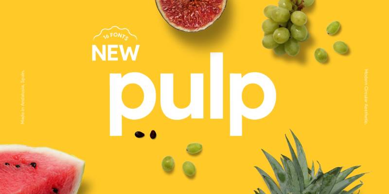
Brent Anderson designed Pulp Display for his foundry Spilled Ink. The font was created in Spain, described as emerging “amongst the orange trees.”
It represents modern geometric design with a friendly, approachable character.
Design Characteristics
Pulp Display is a circular geometric sans-serif.
Technical specifications:
- 16 styles (8 weights with italics)
- Outline variants included
- Clean, rounded letterforms
- 185 glyphs per weight
The design is wholesome and juicy. It works at both large and small sizes.
Cultural Context
While Pulp Display is a contemporary font, its aesthetic echoes 90s geometric trends. The decade loved rounded, friendly typography.
The font bridges vintage warmth with modern precision. It works for contemporary branding while nodding to retro sensibilities.
Use Cases
Pulp Display fits:
- Product packaging and labels
- Food and beverage branding
- Website headers and app interfaces
- Magazine and editorial design
- Social media graphics
Versatile across print and digital applications.
Availability
- Source: Spilled Ink, MyFonts
- Licensing: Commercial license required
- Web support: Available
- Languages: 17 supported including major European languages
Super Retro M54
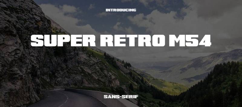
Mohammed Rahman (justme54s) created Super Retro M54 as a love letter to vintage extended lettering. The font captures the bold, blocky aesthetic of 70s and 80s signage.
Rahman suggested pairing it with Compacta for complementary retro projects.
Design Characteristics
Super Retro M54 is an ultra-extended display font.
Visual attributes:
- Wide, stretched letterforms
- Bold, blocky appearance
- Strong horizontal emphasis
- Includes italic variant
The extended width demands attention. It’s impossible to ignore.
Cultural Context
Extended display faces dominated 70s and 80s advertising. Record stores. Movie posters. Automotive branding. That wide, confident look signaled boldness and modernity.
Super Retro M54 recreates that era for digital use. It works for anyone chasing authentic vintage vibes in apparel design, posters, or branding projects.
Use Cases
Super Retro M54 excels at:
- T-shirt and apparel design
- Vintage-themed posters
- Retro branding projects
- Music and entertainment graphics
Best used large. The extended width makes it impractical for body text or small applications.
Availability
- Source: DaFont, 1001Fonts, various free font sites
- Licensing: Free for personal use; donation encouraged
- Web support: Limited
- Styles: Regular and Italic
FAQ on The Best 90S Fonts
What fonts were popular in the 1990s?
Comic Sans MS, Papyrus, Impact, and Template Gothic dominated the decade. Cooper Black experienced a revival through album covers. Eurostile appeared in sci-fi media. VAG Rounded and Bank Gothic found commercial applications in branding and advertising.
Why is Comic Sans so hated by designers?
Vincent Connare designed it for children’s software, not professional documents. The problem isn’t the font itself. It’s the misuse in inappropriate contexts like business presentations and legal documents. Font psychology matters.
Are 90s fonts still used today?
Absolutely. Impact became the standard meme font. Cooper Black appears in retro branding projects. Template Gothic and FF Blur influenced contemporary display typefaces. Many designers use these nostalgic fonts for throwback aesthetics and vintage design projects.
Where can I download free 90s fonts?
Many classic 90s typefaces ship with Windows and Mac operating systems. Google Fonts offers alternatives. DaFont and 1001Fonts host free retro fonts. Adobe Fonts includes premium options like Template Gothic through subscription plans.
What makes a font look “90s”?
Grunge textures, experimental letterforms, and deliberate imperfection define the era. Think distressed edges, pixel fonts, and geometric sans-serifs with rounded corners. The decade rejected modernist perfection in favor of raw, handmade aesthetics.
Which 90s fonts work best for logo design?
Bank Gothic suits corporate and sports branding. VAG Rounded projects friendly warmth. Eurostile works for tech companies. Cooper Black delivers retro charm. Choose based on your brand personality and target audience expectations.
Can I use Comic Sans professionally?
In specific contexts, yes. Dyslexia-friendly documents. Children’s educational materials. Intentionally playful projects. Understanding typographic hierarchy helps you decide when casual typefaces serve your communication goals.
What’s the difference between Papyrus and other decorative fonts?
Papyrus mimics ancient handwritten scripts with rough edges and irregular curves. Chris Costello designed it to evoke 2,000-year-old papyrus documents. Other decorative fonts pursue different historical or stylistic references.
Why did 90s fonts look so experimental?
Desktop publishing democratized type design. Software like Fontographer let designers create fonts without traditional training. Emigre and FontFont encouraged boundary-pushing experiments. The postmodern movement celebrated imperfection over Swiss design precision.
What font pairs well with 90s typefaces?
Pair display fonts like Cooper Black with clean sans-serifs for readability. Match grunge typefaces with neutral body text. Create contrast between decorative headlines and functional paragraph fonts for balanced layouts.
Conclusion
Finding the best 90s fonts takes you back to an era when typography broke every rule. Comic Sans MS, Impact, and Papyrus defined the decade. So did the grunge aesthetic that designers like David Carson pushed into the mainstream.
These retro typefaces still work for nostalgic projects, Y2K revivals, and throwback branding.
Before downloading, check font licensing requirements. Some vintage fonts need commercial licenses.
The 90s gave us bold display fonts, pixel typefaces, and decorative lettering that refused to play it safe. That rebellious energy is exactly why these fonts keep coming back.
Use them for poster design, album covers, or any project that needs raw, unapologetic personality.

Renowned for his expertise in logo design and visual branding, Bogdan has developed a multitude of logos for various clients.
His skills extend to creating posters, vector illustrations, business cards, and brochures. Additionally, Bogdan's UI kits were featured on marketplaces like Visual Hierarchy and UI8.
He also wrote in the past years on sites like Design Your Way, WebDesignerDepot, WPDean, Designmodo, Speckyboy, Slider Revolution, and more.
- The Cursor Logo History, Colors, Font, And Meaning - 24 September 2026
- Canva vs PowerPoint: Which Is Better for Presentations? - 22 September 2026
- How to Install Fonts on Mac (Step-by-Step Guide) - 20 September 2026

Bogdan Sandu is a seasoned designer who has been designing websites since 2008. Renowned for his expertise in logo design and visual branding, Bogdan has developed a multitude of logos for various clients. His skills extend to creating posters, vector illustrations, business cards, and brochures. Additionally, Bogdan's UI kits were featured on marketplaces like Visual Hierarchy and UI8. He also wrote in the past years on sites like Design Your Way, WebDesignerDepot, WPDean, Designmodo, Speckyboy, Slider Revolution, and more.
You Might Also Like