The typeface you choose tells people something before they read a single word.
Finding the best fonts for graphic design is not about picking what looks good. It is about matching typeface structure to context, classification to use case, and weight range to the hierarchy your project actually needs.
Bad font choices slow reading, weaken brand identity, and create licensing problems that surface after a project ships. Good ones do the opposite.
This article covers 10 professional typefaces used across branding, editorial, print, and digital design. For each one, you will find classification data, weight range, license type, rendering performance, and pairing logic — everything needed to make an informed decision, not just an aesthetic one.
The Best Fonts For Graphic Design
Typography is one of the most critical decisions in any design project. The right typeface carries meaning, builds trust, and shapes how people read content. The wrong one does the opposite.
This guide covers 10 of the most used and most reliable fonts for graphic design, with structural data on each one so you can make faster, better decisions.
—
Helvetica

Helvetica is a neo-grotesque sans-serif font designed by Max Miedinger and Eduard Hoffmann in 1957, released by the Haas Type Foundry in Switzerland. It delivers neutral, high-legibility text across signage, branding, and print applications.
Helvetica works best for corporate identity and wayfinding because its uniform stroke width and tight letter-spacing produce a dense, stable visual weight that reads clearly at varied sizes. Brands including BMW, Lufthansa, Nestlé, and the New York City subway system rely on it as their primary typeface.
What makes Helvetica suitable for graphic design?
Helvetica has a high x-height and strokes that terminate on strict horizontal or vertical axes, which creates consistent visual rhythm across all weights. Its closed apertures in letters like “c” and “s” contribute to its dense, solid appearance. This structure performs reliably from 8pt body text up to large-scale display use.
Key attributes:
| Attribute | Value |
| Classification | Neo-grotesque sans-serif |
| Designer | Max Miedinger & Eduard Hoffmann, 1957 |
| Weight range | Thin to Black (34 styles in Neue Helvetica) |
| Variable font | No (Helvetica Now has variable axes) |
| License | Commercial (Monotype) |
| Available on | Adobe Fonts, Monotype direct, Linotype |
| Price | Subscription or one-time purchase |
How does Helvetica perform in graphic design contexts?
Helvetica renders with high consistency across print and screen. Its lack of stroke contrast means it holds up well in reversed-out scenarios and at small text sizes. At display sizes above 48pt, the tight letter-spacing can feel compressed, requiring manual tracking adjustments.
What are the best pairings for Helvetica in graphic design?
Helvetica pairs with Garamond for strong serif/sans-serif contrast in editorial work, and with Bodoni when a high-contrast luxury pairing is needed for fashion or editorial contexts. The Garamond combination is standard practice in book design; the Bodoni pairing is less conventional but widely used in fashion branding. You can explore more options in our Helvetica font pairing guide.
What are the limitations of Helvetica for graphic design?
Helvetica is not available free of charge. Its closed apertures reduce legibility at very small sizes compared to typefaces with more open counters like Frutiger or Gill Sans. It is also frequently criticized for overuse in corporate contexts, which can reduce its distinctiveness in branding work.
Helvetica – Recommended Use Cases Within Graphic Design
- Best for: Corporate identity systems, signage, editorial layouts, packaging
- Avoid for: Body text below 9pt on low-DPI screens, projects requiring high brand distinctiveness
- Optimal weight: Regular 55 for body; Bold 75 for headlines
- Optimal size range: 9pt–12pt for text; 24pt+ for display
—
Garamond

Garamond is an old-style serif font originating from designs by French punch-cutter Claude Garamond in the 1530s, with modern digital revivals including Adobe Garamond (1989) by Robert Slimbach. It delivers refined, high-legibility text for long-form print typography.
Garamond works best for book and editorial design because its low x-height produces a generous ascender-to-cap ratio that improves rhythm across long text passages. It has been used by publishers including Penguin Books and by academic presses worldwide.
What makes Garamond suitable for graphic design?
Garamond features angled stress, bracketed serifs, and a relatively low x-height. These characteristics reduce visual fatigue in extended reading at 10pt–14pt. Its stroke contrast is moderate, making it more forgiving than high-contrast serifs like Bodoni in body text roles.
Key attributes:
| Attribute | Value |
| Classification | Old-style serif |
| Designer | Claude Garamond (16th c.); Robert Slimbach (1989 revival) |
| Weight range | Regular to Bold (varies by version) |
| Variable font | Yes (EB Garamond Weight axis available on Google Fonts) |
| License | Commercial (Adobe Garamond Pro); OFL (EB Garamond) |
| Available on | Adobe Fonts, Google Fonts (EB Garamond), Typekit |
| Price | Free (EB Garamond); Subscription (Adobe Garamond Pro) |
How does Garamond perform in print design?
Garamond’s delicate hairlines render at their best in print at 600 DPI or higher. On screen at sizes below 16px, the thin strokes can drop out on low-resolution displays, reducing legibility. For screen-first projects, Cormorant Garamond is the better choice as it is optimized for display use.
What are the best pairings for Garamond in graphic design?
Garamond pairs with Futura for maximum structural contrast between old-style serif and geometric sans-serif, a combination with a long history in book design. It also pairs with Montserrat for web projects that need a free alternative to the Futura combination. See our full Garamond font pairing guide for more combinations.
What are the limitations of Garamond for graphic design?
Garamond’s thin hairlines degrade significantly at screen sizes below 14px on standard-DPI monitors. The limited weight range in most versions (typically regular and bold) restricts its use in complex typographic hierarchies requiring 4+ weight levels.
Garamond – Recommended Use Cases Within Graphic Design
- Best for: Book interiors, academic publications, editorial body text in print
- Avoid for: Small-screen UI text, reversed-out text below 14pt
- Optimal weight: Regular for body; Bold for subheadings
- Optimal size range: 10pt–14pt for body text in print
—
Futura

Futura is a geometric sans-serif typeface designed by Paul Renner in 1927, released by Bauer Type Foundry in Frankfurt, Germany. It applies Bauhaus-inspired geometric construction to a complete type system for display and text use.
Futura works best for brand identity and poster design because its letterforms are built on near-perfect circles, equilateral triangles, and straight lines, producing a consistent visual logic at any scale. Volkswagen, IKEA, and the Nike “Just Do It” campaign have all used Futura as a primary brand typeface.
What makes Futura suitable for graphic design?
Futura’s geometric construction means all curves share the same underlying radius, creating optical consistency across a layout. Its large weight range (Light to ExtraBold) supports full typographic hierarchies from body text to display headlines. Stroke contrast is minimal, which maintains visual clarity at both small and very large sizes.
Key attributes:
| Attribute | Value |
| Classification | Geometric sans-serif |
| Designer | Paul Renner, 1927 |
| Weight range | Light to ExtraBold, with condensed variants |
| Variable font | No |
| License | Commercial (Bauer/Neufville Digital) |
| Available on | Adobe Fonts, MyFonts, Linotype |
| Price | Subscription or one-time purchase |
How does Futura perform in poster and branding contexts?
At display sizes above 36pt, Futura’s geometric forms create high visual impact with strong legibility at distance. The circular “O” and geometric “a” (single-story) are distinctive at large scale and remain recognizable even when cropped or partially obscured in complex layouts.
What are the best pairings for Futura in graphic design?
Futura pairs with Garamond for editorial and book design, offering maximum contrast between geometric and humanist forms. It also works with Georgia for screen-first projects where a web-safe serif is needed for body text. Check our Futura font pairing guide for specific combination examples.
What are the limitations of Futura for graphic design?
Futura is a commercial font with no free version. Its geometric lowercase letters, particularly the single-story “a” and “g,” can reduce legibility in extended body text at 10pt and below. The lack of a true italic (only an oblique) limits its use in publications requiring semantic differentiation through type style.
Futura – Recommended Use Cases Within Graphic Design
- Best for: Poster headlines, brand identity systems, packaging design, logo typography
- Avoid for: Long-form body text below 11pt, projects requiring true italics
- Optimal weight: Book or Medium for body; Bold or ExtraBold for display
- Optimal size range: 18pt+ for headlines; 11pt–14pt for short body copy
—
Bodoni

Bodoni is a Didone (modern) serif typeface designed by Giambattista Bodoni in 1798, available today through multiple foundries including ITC, Monotype, and Berthold. It delivers extreme stroke contrast for high-impact display typography in luxury and editorial contexts.
Bodoni works best for fashion branding and editorial headlines because the extreme ratio between thick stems and hairline serifs creates maximum visual drama at large display sizes. Vogue magazine has used Bodoni variants as its headline typeface for decades.
What makes Bodoni suitable for graphic design?
Bodoni’s defining structural attribute is the near-total elimination of serif brackets and the reduction of thin strokes to hairline width. This extreme high contrast between thick and thin elements produces a strong graphic presence at 36pt and above. The vertical stress axis adds to its formal, structured appearance.
Key attributes:
| Attribute | Value |
| Classification | Didone (modern) serif |
| Designer | Giambattista Bodoni, 1798 |
| Weight range | Book to Poster (varies by version; ITC Bodoni: 3 optical sizes) |
| Optical sizes | Yes (ITC Bodoni: 6pt, 12pt, 72pt versions) |
| License | Commercial |
| Available on | Adobe Fonts (multiple versions), MyFonts |
| Price | Subscription or one-time purchase |
How does Bodoni perform in luxury and fashion design?
At 48pt and above, Bodoni’s stroke contrast produces a visually striking vertical rhythm that reads as authoritative and high-end. Below 14pt, the hairline serifs can disappear entirely on standard-resolution screens, causing a phenomenon called “dazzle” where thin and thick strokes create an optical vibration that reduces legibility.
What are the best pairings for Bodoni in graphic design?
Bodoni pairs with Garamond for editorial layouts where both heading and body text need to remain within the serif category. It also pairs with Futura for a high-contrast mixed pairing common in luxury brand systems. See our Bodoni font pairing page for more options.
What are the limitations of Bodoni for graphic design?
Bodoni is unsuitable for body text below 12pt due to hairline serif degradation on screen and in low-resolution print. The standard version lacks the optical size variants needed for multi-scale systems, requiring purchase of the ITC Bodoni optical size family for professional multi-size use.
Bodoni – Recommended Use Cases Within Graphic Design
- Best for: Magazine headlines, luxury brand logos, fashion editorial display text
- Avoid for: Body text below 14pt, reversed-out text on dark backgrounds at small sizes
- Optimal weight: Regular or Poster weight for display
- Optimal size range: 36pt+ for headlines; use ITC Bodoni 12 for body text
—
Gill Sans
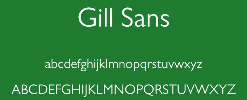
Gill Sans is a humanist sans-serif typeface designed by Eric Gill in 1926, released by Monotype Corporation in 1928. It bridges geometric and humanist letter construction, providing a warmer alternative to purely mechanical grotesques.
Gill Sans works best for editorial and institutional design because its Roman-derived uppercase letters and calligraphic lowercase forms produce high legibility across a wide range of print sizes. The BBC used Gill Sans as its corporate typeface for years, and it remains standard on British railway signage.
What makes Gill Sans suitable for graphic design?
Gill Sans uses a two-story lowercase “a” and “g,” which are more distinctive than single-story geometric equivalents, reducing character misreads in text settings. Its uppercase letters are based directly on classical Roman proportions, giving it a formal authority that purely geometric sans-serifs lack. The family includes 14 styles covering a wide range of editorial needs.
Key attributes:
| Attribute | Value |
| Classification | Humanist sans-serif |
| Designer | Eric Gill, 1926–1928 |
| Weight range | Light to ExtraBold (14 styles) |
| License | Commercial (Monotype) |
| Available on | Adobe Fonts, bundled with macOS |
| Price | Subscription; free on macOS as Gill Sans MT |
How does Gill Sans perform in editorial and print contexts?
Gill Sans renders clearly at 9pt–14pt in print due to its open counters and moderate x-height. Its humanist construction makes it easier to read in long paragraphs compared to geometric typefaces like Futura. On screen, low-resolution rendering can soften its distinctive letterforms, particularly at sizes below 12px.
What are the best pairings for Gill Sans in graphic design?
Gill Sans pairs with Baskerville for a classic British typographic pairing that works well in editorial and publishing. It also pairs with Georgia as a web-safe combination where Gill Sans handles headings and navigation and Georgia handles body text. Our guide on fonts similar to Gill Sans covers free alternatives if licensing is a concern.
What are the limitations of Gill Sans for graphic design?
Gill Sans is only available free on macOS as Gill Sans MT. The full Monotype family requires a commercial license or Adobe Fonts subscription. Its character set has limited support for non-Latin scripts, which restricts its use in multilingual brand systems.
Gill Sans – Recommended Use Cases Within Graphic Design
- Best for: Editorial headings, institutional publications, signage, book covers
- Avoid for: UI text at sizes below 12px, multilingual projects requiring extended script support
- Optimal weight: Regular for body; Bold for headings
- Optimal size range: 9pt–14pt for body text; 18pt+ for headings
—
Baskerville

Baskerville is a transitional serif typeface originally designed by John Baskerville in 1757, with key revivals including the Monotype version by Stanley Morison in 1923 and Libre Baskerville on Google Fonts. It delivers high-contrast, high-legibility text that sits structurally between old-style and modern serifs.
Baskerville works best for long-form print publishing and professional document design because its increased stroke contrast over old-style serifs produces sharper letterform definition on smooth paper stock. The University of Birmingham and the Canadian government use modified Baskerville versions for official communications.
What makes Baskerville suitable for graphic design?
Baskerville has a vertical stress axis and higher stroke contrast than Garamond but stops short of Bodoni’s extreme hairlines. This structural position gives it strong print performance while remaining legible at text sizes as small as 9pt. Its sharply cut serifs give it a refined, professional appearance without sacrificing readability.
Key attributes:
| Attribute | Value |
| Classification | Transitional serif |
| Designer | John Baskerville, 1757; Monotype revival, 1923 |
| Weight range | Regular to Bold (Libre Baskerville: Regular, Bold, Italic) |
| License | Commercial (Monotype); OFL (Libre Baskerville) |
| Available on | Adobe Fonts, Google Fonts (Libre Baskerville) |
| Price | Free (Libre Baskerville); Subscription (Monotype version) |
How does Baskerville perform in professional document and print contexts?
Baskerville performs reliably at 10pt–13pt in high-resolution print, where its stroke contrast reads as elegant without creating the legibility issues associated with Didone serifs like Bodoni. On screen, Libre Baskerville is specifically tuned for improved screen rendering, making it functional at 16px–20px for web body text.
What are the best pairings for Baskerville in graphic design?
Baskerville pairs with Gill Sans for a historically cohesive British typographic combination suited to publishing and institutional work. It also pairs with Futura for a high-contrast serif/geometric pairing common in academic and editorial design. The Baskerville font pairing guide covers both options with examples. You can also find more alternatives in our fonts similar to Baskerville resource.
What are the limitations of Baskerville for graphic design?
The free Libre Baskerville version only includes three styles (Regular, Bold, Italic), which limits complex hierarchy systems. The Monotype version’s higher stroke contrast makes it unsuitable for body text on textured or uncoated paper stock where fine strokes may not print cleanly.
Baskerville – Recommended Use Cases Within Graphic Design
- Best for: Book interiors, professional documents, legal publications, editorial text
- Avoid for: Display text on low-resolution screens below 16px; uncoated paper at small sizes
- Optimal weight: Regular for body; Bold for subheadings
- Optimal size range: 10pt–13pt for print body; 16px–20px for web body text
—
Proxima Nova
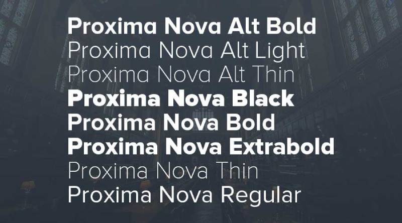
Proxima Nova is a geometric-grotesque sans-serif typeface designed by Mark Simonson, first released as Proxima Sans in 1994 and reissued as Proxima Nova in 2005, available through Mark Simonson Studio and Adobe Fonts. It delivers a hybrid of geometric structure and humanist warmth across UI, branding, and editorial applications.
Proxima Nova works best for digital design and web interfaces because it supports 48 fonts across three widths and seven weights with matching italics, providing complete coverage for multi-level typographic hierarchies. Over 30,000 of the top one million websites use it as a primary typeface.
What makes Proxima Nova suitable for graphic design?
Proxima Nova combines geometric proportions with slightly humanized letterforms, using open apertures in “c,” “e,” and “s” that improve character distinction at small display sizes. Its seven-weight range (Thin to Black) in three widths (Regular, Condensed, Extra Condensed) gives it the structural flexibility to handle UI labels, body text, and display headings within a single font family.
Key attributes:
| Attribute | Value |
| Classification | Geometric-grotesque sans-serif |
| Designer | Mark Simonson, 1994 (revised 2005) |
| Weight range | Thin to Black (7 weights, 3 widths, 48 total fonts) |
| Variable font | No |
| License | Commercial (Mark Simonson Studio); included in Adobe Fonts |
| Available on | Adobe Fonts, MyFonts, Fontspring |
| Price | Subscription or one-time license; $500+ for web licensing |
How does Proxima Nova perform in digital and branding contexts?
Proxima Nova renders clearly at 12px–16px on standard-DPI screens, where its open apertures reduce character misread rates compared to closed-aperture grotesques like Helvetica. At display sizes above 36px, its subtle geometric construction reads as clean and modern without the rigidity of purely geometric typefaces like Futura.
What are the best pairings for Proxima Nova in graphic design?
Proxima Nova pairs with Playfair Display for digital editorial layouts requiring serif/sans-serif contrast. It also works with Georgia for web projects needing a system-safe serif fallback for body text. If budget is a constraint, Montserrat from Google Fonts is the closest structural alternative. Our fonts similar to Proxima Nova guide covers free alternatives in detail.
What are the limitations of Proxima Nova for graphic design?
Proxima Nova is not free. Web licensing starts at $500+, which makes it cost-prohibitive for small projects. It does not include a variable font version, meaning every weight requires a separate file load in web environments, which can affect page performance on weight-heavy typographic systems.
Proxima Nova – Recommended Use Cases Within Graphic Design
- Best for: Web interfaces, digital branding, app UI, advertising campaigns
- Avoid for: Budget-constrained projects; situations where variable font performance is required
- Optimal weight: Regular 400 for body; Semibold 600 for subheadings; Bold 700 for CTAs
- Optimal size range: 12px–16px for body text; 24px+ for headings
—
Montserrat
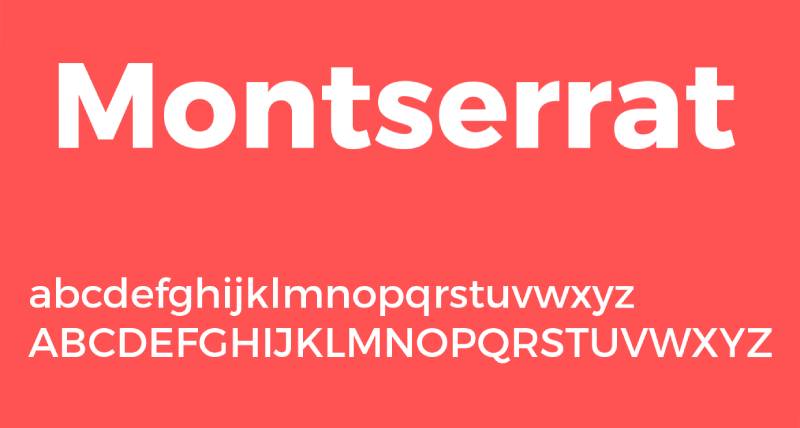
Montserrat is a geometric sans-serif typeface designed by Julieta Ulanovsky, released on Google Fonts in 2011 and updated with variable font support in later versions, available at no cost under the SIL Open Font License. It delivers clean, modern typographic hierarchy for web design, branding, and display applications.
Montserrat works best for web design and digital branding because it supports 9 weights with matching italics and a variable font version, providing full typographic control in a single free file. Its inspiration from old signage in the Montserrat neighborhood of Buenos Aires gives it geometric structure with subtle character variation.
What makes Montserrat suitable for graphic design?
Montserrat has open forms, a moderate x-height, and distinctive alternate characters including a unique “R” tail and “Q” descender. Its 9-weight range covers Thin 100 to Black 900, enabling complete visual hierarchy from body text to display headings within one family. The variable font version covers the full weight axis in a single file, reducing HTTP requests on web projects.
Key attributes:
| Attribute | Value |
| Classification | Geometric sans-serif |
| Designer | Julieta Ulanovsky, 2011 |
| Weight range | Thin 100 to Black 900 (9 weights + italics) |
| Variable font | Yes |
| License | OFL (free for commercial use) |
| Available on | Google Fonts |
| Price | Free |
How does Montserrat perform in web and branding contexts?
Montserrat renders with strong screen legibility at 14px–18px for body use, with its open apertures maintaining character distinction on standard and retina displays. At display sizes above 48px, the geometric structure creates a clean, high-impact appearance well-suited to poster work and social media graphics.
What are the best pairings for Montserrat in graphic design?
Montserrat pairs with EB Garamond for a free editorial combination that replicates the classic Futura/Garamond dynamic on Google Fonts. It also pairs with Lora when a warmer serif body text is needed for blog or magazine-style layouts. See the Montserrat font pairing guide for more options. For alternatives, our fonts similar to Montserrat page covers both free and premium options.
What are the limitations of Montserrat for graphic design?
Montserrat’s visual similarity to Proxima Nova and Gotham means it can appear generic in competitive branding contexts where distinctiveness matters. Its geometric construction, while strong at display sizes, produces less natural reading flow in long-form body text compared to humanist sans-serifs like Gill Sans or Open Sans.
Montserrat – Recommended Use Cases Within Graphic Design
- Best for: Web headings, poster headlines, social media graphics, logo typography, branding on a budget
- Avoid for: Extended body text in long-form publications; high-distinctiveness branding projects
- Optimal weight: Regular 400 for body; SemiBold 600 or Bold 700 for headings
- Optimal size range: 16px–20px for web body; 32px+ for display
—
Bebas Neue
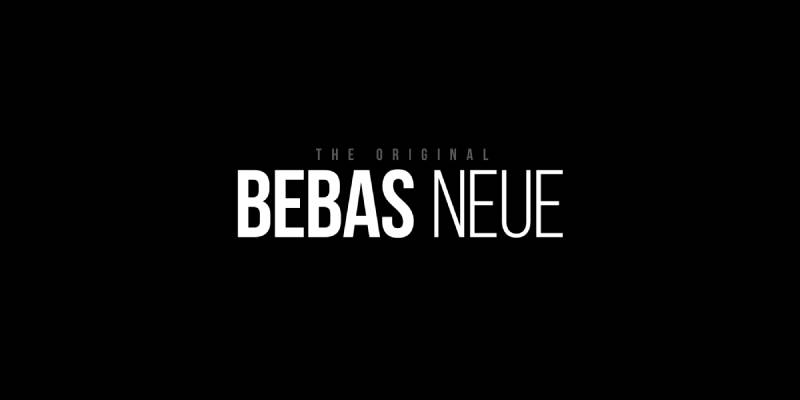
Bebas Neue is a display sans-serif typeface designed by Ryoichi Tsunekawa of Dharma Type, first released in 2010 as a free font and made open-source under SIL OFL in 2018, available through Google Fonts and Adobe Fonts. It delivers bold, all-caps headline typography for high-impact visual communication.
Bebas Neue works best for poster design, packaging, and social media graphics because its tightly spaced uppercase letterforms produce strong visual weight at display sizes with minimal horizontal space. It was used in the title sequence for the film “La La Land.”
What makes Bebas Neue suitable for graphic design?
Bebas Neue’s uppercase-only character set uses narrow proportions and tight default letter-spacing to generate high information density per line at large point sizes. Its clean geometric strokes and uniform weight maintain legibility at sizes from 24pt to 300pt+. The SIL OFL license permits unrestricted commercial use without cost.
Key attributes:
| Attribute | Value |
| Classification | Display sans-serif (all-caps) |
| Designer | Ryoichi Tsunekawa, Dharma Type, 2010 |
| Weight range | Single weight (Regular); Bebas Neue Pro adds 10 styles including lowercase |
| Variable font | No |
| License | OFL (Bebas Neue); Commercial (Bebas Neue Pro) |
| Available on | Google Fonts, Adobe Fonts, Fontfabric |
| Price | Free (Bebas Neue); Commercial license (Pro version) |
How does Bebas Neue perform in poster and display contexts?
At sizes above 36pt, Bebas Neue maintains sharp stroke edges and even optical spacing without requiring manual kerning adjustments in most display settings. Its condensed proportions allow large type to occupy horizontal space efficiently, making it useful for banner design and packaging where line length is constrained.
What are the best pairings for Bebas Neue in graphic design?
Bebas Neue pairs with Open Sans for a common headline/body pairing where the contrast between condensed display and neutral body text is needed. It also pairs with Lato for a warmer body text option in social media and editorial applications. For a more complete type system, the Bebas Neue Pro version adds lowercase and italic styles.
What are the limitations of Bebas Neue for graphic design?
The free version of Bebas Neue contains only uppercase letters, making it unsuitable for any text requiring mixed-case setting including body copy, captions, or sentences. It provides only one weight in the free version, which prevents use in typographic hierarchies without combining it with a second typeface.
Bebas Neue – Recommended Use Cases Within Graphic Design
- Best for: Poster headlines, packaging titles, social media graphics, video title cards, banner headings
- Avoid for: Body text, captions, any mixed-case text setting
- Optimal weight: Regular (only option in free version)
- Optimal size range: 24pt–300pt+ for display; not recommended below 18pt
—
Open Sans
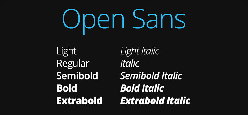
Open Sans is a humanist sans-serif typeface designed by Steve Matteson, released by Google in 2011 and available free on Google Fonts under the Apache License. It delivers neutral, high-legibility text for web interfaces, mobile applications, and print documents.
Open Sans works best for web and UI design because its wide apertures, tall x-height, and upright letterforms maintain legibility at 12px–16px on standard-DPI screens without hinting adjustments. Google used it as its primary UI typeface across products for several years, and it remains one of the most-loaded fonts on the web.
What makes Open Sans suitable for graphic design?
Open Sans has a tall x-height that increases effective legibility at small sizes, and its letter-spacing is optimized for screen rendering rather than print. It supports over 1,000 glyphs including Latin, Greek, and Cyrillic scripts, making it one of the more versatile free fonts for multilingual projects.
Key attributes:
| Attribute | Value |
| Classification | Humanist sans-serif |
| Designer | Steve Matteson, 2011 |
| Weight range | Light 300 to ExtraBold 800 (5 weights + italics) |
| Variable font | Yes (updated version on Google Fonts) |
| License | Apache License 2.0 (free for commercial use) |
| Available on | Google Fonts |
| Price | Free |
How does Open Sans perform in web and UI design contexts?
Open Sans renders clearly at 12px on both standard and retina displays, with its humanist construction reducing character confusion between similar glyphs like “l,” “1,” and “I” in UI contexts. Its neutral character makes it less distinctive than typefaces like Gill Sans or Proxima Nova, which works in its favor for utility-focused interfaces where the font should not draw attention to itself.
What are the best pairings for Open Sans in graphic design?
Open Sans pairs with Playfair Display for a high-contrast editorial combination that covers both web body text and display headings with zero licensing cost. It also pairs with Oswald for a dual-sans system when a condensed display weight is needed alongside a neutral body typeface. See our full Open Sans font pairing guide for more pairings.
What are the limitations of Open Sans for graphic design?
Open Sans is extremely common and immediately recognizable, which limits its value in branding contexts where distinctiveness is needed. Its limited weight range tops out at ExtraBold 800, with no Black 900 weight, restricting maximum impact in display contexts where maximum heaviness is required.
Open Sans – Recommended Use Cases Within Graphic Design
- Best for: Web body text, UI interfaces, app design, multilingual digital publications
- Avoid for: High-distinctiveness branding; projects requiring Black 900 weight for display
- Optimal weight: Regular 400 for body; SemiBold 600 for navigation; Bold 700 for CTAs
- Optimal size range: 12px–18px for body text; 24px+ for headings
—
Quick Comparison: All 10 Fonts at a Glance
| Font | Classification | Best Use | License | Free? |
| Helvetica | Neo-grotesque sans-serif | Corporate branding, signage | Commercial | No |
| Garamond | Old-style serif | Book publishing, editorial | OFL / Commercial | Partial |
| Futura | Geometric sans-serif | Poster design, brand identity | Commercial | No |
| Bodoni | Didone serif | Fashion editorial, luxury brands | Commercial | No |
| Gill Sans | Humanist sans-serif | Editorial, institutional | Commercial / macOS | Partial |
| Baskerville | Transitional serif | Professional documents, books | OFL / Commercial | Partial |
| Proxima Nova | Geometric-grotesque | Web UI, digital branding | Commercial | No |
| Montserrat | Geometric sans-serif | Web headings, social graphics | OFL | Yes |
| Bebas Neue | Display sans-serif | Posters, packaging, headlines | OFL / Commercial | Yes |
| Open Sans | Humanist sans-serif | Web body text, UI design | Apache 2.0 | Yes |
Before committing to any typeface, check the font licensing terms carefully. Free for personal use does not always mean free for commercial use, and web licensing often requires a separate agreement from desktop licensing.
Understanding font psychology also helps here. Each of these typefaces carries different associations rooted in their history, structure, and cultural use. That context matters as much as the technical attributes when selecting a typeface for a specific project.
For more structured help with font combinations, the font pairing generator is a useful starting point. And if you’re adding a new typeface to your workflow, our guides on how to add fonts to Photoshop and how to add fonts to Adobe Illustrator cover the full installation process.
How Do Typeface Classification and Stroke Structure Affect Graphic Design Performance?
Classification is not a label. It is a structural decision that determines everything downstream: rendering environment, pairing logic, weight system, and licensing cost.
83% of designers acknowledge typography as critical to brand identity, according to Monotype’s 2024 Global Font Use and Forecasting Survey of 4,777 participants across 13 countries.
| Classification | Key Structural Feature | Primary Design Context |
| Geometric sans-serif | Circular letterforms, minimal stroke contrast | Brand identity, poster design |
| Humanist sans-serif | Two-story ‘a’ and ‘g’, open apertures | Editorial, UI body text |
| Old-style serif | Bracketed serifs, diagonal stress axis | Book publishing, long-form print |
| Transitional serif | Vertical stress, higher stroke contrast | Professional documents, academic print |
| Didone serif | Extreme contrast, hairline unbracketed serifs | Luxury branding, fashion editorial |
What is the difference between geometric and humanist sans-serif fonts in graphic design?
Geometric sans-serif: letterforms built on circles, equilateral triangles, and straight lines. Futura and Montserrat fall here.
Humanist sans-serif: letterforms derived from calligraphic tradition, with open apertures and two-story ‘a’ and ‘g’. Gill Sans and Open Sans fall here.
The practical difference shows up at small sizes. Geometric typefaces use single-story ‘a’ forms that create ambiguity between ‘a’ and ‘o’ below 12px on standard-DPI screens. Humanist typefaces use distinctive two-story alternates that reduce misread rates in UI contexts.
Futura’s circular ‘O’ reads as a strong graphic element at display sizes above 36pt. Below 11pt in body text, that same circular geometry creates visual monotony that slows reading flow.
How does x-height change legibility at different point sizes?
X-height is the height of lowercase letters relative to capitals. Higher x-height increases effective legibility at small sizes by making lowercase letters more visually prominent.
Open Sans has a tall x-height optimized for 12px–16px screen use. Garamond has a comparatively low x-height designed for 10pt–14pt print environments where longer ascenders improve reading rhythm.
Choosing a low x-height typeface for a UI interface, or a high x-height typeface for long-form print, produces legibility problems that no amount of tracking or leading adjustment fully corrects.
—
What Determines Whether a Font Is Suitable for Print or Screen in Graphic Design?
Print and screen are not interchangeable environments. A typeface that performs at 600 DPI on coated paper can become illegible at 96 DPI on a standard monitor.
Variable font adoption reached 34% of mobile pages and 33% of desktop pages in 2024, up from 29% and 28% respectively in 2022, according to the HTTP Archive Web Almanac 2024.
Which fonts from this list are optimized for screen use?
Screen-optimized typefaces share three structural attributes: tall x-height, open apertures, and low stroke contrast. Low stroke contrast prevents thin elements from disappearing at standard screen resolution.
- Open Sans: tall x-height, wide apertures, designed specifically for screen rendering by Steve Matteson
- Montserrat: moderate x-height, variable font support, geometric construction renders cleanly at 16px+
- Proxima Nova: open apertures in ‘c’, ‘e’, and ‘s’ reduce character misread at 12px on standard DPI
- Gill Sans: humanist construction maintains character distinction at small sizes, though screen hinting varies by platform
The Guardian switched its body text to a system font stack in February 2024 and recorded a 24% improvement in Largest Contentful Paint scores, demonstrating how font rendering decisions directly affect page speed performance.
Which fonts from this list perform best in print at small sizes?
Print performance at small sizes depends on stroke contrast tolerance and serif bracket structure.
Garamond at 10pt–14pt on coated paper produces exceptional reading rhythm due to its angled stress and moderate stroke contrast. Its thin strokes survive 600 DPI print without dazzle.
Baskerville handles 9pt–13pt in high-resolution print, where its higher stroke contrast than Garamond reads as refined rather than fragile. Libre Baskerville is specifically tuned for improved screen rendering as a secondary benefit.
Bodoni is the exception. Its hairline serifs degrade below 14pt in standard print and cause optical vibration on screen at any size. ITC Bodoni ships separate optical masters at 6pt, 12pt, and 72pt specifically because the standard design fails at text sizes.
| Font | Optimal Print Size | Optimal Screen Size | Rendering Risk |
| Garamond | 10pt–14pt | Not recommended below 16px | Hairlines drop on low-DPI screens |
| Baskerville | 9pt–13pt | 16px–20px (Libre Baskerville) | Moderate on uncoated paper |
| Bodoni | 14pt+ (optical sizes required) | Display only, 36pt+ | Dazzle effect below 12pt |
| Open Sans | Acceptable at 9pt+ | 12px–18px | Low risk across environments |
—
How Does Font Licensing Affect Typeface Choice for Graphic Designers?
Licensing eliminates or confirms typefaces before design work begins. Using a font without the correct license creates legal exposure that can force complete rebranding after launch.
47% of designers cite font licensing as challenging to navigate and manage, according to Monotype’s 2024 Global Font Use Survey. The average creative spends 8 hours per week on font administration tasks, according to Monotype.
How do the three main license types differ for graphic designers?
OFL (SIL Open Font License): permits free use for commercial projects without restriction. Montserrat, Bebas Neue, and Libre Baskerville use this license. No cost, no pageview cap, no desktop seat limit.
Apache 2.0: similarly permissive, used by Open Sans. Allows use, modification, and redistribution in commercial work.
Commercial licenses: cover desktop use (per machine), web use (per pageview tier), app use (per download tier), and broadcast use as separate agreements. Proxima Nova web licensing starts above $500. Helvetica and Futura require purchase through Monotype or Linotype at per-weight pricing.
Desktop licensing from a foundry does not include web use. A designer who purchases Helvetica Neue for print work is not licensed to embed it in a client website without a separate webfont agreement.
What does Adobe Fonts vs Google Fonts mean for licensing in practice?
Google Fonts serves free, OFL-licensed typefaces via CDN. No subscription required. Montserrat, Open Sans, Bebas Neue, EB Garamond, and Libre Baskerville are all available.
70% of creatives turn to popular marketplaces for font purchases, according to Monotype’s 2024 survey.
Adobe Fonts bundles commercial typefaces including Proxima Nova, Futura, Bodoni, and Gill Sans within Creative Cloud subscriptions. The license covers desktop use and web embedding for subscribers, but expires if the subscription lapses. Any client deliverable that embeds an Adobe Fonts webfont becomes non-functional if the licensing account closes.
For client work, this creates a dependency risk. Typefaces used in self-hosted projects should carry OFL or purchased perpetual licenses. See the font licensing guide for a full breakdown of use cases by license type.
—
What Font Weight Range and Variable Font Support Does a Graphic Designer Need?
A complete typographic hierarchy requires a minimum of three weight levels: one for body text, one for subheadings, and one for display headings. A font family that offers fewer than three weights forces the designer to introduce a second typeface to fill the gap.
How does weight range determine whether a single font family can carry a full design system?
Proxima Nova’s 48-font system (7 weights, 3 widths, with italics) covers every hierarchy level from UI label to billboard headline in a single family. That breadth eliminates the need for a pairing in many brand systems.
Montserrat offers 9 weights from Thin 100 to Black 900 with matching italics, plus a variable font version. One variable file replaces 18 individual static files in a web project.
Variable fonts reduce page typography file sizes by 35% to 45% compared to loading multiple static weight files, according to the Business Research Insights Font and Typeface Market Report. By 2024, 54% of modern web browsers support variable font formats, per the same report.
Bebas Neue offers a single weight in its free version. That is not a hierarchy. It is a headline tool that requires a second typeface for every project.
When does a single-weight display font force a pairing decision?
Single-weight display typefaces (Bebas Neue free version) cannot set body text, captions, or subheadings within the same visual system. The designer must pair them with a full-weight-range text family.
The structural rule: if a typeface cannot handle both body and display roles, it is a display tool, not a type system. Display tools are valid. But they require planning.
- Bebas Neue (single weight) requires Open Sans, Lato, or another text family for body
- Bodoni standard (limited weights) requires a secondary text face for body copy below 14pt
- EB Garamond (Regular, Bold, Italic only) limits hierarchy depth to three levels
Proxima Nova Condensed and Extra Condensed variants extend horizontal flexibility without adding a second typeface. This is useful for data-heavy layouts, tables, and navigation menus where standard-width text does not fit within column constraints.
—
How Do Typeface Pairings Work in Graphic Design, and Which Combinations Are Structurally Justified?
Font pairing is not a matter of preference. It is a structural contract between two typefaces that produces readable visual hierarchy. The contract fails when the contrast between them is either insufficient or incoherent.
A 2024 study published in Scientific Reports analyzed font pairing patterns across diverse design mediums using Non-negative Matrix Factorization, finding that different mediums predictably prefer fonts with distinct morphological features, confirming that pairing decisions follow structural logic rather than arbitrary taste.
What is the structural reason to pair a serif with a sans-serif in graphic design?
Serif and sans-serif typefaces differ across stroke contrast, terminal style, stress axis, and aperture size. All four attributes create visual contrast simultaneously, making the two categories immediately distinguishable at a glance.
Pairing two geometric sans-serifs (Futura + Montserrat) produces insufficient contrast because both share circular letterforms, low stroke contrast, and similar x-heights. The reader cannot quickly distinguish heading from body text without relying on size alone.
Pairing within the serif category works only when the structural distance is large enough: Bodoni (Didone, extreme contrast) with Garamond (old-style, low contrast) creates readable hierarchy. Baskerville (transitional) with Garamond (old-style) produces subtle contrast that suits academic publishing but not brand systems requiring immediate scanability.
For pairing fonts effectively, structural contrast comes before visual harmony. Harmony without contrast produces monotony. Contrast without coherence produces chaos.
Which font pairings from this list are used by major brands?
Real-world pairing use cases from the 10 listed typefaces:
- Futura + Garamond: standard in book design and editorial, longstanding publishing pairing
- Helvetica + Bodoni: Vogue uses this combination for utility text and display headlines respectively
- Bebas Neue + Open Sans: common in YouTube thumbnail design and social media graphics
- Montserrat + EB Garamond: free web equivalent of the Futura + Garamond pairing, widely used in digital editorial
Spotify’s Wrapped 2023 and 2024 campaigns used custom retro-style serifs paired with clean sans-serif UI text, demonstrating how a display/text pairing creates emotional contrast when the two typefaces occupy clearly separate functional roles.
Use a font pairing generator to test contrast between candidate typefaces before committing to a system. Specific guides for combinations covered in this article: Futura font pairing, Garamond font pairing, Bodoni font pairing, Montserrat font pairing, Open Sans font pairing.
—
How Do Professional Designers Choose Between Iconic and Modern Typefaces for Branding?
Structural quality and cultural saturation are separate variables. A typeface can be structurally excellent and still damage brand differentiation by association with too many competitors.
Typeface choices can increase positive consumer responses by up to 13%, according to Monotype research. Consistent font use across brand materials increases brand recognition, per Lucidpress data showing consistent brand presentation can increase revenue by up to 23%.
When does typeface overuse reduce brand value?
Overuse risk is measurable. Proxima Nova is used by over 30,000 of the top one million websites. Montserrat appears on millions of sites via Google Fonts. Both are structurally sound. Neither is distinctive in a competitive brand context.
Helvetica’s user list reads as a brand credibility roll call: BMW, Lufthansa, Nestlé, American Airlines, and Microsoft. That list also illustrates the problem. A new brand using Helvetica communicates reliability by association, but it also disappears into the same visual pool as every other corporate identity using the same face since the 1960s.
The overuse problem does not apply equally across contexts:
- Helvetica in wayfinding: still the strongest choice, overuse does not reduce clarity in signage
- Helvetica in startup branding: reads as derivative of established corporate identity
- Montserrat on a personal portfolio: unproblematic
- Montserrat as a SaaS brand’s primary typeface: competes visually with hundreds of identical systems
How do historical associations affect typeface selection for specific brand sectors?
Serif typefaces convey tradition, respectability, and reliability, according to studies from Wichita State University. Bodoni’s association with Vogue means fashion brands using it communicate luxury by typographic reference. That same reference works against a brand attempting to signal approachability.
Garamond and Baskerville carry academic and institutional associations. Both work for law firms, financial institutions, and established publishers. Both are awkward choices for consumer tech brands targeting users under 35.
Futura carries a specific mid-century modernist context: Volkswagen used it for decades, IKEA built its entire identity system around it, and its Bauhaus roots place it firmly in progressive, forward-looking design. Paul Renner designed it in 1927 without anticipating its 20th century dominance, but that dominance now shapes how audiences read the typeface before reading any text set in it.
Bebas Neue’s use in the “La La Land” title sequence demonstrates how a display typeface can carry a specific cultural register (cinematic, bold, contemporary) that transfers to any brand using it. Useful for brands that want that register. A liability for brands that do not.
The decision framework is simple: identify the typeface’s existing cultural context, determine whether that context reinforces or contradicts your brand position, and then evaluate structural suitability. Font psychology and brand alignment should be evaluated together, not sequentially. Understanding what a font communicates at the cultural level is as important as what it does at the structural level.
For serif-specific brand positioning decisions, see the full comparison of serif vs sans-serif fonts and their effect on brand perception across different industry sectors.
FAQ on The Best Fonts For Graphic Design
What is the best font for graphic design?
There is no single best font. The right choice depends on classification, use case, and rendering environment. Helvetica leads in corporate and signage contexts. Garamond leads in print editorial. Montserrat leads in free web design. Each serves a different structural purpose.
What is the difference between a font and a typeface?
A typeface is the design family, such as Helvetica or Garamond. A font is a specific instance within that family, such as Helvetica Bold 12pt. Designers choose typefaces. Software uses fonts.
Are serif or sans-serif fonts better for graphic design?
Neither is universally better. Serif vs sans-serif is a context decision. Serif typefaces like Baskerville and Garamond perform better in long-form print. Sans-serif typefaces like Open Sans and Proxima Nova perform better on screen at small sizes.
Which fonts are free to use commercially in graphic design?
Montserrat, Open Sans, and Bebas Neue are free under OFL or Apache 2.0 licenses. Both permit unrestricted commercial use. Proxima Nova, Helvetica, Futura, and Bodoni require paid commercial licenses through Adobe Fonts, Monotype, or direct foundry purchase.
What font is best for logo design?
Futura, Helvetica, and Bodoni are the most used typefaces in logo and brand identity work. Futura suits geometric, forward-looking brands. Bodoni suits luxury and fashion. Helvetica suits corporate and institutional identity where neutrality is the objective.
What is the best font for print design?
Garamond at 10pt–14pt on coated stock is the standard for long-form print body text. Baskerville performs at 9pt–13pt with higher stroke contrast. Both outperform sans-serif typefaces in extended reading contexts on smooth, high-resolution paper.
How many fonts should a graphic designer use in one project?
Two typefaces cover most projects: one for display headings, one for body text. Three is the practical maximum. Using more than three without structural justification produces visual noise rather than hierarchy. Pairing logic matters more than quantity.
What makes a font suitable for branding?
A font suitable for branding needs sufficient weight range for multi-context use, a clear cultural association that matches the brand position, and a license that covers desktop, web, and app use without restrictions that create future legal exposure.
What is a variable font and why does it matter for graphic design?
A variable font stores multiple weights and widths in a single file. One file replaces multiple static font files, reducing HTTP requests and improving web performance. By 2024, variable fonts appeared on 34% of mobile pages, according to the HTTP Archive Web Almanac.
How does font psychology affect design decisions?
Font psychology links typeface structure to audience perception. Serif typefaces signal authority and tradition. Geometric sans-serifs signal modernity. Display typefaces signal personality. Monotype research shows typeface choices increase positive consumer responses by up to 13%, making this a measurable design variable.
Conclusion
This conclusion is for an article presenting the best fonts for graphic design, and the core takeaway is straightforward: typeface selection is a technical decision, not an aesthetic one.
Stroke contrast, x-height, weight range, and font licensing determine whether a typeface actually fits your project. Gut feeling does not.
Geometric sans-serifs like Futura suit brand identity. Transitional serifs like Baskerville carry print editorial work. Display typefaces like Bebas Neue handle headlines and nothing else.
Understanding typographic hierarchy and pairing logic gives you the tools to build complete design systems, not just pick attractive letterforms.
Every font covered here has a structural role. Match the role to the job, check the license, and the decision becomes much simpler.

Renowned for his expertise in logo design and visual branding, Bogdan has developed a multitude of logos for various clients.
His skills extend to creating posters, vector illustrations, business cards, and brochures. Additionally, Bogdan's UI kits were featured on marketplaces like Visual Hierarchy and UI8.
He also wrote in the past years on sites like Design Your Way, WebDesignerDepot, WPDean, Designmodo, Speckyboy, Slider Revolution, and more.
- The Windsurf Logo History, Colors, Font, And Meaning - 10 October 2026
- How to Remove Background From Product Photos (No Photoshop) - 10 October 2026
- How Designers can Build a Stronger Online Creative Identity - 9 October 2026

Bogdan Sandu is a seasoned designer who has been designing websites since 2008. Renowned for his expertise in logo design and visual branding, Bogdan has developed a multitude of logos for various clients. His skills extend to creating posters, vector illustrations, business cards, and brochures. Additionally, Bogdan's UI kits were featured on marketplaces like Visual Hierarchy and UI8. He also wrote in the past years on sites like Design Your Way, WebDesignerDepot, WPDean, Designmodo, Speckyboy, Slider Revolution, and more.
You Might Also Like