Baskerville’s elegant serifs have graced everything from wedding invitations to literary magazines for over 250 years. But what happens when you need that same refined sophistication with a slightly different character, or when licensing becomes an issue?
Finding fonts similar to Baskerville isn’t just about matching aesthetics. You need alternatives that deliver comparable readability, professional polish, and that unmistakable transitional serif quality without sacrificing your design vision.
This guide examines sixteen exceptional Baskerville alternatives, from free Google Fonts options to premium typefaces used by major publications. You’ll discover which fonts work best for body text versus display use, understand the subtle design differences that matter, and learn exactly where to find each option.
Whether you’re designing book interiors, editorial layouts, or sophisticated branding, these carefully selected serif alternatives offer the classical typography and timeless elegance that made Baskerville a standard.
Fonts Similar To Baskerville
| Font Name | Classification & Era | Key Attributes | Best Use Context |
|---|---|---|---|
| Libre Baskerville | Transitional Serif (Modern revival, 2012) | Web-optimized, higher x-height, open-source alternative to Baskerville | Digital reading, blogs, web typography |
| Baskerville Old Face | Transitional Serif (1757, digitized revival) | High contrast, refined stroke variation, elegant vertical stress | Luxury branding, formal documents, editorial design |
| Caslon | Old Style Serif (1722) | Low contrast, bracketed serifs, slightly irregular character design | Long-form text, historical documents, book publishing |
| Garamond | Old Style Serif (16th century) | Organic forms, moderate contrast, excellent readability at small sizes | Books, academic publications, body text |
| Palatino | Old Style Serif (1949) | Wide proportions, calligraphic qualities, Renaissance-inspired | Headings, limited body text, academic work |
| Times New Roman | Transitional Serif (1931) | Compact, space-efficient, designed for newspaper printing | Business documents, academic papers, default system font |
| Sabon | Old Style Serif (1967) | Garamond-inspired, uniform across media, excellent legibility | Fine typography, book design, cross-platform publishing |
| Monticello | Transitional Serif (1946) | Based on Binny & Ronaldson types, American historical character | Historical publications, editorial contexts, scholarly works |
| Le Monde | Transitional Serif (1994) | Designed for newspaper Le Monde, excellent in small sizes, compact | Newspapers, magazines, editorial layouts |
| Galaxie Copernicus | Contemporary Serif (2002) | Large family, optimized for editorial, sturdy construction | Magazines, newspapers, corporate communications |
| Mrs Eaves | Transitional Serif (1996) | Baskerville revival, wider letterspacing, feminine refinement | Display typography, wedding invitations, elegant branding |
| Stone Serif | Contemporary Serif (1987) | Part of superfamily, low contrast, humanist design | Corporate identity, signage systems, multi-format design |
| Goudy Old Style | Old Style Serif (1915) | Calligraphic, eccentric letterforms, warm personality | Vintage design, decorative contexts, display use |
| Century | Modern Serif (1894) | Large x-height, optimized for legibility, American design | Educational materials, textbooks, children’s books |
| Bodoni | Didone/Modern Serif (1790s) | Extreme contrast, hairline serifs, vertical stress, geometric precision | Fashion magazines, luxury branding, display headlines |
| Didot | Didone/Modern Serif (1784) | Maximum contrast, unbracketed serifs, neoclassical elegance | High fashion, luxury goods, sophisticated editorial design |
Libre Baskerville
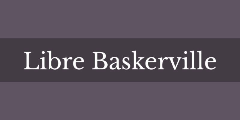
A free web-optimized revival of the 1941 American Type Founders Baskerville, designed by Pablo Impallari in 2012 specifically for screen reading.
Classification & Design Characteristics
Transitional serif font with refined letterforms. Taller x-height than original Baskerville. Wider counters and reduced stroke contrast. Sharp, defined serifs with elegant appearance. Open, rounded characters suitable for continuous reading.
Visual Similarities to Baskerville
Near-vertical stress in rounded strokes. Open lower counter on lowercase ‘g’ with distinctive ear. High contrast between thick and thin strokes (though less than original). Bracketed serifs with tapered endings. Similar proportional harmony in letterform relationships.
Key Differences from Baskerville
Taller x-height for better screen legibility. Wider counters create more open letterforms. Less stroke contrast for digital display. Slightly heavier overall weight. Optimized specifically for 16px body text on screens.
Best Use Cases
Digital environments: Websites, apps, e-readers.
Long-form reading on screens. Blog posts and online articles. E-books and digital publications. Works well at standard web text sizes (14-18px).
Not ideal for fine print or traditional book publishing.
Availability & Licensing
Google Fonts – completely free.
SIL Open Font License (personal and commercial use). Three weights: Regular, Italic, Bold. No bold italic variant available. Web font formats (WOFF, WOFF2). Desktop installation supported (TTF, OTF).
Baskerville Old Face
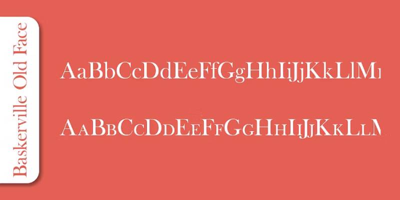
An 18th-century interpretation by Isaac Moore at the Fry Foundry, representing one of the earliest Baskerville adaptations with distinctive characteristics.
Classification & Design Characteristics
Transitional serif based on Moore’s 1776 design. Flatter curves in lowercase letters than original Baskerville. More tapered serifs. Squarish curves in capital C and G. Characteristic Moore ‘a’ at display sizes.
Elegant at large sizes with delicate strokes.
Visual Similarities to Baskerville
High contrast between thick and thin strokes. Vertical stress in rounded letters. Rational, geometric construction. Sharp, refined serif treatment. Typographic hierarchy through size variation.
Key Differences from Baskerville
Flatter lowercase curves. More tapered serifs than original. Different ‘a’ design at larger sizes. Light and narrow at small sizes (below 14pt). More weight and vigor in sizes above 30pt.
Squarish capital C and G letterforms.
Best Use Cases
Display typography and headlines.
Large format printing (30pt and above). Book titles and chapter headings. Elegant invitations and announcements. Works best at 18pt and larger.
Avoid for extended body text at small sizes.
Availability & Licensing
Included with Microsoft Windows (URW digitization). No italic or bold weights in Windows version. Various commercial digitizations available. Linotype, Monotype versions offer complete families. Free in basic form, commercial for extended families.
Caslon
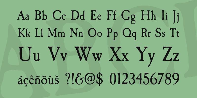
Created by William Caslon in the 1720s, this quintessential British typeface dominated English and American printing for over a century.
Classification & Design Characteristics
Old-style serif with traditional proportions. Moderate stroke contrast with robust texture. Bracketed serifs with wedge-topped serifs on lowercase. Characteristic curve at apex of uppercase ‘A’. Short ascenders and descenders. Small tapered stroke at bottom left of ‘b’.
Visual Similarities to Baskerville
Both are British transitional/old-style classics. High-quality letterforms with refined details. Excellent readability in print design. Similar historical period and influence. Professional, authoritative character.
Key Differences from Baskerville
More pronounced stroke variation overall. Wedge-topped serifs (Baskerville has horizontal serifs). Less vertical stress, more organic feel. Thicker capitals that can appear “spotty” on page. Swift serifs versus Baskerville’s tapered ones.
Caslon predates Baskerville by about 30 years.
Best Use Cases
Traditional book typography.
Legal documents and formal correspondence. Historical or period design projects. Declaration of Independence replica projects. Body text in books and magazines.
Classic, conservative branding.
When in doubt, use Caslon (old printers’ maxim).
Availability & Licensing
Adobe Caslon Pro (Adobe Fonts subscription). Many free and commercial versions exist. Caslon 540, Caslon Old Face variants. Included in various professional font packages. ITC Caslon 224 for modern applications.
Garamond

A venerable old-style serif from the 16th century, named after Claude Garamond, representing the pinnacle of French Renaissance typography.
Classification & Design Characteristics
Old-style serif with Renaissance origins. Small bowl on lowercase ‘a’. Small eye of lowercase ‘e’. Organic, calligraphic details. Lower stroke contrast than Baskerville. Elegant, refined letterforms with moderate x-height.
Visual Similarities to Baskerville
Both are classic book faces. High legibility for extended reading. Professional, literary associations. Traditional serif structure. Suitable for body text.
Key Differences from Baskerville
Less vertical stress, more angled. Lower contrast between thick and thin strokes. Smaller, more delicate overall appearance. Rounder, softer letterforms. Old-style versus transitional classification.
Garamond appears lighter and more graceful.
Best Use Cases
Book interiors and long-form text.
Academic papers and scholarly publications. Literary works and poetry. Eco-friendly printing (uses less ink). Professional documents where elegance matters.
Magazine and newspaper body text.
Particularly strong at 10-12pt for print.
Availability & Licensing
Adobe Garamond Pro (widely available). EB Garamond (free, Google Fonts). Garamond Premier Pro (Adobe). Many versions from different foundries. Apple Garamond included on Mac systems.
System fonts on most computers.
Palatino
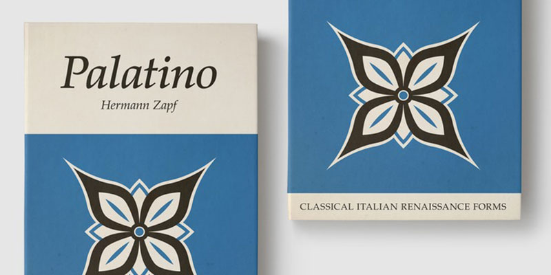
Designed by Hermann Zapf in 1949, this humanist serif balances Renaissance elegance with modern proportions and exceptional legibility.
Classification & Design Characteristics
Humanist serif with calligraphic roots. Wide letterforms with generous proportions. Larger x-height than Garamond. Strong, slightly heavy strokes. Sharp serifs on many letters.
Based on Italian Renaissance forms.
Distinctive personality without being ornate.
Visual Similarities to Baskerville
Both work well for book typography. High readability at text sizes. Professional, sophisticated appearance. Clear letterform distinctions. Balanced proportions.
Key Differences from Baskerville
Wider letterforms (takes more space). Heavier overall weight. More calligraphic, less geometric. Humanist rather than transitional classification. Stronger serifs create different texture.
Less formal, warmer character.
Best Use Cases
Book text and long documents.
Headings and display where space allows. Academic and educational materials. Presentations and slides (good screen presence). Documents requiring space and presence.
Corporate communications.
Particularly effective at larger text sizes.
Availability & Licensing
Palatino Linotype (included with Windows). Book Antiqua (similar, Windows default). Palatino (Mac system font). Commercial versions with extended families. Various weights and styles available.
Times New Roman
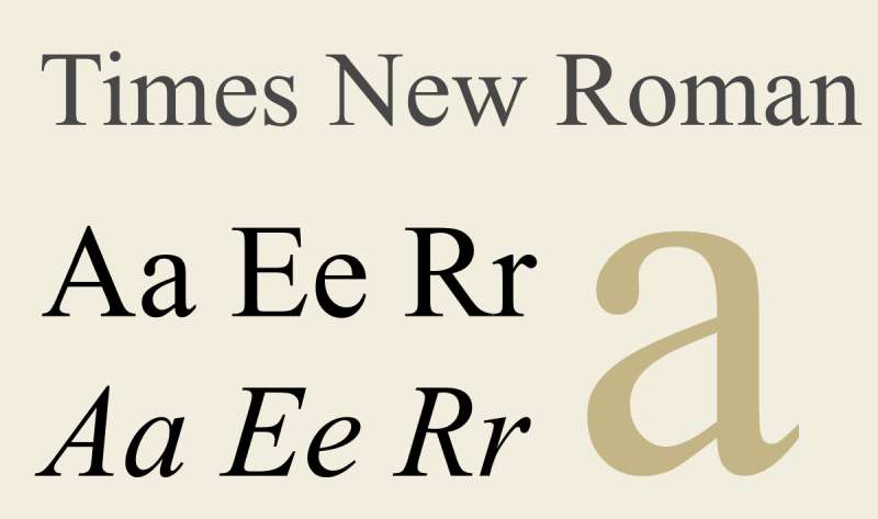
Commissioned by The Times of London in 1931, designed by Stanley Morison and Victor Lardent to be economical yet readable in newspaper columns.
Classification & Design Characteristics
Transitional serif optimized for newspaper printing. Narrow, space-efficient letterforms. Higher stroke contrast. Shorter descenders for tight line spacing. Moderate x-height.
Designed for small sizes and narrow columns.
Visual Similarities to Baskerville
Both are transitional serifs. Strong vertical stress. High contrast letterforms. Professional, formal appearance. Suitable for body text.
Key Differences from Baskerville
Much narrower character widths. More condensed, economical spacing. Designed for newsprint, not fine printing. Heavier, more upright than Baskerville. Less elegant, more utilitarian.
Times feels more compressed and formal.
Best Use Cases
Space-constrained documents.
Resumes and CVs (fits more text). Academic papers with length limits. Forms and official documents. Newspaper-style layouts.
Default choice for conservative documents.
Better for print than screen display.
Availability & Licensing
Pre-installed on Windows and Mac. Ubiquitous system font. Free for personal and commercial use. Multiple versions (Times, Times New Roman, Times Roman). Various weights available.
Essentially universal availability.
Sabon

Designed by Jan Tschichold in 1964-1967, this Garamond revival was created to look identical across different typesetting technologies.
Classification & Design Characteristics
Old-style serif based on Garamond. Robert Granjon’s italics as inspiration. Moderate stroke contrast. Unique feature: Roman, italic, and bold all share identical width. Balanced, harmonious letterforms.
Designed for technological compatibility.
Visual Similarities to Baskerville
Both are refined book faces. High legibility at text sizes. Classical proportions. Professional quality typography. Suitable for extended reading.
Key Differences from Baskerville
Lower stroke contrast. Old-style rather than transitional. Less vertical stress. Warmer, more humanist character. Garamond-inspired details.
More traditional, less geometric than Baskerville.
Best Use Cases
Book interiors and body text.
Traditional or formal publications. Literary works requiring classical typography. Documents needing consistent copyfitting. Fine printing and limited editions.
Professional typesetting projects.
Excellent for books requiring elegance.
Availability & Licensing
Linotype Sabon (commercial). Sabon Next (updated version). Adobe Fonts subscription. Professional font packages. Not freely available.
Requires commercial license for most uses.
Monticello
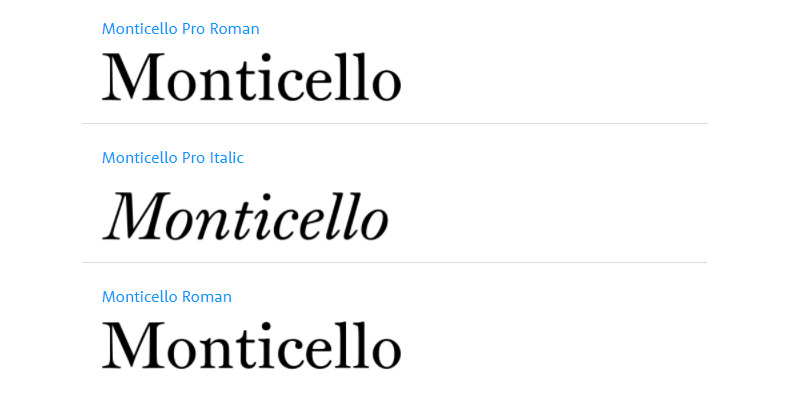
An American typeface revival commissioned by the University of Virginia, based on types used during Thomas Jefferson’s time, embodying early American printing.
Classification & Design Characteristics
Transitional serif with neoclassical influences. Designed during the Revolution/Enlightenment period. Vertical stress with rational axis. Influenced by Baskerville’s work. American interpretation of European models.
Historical yet refined letterforms.
Visual Similarities to Baskerville
Both represent transitional period. Vertical stress in construction. High contrast strokes. Refined, rational design approach. Neoclassical aesthetic values.
Key Differences from Baskerville
Specifically American historical character. Different historical context and usage. May have variations for period authenticity. Less widely known or distributed. Designed for specific institutional use.
Best Use Cases
Historical American documents.
Academic and university publications. Period-appropriate design projects. Books about American Revolutionary era. Institutional communications.
Projects requiring American historical character.
Availability & Licensing
Limited commercial availability. Primarily through specialized foundries. May require institutional licensing. Not as widely distributed as Baskerville. Check with University of Virginia resources.
Le Monde

A contemporary newspaper typeface designed by Jean François Porchez for Le Monde newspaper, combining classical elegance with modern functionality.
Classification & Design Characteristics
Modern transitional serif for news. High contrast letterforms. Optimized for small text sizes. Sharp, refined details. Multiple optical sizes.
Designed for contemporary newspaper production.
Visual Similarities to Baskerville
Transitional serif classification. High stroke contrast. Vertical stress. Elegant, refined appearance. Sophisticated typography.
Key Differences from Baskerville
Designed for modern printing technology. Optimized for newsprint and small sizes. Contemporary design (1990s versus 1750s). Multiple optical size variants. More compact for space efficiency.
Modern interpretation versus historical model.
Best Use Cases
Newspaper and editorial design.
Magazine text and headlines. Contemporary publications. Text requiring elegance and economy. Professional journalism.
Projects needing modern sophistication.
Availability & Licensing
Porchez Typofonderie (commercial). Professional licensing required. Multiple weights and styles. Optical size variants available. Expensive, premium typeface.
Galaxie Copernicus
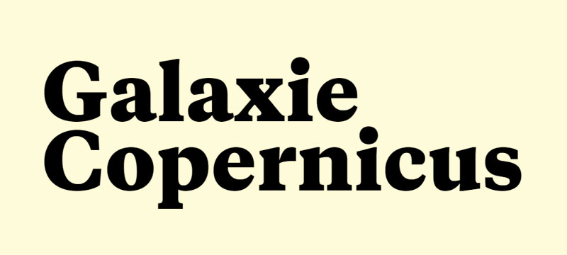
A contemporary serif designed by Chester Jenkins combining old-style warmth with modern precision, named after the astronomer.
Classification & Design Characteristics
Hybrid serif blending multiple influences. Old-style foundations with modern clarity. Moderate contrast. Slightly condensed proportions. Contemporary interpretation of classical forms.
Designed for versatility.
Visual Similarities to Baskerville
Refined, professional appearance. Suitable for book typography. Balanced proportions. Clear letterform distinctions. Transitional influences.
Key Differences from Baskerville
More contemporary design language. Slightly condensed versus Baskerville’s width. Blends more stylistic influences. Modern production values. Less historically specific.
Best Use Cases
Contemporary book design.
Editorial publications. Corporate communications. Modern branding requiring sophistication. Documents needing fresh classicism.
Projects bridging traditional and contemporary.
Availability & Licensing
Village (commercial foundry). Professional licensing. Multiple weights available. Not freely available. Premium pricing.
Mrs Eaves
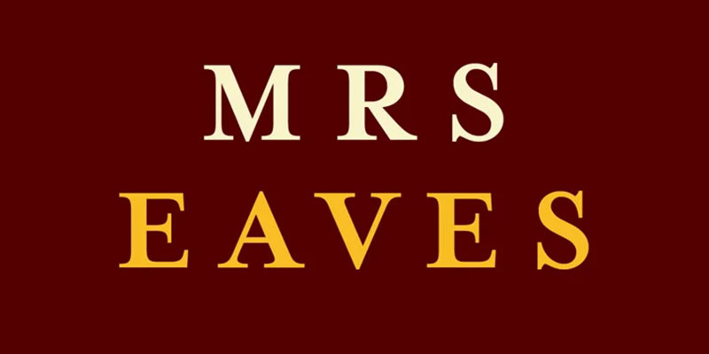
Zuzana Licko’s 1996 interpretation of Baskerville, named after John Baskerville’s housekeeper and wife Sarah Eaves, designed for display use.
Classification & Design Characteristics
Transitional serif based on Baskerville. Low x-height (distinctive feature). Loose letter spacing. Extensive ligature collection (213 ligatures). Wide lowercase proportions.
Open counter in lowercase ‘g’.
Designed for display, not extended body text.
Visual Similarities to Baskerville
Based directly on Baskerville models. Near-vertical stress. Open lowercase ‘g’ with swash ear. Flowing uppercase ‘Q’ tail. Similar serif treatment.
Key Differences from Baskerville
Much lower x-height creates different texture. Looser spacing throughout. Based on printed specimens, not metal type. Extensive ligatures (Baskerville had few). Reduced stroke contrast for offset printing.
Wider lowercase proportions.
More quirky, artistic character.
Best Use Cases
Book covers and dust jackets (primary use).
Display typography and headlines. Short text blocks. Literary and artistic projects. Invitations and announcements.
Blurbs and pull quotes.
Not recommended for long body text.
Availability & Licensing
Emigre foundry (commercial). Adobe Fonts subscription. Multiple variants (Mrs Eaves XL for text). Extensive OpenType features. Mr Eaves (sans-serif companion).
Relatively affordable for quality.
Stone Serif
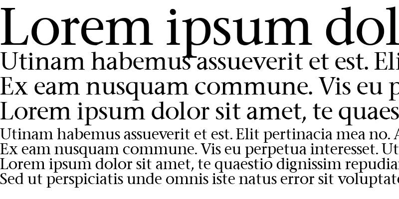
Designed by Sumner Stone in 1987 as part of a three-family system, representing contemporary humanist serif design with excellent screen performance.
Classification & Design Characteristics
Humanist serif with contemporary proportions. Part of coordinated family (Serif, Sans, Informal). Large x-height for legibility. Open counters and apertures. Moderate stroke contrast.
Designed for digital environments.
Visual Similarities to Baskerville
Professional typography quality. Refined letterform construction. Suitable for text and display. Clear, readable structure. Transitional influences.
Key Differences from Baskerville
Much larger x-height. Designed for screens and digital use. Contemporary 1980s design. Part of coordinated type system. Less historical character.
More neutral, modern personality.
Best Use Cases
Corporate communications.
Documents requiring screen display. Multi-platform publications. Professional correspondence. Technical documentation.
Projects needing neutrality and clarity.
Works well in web design projects.
Availability & Licensing
ITC Stone Serif (commercial). Adobe Fonts subscription. Professional font packages. Multiple weights and styles. Coordinated with Stone Sans.
Goudy Old Style

Created by Frederic Goudy in 1915 for American Type Founders, this old-style serif became an instant bestseller with distinctive personality.
Classification & Design Characteristics
Old-style serif with Arts & Crafts influence. Diamond-shaped dots on ‘i’, ‘j’, punctuation. Upward-curved ear on ‘g’. Sharply canted hyphen. Relatively light color on page.
Short descenders (ATF requirement).
Slightly eccentric detailing.
Visual Similarities to Baskerville
Classic book typography approach. Professional quality letterforms. Suitable for text and display. Traditional serif structure. Literary associations.
Key Differences from Baskerville
Old-style versus transitional. Lower stroke contrast. More organic, less geometric. Distinctive quirky details. Earlier historical influences (Renaissance).
Lighter overall appearance.
Best Use Cases
Literary publications and books.
Magazine typography. Editorial design. Projects requiring personality. Elegant yet approachable documents.
Traditional design with character.
Used by Harper’s Magazine.
Availability & Licensing
Widely available commercially. Monotype, Adobe, Bitstream versions. Some free versions exist. LTC version includes swash characters. Sorts Mill Goudy (open-source variant).
Generally accessible and affordable.
Century

Designed by Linn Boyd Benton and later expanded by Morris Fuller Benton, this highly legible serif was created specifically for magazine use.
Classification & Design Characteristics
Old-style/transitional hybrid. Large x-height for excellent legibility. Modest stroke contrast. Open counters. Sturdy construction.
Originally designed for The Century Magazine.
Multiple variants exist (Century Schoolbook, etc.).
Visual Similarities to Baskerville
Both prioritize readability. Transitional period influences. Suitable for body text. Professional appearance. Clear letterform distinctions.
Key Differences from Baskerville
Larger x-height. Less stroke contrast. More open, friendly appearance. Less formal character. American versus British origins.
Designed for magazines, not fine books.
Best Use Cases
Educational materials (Century Schoolbook).
Textbooks and learning resources. Magazines and periodicals. Documents for young readers. Materials requiring high legibility.
Professional publications needing clarity.
Particularly good for children’s books.
Availability & Licensing
Century Schoolbook widely available. System fonts on many computers. Bitstream, URW versions. Various Century variants exist. Generally freely available for basic versions.
Bodoni
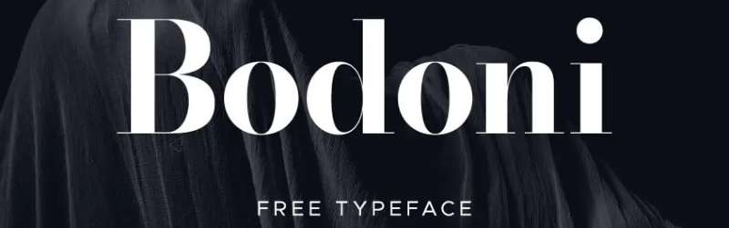
Created by Giambattista Bodoni in 1798, this modern serif represents the extreme development of high-contrast typography with razor-thin hairlines.
Classification & Design Characteristics
Modern (Didone) serif classification. Extreme stroke contrast (defining feature). Hairline serifs with no brackets. Vertical stress. Geometric, rational construction.
Unbracketed, perpendicular serifs.
Visual Similarities to Baskerville
Both show high contrast. Vertical stress in construction. Refined, elegant appearance. Represent typographic innovation. Suitable for display use.
Both influenced by Enlightenment ideals.
Key Differences from Baskerville
Far more extreme stroke contrast. Unbracketed serifs (Baskerville has brackets). Later historical period (1798 vs 1757). Modern rather than transitional classification. More geometric, less organic.
Creates “dazzle” effect at small sizes.
Bodoni pushes Baskerville’s ideas to extremes.
Best Use Cases
Headlines and display typography.
Fashion and luxury branding. Magazine covers and editorial headers. High-end advertising. Large format printing.
Modern, elegant design projects.
Requires high-quality printing for small sizes.
Used by Vogue, Nirvana logo.
Availability & Licensing
Multiple versions widely available. ITC Bodoni (various optical sizes). Bodoni Poster for extreme display. Adobe, Linotype versions. Often included in professional packages.
Free versions available (Libre Bodoni).
Didot
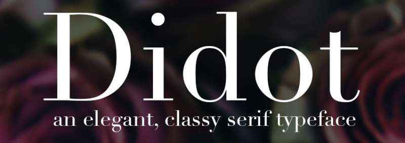
Developed by the Didot family (primarily Firmin Didot) from 1784-1811, this French modern serif competes with Bodoni as the pinnacle of high-contrast typography.
Classification & Design Characteristics
Modern (Didone) serif. Extreme contrast between thick and thin. Hairline serifs with no bracketing. Vertical stress. Condensed armature.
Neoclassical, Enlightenment aesthetic.
Even more delicate than Bodoni.
Visual Similarities to Baskerville
High contrast strokes. Vertical stress. Refined, elegant construction. Represents typographic progress. Intellectual, refined associations.
Inspired by Baskerville’s innovations.
Key Differences from Baskerville
More extreme contrast (hairlines even thinner). Later period (1780s-1810s vs 1757). Unbracketed versus bracketed serifs. More condensed proportions. Modern versus transitional classification.
Even more susceptible to “dazzle” effect.
Best Use Cases
Fashion and luxury applications.
Magazine mastheads (Harper’s Bazaar). High-end editorial design. Display typography at large sizes. Sophisticated branding.
Art book titles.
Harper’s Bazaar and Vogue historically used Didot.
Requires excellent printing conditions.
Availability & Licensing
Linotype Didot (Adrian Frutiger version). Hoefler & Co versions with optical sizing. Multiple weights and display sizes. Commercial licensing required. Premium pricing for quality versions.
Free alternatives exist but lack refinement.
FAQ on Fonts Similar To Baskerville
What is the closest free alternative to Baskerville?
Libre Baskerville is the closest free option, available through Google Fonts. It’s based directly on the 1941 American Type Founders Baskerville with modifications for screen readability, including a taller x-height and wider counters for digital display.
Can I use Baskerville Old Face for commercial projects?
Yes, but availability varies. The basic version included with Windows has limited weights. For commercial projects requiring complete font families with multiple weights and italics, you’ll need to purchase licenses from foundries like Linotype or Monotype.
Which font is better for body text: Garamond or Baskerville?
Both excel at body text but serve different purposes. Garamond offers warmer, more traditional old-style readability and uses less ink. Baskerville provides sharper, more modern transitional contrast that works well for contemporary editorial design and print design.
What’s the difference between Baskerville and Caslon?
Caslon predates Baskerville by 30 years and features more pronounced stroke variation with wedge-topped serifs. Baskerville has greater vertical stress, more circular rounded strokes, and sharper tapered serifs representing the transitional period between old-style and modern typography.
Is Times New Roman similar to Baskerville?
Both are transitional serifs with vertical stress, but Times New Roman is much narrower and more condensed. It was designed for newspaper economy, while Baskerville prioritizes elegance. Times feels utilitarian; Baskerville feels refined and sophisticated for quality publishing.
Why is Mrs Eaves not good for body text?
Mrs Eaves has an unusually low x-height and loose letter spacing designed specifically for display use. These characteristics create visual interest in headlines and book covers but cause readability issues in extended body text where consistent rhythm matters.
What fonts pair well with Baskerville alternatives?
Pairing fonts works best when combining serif and sans-serif typefaces. For Baskerville-style serifs, pair with humanist sans-serifs like Gill Sans, Frutiger, or modern geometrics like Futura. The contrast creates visual hierarchy while maintaining sophistication.
Are Bodoni and Didot too similar to Baskerville?
No, they’re distinctly different despite historical connections. Bodoni and Didot are modern serifs with extreme stroke contrast and unbracketed hairline serifs. Baskerville is transitional with moderate contrast and bracketed serifs, making it more readable for body text applications.
Which Baskerville alternative works best for websites?
Libre Baskerville was specifically optimized for screen display with larger x-height and reduced contrast. For more options, consider Georgia (designed for screens) or system fonts like Palatino that render well digitally while maintaining classical elegance in web design.
How do I choose between Sabon and Baskerville?
Sabon offers warmer, more humanist old-style character based on Garamond with lower stroke contrast. Baskerville provides sharper, more geometric transitional styling with higher contrast. Choose Sabon for traditional book typography; choose Baskerville for contemporary editorial sophistication and modern publishing.
Conclusion
Exploring fonts similar to Baskerville reveals a rich landscape of transitional and old-style serifs that balance classical elegance with practical functionality. From free options like Libre Baskerville to premium choices like Sabon and Mrs Eaves, each alternative offers distinct advantages for different design contexts.
The right choice depends on your specific needs. Consider x-height for readability, stroke contrast for printing conditions, and licensing requirements for your project scope.
Professional typography demands understanding these subtle differences. Caslon brings historical warmth, Garamond offers refined economy, while Bodoni and Didot push high-contrast drama for display applications.
Test several alternatives in your actual layouts before committing. What works beautifully at 48pt might struggle at 11pt, and screen display requirements differ dramatically from book cover design needs.
These sixteen serif fonts provide sophisticated alternatives without sacrificing the refined character that makes Baskerville enduringly popular across editorial design and literary publishing.
If you enjoyed reading this article on Amazing fonts similar to Baskerville, you should check out these articles with fonts similar to Gotham, Calibri, Trajan, Rockwell, Montserrat, Oswald, and Brandon Grotesk.

Renowned for his expertise in logo design and visual branding, Bogdan has developed a multitude of logos for various clients.
His skills extend to creating posters, vector illustrations, business cards, and brochures. Additionally, Bogdan's UI kits were featured on marketplaces like Visual Hierarchy and UI8.
He also wrote in the past years on sites like Design Your Way, WebDesignerDepot, WPDean, Designmodo, Speckyboy, Slider Revolution, and more.
- The Cursor Logo History, Colors, Font, And Meaning - 24 September 2026
- Canva vs PowerPoint: Which Is Better for Presentations? - 22 September 2026
- How to Install Fonts on Mac (Step-by-Step Guide) - 20 September 2026

Bogdan Sandu is a seasoned designer who has been designing websites since 2008. Renowned for his expertise in logo design and visual branding, Bogdan has developed a multitude of logos for various clients. His skills extend to creating posters, vector illustrations, business cards, and brochures. Additionally, Bogdan's UI kits were featured on marketplaces like Visual Hierarchy and UI8. He also wrote in the past years on sites like Design Your Way, WebDesignerDepot, WPDean, Designmodo, Speckyboy, Slider Revolution, and more.
You Might Also Like