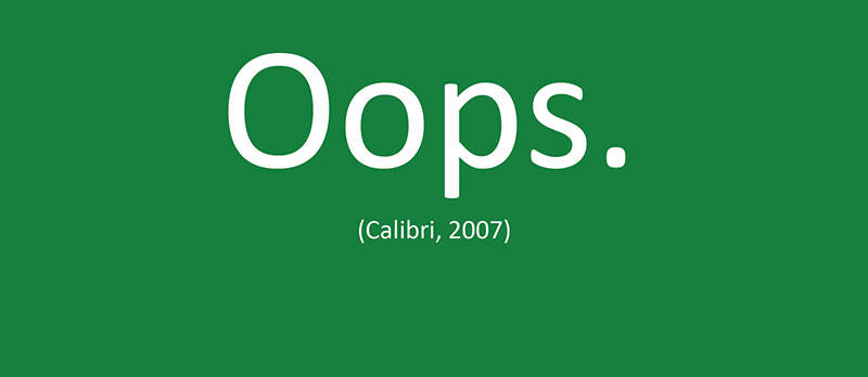
Calibri’s reign as Microsoft Office’s default ended in 2023, leaving millions scrambling for alternatives. Whether you’re switching by choice or necessity, finding fonts similar to Calibri that maintain professional polish while offering fresh character isn’t simple.
The challenge goes beyond aesthetics. Document compatibility, cross-platform availability, and licensing restrictions complicate the search. A poor substitute can reflow entire reports or compromise brand consistency.
This guide examines 20 Calibri alternatives across free and commercial options. You’ll discover exact metric matches for seamless document migration, humanist sans options that preserve Calibri’s warmth, and modern grotesque typefaces that elevate professional communications.
From open-source replacements like Carlito to Microsoft’s official successor Aptos, each font includes technical specifications, readability assessments, and practical pairing recommendations. Stop settling for Arial.
Fonts Similar To Calibri
| Font Name | Classification | Best Use Context | Key Similarity to Calibri |
|---|---|---|---|
| Carlito | Humanist Sans-Serif | Open-source alternative for LibreOffice | Metrically identical, direct substitute |
| Aptos | Humanist Sans-Serif | Microsoft’s new default replacing Calibri | Modern successor, warmer terminals |
| JUST Sans | Humanist Sans-Serif | Digital interfaces and branding | Rounded terminals, friendly readability |
| Open Sans | Humanist Sans-Serif | Web typography and screen reading | Neutral appearance, optimized legibility |
| Fira Sans | Humanist Sans-Serif | Mozilla products and code editors | Clear proportions, technical precision |
| Gill Sans | Humanist Sans-Serif | Classic British design and branding | Geometric forms with humanist warmth |
| Frutiger | Humanist Sans-Serif | Wayfinding and signage systems | Exceptional clarity at any size |
| Verdana | Humanist Sans-Serif | Low-resolution screens and small sizes | Wide proportions, screen-optimized |
| Droid Sans | Humanist Sans-Serif | Android UI and mobile applications | Open apertures, mobile readability |
| Helvetica | Neo-Grotesque Sans | Corporate identity and Swiss design | Neutral tone, professional appearance |
| Helvetica Neue | Neo-Grotesque Sans | Apple ecosystem and premium branding | Refined proportions, extended weights |
| Concourse | Humanist Sans-Serif | Long-form text and editorial design | Balanced readability, professional tone |
| Guardian Sans | Humanist Sans-Serif | News and journalism contexts | Editorial clarity, space-efficient |
| Seravek | Humanist Sans-Serif | Apple platforms and digital reading | Warm character, excellent legibility |
| Fort | Geometric Sans-Serif | Display and headline purposes | Geometric structure with soft edges |
| Raleway | Geometric Sans-Serif | Web headers and elegant displays | Thin proportions, sophisticated feel |
| Nunito Sans | Humanist Sans-Serif | Web interfaces and body text | Rounded terminals, friendly tone |
| TT Commons Pro | Neo-Grotesque Sans | Modern branding and interfaces | Contemporary neutrality, versatile |
| TT Norms | Neo-Grotesque Sans | Tech startups and digital products | Clean geometry, functional design |
| Lato | Humanist Sans-Serif | Web typography and corporate use | Warm proportions, serious yet friendly |
Carlito

Carlito is metric-compatible with Calibri, meaning documents won’t reflow when switching between them. Built from Lato’s foundation by the same designer, it mirrors Calibri’s proportions while maintaining open-source accessibility.
Classification & Design Attributes
Sans-serif, neo-grotesque, humanist sans typeface. Released 2013, designed by Lukasz Dziedzic (tyPoland).
Features rounded terminals in some characters while Calibri has consistent rounding throughout. Contemporary design with warm, friendly character while maintaining professional neutrality.
Primary Use Cases
Business documents, presentations, body text in reports, office correspondence. Works across print and digital environments.
Optimal at 10-12pt for body text. Functions well in spreadsheets and data-heavy layouts. Default Calibri replacement in LibreOffice Suite and ChromeOS.
Technical Specifications
Approximately 2,782 glyphs covering Latin, Greek, and Cyrillic scripts (incomplete sets). Four weights: Regular, Bold, Italic, Bold Italic.
Cross-platform compatible (Windows, macOS, Linux). Licensed under SIL Open Font License 1.1. Includes hand-hinted optimizations for screen rendering.
Comparison to Calibri
Identical metrics mean one-to-one character spacing match. X-height matches Calibri precisely for seamless document compatibility.
Letter spacing designed to replicate Calibri’s rhythm. Some terminals show different rounding approaches. The lowercase ‘a’ retains similar openness but with subtle geometric variations.
Accessibility & Readability
Performs well at small sizes (8pt+) due to large apertures. Screen rendering benefits from TrueType hinting.
Strong body text candidate with clear character differentiation. Not specifically marketed as dyslexia-friendly but maintains open letterforms that aid readability.
Pairing Recommendations
Pairs with Caladea (Cambria alternative) for heading/body combinations. Works alongside Courier New alternatives like Cousine for monospace needs.
Combines well with geometric sans options for UI elements. Try bolder weights alongside serif fonts for document hierarchy.
Aptos

Microsoft’s official Calibri successor, launched as the new default for Office 365 in 2023. Commissioned specifically to work across high-resolution displays while maintaining professional warmth.
Classification & Design Attributes
Neo-grotesque sans-serif with humanist influences. Released 2021 (as Bierstadt), renamed Aptos 2023. Designed by Steve Matteson.
Inspired by mid-20th-century Swiss typography but softened with subtle curves. Features distinctive lowercase ‘l’ with tail, circular dots on ‘i’ and ‘j’.
Primary Use Cases
Business documents, corporate presentations, professional correspondence. Optimized for Word, PowerPoint, Excel, Outlook.
Works across screen resolutions from mobile to 4K displays. Body text performs best at 10-14pt. Display and Narrow variants expand usage to specialized applications.
Technical Specifications
12 core weights: Light, Regular, Semibold, Bold, Extrabold, Black (each with italic). Plus Aptos Display, Aptos Narrow, Aptos Serif, Aptos Mono variants.
Full Latin, Greek, Cyrillic, and Vietnamese support. OpenType features include proportional and tabular figures. Proprietary Microsoft licensing (included with Microsoft 365 subscriptions).
Comparison to Calibri
Larger x-height than Calibri. Horizontal stroke endings versus Calibri’s angled terminals.
Removed distinctive tail from lowercase ‘a’, added it to ‘l’ instead. Slightly tighter letter spacing overall. More neutral tone compared to Calibri’s friendly softness.
Numbers use mixed construction (single-stroke 6, double-elliptical 8).
Accessibility & Readability
Excellent small-size legibility (designed for high-DPI screens). Clear character distinction prevents ‘l’, ‘I’, ‘1’ confusion.
Optimized specifically for digital reading at various zoom levels. Performs consistently across Microsoft’s ecosystem. Strong screen performance exceeds print optimization.
Pairing Recommendations
Use Aptos Serif for traditional document headers. Pair with Aptos Mono for code or technical specifications.
Calibri remains available for transitional pairing. Combines effectively with older Microsoft standards (Arial, Times New Roman) during migration periods.
JUST Sans
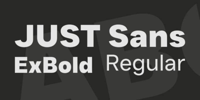
Modern geometric sans with sharp angled terminals. Created for branding agency JUST Creative with emphasis on tech and design industries.
Classification & Design Attributes
Geometric grotesque sans-serif. Released 2022. Designed by Eugene Tantsurin (Groteskly Yours) and Jacob Cass.
Open, airy letterforms with generous width. Sharp angled terminals provide grip and character. Clean, minimal aesthetic with warm expressiveness despite geometric foundation.
Primary Use Cases
Branding, logos, headlines, UI design. Web-optimized with hand-hinted fonts. Strong performance in technology, architecture, fashion, and new media contexts.
Suitable for body text at 10-12pt. Works well in packaging, signage, posters. Display purposes benefit from heavier weights.
Technical Specifications
Seven weights: Extra Light, Light, Regular, Medium, Semi Bold, Bold, Extra Bold (each with italics). Variable font available for granular weight control.
Complete Latin Extended character support. Includes stylistic alternates and tabular figures. Hand-adjusted kerning pairs. Licensed commercially through Envato Elements; limited free version available under CC BY-ND.
Comparison to Calibri
Wider characters than Calibri. More geometric construction versus Calibri’s humanist softness.
Terminal treatment dramatically different – angular cuts versus Calibri’s rounded ends. Similar x-height proportions but bolder personality. Less neutral, more distinctive.
Accessibility & Readability
Strong screen performance with hand-hinted web fonts. Clear at small sizes but personality shines at larger display sizes.
Geometric clarity aids readability. Open apertures prevent confusion at body text sizes. Best suited for shorter text blocks rather than lengthy documents.
Pairing Recommendations
Pairs with JUST Sans Outline for dimensional contrast. Combines with traditional serif fonts (Garamond, Caslon) for editorial layouts.
Works alongside condensed fonts for space-constrained designs. Try with slab serifs for tech branding.
Open Sans

Humanist sans designed specifically for digital legibility. One of Google Fonts’ most popular options, serving billions of daily pageviews.
Classification & Design Attributes
Humanist sans-serif. Released 2011. Designed by Steve Matteson (derived from his earlier Droid Sans for Android).
Wide apertures on many letters enhance on-screen clarity. Large x-height maximizes legibility at small sizes. Upright stress with open forms creates neutral yet friendly appearance.
Primary Use Cases
Web design (body text and headlines). Mobile app interfaces. Branding, marketing materials, presentations.
Optimized for 9-16pt body text on screens. Works across print and digital. Extremely versatile for corporate to casual applications.
Technical Specifications
Ten weights: Light (300), Regular (400), Medium (500), Semi-Bold (600), Bold (700), Extra Bold (800) – each with italic. Condensed variants also available.
897 characters covering Latin, Greek, Cyrillic. Variable font version added 2021. Hebrew support included. Licensed under Apache License (free for commercial use).
Comparison to Calibri
Wider characters than Calibri create more open, spacious feel. Larger x-height increases perceived size at same point setting.
Less rounded terminals – more neutral geometric approach. Double-story ‘g’ differs from Calibri’s single-story option. True italic (not oblique) provides more typographic options.
Accessibility & Readability
Exceptional screen readability at all sizes. Large x-height and open apertures prevent character confusion.
Popular choice for accessible web design. Performs consistently across browsers and devices. Strong body text performance for extended reading.
Pairing Recommendations
Pairs naturally with Open Serif (companion slab serif by same designer). Combines with Montserrat or Raleway for heading contrast.
Works alongside Merriweather or Source Serif for serif complement. Roboto offers similar functionality with different personality.
Fira Sans
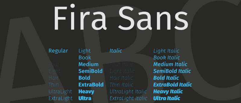
Designed for Mozilla’s Firefox OS. Clean, functional humanist sans with extensive character coverage and contemporary styling.
Classification & Design Attributes
Humanist sans-serif. Released 2013. Designed by Erik Spiekermann and Ralph du Carrois (Carrois Type Design).
Four-axis design system provides precise control. Slightly condensed proportions save space without sacrificing readability. Open counters and generous x-height optimize digital display.
Primary Use Cases
User interfaces, app design, web typography. Corporate communications, branding materials. Code-adjacent text (pairs with Fira Mono).
Body text at 9-14pt. Works well in responsive layouts. Strong performance in technical documentation and software environments.
Technical Specifications
18 weights across Regular and Condensed subfamilies (Thin through Ultra). Each with italic. Over 4,000 glyphs.
Extensive language support including Latin, Greek, Cyrillic, Arabic, Devanagari, Georgian, Hebrew. OpenType features include fractions, arrows, ligatures. Licensed under SIL Open Font License.
Comparison to Calibri
More condensed proportions than Calibri. Slightly taller x-height.
Terminal treatment less rounded – cleaner, more technical appearance. Character width narrower, fitting more text per line. Less warm than Calibri but highly functional.
Accessibility & Readability
Excellent screen rendering across devices. Clear character distinction aids accessibility.
Condensed width doesn’t compromise legibility. Strong performance in UI contexts. Extended character sets support multilingual accessibility.
Pairing Recommendations
Pairs with Fira Mono for code blocks or technical content. Combines with Roboto Slab for editorial contrast.
Works alongside PT Sans or Source Sans Pro for similar but distinct alternatives. Merriweather provides classic serif pairing.
Gill Sans
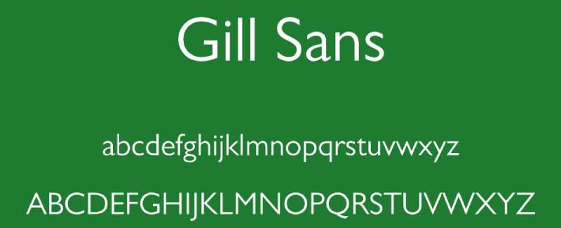
Classic British humanist sans from 1928. Elegant proportions with calligraphic influences create timeless, sophisticated aesthetic.
Classification & Design Attributes
Humanist sans-serif. Released 1928-1930. Designed by Eric Gill.
Based on Edward Johnston’s London Underground typeface. Geometric with humanist warmth from Gill’s stonecutting background. Distinctive ‘a’, ‘g’, and ‘t’ show calligraphic roots.
Primary Use Cases
Editorial design, book covers, branding. Corporate identity for sophisticated brands. Print-optimized but functions digitally.
Body text at 10-14pt. Excellent for headlines and display. Less ideal for extended on-screen reading compared to digital-native fonts.
Technical Specifications
Multiple weights from Light through Extra Bold. Includes condensed and ultra-bold variants.
Latin character coverage. OpenType features include ligatures, old-style figures. Proprietary licensing (Monotype). Available through Adobe Fonts, commercial licenses required otherwise.
Comparison to Calibri
More traditional proportions versus Calibri’s contemporary spacing. Smaller x-height creates different vertical rhythm.
Strong calligraphic influence versus Calibri’s modern neutrality. Less optimized for screens. More distinctive personality – luxury aesthetic versus office neutrality.
Accessibility & Readability
Good print legibility. Screen performance adequate but not optimized for digital.
Sophisticated but less universally accessible than modern humanist options. Best for branding rather than functional body text.
Pairing Recommendations
Classic pairing with Joanna (Gill’s serif). Combines with Baskerville or Caslon for traditional layouts.
Works alongside Futura for geometric contrast. Sabon provides renaissance serif complement.
Frutiger
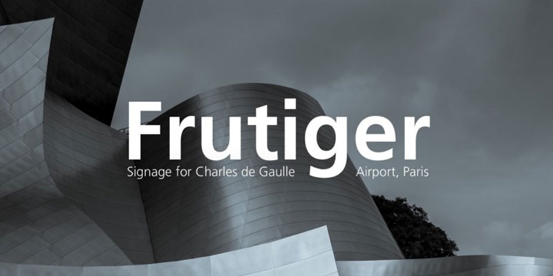
Influential humanist sans designed for airport wayfinding. Exceptional legibility under adverse conditions translated to widespread digital adoption.
Classification & Design Attributes
Humanist sans-serif. Released 1976. Designed by Adrian Frutiger.
Originally created for Charles de Gaulle Airport signage. Balanced stroke weights with open counters. Organic yet rational proportions combine functionality with warmth.
Primary Use Cases
Signage, wayfinding systems, corporate identity. Editorial design, information graphics. Performs equally well in print and digital.
Body text at 9-12pt. Exceptional for small sizes and distance reading. Used extensively in transportation and public information design.
Technical Specifications
Multiple weights from Ultra Light through Black. Condensed variants extend family.
Full Latin character support. OpenType features in digital versions. Proprietary licensing (Linotype/Monotype). Professional-grade font family with extensive language coverage.
Comparison to Calibri
Similar humanist approach but more refined proportions. Larger apertures than Calibri.
Less rounded terminals – cleaner, more precise cuts. Slightly narrower character width. More sophisticated engineering for challenging legibility contexts.
Accessibility & Readability
Designed specifically for maximum legibility. Performs exceptionally at small sizes and poor viewing angles.
Open counters prevent character ambiguity. Professional standard for accessible public information design. Screen performance excellent despite pre-digital origins.
Pairing Recommendations
Works with any quality serif (Minion, Garamond, Sabon). Pairs with Avenir for related geometric aesthetic.
Helvetica provides contrasting pairing despite both being Swiss designs. Universe offers systematic alternative.
Verdana
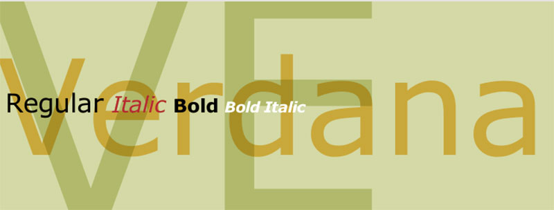
Screen-optimized sans designed specifically for Microsoft. Extremely wide proportions maximize on-screen clarity at small sizes.
Classification & Design Attributes
Humanist sans-serif. Released 1996. Designed by Matthew Carter.
Created for Microsoft’s core web fonts initiative. Extremely large x-height and loose letter spacing. Wide proportions prevent on-screen blurring at small sizes.
Primary Use Cases
Web body text at small sizes. On-screen reading in applications. User interfaces where clarity trumps space efficiency.
Optimized for 8-12pt screen display. Less suitable for print due to width. Excellent for accessibility-focused web projects.
Technical Specifications
Four core weights: Regular, Bold, Italic, Bold Italic. True italic rather than oblique.
Latin character support with TrueType hinting optimized for Windows ClearType. Proprietary Microsoft licensing (bundled with Windows, available via web-safe fonts).
Comparison to Calibri
Significantly wider than Calibri. Larger x-height creates more vertical presence.
More aggressive screen optimization versus Calibri’s balanced approach. Less elegant proportions but superior clarity at small on-screen sizes. Lowercase ‘a’ and ‘e’ notably more open.
Accessibility & Readability
Exceptional accessibility for vision-impaired readers. Large apertures and loose spacing prevent confusion.
Screen-specific hinting maintains clarity across resolutions. Trade-off: less space-efficient than alternatives. Gold standard for accessible web typography in its era.
Pairing Recommendations
Georgia provides companion serif (both designed by Carter for Microsoft). Pairs with Arial for Microsoft ecosystem consistency.
Tahoma offers similar goals with tighter spacing. Source Sans Pro provides modern alternative with comparable accessibility.
Droid Sans
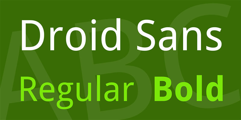
Google’s original Android system font. Designed for mobile screen legibility before smartphone displays reached current resolutions.
Classification & Design Attributes
Humanist sans-serif. Released 2007. Designed by Steve Matteson (Ascender Corporation).
Created specifically for Android OS mobile devices. Narrower proportions than Open Sans (its successor) optimize small screen real estate. Large x-height aids mobile legibility.
Primary Use Cases
Mobile interfaces, Android app design. Small-screen display text. Compact layouts requiring space efficiency.
Optimal at mobile device sizes (system default was ~14sp). Functions in print but designed for digital. Largely superseded by Roboto in Android ecosystem.
Technical Specifications
Two weights: Regular and Bold. Latin character support with some extended coverage.
Licensed under Apache License (open source). Includes manually adjusted hinting for mobile displays. Available via Google Fonts.
Comparison to Calibri
Narrower character width than Calibri. Similar x-height proportions.
Less refined than Calibri – optimized for technical constraints of early smartphones rather than aesthetic sophistication. More utilitarian character. Rounder terminals similar to Calibri’s approach.
Accessibility & Readability
Good mobile legibility at intended sizes. Clear character distinction at small dimensions.
Narrow width reduces readability in lengthy text blocks. Best for short UI strings and labels. Superseded by more refined options as screen technology improved.
Pairing Recommendations
Droid Serif provides companion serif option. Roboto offers evolved alternative within Android ecosystem.
Open Sans provides wider, more refined evolution by same designer. Works alongside system UI fonts on mobile platforms.
Helvetica
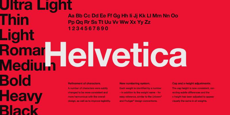
Swiss neo-grotesque icon. Neutral, ubiquitous, professionally standardized. The comparison point for modern sans-serif design.
Classification & Design Attributes
Neo-grotesque sans-serif. Released 1957. Designed by Max Miedinger and Eduard Hoffmann (Haas Type Foundry).
Extremely neutral letterforms prioritize clarity and objectivity. Tight spacing and uniform stroke weights. International Typographic Style embodiment.
Primary Use Cases
Corporate identity, branding, editorial design. Professional documents, signage, advertising. Print-optimized but functions digitally.
Body text at 9-14pt. Ubiquitous in graphic design. Used across all media types from business cards to billboards.
Technical Specifications
Extensive weight range from Ultra Light through Black. Multiple width variants (Condensed, Compressed, Extended).
Full Latin and extended character coverage. Proprietary licensing (Linotype, Monotype). Premium font with professional pricing.
Comparison to Calibri
Tighter character spacing versus Calibri’s openness. Smaller x-height creates different proportional system.
More rigid, less warm than Calibri. Horizontal terminal cuts versus Calibri’s angles. Highly neutral versus Calibri’s subtle friendliness.
Accessibility & Readability
Good legibility but less optimized for screen than digital-native alternatives. Tight spacing can challenge accessibility.
Professional standard but not specifically accessible. Better for branding than functional body text in digital contexts.
Pairing Recommendations
Classic pairing with Times or Garamond. Works with any quality serif for traditional layouts.
Univers provides related Swiss systematic alternative. Futura offers geometric contrast while maintaining modernist aesthetic.
Helvetica Neue
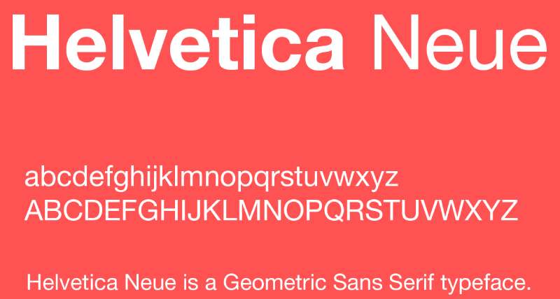
Refined evolution of Helvetica. Unified weight system and improved proportions address original’s inconsistencies.
Classification & Design Attributes
Neo-grotesque sans-serif. Released 1983. Designed by Linotype Design Studio (based on Helvetica by Miedinger/Hoffmann).
Redesigned weight progression creates systematic family. Improved letterspacing over original Helvetica. Tighter curves and refined proportions throughout.
Primary Use Cases
Corporate branding (Apple’s former system font). Professional documents, apps, editorial design. Print and digital applications.
Body text at 9-14pt. Default font for macOS/iOS before San Francisco. Ubiquitous in high-end design contexts.
Technical Specifications
51 weights across multiple widths (from Ultra Light Condensed through Black Extended). Comprehensive weight system unlike original Helvetica.
Full character coverage with OpenType features. Proprietary licensing (Linotype). Premium pricing reflects professional market position.
Comparison to Calibri
Similar x-height to Calibri but tighter spacing. More refined curves and proportions.
Colder, more formal than Calibri’s warmth. Better systematic weight progression. Less optimized for screen legibility than Calibri.
Accessibility & Readability
Good legibility but tight spacing can challenge screen reading. Better suited to print.
Professional quality but not accessibility-focused. Works best at appropriate sizes (not too small on screen).
Pairing Recommendations
Pairs with Helvetica family members for multi-weight projects. Garamond or Caslon provide contrasting serif options.
Baskerville works for editorial contexts. Lucida Grande offers system font alternative.
Concourse
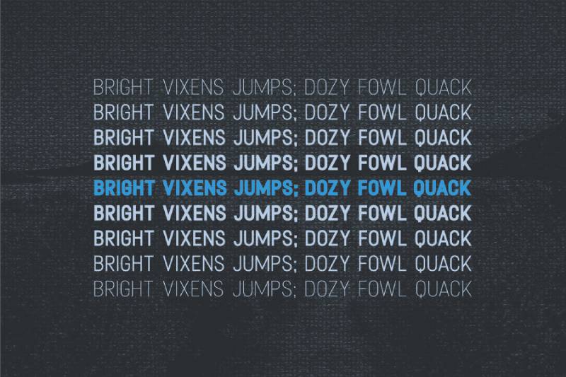
Comprehensive text and display sans designed for professional documents. Emphasizes readability and extensive customization options.
Classification & Design Attributes
Humanist sans-serif. Released 2013. Designed by Matthew Butterick.
Created specifically for legal and professional document work. Offers proportional, lining, tabular, and index variants. Extended weight range supports complex hierarchies.
Primary Use Cases
Professional documents, legal briefs, business reports. Body text for lengthy documents. Print-optimized with strong screen performance.
Optimal at 10-14pt for body text. Designed for documents requiring clear hierarchy and extensive reading. Functions across digital and print.
Technical Specifications
Seven weights from Light through Black. Four width variants: Proportional (T1-T7), Index (C1-C6), Caps (T1c-T7c), Lining (T1L-T7L).
OpenType features include proportional and tabular figures, small caps, ligatures. Proprietary licensing (Typography for Lawyers / Matthew Butterick).
Comparison to Calibri
Similar professional document focus. More extensive weight and width options than Calibri.
Tighter spacing creates different texture. Refined proportions aim for sophisticated professionalism versus Calibri’s approachability. More customization for technical document needs.
Accessibility & Readability
Strong readability in lengthy documents. Clear hierarchy through weight variations.
Index and tabular variants support technical document needs. Performs well in both screen and print contexts.
Pairing Recommendations
Charter or Equity (Butterick’s serifs) provide designed companions. Works with traditional book serifs for formal documents.
Triplicate (Butterick’s monospace) pairs for code or data. System serifs like Georgia function as budget pairings.
Guardian Sans

Designed for The Guardian newspaper. Balances personality with functionality for editorial design.
Classification & Design Attributes
Humanist sans-serif. Released 2005-2009. Designed by Paul Barnes and Christian Schwartz (Commercial Type).
Created as part of comprehensive Guardian typeface system. Warm, approachable character with strong editorial personality. Optimized for newsprint and screens.
Primary Use Cases
Editorial design, journalism, news websites. Magazine layouts, corporate communications. Performs across print and digital platforms.
Body text at 9-12pt in editorial contexts. Headlines benefit from heavier weights. Designed for news environment readability challenges.
Technical Specifications
Multiple weights from Hairline through Black. Includes condensed variants for space-constrained layouts.
OpenType features support editorial needs. Proprietary licensing (Commercial Type). Part of larger Guardian system including serif and Egyptian styles.
Comparison to Calibri
More personality than Calibri’s neutrality. Similar approachability but with editorial flair.
Tighter spacing for efficient text setting. X-height comparable but overall character more distinctive. Less suitable for corporate documents, better for content-focused applications.
Accessibility & Readability
Excellent editorial readability. Designed for newsprint legibility translates well to screens.
Clear at small sizes with personality retained at display scales. Strong performance in content-heavy layouts.
Pairing Recommendations
Guardian Egyptian and Guardian Text Serif provide system companions. Works with editorial staples like Miller or Publico.
Lyon or Freight Text offer alternative serif pairings. Interstate provides contrasting geometric sans option.
Seravek
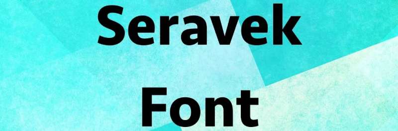
Refined humanist sans with calligraphic influences. Elegant contemporary design for sophisticated applications.
Classification & Design Attributes
Humanist sans-serif with calligraphic elements. Released 2014. Designed by Monotype Studio (based on Eric Gill’s sketches).
Derived from Gill’s unpublished designs. More contemporary than Gill Sans while retaining humanist warmth. Open counters and generous proportions.
Primary Use Cases
Branding, editorial design, upscale applications. Corporate communications requiring sophistication. Works in print and high-quality digital contexts.
Body text at 10-14pt. Display weights effective for headlines. Best suited to quality-focused projects rather than utilitarian documents.
Technical Specifications
Six weights from Extra Light through Bold, each with italic. Medium and Medium Italic added to original family.
OpenType features include ligatures, proportional figures. Proprietary licensing (Monotype). Available through professional font services.
Comparison to Calibri
More refined and sophisticated than Calibri. Calligraphic influences create warmer character.
Looser letter spacing than Calibri. Similar x-height but more elegant proportions. Less neutral, more distinctive personality.
Accessibility & Readability
Good readability with sophisticated aesthetic. Open counters aid legibility.
Better suited to quality design work than functional office documents. Screen performance solid but emphasizes print beauty.
Pairing Recommendations
Works with traditional book serifs (Garamond, Baskerville, Caslon). Joanna provides Gill-related serif option.
Minion or Arno pair well for editorial projects. FF Meta offers contrasting contemporary sans.
Fort
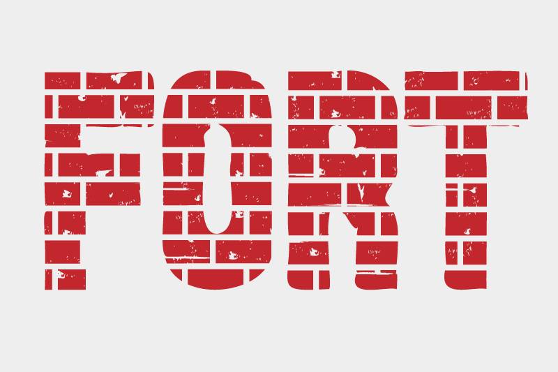
Contemporary grotesque with strong geometric foundation. Clean, modern aesthetic for branding and digital design.
Classification & Design Attributes
Geometric grotesque sans-serif. Released 2018. Designed by Anton Koovit (Fort Foundry).
Sharp, precise letterforms with subtle humanist touches. Circular forms in ‘o’, ‘e’, ‘a’ create geometric consistency. Modern without coldness.
Primary Use Cases
Branding, logo design, website headers. Modern corporate identity, tech sector applications. Digital-first design with print capability.
Display sizes showcase geometric precision. Body text works at 10-14pt. Strong UI and web typography choice.
Technical Specifications
Nine weights from Hairline through Extra Black, each with italic. Extended Latin character support.
OpenType features include alternate characters, ligatures. Commercial licensing with different tiers. Variable font version provides granular weight control.
Comparison to Calibri
More geometric construction versus Calibri’s humanist approach. Similar contemporary feel but different structural foundation.
Tighter spacing creates more compact texture. Comparable x-height but rounder letterforms. More distinctive for branding, less neutral than Calibri.
Accessibility & Readability
Good screen legibility with clear character forms. Geometric precision aids UI clarity.
Works well in body text but shines at display sizes. Open counters maintain readability across sizes.
Pairing Recommendations
Combines with serif fonts like Freight or FF Tisa for editorial contrast. Works alongside condensed fonts for spatial variety.
Lyon or Tiempos provide sophisticated serif complements. Source Sans Pro offers functional alternative pairing.
Raleway
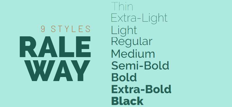
Elegant geometric sans with refined proportions. Thin weights provide distinctive character for headlines and branding.
Classification & Design Attributes
Geometric sans-serif. Released 2012 (redesigned from 2009 original). Designed by Matt McInerney, Pablo Impallari, Rodrigo Fuenzalida.
Based on original thin-weight design, expanded to full family. Uniform stroke weights with geometric construction. Elegant, contemporary aesthetic.
Primary Use Cases
Headlines, display text, branding. Website headers and hero sections. Less suitable for extensive body text.
Optimal at display sizes (18pt+). Thin weights particularly effective for luxury or minimal branding. Works best in short text blocks.
Technical Specifications
18 weights from Thin (100) through Black (900), each with italic. Full Latin Extended support.
Variable font available. Licensed under SIL Open Font License (free for commercial use). Available via Google Fonts.
Comparison to Calibri
More geometric versus Calibri’s humanist approach. Lower x-height creates different proportional system.
Thinner available weights extend range beyond Calibri. More distinctive personality suited to display rather than functional body text. Tighter spacing in regular weights.
Accessibility & Readability
Thin weights beautiful but less legible at small sizes. Regular through Bold weights improve body text readability.
Best suited to short text blocks and headlines. Extended character availability aids multilingual projects.
Pairing Recommendations
Lora or Crimson Text provide contrasting serif options. Open Sans offers body text complement.
Works with Montserrat for geometric variety at different weights. Merriweather provides traditional serif pairing.
Nunito Sans
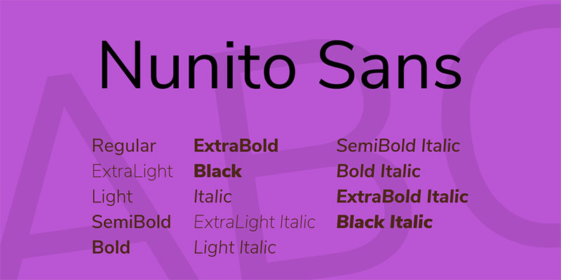
Rounded humanist sans with friendly character. Balanced personality makes it versatile for modern digital applications.
Classification & Design Attributes
Humanist sans-serif with rounded terminals. Released 2016. Designed by Vernon Adams, extended by Jacques Le Bailly and Alexei Vanyashin (Cyreal).
Based on Nunito display family, adapted for text use. Slightly rounded corners soften geometric foundation. Contemporary with warm, approachable feel.
Primary Use Cases
Website body text, app interfaces. Friendly branding, casual communications. Digital-first with solid print performance.
Body text at 10-14pt. Works across informational and marketing contexts. Strong web typography choice for consumer-facing brands.
Technical Specifications
14 weights from Extra Light (200) through Black (900), each with italic. Latin Extended, Vietnamese support.
Variable font available for precise weight control. Licensed under SIL Open Font License. Available via Google Fonts.
Comparison to Calibri
Similar approachability but more rounded. Comparable x-height and open counters.
Slightly less formal than Calibri – rounded terminals create friendlier character. Similar versatility across applications. More personality without sacrificing professionalism.
Accessibility & Readability
Strong readability with friendly aesthetic. Rounded forms don’t compromise clarity.
Performs well at small sizes. Open counters aid character distinction. Solid accessibility while maintaining personality.
Pairing Recommendations
Pairs with Nunito display family for weight variety. Lora or Spectral provide serif complements.
Works alongside Source Sans Pro or Open Sans for functional alternatives. Playfair Display offers contrasting serif for editorial layouts.
TT Commons Pro
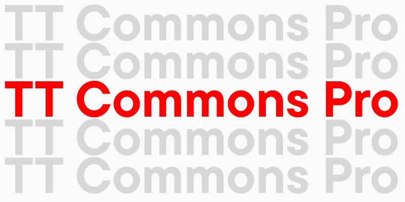
Modern grotesque with extensive weight range. Professional workhorse designed for branding and corporate identity.
Classification & Design Attributes
Neo-grotesque sans-serif. Released 2018. Designed by Ivan Gladkikh and Yulia Gonina (TypeType).
Extended weight range from Hairline through Black. Neutral yet contemporary character. Systematic design with strong technical foundation.
Primary Use Cases
Corporate identity, branding systems. Professional documents, presentations. Digital and print applications requiring weight variety.
Body text at 9-14pt. Display weights effective for headlines. Versatile across business communications and marketing.
Technical Specifications
22 weights across Regular, Condensed, and Expanded widths. Each with italic. Extensive OpenType feature set.
Support for 200+ languages with Latin, Cyrillic, Greek. Variable fonts available. Commercial licensing with various tiers.
Comparison to Calibri
More systematic weight progression than Calibri. Similar professional positioning but more geometric construction.
Neutral character comparable to Calibri but with extended customization options. Slightly tighter spacing. Better weight range for complex hierarchies.
Accessibility & Readability
Clear legibility across weights. Systematic design maintains readability from thin through black weights.
Strong screen performance. Extensive character coverage supports multilingual accessibility. Professional-grade readability.
Pairing Recommendations
Works with TT Norms (related family) for width variety. Combines with quality serifs like Minion or Garamond.
Source Serif Pro provides functional pairing. Works alongside geometric sans options for contrast.
TT Norms Pro
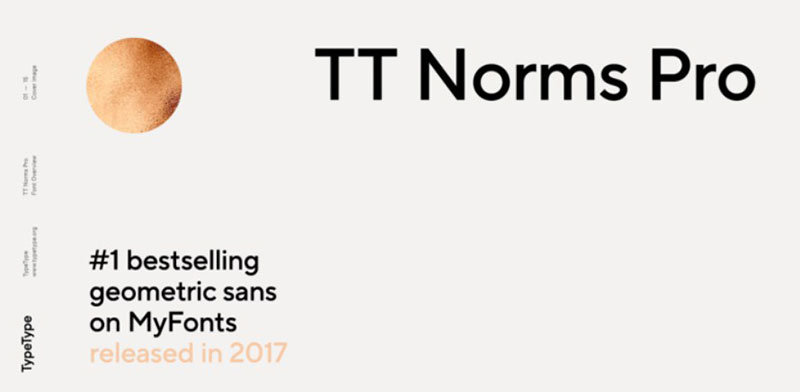
Refined grotesque with humanist warmth. Balanced between geometric precision and organic readability.
Classification & Design Attributes
Neo-grotesque sans-serif with humanist influences. Released 2017. Designed by Ivan Gladkikh (TypeType).
Softer than pure geometric grotesques. Open apertures and friendly character while maintaining professional neutrality. Contemporary without trendiness.
Primary Use Cases
Branding, corporate communications. Web and app interfaces. Marketing materials requiring approachability with professionalism.
Body text at 9-14pt. Works across digital and print. Strong versatility for modern business applications.
Technical Specifications
18 weights from Thin through Black, each with italic. Condensed variant extends family.
Over 1,000 glyphs per font. Latin, Cyrillic support with extended characters. OpenType features include ligatures, fractions, arrows. Commercial licensing.
Comparison to Calibri
Similar balance of professional and approachable. Slightly more geometric than Calibri.
Comparable x-height and spacing. More contemporary feel while maintaining functional readability. Less rounded terminals than Calibri.
Accessibility & Readability
Excellent readability with friendly character. Open forms aid legibility without sacrificing personality.
Strong screen optimization. Clear character distinction across weights. Performs well in body text and display.
Pairing Recommendations
TT Norms Serif provides designed companion. Works with traditional serifs like Baskerville or Freight.
Combines with Source Sans Pro or Open Sans for functional alternatives. FF Meta offers related humanist pairing.
Lato

Warm humanist sans with strong curves. Semi-rounded details create friendly but professional character.
Classification & Design Attributes
Humanist sans-serif. Released 2010 (updated 2015). Designed by Lukasz Dziedzic (tyPoland).
Semi-rounded letterforms create warm, stable feeling. Strong curves in round letters contrast with straight elements. Classical proportions with contemporary execution.
Primary Use Cases
Corporate communications, web body text. Marketing materials, presentations. Versatile across print and digital.
Body text at 9-14pt. Works in extensive text and display. Popular choice for accessible web typography.
Technical Specifications
18 styles across Regular and Hairline subfamilies. Nine weights from Thin through Black, each with italic.
Nearly 3,000 glyphs covering extensive language support. Licensed under SIL Open Font License. Available via Google Fonts.
Comparison to Calibri
More rounded details than Calibri. Similar warmth and professionalism.
Comparable x-height but rounder construction. Slightly wider character width. Both balance friendly and functional but Lato leans warmer.
Accessibility & Readability
Excellent legibility with warm character. Semi-rounded forms don’t compromise clarity.
Strong web typography performance. Clear character distinction aids accessibility. Popular for reason – works reliably across contexts.
Pairing Recommendations
Works with slab serifs like Merriweather or Roboto Slab. Playfair Display provides elegant contrast.
Combines with Open Sans or Source Sans Pro for related alternatives. Georgia offers system serif pairing option.
FAQ on Fonts Similar To Calibri
What font is most similar to Calibri?
Carlito offers the closest match. It’s metric-compatible with Calibri, meaning documents won’t reflow when switching between them. Designed by the same creator as Lato, Carlito maintains identical character spacing and proportions while being free under the SIL Open Font License.
Is Aptos better than Calibri?
Aptos provides improved screen clarity on high-resolution displays with better character distinction (the lowercase ‘l’ has a distinctive tail). Whether it’s “better” depends on preference. Calibri feels warmer and friendlier, while Aptos leans more neutral and contemporary for professional communications.
What free fonts look like Calibri?
Open Sans, Carlito, Lato, and Nunito Sans offer similar humanist warmth without licensing fees. Carlito provides exact metric compatibility. Open Sans dominates web typography with comparable readability. All work reliably across professional documents, presentations, and digital platforms through Google Fonts or SIL licensing.
Can I use Calibri alternatives in Microsoft Office?
Yes. Office supports any installed font on your system. Install alternatives like Carlito, Open Sans, or JUST Sans, then select them from the font menu. For team collaboration, stick with system fonts or ensure everyone has the same typeface installed to prevent substitution issues.
What replaced Calibri in Microsoft Office?
Aptos became Office’s default in 2023, replacing Calibri after 16 years. Originally named Bierstadt, Steve Matteson designed it specifically for modern high-resolution screens. Calibri remains available in Office but no longer appears automatically in new documents unless users manually change their default settings.
Which Calibri alternative works best for resumes?
Open Sans and Lato provide professional polish with excellent readability. Avoid overly distinctive options like Raleway. Resume fonts should prioritize clarity over personality. Both Open Sans and Lato offer multiple weights for hierarchy, work across applicant tracking systems, and maintain professional tone without appearing generic.
Do Google Fonts have Calibri alternatives?
Google Fonts offers multiple options: Open Sans (most popular), Lato, Nunito Sans, Raleway, and Carlito. All provide free commercial licensing with easy web implementation. Open Sans comes closest in versatility and professional applications. Carlito specifically targets Calibri replacement with matching metrics for document compatibility.
What’s the difference between humanist and grotesque sans-serif fonts?
Humanist sans like Calibri show calligraphic influences with varied stroke widths and warmer character. Grotesque fonts like Helvetica use uniform strokes and geometric construction for neutral, technical appearance. Humanist fonts typically offer better readability in body text while grotesques excel in headlines and branding applications.
Can I use Calibri on Mac?
Calibri comes bundled with Microsoft Office for Mac but isn’t a macOS system font. Without Office installed, Mac users need alternatives like Carlito (free) or purchase Calibri separately. Apple’s system includes Helvetica Neue as default, though it lacks Calibri’s warmth for document work.
What fonts pair well with Calibri alternatives?
Pair sans-serif fonts like Open Sans with serif options (Georgia, Merriweather, Source Serif) for contrast. Use heavier weights of the same family for headings rather than switching typefaces. For presentations, combine your Calibri alternative with complementary monospace fonts like Consolas or Fira Mono for technical content.
Conclusion
Finding fonts similar to Calibri requires balancing technical compatibility with aesthetic goals. Carlito delivers metric-perfect replacement for document migration. Aptos represents Microsoft’s official evolution with enhanced screen clarity.
Open Sans and Lato dominate web typography for good reason. Both offer the humanist warmth that made Calibri popular while providing superior digital optimization and free licensing.
Your choice depends on context. Business documents benefit from professional neutrality (TT Commons Pro, Concourse). Branding projects need distinctive character (JUST Sans, Fort). Web applications prioritize screen performance (Fira Sans, Verdana).
Don’t default to Arial. The typefaces covered here offer superior readability, better font pairing options, and more nuanced personality. Test several alternatives in your actual workflow before committing.
If you enjoyed reading this article about fonts similar to Calibri, you should check out these articles with fonts similar to Gotham, Montserrat, Trajan, Rockwell, Baskerville, Oswald, and Brandon Grotesk.

Renowned for his expertise in logo design and visual branding, Bogdan has developed a multitude of logos for various clients.
His skills extend to creating posters, vector illustrations, business cards, and brochures. Additionally, Bogdan's UI kits were featured on marketplaces like Visual Hierarchy and UI8.
He also wrote in the past years on sites like Design Your Way, WebDesignerDepot, WPDean, Designmodo, Speckyboy, Slider Revolution, and more.
- Versatile Georgia Font Pairing for Timeless Layouts - 24 October 2026
- How to Turn Inconsistent UI into One Design System (Without a Full Redesign) - 24 October 2026
- Beautiful Fonts Similar to Poppins You Should Try - 22 October 2026

Bogdan Sandu is a seasoned designer who has been designing websites since 2008. Renowned for his expertise in logo design and visual branding, Bogdan has developed a multitude of logos for various clients. His skills extend to creating posters, vector illustrations, business cards, and brochures. Additionally, Bogdan's UI kits were featured on marketplaces like Visual Hierarchy and UI8. He also wrote in the past years on sites like Design Your Way, WebDesignerDepot, WPDean, Designmodo, Speckyboy, Slider Revolution, and more.
You Might Also Like