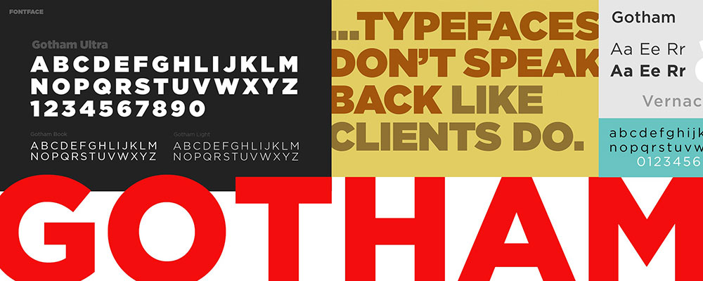
Gotham’s licensing costs push many designers toward alternatives that deliver similar geometric precision without the premium price tag.
Whether you need a free option for client work or simply want to avoid the ubiquity of Tobias Frere-Jones’s iconic typeface, plenty of fonts similar to Gotham match its clean, modern aesthetic. Some alternatives are completely free under open-source licenses, while others offer refined features that rival or surpass the original.
This guide examines 20 geometric sans serif typefaces that share Gotham’s DNA. You’ll find detailed comparisons covering design characteristics, optimal use cases, and licensing requirements.
Each alternative is evaluated on how closely it matches Gotham’s proportions, x-height, and overall character. By the end, you’ll know exactly which typeface fits your project’s needs and budget.
Fonts Similar To Gotham
| Font Name | Similarity to Gotham | Key Characteristics | Best Use Case |
|---|---|---|---|
| Proxima Nova | Very High | Geometric forms, humanist warmth, clean terminals | Versatile branding, web interfaces |
| Montserrat | High | Urban typography inspiration, geometric structure | Digital projects, modern brands |
| Metropolis | Very High | Art Deco influence, geometric sans, strong presence | Headers, editorial design |
| Avenir | High | Organic geometry, slightly softer curves | Corporate identity, print materials |
| Brandon Grotesque | High | Refined geometric, elegant proportions | Luxury branding, fashion |
| Circular | Moderate-High | Rounded terminals, friendly appearance | Tech products, mobile apps |
| Lato | Moderate | Semi-rounded details, warm feel, open-source | Body text, web content |
| Open Sans | Moderate | Neutral, optimized legibility, Google font | UI design, accessibility |
| Raleway | Moderate | Elegant thin weights, display qualities | Headers, minimal designs |
| Museo Sans | High | Low contrast, sturdy construction | Museums, cultural institutions |
| Geomanist | Very High | Sharp geometry, modern minimalism | Tech startups, contemporary brands |
| Nexa | High | Geometric precision, wide range of weights | Corporate communications |
| Figtree | Moderate-High | Contemporary geometric, balanced proportions | Modern web applications |
| Pier Sans | High | Functional geometry, technical precision | Technical documentation |
| Nunito Sans | Moderate | Rounded terminals, friendly and approachable | User-facing interfaces |
| Effra | High | Humanist geometric, professional warmth | Business branding |
| FF Mark | Very High | Crisp geometric forms, Swiss design influence | Editorial, premium branding |
| Mallory | Moderate-High | Quirky personality, slightly condensed | Creative projects, distinctive brands |
| Loew Next | High | Updated geometric classic, versatile weights | Flexible brand systems |
Proxima Nova
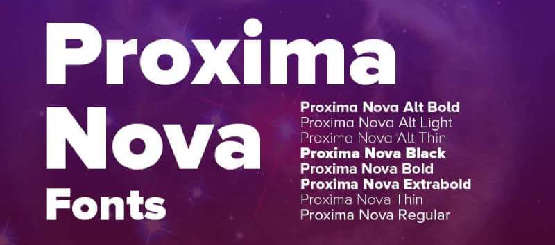
Mark Simonson’s Proxima Nova bridges the gap between Futura’s geometric precision and Helvetica’s modern proportions, creating one of the most widely used commercial typefaces on the web. This hybrid approach delivers the clean aesthetic Gotham users expect while adding subtle warmth through careful optical adjustments.
Design Characteristics
The letterforms combine geometric circles with humanist proportions, featuring a generous x-height that improves screen readability.
Stroke contrast remains minimal but not perfectly uniform. Terminals are slightly rounded rather than cut at strict angles, softening the overall appearance without sacrificing the professional edge.
Character widths are moderately condensed, saving space while maintaining legibility at small sizes.
Use Cases
Proxima Nova excels in corporate branding and user interface design where both professionalism and approachability matter.
The extensive weight range (from Thin to Black across 48 fonts) makes it suitable for complex typographic hierarchy systems. Digital products benefit from its careful hinting and screen optimization.
Editorial layouts and signage projects use the middle weights for body text while display weights handle headlines.
Comparison to Gotham
Both typefaces share geometric DNA with humanist refinements, but Proxima Nova feels slightly warmer and more organic. Gotham’s terminals are more angular and precise, giving it a sharper, more technical appearance.
Proxima Nova offers 80 fonts across five widths compared to Gotham’s more limited range. The stroke modulation in Proxima Nova is subtler, making it feel less mechanical than strict geometric sans serifs.
Weight progression differs too. Proxima Nova’s medium weight sits between regular and semibold, providing more granular control over visual hierarchy.
Licensing & Availability
Commercial font requiring purchase from Mark Simonson Studio or subscription through Adobe Fonts.
Desktop licenses start around $40 per weight, with complete family packages available. Web font licensing is usage-based through Adobe Fonts or self-hosted options.
The typeface is included with Creative Cloud subscriptions, making it accessible for designers already in the Adobe ecosystem.
Montserrat
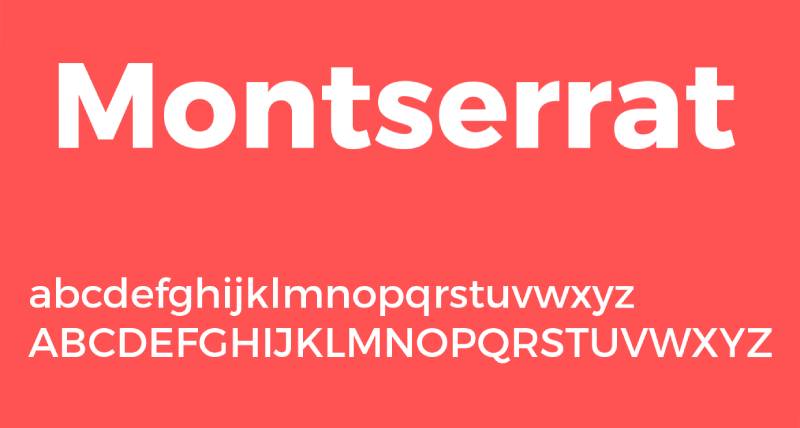
Julieta Ulanovsky’s Montserrat rescues the geometric letterforms painted on buildings in Buenos Aires’ Montserrat neighborhood, transforming historical urban typography into a free digital typeface. This geometric sans serif has become the third most popular font on Google Fonts, offering a no-cost alternative to premium options like Gotham.
Design Characteristics
Large x-height and short descenders maximize readability at small sizes without sacrificing display performance.
The geometric construction uses perfect circles for rounded characters, creating a clean, systematic appearance. Wide apertures prevent characters from closing up at small sizes or on screens.
Letterform proportions lean slightly condensed, packing more words per line without feeling cramped. Terminals are cut at clean angles, maintaining the crispness expected from modern sans-serif fonts.
Use Cases
Web design projects gravitate toward Montserrat for its excellent screen rendering and zero licensing cost.
The nine weights (Thin through Black) with matching italics handle everything from subtle captions to bold headlines. Branding and identity work benefits from the urban, contemporary feel rooted in early 20th-century lettering.
Montserrat Alternates provides single-story ‘a’ and other variations for projects needing typographic flexibility.
Comparison to Gotham
Montserrat shares Gotham’s geometric foundation but with more pronounced roundness in circular characters. The free font feels slightly less refined in spacing and kerning, though recent updates have narrowed this gap significantly.
Both typefaces work well for corporate applications, but Gotham maintains tighter control over optical adjustments. Montserrat’s wider availability makes it ubiquitous, which some designers view as limiting uniqueness in commercial work.
Weight distribution is similar, though Gotham’s intermediate weights feel more carefully calibrated.
Licensing & Availability
Free under SIL Open Font License for both personal and commercial use.
Available through Google Fonts, Adobe Fonts, and direct download from GitHub. No restrictions on web embedding, app integration, or distribution.
The open-source nature means it can be modified and distributed freely, making it popular for client projects with tight budgets or uncertain scope.
Metropolis

Chris Simpson designed Metropolis as a free geometric sans serif influenced by contemporary minimalist typefaces like Proxima Nova and Montserrat. The open-source alternative delivers clean, modern aesthetics suitable for both text and display applications.
Design Characteristics
Geometric forms receive optical corrections for improved legibility rather than strict mathematical construction.
The semi-geometric approach balances circular shapes with subtle adjustments that prevent the cold feeling of pure geometry. Consistent stroke weight and minimal contrast create even texture in text blocks.
Letterforms maintain moderate proportions without extreme condensing or extending. Terminals end with clean cuts that emphasize the modern, technical character.
Use Cases
Metropolis fits tech startups and digital product interfaces where geometric sans serifs communicate innovation and efficiency.
Nine weights with matching italics (18 styles total) provide flexibility across branding applications and editorial design. Small text remains legible while display sizes show off the geometric precision.
The font works well for mobile apps and web design projects requiring a contemporary look without licensing costs.
Comparison to Gotham
Metropolis deliberately emulates the Gotham aesthetic with similar geometric construction and proportions. Side-by-side comparison reveals Metropolis has slightly more mechanical regularity, lacking some of Gotham’s subtle humanist adjustments.
The free alternative provides comparable functionality but with less refined details in spacing and alternate characters. Weight progression matches Gotham’s range closely, making Metropolis a viable substitute for budget-conscious projects.
Character set coverage is more limited than Gotham’s extensive glyph library.
Licensing & Availability
Released under SIL Open Font License, completely free for commercial and personal use.
Available for download from GitHub and various font repositories. Desktop formats (OTF, TTF) and web formats (WOFF, WOFF2) are included.
Some versions are distributed as public domain under Unlicense, removing all restrictions. The GitHub repository is no longer public, but font files remain widely available through font distribution sites.
Avenir
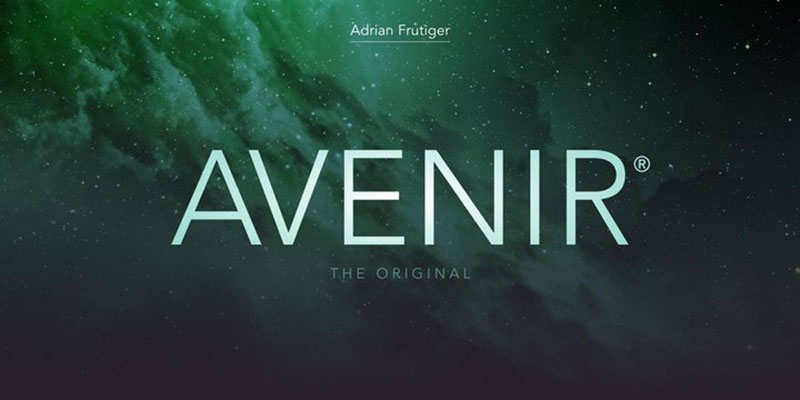
Adrian Frutiger created Avenir in 1988 to blend the geometric style of 1920s typefaces like Futura with humanist warmth and modern proportions. The French word for “future” reflects Frutiger’s goal of creating a forward-looking design grounded in classical principles.
Design Characteristics
Geometric circles are refined with subtle adjustments – the ‘O’ isn’t a perfect circle, and vertical strokes are slightly thicker than horizontals.
This optical correction prevents the rigid, mechanical feel of pure geometric construction. Ascenders are moderately shortened, and the x-height is generous without being extreme.
Terminals are clean-cut but not severe, maintaining professionalism without coldness. The overall balance between geometry and organic form makes Avenir exceptionally versatile.
Use Cases
Corporate identity and signage benefit from Avenir’s professional yet approachable character.
Amsterdam’s city identity, Bloomberg’s corporate typeface, and airport wayfinding systems at Dallas Fort Worth demonstrate its range. The font family includes specialized weights designed for specific purposes – Book weight for body text, Light for captions, and heavier weights for display.
Digital interfaces on iOS and macOS include Avenir and Avenir Next as system fonts, making it familiar to millions of users.
Comparison to Gotham
Both typefaces share geometric foundations with humanist refinements, but Frutiger’s approach predates Gotham by 14 years.
Avenir feels more European and classical compared to Gotham’s distinctly American, industrial aesthetic. Gotham has slightly more pronounced geometric character and a taller x-height.
Avenir Next (the expanded 2004 version) offers 32 fonts with additional weights and condensed styles, rivaling Gotham’s family breadth. The original Avenir’s weight system used numbers (45, 55, 65) rather than names, though Avenir Next adopted conventional naming.
Licensing & Availability
Commercial typeface from Linotype/Monotype requiring paid licenses.
Desktop licenses cost approximately $40-50 per weight, with family packages offering better value. Web font and app licenses are available separately through MyFonts and Linotype.
Adobe Fonts subscribers get full access. The font is also bundled with recent versions of macOS and iOS, though system font usage doesn’t extend to commercial projects.
Brandon Grotesque
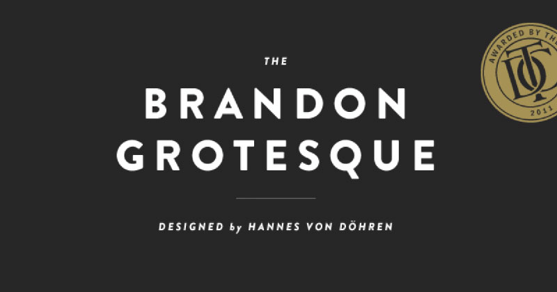
Hannes von Döhren designed Brandon Grotesque in 2009-2010, drawing inspiration from geometric sans serifs of the 1920s and 30s filtered through a warm, humanist lens. The small x-height and restrained forms create distinctive elegance that sets it apart from more utilitarian geometric typefaces.
Design Characteristics
Geometric forms with intentionally rounded corners create warmth despite mathematical clarity.
Von Döhren studied vintage magazines from the 1920s-30s, replicating the soft edges that resulted from period printing methods. The small x-height (shorter than most modern geometric sans serifs) lends sophistication and requires generous line spacing.
Letterforms are moderately wide with consistent stroke weight. Terminals and junctions are subtly softened to avoid harsh corners while maintaining geometric structure.
Use Cases
Display typography and headlines showcase Brandon Grotesque’s refined character best.
The six weights (Thin through Black) with italics work well for branding projects requiring elegance and personality. Luxury brands and creative agencies favor its sophisticated appearance.
Brandon Text, a companion family with higher x-height, handles body text while maintaining stylistic consistency. The condensed version provides space-efficient options for complex layouts.
Comparison to Gotham
Brandon Grotesque’s small x-height creates a more refined, less utilitarian feel than Gotham’s larger, more practical proportions.
Both share geometric DNA, but Brandon adds deliberate warmth through rounded corners while Gotham maintains sharper precision. Gotham reads better at small sizes due to its larger x-height.
Brandon’s elegant character suits upscale branding, while Gotham’s versatility works across a broader range of applications. Weight ranges are similar, though Brandon’s Thin weight is more delicate.
Licensing & Availability
Commercial font from HVD Fonts requiring purchase.
Desktop licenses start around $50 per weight with family packages available. Web font licenses are sold through MyFonts and HVD Fonts directly.
Adobe Fonts subscription includes Brandon Grotesque, making it accessible without separate purchase. The complete Brandon super family (including Text and Condensed versions) offers 48 styles.
Circular
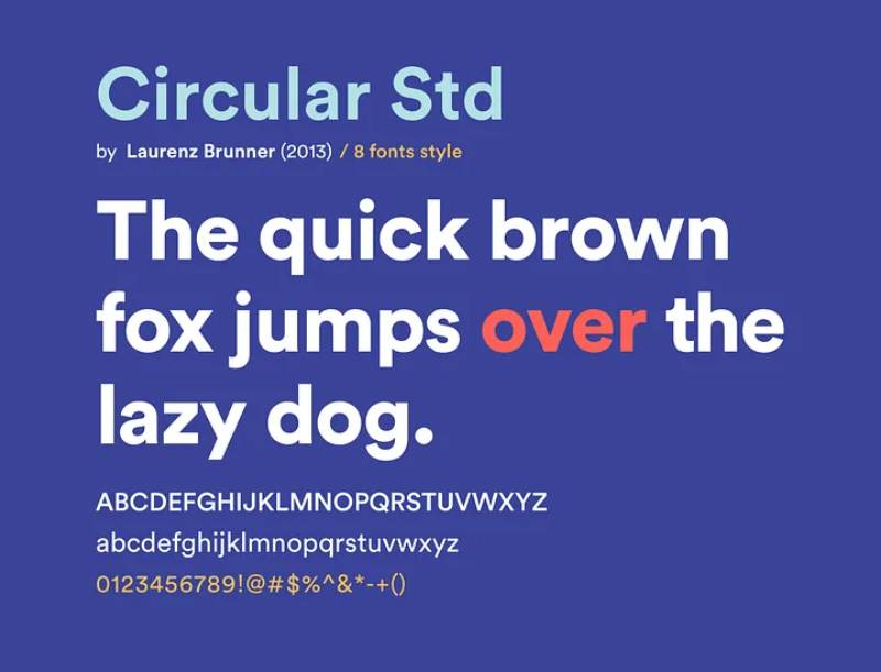
Spotify commissioned Circular as a custom corporate typeface, later making it available for wider use. This geometric sans serif combines the rounded friendliness needed for consumer apps with the professionalism required for corporate communications.
Design Characteristics
Perfectly circular forms in round characters create immediate geometric recognition.
The typeface maintains consistent stroke width throughout letterforms, avoiding stroke contrast. Terminals are cut at precise angles without softening, keeping the design crisp and modern.
X-height sits between Gotham’s generous proportions and Brandon Grotesque’s more restrained approach. Character widths are moderate, neither condensed nor extended.
Use Cases
Digital product interfaces benefit from Circular’s clean, tech-forward appearance.
Spotify’s streaming platform demonstrates its effectiveness in complex UI systems with multiple typographic scales. The four weights (Book through Bold) cover most interface and branding needs.
Tech companies and startups use Circular for brand identity work, drawn to its association with successful consumer technology.
Comparison to Gotham
Circular’s letterforms are more purely geometric than Gotham’s optically adjusted characters.
Both typefaces work well in digital interfaces, but Circular has a softer, more approachable feel suited to consumer products. Gotham maintains a more serious, institutional character.
Gotham’s weight range is significantly more extensive, offering finer control over typographic hierarchy. Circular’s limited weight options make it less versatile for complex print projects.
Licensing & Availability
Originally custom, now available through Lineto with commercial licensing.
Desktop and web font licenses must be purchased separately. Pricing is premium due to its association with Spotify and limited distribution.
The typeface isn’t available through common font subscription services, requiring direct purchase from Lineto.
Lato

Lukasz Dziedzic created Lato as a humanist sans serif with semi-rounded details, designed for corporate and web use. The name means “summer” in Polish, reflecting the typeface’s warm, friendly character despite classical proportions.
Design Characteristics
Semi-rounded letterforms soften geometric foundations without becoming overtly friendly.
The generous x-height and wide proportions improve readability, especially on screens. Stroke contrast is minimal but perceptible, adding subtle dynamics to text.
Terminals have slight rounding that humanizes the design while maintaining professional polish. Character spacing is generous, preventing crowding at small sizes.
Use Cases
Web typography benefits from Lato’s optimization for screen rendering and diverse weight range.
The 18 styles (nine weights with italics) handle everything from lightweight interfaces to bold headlines. Corporate communications use Lato’s professional warmth for presentations, documents, and brand guidelines.
Google Fonts distribution has made it one of the most-used free fonts for web projects globally.
Comparison to Gotham
Lato’s humanist approach creates more warmth and approachability than Gotham’s stricter geometry.
While both work well for corporate applications, Lato feels more casual and accessible. Gotham’s sharper terminals and more geometric construction convey greater authority.
Weight ranges are comparable, though Lato’s progression feels more gradual. Lato’s wide availability through Google Fonts makes it ubiquitous compared to Gotham’s premium positioning.
Licensing & Availability
Free under SIL Open Font License for all uses.
Available through Google Fonts, Adobe Fonts, and direct download. Web embedding and app integration have no restrictions or usage limits.
The complete family downloads as a single package with all weights and styles included.
Open Sans
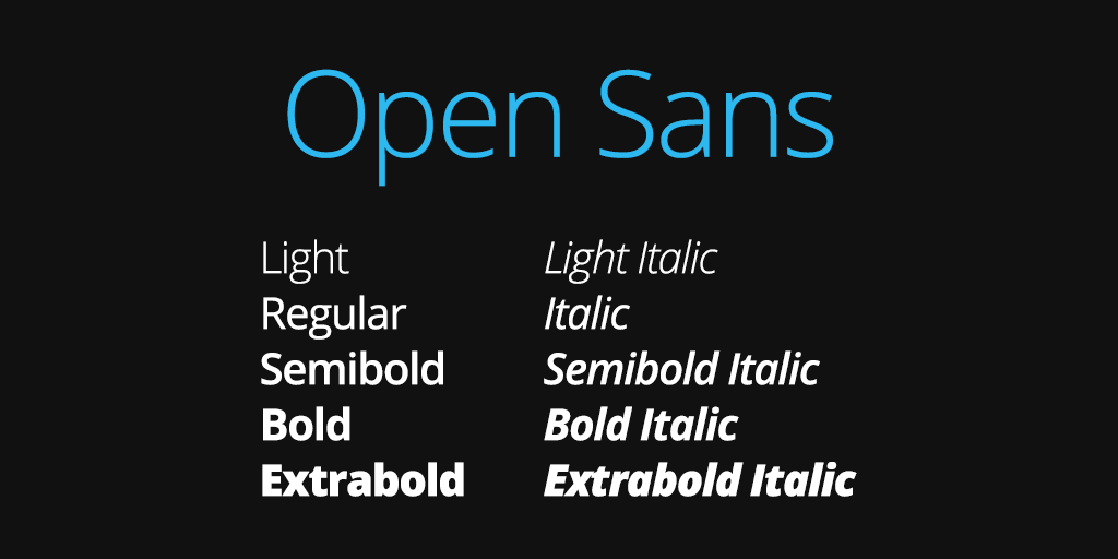
Steve Matteson designed Open Sans for Google, creating a humanist sans serif optimized for print, web, and mobile interfaces. The typeface emphasizes neutral, friendly characteristics with excellent legibility across multiple contexts.
Design Characteristics
Upright stress and open apertures improve character recognition at small sizes.
The low contrast and wide letterforms create even texture in text blocks. Generous x-height and short ascenders/descenders maximize the printed area of each letter.
Terminals are clean-cut without harsh angles, and curved strokes have subtle thickness variation. The overall appearance is neutral without being bland.
Use Cases
User interfaces and web content benefit from Open Sans’s extensive language support and screen optimization.
The ten weights cover ultra-light through extra-bold with matching italics. Government websites, corporate applications, and content-heavy platforms favor its neutral reliability.
Mobile apps use Open Sans for its excellent rendering on various screen densities and operating systems.
Comparison to Gotham
Open Sans takes a more humanist approach than Gotham’s geometric construction.
Both work well for corporate and institutional applications, but Open Sans feels more organic and less structured. Gotham’s geometric precision creates a more distinctive, less neutral appearance.
Open Sans’s free availability through Google Fonts makes it accessible but also ubiquitous. Weight ranges are similar, though Gotham offers more refined optical sizing.
Licensing & Availability
Free under Apache License 2.0 for all commercial and personal uses.
Google Fonts provides instant web embedding with no download required. Desktop versions are freely available through multiple repositories.
The typeface includes extensive character sets supporting Latin, Greek, and Cyrillic scripts with no restrictions on distribution or modification.
Raleway
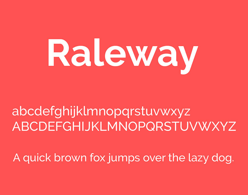
Matt McInerney originally designed Raleway as a single thin weight, later expanded by designers including Pablo Impallari and Rodrigo Fuenzalida. This elegant geometric sans serif combines refined proportions with a distinctive character.
Design Characteristics
Geometric construction with subtle elegance through careful proportion and spacing.
The letterforms maintain consistent geometry while avoiding mechanical rigidity. Moderate x-height and classic proportions create balanced text blocks.
Thin weights show off the geometric construction most clearly, while bolder weights maintain the essential character. Terminals are clean-cut without excessive sharpness.
Use Cases
Fashion and lifestyle brands use Raleway’s refined aesthetic for elegant communication.
The nine weights (Thin through Black) with italics provide range for sophisticated branding and editorial work. Web design projects benefit from its elegant appearance and free availability.
Display typography showcases the thin weights effectively, while medium weights handle body text comfortably.
Comparison to Gotham
Raleway’s proportions are more refined and elegant than Gotham’s utilitarian approach.
Both share geometric foundations, but Raleway skews toward sophistication while Gotham emphasizes functionality. Gotham’s larger x-height makes it more practical for small text.
Raleway’s thin weights are more delicate and expressive than Gotham’s lighter options. The overall character differs significantly despite similar structural approaches.
Licensing & Availability
Free under SIL Open Font License for unlimited commercial and personal use.
Google Fonts provides easy web embedding. Adobe Fonts and direct downloads offer desktop formats.
The complete family is available as a single download with all weights and styles included without restriction.
Museo Sans
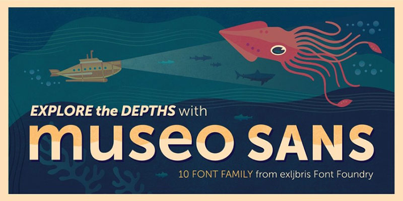
Jos Buivenga created Museo Sans as a geometric sans serif companion to his popular Museo slab serif family. The typeface balances geometric structure with subtle humanist details for improved readability.
Design Characteristics
Geometric letterforms with optical adjustments prevent mechanical appearance.
The moderate x-height and classic proportions work well for extended reading. Stroke weight remains consistent with minimal contrast.
Rounded characters use geometric circles refined for optical balance. Terminals are cut cleanly without excessive precision or softness.
Use Cases
Museums and cultural institutions favor Museo Sans for its combination of authority and approachability.
The ten weights (from 100 through 900) provide extensive range for complex typographic systems. Exhibition graphics, catalogs, and wayfinding benefit from clear, professional appearance.
Corporate communications and editorial design use the middle weights for body text while lighter and heavier weights handle display applications.
Comparison to Gotham
Museo Sans shares Gotham’s approach to geometric refinement with humanist warmth.
Both typefaces work exceptionally well for institutional applications. Museo Sans has slightly more traditional proportions compared to Gotham’s more contemporary approach.
Weight progression is similar, though Museo Sans uses numerical naming (100-900) rather than descriptive names. The character sets are comparable in breadth.
Licensing & Availability
Commercial typeface requiring purchase from exljbris Font Foundry.
Desktop licenses are sold per weight with family packages offering better value. Web font licenses are available separately.
Some weights have been offered free for personal use at various times, though commercial use requires paid licensing.
Geomanist
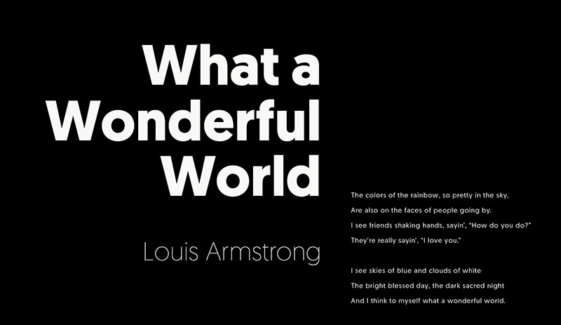
Atipo Foundry designed Geomanist as a pure geometric sans serif with perfect circular forms and mathematical precision. The typeface embraces strict geometry without the optical corrections common in humanist designs.
Design Characteristics
Perfect circles, squares, and mathematical proportions create systematic construction.
The typeface maintains absolute geometric purity more strictly than most geometric sans serifs. Stroke weight is uniform throughout letterforms.
Character widths follow geometric logic, and terminals are cut at precise angles. The small x-height and tall ascenders create elegant proportions.
Use Cases
Tech brands and modern design projects use Geomanist’s pure geometry for contemporary impact.
Eight weights provide range from ultra-light through black. Display typography and branding applications showcase the geometric character most effectively.
Editorial design and packaging benefit from the distinctive geometric personality while maintaining functionality.
Comparison to Gotham
Geomanist pursues geometric purity more strictly than Gotham’s optically adjusted approach.
Gotham’s humanist refinements make it more versatile and readable at small sizes. Geomanist’s mathematical precision creates a more distinctive, less neutral appearance.
Both work for modern branding, but Geomanist feels more stylized while Gotham maintains broader applicability. Weight ranges are comparable.
Licensing & Availability
Commercial typeface from Atipo Foundry requiring purchase.
Desktop and web font licenses are sold separately with per-weight and family pricing. Trial versions are sometimes available for testing.
The typeface isn’t available through major subscription services, requiring direct purchase from Atipo.
Nexa
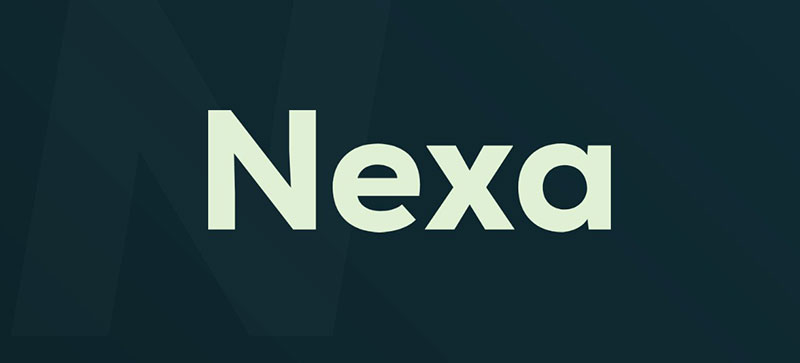
Fontfabric created Nexa as a geometric sans serif with slightly condensed proportions and modern character. The typeface combines geometric construction with practical readability.
Design Characteristics
Geometric letterforms with moderate condensing create efficient space usage.
The consistent stroke weight and minimal contrast maintain clean texture. X-height is generous without being extreme, balancing readability and proportion.
Terminals are cut cleanly with subtle softening that prevents harsh appearance. Rounded characters follow geometric circles with minor optical adjustments.
Use Cases
Corporate branding and identity systems use Nexa’s professional geometric character.
The range from Light through Black provides typographic flexibility. User interfaces and web design benefit from clear on-screen rendering.
Display typography shows off the geometric construction effectively while text sizes remain functional and readable.
Comparison to Gotham
Nexa’s slightly condensed proportions differentiate it from Gotham’s more standard widths.
Both share geometric foundations with practical refinements. Gotham feels more substantial and grounded, while Nexa has a lighter, more contemporary feel.
Weight ranges are similar, though Gotham’s progression feels more carefully calibrated across the family. Character sets are comparable in breadth.
Licensing & Availability
Commercial font from Fontfabric with both free and paid versions.
Nexa Free includes limited weights for personal and commercial use. The complete Nexa family requires purchase with desktop and web font licenses sold separately.
Free version is available through Fontfabric’s website. Paid licenses are sold per weight or as family packages.
Figtree
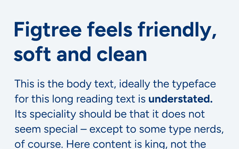
Erik Kennedy designed Figtree specifically for UI design, emphasizing clarity and geometric construction suited to digital interfaces. The typeface prioritizes function while maintaining personality.
Design Characteristics
Geometric forms refined for screen rendering and interface applications.
The moderate x-height and consistent stroke weight create reliable text texture. Letterforms are slightly condensed for efficient screen real estate usage.
Terminals are cleanly cut, and curved characters follow geometric principles with subtle optical refinement. Character spacing is optimized for digital displays.
Use Cases
User interface design and digital products benefit from Figtree’s screen-optimized construction.
Multiple weights handle different interface hierarchy needs from subtle labels to prominent headlines. The typeface works well across various screen sizes and resolutions.
Design systems and component libraries appreciate the consistent, predictable character that maintains readability across contexts.
Comparison to Gotham
Figtree specifically targets UI applications while Gotham serves broader purposes.
Both maintain geometric clarity, but Figtree’s interface optimization makes it more specialized. Gotham’s extensive weight range provides more granular control.
Figtree feels more contemporary and tech-focused compared to Gotham’s more established, institutional character. Both work well digitally, but from different design philosophies.
Licensing & Availability
Free under SIL Open Font License for all commercial and personal use.
Available through Google Fonts for easy web implementation. Desktop formats are freely downloadable.
The complete family includes all weights and styles without restrictions on usage or distribution.
Pier Sans
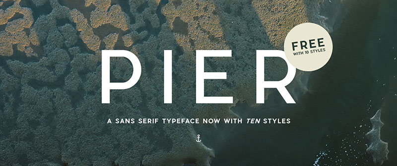
Dieter Hofrichter designed Pier Sans as a geometric sans serif with clean, modern proportions suitable for diverse applications. The typeface balances geometric structure with practical functionality.
Design Characteristics
Geometric construction with subtle humanist adjustments for improved readability.
The moderate x-height and classic proportions create balanced text blocks. Stroke weight is consistent with minimal contrast throughout letterforms.
Terminals are cleanly cut without harsh edges, and rounded characters use geometric circles refined for optical harmony. Character widths are moderate, neither condensed nor extended.
Use Cases
Editorial design and corporate communications use Pier Sans’s clean professionalism.
Multiple weights provide range for establishing clear typographic hierarchy. Branding projects benefit from the neutral, versatile character.
Print and digital applications both work well with Pier Sans’s carefully crafted letterforms and spacing.
Comparison to Gotham
Pier Sans offers similar geometric approach with slightly more European sensibility.
Both work well for professional applications across media. Gotham has more extensive weight range and more refined optical sizing.
The overall character is comparable, making Pier Sans a viable alternative when Gotham isn’t available or desired. Pricing and availability differ significantly.
Licensing & Availability
Commercial typeface requiring purchase through font distributors.
Desktop and web font licenses are sold separately with per-weight pricing. Family packages offer multiple weights at reduced rates.
The typeface is available through standard font retailers but not subscription services like Adobe Fonts.
Nunito Sans
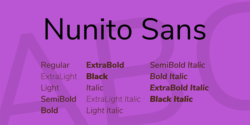
Vernon Adams originally created Nunito, later expanded by Jacques Le Bailly into Nunito Sans as a more comprehensive sans serif family. The rounded geometric sans serif combines friendly appearance with serious functionality.
Design Characteristics
Rounded terminals soften geometric construction without becoming overtly playful.
The generous x-height and open apertures maximize readability at small sizes. Stroke weight is consistent with minimal contrast.
Letterforms maintain geometric foundation with subtle organic warmth. Character proportions are moderate with comfortable spacing.
Use Cases
Web projects and user interfaces benefit from Nunito Sans’s friendly professionalism.
The 12 styles (six weights with italics) handle diverse typographic needs. Content-heavy websites use it for extended reading comfort.
Branding applications benefit from the approachable geometric character that feels modern yet warm.
Comparison to Gotham
Nunito Sans’s rounded terminals create softer, more approachable feel than Gotham’s cleaner cuts.
Both work well for contemporary applications, but Nunito Sans skews friendlier while Gotham maintains more authority. Gotham’s geometric precision is sharper and more technical.
Weight ranges are similar, though Gotham offers more granular options. Free availability makes Nunito Sans ubiquitous compared to Gotham’s premium positioning.
Licensing & Availability
Free under SIL Open Font License for unlimited commercial and personal use.
Google Fonts provides instant web access. Desktop versions are freely available through multiple sources.
Complete family downloads include all weights and styles without restriction on usage or distribution.
Effra
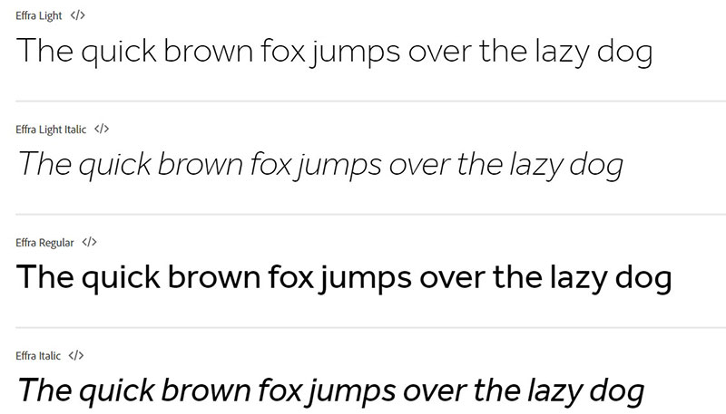
Dalton Maag created Effra as a humanist geometric sans serif that balances geometric construction with organic warmth. The British design consultancy crafted it for versatility across media and applications.
Design Characteristics
Geometric foundation with humanist refinements prevents mechanical coldness.
The large x-height and open counters improve legibility across sizes and contexts. Stroke contrast is minimal but perceptible, adding subtle life to text.
Terminals have slight softening that humanizes the geometric structure. Character proportions are moderate with careful attention to spacing and rhythm.
Use Cases
Corporate identity and branding projects use Effra’s professional versatility.
Seven weights provide range from Light through Bold with matching italics. Editorial design and signage benefit from clear, functional character.
Digital and print applications both work well with the carefully crafted letterforms and comprehensive language support.
Comparison to Gotham
Effra takes a slightly warmer, more humanist approach than Gotham’s stricter geometry.
Both excel in professional applications, but Effra feels more European while Gotham has American industrial character. Weight ranges are comparable.
Gotham’s x-height is marginally larger, affecting small-size readability. Overall functionality is similar, making Effra a solid alternative when Gotham isn’t available.
Licensing & Availability
Commercial typeface from Dalton Maag requiring purchase.
Desktop and web font licenses are sold separately. Pricing varies by weight and usage tier.
The typeface is available through Dalton Maag directly and some font retailers. Not included in major subscription services.
FF Mark
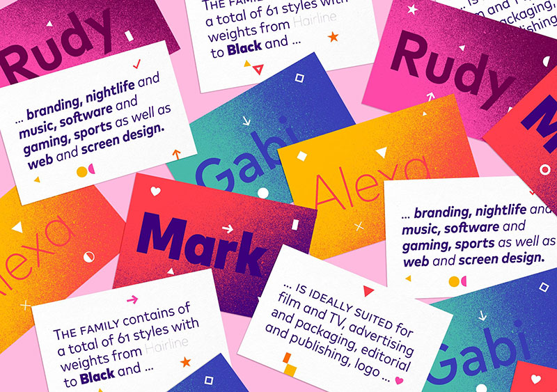
Hannes von Döhren and Christoph Koeberlin created FF Mark for FontFont as a geometric sans serif with exceptional weight range and comprehensive features. The typeface combines geometric clarity with practical versatility.
Design Characteristics
Geometric letterforms with subtle optical corrections balance precision and functionality.
The moderate x-height and consistent stroke weight create reliable text texture. Terminals are cleanly cut without harsh edges.
Rounded characters follow geometric principles with minor adjustments for optical harmony. Character widths are standard, neither condensed nor extended.
Use Cases
Editorial design and complex typographic systems benefit from FF Mark’s extensive weight range.
The 32 styles (including condensed and narrow widths) provide exceptional flexibility. Corporate communications and branding use the reliable geometric character.
Both print and digital applications work well with the comprehensive family and careful technical execution.
Comparison to Gotham
FF Mark offers similar geometric approach with more extensive width variations.
Both excel in professional typography, with comparable weight ranges and functionality. FF Mark includes more alternate characters and OpenType features.
The overall character is comparable, making FF Mark a sophisticated alternative. Both come from respected foundries with premium pricing.
Licensing & Availability
Commercial typeface from FontFont/Monotype requiring purchase.
Desktop and web font licenses are sold separately with per-weight and family pricing. Usage-based web font licensing is available.
The complete family is expensive but offers exceptional range and quality. Available through Monotype and major font retailers.
Mallory
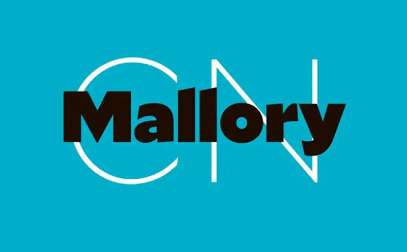
Tobias Frere-Jones (the designer of Gotham) created Mallory as a contemporary geometric sans serif with refined proportions and extensive features. The typeface represents his continued exploration of American geometric sans serif tradition.
Design Characteristics
Geometric construction with meticulous optical refinement from one of typography’s masters.
The moderate x-height and carefully calibrated proportions create exceptional readability. Stroke weight is consistent with subtle adjustments that add life without distraction.
Terminals are precisely cut, and character relationships are expertly considered. The design demonstrates Frere-Jones’s deep understanding of how geometry and optics interact.
Use Cases
High-end branding and editorial design use Mallory’s refined sophistication.
Eight weights with italics provide comprehensive range. Corporate identity systems benefit from the extensive alternate characters and OpenType features.
Both print and digital applications showcase the expert craftsmanship and attention to detail.
Comparison to Gotham
Mallory represents Frere-Jones’s evolution beyond Gotham, created after founding his own foundry.
Both share geometric DNA and meticulous craft, but Mallory has a more contemporary, refined character. Gotham’s proportions are slightly more grounded and industrial.
Mallory offers more extensive alternates and OpenType features. Both are premium typefaces, but Mallory’s newer design incorporates modern production techniques.
Licensing & Availability
Commercial typeface from Frere Jones Type requiring purchase.
Desktop and web font licenses are sold separately with premium pricing. The typeface is positioned as a high-end offering.
Available directly from Frere Jones Type. Not included in subscription services like Adobe Fonts.
Loew Next
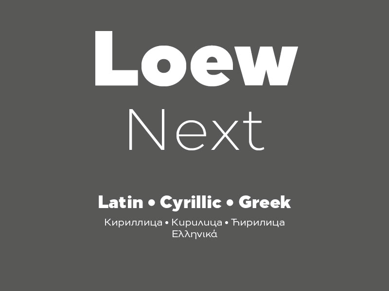
Philipp Neumeyer created Loew Next as a geometric sans serif with careful attention to spacing and rhythm. The typeface emphasizes clean functionality with subtle personality.
Design Characteristics
Geometric letterforms with balanced proportions and expert spacing.
The moderate x-height and consistent stroke weight create reliable text texture. Terminals are cleanly cut without excessive precision or softness.
Rounded characters follow geometric principles with optical refinements. Character widths are standard with careful attention to rhythm and spacing.
Use Cases
Corporate communications and editorial design use Loew Next’s clean professionalism.
Multiple weights provide range for diverse typographic needs. Branding applications benefit from the neutral, versatile character.
Both print and digital contexts work well with the carefully executed letterforms and comprehensive character set.
Comparison to Gotham
Loew Next offers similar geometric approach with slightly more European sensibility.
Both work well for professional applications. Gotham has more extensive weight range and optical sizing refinements.
The overall functionality is comparable, making Loew Next a viable alternative in appropriate contexts. Character and personality differ subtly between the two.
Licensing & Availability
Commercial typeface requiring purchase through font distributors.
Desktop and web font licenses are sold separately with standard per-weight pricing. Family packages offer multiple weights at reduced rates.
Available through font retailers but not major subscription services like Adobe Fonts.
FAQ on Fonts Similar To Gotham
What is the closest free alternative to Gotham?
Montserrat offers the closest match to Gotham’s geometric proportions and is completely free under the SIL Open Font License. Available through Google Fonts, it provides nine weights with italics and extensive language support for commercial projects.
Can I use Proxima Nova instead of Gotham?
Yes. Proxima Nova delivers similar geometric aesthetics with slightly warmer character. It requires paid licensing through Adobe Fonts or Mark Simonson Studio, but offers 80 fonts across five widths, exceeding Gotham’s range.
Which geometric sans serif works best for web design?
Open Sans and Montserrat excel for web typography due to screen optimization and free licensing. Both provide excellent rendering across devices, extensive weight ranges, and Google Fonts integration for easy implementation without performance penalties.
Is Brandon Grotesque a good Gotham substitute?
Brandon Grotesque works well for display typography and branding but has a smaller x-height than Gotham. The refined, elegant character suits upscale projects better than utilitarian applications where Gotham typically excels.
What font does Spotify use?
Spotify commissioned Circular as its custom corporate typeface. This geometric sans serif shares similarities with Gotham but with more purely circular letterforms and a tech-forward, consumer-friendly appearance suitable for digital interfaces.
Are there any free fonts that look exactly like Gotham?
No free font replicates Gotham exactly. Metropolis comes closest, deliberately emulating Gotham’s aesthetic with similar geometric construction. Montserrat offers comparable functionality with slightly more pronounced roundness in circular characters and different optical refinements.
How does Avenir compare to Gotham?
Avenir predates Gotham by 14 years and takes a more classical European approach. Adrian Frutiger’s design has subtler humanist refinements and feels less industrial than Gotham’s distinctly American, technical character.
What’s the difference between geometric and humanist sans serifs?
Geometric sans serifs like Gotham use circular forms and mathematical construction. Humanist sans serifs incorporate organic variation and calligraphic influences. Many Gotham alternatives blend both approaches, combining geometric clarity with humanist warmth for improved readability.
Can I pair Gotham alternatives with serif fonts?
Yes. Geometric sans serifs pair well with transitional and modern serifs. Consider the contrast between geometric precision and organic serif details when creating font pairings for establishing clear visual hierarchy across headings and body text.
Which Gotham alternative is best for branding?
Brandon Grotesque, Proxima Nova, and FF Mark work exceptionally well for brand identity systems. Brandon offers elegance, Proxima provides versatility, and FF Mark delivers comprehensive features. Choice depends on desired personality and budget constraints.
Conclusion
Finding fonts similar to Gotham no longer requires compromising on quality or geometric precision. Free alternatives like Montserrat and Metropolis deliver professional results without licensing costs, while premium options like Proxima Nova and Avenir offer refined features for complex typography systems.
Your choice depends on project requirements and budget constraints. Digital products benefit from screen-optimized options like Circular and Figtree. Branding applications call for distinctive personalities found in Brandon Grotesque or FF Mark.
Consider x-height, weight range, and character set coverage when selecting alternatives. Test candidates in actual layouts rather than relying on specimen sheets alone.
Most geometric sans serif typefaces share similar DNA but express different personalities. The right alternative balances functional needs with aesthetic goals while fitting within project constraints.
If you enjoyed reading this article about fonts similar to Gotham, you should check out these articles with fonts similar to Montserrat, Calibri, Trajan, Rockwell, Baskerville, Oswald, and Brandon Grotesk.

Renowned for his expertise in logo design and visual branding, Bogdan has developed a multitude of logos for various clients.
His skills extend to creating posters, vector illustrations, business cards, and brochures. Additionally, Bogdan's UI kits were featured on marketplaces like Visual Hierarchy and UI8.
He also wrote in the past years on sites like Design Your Way, WebDesignerDepot, WPDean, Designmodo, Speckyboy, Slider Revolution, and more.
- Versatile Georgia Font Pairing for Timeless Layouts - 24 October 2026
- How to Turn Inconsistent UI into One Design System (Without a Full Redesign) - 24 October 2026
- Beautiful Fonts Similar to Poppins You Should Try - 22 October 2026

Bogdan Sandu is a seasoned designer who has been designing websites since 2008. Renowned for his expertise in logo design and visual branding, Bogdan has developed a multitude of logos for various clients. His skills extend to creating posters, vector illustrations, business cards, and brochures. Additionally, Bogdan's UI kits were featured on marketplaces like Visual Hierarchy and UI8. He also wrote in the past years on sites like Design Your Way, WebDesignerDepot, WPDean, Designmodo, Speckyboy, Slider Revolution, and more.
You Might Also Like