

Free-spirited design demands typography that breaks conventions while maintaining readability. Bohemian fonts capture this artistic rebellion through organic forms, vintage textures, and hand-crafted authenticity that corporate typefaces can’t replicate.
These decorative typefaces emerged from counterculture movements, folk art traditions, and Art Nouveau influences. They reject geometric precision in favor of flowing curves, irregular baselines, and ornamental details that feel genuinely human.
Designers working on wedding invitations, lifestyle branding, festival posters, and artisan product packaging need fonts that communicate creativity without sacrificing legibility. The challenge lies in finding typefaces that balance artistic expression with functional typography.
This guide examines 50 bohemian typefaces across multiple categories. You’ll discover vintage revivals, modern interpretations, script fonts with calligraphic roots, and display fonts built for maximum impact. Each entry includes practical applications and pairing strategies to help you choose the right font for your project.
Bohemian Fonts
| Font Name | Style Category | Primary Use Case | Distinctive Characteristics |
|---|---|---|---|
| Glass Antiqua | Decorative Serif | Display Headlines | Vintage letterpress aesthetic with distressed edges |
| Soria | Modern Serif | Editorial Typography | Elegant serifs with refined proportions |
| Romantic Couple | Script Calligraphy | Wedding Invitations | Flowing connected letterforms with romantic flourishes |
| Cutive Mono | Monospace Typewriter | Code Display, Retro Design | Fixed-width characters mimicking typewriter output |
| Milonga | Latin Display | Dance Posters, Cultural Events | Argentine tango-inspired geometric letterforms |
| Lancelot | Gothic Display | Medieval Themes, Fantasy Branding | Blackletter influence with contemporary readability |
| Berkshire Swash | Brush Script Display | Vintage Signage, Logo Design | Bold swash capitals with hand-lettered character |
| Gogoia | Geometric Display | Modern Branding | Angular forms with artistic asymmetry |
| Buffalo Script | Western Script | Wild West Themes, Rustic Design | Casual brush strokes with frontier aesthetic |
| Averia Serif | Humanist Serif | Body Text, Long-form Reading | Averaged letterforms creating organic imperfection |
| Bellota | Rounded Sans-Serif | Children’s Content, Friendly UI | Soft terminals with playful personality |
| Alice | Transitional Serif | Literary Text, Book Design | Classic proportions with storybook charm |
| Cherry Swash | Swash Display | Decorative Headers, Feminine Branding | Elaborate swash alternates with retro flair |
| Forum | Classical Roman | Historical Projects, Academic Use | Inscriptional capitals based on Roman lettering |
| August Script | Formal Script | Elegant Invitations, Certificates | Connected cursive with formal calligraphic structure |
| Ostrich Sans | Condensed Sans-Serif | Display Typography, Fashion Design | Ultra-tall characters with multiple weight options |
| Alegreya | Old Style Serif | Literary Works, Academic Publishing | Dynamic rhythm with strong personality for text |
| Tenor Sans | Humanist Sans-Serif | Web Content, UI Design | Narrow proportions with high legibility |
| Spinwerad | Decorative Display | Artistic Projects, Unique Branding | Unconventional letterforms with artistic expression |
| Amatic SC | Handwritten Display | Casual Design, Informal Communication | Narrow hand-drawn characters with casual feel |
| Black Mango | Bold Script | Product Packaging, Bold Statements | Heavy brush strokes with tropical energy |
| RoxboroughCF | Condensed Serif | Editorial Headlines, Magazine Design | Narrow letterforms with strong vertical emphasis |
| Hatton | Didone Display | Fashion Branding, Luxury Design | High contrast with elegant thin serifs |
| Pierson | Geometric Slab Serif | Modern Editorial, Tech Branding | Precise geometry with strong slab terminals |
| West & Olives | Rustic Script | Organic Branding, Artisan Products | Hand-painted aesthetic with natural irregularity |
| Bohemian Soul | Free-Spirited Display | Boho Lifestyle Branding, Creative Projects | Expressive letterforms embodying artistic freedom |
| NT Seawave | Wave-Inspired Display | Coastal Branding, Ocean Themes | Flowing curves mimicking ocean waves |
| Shalomita | Cultural Script | Cultural Events, Spiritual Design | Calligraphic forms with cultural significance |
| Bohemian Script | Flowing Handwritten | Personal Branding, Artistic Expression | Connected script with bohemian character |
| Blanch Sage | Decorative Condensed | Vintage Packaging, Retro Design | Art Deco influence with condensed proportions |
| Nomad | Wanderlust Display | Travel Branding, Adventure Marketing | Rugged letterforms suggesting exploration |
| Oracul | Mystical Display | Spiritual Content, Mysticism Design | Arcane characteristics with prophetic feel |
| Celestial | Ethereal Script | Spiritual Branding, Cosmic Themes | Delicate strokes with heavenly quality |
| Bhiure | Abstract Display | Artistic Projects, Modern Art | Unconventional forms with artistic interpretation |
| Ocean Child | Playful Script | Beach Brands, Youth Marketing | Carefree strokes with marine inspiration |
| Bohemian Dreams | Whimsical Display | Dreamy Branding, Creative Arts | Fantasy-inspired forms with imaginative quality |
| Bellyman | Bold Decorative | Impact Design, Strong Messaging | Heavy weight with commanding presence |
| Modien | Contemporary Display | Fashion Typography, Modern Design | Stylish proportions with trend-forward appeal |
| Boho Rainbow | Colorful Display | Vibrant Branding, Festival Design | Multicolored aesthetic with joyful energy |
| Bohemian Stylish | Fashion Script | Boutique Branding, Style Blogs | Refined script with fashionable sophistication |
| Florentina | Renaissance Display | Historical Design, Classical Projects | Italian Renaissance-inspired ornamental forms |
| Beauty Bohemian | Elegant Script | Beauty Products, Wellness Brands | Graceful curves with natural beauty aesthetic |
| Mansier | Vintage Serif | Heritage Branding, Traditional Design | Classical proportions with timeless elegance |
| Boho Mood | Expressive Display | Lifestyle Branding, Mood Boards | Atmospheric letterforms conveying emotion |
| Bohemia Brush Script | Brush Lettering | Hand-Crafted Branding, Artisan Design | Painted brush strokes with artisan quality |
| Boho Babe | Trendy Script | Fashion Blogs, Lifestyle Content | Modern handwritten style with trendy appeal |
| Bohemy | Artistic Display | Creative Studios, Art Galleries | Distinctive forms expressing artistic identity |
| Geshana | Refined Script | Elegant Branding, Premium Products | Sophisticated script with premium character |
| Bohemia Script | Classic Cursive | Traditional Invitations, Formal Design | Traditional cursive with bohemian influence |
| Boho Lifestyle | Lifestyle Display | Wellness Brands, Eco Products | Natural aesthetic embodying boho lifestyle values |
Glass Antiqua
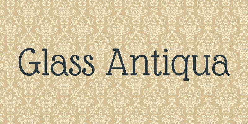
Glass Antiqua revives a 1913 typeface originally released by Genzsch & Heyse, blending Art Nouveau aesthetics with traditional serif font characteristics. The design combines slab serif elements with antiqua forms and touches of cursive calligraphy, creating a distinctive vintage appearance perfect for bohemian branding projects.
Jugendstil Heritage
The original Glass Antiqua emerged during the Jugendstil movement in early 20th-century Germany.
Franz Paul Glass designed this typeface with flowing serifs and organic curves that reflect Art Nouveau’s natural forms. The digital revival by Denis Masharov preserves these historical elements while adding extended character sets and refined spacing for modern applications.
Hybrid Construction
Glass Antiqua merges multiple typographic traditions into one cohesive design. Slab serif foundations provide structural stability, while antiqua letterforms add classical elegance.
Cursive calligraphy influences appear in the flowing terminals and decorative flourishes. This combination creates versatility across both display and body text applications.
Retro Texture
The font delivers an immediate vintage aesthetic without appearing overly aged or damaged. Rounded serifs and moderate stroke contrast produce a soft, approachable feel that works exceptionally well for packaging design, editorial layouts, and wedding stationery.
Characters maintain readability even at smaller sizes, though the decorative qualities shine brightest in headlines and titles.
Open Licensing
Glass Antiqua operates under the SIL Open Font License, making it freely available for commercial projects. The extended character set supports 57 languages, and careful kerning ensures professional results across various design contexts from logos to magazine layouts.
Soria
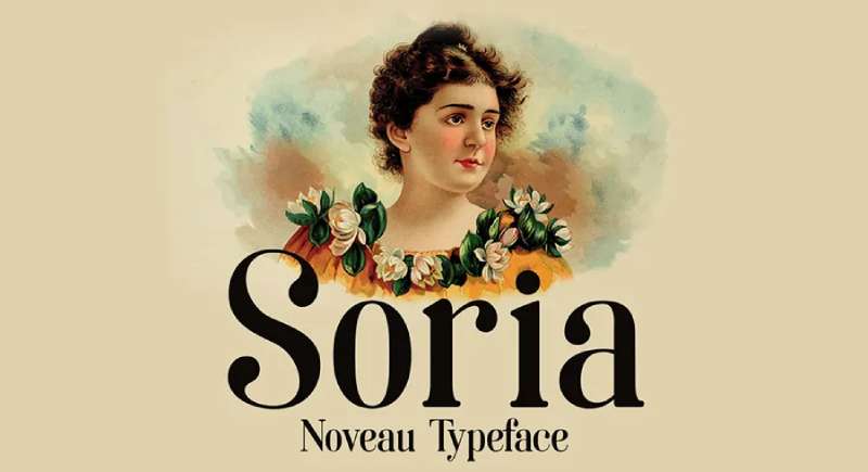
Soria emerges from the intersection of Art Nouveau sensibility and Didot-inspired high contrast, resulting in a modern display font with dramatic flair. Spanish designer Dani Bydani released this decorative typeface in 2016, targeting headline and branding applications where visual impact matters most.
Art Nouveau Influence
The font channels Art Nouveau’s organic elegance through elongated letterforms and flowing curves.
Delicate hairlines contrast sharply with thick stems, creating the dramatic visual rhythm characteristic of both Art Nouveau posters and Didot typefaces. This dual influence produces a contemporary feel while honoring historical design movements.
High Contrast Structure
Extreme stroke variation defines Soria’s personality. Thick verticals transition abruptly to razor-thin horizontals, demanding attention in logos and titles.
This high contrast requires careful sizing. Too small and the hairlines disappear; at display sizes, the dramatic weight differences create stunning visual interest perfect for cosmetics branding, fashion editorials, and upscale product packaging.
Display Optimization
Soria functions exclusively as a headline font rather than body text. The single regular weight includes 170 glyphs supporting 51 languages.
Tall x-height and narrow proportions allow for impactful headlines without consuming excessive horizontal space. Best applications include poster design, magazine covers, and brand identities seeking sophisticated bohemian aesthetics.
Commercial Flexibility
Released under SIL Open Font License, Soria remains free for both personal and commercial projects. The TrueType format ensures compatibility across design platforms, while the extensive language support makes it viable for international branding campaigns and multilingual publications.
Romantic Couple
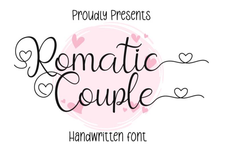
Romantic Couple delivers handcrafted authenticity through irregular baseline placement and varied letter weights. This script font emphasizes organic, flowing connections between characters, creating the appearance of genuine brush lettering rather than digital construction.
Organic Flow
Letters connect through natural ligatures that mimic actual handwriting motion. Baseline shifts create rhythm and movement, preventing the mechanical appearance common in digital scripts.
The casual yet elegant letterforms work particularly well for wedding invitations, greeting cards, and lifestyle branding where personal touch matters more than geometric precision.
Brush Texture
Stroke endings show subtle texture variation suggesting analog brush or marker application. This tactile quality adds warmth to designs without overwhelming the composition with heavy distressing effects.
Weight variations within individual characters reinforce the handmade aesthetic while maintaining overall legibility across different sizes and applications.
Romantic Applications
The font targets projects emphasizing intimacy and personal connection. Wedding suites, love-themed social media graphics, and boutique branding benefit from its gentle, approachable character.
Pairing with simple sans-serif body text creates visual hierarchy while letting the script maintain its decorative role.
Spacing Considerations
Generous spacing between words prevents crowding despite the connected script nature. Individual letter spacing has been carefully adjusted to ensure smooth visual flow without requiring manual kerning adjustments in most applications.
Cutive Mono
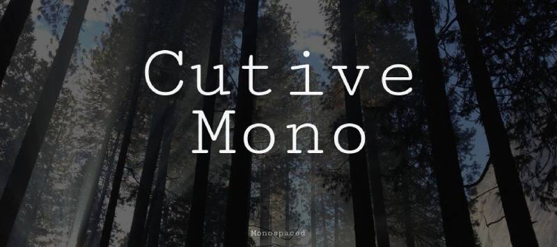
Cutive Mono resurrects classic typewriter aesthetics through monospaced characters based on IBM Executive and Smith-Premier typewriter faces. Vernon Adams created the original design, with Anna Richard later expanding it into a full family with multiple weights and italics.
Typewriter Heritage
The design references mid-century office typewriters, capturing their mechanical precision and uniform character width.
Each letter occupies identical horizontal space, creating the distinctive rhythm of typed documents. This monospaced structure makes Cutive Mono ideal for displaying code, technical documentation, and designs requiring nostalgic typewriter aesthetics.
Monospace Function
Fixed-width characters ensure perfect vertical alignment across lines, essential for programming applications and data tables. The typewriter-inspired forms add character to otherwise utilitarian layouts.
Unlike condensed code fonts, Cutive Mono maintains comfortable proportions that work equally well in body text and display applications.
Character Personality
Slab serifs and robust stroke weights give Cutive Mono presence beyond typical monospace fonts. The design balances technical functionality with vintage charm.
Numerals and special characters receive the same design attention as letters, ensuring cohesive appearance in mixed-content applications like invoices, receipts, and technical specifications.
Web Font Optimization
Cutive Mono exists as a Google Font, optimized for screen display and web typography. The 59-language character set supports international projects, while the SIL Open Font License permits unlimited commercial use without licensing fees or attribution requirements.
Milonga
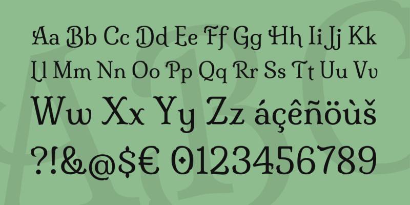
Milonga channels Argentine tango culture through bold, energetic letterforms with Art Deco undertones. This display typeface brings musical rhythm and Latin American flair to headlines, posters, and branding projects seeking passionate, dramatic character.
Tango Spirit
The font embodies tango’s dramatic contrasts through sharp angles and flowing curves. Bold weights command attention while maintaining the sensual fluidity associated with Argentine dance culture.
Letterforms suggest movement and rhythm, making Milonga particularly effective for music-related design, event posters, and entertainment branding.
Art Deco Elements
Geometric shapes and stylized curves recall 1920s-30s design movements. Strong vertical emphasis and decorative details create a vintage-modern hybrid aesthetic.
This combination works well for restaurant branding, cocktail bars, and projects requiring both historical reference and contemporary edge.
Latin Character
Milonga captures Latin American design sensibilities through passionate, unrestrained forms. The typeface avoids subtle restraint in favor of bold expression.
Full character set includes accented letters essential for Spanish-language applications, making it practical for international Latin American markets alongside its decorative appeal.
Display Applications
Strong personality limits Milonga to headline and logo use rather than body text. The bold weight and decorative nature demand large sizes to showcase design details.
Best results come from pairing with neutral sans-serif body fonts that won’t compete for attention.
Lancelot
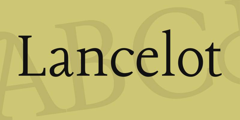
Lancelot presents ornate serif typography rooted in French design traditions, featuring two distinct capital sets for versatile formal applications. This Google Font brings classical elegance and decorative flair to projects requiring refined, traditional aesthetics.
Dual Capital Sets
Lancelot includes both swash capitals and classical alternatives, offering designers flexibility in formality levels.
Swash versions feature elaborate flourishes suitable for wedding invitations and luxury branding. Classical capitals provide restrained elegance for applications requiring sophistication without excessive ornamentation.
French Tradition
The design references French typographic heritage through refined proportions and elegant serifs. Delicate details and balanced letterforms reflect Parisian design sensibility.
This European influence makes Lancelot particularly appropriate for perfume branding, fashion applications, and projects targeting sophisticated, international audiences.
Ornamental Details
Decorative elements appear throughout the character set without overwhelming readability. Subtle flourishes on select letters add visual interest while maintaining overall cohesion.
The ornate nature positions Lancelot firmly in display territory, though its good readability allows for short text blocks in carefully designed layouts.
Formal Contexts
Lancelot excels in contexts demanding traditional elegance. Wedding materials, certificate designs, and upscale product packaging benefit from its refined character.
The font pairs effectively with simple serif body text or clean sans-serif options that won’t compete with its decorative nature.
Berkshire Swash
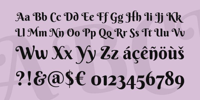
Berkshire Swash delivers bold feminine charm through curved serifs and playful swash elements designed by Astigmatic. This display typeface combines script sensibilities with serif structure, creating a semi-sweet personality ideal for projects targeting female audiences without veering into overtly girly territory.
Bold Femininity
The design balances strength and softness through substantial stroke weights paired with gentle curves. Unlike delicate script fonts, Berkshire Swash maintains presence and readability at various sizes.
Swash elements add decorative flair without compromising the font’s bold character, making it suitable for confident, feminine branding that avoids fragile or overly delicate aesthetics.
Swash Details
Select letters feature extended flourishes that create visual interest in headlines and logos. These decorative elements remain optional through alternate characters, allowing designers to control ornamental intensity.
The swashes work particularly well at the beginning and end of words, framing text with elegant curves that enhance bohemian and vintage-inspired designs.
Script-Serif Hybrid
Berkshire Swash occupies a unique space between script and serif classifications. Curved letterforms suggest script movement, while serif details provide traditional structure.
This hybrid nature makes it more versatile than pure scripts, functioning effectively in contexts where full scripts might appear too casual or feminine.
Wedding Applications
The font has become popular for wedding invitations, bridal branding, and romantic event materials. Its bold weight ensures readability in printed invitations while maintaining elegant character.
Pairs effectively with simple sans-serif body text or classic serif fonts that complement rather than compete with its decorative personality.
Gogoia
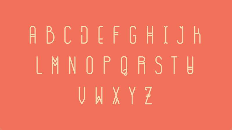
Gogoia brings contemporary bohemian styling through irregular forms and artistic imperfection. This display font emphasizes individuality over uniformity, making each letter feel hand-crafted rather than mechanically reproduced.
Artistic Irregularity
Letter heights and widths vary deliberately, creating organic rhythm across text. This intentional inconsistency mimics artistic hand-lettering where perfection takes backseat to character.
Baseline variations and asymmetrical forms prevent monotony, particularly effective in short headlines and logos where each letter can be appreciated individually.
Bohemian Character
Gogoia captures free-spirited bohemian aesthetics through unconventional proportions and playful details. The font rejects traditional typographic conventions in favor of artistic expression.
This rebellious quality makes it ideal for indie brands, craft businesses, and creative ventures seeking to differentiate from corporate competitors.
Limited Applications
Strong personality restricts Gogoia to display use in logos, posters, and short headlines. The irregular forms become difficult to read in body text or extended passages.
Best results come from large sizes where the artistic details remain visible and contribute to overall design impact.
Pairing Strategy
Neutral, highly legible body fonts work best alongside Gogoia. Simple sans-serif or clean serif options provide necessary contrast while letting the display font maintain its artistic role.
Avoid pairing with other decorative fonts, which creates visual confusion rather than complementary hierarchy.
Buffalo Script
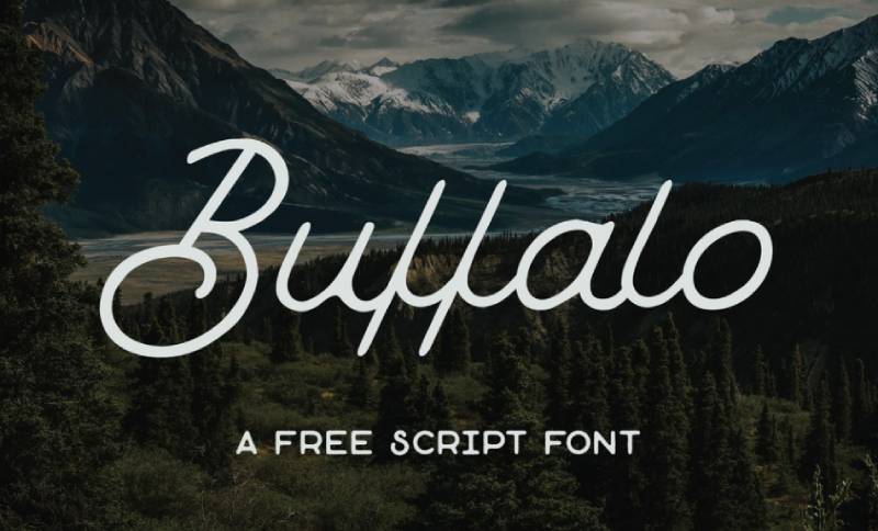
Buffalo Script channels Western Americana through connected script letterforms with vintage sign-painting character. This casual script font brings rustic charm and hand-lettered authenticity to projects emphasizing American heritage and outdoor lifestyles.
Western Heritage
The design references historical Western signage and hand-painted store fronts. Letters connect smoothly while maintaining individual character, avoiding the overly mechanical appearance of some digital scripts.
Rustic details and confident strokes evoke frontier aesthetics without resorting to obvious cowboy cliches, making it suitable for modern brands with Western influences.
Casual Script Flow
Connected letters create continuous visual flow while allowing for natural breaks between words. The script maintains legibility through generous spacing and substantial stroke weights.
Unlike formal calligraphy scripts, Buffalo Script presents a relaxed, approachable personality suitable for casual branding and lifestyle applications.
Sign-Painting Quality
Stroke endings and weight variations suggest brush or marker application rather than pen and ink. This painterly quality adds warmth and human touch to digital designs.
The hand-lettered aesthetic works particularly well for craft breweries, outdoor brands, and businesses emphasizing artisan craftsmanship.
Rustic Applications
Buffalo Script excels in contexts emphasizing American heritage, outdoor recreation, and handcrafted quality. Ranch branding, camping gear, and farm-to-table restaurant materials benefit from its authentic Western character.
Pairing with wood textures, kraft paper backgrounds, and earth-tone color palettes reinforces the rustic bohemian aesthetic.
Averia Serif
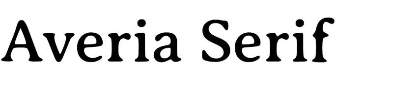
Averia Serif emerges from an unusual design process, created by averaging multiple font families to produce a “average” typeface. This experimental approach results in soft, organic forms with subtle irregularities that create approachable, human character.
Averaged Design
Dan Sayers developed Averia by digitally averaging the shapes of multiple typefaces. This mathematical approach paradoxically produces organic, hand-drawn qualities.
The averaging process creates gentle curves and softened corners that feel less mechanical than traditionally designed fonts, giving Averia unexpected warmth for a serif face.
Organic Softness
Letterforms show subtle variations in weight and proportion, creating visual interest without disrupting readability. The slight irregularities prevent the monotony of perfect geometric construction.
This gentle imperfection makes Averia Serif particularly suitable for children’s books, craft branding, and designs requiring friendly, accessible character.
Serif Warmth
Unlike crisp, formal serifs, Averia presents a casual, approachable personality. The serifs themselves appear soft and rounded rather than sharp and precise.
This warmth allows the font to function in contexts where traditional serifs might appear too formal or cold, bridging the gap between professional and friendly aesthetics.
Family Versatility
Averia includes serif, sans-serif, and libre variations, all sharing the same soft, averaged characteristics. Multiple weights provide typographic hierarchy options while maintaining cohesive family personality.
The complete family allows designers to create varied yet unified layouts using only Averia fonts.
Bellota
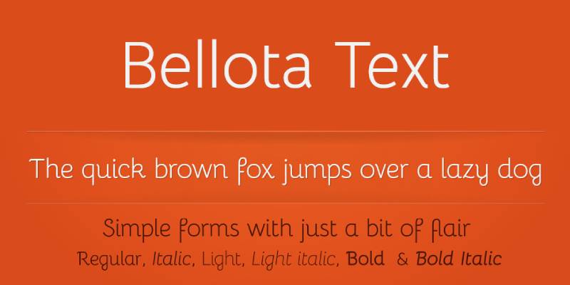
Bellota brings rounded, friendly forms to both display and text applications through its complete font family with multiple weights and styles. This versatile typeface balances playful character with practical functionality, making it suitable for both serious communication and lighthearted branding.
Rounded Forms
Soft, rounded terminals create approachable, friendly character throughout the design. The curves soften what could otherwise be a standard sans-serif, adding personality without sacrificing legibility.
This rounded quality works particularly well for brands targeting families, children’s products, or any context where warmth and accessibility matter more than corporate formality.
Complete Family
Bellota includes regular, italic, light, and bold weights, providing designers with comprehensive typographic tools. This range allows for proper hierarchy and emphasis without introducing additional fonts.
The complete family makes Bellota practical for projects requiring both display impact and readable body text from a single typeface source.
Bohemian Versatility
While maintaining bohemian charm through its soft forms, Bellota remains functional enough for body text. This versatility distinguishes it from purely decorative bohemian fonts limited to headlines.
The font successfully bridges whimsical and practical, making it valuable for brands needing both personality and professionalism.
Text Performance
Unlike many decorative fonts, Bellota maintains legibility at small sizes. The rounded forms don’t blur together, and adequate spacing prevents crowding in longer passages.
This text-friendly nature makes it suitable for websites, brochures, and other materials requiring extended reading without visual fatigue.
Alice

Alice presents delicate femininity through refined serif forms with subtle decorative details. This elegant typeface brings old-world charm and fairy-tale aesthetics to projects requiring gentle sophistication without heavy ornamentation.
Delicate Character
Fine lines and graceful proportions create an inherently feminine aesthetic. The design maintains structural integrity while conveying softness through its refined details.
Unlike bold display faces, Alice succeeds through subtlety, making it appropriate for projects where quiet elegance matters more than immediate visual impact.
Fairy-Tale Quality
The font’s name and aesthetic evoke Lewis Carroll’s Alice in Wonderland, bringing storybook charm to designs. This literary association makes it particularly suitable for children’s books, vintage-inspired branding, and romantic materials.
Decorative elements remain restrained, preventing the font from appearing overtly childish or costume-like.
Serif Refinement
Traditional serif structure provides familiar readability while gentle curves and elegant proportions add distinctive character. The design avoids harsh angles in favor of flowing, organic forms.
This refinement makes Alice suitable for body text in appropriate contexts, though its personality shines brightest in headlines and display applications.
Romantic Applications
Alice excels in contexts emphasizing romance, femininity, and vintage aesthetics. Wedding invitations, boutique branding, and literary projects benefit from its storybook character.
The font pairs well with script accents or simple sans-serif body text that won’t compete with its delicate nature.
Cherry Swash
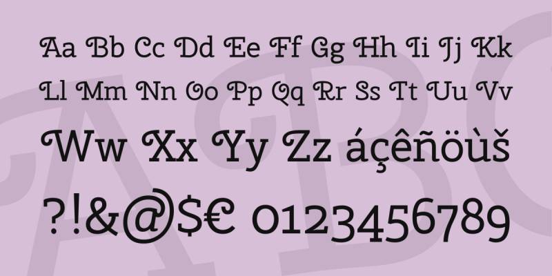
Cherry Swash combines monolinear slab serif construction with elegant swash capitals, creating a contemporary typeface with vintage charm. This distinctive font brings eye-catching personality to headlines and logos through its unique fusion of sturdy structure and decorative flair.
Monolinear Construction
Consistent stroke weights throughout the design create a modern, streamlined appearance. This uniformity distinguishes Cherry Swash from traditional slab serifs with variable stroke weights.
The monolinear approach gives the font a contemporary edge while the slab serifs and swashes add vintage character, resulting in a unique temporal ambiguity.
Swash Capitals
Elaborate swash capitals provide decorative alternatives to standard letterforms. These flourished versions add drama to headlines and logos without requiring separate ornamental fonts.
Designers can toggle between standard and swash capitals based on context, offering flexibility in formality and visual impact across different applications.
Slab Serif Base
Sturdy slab serifs provide solid foundation and strong presence. The blocky serifs give Cherry Swash better visibility and impact than delicate serif alternatives.
This robust structure makes the font particularly effective for display applications, posters, and branding where strong visual presence matters.
Contemporary Vintage
Cherry Swash occupies an interesting design space between modern and retro. The monolinear construction reads contemporary, while swashes and slab serifs reference historical typography.
This temporal flexibility makes it valuable for brands wanting vintage character without appearing dated or for modern designs needing warmth and personality.
Forum
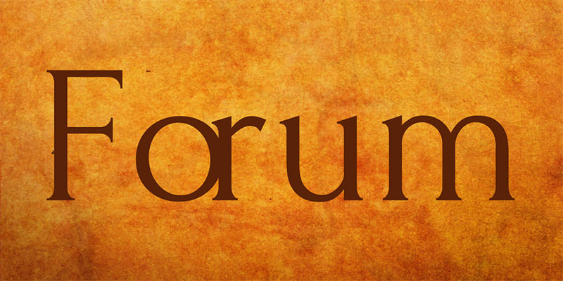
Forum revives ancient Roman inscription lettering through refined capital letterforms with classical proportions. This all-caps typeface brings historical gravitas and timeless elegance to projects requiring traditional sophistication and architectural character.
Roman Inscription
Based on lettering found in ancient Roman monuments and inscriptions, Forum captures classical proportions and formal elegance. The design references stone-carved letters, bringing architectural permanence to digital applications.
This historical foundation makes Forum particularly appropriate for luxury branding, classical music materials, and projects emphasizing tradition and heritage.
All-Caps Design
Forum exists exclusively in capital letters, eliminating lowercase characters entirely. This limitation reinforces its classical nature, as Roman inscriptions used only capitals.
The all-caps format restricts Forum to headlines, titles, and short text blocks where readability remains adequate without lowercase letters.
Classical Proportions
Letter widths and heights follow traditional Roman ratios, creating harmonious visual relationships. This mathematical precision produces inherently balanced compositions.
The classical proportions make Forum self-correcting in layouts, as the letterforms naturally create visually pleasing arrangements without extensive kerning adjustments.
Timeless Elegance
Forum’s historical basis gives it immunity from trendy design cycles. The font appears equally appropriate in contemporary and traditional contexts.
This temporal neutrality makes it valuable for brands seeking longevity and projects requiring sophistication that won’t appear dated in future years.
August Script
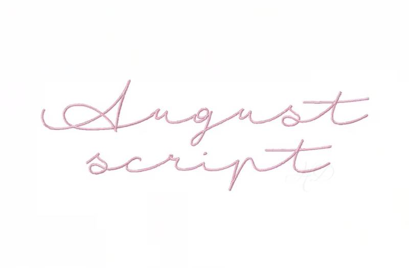
August Script delivers flowing calligraphy with romantic elegance through connected letterforms and graceful flourishes. This formal script font brings wedding invitation character and upscale sophistication to projects emphasizing beauty and refinement.
Calligraphic Flow
Letters connect through natural ligatures that replicate traditional pen-and-ink calligraphy. The flowing connections create visual rhythm and movement across text.
Stroke weight variations within letters suggest the pressure changes of actual hand-lettering, adding authenticity and organic quality to the digital design.
Romantic Character
August Script embodies romantic aesthetics through its delicate forms and elegant flourishes. The font targets contexts emphasizing love, beauty, and special occasions.
Wedding invitations represent the primary use case, though the font also suits boutique branding, perfume packaging, and other luxury applications requiring feminine elegance.
Formal Script
Unlike casual handwritten fonts, August Script maintains formal sophistication suitable for upscale contexts. The refined letterforms and controlled flourishes prevent the font from appearing too casual or childish.
This formality makes it appropriate for high-end brands and events where elegance matters more than approachability.
Flourish Balance
Decorative elements enhance beauty without overwhelming legibility. Flourishes appear primarily on capital letters and select lowercase terminals, creating visual interest while maintaining overall restraint.
This balanced approach prevents the font from appearing overly fussy or difficult to read, even in longer text blocks.
Ostrich Sans
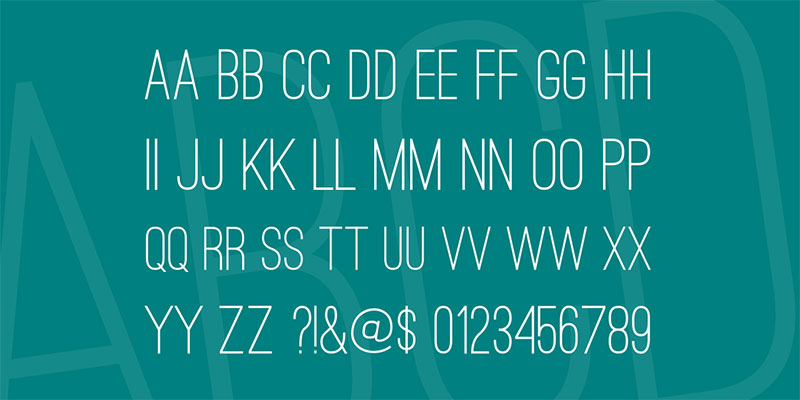
Ostrich Sans presents tall, condensed letterforms with Art Deco influences through a complete family of weights from light to black. This striking display font brings vertical drama and retro sophistication to posters, headlines, and branding requiring strong visual impact.
Extreme Condensation
Exceptionally narrow letterforms create dramatic vertical emphasis. This condensation allows for impactful headlines without consuming excessive horizontal space.
The tall, thin characters demand attention through their unusual proportions, making Ostrich Sans impossible to ignore in layouts.
Art Deco Influence
Geometric shapes and stylized forms reference 1920s-30s design movements. The font captures Art Deco’s glamorous sophistication and modern elegance.
This vintage association makes Ostrich Sans particularly effective for projects referencing the Jazz Age, retro futurism, or upscale vintage aesthetics.
Weight Range
Multiple weights from light to black provide versatility within the condensed format. Light weights create elegant refinement, while black weights deliver maximum impact.
This range allows designers to create hierarchy and emphasis using only Ostrich Sans, though the condensed proportions remain consistent across all weights.
Display Optimization
Extreme proportions limit Ostrich Sans to display applications rather than body text. The condensed forms become difficult to read in smaller sizes or extended passages.
Best results come from large headlines, posters, and logo applications where the distinctive proportions can be fully appreciated.
Alegreya

Alegreya provides elegant serif typography optimized for both print and digital reading through careful optical sizing and humanist proportions. This versatile typeface family brings literary character and sophisticated readability to books, magazines, and editorial design.
Humanist Structure
Organic proportions and calligraphic influences create warmth and personality within a traditional serif framework. The humanist approach produces letterforms that feel hand-crafted rather than mechanically constructed.
This warmth makes Alegreya particularly suitable for literary applications, poetry, and texts where human voice and character matter.
Optical Sizing
Different versions optimized for various text sizes ensure ideal readability across applications. Display versions maximize dramatic details for headlines, while text versions prioritize clarity for body copy.
This attention to optical sizing makes Alegreya exceptionally functional across the full range of typographic applications.
Print Heritage
Originally designed for literature and long-form reading, Alegreya brings print-quality typography to digital contexts. The design prioritizes reading comfort over pure display impact.
This editorial foundation makes it ideal for blogs, online magazines, and digital publications where sustained reading matters more than visual novelty.
Complete Family
Alegreya includes regular, italic, and small caps in multiple weights, plus a complementary sans-serif companion (Alegreya Sans). This comprehensive system provides all necessary typographic tools within one cohesive family.
The complete family allows designers to create complex, hierarchical layouts without introducing disparate typefaces.
Tenor Sans
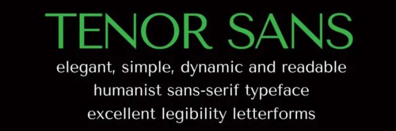
Tenor Sans delivers contemporary elegance through refined sans-serif forms with subtle classical influences. This versatile typeface bridges modern simplicity and traditional sophistication, making it suitable for both digital interfaces and editorial design.
Classical Sans-Serif
Tenor Sans incorporates classical proportions within a clean sans-serif structure. This combination produces refined elegance unusual in purely geometric sans-serif designs.
The classical influences create visual sophistication while maintaining the clarity and functionality expected from contemporary sans-serif fonts.
Refined Minimalism
Simple forms avoid unnecessary decoration while maintaining distinctive character. The design achieves personality through proportion and subtle details rather than obvious stylistic flourishes.
This restrained approach makes Tenor Sans suitable for minimalist branding, fashion applications, and contexts requiring quiet sophistication.
Versatile Applications
Tenor Sans functions effectively across display and text applications. The refined forms maintain legibility at small sizes while providing enough personality for headlines and branding.
This versatility makes it valuable for complete brand identity systems, websites, and editorial projects requiring typographic consistency.
Contemporary Elegance
The font succeeds in contexts requiring modern sophistication without cold, purely geometric character. Subtle warmth and classical proportions prevent Tenor Sans from appearing sterile or overly technical.
Fashion brands, lifestyle publications, and upscale digital products benefit from its contemporary yet refined aesthetic.
Spinwerad
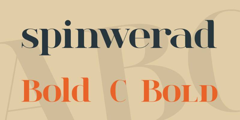
Spinwerad brings experimental bohemian character through unconventional letterforms and artistic construction. This display font prioritizes visual interest and artistic expression over traditional readability metrics, making it ideal for projects where typography functions as art.
Experimental Forms
Letters break from traditional construction through unexpected shapes and proportions. This experimental approach creates a unique visual signature that’s immediately recognizable.
The unconventional forms make Spinwerad suitable for artistic projects, alternative music branding, and contexts where breaking typographic rules enhances rather than hinders communication.
Artistic Expression
Spinwerad functions as much as visual art as practical typography. Individual letters work as graphic elements beyond their linguistic function.
This artistic quality makes the font particularly valuable for poster design, album covers, and branding seeking to emphasize creativity and unconventional thinking.
Limited Readability
Strong artistic character restricts Spinwerad to short text applications. The experimental forms become challenging to read in anything beyond single words or very short phrases.
Best applications include logos, poster headlines, and decorative text elements where visual impact matters more than easy reading.
Bohemian Edge
The font captures bohemian aesthetics through rejection of conventional typographic rules. This rebellious quality appeals to counterculture brands and artistic ventures.
Spinwerad makes a statement about creative freedom and artistic independence, making it valuable for brands wanting to position themselves outside mainstream design trends.
Amatic SC
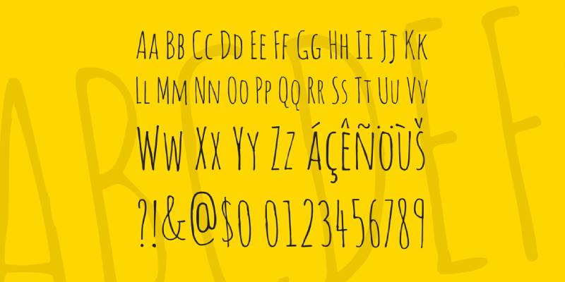
Amatic SC delivers hand-drawn character through small caps construction and casual letterforms designed by Vernon Adams. This versatile display font brings approachable personality and artistic authenticity to web design, posters, and branding requiring friendly, handcrafted character.
Small Caps Format
The font exists entirely in small capitals rather than standard uppercase and lowercase. This unusual approach creates visual consistency and prevents the jarring size differences between capital and lowercase letters.
The small caps format makes Amatic SC particularly effective for headlines, titles, and short text blocks where uniform letter heights create visual cohesion.
Hand-Drawn Quality
Irregular forms and organic shapes suggest hand-lettering rather than digital construction. This authentic handmade quality adds warmth and personality to designs.
The hand-drawn nature makes Amatic SC popular for casual branding, craft businesses, and projects emphasizing human touch over corporate polish.
Dual Weights
Regular and bold weights provide basic hierarchy options while maintaining the hand-drawn character. The bold version increases impact without changing the font’s casual personality.
This weight range makes Amatic SC functional for simple typographic systems requiring only basic variation.
Web Font Popularity
As a Google Font, Amatic SC sees widespread use in web design. The hand-drawn character provides personality without requiring custom fonts or complex licensing.
Free availability and strong character make it particularly popular among small businesses, bloggers, and creative ventures with limited design budgets.
Black Mango
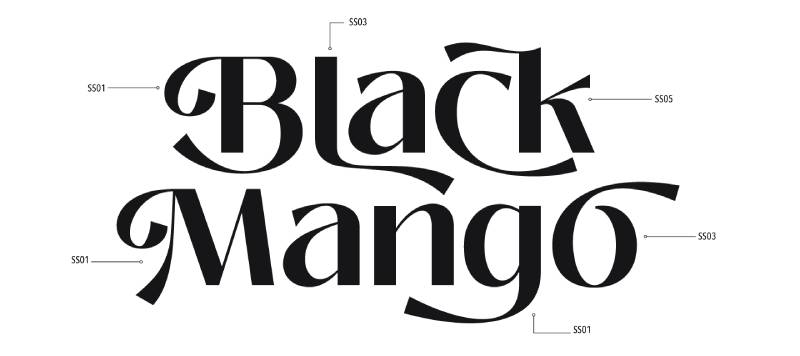
Black Mango delivers bold tropical personality through substantial stroke weights and playful letterforms. This display font brings summer energy and vacation vibes to branding, packaging, and materials requiring warm, approachable character.
Tropical Character
The font embodies tropical aesthetics through rounded forms and cheerful proportions. Letters suggest relaxation, warmth, and casual island living.
This tropical personality makes Black Mango particularly suitable for resort branding, tropical beverage packaging, and summer event materials.
Bold Presence
Substantial stroke weights ensure visibility and impact across applications. The bold character prevents the playful forms from appearing weak or ineffective.
This combination of friendliness and strength makes Black Mango suitable for brands needing both approachability and presence.
Casual Energy
Playful letterforms create energetic, upbeat character without appearing childish. The design maintains enough sophistication for adult-oriented products while conveying fun and accessibility.
This balanced approach allows Black Mango to work for both family-friendly and adult beverage/resort contexts.
Summer Applications
Black Mango excels in contexts emphasizing summer, vacation, and tropical themes. Beach resort branding, tiki bars, and summer festival materials benefit from its warm, casual character.
Pairing with bright colors and tropical imagery reinforces the font’s inherent summer personality.
RoxboroughCF
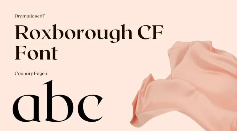
RoxboroughCF presents refined Arts and Crafts movement character through carefully crafted letterforms with handmade quality. This versatile display font brings artisan authenticity and design movement history to branding requiring crafted sophistication.
Arts and Crafts Heritage
The design references early 20th-century Arts and Crafts typography through honest construction and handcrafted character. This movement emphasized skilled craftsmanship over industrial mass production.
RoxboroughCF captures this artisan philosophy through letterforms that show the hand of the designer rather than appearing mechanically generated.
Handcrafted Quality
Individual letters show subtle variations suggesting manual construction. This handmade quality creates warmth and authenticity without sacrificing overall cohesion.
The crafted character makes RoxboroughCF particularly suitable for artisan businesses, craft breweries, and brands emphasizing traditional skills and quality materials.
Versatile Weights
Multiple weights provide hierarchy options while maintaining the handcrafted aesthetic. Light weights create refined elegance, while bolder versions deliver stronger presence.
This weight range makes RoxboroughCF functional for complete brand identity systems requiring varied typography from a single family.
Contemporary Craft
While referencing historical design movements, RoxboroughCF feels current rather than costume-like. The design successfully updates Arts and Crafts aesthetics for contemporary applications.
This temporal balance makes it valuable for modern craft businesses wanting historical authenticity without appearing dated.
Hatton
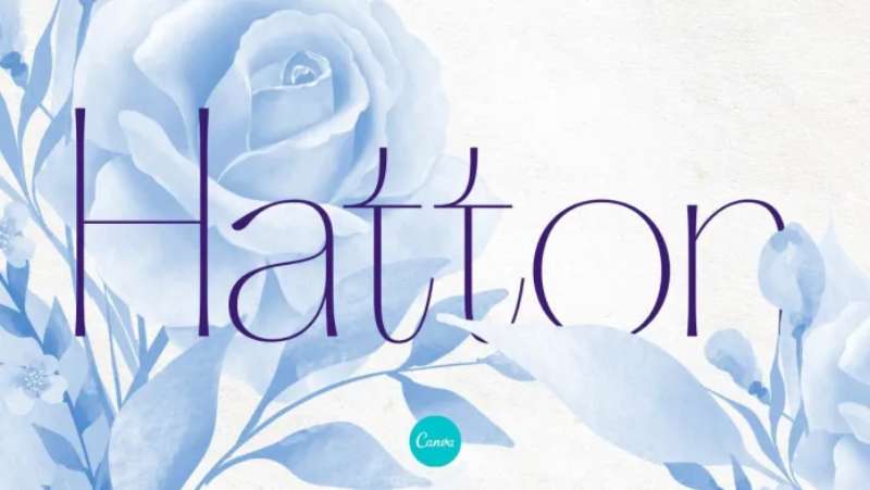
Hatton delivers geometric sans-serif precision with subtle vintage character through carefully balanced proportions. This versatile font family brings mid-century modern sophistication to branding, editorial design, and digital applications requiring clean, confident typography.
Geometric Foundation
Clean geometric shapes form the basis of Hatton’s design. Circles and straight lines create consistent, harmonious letterforms throughout the character set.
This geometric precision gives Hatton a modern, rational appearance that works particularly well for tech companies, architectural firms, and brands emphasizing clarity and logic.
Vintage Touches
Subtle details reference mid-century typography without overwhelming the geometric foundation. These vintage influences add warmth to what could otherwise be a cold, purely geometric design.
The vintage touches make Hatton suitable for brands wanting modern aesthetics with human warmth and historical resonance.
Weight Range
Multiple weights from thin to black provide comprehensive typographic tools. This range allows for complex hierarchical systems using only Hatton.
The consistent geometric structure across all weights ensures visual cohesion even when mixing multiple weights in single layouts.
Professional Applications
Hatton’s balance of clarity and character makes it valuable for professional contexts. Corporate branding, annual reports, and business communications benefit from its confident, sophisticated appearance.
The font conveys competence and professionalism while avoiding the cold sterility of purely technical sans-serif options.
Pierson
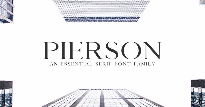
Pierson channels 1920s-era elegance through refined letterforms with Art Deco influences. This display typeface brings vintage glamour and sophisticated geometry to luxury branding, wedding materials, and projects requiring period-specific character.
Jazz Age Aesthetics
The design captures 1920s glamour through streamlined forms and elegant proportions. Geometric shapes and decorative elements reference the Art Deco movement’s sophisticated modernism.
This period character makes Pierson particularly effective for Great Gatsby-themed events, vintage wedding invitations, and brands emphasizing classic luxury.
Geometric Elegance
Clean geometric construction combines with decorative details to create sophisticated visual impact. The balance between simplicity and ornamentation prevents the font from appearing either too plain or overly fussy.
This equilibrium makes Pierson suitable for upscale applications requiring both visual interest and refined restraint.
Luxury Applications
Pierson excels in contexts emphasizing luxury, sophistication, and timeless elegance. High-end fashion branding, jewelry packaging, and luxury real estate materials benefit from its glamorous character.
The vintage associations add depth and cultural resonance to contemporary luxury branding.
Display Optimization
Strong personality and decorative details restrict Pierson to headlines and display applications. The design prioritizes visual impact over extended readability.
Best results come from large sizes where geometric precision and decorative elements can be fully appreciated.
West & Olives
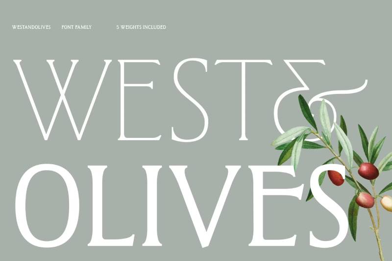
West & Olives combines rustic Western character with Mediterranean sophistication through unique letterform fusion. This eclectic display font brings cross-cultural charm and unexpected elegance to branding requiring distinctive personality.
Cultural Fusion
The design merges American Western aesthetics with European Mediterranean influences. This unexpected combination creates a unique visual personality that stands apart from single-culture typefaces.
The fusion approach makes West & Olives particularly suitable for restaurants, hospitality brands, and products combining different cultural influences.
Rustic Sophistication
Western ruggedness meets Mediterranean refinement in the letterforms. Rough edges and hand-crafted quality coexist with elegant proportions and sophisticated details.
This balance makes the font suitable for upscale rustic contexts where both authenticity and refinement matter.
Eclectic Character
West & Olives embraces eclecticism through its cultural mixing and varied letterforms. This diversity creates visual interest and prevents monotony.
The eclectic nature appeals to bohemian brands, fusion restaurants, and creative ventures celebrating cultural diversity.
Niche Applications
Strong personality and unusual cultural fusion restrict West & Olives to specific contexts. The font works brilliantly when cultural mixing aligns with brand identity but appears forced in single-culture applications.
Best results come from brands authentically combining Western and Mediterranean influences in their products or services.
Bohemian Soul

Bohemian Soul captures free-spirited aesthetics through flowing forms and artistic irregularity. This display font embodies bohemian philosophy directly through its name and design, making it ideal for brands explicitly embracing counterculture values.
Free-Spirit Character
Letters flow freely with minimal geometric constraint. This liberated approach creates organic, unpredictable forms that feel intuitive rather than calculated.
The free-spirited nature makes Bohemian Soul perfect for yoga studios, holistic wellness brands, and lifestyle companies emphasizing personal freedom and spiritual exploration.
Artistic Flow
Flowing connections between letters create visual rhythm and movement. The design prioritizes aesthetic beauty over rigid readability standards.
This artistic priority positions Bohemian Soul as expressive typography where visual impact matters more than clinical legibility metrics.
Counterculture Appeal
The font directly targets bohemian and counterculture markets through its name and aesthetic. This explicit positioning makes it valuable for brands wanting to clearly signal alternative values.
Bohemian Soul works particularly well for music festivals, alternative fashion brands, and businesses serving consciously bohemian demographics.
Spiritual Associations
Flowing forms and organic construction create associations with spirituality and mindfulness. The design feels meditative and intentional rather than rushed or mechanical.
This spiritual quality makes the font suitable for meditation apps, wellness retreats, and products emphasizing consciousness and inner exploration.
NT Seawave
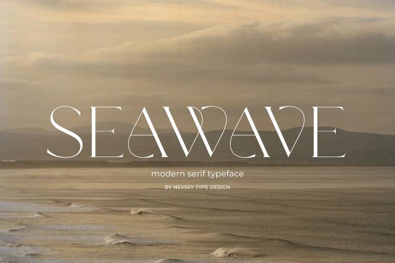
NT Seawave brings coastal aesthetics through fluid letterforms suggesting ocean movement and beach culture. This display font captures maritime character and seaside relaxation, making it ideal for coastal businesses and beach-themed projects.
Wave-Inspired Forms
Letters incorporate flowing curves suggesting water movement and wave patterns. This aquatic influence creates immediate associations with ocean and beach environments.
The wave-inspired construction makes NT Seawave particularly suitable for surf brands, coastal resorts, and beach-themed products.
Coastal Character
Beyond direct wave references, the overall design embodies coastal lifestyle aesthetics. Relaxed forms and flowing rhythm suggest beach culture’s laid-back approach.
This coastal personality works well for seafood restaurants, marina branding, and vacation properties near water.
Fluid Construction
Organic curves and smooth transitions between letterforms create visual flow. The fluid nature prevents the font from appearing static or rigid.
This movement quality makes NT Seawave effective for brands emphasizing flow, relaxation, and natural rhythms.
Maritime Applications
NT Seawave excels in contexts explicitly referencing water and maritime themes. Boat companies, fishing charters, and ocean conservation organizations benefit from its immediate aquatic associations.
The font’s direct thematic connection makes it most effective when brand identity already emphasizes coastal or maritime elements.
Shalomita
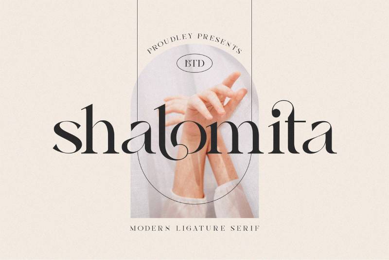
Shalomita delivers handwritten authenticity through irregular baseline placement and varied letter weights. This casual script font brings personal warmth and organic character to designs requiring genuine handmade appearance.
Handwritten Irregularity
Letters vary in size, weight, and baseline position, mimicking actual handwriting’s natural inconsistency. This irregularity creates authenticity that perfectly uniform scripts lack.
The handwritten quality makes Shalomita particularly effective for personal branding, artisan businesses, and contexts where human touch matters more than polish.
Organic Rhythm
The irregular placement creates visual rhythm and movement across text. This organic flow prevents the mechanical appearance common in digital fonts.
The rhythmic quality works well for creative projects, personal correspondence, and designs emphasizing spontaneity over rigid planning.
Personal Connection
Shalomita’s handwritten character creates immediate personal connection with viewers. The human imperfection makes designs feel approachable and authentic.
This personal quality makes the font valuable for small businesses, independent creators, and brands emphasizing personal relationships over corporate distance.
Casual Applications
Strong handwritten character restricts Shalomita to casual contexts. The irregular forms would appear inappropriate in formal or corporate settings.
Best applications include greeting cards, personal blogs, craft business branding, and casual social media graphics.
Bohemian Script
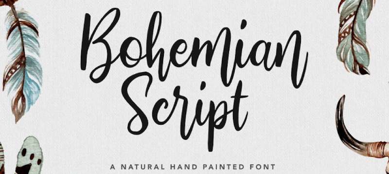
Bohemian Script embodies flowing calligraphy with artistic flourishes through connected letterforms and decorative elements. This formal script brings bohemian romance and artistic elegance to wedding materials and upscale bohemian branding.
Calligraphic Elegance
Traditional calligraphic construction creates flowing, connected letterforms. The design references hand-lettered invitation traditions while adding bohemian artistic flair.
This calligraphic foundation makes Bohemian Script particularly suitable for wedding invitations, event materials, and contexts requiring formal elegance with artistic personality.
Bohemian Flourishes
Decorative elements and artistic details distinguish Bohemian Script from traditional formal scripts. These flourishes add personality and prevent the font from appearing overly conservative.
The bohemian touches make it suitable for alternative weddings, artistic events, and upscale bohemian brands wanting formal elegance with unconventional edge.
Connected Flow
Letters connect through natural ligatures creating continuous visual movement. This flowing connection enhances the romantic, unified character.
The connected nature works particularly well for names, short phrases, and decorative headlines where the flowing quality can be fully appreciated.
Formal Bohemian
Bohemian Script occupies a unique space between formal calligraphy and casual bohemian aesthetics. This combination appeals to couples and brands wanting sophistication without traditional stuffiness.
The font bridges conventional elegance and alternative style, making it valuable for contexts requiring both refinement and personality.
Blanch Sage
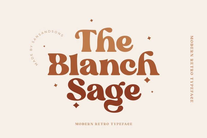
Blanch Sage delivers botanical character through organic forms and natural textures. This display font brings garden aesthetics and herbal associations to natural product branding and wellness applications.
Botanical Forms
Letterforms incorporate organic shapes suggesting plant growth and natural forms. This botanical influence creates immediate associations with gardens, herbs, and natural products.
The plant-inspired construction makes Blanch Sage particularly suitable for herbal tea brands, garden centers, and natural skincare products.
Natural Texture
Subtle texture throughout the design suggests natural materials rather than smooth digital construction. This textured quality adds tactile dimension to otherwise flat typography.
The natural texture works well for brands emphasizing organic ingredients, sustainable practices, and connection to nature.
Herbal Associations
The name “Sage” and the design’s botanical character create strong herbal and medicinal plant associations. This connection makes the font particularly effective for wellness brands.
Herbal supplement companies, naturopathic practices, and holistic wellness centers benefit from these immediate associations.
Garden Applications
Blanch Sage excels in contexts explicitly referencing gardens, plants, and natural growth. Nurseries, landscape design firms, and farm-to-table restaurants benefit from its botanical personality.
The font’s direct natural connection makes it most effective when brand identity already emphasizes plant-based or garden themes.
Nomad
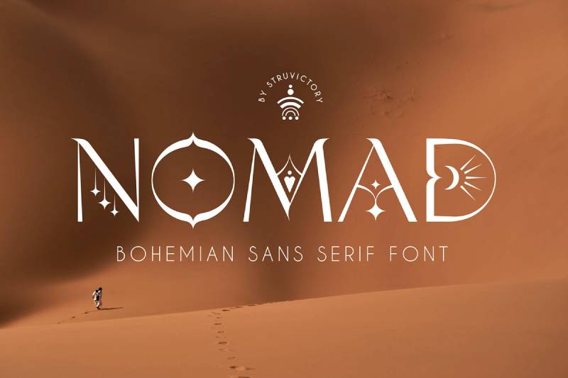
Nomad captures wanderlust and travel spirit through forms suggesting movement and exploration. This display font brings adventurous character and global consciousness to travel brands and products emphasizing discovery.
Travel Spirit
The design embodies nomadic lifestyle through letterforms suggesting movement and journey. This wandering quality creates associations with travel, exploration, and adventure.
Nomad works particularly well for travel agencies, adventure tour operators, and lifestyle brands emphasizing exploration and global connection.
Global Aesthetic
Forms incorporate influences from multiple cultures, reflecting the nomadic experience of encountering diverse traditions. This multicultural character creates worldly sophistication.
The global aesthetic makes Nomad suitable for international brands, cultural exchange organizations, and products celebrating diversity.
Adventurous Character
Beyond direct travel associations, Nomad conveys adventurous spirit and willingness to explore unknown territories. This bold character appeals to risk-takers and explorers.
The adventurous quality works well for outdoor gear brands, extreme sports companies, and products targeting people seeking new experiences.
Journey Metaphor
Nomad functions as visual metaphor for personal journey and transformation. This deeper meaning makes it valuable for brands emphasizing growth, change, and self-discovery.
Life coaching services, transformational travel experiences, and personal development products benefit from these journey associations.
Oracul
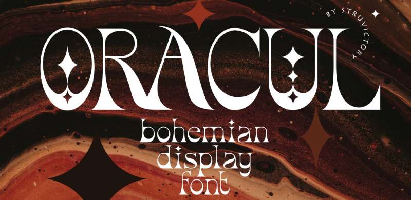
Oracul brings mystical character through mysterious forms and esoteric aesthetics. This display font captures occult associations and spiritual mystery, making it ideal for brands emphasizing hidden knowledge and spiritual exploration.
Mystical Forms
Letters incorporate mysterious, somewhat arcane shapes suggesting hidden meanings and spiritual knowledge. This esoteric quality creates immediate occult associations.
Oracul works particularly well for tarot readers, metaphysical shops, and brands explicitly embracing mystical or magical themes.
Occult Aesthetics
The design references occult typography traditions through its mysterious construction. These associations appeal to audiences interested in esoteric knowledge and spiritual practices.
The occult character makes Oracul suitable for witchcraft supplies, astrology services, and alternative spirituality brands.
Mysterious Character
Beyond explicit occult references, Oracul conveys general mystery and hidden depths. This enigmatic quality intrigues viewers and suggests deeper meanings.
The mysterious nature works well for psychological thriller books, mystery games, and brands wanting to create intrigue and curiosity.
Spiritual Applications
Oracul excels in contexts emphasizing spiritual exploration and mystical knowledge. New Age bookstores, spiritual retreat centers, and meditation apps with mystical orientations benefit from its esoteric character.
The font’s direct spiritual associations make it most effective when brand identity explicitly embraces mystical or occult themes.
Celestial
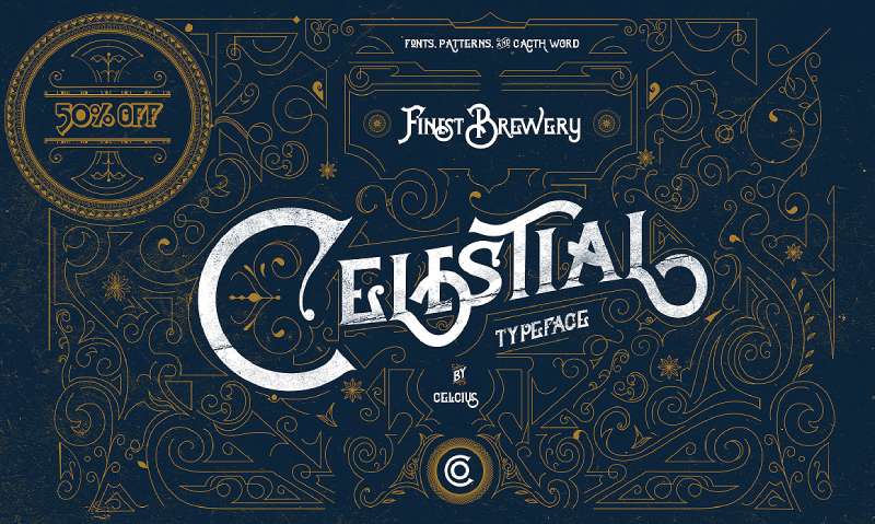
Celestial captures cosmic wonder through starry aesthetics and astronomical associations. This display font brings space-age character and universal consciousness to brands emphasizing cosmic connection and infinite possibility.
Cosmic Character
The design incorporates astronomical references through forms suggesting stars, space, and celestial bodies. This cosmic quality creates immediate space associations.
Celestial works particularly well for astronomy clubs, planetariums, and brands using space as metaphor for infinite potential.
Starry Aesthetics
Decorative elements reference stars and celestial objects. These details add visual interest while reinforcing the astronomical theme.
The starry quality makes Celestial suitable for night sky events, astrology services, and products emphasizing cosmic connection.
Universal Consciousness
Beyond literal space references, Celestial conveys ideas of universal connection and cosmic awareness. This metaphysical dimension appeals to spiritually-oriented audiences.
The universal quality works well for meditation apps, consciousness exploration services, and brands emphasizing interconnection.
Space Applications
Celestial excels in contexts explicitly referencing space, astronomy, and cosmic themes. Space camps, science museums, and astronomical products benefit from its immediate celestial associations.
The font’s direct cosmic connection makes it most effective when brand identity already emphasizes astronomical or universal themes.
Bhiure
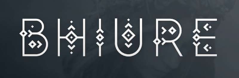
Bhiure delivers experimental character through unconventional letterforms and artistic construction. This avant-garde display font brings contemporary art aesthetics and design innovation to projects emphasizing creativity and forward-thinking.
Experimental Forms
Letters break from traditional construction through unexpected shapes and proportions. This experimental approach creates distinctive visual signature.
The unconventional forms make Bhiure suitable for contemporary art galleries, experimental music labels, and brands positioning themselves as design innovators.
Artistic Innovation
Bhiure functions as contemporary typography pushing traditional boundaries. The design prioritizes artistic expression over conventional readability.
This innovative character appeals to audiences valuing creativity, originality, and artistic risk-taking over safe, conventional choices.
Avant-Garde Appeal
The font targets audiences interested in cutting-edge design and contemporary aesthetics. This positioning makes it valuable for brands wanting to signal innovation and forward-thinking.
Avant-garde fashion brands, contemporary design studios, and experimental venues benefit from Bhiure’s clearly innovative character.
Limited Applications
Strong experimental character restricts Bhiure to contexts where artistic innovation matters more than broad accessibility. The unconventional forms can alienate mainstream audiences.
Best applications include art projects, limited edition products, and brands explicitly serving design-conscious, innovation-seeking demographics.
Ocean Child

Ocean Child brings playful coastal character through cheerful letterforms and beach culture associations. This friendly display font captures seaside childhood memories and carefree summer days, making it ideal for family-friendly beach brands.
Childhood Nostalgia
The design evokes childhood beach memories through playful forms and optimistic character. This nostalgic quality creates emotional connection with viewers.
Ocean Child works particularly well for family beach resorts, children’s beach apparel, and products emphasizing innocent summer joy.
Beach Culture
Beyond direct ocean references, Ocean Child embodies beach culture’s carefree, playful spirit. The design feels sunny, optimistic, and relaxed.
This coastal personality makes it suitable for surf shops targeting families, beach toy brands, and vacation properties emphasizing fun rather than luxury.
Playful Character
Friendly, approachable letterforms create welcoming, accessible personality. The playful nature appeals to children and adults seeking lighthearted fun.
The cheerful character works well for ice cream shops, beach activity rentals, and casual coastal dining establishments.
Family Applications
Ocean Child excels in family-friendly contexts. The innocent, playful character appeals to parents and children while avoiding overly juvenile aesthetics.
Family beach brands, summer camps, and children’s ocean education programs benefit from its warm, accessible personality.
Bohemian Dreams
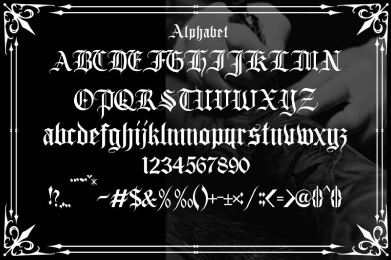
Bohemian Dreams embodies ethereal character through soft forms and dreamy aesthetics. This whimsical display font brings fantasy and imagination to brands emphasizing creativity, dreams, and otherworldly beauty.
Ethereal Quality
Soft, flowing forms create dreamlike, otherworldly character. The design feels light and fantastical rather than grounded and practical.
This ethereal nature makes Bohemian Dreams particularly suitable for fantasy books, dream journals, and brands emphasizing imagination and creativity.
Dreamy Aesthetics
The font captures dream-state aesthetics through its floating, ungrounded quality. Letterforms feel more like cloud shapes than solid constructions.
This dreamy character works well for sleep products, meditation apps with visualization features, and creative services emphasizing imagination.
Whimsical Character
Playful elements and unexpected details create whimsical, fairy-tale quality. The design feels magical and slightly surreal.
The whimsical nature appeals to brands targeting creative individuals, artists, and people seeking escape from mundane reality.
Imagination Applications
Bohemian Dreams excels in contexts emphasizing creativity, imagination, and fantasy. Art supply stores, creative workshops, and fantasy-themed businesses benefit from its dreamy character.
The font’s fantastical quality makes it most effective when brand identity explicitly embraces imagination, dreams, or creative exploration.
Bellyman
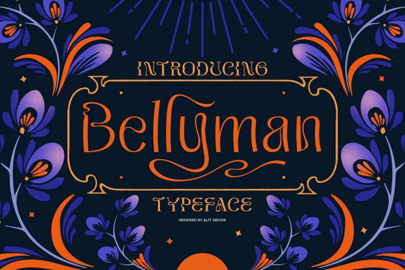
Bellyman delivers bold hand-lettered character through substantial stroke weights and confident forms. This casual script font brings masculine energy and confident personality to branding requiring approachable strength.
Hand-Lettered Strength
Unlike delicate scripts, Bellyman presents bold, confident letterforms with substantial presence. This strength makes it suitable for male-oriented brands often underserved by feminine script options.
The hand-lettered quality maintains authenticity while the bold weight prevents the font from appearing too casual or weak.
Masculine Appeal
Bellyman targets male audiences through its strong, confident character. The design avoids the delicacy common in many script fonts.
This masculine quality makes it valuable for men’s grooming products, craft breweries targeting male demographics, and lifestyle brands emphasizing masculine strength.
Casual Confidence
The script maintains casual, approachable character despite its bold weight. This combination creates friendly strength rather than intimidating aggression.
The confident yet casual nature works well for barbershops, men’s lifestyle blogs, and products requiring both approachability and masculine presence.
Bold Applications
Strong stroke weights restrict Bellyman to display applications where the bold character can shine. The substantial forms would overwhelm body text.
Best results come from logos, packaging headlines, and poster applications where confident masculine character enhances brand messaging.
Modien
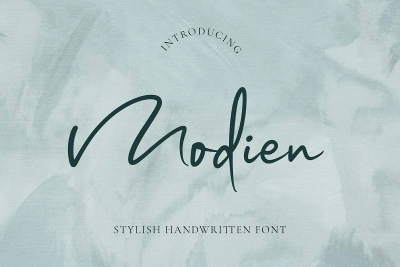
Modien combines geometric precision with organic warmth through carefully balanced forms. This versatile display font brings contemporary sophistication and approachable character to branding requiring both modern edge and human warmth.
Geometric Warmth
Clean geometric shapes form the foundation, but subtle organic variations add human warmth. This balance prevents the cold, sterile quality of purely geometric designs.
The geometric warmth makes Modien suitable for tech brands wanting approachability, design studios, and contemporary businesses emphasizing both innovation and humanity.
Balanced Character
Modien succeeds through careful balance between multiple qualities. Modern yet warm, geometric yet organic, bold yet approachable.
This equilibrium makes the font versatile across various contexts without strong limitations to specific industries or demographics.
Contemporary Edge
The design feels current and forward-looking through its clean forms and modern proportions. This contemporary quality prevents Modien from appearing dated or retro.
The modern edge works well for startups, contemporary fashion brands, and businesses positioning themselves as innovative and current.
Versatile Applications
Balanced character allows Modien to function across various contexts. The font doesn’t impose strong stylistic limitations or narrow demographic targeting.
This versatility makes it valuable for designers needing flexible options or brands evolving across different products and services.
Boho Rainbow
Boho Rainbow brings colorful bohemian character through playful forms designed for chromatic application. This cheerful display font captures rainbow aesthetics and optimistic energy, making it ideal for joyful, inclusive brands.
Rainbow Aesthetics
The design invites colorful, multi-hued application through its playful construction. While functional in single colors, Boho Rainbow truly shines when rendered in rainbow gradients.
This chromatic invitation makes it particularly suitable for LGBTQ+ brands, children’s products, and businesses emphasizing joy, diversity, and celebration.
Cheerful Character
Optimistic, upbeat letterforms create immediately positive emotional response. The design radiates happiness and celebrates life’s colorful diversity.
The cheerful nature works well for party supplies, celebration services, and brands targeting audiences seeking joy and positivity.
Inclusive Spirit
Rainbow associations and joyful character create inclusive, welcoming personality. The font signals acceptance, diversity, and celebration of differences.
This inclusive spirit makes Boho Rainbow valuable for community organizations, diversity initiatives, and brands explicitly embracing inclusivity.
Celebration Applications
Boho Rainbow excels in celebration contexts. Birthday parties, pride events, and joyful gatherings benefit from its festive, colorful character.
The font’s celebratory quality makes it most effective when brand identity emphasizes happiness, celebration, or inclusive community.
Bohemian Stylish
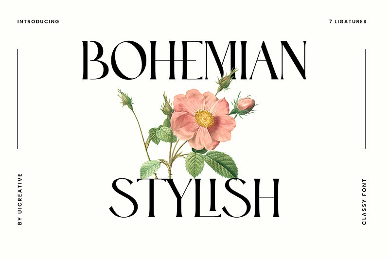
Bohemian Stylish combines bohemian freedom with fashion-forward sophistication. This elegant display font brings runway aesthetics and artistic flair to fashion brands and lifestyle applications requiring stylish bohemian character.
Fashion Forward
The design balances bohemian aesthetics with contemporary fashion sensibilities. This combination creates sophisticated bohemian style rather than purely casual or rustic character.
Bohemian Stylish works particularly well for boho-chic fashion brands, lifestyle magazines, and upscale bohemian retailers.
Sophisticated Bohemian
Unlike casual bohemian fonts, Bohemian Stylish maintains refinement and polish. The font captures bohemian spirit without appearing messy or unrefined.
This sophisticated approach makes it suitable for high-end bohemian brands and contexts where style matters as much as free-spirited philosophy.
Runway Applications
Fashion-forward character makes Bohemian Stylish ideal for runway shows, fashion editorials, and clothing brands. The font speaks fashion industry language while maintaining bohemian authenticity.
Fashion bloggers, boutique clothing brands, and style-conscious lifestyle companies benefit from its fashionable bohemian fusion.
Style Conscious
Bohemian Stylish targets style-conscious audiences appreciating both bohemian values and fashion sophistication. This specific positioning makes it valuable for brands serving fashion-aware bohemian demographics.
The font works best when brand identity explicitly combines bohemian philosophy with style consciousness and fashion awareness.
Florentina
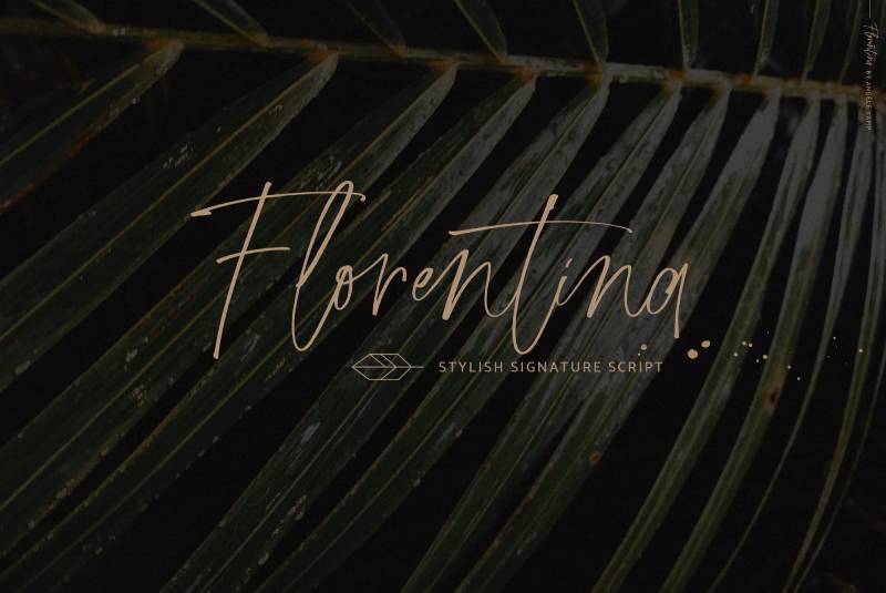
Florentina delivers Italian Renaissance character through classical letterforms and Florentine artistic heritage. This elegant serif font brings old-world sophistication and cultural depth to luxury brands and projects emphasizing European artistic traditions.
Renaissance Heritage
The design references Italian Renaissance typography and Florentine artistic traditions. This historical connection creates associations with classical art, culture, and European sophistication.
Florentina works particularly well for Italian restaurants, art galleries, and luxury brands emphasizing classical European heritage.
Classical Elegance
Traditional proportions and refined details create timeless elegance. The font avoids trendy styling in favor of enduring classical beauty.
This timeless quality makes Florentina suitable for brands seeking longevity and projects requiring sophistication that won’t appear dated.
Italian Character
Beyond general Renaissance references, Florentina specifically embodies Italian design sensibilities. The font feels distinctly Italian in its elegant proportions and refined details.
Italian wine brands, Tuscan tourism materials, and products emphasizing Italian craftsmanship benefit from its authentic Italian character.
Luxury Applications
Classical refinement and Renaissance associations position Florentina firmly in luxury territory. High-end restaurants, luxury goods, and upscale services benefit from its sophisticated character.
The font conveys quality, refinement, and cultural sophistication appropriate for luxury positioning.
Beauty Bohemian
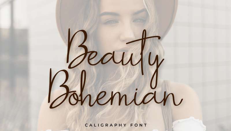
Beauty Bohemian combines feminine beauty with bohemian spirit through delicate forms and free-flowing character. This romantic display font brings natural beauty aesthetics and organic femininity to beauty brands and feminine bohemian applications.
Natural Beauty
The design emphasizes organic beauty rather than artificial perfection. Flowing forms and gentle curves suggest natural feminine grace.
Beauty Bohemian works particularly well for natural beauty products, organic skincare brands, and wellness services emphasizing natural beauty.
Feminine Bohemian
The font specifically targets feminine bohemian audiences through its delicate character and romantic aesthetics. This combination appeals to women embracing both femininity and bohemian values.
Bohemian fashion brands for women, feminine wellness services, and beauty products emphasizing natural ingredients benefit from its character.
Romantic Flow
Flowing, connected forms create romantic, graceful movement. The design feels gentle and nurturing rather than bold or assertive.
This romantic quality makes Beauty Bohemian suitable for wedding planning services with bohemian focus, romantic event materials, and feminine lifestyle brands.
Beauty Industry
Beauty Bohemian excels in beauty industry applications. Salons with natural focus, organic makeup brands, and holistic beauty services benefit from its natural feminine character.
The font’s specific beauty positioning makes it most effective when brand identity explicitly combines beauty services with bohemian or natural approaches.
Mansier
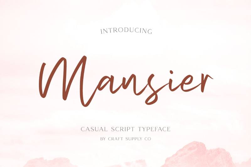
Mansier brings architectural character through strong, structural letterforms with geometric foundation. This bold display font combines geometric precision with artistic details, creating sophisticated industrial character.
Architectural Forms
Letters incorporate architectural elements and structural logic. This construction-focused approach creates associations with buildings, design, and spatial thinking.
Mansier works particularly well for architecture firms, interior design studios, and construction companies wanting sophisticated visual identity.
Geometric Structure
Clean geometric shapes provide foundation, but artistic details prevent purely technical appearance. This balance creates visual interest while maintaining structural clarity.
The geometric structure makes Mansier suitable for engineering firms, tech companies, and brands emphasizing logic, precision, and systematic thinking.
Industrial Sophistication
The font combines industrial strength with sophisticated refinement. This fusion creates upscale industrial character rather than purely utilitarian or gritty aesthetics.
Upscale industrial design shops, architectural lighting companies, and sophisticated urban brands benefit from this refined industrial character.
Bold Presence
Strong forms and substantial stroke weights ensure visibility and impact. The architectural character maintains presence without requiring excessive decoration.
This bold presence makes Mansier effective for signage, large-format applications, and branding requiring strong visual identity.
Boho Mood
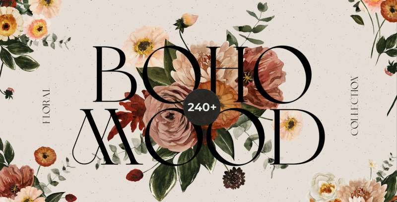
Boho Mood captures emotional bohemian character through expressive forms and atmospheric aesthetics. This versatile display font brings feeling and mood to bohemian branding requiring emotional resonance and atmospheric depth.
Emotional Expression
The design emphasizes feeling over pure visual aesthetics. Letterforms convey mood and atmosphere, creating emotional connection with viewers.
Boho Mood works particularly well for music festivals, artistic venues, and brands emphasizing emotional experience over functional utility.
Atmospheric Character
Beyond individual letter beauty, Boho Mood creates overall atmosphere and feeling. The font establishes mood before communicating specific information.
This atmospheric quality makes it suitable for entertainment venues, experiential brands, and products where creating mood matters as much as conveying information.
Versatile Moods
Despite its name, Boho Mood adapts to various emotional contexts. The design supports different moods while maintaining bohemian character.
This versatility makes it valuable for brands needing emotional flexibility or festivals featuring varied musical acts and atmospheric experiences.
Experience Design
Boho Mood excels in experience-focused contexts. Music venues, immersive art installations, and experiential marketing campaigns benefit from its mood-setting character.
The font works best when brand identity emphasizes creating emotional experiences rather than simply delivering products or services.
Bohemia Brush Script
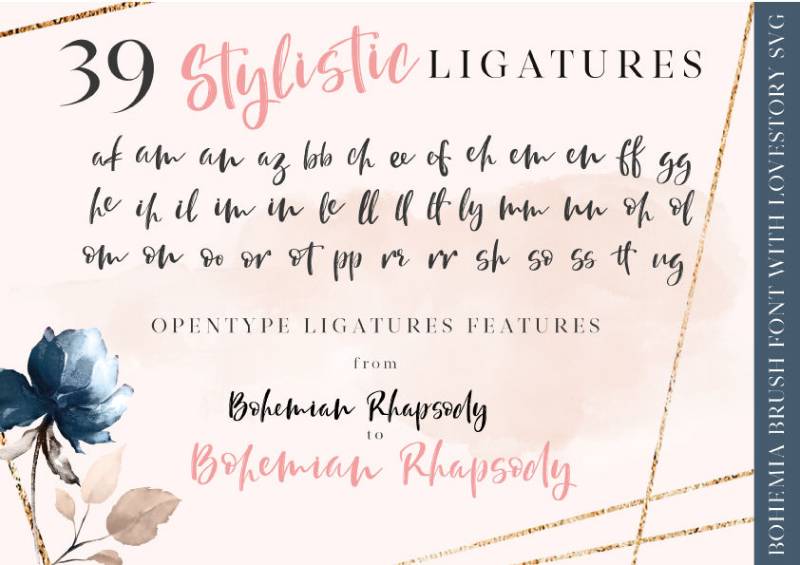
Bohemia Brush Script delivers authentic brush lettering character through textured strokes and energetic forms. This dynamic script font brings hand-painted authenticity and artistic energy to bohemian brands requiring genuine handmade character.
Brush Texture
Visible brush textures and organic stroke variations create authentic painted appearance. This textural quality distinguishes Bohemia Brush Script from clean, vector-based scripts.
The brush character works particularly well for artist branding, handmade product packaging, and designs emphasizing craft process over polished finish.
Energetic Flow
Dynamic, energetic strokes create movement and vitality. The font feels alive and spontaneous rather than carefully planned.
This energetic quality makes Bohemia Brush Script suitable for music branding, action sports, and brands emphasizing vitality and spontaneous living.
Hand-Painted Quality
The design replicates actual brush painting rather than digital simulation. This authenticity creates genuine handmade character.
Hand-painted quality appeals to audiences valuing authentic craftsmanship, artistic process, and human touch over machine precision.
Artistic Applications
Bohemia Brush Script excels in artistic contexts. Gallery branding, artist portfolios, and creative studio identities benefit from its authentic artistic character.
The font’s clear artistic positioning makes it most effective when brand identity explicitly emphasizes art, creativity, or handmade production.
Boho Babe
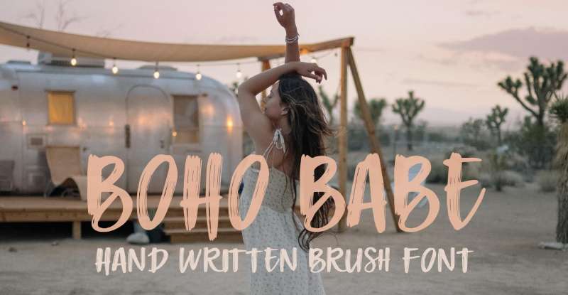
Boho Babe targets young feminine bohemian demographics through playful forms and contemporary aesthetics. This trendy display font brings social media-friendly character and millennial appeal to lifestyle brands and feminine bohemian applications.
Youth Culture
The design speaks directly to younger bohemian audiences through contemporary styling and social media aesthetics. This generational targeting creates immediate relevance for younger demographics.
Boho Babe works particularly well for Instagram-focused brands, millennial lifestyle products, and services targeting young women embracing bohemian values.
Feminine Appeal
Playful yet confident character targets feminine audiences without excessive delicacy. The font maintains substance while conveying femininity.
This balanced femininity makes Boho Babe suitable for young women’s fashion, feminine lifestyle blogs, and products targeting independent, style-conscious young women.
Social Media Ready
The design functions effectively in social media contexts where visual impact matters more than traditional readability. This platform-specific optimization makes Boho Babe valuable for digital-first brands.
Instagram boutiques, TikTok creators, and social media-native brands benefit from its platform-appropriate character.
Trend Conscious
Boho Babe embraces contemporary design trends rather than timeless aesthetics. This trend consciousness creates immediate relevance but may limit longevity.
The trendy character works best for fashion-forward brands comfortable evolving their visual identity as trends shift.
Bohemy
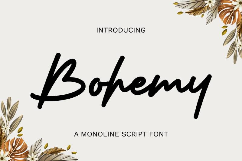
Bohemy distills essential bohemian character through simplified forms and pure expression. This straightforward display font brings uncomplicated bohemian spirit to brands valuing authenticity and directness over elaborate decoration.
Essential Bohemian
The design captures core bohemian values without excessive ornamentation. This purity creates clear, direct bohemian expression.
Bohemy works particularly well for brands wanting bohemian identity without elaborate visual styling or for contexts where simplicity matters.
Simplified Forms
Clean, straightforward letterforms avoid unnecessary decoration. This simplification creates accessible bohemian character that doesn’t require design expertise to use effectively.
The simple forms make Bohemy suitable for small businesses, DIY projects, and applications where ease of use matters more than elaborate styling.
Direct Expression
Bohemy communicates bohemian identity directly rather than through subtle suggestion. This straightforward approach creates clear positioning.
The direct character works well for brands confidently embracing bohemian identity without irony or hesitation.
Accessible Bohemian
Simplified character makes Bohemy accessible to wider audiences than more elaborate bohemian fonts. The design removes barriers to entry while maintaining authentic bohemian spirit.
This accessibility makes it valuable for community organizations, inclusive bohemian brands, and applications requiring broad appeal.
Geshana
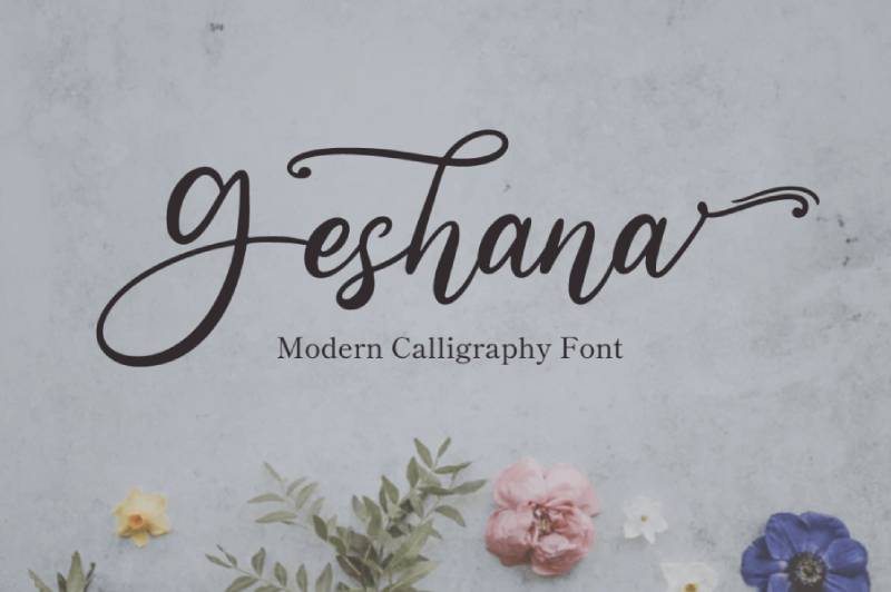
Geshana brings exotic character through forms suggesting distant cultures and global traditions. This decorative display font creates worldly sophistication and cultural depth, appealing to audiences valuing global consciousness and cultural exploration.
Exotic Forms
Letterforms incorporate influences from multiple non-Western traditions. This exotic quality creates associations with travel, global culture, and worldly sophistication.
Geshana works particularly well for ethnic restaurants, fair trade products, and brands emphasizing global connection and cultural appreciation.
Cultural Fusion
The design merges influences from various traditions rather than representing single cultures. This fusion approach creates contemporary global aesthetics.
The multicultural character makes Geshana suitable for international organizations, cultural exchange programs, and brands celebrating diversity.
Worldly Sophistication
Exotic influences combine with sophisticated execution, creating upscale global character rather than costume-like cultural appropriation.
This refined approach makes Geshana appropriate for luxury travel brands, upscale ethnic cuisine, and sophisticated global lifestyle products.
Global Applications
Geshana excels in contexts emphasizing global awareness and cultural appreciation. International festivals, world music venues, and globally-focused nonprofits benefit from its worldly character.
The font works best when brand identity authentically engages with global cultures rather than superficially borrowing exotic aesthetics.
Bohemia Script
Bohemia Script delivers flowing calligraphic elegance with bohemian artistic flair. This sophisticated script font brings formal beauty and free-spirited character to upscale bohemian applications requiring both refinement and authenticity.
Calligraphic Refinement
Traditional calligraphic construction creates elegant, flowing letterforms. This formal foundation provides structural quality and readable beauty.
The calligraphic refinement makes Bohemia Script suitable for upscale wedding invitations, boutique branding, and contexts requiring both sophistication and bohemian character.
Bohemian Artistry
Artistic flourishes and unconventional details distinguish Bohemia Script from purely traditional calligraphy. These bohemian touches prevent the font from appearing conservative or conventional.
The artistic elements appeal to audiences seeking formal beauty without traditional stuffiness or rigid convention.
Formal Freedom
Bohemia Script balances formal elegance with bohemian freedom. This combination creates sophisticated informality or refined casualness.
The balanced character works well for alternative weddings, artistic galas, and events requiring both elegance and unconventional spirit.
Upscale Bohemian
The font targets upscale bohemian demographics with resources for quality design and appreciation for refined aesthetics. This specific positioning creates clear market appeal.
Luxury bohemian retailers, upscale yoga studios, and high-end holistic wellness centers benefit from its refined bohemian character.
Boho Lifestyle
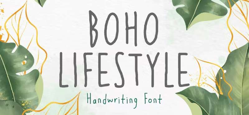
Boho Lifestyle embodies complete bohemian living philosophy through holistic character and lifestyle-focused aesthetics. This comprehensive display font brings full-spectrum bohemian values to lifestyle brands and products emphasizing conscious, alternative living.
Lifestyle Philosophy
The design conveys complete bohemian lifestyle rather than just visual aesthetics. This holistic approach creates deeper brand connection than purely decorative fonts.
Boho Lifestyle works particularly well for lifestyle blogs, conscious living magazines, and brands positioning bohemian approach as complete life philosophy.
Holistic Character
The font addresses multiple aspects of bohemian living through its comprehensive character. This holistic quality supports brands with diverse product offerings or complete lifestyle systems.
Bohemian lifestyle brands offering multiple services or products benefit from the font’s comprehensive, lifestyle-focused character.
Conscious Living
Beyond aesthetics, Boho Lifestyle suggests conscious choices and intentional living. This deeper meaning appeals to audiences seeking purpose and authenticity.
The conscious character makes it suitable for sustainable products, ethical brands, and services emphasizing mindful consumption and conscious lifestyle choices.
Complete Identity
Boho Lifestyle provides complete visual identity solution for bohemian lifestyle brands. The comprehensive character reduces need for additional fonts or visual elements.
This completeness makes it valuable for startups, small businesses, and projects requiring full bohemian identity without extensive design resources.
FAQ on Bohemian Fonts
What defines a bohemian font?
Bohemian fonts feature organic shapes, vintage textures, and artistic irregularity that reject corporate precision. They incorporate Art Nouveau influences, hand-crafted details, and flowing curves that communicate free-spirited creativity. Common characteristics include decorative flourishes, irregular baselines, and handwritten authenticity.
Are bohemian fonts free to use commercially?
Many bohemian fonts operate under SIL Open Font License, allowing commercial use without fees. Google Fonts offers numerous free options like Amatic SC and Berkshire Swash. Always verify font licensing terms before commercial applications, as some require purchase or attribution.
What’s the difference between bohemian and hippie fonts?
Bohemian fonts encompass broader artistic freedom including Art Nouveau, vintage, and handcrafted styles. Hippie fonts specifically reference 1960s-70s psychedelic aesthetics with groovy, retro characteristics. Bohemian represents a timeless counterculture aesthetic, while hippie fonts target specific era nostalgia.
Can bohemian fonts work for body text?
Most bohemian fonts function exclusively as display fonts for headlines and logos. Exceptions like Alegreya and Bellota maintain legibility at smaller sizes. Decorative elements and irregular forms typically reduce readability in extended passages, making them unsuitable for body copy.
How do I pair bohemian fonts effectively?
Combine decorative bohemian display fonts with simple sans-serif fonts or clean serif fonts for body text. Avoid pairing multiple decorative fonts together. Establish clear visual hierarchy through size and weight differences. Let the bohemian font dominate while supporting typography remains neutral.
What industries use bohemian fonts most?
Wedding planning, boutique fashion, artisan crafts, yoga studios, and organic beauty products frequently employ bohemian typography. Festival branding, lifestyle blogs, and handmade product packaging also rely on these typefaces. Any brand emphasizing creativity, authenticity, or counterculture values benefits from bohemian aesthetics.
Are bohemian fonts suitable for logos?
Bohemian fonts excel in logo design when brand identity emphasizes artistic character and creative freedom. Strong personality creates memorable visual identity but limits versatility across applications. Consider scalability and readability at small sizes before committing to decorative options for logo typography.
What’s the best size for bohemian fonts?
Display sizes (36pt and larger) showcase decorative details and artistic flourishes effectively. Most bohemian fonts lose character below 24pt and become illegible below 18pt. Large-format applications like posters, signage, and packaging headlines maximize their visual impact and artistic qualities.
How do bohemian fonts affect brand perception?
These typefaces communicate creativity, authenticity, and artistic values while potentially reducing perceived corporate professionalism. They attract audiences valuing handcrafted quality and counterculture aesthetics. Bohemian typography signals approachability and human touch but may alienate conservative or corporate demographics seeking traditional reliability.
Can I mix serif and script bohemian fonts?
Mixing serif and script bohemian fonts risks visual chaos. Choose one decorative bohemian font as primary, then pair with neutral supporting typography. If using multiple bohemian typefaces, ensure distinct roles through size hierarchy and limit total fonts to three maximum for cohesive design.
Conclusion
Bohemian fonts deliver authentic artistic character that mass-produced corporate typefaces can’t replicate. These decorative typefaces span vintage revivals, hand-lettered scripts, and contemporary interpretations of counterculture aesthetics.
Successful implementation requires understanding each typeface personality and practical limitations. Display applications like wedding invitations, festival posters, and artisan packaging maximize their ornamental qualities.
Strategic pairing fonts with neutral body text maintains readability while preserving bohemian spirit. Consider your audience’s expectations. Alternative lifestyle brands benefit from free-spirited typography, while conservative industries require restraint.
Google Fonts provides accessible options including Amatic SC, Alegreya, and Berkshire Swash under open licenses. Premium collections offer greater uniqueness for competitive markets.
Test fonts at actual application sizes before committing. What appears elegant at 72pt may become illegible at 18pt. Proper font spacing, kerning, and hierarchy transform decorative typefaces into functional design assets rather than obstacles.

Renowned for his expertise in logo design and visual branding, Bogdan has developed a multitude of logos for various clients.
His skills extend to creating posters, vector illustrations, business cards, and brochures. Additionally, Bogdan's UI kits were featured on marketplaces like Visual Hierarchy and UI8.
He also wrote in the past years on sites like Design Your Way, WebDesignerDepot, WPDean, Designmodo, Speckyboy, Slider Revolution, and more.
- The Cursor Logo History, Colors, Font, And Meaning - 24 September 2026
- Canva vs PowerPoint: Which Is Better for Presentations? - 22 September 2026
- How to Install Fonts on Mac (Step-by-Step Guide) - 20 September 2026

Bogdan Sandu is a seasoned designer who has been designing websites since 2008. Renowned for his expertise in logo design and visual branding, Bogdan has developed a multitude of logos for various clients. His skills extend to creating posters, vector illustrations, business cards, and brochures. Additionally, Bogdan's UI kits were featured on marketplaces like Visual Hierarchy and UI8. He also wrote in the past years on sites like Design Your Way, WebDesignerDepot, WPDean, Designmodo, Speckyboy, Slider Revolution, and more.
You Might Also Like


