


You read sans-serif fonts every single day. Your phone, your browser, the app you just closed, they all use them. But what is a sans-serif font, exactly, and why did it become the default for nearly everything on a screen?
The answer goes deeper than “a font without the little lines.” Sans-serif typefaces carry over two centuries of design history, and they show up in 85% of websites and three-quarters of Fortune 500 logos.
This article covers what defines a sans-serif font, how it differs from serif type, the major categories (grotesque, geometric, humanist), and how to choose, pair, and implement one in your own projects.
What Is a Sans-Serif Font
A sans-serif font is a typeface that lacks the small decorative strokes (called serifs) at the ends of its letterforms. The name comes from French: “sans” means “without.”
So when you strip away those tiny feet and tails that sit at the edges of each character, you get a cleaner, more streamlined letter shape. That’s it. That’s the whole concept.
What makes these fonts recognizable at a glance is their uniform stroke width. Most sans-serif letterforms maintain consistent thickness throughout each character, which gives text a modern, uncluttered appearance. You’ve seen this everywhere, even if you didn’t know the term. Helvetica on subway signs. Arial in your email drafts. Roboto on your Android phone.
An analysis of 1,000 websites found that 85% use sans-serif fonts as their primary font choice (Toner Buzz). And three-quarters of Fortune 500 companies use sans-serif fonts in their logos (Website Planet).
These numbers aren’t random. Sans-serif fonts became the default for digital screens because their simplified shapes render clearly at small sizes and low resolutions. They work across devices, across operating systems, and across languages. That kind of flexibility made them the backbone of web design and mobile interfaces.
Monotype’s 2024 Global Font Use Survey, covering 4,777 designers across 13 countries, confirmed that sans-serif remains the top choice among creatives. And 76% of those designers said readability and accessibility are their primary concerns when picking a typeface.
The reason is practical. Sans-serif fonts strip typography down to its most functional form. Nothing extra. Nothing decorative. Just the letter itself, doing its job.
How Sans-Serif Fonts Differ from Serif Fonts
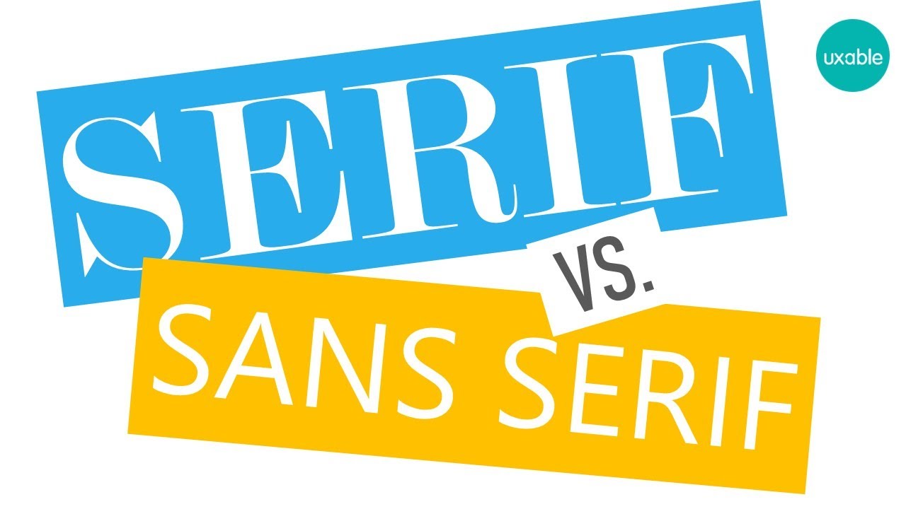
The difference is structural, and it starts at the edges of each letter.
Serif fonts have small lines or strokes attached to the ends of their characters. Think of the little feet at the bottom of a capital “T” in Times New Roman. Sans-serif fonts don’t have them. Clean cuts. No extensions.
But the differences go deeper than that.
| Feature | Sans-Serif | Serif |
|---|---|---|
| Stroke width | Mostly uniform | Varies between thick and thin |
| Terminals | Clean, blunt endings | Decorative strokes at edges |
| Typical feel | Modern, neutral | Traditional, formal |
| Screen performance | Strong at small sizes | Better on high-res displays |
| Common use | Digital interfaces, apps | Books, newspapers, print |
Stroke Contrast and Letter Shape
Serif typefaces typically have noticeable stroke contrast, meaning some parts of each letter are thicker than others. Look at the capital “O” in Bodoni, and you’ll see thin sides and thick tops. Sans-serif fonts flatten that difference out.
This creates a fundamentally different reading texture on the page. Serif text has a more rhythmic, flowing quality. Sans-serif text looks more even, more uniform. Neither is objectively better. It depends on what you’re designing.
Where Each Style Works Best
Print context: Serif fonts still dominate long-form printed material. Books, academic journals, newspapers. The serifs act as tiny guides that help the eye track along lines of text. At least that’s the conventional wisdom (the science is actually less clear-cut, but more on that later).
Screen context: Sans-serif fonts own the screen. The HTTP Archive’s 2024 Web Almanac found sans-serif in the CSS font-family stack on 89% of mobile pages. At lower resolutions, those thin serif strokes can blur or disappear. Sans-serif letterforms don’t have that problem.
Dribbble’s research into the top 1,000 websites showed something interesting, though. Headers are less likely to be sans-serif than body text. The probability of being sans-serif drops to 58% for H1 tags but rises to 93% for paragraph tags. So designers are already mixing both styles within single pages, using typographic hierarchy to create visual hierarchy.
The Origins of Sans-Serif Typography
The first recorded sans-serif typeface appeared in 1816. William Caslon IV published it in a specimen catalog, and people hated it.
They called it “grotesque.” Not as a compliment. The design world at the time considered serif typefaces the only legitimate approach to typesetting. A letter without serifs looked unfinished, even crude. The name stuck, and “grotesque” became an actual classification term for early sans-serif fonts.
From Rejection to Standard
Sans-serif designs stayed mostly in the background through the 1800s, used for advertising and signage but rarely for body text. The real shift happened in the early 20th century, driven by two graphic design movements that changed how people thought about type.
The Bauhaus school in Germany (1919 to 1933) pushed for functional, stripped-down design. Decoration was wasteful. Form should follow purpose. That philosophy produced geometric sans-serif typefaces like Futura, designed by Paul Renner in 1927, where every letter was built from basic shapes: circles, triangles, straight lines.
Then came Swiss design in the 1950s. The Swiss International Typographic Style turned sans-serif typography into a complete design system. Grid systems. Clean layouts. Objective communication. Max Miedinger designed Helvetica in 1957 for the Haas type foundry in Switzerland, and it became arguably the most used typeface of the 20th century.
The Digital Shift
Computers sealed the deal. When screens had 72 DPI resolution, serif fonts looked terrible at small sizes. Those thin decorative strokes turned into blurry messes. Sans-serif letterforms, with their consistent stroke width, rendered cleanly even on basic monitors.
Microsoft bundled Arial with Windows in 1992. Apple adopted Helvetica (later San Francisco) as its system font. Google built Roboto for Android. The HTTP Archive’s 2025 Web Almanac reports that web fonts now appear on roughly 88% of all websites, and the vast majority of those are sans-serif.
What started as a rejected experiment in 1816 became the default way the world reads on screens, two centuries later.
Categories of Sans-Serif Typefaces
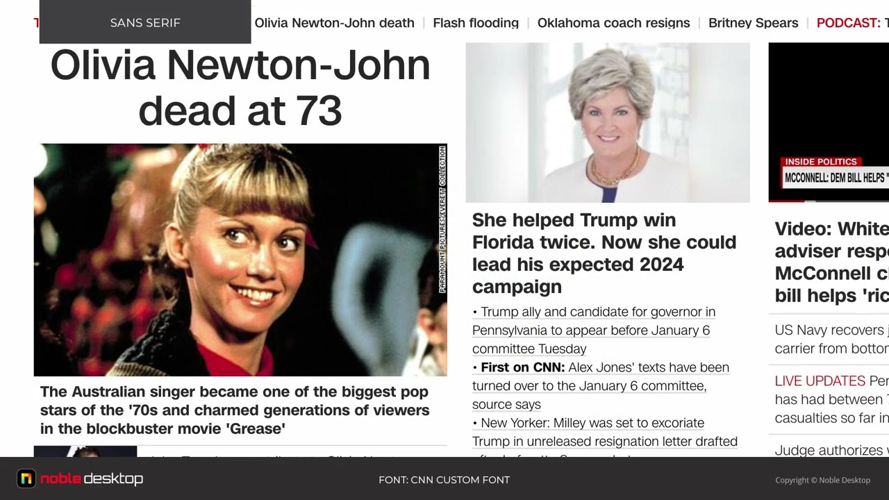
“Sans-serif” isn’t one style. It’s four distinct categories, each with a different personality and set of characteristics. Picking the wrong category for your project is like choosing the right color from the wrong color palette. Technically correct, practically off.
Grotesque and Neo-Grotesque Sans-Serifs
Grotesque fonts were the originals. Akzidenz-Grotesk (1898) and Franklin Gothic (1902) have slightly irregular letter shapes, with visible stroke width variation in places. They look handmade. A little rough around the edges.
Neo-grotesque fonts cleaned all of that up. Helvetica and Univers (both 1957) pursued total neutrality. Every letter as uniform as possible. No personality, on purpose. That’s why Helvetica became the go-to for corporate visual identity systems. It doesn’t say anything by itself. It lets the content talk.
Arial falls into this category too. Microsoft licensed it as a Helvetica alternative, and it remains one of the most widely installed fonts on any operating system.
Geometric Sans-Serifs
Built from shapes, not handwriting.
Geometric sans-serifs construct each letter from circles, squares, and straight lines. The “O” is a near-perfect circle. The “A” is a triangle. Futura (1927) is the classic example, and it’s still generating revenue. WhatFontIs reported that Futura was the most profitable font in 2022, bringing in over $7 million.
Montserrat and Century Gothic are modern entries in this category. On Google Fonts, Montserrat alone has accumulated over 11 billion total views. These fonts look clean and contemporary, but they can create readability issues in long paragraphs because many letters share similar shapes (the “O” and “C” can look alike at small sizes).
Humanist Sans-Serifs
Humanist sans-serifs borrow from calligraphy. Each letter has subtle variations in stroke width and shape that mimic handwritten text, making them warmer and easier to read in longer passages.
Gill Sans (designed by Eric Gill in 1928), Frutiger (by Adrian Frutiger, 1976), and Open Sans are all humanist designs. Monotype’s legibility research specifically recommends humanist typefaces for digital use because their letter shapes are more distinct from each other, reducing confusion between similar characters.
Open Sans is the second most popular variable font on the web, found on 16% of websites using variable fonts (HTTP Archive 2024). Frutiger was originally designed for airport signage at Charles de Gaulle in Paris, where legibility at a distance literally kept people from getting lost.
Sans-Serif Fonts in Digital Interfaces

Every major operating system ships with a sans-serif font as its default. That’s not a coincidence. It’s a design decision driven by pixel rendering and screen technology.
System Fonts by Platform
Apple: San Francisco, introduced in 2015. Designed specifically for the Retina display with optical sizes that adjust automatically based on text size.
Microsoft: Segoe UI, the default across Windows since Vista. Optimized for ClearType subpixel rendering.
Google/Android: Roboto, created by Christian Robertson. It has accumulated over 28 trillion all-time views through Google Fonts (Photutorial 2025), making it the most viewed typeface on the platform by a massive margin.
These aren’t arbitrary picks. Each one was engineered for how DPI and anti-aliasing interact with letterforms on their respective platforms.
Google Fonts and the Web Typography Boom
Google Fonts changed how the web looks. Before it launched, using custom fonts on websites meant buying expensive licenses and dealing with compatibility headaches. Google Fonts made it free.
The HTTP Archive’s 2025 data shows Google Fonts appearing on roughly 54% of desktop sites and 47% of mobile sites. As of May 2025, the platform hosts 1,826 font families, including 744 sans-serif options (Photutorial).
The most used Google Fonts lean heavily sans-serif: Roboto, Open Sans, Lato, Montserrat, Poppins. Inter is climbing fast too, sitting around 1% of all websites and rising because of its heavy presence in design frameworks and component libraries.
Variable Fonts and Responsive Design
Variable fonts are a more recent development. Instead of loading separate files for each weight (light, regular, bold), a single variable font file contains the entire range.
Google Fonts now serves 92% of all variable fonts used on the web, down slightly from 97% in 2022 as more designers move to self-hosting (HTTP Archive 2024). Noto Sans JP leads at 27% of desktop sites using variable fonts, followed by Open Sans and Montserrat.
For sans-serif fonts specifically, variable font technology means a single file can cover weights from thin to black, widths from condensed to expanded. Fewer HTTP requests. Smaller total file size. Better performance on mobile.
Common Sans-Serif Fonts and Where They’re Used

Some sans-serif fonts are so widespread that you encounter them dozens of times a day without thinking about it. Each carries specific associations, and those associations aren’t accidental.
Helvetica
Designed in 1957 by Max Miedinger at the Haas type foundry in Switzerland. The name literally means “Swiss.”
Helvetica became the corporate identity standard. American Airlines, Jeep, Panasonic, BMW, Nestlé. The New York City subway system. NASA used it for decades. Its neutrality is the point. Helvetica doesn’t add personality. It lets the brand name carry the weight, following solid logo design principles that prioritize clarity.
Monotype (which now owns the Helvetica family) has built a library of over 150,000 fonts, but Helvetica remains their most recognized product.
Arial and Its Relationship to Helvetica
Arial is not Helvetica. But it’s close enough that it caused decades of debate.
Microsoft commissioned Arial in 1982 as a cheaper alternative (Helvetica’s licensing fees were steep). The letter shapes are similar but not identical. Look at the capital “G” or the lowercase “a” side by side, and you’ll spot the differences. Still, Arial became one of the most installed fonts on any computer, and the default for everything from email to spreadsheets.
Futura
Paul Renner’s 1927 geometric masterpiece. Every letter built from perfect circles and straight lines. It’s been a favorite for fashion brands (Supreme uses it exclusively) and film (Wes Anderson’s movies feature it prominently in title cards and on-screen text).
Beyond its $7 million in annual revenue, Futura communicates something specific: precision, forward-thinking, minimalist confidence. The psychology behind font choices shows that geometric sans-serifs like Futura trigger perceptions of modernity and innovation.
The Modern Web Defaults
A handful of sans-serif fonts now dominate online interfaces.
- Roboto: 28 trillion views on Google Fonts. Default on Android, Google apps, Material Design
- Open Sans: Preferred for legal and professional websites. Found on 16% of sites using variable fonts
- Inter: Rising fast in design frameworks. Around 1% of all websites and growing
- Montserrat: Geometric, Buenos Aires-inspired. 11 billion total views
Your choice of sans-serif font communicates something about your brand before anyone reads a single word of your content. That’s the role of brand typography in action. A tech startup using Inter sends a different signal than a luxury brand using Futura.
Consistent font usage can increase brand recognition by up to 80% (Linearity). That’s why brand guidelines almost always specify exact typeface families, weights, and usage rules.
How to Choose a Sans-Serif Font

Picking the right sans-serif font isn’t just about what looks good on your screen at that moment. It’s about what works across every context your project will appear in.
Monotype’s 2024 survey found that 83% of designers rank font selection among their top three creative decisions. And 75% view choosing a distinctive typeface as critical to shaping a brand’s identity.
So where do you start?
Match the Category to the Tone
Geometric sans-serifs (Futura, Montserrat) feel precise and modern. Great for tech products, fashion brands, and minimalist layouts.
Humanist sans-serifs (Frutiger, Open Sans) feel warmer and more approachable. Better for healthcare, education, government sites, and anywhere long-form reading matters.
Neo-grotesque sans-serifs (Helvetica, Arial) feel neutral. They stay out of the way. Corporate identity systems love them for exactly that reason.
The psychology behind typeface choices is real. Wichita State University research found that serif fonts are perceived as formal and mature, while sans-serif fonts carried no strong emotional associations, making them a blank canvas for brand personality.
Check Weight and Language Coverage
| Factor | What to Look For | Why It Matters |
|---|---|---|
| Weights | 4+ options (light to bold) | Builds typographic hierarchy |
| Width variants | Condensed, regular, expanded | Fits different layout needs |
| Glyph coverage | Latin, Cyrillic, Greek, CJK | Serves global audiences |
| OpenType features | Ligatures, tabular figures | Professional typesetting |
A font family with only two weights limits what you can do. I’ve been stuck on projects where the client picked a beautiful typeface with no bold italic, and everything had to be reworked. Check the weight range before you commit.
Pairing Sans-Serif Fonts with Other Typefaces
The classic combination is a sans-serif for headings with a serif for body text, or the reverse. Pairing fonts well comes down to contrast without conflict.
Monotype’s creative type director Terrance Weinzierl recommends looking at typeface “superfamilies” like Kairos or Macklin that include both serif and sans-serif styles designed to work together from the start.
A few tested combinations that work:
- Roboto (headings) + Open Sans (body) for technical documentation
- Montserrat (headings) + Merriweather (body) for editorial content
- Source Sans Pro (headings) + Source Serif Pro (body), literally designed as a pair
Stick to two fonts maximum. Three is pushing it. Anything beyond that creates visual noise, not variety.
Licensing Considerations
Google Fonts is free. Adobe Fonts comes with a Creative Cloud subscription. Everything else has a price tag. The average cost for a single font license runs about $49 (WhatFontIs).
Small businesses spend roughly $300 per year on font licensing (Linearity). That might sound minor until you realize a full commercial family from a foundry like Monotype can cost several hundred dollars for web use alone.
Sans-Serif Fonts and Readability
Here’s the thing most people get wrong: the serif vs. sans-serif readability debate is not settled science. It’s way more complicated than “sans-serif is better for screens.”
What the Research Actually Shows
A 2024 eye-tracking study published in the International Journal of Human-Computer Interaction tested serif versus sans-serif typefaces on e-commerce websites with 246 participants. The finding: no statistically significant differences in readability or user preference between the two styles.
Multiple studies from Toner Buzz’s analysis reached similar conclusions. When testing Latin and Cyrillic alphabets, researchers found no meaningful readability gap between serif and sans-serif fonts in general reading conditions.
But context changes things.
Where Sans-Serif Has a Clear Edge
Low vision readers: A review of 18 studies with over 1,500 participants, published in the Journal of Visual Impairment and Blindness, concluded that sans-serif fonts like Arial, Helvetica, and Verdana are more readable for people with low vision.
Dyslexia: Eye-tracking research examining 97 participants (half with dyslexia) found Arial ranked first for reading performance in both groups. The top three preferred fonts for dyslexic and non-dyslexic readers were all sans-serif.
A 2024 study on children’s reading found that Roboto and Arial produced significantly faster reading speeds compared to other tested fonts, including both serif and sans-serif options (MDPI, 2024).
What Matters More Than Serif or Sans-Serif
Type designer Bruno Maag, who developed BBC Reith, puts it bluntly: serif or sans-serif generally doesn’t matter as long as letter spacing is sufficient.
The factors that actually affect readability more than the serif/sans-serif distinction:
- X-height proportion (taller x-height = more legible at small sizes)
- Leading and line height (too tight = lines blur together)
- Tracking and letter spacing (too narrow = characters merge)
- Color contrast between text and background
WCAG accessibility guidelines focus on contrast ratios and text sizing, not on whether you use a serif or sans-serif font. That tells you something about where the actual readability gains come from.
Sans-Serif Fonts in CSS and Web Development

Every CSS stylesheet on the planet has dealt with sans-serif fonts. The font-family property is where it all happens, and getting it right has real performance implications.
The Generic Sans-Serif Fallback
CSS includes sans-serif as a generic font family keyword. When you write font-family: sans-serif;, the browser picks whatever default sans-serif the operating system provides.
The HTTP Archive’s 2022 Web Almanac showed the sans-serif generic family appearing on 89% of both desktop and mobile pages. That makes it the most widely used CSS font declaration in existence.
But just using font-family: sans-serif alone means you’re letting each OS decide what your site looks like. On macOS, you’ll probably get Helvetica Neue. On Windows, Arial. On Android, Roboto. The results are functional but inconsistent.
System Font Stacks
A system font stack lists platform-specific sans-serif fonts in order of priority, falling back through alternatives until the browser finds one that’s installed. WordPress uses this approach.
A typical stack looks like:
font-family: -apple-system, BlinkMacSystemFont, "Segoe UI", Roboto, Oxygen-Sans, Ubuntu, Cantarell, "Helvetica Neue", sans-serif;
The benefit is performance. No font files to download. No layout shifts. No flash of invisible text. The text renders instantly using whatever the user’s device already has. As of 2024, web fonts account for roughly 16% of a website’s total weight on average (getButterfly). System fonts cut that to zero.
The newer system-ui CSS value simplifies this further. One keyword that maps to whatever the OS interface font is. Browser support is solid across all modern browsers.
Loading Custom Sans-Serif Web Fonts
If you need a specific sans-serif font for brand consistency, you’re loading a web font. The performance considerations are real.
WOFF2 is the standard format now, used on 81% of desktop websites (HTTP Archive 2024). It offers the smallest file sizes through Brotli compression.
The font-display CSS property controls what happens while that font downloads. Usage of font-display: swap has grown from 11% of sites in 2020 to 45% in 2024 (HTTP Archive). It tells the browser to show a fallback font immediately, then swap in the custom font once loaded.
| font-display value | Behavior | Best for |
|---|---|---|
| swap | Shows fallback, swaps when ready | Body text, headings |
| block | Hides text up to 3 seconds | Icon fonts, logos |
| fallback | 100ms block, 3s swap window | Balanced approach |
| optional | 100ms block, may skip custom font | Slow connections |
Self-hosting fonts instead of using Google Fonts gives you control over caching and eliminates third-party dependencies. The HTTP Archive 2025 data shows roughly one-third of all sites now rely solely on self-hosted fonts, up from about 30% the year before.
Browser Rendering Differences
The same sans-serif font doesn’t look identical across platforms. macOS uses subpixel antialiasing (or did, until Big Sur dropped it). Windows uses ClearType. Linux uses FreeType. Each produces slightly different stroke weights and character spacing.
That’s part of why the median CSS font-family stack includes four fonts deep (Dribbble research). One primary font, three backups. Each backup tries to preserve the look of the intended typeface on a different operating system.
If you care about cross-platform consistency down to the pixel, self-host your font in WOFF2 format and test across Chrome, Firefox, Safari, and Edge on at least two operating systems. Your mileage may vary, but at least you’ll know where.
FAQ on What Is A Sans-Serif Font
What does sans-serif mean?
“Sans” is French for “without.” A sans-serif font is a typeface without the small decorative strokes (serifs) at the ends of letters. The result is clean, simple letterforms with uniform stroke width.
What is the difference between serif and sans-serif fonts?
Serif fonts have small lines extending from letter edges. Sans-serif fonts don’t. Serifs tend to feel traditional, while sans-serif typefaces look modern. Both perform similarly in readability studies.
Is Arial a sans-serif font?
Yes. Arial is a neo-grotesque sans-serif font. Microsoft introduced it in 1992 as an alternative to Helvetica. It remains one of the most widely installed typefaces across Windows and macOS systems.
Why are sans-serif fonts used on websites?
Sans-serif fonts render cleanly on screens, especially at small sizes. Their simplified letter shapes avoid the blurring that thin serif strokes can cause at low DPI. About 85% of websites use them.
What are the best sans-serif fonts for web design?
Roboto, Open Sans, Inter, Lato, and Montserrat are the most popular choices on Google Fonts. For system fonts, San Francisco (Apple), Segoe UI (Windows), and Roboto (Android) are the defaults.
Are sans-serif fonts easier to read than serif fonts?
Not always. Research shows no significant difference for most readers. Sans-serif fonts do perform better for people with dyslexia or low vision. Factors like letter spacing and x-height matter more than the serif itself.
What are the main types of sans-serif fonts?
Four categories: grotesque (Akzidenz-Grotesk), neo-grotesque (Helvetica, Arial), geometric (Futura, Montserrat), and humanist (Gill Sans, Frutiger). Each has a distinct personality and works best in different design contexts.
Can you pair a sans-serif font with another sans-serif?
Yes, if they come from different categories. A geometric sans-serif headline with a humanist sans-serif body text creates enough contrast. The key is picking typefaces with noticeably different structures, not just different names.
What is the most popular sans-serif font?
Helvetica holds the historical title. Online, Roboto dominates with over 28 trillion views on Google Fonts. Arial is probably the most installed sans-serif font on personal computers worldwide.
How do I use a sans-serif font in CSS?
Add font-family: "Your Font Name", sans-serif; to your CSS. The generic sans-serif keyword acts as a fallback. For system fonts, use system-ui or a full system font stack listing platform-specific typefaces.
Conclusion
Understanding what is a sans-serif font goes beyond a simple definition. It’s a typeface category that shapes how billions of people read on screens every day, from Android’s Roboto to Apple’s San Francisco.
The choice between geometric, neo-grotesque, and humanist styles affects readability, brand perception, and page performance. Each category sends a different signal.
Font selection also has technical weight. CSS font stacks, WOFF2 formatting, and font-display` strategies all determine whether your typography helps or hurts your site speed and Core Web Vitals scores.
Sans-serif fonts earned their dominance through function, not fashion. They work at small sizes, across devices, and for users with accessibility needs.
Pick the right one for your project’s tone, check the weight and glyph coverage, pair it with care, and test it across browsers. That’s really all there is to it.

Renowned for his expertise in logo design and visual branding, Bogdan has developed a multitude of logos for various clients.
His skills extend to creating posters, vector illustrations, business cards, and brochures. Additionally, Bogdan's UI kits were featured on marketplaces like Visual Hierarchy and UI8.
He also wrote in the past years on sites like Design Your Way, WebDesignerDepot, WPDean, Designmodo, Speckyboy, Slider Revolution, and more.
- The Windsurf Logo History, Colors, Font, And Meaning - 10 October 2026
- How to Remove Background From Product Photos (No Photoshop) - 10 October 2026
- How Designers can Build a Stronger Online Creative Identity - 9 October 2026

Bogdan Sandu is a seasoned designer who has been designing websites since 2008. Renowned for his expertise in logo design and visual branding, Bogdan has developed a multitude of logos for various clients. His skills extend to creating posters, vector illustrations, business cards, and brochures. Additionally, Bogdan's UI kits were featured on marketplaces like Visual Hierarchy and UI8. He also wrote in the past years on sites like Design Your Way, WebDesignerDepot, WPDean, Designmodo, Speckyboy, Slider Revolution, and more.
You Might Also Like


