


The serif vs sans-serif fonts debate has been going on for decades, and it’s still not settled. Every designer, developer, and brand strategist eventually has to pick a side, or at least pick the right one for the job.
But here’s the thing. The “right” choice depends on where your text lives, who reads it, and what you’re trying to communicate. A typeface that works perfectly in a printed book can fall apart on a phone screen.
This guide breaks down the real differences between serif and sans-serif typography, covering readability research, branding data, web and mobile performance, accessibility findings, and practical CSS implementation. No fluff, just what you actually need to make a good decision.
What Are Serif and Sans-Serif Fonts?

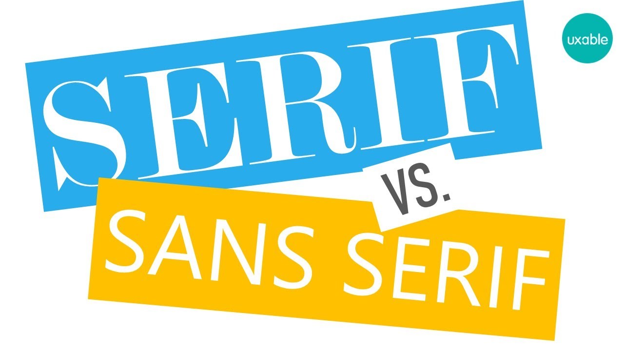
A serif font has small decorative strokes attached to the ends of each letterform. These strokes (called serifs) appear at the top and bottom of characters, creating a look that traces back to Roman stone-carved inscriptions.
A sans-serif font drops those strokes entirely. The word “sans” literally means “without.” What you get is a cleaner, more stripped-down letter shape.
That single structural difference drives almost every decision designers face when picking between the two. It affects readability, brand perception, screen rendering, and print performance.
The Core Structural Difference
Serif strokes come in different forms. Some taper gradually (called bracketed serifs), while others cut straight across at uniform thickness. These variations split serif typefaces into subcategories like old-style, transitional, and modern.
Old-style serifs (Garamond, Caslon) have angled stress and subtle contrast between thick and thin strokes. Transitional serifs (Baskerville, Times New Roman) sharpen that contrast. Modern serifs (Bodoni, Didot) push it to the extreme with hairline-thin horizontal strokes and thick verticals.
Sans-serif typefaces break down differently. Grotesque designs (Helvetica, Arial) keep strokes nearly uniform. Geometric families (Futura, Avenir) build letters from circles and straight lines. Humanist versions (Gill Sans, Open Sans) add subtle stroke variation that mimics handwriting.
Historical Origins
Serifs have been around for centuries, rooted in the way Roman stonemasons carved letters with a flat chisel. That carving technique naturally produced small flares at stroke endings.
The first documented sans-serif font was published by William Caslon IV in 1816, according to Website Planet research. Initially called “grotesque” because it looked so strange at the time, sans-serif type gained real traction through 19th-century advertising and signage.
Swiss design movements of the mid-20th century, especially the International Typographic Style, made sans-serif typefaces like Helvetica central to modern graphic communication. That influence still shapes web design and digital interfaces today.
Common Font Families in Each Category
| Category | Popular Families | Typical Use |
|---|---|---|
| Serif | Times New Roman, Georgia, Garamond, Merriweather | Books, newspapers, academic papers |
| Sans-Serif | Helvetica, Arial, Roboto, Open Sans | Websites, apps, UI design |
| Slab Serif | Rockwell, Courier, Clarendon | Posters, headlines, signage |
Roboto alone has over 26 billion total views on Google Fonts, according to UMA Technology data from 2024. Open Sans follows with 17 billion views. Merriweather, one of the top serif options, sits at around 10 billion.
The gap is massive. And it tells you a lot about where the industry has landed, at least for digital work.
How Readability Differs Between Serif and Sans-Serif Fonts
This is the question that starts every serif vs. sans-serif argument. And honestly, the answer is less clear-cut than most people expect.
Multiple studies, including research across Latin and Cyrillic alphabets, have found no significant difference in readability between the two categories for general reading, according to Toner Buzz data.
A Wichita State University study found Arial was rated only 0.4 points more readable than Times New Roman on screens, on a 1-to-7 scale. Barely noticeable.
Long-Form Print vs. Digital Screens
Print still favors serifs. The conventional argument is that serif strokes guide the eye along horizontal lines in long text blocks. Most printed books, newspapers, and academic journals continue using serif typefaces. Linearity data shows serif fonts appear in roughly 70% of print newspapers and about 80% of academic journals.
Screens tell a different story. An analysis of 1,000 websites found that 85% use sans-serif fonts as their primary typography, per Toner Buzz research.
Why the screen preference? At low resolutions, serif details can blur together. When individual pixels are between 9 and 20 pixels tall, the proportional serifs in common vector typefaces become smaller than single pixels. Hinting and anti-aliasing help, but proportions still look off.
High-DPI screens (Retina displays, 4K monitors) have narrowed this gap significantly. You can run Georgia at 16px on a modern MacBook and it looks crisp. But the habit of defaulting to sans-serif for screens persists.
What the Research Actually Says
A 2024 eye-tracking study published in the International Journal of Human-Computer Interaction found no statistically significant differences in readability or preference between serif and sans-serif typefaces on e-commerce websites.
Gasser and colleagues found in a 2005 study that serif fonts helped people remember 9% more information than sans-serif fonts like Arial.
And a 2010 study by Diemand-Yauman, Oppenheimer, and Caighan showed that harder-to-read fonts (including Bodoni MT) improved information retention by 13.7% compared to simpler fonts like Arial.
So readability and retention are actually two separate conversations. A font that reads smoothly might not be the best for helping someone remember what they read. Something worth thinking about if you design educational materials.
UX consultant Alex Poole put it well in his review of the research: most reasonably designed typefaces in mainstream use will be equally legible. The differences that matter most come from spacing, size, and contrast against the background, not from the serif-or-not question alone.
Serif vs Sans-Serif in Web Design
Sans-serif dominates the web. That’s not opinion. It’s just what the data shows.
Google Fonts, which powers typographic choices on nearly 12 million websites, skews heavily toward sans-serif families. Roboto, Open Sans, Lato, and Montserrat consistently rank as the most-used typefaces in the library.
Why Sans-Serif Took Over Online
Screen rendering: Sans-serif letterforms render more predictably across browsers and operating systems. Fewer fine details means fewer rendering inconsistencies.
Mobile-first design: Touch interfaces favor clean, uncluttered text. Apple built San Francisco (a sans-serif) specifically for this reason. Google built Roboto for Android.
Short-form content: Websites tend toward shorter text blocks than books or magazines. Sans-serif performs well in headlines, navigation menus, and button labels where quick scanning matters more than long reading sessions.
Jeremy Loyd noted on Tuts+ that sans-serif fonts spread across the web because they match modern design trends and work well for the short-form copy that’s become standard on most sites.
When Serif Works on the Web
Editorial and magazine-style sites still lean serif for body text. Medium used a serif for years (and readers praised it). The New York Times website runs on a serif. So does The Atlantic.
Luxury and fashion brands often pick serif for their product pages, even when the rest of the UI is sans-serif. It signals a different kind of attention. A certain weight.
Portfolio sites in architecture, fine art, and literary publishing use serif type to set themselves apart from the default sans-serif look that blankets the rest of the internet.
The trick is line height. Serif body text on screens needs more generous leading than sans-serif. Without it, those decorative strokes crowd the text and kill the reading experience. Took me a while to figure that one out the hard way.
Font Pairing Combinations That Work
The most reliable approach to pairing fonts is combining a serif heading with a sans-serif body, or the reverse. The contrast creates a clear typographic hierarchy without fighting for the reader’s attention.
| Heading Font | Body Font | Best For |
|---|---|---|
| Playfair Display (serif) | Source Sans Pro (sans-serif) | Editorial sites, blogs |
| Merriweather (serif) | Roboto (sans-serif) | Content-heavy sites |
| Lora (serif) | Open Sans (sans-serif) | Portfolios, storytelling pages |
| Montserrat (sans-serif) | Crimson Text (serif) | Long-form reading |
The key to a good pairing isn’t just “one serif, one sans-serif.” You need enough visual contrast to make each glyph feel like it belongs in its role. Two fonts from the same category that look too similar create confusion, not harmony.
Which Font Type Works Better for Branding?

Three-quarters of Fortune 500 companies use sans-serif fonts in their logos. Only 19% use serif exclusively, and about 5% combine both, according to Toner Buzz.
That stat alone could end the conversation. But it shouldn’t, because context matters more than market share.
What Each Category Signals
Serif fonts signal heritage and authority. The New York Times, Rolex, Prada, and Tiffany & Co. all use serif wordmarks. These brands lean into tradition because their audience expects it. There’s a reason law firms and financial institutions default to serif. It says: we’ve been here a while.
Sans-serif fonts signal modernity and simplicity. Google, Spotify, Airbnb, and Netflix run sans-serif logos. Over 300 large global companies use sans-serif typefaces in their logos, including Facebook, Nestlé, and Unilever.
Linearity research shows consistent font usage can increase brand recognition by up to 80%. Your mileage may vary, but that number underlines how much the typeface choice feeds into long-term identity.
The Luxury Brand Serif Revival
Around 2018, a wave of luxury fashion houses dropped their serif logos for sans-serif wordmarks. Burberry, Balmain, Balenciaga, Celine, and Saint Laurent all made the switch. Designers Thierry Brunfaut and Tom Greenwood coined the term “blanding” to describe the resulting monotony.
Then it reversed.
In 2023, Burberry brought back a custom serif font under creative director Daniel Lee. They also restored their 122-year-old Equestrian Knight motif. Ferragamo and Bottega Veneta followed with their own serif returns. Saint Laurent quietly reintroduced the classic YSL monogram designed by Cassandre in 1961.
The lesson? Sans-serif works for brands that need to look contemporary and tech-forward. But for companies that have rebranded away from their heritage, the loss of distinctiveness can backfire. As one branding expert at Branding Records put it, the new identity signals the end of minimalist identities and a shift toward storytelling-driven brand design.
Choosing by Industry
| Industry | Typical Choice | Why |
|---|---|---|
| Finance, Law | Serif | Trust, formality, tradition |
| Tech, SaaS | Sans-serif | Clean, modern, scalable |
| Fashion, Luxury | Mixed (shifting back to serif) | Heritage vs. contemporary appeal |
| Healthcare | Sans-serif | Clarity, approachability |
| Publishing, Media | Serif | Editorial authority, readability |
Your brand typography should match what your audience already expects from your industry. Going against type (pun intended) can work, but only if it’s a deliberate positioning move, not an accident.
Serif and Sans-Serif in Mobile and App Design

Mobile screens are where sans-serif fonts really prove their worth. Small viewports, variable lighting, and touch-based interaction all favor clean, uncluttered letterforms.
About 80% of mobile apps use system default fonts for compatibility and performance, according to Linearity research. And those defaults are almost always sans-serif.
Platform-Specific System Fonts
Apple’s San Francisco replaced Helvetica Neue as the system font across iOS, macOS, and watchOS. SF Pro features nine weights, variable optical sizes for different text contexts, and supports over 150 languages. Apple even built SF Compact specifically for the Apple Watch’s narrow display.
Google’s Roboto serves the same role for Android. Its geometric structure handles small sizes well, and it comes in enough weights to cover everything from body text to navigation labels.
Both companies invested years developing these typefaces. Apple’s San Francisco family includes condensed, compressed, and expanded widths introduced at WWDC 2022. That’s a huge range of flexibility built into a single sans-serif system.
When Serif Appears in Mobile Apps
Reading-focused apps break the pattern. Medium, Kindle, Instapaper, and Apple Books all offer serif options for long-form content.
Apple actually released New York, a serif companion to San Francisco, in 2019. It first appeared in the redesigned Apple Books app. So even Apple recognized that for sustained reading, a serif option matters.
The split usually works like this: sans-serif for the UI shell (navigation, buttons, menus) and serif as an option for content consumption. Your mileage may vary, but it’s a smart pattern.
Accessibility and Font Choice

Around 10% of the global population has dyslexia, according to research cited by ACM Transactions on Accessible Computing. Font choice directly affects their reading experience, but probably not in the way you’d assume.
What the British Dyslexia Association Recommends
The BDA’s 2023 Style Guide recommends sans-serif fonts because letters appear less crowded. Their specific recommendations include Arial, Comic Sans, Verdana, Tahoma, Century Gothic, Trebuchet, Calibri, and Open Sans.
A review published in the Journal of Visual Impairment and Blindness, covering 18 studies with over 1,500 participants, reached a similar conclusion: for people with low vision, sans-serif fonts like Arial, Helvetica, and Verdana are more readable than serif alternatives.
But here’s the nuance that often gets lost. Research from Rello and Baeza-Yates (2013) found no statistically significant difference in reading time between serif and sans-serif fonts for dyslexic readers. The BDA itself doesn’t cite specific research to support its recommendation, as noted in an Annals of Dyslexia study from 2017.
What Actually Matters More Than Serif vs. Sans-Serif
According to a 2020 comparative study on dyslexia style guides, the characteristics that truly affect readability for dyslexic readers are:
- Letter spacing: generous spacing between characters reduces crowding
- X-height: taller lowercase letters improve recognition
- Open counters: the enclosed spaces inside letters like “a,” “e,” and “g” need to be large and distinct
- Font size: research suggests 18-22pt may be more readable for dyslexic readers than the BDA’s recommended minimum of 12pt
Specialized fonts like OpenDyslexic (which adds weighted bottoms to prevent letter-flipping) haven’t performed well in controlled studies. A 2017 study found no improvement in reading rate or accuracy for young children with dyslexia using OpenDyslexic. Atkinson Hyperlegible, designed by the Braille Institute, takes a different approach by maximizing character differentiation rather than adding visual weight.
WCAG, the international standard for digital accessibility, does not require any specific font or font category. It focuses on text contrast, resizability, and spacing rather than prescribing serif or sans-serif.
So the real takeaway? Sans-serif is a safer default for accessibility, but it’s not a magic fix. Tracking, size, and line spacing do more heavy lifting than the presence or absence of serifs.
FAQ on Serif Vs Sans-Serif Fonts
What is the main difference between serif and sans-serif fonts?
Serif fonts have small decorative strokes at the ends of letterforms. Sans-serif fonts don’t. That single structural difference affects readability, brand perception, and how text renders across print and digital screens.
Which is easier to read, serif or sans-serif?
Neither wins outright. Research shows no significant readability difference for most readers. Print tends to favor serif for long text, while screens favor sans-serif at lower resolutions. High-DPI displays have mostly closed that gap.
Are sans-serif fonts better for websites?
Generally, yes. About 85% of websites use sans-serif as their primary typeface. They render more consistently across browsers and work well for short-form content, navigation, and mobile interfaces.
Why do luxury brands use serif fonts?
Serif typefaces communicate heritage, authority, and sophistication. Brands like Rolex, Tiffany & Co., and The New York Times use serifs to signal tradition. Burberry returned to serif in 2023 after backlash against its sans-serif rebrand.
What font type is best for mobile apps?
Sans-serif dominates mobile. Apple built San Francisco and Google built Roboto specifically for screen clarity at small sizes. Reading apps like Kindle and Apple Books offer serif as an option for long-form content.
Are serif fonts bad for accessibility?
Not necessarily. The British Dyslexia Association recommends sans-serif, but research shows letter spacing, font size, and open counters matter more than the serif-or-not distinction alone. WCAG doesn’t mandate either category.
Can you mix serif and sans-serif fonts together?
Yes, and it’s standard practice. Pairing a serif heading with a sans-serif body (or vice versa) creates strong visual hierarchy. The key is picking fonts with enough contrast so each serves a clear role.
What are the best serif and sans-serif Google Fonts?
Sans-serif: Roboto, Open Sans, Lato, Montserrat. Serif: Merriweather, Playfair Display, Lora, Crimson Text. Roboto alone has over 26 billion views on Google Fonts, making it the most widely used option.
Do serif or sans-serif fonts affect SEO?
Not directly. Google doesn’t rank pages based on font category. But font choice affects user experience, bounce rates, and time on page. Poor readability pushes visitors away, which can indirectly hurt search performance.
Which font type should I use for my brand logo?
It depends on your industry and audience. About 75% of Fortune 500 companies use sans-serif logos. Serif works better for finance, law, and publishing. Sans-serif suits tech, startups, and consumer brands.
Conclusion
The serif vs sans-serif fonts choice comes down to context, not personal preference. Where your text appears, who reads it, and what action you want them to take should drive every typographic decision.
Sans-serif typefaces like Roboto and Helvetica dominate digital interfaces for good reason. They render cleanly, scale well on mobile, and match what users expect from modern UI design. Serif families like Georgia and Garamond still hold ground in print, editorial layouts, and brands built on heritage.
Don’t overthink it. Test your font choices across devices. Check your letter spacing and line height. Pay attention to how real users interact with your content.
The best font pairing is the one your audience reads without noticing. That’s the whole point of good typographic design. Pick based on function, validate with data, and move on.

Renowned for his expertise in logo design and visual branding, Bogdan has developed a multitude of logos for various clients.
His skills extend to creating posters, vector illustrations, business cards, and brochures. Additionally, Bogdan's UI kits were featured on marketplaces like Visual Hierarchy and UI8.
He also wrote in the past years on sites like Design Your Way, WebDesignerDepot, WPDean, Designmodo, Speckyboy, Slider Revolution, and more.
- The Windsurf Logo History, Colors, Font, And Meaning - 10 October 2026
- How to Remove Background From Product Photos (No Photoshop) - 10 October 2026
- How Designers can Build a Stronger Online Creative Identity - 9 October 2026

Bogdan Sandu is a seasoned designer who has been designing websites since 2008. Renowned for his expertise in logo design and visual branding, Bogdan has developed a multitude of logos for various clients. His skills extend to creating posters, vector illustrations, business cards, and brochures. Additionally, Bogdan's UI kits were featured on marketplaces like Visual Hierarchy and UI8. He also wrote in the past years on sites like Design Your Way, WebDesignerDepot, WPDean, Designmodo, Speckyboy, Slider Revolution, and more.
You Might Also Like


