


Two fonts set at identical sizes can look completely different. That’s x-height at work.
X-height is the measurement that defines how tall a typeface’s lowercase letters actually appear – and it’s one of the most overlooked factors in font legibility, typeface selection, and screen readability.
Understanding what x-height is changes how you pick fonts, pair typefaces, and build typographic systems that actually work at small sizes.
This article covers:
- How x-height is defined and measured
- How it compares to cap height and the em square
- Its direct impact on font legibility and readability
- How type designers use it – and how you should too
What Is X-Height

X-height is the vertical distance between the baseline and the top of a typeface’s lowercase letters that have no ascenders or descenders. The name comes from the letter “x” specifically, because it sits cleanly between those two lines without any optical tricks.
Not all lowercase letters share the exact same height. Letters like “a,” “c,” “e,” and “o” often overshoot the x-height slightly due to optical compensation. But “x,” “v,” “w,” and “z” hit it precisely – which is why “x” became the standard reference point.
This measurement is one of the most defining characteristics of a typeface. It shapes how large a font appears, how readable it is at small sizes, and how much personality it carries at large ones.
The anatomy behind the measurement
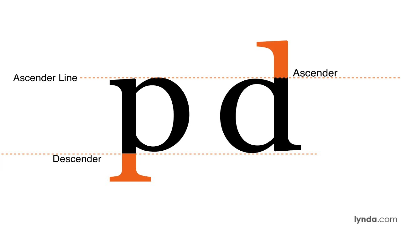
X-height sits within a layered system of typographic lines. Understanding where it lands relative to the others makes everything clearer.
- Baseline: The invisible line all letters rest on
- X-height line (mean line): The top of standard lowercase letters
- Ascender line: Where tall lowercase letters like “b,” “d,” and “h” reach
- Cap height: The top of uppercase letters (usually below the ascender line)
- Descender line: Where letters like “g,” “p,” and “y” dip below the baseline
X-height is relative, not fixed. Two fonts set at identical 16px will look very different in perceived size if their x-heights differ. Georgia appears noticeably larger than Times New Roman at the same point size – entirely because of this.
Why “x” and not another letter
“x” has no ascender, no descender, and no curved overshoot. It’s the most geometrically honest lowercase letter in the Latin alphabet.
Curved letters like “o” or “e” extend slightly above the x-height to look optically level – a trick called overshoot. Using them as reference points would introduce inconsistency. “x” doesn’t lie.
—
How X-Height Is Measured
In digital type, x-height isn’t measured in pixels or points directly. It’s expressed as units within the em square – the invisible design grid every glyph is drawn inside.
Most OpenType fonts use a grid of 1,000 units per em (UPM). TrueType fonts typically use 1,024 or 2,048 UPM. When a designer sets the x-height at, say, 480 units in a 1,000 UPM font, that translates to 48% of the total em square. According to Wikipedia’s typography documentation, an average font has a cap height of roughly 70% of the em and an x-height of around 48% – though designers have full freedom to go higher or lower.
For Latin-script fonts, x-height in a 2,048 UPM grid normally falls between 800 and 1,100 units, according to font development best practice guidelines from SIL International.
Optical x-height vs. mathematical x-height
There’s a gap between the two. Mathematical x-height is the exact unit value set in the font file. Optical x-height is what the eye actually perceives.
Curved and diagonal letters often appear shorter than flat-topped ones at the same mathematical height. Designers compensate with overshoot – letting those letters extend fractionally above the x-height line so they read as visually equal. It’s subtle. Most people never notice it, but you’d absolutely notice if it wasn’t there.
Tools used to measure and set x-height
Professional type design software handles this directly in the glyph drawing environment:
- FontForge – open-source, sets x-height via “Elements → Font Info → General”
- Glyphs App – uses custom parameters in the font info panel
- RoboFont – stores metrics in the UFO font format
In CSS, the x-height maps to the ex unit. Browser handling is inconsistent though – Firefox calculates ex relative to the actual x-height of the loaded font, while older versions of Internet Explorer set it to exactly half the em, regardless of the real x-height.
| Font format | Standard UPM | Typical x-height range |
|---|---|---|
| OpenType (CFF) | 1,000 units | ~480–540 units |
| TrueType / OpenType (TTF) | 2,048 units | ~800–1,100 units |
| PostScript (legacy) | 1,000 units | ~450–500 units |
—
X-Height vs. Cap Height vs. Em Square
These three measurements get confused constantly, even by experienced designers. They’re related but measure completely different things.
| Measurement | What it measures | Visible to the eye? |
|---|---|---|
| X-height | Height of lowercase letters without ascenders | Yes |
| Cap height | Height of uppercase letters from baseline | Yes |
| Em square | The invisible design container for all glyphs | No |
The x-height ratio

Divide the x-height by the cap height and you get the x-height ratio. This single number tells you a lot about a typeface’s character.
A ratio above 0.70 signals a high x-height font – more modern, better for small sizes. A ratio below 0.55 suggests a classical typeface with more contrast between uppercase and lowercase, like Garamond or Caslon.
Verdana has an x-height ratio of around 0.75. Times New Roman sits closer to 0.45. Both are set at “12pt” constantly – but they do not look the same size, at all.
Why the em square doesn’t equal any visible letter
The em square is an abstract grid, not a letter-height measurement. It’s the coordinate system type designers work inside. No character in a well-made Latin font actually fills the full em square – there’s always room left for leading and spacing.
When you set text to 16px in CSS, you’re scaling the em square to 16px, not any specific letter. The actual rendered height of lowercase text depends entirely on the x-height ratio baked into that particular font file.
—
Why X-Height Affects Readability
A 2024 study by Cooreman and Beier (Royal Danish Academy) confirmed that x-height is a significant factor in font legibility – and that modifying x-height fraction or ascender/descender length are the two main levers typographers can use to improve it.
The research specifically flagged time-sensitive reading contexts – traffic signs, vehicle displays, low-vision environments – as cases where x-height fraction is especially critical.
High x-height: better at small sizes
Larger lowercase letters mean more ink on the page (or pixels on screen) at any given size. That translates directly to easier recognition.
- Letters fill more of the visual field at small point sizes
- Open counters (the enclosed spaces in “e,” “a,” “g”) stay visible longer before collapsing
- Works well for body copy on mobile, captions, UI labels
According to TypeType’s legibility research, increasing x-height positively affects recognition across all characters – not just the obvious ones like “x” or “n.”
Low x-height: deliberate elegance
Low x-height creates more visual contrast between uppercase and lowercase letters. The eye reads the variation as refined, even delicate.
Best used for: display headlines, luxury branding, editorial design where type is large enough to read comfortably anyway. Garamond, Didot, and Mrs Eaves all sit in this territory. Beautiful at 40px. Genuinely painful at 11px.
The “apparent size” problem in practice
This is where designers get caught out. Two fonts at the same point size look different in size – and x-height is usually why.
Georgia and Times New Roman are both serif fonts, both used constantly for body text. Georgia’s x-height ratio is significantly higher. At 14px, Georgia reads comfortably. Times New Roman at the same size starts to feel cramped on screen. Matthew Carter designed Georgia specifically for Microsoft in the 1990s with screen legibility in mind – and the higher x-height was a deliberate, central decision.
—
X-Height in Typeface Selection
Knowing the x-height ratio of a font before committing to it is genuinely useful. It tells you where the font will perform and where it’ll struggle.
High x-height typefaces
These fonts carry body copy well, especially on screen. An analysis of 1,000 websites found that 85% use sans-serif fonts for web body text (Toner Buzz, 2024) – and most of those are high x-height choices by design.
- Inter – built for UI, very high x-height, excellent at 14–18px
- Verdana – Matthew Carter again, designed specifically for low-resolution screens
- Roboto – Google’s system font, dominant on Android interfaces
- Georgia – the go-to high x-height serif for editorial web content
Rasmus Andersson designed Inter with nearly every decision optimized for screen rendering – x-height included. It’s become a default choice for design systems across the industry.
Low x-height typefaces
Lower x-height signals classical proportions. These fonts carry weight in headlines, brand wordmarks, and print design where type is large enough to handle the reduced lowercase size.
Garamond – among the oldest continuously used typefaces, very low x-height by modern standards. Caslon – similar classical proportion, often used in book publishing. Didot – extreme stroke contrast combined with a low x-height, best left to display sizes.
Pairing fonts: x-height matching
When pairing fonts, mismatched x-heights create visual tension that’s hard to pin down but immediately uncomfortable. The heading and body fonts look like they belong to different design eras.
The practical fix: open both fonts side by side at the same point size. The lowercase letters should feel roughly equal in visual weight and height. If one looks dramatically smaller, either adjust relative sizing or pick a different combination. There’s no algorithm for this – it’s a judgment call, and it takes a few rounds of testing.
| Font | X-height style | Best use case |
|---|---|---|
| Inter | Very high | UI, body copy, small labels |
| Georgia | High | Editorial web, long-form reading |
| Garamond | Low | Book publishing, refined print work |
| Didot | Very low | Fashion editorial, luxury display |
—
X-Height in Web and UI Design
This is where x-height stops being a typographic theory and starts having real consequences – in CSS, design systems, and layout behavior.
The CSS <code>ex</code> unit
CSS exposes x-height directly through the ex unit. In theory, 1ex equals the x-height of the current font. In practice, browser support is inconsistent enough that most developers avoid it for anything critical.
Firefox calculates ex from the font’s actual x-height. Older Internet Explorer versions fixed it at exactly 0.5em regardless of the real measurement. At 10px font size with a 45% x-height, browsers may round ex to either 4px or 5px depending on how they handle sub-pixel values. That’s a real layout difference.
Font stacks and x-height mismatches
This is a practical problem most designers discover accidentally. When a custom web font fails to load and the browser falls back to a system font, x-height differences between the two cause layout shifts.
- Text reflows to different line counts
- Buttons expand or contract depending on text height
- Line-height ratios that worked for the primary font feel off with the fallback
Google’s 2023 Material Design update addressed spacing partly by standardizing line height ratios for interface elements – using 1.5 line height across components, which improved form completion rates by 18% according to DeveloperUX research.
X-height and design systems
Design systems like Material Design and Apple’s Human Interface Guidelines don’t publish explicit x-height targets. But their font choices embed those decisions quietly. Apple uses SF Pro across iOS and macOS – a typeface with a carefully tuned x-height for legibility at small UI sizes. Google recommends Roboto, which carries a similarly high x-height ratio.
When building a brand style guide that includes a custom typeface, the x-height of that font needs to be documented alongside leading and tracking values. Otherwise, every developer who implements the type will set their own line heights – and the system will look inconsistent across products.
Good typography in a UI isn’t just about which font looks nice. It’s about whether lowercase letters are legible at 12px on a phone screen. X-height is the variable that answers that question.
X-Height Across Different Scripts and Languages
X-height is a Latin typography concept. It maps cleanly to the Latin alphabet because lowercase letters in Latin scripts have consistent, predictable heights. Outside of Latin, the concept doesn’t translate directly.
Of the roughly 200 writing scripts in the world, only a handful share enough structural similarity with Latin to borrow its height system. Cyrillic is one – it uses the same cap and lowercase structure and copies some characters directly. Arabic, Devanagari, Thai, and Chinese do not.
Why Arabic and Latin can’t simply share a size
The core problem: Arabic letterforms vary considerably in height within a single word. Latin has consistent heights. Matching the tallest letters across both scripts leaves Arabic text looking disproportionately small everywhere else.
According to research published in Balancing Arabic and Latin Typography (Intellect Limited), replacing Latin text with Arabic at the same font size almost always requires a significant scaling correction for the Arabic font – making point size equivalence between the two scripts practically unreliable.
Arabic type also sits on a different structural system. As documented by type designer Pascal Zoghbi at 29LT, Latin type conventionally uses five vertical reference lines: baseline, x-height, ascender, descender, and cap height. Arabic has more levels and the number is decided by the type designer based on the calligraphic style being used.
Hebrew: between x-height and cap height
Hebrew offers a useful middle case. When designing matched Latin and Hebrew typefaces, type designers at Type-Together found that harmonizing the two scripts works best when Hebrew letter height sits between the Latin x-height and cap height – not matching either precisely.
This is a workable starting point, not a rule. The visual weight of Hebrew and Latin text at the same setting still requires optical adjustment.
Multilingual type design in practice
Google’s Noto project is the most documented attempt at resolving this. The goal: design a single font family that covers every Unicode-supported script without showing missing characters. Getting x-height-equivalent proportions consistent across Latin, Arabic, Devanagari, and CJK required script-specific metrics for each family member.
| Script | Latin x-height equivalent | Key challenge |
|---|---|---|
| Cyrillic | Direct match possible | Minimal, shares Latin structure |
| Hebrew | Between x-height and cap height | Optical weight matching |
| Arabic | No direct equivalent | Variable letter heights within words |
| Devanagari | No direct equivalent | Headline bar (shirorekha) dominates visual height |
OpenType handles some of this through script-specific metrics and contextual alternates. But the underlying proportional decisions still have to be made by the type designer, not the font format.
—
How Type Designers Use X-Height
X-height is one of the first decisions a type designer locks in. It sets the proportions of every other letter in the lowercase alphabet. Change it late in the process and you’re essentially rebuilding the font.
FF Meta is a documented example. Erik Spiekermann designed it originally for the Deutsche Bundespost in 1985 with legibility at small sizes as the primary brief – printed on stamps, mailboxes, trucks. The large x-height and open letterforms were deliberate decisions from day one, not refinements added later. According to MyFonts, FF Meta Serif was later designed to match FF Meta precisely in terms of x-height so the two could mix on the same page without visual conflict.
Setting x-height early determines everything downstream
Once x-height is set, it governs:
- The height of all standard lowercase letters (a, c, e, m, n, o, r, s, u, v, w, x, z)
- How much space remains for ascenders and descenders
- The bowl proportions of letters like b, d, p, q
- The visual weight of the [glyph] set as a whole
A higher x-height compresses the space available for ascenders and descenders. That’s a real trade-off – more legibility at small sizes, but letters like “b,” “h,” and “g” have less room to breathe.
The ITC trend: high x-heights in the 1960s and 70s
International Typeface Corporation released popular variations of classic typefaces with deliberately boosted x-heights throughout the 1960s and 1970s. ITC Avant Garde Gothic, released in 1970 by Herb Lubalin and Tom Carnase, featured a tall x-height and wide characters as core design choices – MyFonts describes the open counters and tall x-heights as contributing to its friendly appearance.
ITC Garamond followed the same pattern: taking a historically low x-height classical font and boosting it for modern readability. The result was controversial among type purists but commercially successful.
The counter-reaction: low x-heights as a design statement
More recently, some typefaces have gone the other direction. Mrs Eaves (Zuzana Licko, 1996), Neutraface, and Brandon Grotesque were all issued with distinctively low x-heights – specifically to create a more refined, elegant appearance at a time when high x-height had become the norm.
It’s a positioning decision as much as a functional one. Low x-height signals “classical” or “luxury.” High x-height signals “modern” and “accessible.” Neither is inherently better – it depends entirely on context.
Optical size and x-height adjustments
Professional foundries like Adobe issue fonts across multiple optical sizes. The x-height actually increases for caption and footnote sizes and decreases for display sizes. At 8pt, you need more x-height for the letters to stay readable. At 60pt, a lower x-height adds elegance without sacrificing legibility.
This is why [variable fonts] are interesting for x-height. In theory, an optical size axis in a variable font can shift x-height proportions as the font scales. Practically, this is still uncommon – most variable fonts vary weight and width before touching x-height. But the capability exists in the OpenType spec and some foundries are starting to use it.
Understanding x-height at this level is what separates designers who use [font spacing] intuitively from those who understand why their spacing choices work. A typographic hierarchy built without considering x-height ratios across different fonts tends to feel slightly off – even when every other decision is correct.
FAQ on What Is X-Height
What is x-height in typography?
X-height is the vertical distance between the baseline and the top of lowercase letters without ascenders. It’s named after the letter “x,” which sits cleanly between those two lines without optical tricks or overshoots.
Why does x-height matter for readability?
A higher x-height means larger lowercase letters at any given point size, which improves font legibility at small sizes. Research by Cooreman and Beier (2024) confirms x-height is a significant factor in character recognition, especially in time-sensitive reading contexts.
How is x-height measured?
X-height is expressed in units relative to the em square. In a 1,000 UPM OpenType font, a typical x-height falls around 480–540 units. Type design tools like FontForge, Glyphs App, and RoboFont let designers set this directly.
What is the difference between x-height and cap height?
Cap height measures uppercase letters from the baseline up. X-height measures standard lowercase letters. Dividing one by the other gives you the x-height ratio, which tells you a lot about a typeface’s personality and intended use.
Which fonts have a high x-height?
Inter, Verdana, Roboto, and Georgia all have high x-heights. These fonts perform well for body copy and UI design. Verdana and Georgia were both designed by Matthew Carter specifically for screen legibility at small sizes.
Which fonts have a low x-height?
Garamond, Caslon, Didot, and Mrs Eaves all sit in low x-height territory. They look refined and classical at display sizes but become harder to read in small body text. Best left to headlines and print design.
How does x-height affect font pairing?
Mismatched x-heights between heading and body fonts create visual tension that’s hard to identify but immediately uncomfortable. When pairing fonts, check that lowercase letters appear roughly equal in size at the same point size setting.
What is the CSS ex unit?
The CSS ex unit maps directly to x-height – in theory, 1ex equals the x-height of the current font. In practice, browser support is inconsistent. Firefox calculates it from the actual font x-height; older Internet Explorer fixed it at exactly half the em.
Does x-height apply to non-Latin scripts?
X-height is a Latin typography concept and doesn’t translate directly to Arabic, Devanagari, or Chinese scripts. Arabic letterforms vary considerably in height within a single word, making point size equivalence between Latin and Arabic practically unreliable without manual scaling.
How do type designers decide on x-height?
X-height is set early in the design process because it governs the proportions of every lowercase letter. A higher x-height compresses space for ascenders and descenders. It’s a trade-off between small-size legibility and the visual contrast between uppercase and lowercase letters.
Conclusion
This conclusion is for an article presenting what is x-height – and why it belongs in every designer’s decision-making process, not just a type designer’s.
The x-height ratio shapes how fonts perform at small sizes, how typefaces pair together, and how readable body copy feels across screen and print.
From Matthew Carter’s screen-optimized Georgia to Erik Spiekermann’s legibility-first FF Meta, the most trusted typefaces in use today were built around deliberate x-height decisions.
Ignore it and your typographic hierarchy will feel slightly off, even when everything else looks right.
Get it right and your font choices stop being guesswork – they become informed, consistent, and built to last across any context or device.

Renowned for his expertise in logo design and visual branding, Bogdan has developed a multitude of logos for various clients.
His skills extend to creating posters, vector illustrations, business cards, and brochures. Additionally, Bogdan's UI kits were featured on marketplaces like Visual Hierarchy and UI8.
He also wrote in the past years on sites like Design Your Way, WebDesignerDepot, WPDean, Designmodo, Speckyboy, Slider Revolution, and more.
- How to Install Fonts on Mac (Step-by-Step Guide) - 20 September 2026
- From Mockup to Code: How AI-Augmented Development Speeds Up the Design Handoff - 19 September 2026
- The Beehiiv Logo History, Colors, Font, And Meaning - 18 September 2026

Bogdan Sandu is a seasoned designer who has been designing websites since 2008. Renowned for his expertise in logo design and visual branding, Bogdan has developed a multitude of logos for various clients. His skills extend to creating posters, vector illustrations, business cards, and brochures. Additionally, Bogdan's UI kits were featured on marketplaces like Visual Hierarchy and UI8. He also wrote in the past years on sites like Design Your Way, WebDesignerDepot, WPDean, Designmodo, Speckyboy, Slider Revolution, and more.
You Might Also Like


