


Every letter you read carries the DNA of its creator.
Famous typographers shaped how we consume information, from Renaissance printing presses to digital screens. These masters didn’t just design letters. They engineered legibility, crafted visual identity, and influenced graphic design movements that defined entire eras.
This guide profiles the type designers whose work appears everywhere you look. You’ll discover the minds behind Helvetica, Times New Roman, Futura, and other iconic fonts that dominate modern communication.
Their stories reveal how typeface design evolved from hand-cut punches to algorithmic curves, and why certain letterforms endure while others fade.
Famous Typographers
| Typographer | Era & Nationality | Notable Typefaces | Key Contribution |
|---|---|---|---|
| Claude Garamond | 1480s-1561, French | Garamond, Granjon | Refined Renaissance roman types with elegant proportions |
| William Caslon | 1692-1766, English | Caslon | Created quintessential English old-style typeface |
| John Baskerville | 1706-1775, English | Baskerville | Transitional typeface bridging old-style and modern designs |
| Giambattista Bodoni | 1740-1813, Italian | Bodoni | Modern typeface with extreme contrast and vertical stress |
| Frederic Goudy | 1865-1947, American | Goudy Old Style, Copperplate Gothic | Prolific designer creating over 100 typefaces |
| Stanley Morison | 1889-1967, English | Times New Roman | Commissioned highly readable newspaper typeface |
| Eric Gill | 1882-1940, English | Gill Sans, Perpetua | Humanist sans-serif blending classical and modern forms |
| Paul Renner | 1878-1956, German | Futura | Geometric sans-serif embodying Bauhaus principles |
| Jan Tschichold | 1902-1974, German | Sabon, Transit | Pioneered asymmetric typography and modernist design |
| Adrian Frutiger | 1928-2015, Swiss | Univers, Frutiger, Avenir | Systematic type family design with multiple weights |
| Max Miedinger | 1910-1980, Swiss | Helvetica | Created most widely used sans-serif typeface worldwide |
| Hermann Zapf | 1918-2015, German | Palatino, Zapfino, Optima | Masterful calligraphic typefaces with organic forms |
| Herb Lubalin | 1918-1981, American | Avant Garde Gothic, Lubalin Graph | Innovative typographic expression and tight letter spacing |
| Matthew Carter | 1937-present, English | Georgia, Verdana, Bell Centennial | Screen-optimized typefaces for digital readability |
| Ed Benguiat | 1927-2020, American | ITC Benguiat, Souvenir | Designed over 600 typefaces with distinctive character |
| Carol Twombly | 1959-present, American | Trajan, Adobe Caslon, Myriad | Historical revival typefaces with contemporary refinement |
| Jonathan Hoefler | 1970-present, American | Gotham, Sentinel, Mercury | Premium custom typefaces for corporate branding |
| Tobias Frere-Jones | 1970-present, American | Interstate, Gotham (with Hoefler), Whitney | Technical excellence in typeface engineering |
| Erik Spiekermann | 1947-present, German | FF Meta, ITC Officina, Fira | Functional typefaces for corporate identity systems |
| Neville Brody | 1957-present, English | FF Blur, Industria, Arcadia | Experimental digital typography and magazine design |
| Zuzana Licko | 1961-present, Slovak-American | Oakland, Matrix, Mrs Eaves | Early digital type design optimized for low-resolution screens |
| Paula Scher | 1948-present, American | Custom typography for Citi, Tiffany, MoMA | Bold typographic solutions in environmental graphics |
| Massimo Vignelli | 1931-2014, Italian-American | Advocated Helvetica, Bodoni, Garamond use | Systematic approach to typography in corporate design |
| Jessica Hische | 1984-present, American | Buttermilk, Tilda, Mighty | Contemporary lettering artist and script typeface designer |
Claude Garamond
French Renaissance typographer who transformed printing through refined letterforms and independent craftsmanship. Born around 1480 in Paris, died 1561.
His types became the standard across Europe and influenced typography for centuries.
Signature Typefaces
Garamond’s romans cut between 1530-1545 represented the era’s pinnacle.
The Grecs du Roi (1541) were commissioned by King Francis I. Three sizes modeled on Angelo Vergecio’s handwriting included vast alternate letters and ligatures.
His pica roman first appeared around 1530 for printer Robert Estienne. Modern revivals include Adobe Garamond (Robert Slimbach, 1989) and ITC Garamond (Tony Stan, 1975).
Design Philosophy
Garamond refined Dutch Baroque types into something more elegant. His old-style serif font design created letters with organic structure resembling pen-written forms but more upright.
The work showed delicate modeling. Soft rounded serifs often featured concave slanted profiles.
He emphasized clarity and legibility over ornament.
Historical Impact
First independent punchcutter in Paris, specializing in type design as a service rather than working for one printer. This model defined typefounding as a distinct industry.
His types replaced Francesco Griffo’s designs at Venice’s Aldine Press. By 1549, he was recognized as Paris’s preeminent punchcutter.
Gothic blackletter gave way to his readable roman faces.
Notable Collaborations
Type Foundries:
- Worked with printer Robert Estienne on multiple commissions
- Guillaume Le Be acquired many of his punches and matrices
- Christoph Plantin purchased his types after Garamond’s death
- Frankfurt’s Egenolff-Berner foundry obtained portions of his work
Published books himself starting 1545.
Collaborated with various Paris publishers and the French crown.
Legacy in Modern Design
Many typefaces called “Garamond” exist today, though some actually derive from Jean Jannon’s work.
His influence shaped graphic design principles around text legibility and elegant proportion.
Used extensively in book design, editorial work, and corporate communications. Adobe Garamond remains a standard option in most design software.
The term “Garalde” describes fonts following the Aldus-Garamond model.
John Baskerville

English printer and typeface designer who bridged old style and modern typography. Born January 28, 1706, in Wolverley, Worcestershire. Died January 8, 1775, in Birmingham.
Signature Typefaces
Baskerville (1757) represented the peak of transitional design.
His roman and italic cut in approximately 14-point size first appeared in his Virgil quarto edition. The 1763 folio Bible showcased his types at their finest.
Designed with punchcutter John Handy, who executed Baskerville’s precise specifications.
Modern revivals include Mrs Eaves (Zuzana Licko, 1996) and numerous Monotype and Linotype versions from the 1920s onward.
Design Philosophy
Baskerville increased stroke contrast between thick and thin parts. Made serifs sharper and more tapered. Shifted axis of rounded letters to vertical position.
The approach reflected his calligraphy background. Curved strokes became more circular, characters more regular.
He emphasized wide margins and generous leading between lines. Worked without ornaments or rules for clean, austere pages.
Innovation extended beyond type. He invented highly glossed wove paper and truly black ink.
Historical Impact
Started as writing master and japanning manufacturer before entering printing at age 44.
His 1757 Virgil made such impact that Cambridge University appointed him their printer in 1758. Printed the Book of Common Prayer (1762) despite being an atheist.
Initially criticized in England, his work gained more appreciation in Europe. Benjamin Franklin, a fellow printer, greatly admired his types.
Types fell from favor after his death but revived in the 1840s as graphic design movements reassessed quality standards.
Notable Collaborations
Cambridge University Press – Official printer 1758-1760s
Punchcutter John Handy executed all his type designs
Papermaker James Whatman developed wove paper for his specifications
His wife Sarah Eaves (formerly his housekeeper) managed business affairs. Mrs Eaves typeface honors her contribution.
Legacy in Modern Design
Baskerville remains popular for book text and editorial design. Considered ideal for continuous reading due to clarity and balance.
The transitional category he defined influenced later designers including Bodoni and Didot.
His original punches and matrices, after complex history, were presented to Cambridge University in 1953.
A Portland stone sculpture honors him in Birmingham’s Centenary Square.
Giambattista Bodoni

Italian master whose extreme stroke contrast defined modern typography. Born February 16, 1740, in Saluzzo, Piedmont. Died November 29, 1813, in Parma.
Called the “King of Printers and Printer of Kings.”
Signature Typefaces
His 1788 Manuale tipografico displayed 291 roman and italic faces plus Greek, Russian, and exotic scripts. Wife Margherita published the expanded two-volume 1818 edition posthumously.
The Bodoni we know today derives from his work between 1787-1813. Extreme contrast between hairline and thick strokes. Flat, unbracketed serifs perpendicular to vertical strokes. Overall geometric construction.
Design Philosophy
Initially used old-style types with decoration. Converted to Pierre Didot’s theories by 1787, embracing stark simplicity.
Four principles from his Manuale: regularity, cleanness, good taste, and charm.
Bodoni achieved unprecedented technical refinement. Faithfully reproduced very thin hairlines contrasting with thick main stems.
Pages featured minimal decoration, wide margins, and pristine materials. Smooth Parma paper and high-quality metal casting made fine details possible.
Historical Impact
Apprenticed at Rome’s Propaganda Fide press, mastering exotic language types.
Became director of Parma’s Royal Press (Stamperia Reale) in 1768 under Duke Ferdinand. Built international reputation. Famous visitors including Napoleon sought meetings.
His 1791 Horace, 1793 Virgil, and 1808 Homer’s Iliad became legendary.
Benjamin Franklin wrote him fan letters. Upon his death, Parma’s cathedral bell tolled in mourning.
Notable Collaborations
Worked under Cardinal Giuseppe Spinelli and Costantino Ruggieri in Rome
Duke Ferdinand of Parma – patron who gave him press independence
Wife Margherita managed affairs and published his Manuale after death
Influenced by Pierre Simon Fournier and John Baskerville’s work
Legacy in Modern Design
Massimo Vignelli called Bodoni “one of the most elegant typefaces ever designed.”
William Morris and Frederic Goudy criticized its “sweltering hideousness” and mechanical perfection.
Modern revivals include ATF Bodoni, Bauer Bodoni (Heinrich Jost, 1926), ITC Bodoni with optical sizes.
Widely used in fashion (Vogue, Armani, Calvin Klein) and music industry branding.
“Dazzle effect” from alternating strokes can reduce readability at small sizes. Best for display work and high-gloss printing.
William Caslon

English typefounder whose practical designs dominated printing for 200 years. Born 1692 in Cradley, Worcestershire. Died January 23, 1766, in Bethnal Green, London.
The maxim “when in doubt, use Caslon” guided printers for generations.
Signature Typefaces
His first Latin types were pica roman and italic (1722-1726).
The 1734 specimen sheet displayed roman and italic in 14 sizes. This became the standard reference.
Caslon’s letterforms featured:
- Concave hollow at top left of ‘A’
- ‘G’ without downwards-pointing spur
- Straight sides on ‘M’
- Short ascenders and descenders
- Modest stroke contrast
First typeface was actually Arabic (1720) for the Society for Promoting Christian Knowledge. Also cut Hebrew for William Bowyer (1726).
Design Philosophy
Caslon refined Dutch Baroque types that dominated England. He introduced more interest, variety, and delicate modeling.
The types weren’t individually perfect. Their strength came from harmonious mass effect.
According to Daniel Berkeley Updike: “perfection of the whole, derived from harmonious but not necessarily perfect individual letterforms.”
Started as gunlock engraver. This metalworking precision served his punchcutting.
Kerning and spacing received careful attention.
Historical Impact
Opened London engraving shop in 1716 for gunlocks and bookbinder’s tools.
John Watts noticed his work and commissioned type punches.
Between 1720-1780, few English books used anything but Caslon types. Ended England’s dependence on Dutch imports.
The United States Declaration of Independence was printed in Caslon.
Types spread throughout British Empire and American colonies.
Notable Collaborations
Printer William Bowyer – early patron who advanced him money
Punchcutter John Handy – no relation to Baskerville’s Handy
Son William Caslon II joined as partner around 1742 and continued the foundry
Wife Elizabeth Caslon skillfully managed operations after William II’s death
Multiple type foundries later acquired portions of Caslon matrices
Legacy in Modern Design
Fell from favor late 18th century with arrival of Baskerville and Bodoni.
The Arts and Crafts movement (1840s-1880s) sparked major revival. George Bernard Shaw insisted all his books use Caslon.
H.W. Caslon & Company operated until 1937, transferring rights to Stephenson Blake.
Modern versions include ITC Caslon, Adobe Caslon (Carol Twombly, 1990), and Big Caslon.
Remains standard for book text, particularly in traditional publishing.
Stanley Morison
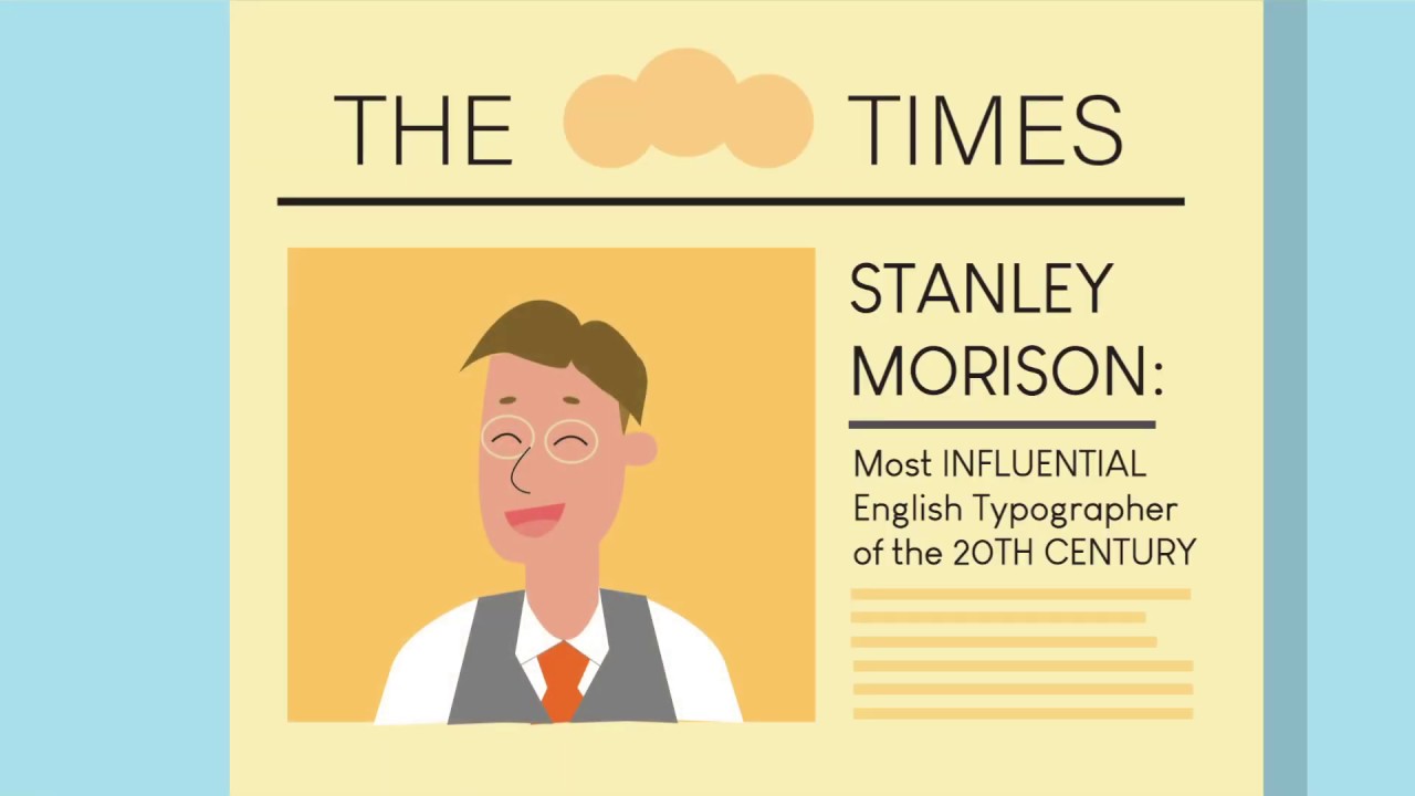
British typographer and historian who created the world’s most ubiquitous typeface. Born May 6, 1889, in Wanstead, Essex. Died October 11, 1967, in London.
Largely self-taught, he reshaped 20th-century typography through scholarship and design.
Signature Typefaces
Times New Roman (1932) – developed with Victor Lardent for The Times newspaper. Became most successful typeface of the first half 20th century.
Under his Monotype advisorship:
- Commissioned Gill Sans (Eric Gill, 1928)
- Perpetua (Eric Gill, 1929)
- Revived Bembo (1929), Garamond (1922), Ehrhardt, and Bell
Each revival attended to historical accuracy while meeting modern printing needs.
Design Philosophy
“Typography is the efficient means to an essentially utilitarian and only accidentally aesthetic end.”
From his influential “First Principles of Typography” (1936), he argued for maximum readability.
Believed any disposition of material coming between author and reader was wrong.
Briefly promoted radical idea that italics disrupted text flow. Later conceded this impractical.
Emphasized historically informed design. Studied Renaissance through late 18th-century models extensively.
Historical Impact
Joined Monotype Corporation as typographic adviser in 1923. Position lasted until 1967, though he held various roles.
As typographic adviser to Cambridge University Press (1923-1959), he established lasting standards.
Criticized The Times in 1929 for poor typography. They hired him as consultant. Times New Roman appeared October 3, 1932.
Edited The Times Literary Supplement (1945-1947). Wrote History of the Times (1935-1952).
Published over 170 works on typography history.
Notable Collaborations
Victor Lardent – advertising department artist who drew Times New Roman under Morison’s direction
Eric Gill – commissioned to design Gill Sans and Perpetua for Monotype
The Times newspaper – 30+ year relationship shaping its typography
Cambridge University Press – 36-year consulting relationship
Friend of printer Brooke Crutchley. Archives went to Cambridge after death.
Legacy in Modern Design
Times New Roman remains one of the most-used typefaces globally. Default system font on countless computers.
His scholarship elevated typography’s intellectual standing. “First Principles” remains essential reading.
Though The Times abandoned Times New Roman, it dominates book and publication design.
Monotype’s revival program under his guidance preserved crucial historical designs.
Declined knighthood (1953) and CBE (1962).
Eric Gill

British sculptor and type designer whose controversial life contrasts with his elegant letterforms. Born February 22, 1882, in Brighton, Sussex. Died November 17, 1940, in Uxbridge, Middlesex.
Signature Typefaces
Gill Sans (1927-30) – humanist sans-serif released by Monotype. Based on Edward Johnston’s Underground Railway alphabet.
Started when Gill hand-painted fascia for Douglas Cleverdon’s Bristol bookshop (1926). Stanley Morison commissioned full type family development.
Perpetua (1925-29) – elegant serif face with precise linear quality
Joanna (1930) – named after his daughter, used for his own Essay on Typography
Other designs: Solus, Bunyan (later Pilgrim), Golden Cockerel types
Design Philosophy
“The shapes of letters do not derive their beauty from any sensual or sentimental reminiscences.”
Aimed for “fool-proof” designs improving on his teacher Johnston’s work. Each weight of Gill Sans retained distinct character rather than mechanical derivation.
Influenced by Arts and Crafts movement and medieval craftsmanship.
As sculptor first, he brought understanding of carved forms to type. The connection between stonecutting and letterforms remained central.
Opposed industrialization and mass production despite creating typefaces for mechanical reproduction.
Historical Impact
Apprenticed to architect, then studied under calligrapher Edward Johnston at Central School of Arts and Crafts (1901).
Johnston’s Underground alphabet profoundly influenced his work.
Made architectural sculptures for BBC headquarters and London Underground buildings.
Founded Guild of St. Joseph and St. Dominic, attempting medieval-style artistic community.
Created wood engravings for Golden Cockerel Press considered finest of their kind.
Appointed Royal Designer for Industry (1938).
Notable Collaborations
Edward Johnston – teacher whose Underground typeface inspired Gill Sans
Stanley Morison – Monotype adviser who commissioned his type designs
Golden Cockerel Press – created numerous wood-engraved illustrations
Monotype Corporation – published his major typefaces
Wife and daughters worked in his artistic communities
Legacy in Modern Design
Gill Sans became visual identity of London and North Eastern Railway, later British Railway.
BBC adopted Gill Sans for wordmark (1997) and on-screen graphics.
The typeface’s humanist proportions influenced sans-serif design globally.
Perpetua remains choice for books and inscriptional work.
Since 1989, revelations about his personal life sparked debates about separating art from artist. Save the Children rebranded away from Gill Sans in 2022.
His work remains ubiquitous despite controversy.
Frederic Goudy

America’s most prolific type designer, creating over 100 faces from modest beginnings. Born March 8, 1865, in Bloomington, Illinois. Died May 11, 1947, in Marlboro, New York.
At 40, he kept books for a Chicago realtor. Then created 113 usable fonts over 36 years.
Signature Typefaces
Goudy Old Style (1915) – his most famous design. Warm, readable, suitable for text and display.
Copperplate Gothic (1901) – sharp, elegant capitals-only design for formal use. Not actually gothic or copperplate-related.
Kennerley (1911) – commissioned by Mitchell Kennerley. Based on Caslon with Goudy’s refinements.
Camelot (1896) – his first design, sold for $10 to Dickinson Type Foundry
Forum (1911) – capitals inspired by Roman inscription on Arch of Titus
University of California Old Style (1938) became ITC Berkeley
Design Philosophy
“My craft is a simple one. For nearly forty years I have endeavored to create greater esteem for good printing.”
Worked under Arts and Crafts movement influence, echoing William Morris’s Golden Type.
Saw himself as modern embodiment of Renaissance goldsmiths who first cut type.
While respecting tradition, created distinctively original faces. Balanced beauty and dignity with publishers’ practical demands.
Cut punches by hand initially, later used pantograph technology.
Famous for saying: “Anyone who would letterspace lowercase would steal sheep.”
Historical Impact
Founded Booklet Press (later Camelot Press) in 1895 in Chicago.
Founded Village Press with wife Bertha and Will Ransom (1903) in Park Ridge, Illinois. Press burned down in 1908, destroying equipment and designs.
Rebuilt and created E-38 (Goudy Light) for Lanston Monotype (1908).
Second fire in 1939 destroyed workshop and foundry. Many designs lost.
Taught at Art Students League (1916-24) and New York University (1927-29).
Art director of Lanston Monotype Machine Company (1920-1940).
Notable Collaborations
Wife Bertha M. Goudy (1869-1935) – co-founded Village Press, composed type for 31 years
Lanston Monotype Machine Company – main commercial partner for decades
Will Ransom – Village Press co-founder
Worked with numerous publishers including Mitchell Kennerley
American Type Founders produced several of his designs
Legacy in Modern Design
Goudy Old Style remains one of America’s most popular typefaces.
The Cary Graphic Arts Collection at Rochester Institute of Technology sponsors annual Frederic W. Goudy Award.
Owns the Albion iron hand press No. 6551 (Kelmscott/Goudy Press), previously William Morris’s.
His emphasis on American type design helped establish domestic industry.
Many faces show typical “Goudyisms” – tilted ‘e’ and distinctive details. Walter Tracy called him “over-fond” of these quirks.
Syracuse University adopted and digitized his 1910 Sherman typeface.
Paul Renner
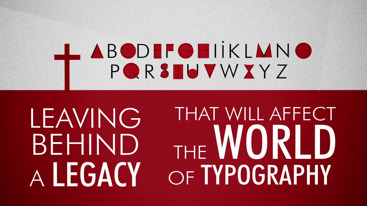
German typographer who created the geometric sans-serif that defined modernism. Born August 9, 1878, in Wernigerode, Harz. Died April 25, 1956, in Hodingen.
His Futura became Die Schrift unserer Zeit – “The Typeface of Our Time.”
Signature Typefaces
Futura (1924-27) – released by Bauer Type Foundry. Geometric sans-serif based on circles, triangles, and straight lines.
First version strictly geometric proved too rigid. Final 1927 release incorporated optical corrections for readability.
Multiple weights followed: Light (1932), Schlagzeile display weights (1932), Black, Condensed.
Steile Futura (1952) – attempted 19th-century sans-serif approach
Ballade (1937), Renner Antiqua (1939) – serif designs
Architype Renner reproduces his experimental alternate characters deleted from Futura.
Design Philosophy
Aimed to create “serifless roman” with classical proportions, not just geometric novelty.
Influenced by Bauhaus design principles though never formally affiliated.
Believed in “New Typography” – modernist approach rejecting ornament.
Wrote extensively: “Typographie als Kunst” (1922), “Mechanisierte Grafik” (1930), “Die Kunst der Typographie” (1948).
Opposed Gothic Fraktur blackletter favored by conservatives.
Described Futura as third eternal type form after classical medieval and classical modern.
Historical Impact
Became director of Munich’s printing school (Meisterschule fur Deutschlands Buchdrucker) in 1926.
Published “Kulturbolschewismus?” (1932) criticizing Nazi cultural policy.
Dismissed from teaching in 1933 as “Cultural Bolshevist” intellectual subversive.
Arranged for George Trump to succeed him, preventing Nazi appointment. Jan Tschichold also taught under him.
Nazis initially promoted Gothic Fraktur, banning modern types. 1941 reversal made Futura acceptable for propaganda in occupied territories.
Worked as painter and writer 1934-1945.
Notable Collaborations
Bauer Type Foundry – Georg Hartmann’s vision and Heinrich Jost’s craft expertise brought Futura to reality
Jan Tschichold – colleague and fellow New Typography advocate
George Trump – friend who succeeded as school director
Kurt Schwitters – used Futura for Hanover city identity before Nazi takeover
Deberny & Peignot released Futura as “Europe” in France
Legacy in Modern Design
Futura remains one of history’s most-used typefaces.
American Type Founders created Spartan, nearly identical copy. Twentieth Century, Kabel, and Metro followed as Futura-inspired competitors.
Used for countless book covers, fashion brands, and corporate identities.
The Apollo 11 plaque left on the moon is set in Futura.
Monotype released Futura Now (2020) – 102 styles based on original designs.
BauerTypes & TypeTogether announced Futura 100 (2025) for global inclusivity.
Copyright expires 2026, entering public domain worldwide.
Jan Tschichold

German typographer who revolutionized modern design then abandoned it for classical tradition. Born April 2, 1902, in Leipzig, Germany. Died August 11, 1974, in Locarno, Switzerland.
Son of a sign painter, trained in calligraphy at Leipzig Academy.
Signature Typefaces
Sabon (1967) – his only completed typeface. Designed to look identical on Monotype, Linotype, and hand-set systems.
Named after Jacques Sabon, 16th-century Lyon punchcutter who brought Garamond’s types to Frankfurt.
Used by Bradbury Thompson for Washburn College Bible. “Sabon Next” released by Linotype as interpretation of original.
Also designed Transit for Basel trams (1960s) and Saskia (1932), early serif showing his move from modernism.
Design Philosophy
Converted to Modernist design after 1923 Weimar Bauhaus exhibition.
His 1928 “Die neue Typographie” (The New Typography) became design manifesto. Condemned all typefaces except sans-serif. Advocated standardized paper sizes and non-centered layouts.
From 1932 onward, gradually abandoned these rigid beliefs. Later condemned Die neue Typographie as too extreme and inherently fascistic.
Returned to classical Roman typefaces and symmetrical arrangements. This reversal shocked the design world.
Historical Impact
Published influential “elementare typographie” in Typographische Mitteilungen (1925).
Arrested by Nazis in 1933 as “cultural Bolshevik.” Imprisoned four weeks, then fled to Switzerland.
Redesigned 500+ Penguin Books paperbacks (1947-1949). Created standardized Penguin Composition Rules still influential today.
His work spread Modernist graphic design globally despite later rejection of it.
Notable Collaborations
Worked closely with Paul Renner (Futura designer) at Munich printing school
Friend and correspondent with Kurt Schwitters, El Lissitzky, Laszlo Moholy-Nagy
Penguin Books – complete redesign establishing their iconic look
Founded “The Ring” group (1927) with other European designers
Eugen Rentsch published his “Kulturbolschewismus?” in Switzerland when German publishers refused
Legacy in Modern Design
Sabon remains widely used for book text and editorial design.
His New Typography principles influenced generations despite his own abandonment of them.
Penguin design standards set lasting conventions for paperback publishing.
Collection donated to Museum of Modern Art by Philip Johnson.
His career demonstrates how designers’ philosophies evolve. Few figures show such dramatic ideological shift.
Adrian Frutiger

Swiss master who created typeface systems spanning hot metal to digital eras. Born May 24, 1928, in Unterseen, Canton of Bern. Died September 10, 2015, in Bremgarten bei Bern.
Called typography’s three main sans-serif genres through Univers, Frutiger, and Avenir.
Signature Typefaces
Univers (1954-57) – revolutionary family of 21 coordinated weights and widths released simultaneously. First typeface issued in hand-set, Monotype, and phototype at once.
Two-digit numbering system: first digit (3-8) indicates weight, second shows width and style.
Frutiger (1976) – humanist sans designed for Charles de Gaulle Airport signage. Originally called Roissy. Steve Matteson called it “best choice for legibility in pretty much any situation.”
Avenir (1988) – geometric sans with organic warmth
OCR-B (1968) – machine-readable typeface, ISO standard for barcodes worldwide
Also: Meridien (1955), Serifa (1967), Glypha (1977), Vectora
Design Philosophy
“I’m the brickmaker, not the architect. I just make good bricks for graphic designers to build with.”
Aimed to achieve “the best possible legibility” above all.
Created sans-serif types as “main life’s work.” Found them more difficult than serifs.
Disliked geometric rigidity of Futura. Based Univers on realist neo-grotesque Akzidenz-Grotesk instead.
Frutiger blended Univers’s systematic approach with humanist warmth of Gill Sans and Johnston.
Historical Impact
Hired by Charles Peignot at Deberny & Peignot foundry (1952) at age 24.
Became artistic director, pioneering phototypesetting technology.
Univers presented in periodic table-style chart by Deberny & Peignot. IBM adopted it for typewriters. Instant worldwide success.
Airport signage work (Orly, Charles de Gaulle) established new wayfinding standards.
Later collaborated with Akira Kobayashi on refinements: Linotype Univers (1999), Frutiger Next (2000), Avenir Next (2003).
Notable Collaborations
Charles Peignot – Deberny & Peignot owner who hired and championed him
Founded studio with Andre Gurtler and Bruno Pfaffli (1960)
Akira Kobayashi – partner on late-career revivals and Frutiger Serif (2008)
Clients: Air France, IBM, Swiss Post Office, Paris Metro
European Computer Manufacturers’ Association – commissioned OCR-B
Legacy in Modern Design
Swiss Federal Administration uses Frutiger as official typeface.
Airport signage became template for transportation systems worldwide.
OCR-B appears on barcodes, ISBN numbers, payment slips, identity cards globally.
His systematic approach to type families influenced digital font development.
Created over 50 typefaces across multiple scripts and styles.
Wrote influential book “Typefaces: Complete Works.”
Max Miedinger

Swiss designer who created the world’s most ubiquitous typeface almost by accident. Born December 24, 1910, in Zurich. Died March 8, 1980, in Zurich.
Designed only three typefaces in five decades. The second became Helvetica.
Signature Typefaces
Neue Haas Grotesk (1957) – renamed Helvetica in 1960. Became perhaps most-used, most-recognized typeface ever created.
Based on 19th-century Akzidenz-Grotesk with refinements. High x-height, tight spacing, horizontal/vertical stroke terminations.
Pro Arte (1954) – condensed slab serif, his first design. Charming mid-century narrow form with inverted stroke contrast.
Horizontal (1965) – extra-wide modern Grotesk for progressive designers. Geometric, boxy, more radical than Eurostile but never achieved its popularity.
Design Philosophy
Trained as typesetter (1926-30), then took evening classes at Kunstgewerbeschule Zurich.
Practical rather than theoretical approach. Worked as typographer for Globus department store (1936-46).
At Haas Type Foundry as sales representative (1947-56), understood customer needs intimately.
This commercial knowledge proved crucial. He knew what Swiss graphic designers and corporations wanted.
Created modern sans-serif responding to 1950s resurgence of grotesque types.
Historical Impact
Eduard Hoffmann, Haas director, commissioned him in 1956 to design new Grotesk.
Miedinger worked freelance from Zurich. Hoffmann provided art direction.
1957-58 development involved extensive correspondence and refinement.
Originally “Neue Haas Grotesk” renamed Helvetica (Latin for “Swiss”) in 1960 by Stempel for marketing outside Switzerland.
Both designers disliked the name change initially.
Became hallmark of Swiss design and International Typographic Style.
Notable Collaborations
Eduard Hoffmann – Haas foundry director who commissioned and art-directed Helvetica
August Rosenberger – punch cutter at Haas
Stempel AG – parent company that renamed and marketed Helvetica globally
Linotype – licensed for machine composition, ensuring wide distribution
Worked with progressive Swiss graphic designers who informed his design decisions
Legacy in Modern Design
Helvetica dominates corporate identity, signage, government communications.
Apple used it as iOS system font until San Francisco. macOS 10.10 used specially optimized Neue Helvetica.
2007 documentary “Helvetica” explored its cultural impact.
Neue Helvetica (1983) by Linotype unified the family structure.
Christian Schwartz’s Neue Haas Grotesk (2010s) returned to original tighter spacing.
Love it or hate it, impossible to escape Helvetica.
Herb Lubalin

American typographer who pushed letterforms into graphic art. Born March 17, 1918, in New York City. Died May 24, 1981, in New York City.
Master of expressive typography and tight letter spacing.
Signature Typefaces
Avant Garde Gothic (1970) – geometric sans with radical ligatures. Originally custom lettering for Avant Garde magazine (1968). ITC release included extensive alternate character sets.
Lubalin Graph (1974) – geometric slab serif
Serif Gothic (1972) – sans-serif with tiny serifs, paradoxical hybrid
ITC Avant Garde Gothic expanded family with countless variations
Created distinctive wordmarks and logotypes rather than traditional text faces.
Design Philosophy
“Typography happens to be an art where you don’t have to reinvent the wheel. Just redesign it.”
Pushed letters tight together, sometimes overlapping. Used letterforms as graphic elements, not just communication tools.
Championed phototypesetting’s flexibility for creative spacing and sizing.
Believed in typography as expressive art, not invisible vessel.
Founded design magazine U&lc (Upper and lower case) to showcase typographic creativity.
Historical Impact
Art director for numerous publications including Avant Garde, Eros, Fact magazines.
Co-founded International Typeface Corporation (ITC) in 1970 with Aaron Burns and Ed Benguiat.
ITC revolutionized type industry. First independent type licensing company.
U&lc magazine (1973-1999) influenced generation of designers.
His tight spacing and graphic approach influenced display typography globally.
Notable Collaborations
Aaron Burns – ITC co-founder
Ed Benguiat – ITC co-founder and fellow type designer
Ralph Ginzburg – publisher who commissioned his magazine work
Tom Carnase – lettering partner on many projects
ITC worked with foundries worldwide to license designs
Legacy in Modern Design
Avant Garde Gothic remains iconic of 1970s modernism.
His approach to expressive typography liberated designers from Swiss rationalism.
ITC’s licensing model changed how type industry operates.
Influenced digital type design’s experimental character.
Marriage of type and image remains influential in editorial design.
Matthew Carter

British-American type designer bridging metal, photo, and digital eras. Born October 1, 1937, in London, England.
Created ubiquitous screen and print faces with technical mastery.
Signature Typefaces
Verdana (1996) – designed for Microsoft for screen legibility. One of most-used web fonts.
Georgia (1996) – screen-optimized serif companion to Verdana
Tahoma (1994) – narrow sans-serif, Windows default for years
Bell Centennial (1978) – designed for cramped phone book conditions. Revolutionary ink trap solution.
Snell Roundhand (1972) – script revival
Big Caslon (1994) – display version of Caslon
Charter (1987) – legible at low resolutions
Miller (1997) – workhorse text family for newspapers
Design Philosophy
Trained as punchcutter under Dutch master P.H. Rädisch at Enschedé.
One of few modern designers who cut punches by hand.
Focuses on solving technical problems through design.
Bell Centennial’s ink traps prevented filling-in at small sizes on cheap paper.
Screen fonts required completely different approach than print. Verdana and Georgia designed pixel-by-pixel for CRT displays.
Historical Impact
Worked for Linotype in 1960s developing phototype.
Co-founded Bitstream (1981), first independent digital type foundry.
Founded Carter & Cone Type (1992) with Cherie Cone.
Received MacArthur Fellowship (2010).
First typeface designer to receive this “genius grant.”
Notable Collaborations
P.H. Rädisch – mentor at Enschedé
Mike Parker – Linotype colleague
Cherie Cone – business partner and wife
Microsoft – commissioned Verdana, Georgia, Tahoma
Tom Rickner – hinted his screen fonts
Newspapers: The Washington Post, The Guardian, Le Monde
Legacy in Modern Design
Verdana and Georgia shaped web typography for decades.
Bell Centennial solved problems other designers hadn’t addressed.
His digital revivals (Galliard from Granjon, Big Caslon) set standards for historical adaptation.
Proves technical constraints can drive beautiful solutions.
Yale Typeface designed for university shows ongoing relevance.
Hermann Zapf

German calligrapher-turned-type designer whose elegant forms span seven decades. Born November 8, 1918, in Nuremberg. Died June 4, 2015, in Darmstadt.
Created over 200 typefaces from hot metal through digital.
Signature Typefaces
Palatino (1948) – named after Renaissance writing master Giambattista Palatino. Became core PostScript font, ensuring massive distribution.
Warm, organic design inspired by Italian Renaissance calligraphy.
Optima (1952-58) – humanist sans with flared strokes. Zapf’s personal favorite. “A father should not have a favorite among his daughters.”
Inspired by tombstone lettering in Florence’s Basilica di Santa Croce.
Zapfino (1998) – calligraphic script with extensive alternates
Zapf Dingbats (1978) – symbols and ornaments, 1000+ designed
Melior (1952) – based on super-ellipse mathematical principle
Aldus (1954) – book version of Palatino
Design Philosophy
Trained as calligrapher, brought pen-drawn grace to type.
“Every typeface is a child of its time.”
Believed in bridging tradition and technology.
Optima designed to serve both body text and display. Set entire book “About Alphabets” in regular weight to prove versatility.
Early advocate for digital typography from 1960s.
His “hz-program” improved micro-typography, later licensed by Adobe for InDesign.
Historical Impact
Attended 1935 Rudolf Koch exhibition in Nuremberg. Transformed his direction.
Self-taught calligraphy from books after leaving school.
Worked at D. Stempel AG foundry from 1947.
First typeface Gilgengart (1938), a Fraktur.
WWII service as cartographer. Drew maps of Spain with remarkable precision.
Palatino breakthrough came via Standard Oil’s 1956 annual report.
Wrote Preamble to UN Charter in four languages for Pierpont Morgan Library (1960).
Notable Collaborations
August Rosenberger – punchcutter at Stempel who refined Palatino
Gudrun Zapf-von Hesse – wife, calligrapher and type designer
Akira Kobayashi – partnered on late-career revivals (Palatino nova, Optima nova)
URW Software – developed hz-program together
Steve Jobs – selected Zapf types for early Apple computers
Won first TDC Medal (1967), first SOTA Award (2003)
Legacy in Modern Design
Vietnam Veterans Memorial uses Optima for carved names. Perfect choice.
Palatino’s inclusion in PostScript made it ubiquitous, sometimes overused.
Microsoft Book Antiqua copied Palatino without credit. Zapf resigned from ATypI in protest.
Palatino Linotype (1999) – Microsoft’s authorized version after controversy.
His advocacy for digital type’s potential proved prescient.
Zapfino demonstrates calligraphic possibilities in OpenType.
Ed Benguiat

American typographer and lettering artist who dominated 1970s-80s design. Born October 27, 1927, in New York City. Died October 15, 2020, in New York City.
Designed over 600 typefaces, many defining their eras.
Signature Typefaces
ITC Benguiat (1977) – Art Nouveau revival, ornate and elegant. Used for Stranger Things logo, Choose Your Own Adventure books, Planet of the Apes.
Souvenir (1970) – soft, friendly curves. Ubiquitous in 1970s.
Bookman (1975) – revival/redesign of classic face
Tiffany (1974) – refined Victorian-era style
Korinna (1974) – rounded serif
Panache (1988) – script
ITC Barcelona – condensed elegant serif
Created numerous headline faces for Photo-Lettering Inc.
Design Philosophy
Started as jazz drummer and percussionist. This rhythm influenced his type.
Studied at Workshop School of Advertising Art under Herb Lubalin.
Worked in lettering before type design. Custom wordmarks preceded font families.
Believed type should have personality and character.
Often revived and reinterpreted historical styles for modern use.
Master of display types rather than text faces.
Historical Impact
Vice-president of International Typeface Corporation (ITC).
Succeeded Herb Lubalin as design director.
His ITC designs dominated 1970s-80s typography.
Taught at School of Visual Arts for decades.
Influenced generations through teaching and practice.
Notable Collaborations
Herb Lubalin – mentor and ITC co-founder
Aaron Burns – ITC partner
Photo-Lettering Inc. – created hundreds of custom faces
ITC – designed 30+ type families for them
Esquire, Playboy, The New York Times – editorial clients
Received TDC Medal (2000)
Legacy in Modern Design
Stranger Things’ use of ITC Benguiat sparked major revival.
His 1970s types define that decade’s aesthetic.
Souvenir became synonymous with friendly, approachable design.
Showed ornamental type could be commercially successful.
Proved designer could create hundreds of distinct faces with recognizable voice.
Carol Twombly
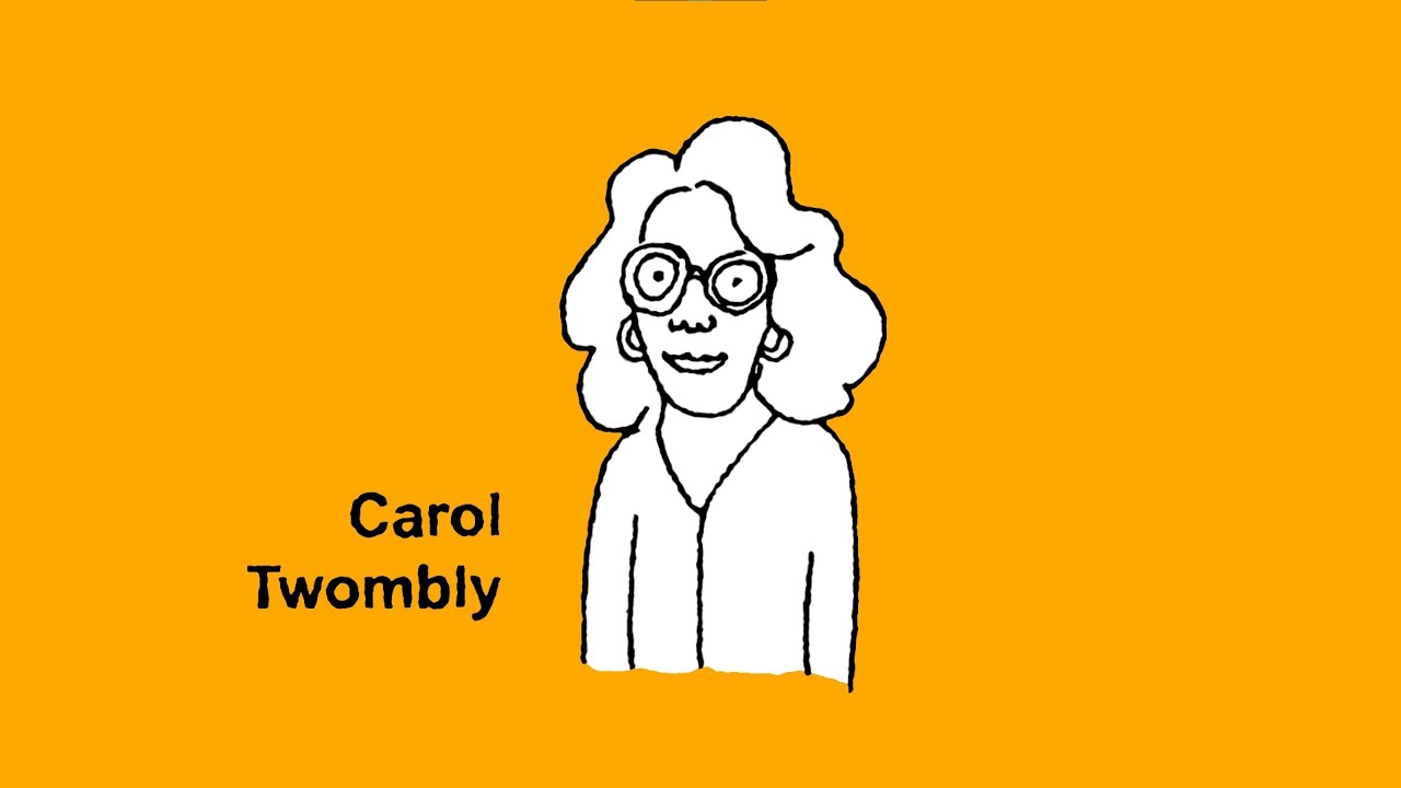
American type designer whose brief career yielded enduring classics. Born June 13, 1959, in Massachusetts.
Retired from type design in 1999 after 13 years. Impact remains massive.
Signature Typefaces
Trajan (1989) – based on Roman capitals from Trajan’s Column (AD 113). Became movie poster cliche. Elegant, authoritative inscriptional caps.
Adobe Caslon (1990) – refined revival of William Caslon’s work
Myriad (1992) – humanist sans designed with Robert Slimbach. Apple’s corporate font 2002-2017.
Lithos (1989) – Greek-inspired caps-only face
Charlemagne (1989) – inscriptional caps
Nueva (1994) – her final typeface
Chaparral (1997) – slab-serif influenced text face
Design Philosophy
Studied at Rhode Island School of Design, then Stanford.
Worked at Adobe 1988-1999.
Focused on historical revival with contemporary refinement.
Researched original sources meticulously.
Trajan studied from rubbings and photographs of actual column.
Brought calligraphic sensitivity to digital type.
Historical Impact
First woman to win Prix Charles Peignot (1994) from ATypI.
Her Adobe work helped establish digital type as equal to metal.
Trajan’s success proved classical forms worked in modern contexts.
Retired at peak of career to pursue other interests.
Left type design completely. Rare in field.
Notable Collaborations
Robert Slimbach – Adobe colleague, co-designed Myriad
Adobe Type Department – Sumner Stone, Fred Brady, others
Charles Bigelow – professor at Stanford
Won multiple awards including Frederic W. Goudy Award
Legacy in Modern Design
Trajan appears on countless movie posters. Some call it overused.
Myriad’s clean humanism influenced corporate sans-serif choices.
Adobe Caslon set standard for Caslon revivals.
Proved woman designer could create industry-defining work.
Brief career demonstrates quality over quantity.
Her types remain Adobe bestsellers decades later.
Jonathan Hoefler

American type designer and co-founder of influential foundry. Born August 22, 1970, in New York.
Built one of most respected independent type companies.
Signature Typefaces
Hoefler Text (1991) – created for Apple at age 21. Shipped with Mac OS.
Gotham (2000) – designed with Tobias Frere-Jones. Became Obama campaign’s visual voice. Based on Port Authority Bus Terminal lettering.
Knockout (1994) – condensed sans family with 32 widths
Didot (1991) – revival of Firmin Didot’s neoclassical types
Mercury (1996) – newspaper text family for harsh printing conditions
Whitney (2004) – designed for Whitney Museum
Chronicle – text and display family
Archer (2001) – geometric slab serif
Design Philosophy
Studied with Ed Benguiat at School of Visual Arts.
Started type design company at 21.
Focuses on custom corporate typefaces and licensing.
Believes typefaces should solve specific problems.
Gotham’s “architectural simplicity” came from vernacular American lettering.
Emphasizes extensive testing in intended use conditions.
Historical Impact
Founded The Hoefler Type Foundry (1989), later Hoefler & Co.
Partnership with Tobias Frere-Jones (1999-2014) produced major work.
2014 split became public, bitter lawsuit over ownership and credit.
Obama 2008 campaign’s use of Gotham made it cultural phenomenon.
Designed custom fonts for Wall Street Journal, New York Times Magazine, Sports Illustrated.
Notable Collaborations
Tobias Frere-Jones – design partner 1999-2014 (ended contentiously)
Apple – commissioned Hoefler Text early in career
Whitney Museum, Tiffany & Co., Martha Stewart Living – custom type clients
Jesse Ragan – collaborator on several projects
Won AIGA Medal (2013 with Frere-Jones)
Legacy in Modern Design
Gotham’s success proved vernacular sources could yield major commercial types.
His business model of custom fonts for brands influenced industry.
High-end boutique foundry approach became template for others.
Hoefler Text introduced quality typography to millions of Mac users.
2014 split highlighted tensions in design partnerships and credit.
Tobias Frere-Jones

American type designer known for clean, usable typefaces. Born August 28, 1970, in New York.
Prolific designer whose fonts are everywhere.
Signature Typefaces
Gotham (2000) – co-designed with Jonathan Hoefler. Obama campaign font. Based on NYC vernacular lettering.
Interstate (1993-94) – based on FHWA highway signage. Clear, neutral, American.
Poynter Oldstyle (1997-2000) – for newspaper Poynter Institute
Fibonacci (2010) – experimental proportional system
Tungsten (2009) – narrow sans for tight spaces
Armada (2010) – bold sans serif
Mallory (2015) – first typeface after split with Hoefler
Retina – designed for screens before tablets arrived
Design Philosophy
Studied at Rhode Island School of Design.
Interested in vernacular American typography – signs, packaging, lettering.
Interstate proved highway signs could inspire elegant fonts.
Believes in systematic, engineered approach to type families.
Extensive optical corrections to maintain visual consistency across weights.
Historical Impact
Started designing type as teenager.
Worked at Font Bureau before partnering with Hoefler (1999).
Hoefler & Frere-Jones partnership produced some of decade’s most important types.
2014 lawsuit against Hoefler over partnership dissolution made headlines.
Claimed he was 50% partner but paid as employee.
Settlement reached but details confidential.
Notable Collaborations
Jonathan Hoefler – partner 1999-2014 (disputed credit afterwards)
Font Bureau – early employer in 1990s
David Berlow – Font Bureau founder and mentor
Corporate clients: Nike, General Electric, Saks Fifth Avenue
Jesse Ragan, Sara Soskolne – collaborators at Frere Jones Type
Legacy in Modern Design
Interstate everywhere in American design. Authentic American voice.
Gotham defined late 2000s aesthetic. Still ubiquitous.
2014 split raised questions about design credit and partnership equity.
His work shows American vernacular can inspire world-class typography.
Continues prolific output through Frere Jones Type.
Erik Spiekermann
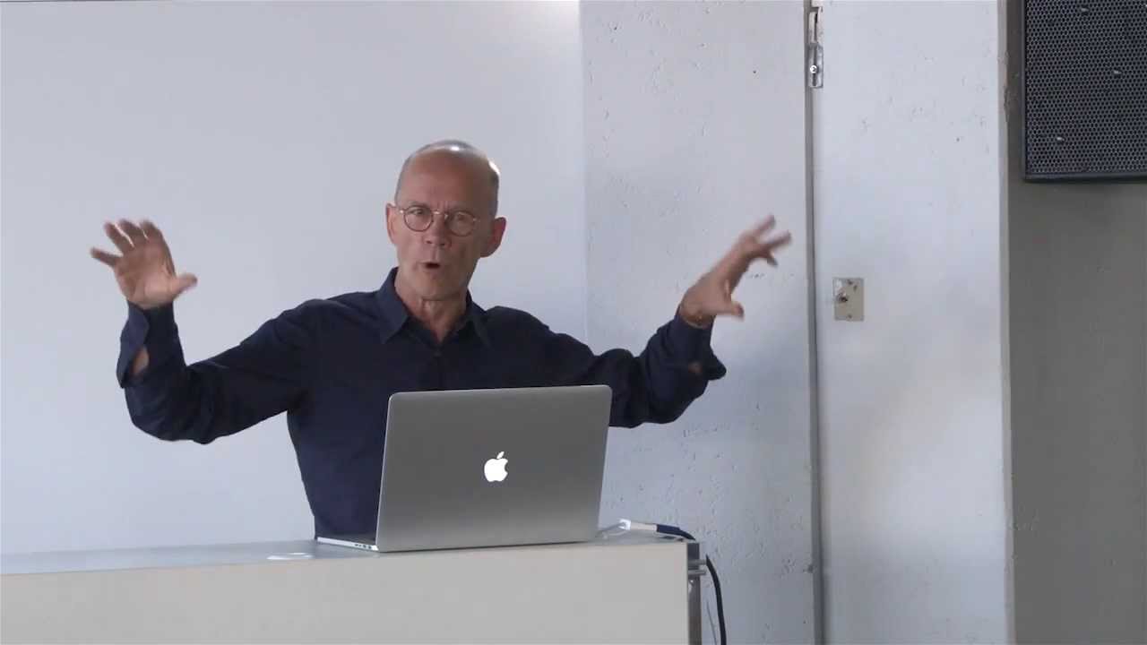
German typographer, graphic designer, and font designer. Born May 30, 1947, in Stadthagen, Lower Saxony.
“Typographic conscience” of German design.
Signature Typefaces
FF Meta (1991) – called “Helvetica of the ’90s.” Originally rejected by German Post Office. Released independently to massive success.
ITC Officina (1990) – sans and serif designed for office use
FF Info (2000) – wayfinding typeface
FF Unit (2009) – grotesque sans
Axel – narrow sans serif
Berliner Grotesk – for Berlin Transit
Designed corporate typefaces for Deutsche Bahn, Bosch, Audi, Mozilla
Design Philosophy
“Type is beautiful, get over it.”
Advocates for better typography in everyday life, not just elite design.
Founded multiple design studios and foundries.
Believes type should be functional first, beautiful second.
Meta designed to work in terrible fax reproduction. Constraints bred innovation.
Passionate educator and advocate for good design.
Historical Impact
Founded MetaDesign (1979), became Germany’s largest design firm.
Co-founded FontShop (1989), first mail-order digital font retailer.
Co-founded FontFont library (1990), releasing Meta and hundreds of faces.
Designed signage for Berlin Transit, improving legibility dramatically.
Wrote and spoke extensively on typography and design practice.
Notable Collaborations
Joan Spiekermann – wife and business partner
Oded Ezer, Christian Schwartz – fellow type designers
FontFont – co-founded with Neville Brody
UDN (United Designers Network) – global design collective
Corporate clients reshaping German visual landscape
Legacy in Modern Design
FF Meta proved independent foundries could compete with giants.
FontShop/FontFont changed how designers bought fonts.
His activism for better design influenced public projects across Germany.
Berlin Transit system shows his work daily to millions.
Continues designing, writing, teaching into his 70s.
Proves type design career can span decades with continued relevance.
Neville Brody
British graphic designer and typographer who defined 1980s style. Born April 23, 1957, in London.
Magazine design revolutionary turned digital pioneer.
Signature Typefaces
Industria (1984) – geometric sans with angular forms
Insignia (1989) – bold condensed face
Blur (1991) – bitmap experimental face
FF Autotrace – digital experimentation
FF Blur – pushed digital limitations
Designed numerous custom faces for The Face magazine that were later commercialized.
FontFont library releases in 1990s explored digital possibilities.
Design Philosophy
Started as punk-influenced designer in late 1970s.
Broke typography rules deliberately in The Face magazine.
Mixed faces, weights, sizes in radical layouts.
Embraced digital type early, seeing creative potential.
“The way something is presented will define the way you react to it.”
Believed in visual hierarchy through unconventional means.
Historical Impact
Art direction of The Face (1981-86) revolutionized magazine design.
Also designed Arena, Actuel magazines with similar impact.
His 1980s work influenced generation of designers.
Co-founded FontFont with Erik Spiekermann (1990).
FontShop International brought designer fonts to desktop publishers.
Founded Research Studios (1994) as multidisciplinary design practice.
Notable Collaborations
Erik Spiekermann – FontFont co-founder
The Face, Arena – magazines defining his aesthetic
Jon Wozencroft, Malcolm Garrett – fellow British designers
Corporate clients: Nike, BBC, Homechoice, Dom Pérignon
Dean of School of Communication at Royal College of Art (2011-18)
Legacy in Modern Design
The Face layouts remain touchstone for editorial design.
Showed magazines could be art, not just information delivery.
FontFont democratized access to cutting-edge type.
His 1980s work still copied and referenced.
Industria’s harsh geometry captured decade’s aesthetic.
Proved graphic designers could successfully design type.
Paula Scher
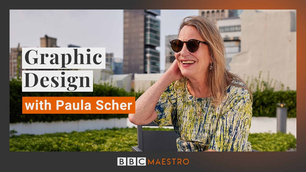
American graphic designer and painter. Born October 6, 1948, in Washington, D.C.
First female principal at Pentagram. Typography-driven design.
Signature Typefaces
Primarily known for typographic design rather than font design.
Created numerous custom lettering and logotypes.
Her hand-drawn environmental typography for buildings and interiors influential.
Designed identities where lettering is central: Public Theater, Citibank, Tiffany & Co.
Not a traditional typeface designer but master of typographic form.
Design Philosophy
“Type can be used to reflect or comment on content.”
Uses typography as primary design element.
Hand-drawn maps covered with layers of text.
Believes good design is obvious, great design is transparent.
Her Public Theater identity uses bold wood type aesthetic.
Historical Impact
Album cover designer in 1970s-80s for CBS and Atlantic Records.
Joined Pentagram in 1991, first female principal.
Public Theater identity (1994) became iconic of 1990s New York.
Her maps and environmental graphics blur art and design.
Notable Collaborations
Pentagram partners – collaborative design practice
Public Theater, New 42nd Street – defining New York identities
Museum of Modern Art, Bloomberg – corporate and cultural clients
School of Visual Arts – educator
AIGA Medal recipient (1998)
Legacy in Modern Design
Proved typography could be painterly and expressive.
Public Theater work influenced generation of designers.
Her maps shown in museums as fine art.
Pentagram partnership helped legitimize women in top design roles.
Shows boundary between graphic design and fine art is porous.
Massimo Vignelli
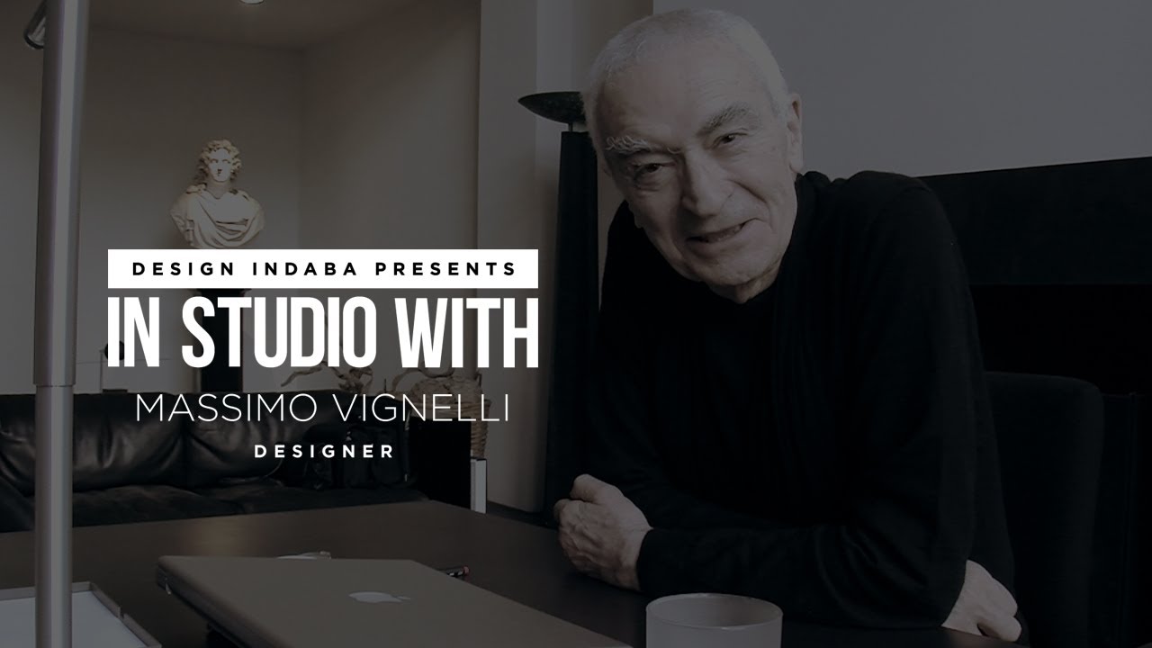
Italian designer who brought European modernism to America. Born January 10, 1931, in Milan. Died May 27, 2014, in New York.
Designed everything from furniture to subway maps.
Signature Typefaces
Didn’t design original typefaces but championed specific fonts.
Famous for limiting palette to six faces: Bodoni, Helvetica, Futura, Garamond, Century Expanded, Optima.
“In the new computer age the proliferation of typefaces has become unbelievable. We cannot distinguish the wheat from the chaff.”
Designed with restraint. Used few typefaces masterfully.
Design Philosophy
“If you can design one thing, you can design everything.”
Modernist believing in timeless design over trends.
Grid systems, limited color palettes, classic typefaces.
Information should be clear and beautiful.
Form follows function, but both matter.
Historical Impact
Co-founded Unimark International (1965), spreading Swiss-style modernism.
Designed NYC Subway map (1972) – controversial rationalization.
American Airlines identity, Bloomingdale’s bags, Knoll graphics.
Founded Vignelli Associates (1971) with wife Lella.
Designed signage for National Parks, DC Metro.
Notable Collaborations
Lella Vignelli – wife and design partner for 50+ years
Bob Noorda – Unimark co-founder
Corporate clients: American Airlines, Ford, IBM, Xerox
The Vignelli Canon taught design principles simply
Legacy in Modern Design
NYC Subway map remains debated. Abstract versus representational.
His six typeface philosophy influenced minimalist design.
Proved designer could work across all scales and media.
American Airlines identity lasted decades.
Shows modernist principles can have longevity.
Zuzana Licko

Slovak-American type designer and digital typography pioneer. Born 1961 in Bratislava, Czechoslovakia.
Co-founder of Emigre, digital type’s cutting edge.
Signature Typefaces
Oakland (1985) – bitmap font designed for screen, not print
Emperor (1985) – lo-res bitmap
Modula series – geometric, modular construction
Mrs Eaves (1996) – revival of Baskerville named after his wife Sarah Eaves
Filosofia (1996) – based on Bodoni
Solex (2000) – designed for small sizes
Base 9 and Base 12 – early bitmap experiments
Her early bitmap fonts defined computer age aesthetic.
Design Philosophy
“Computers allow us to create typefaces unthinkable before.”
Embraced digital constraints as design opportunities.
Early work used bitmap limits creatively.
Later shifted to high-resolution outline fonts.
Mrs Eaves proves classical revivals can have warmth and personality.
Kerning in Mrs Eaves encourages ligatures.
Historical Impact
Founded Emigre magazine and foundry (1984) with Rudy VanderLans.
Emigre magazine showcased digital typography’s possibilities.
Her fonts were among first designed for desktop publishing.
Challenged traditional typography establishment.
Showed digital type could be expressive, not just functional.
Notable Collaborations
Rudy VanderLans – husband and Emigre co-founder
Emigre magazine – platform for experimental typography
Influenced by postmodern design and deconstruction
California College of Arts faculty
Legacy in Modern Design
Early bitmap fonts now nostalgic reminders of digital age’s birth.
Mrs Eaves one of most beloved Baskerville interpretations.
Emigre changed independent type publishing.
Proved woman designer could lead typographic revolution.
Desktop publishing wouldn’t look same without her work.
Jessica Hische
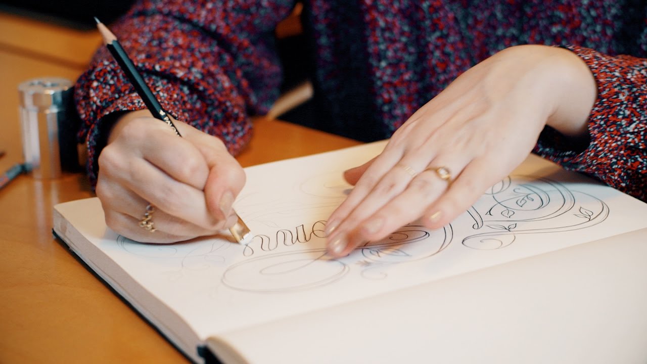
American lettering artist and type designer. Born April 4, 1984, in South Carolina.
Brings warmth and craft to digital age.
Signature Typefaces
Tilda (2007) – graceful script
Buttermilk (2012) – versatile script family
Dulcinea (2013) – romantic serif
Cafelita – casual connected script
Argumentum (2011) – headline serif
Known more for custom lettering than font families.
Her illustrated drop caps and title lettering appear in books and magazines.
Design Philosophy
“The difference between good and great is attention to detail.”
Focuses on ornamental typography and illustration.
Hand-drawn aesthetic in digital tools.
Believes in procrastiworking (productive procrastination).
Her work bridges traditional sign painting and modern design.
Historical Impact
Worked at Louise Fili Ltd., learned traditional approaches.
Freelance since 2009, commanding major projects.
Moonlighting typographic website educated designers about terminology.
Daily Drop Cap project (2009-2010) built following and skills.
Notable Collaborations
Louise Fili – early employer and mentor
Wes Anderson – designed titles for Moonrise Kingdom
Penguin Books – redesigned Classic series covers
The New York Times, Target, Tiffany & Co. – major clients
AIGA Medal (2019)
Legacy in Modern Design
Proves hand lettering thrives in digital age.
Drop Cap project inspired many similar daily design challenges.
Her educational outreach demystifies typography.
Shows design career can combine commercial work and personal projects.
Represents new generation bringing warmth to modernism.
FAQ on Famous Typographers
Who is the most famous typographer in history?
Claude Garamond and Johannes Gutenberg dominate discussions about famous typographers. Garamond’s 16th-century romans influenced typography for centuries.
However, modern designers often cite Adrian Frutiger, whose Univers and Frutiger typefaces shaped contemporary visual communication globally.
What did Stanley Morison design?
Stanley Morison created Times New Roman in 1932 for The Times newspaper. It became the 20th century’s most successful typeface.
He also advised Monotype Corporation, commissioning Gill Sans, Perpetua, and reviving classic faces like Bembo and Garamond for modern printing.
Why is Helvetica so popular?
Max Miedinger’s 1957 design offered clean, neutral legibility that suited corporate communications. Its high x-height and tight spacing created dense, modern appearance.
Helvetica became synonymous with Swiss design and International Typographic Style, dominating signage, branding, and government communications worldwide.
What typefaces did Hermann Zapf create?
Hermann Zapf designed over 200 typefaces including Palatino (1948), Optima (1958), and Zapfino (1998). Palatino became a core PostScript font.
Optima’s flared sans-serif bridges traditional and modern design. Zapf Dingbats provided symbols and ornaments still widely used today.
Who designed Futura?
Paul Renner designed Futura between 1924-1927 for Bauer Type Foundry. The geometric sans-serif embodied Bauhaus design principles.
Despite Nazi persecution calling it “cultural Bolshevism,” Futura became one of history’s most influential typefaces, used from corporate identities to the Apollo 11 moon plaque.
What is Jan Tschichold known for?
Jan Tschichold wrote “Die neue Typographie” (1928), defining modernist graphic design principles. He later rejected these ideas as too rigid.
His Sabon typeface (1967) and redesign of 500 Penguin Books established lasting standards. His career shows how designers’ philosophies evolve dramatically.
Who created the first sans-serif typeface?
William Caslon IV released the first sans-serif in 1816. However, earlier examples existed.
Modern sans-serif fonts emerged in 19th century as grotesques. Akzidenz-Grotesk (1898) influenced later designs like Helvetica and Univers, establishing the neo-grotesque style.
What makes a typeface historically important?
Historical significance comes from innovation, widespread adoption, or solving design problems. Garamond established independent typefounding.
Baskerville bridged old style and modern. Bodoni defined Didone types. Technical advances like Frutiger’s systematic families or Carter’s screen-optimized designs also create lasting impact.
How did digital technology change type design?
Digital tools democratized type design, enabling independent foundries like Emigre and FontFont. Zuzana Licko’s bitmap fonts embraced early computer limitations creatively.
Designers like Matthew Carter solved screen legibility challenges with Verdana and Georgia. Variable fonts now offer unprecedented flexibility.
Which typographers influenced modern branding?
Adrian Frutiger’s airport signage systems set wayfinding standards. Erik Spiekermann’s FF Meta became corporate favorite.
Tobias Frere-Jones and Jonathan Hoefler’s Gotham defined 2000s aesthetics through Obama’s campaign. Massimo Vignelli’s restrained approach using limited typeface palettes influenced minimalist corporate identity.
Conclusion
These famous typographers shaped how we read and communicate today. Their work spans centuries, from the refined elegance of Garamond to the bold clarity of Helvetica.
Each designer brought something different. Paul Renner gave us Futura. Hermann Zapf created Palatino. Matthew Carter designed typefaces that work beautifully on screens.
What connects them all? A deep understanding of letterform design and visual communication.
Their influence reaches beyond font creation. They established principles of typographic hierarchy and legibility that designers still follow.
Typography history isn’t just academic. It’s practical knowledge that makes your work better.
Study these masters. Learn from their decisions. Then find your own typographic voice.

Renowned for his expertise in logo design and visual branding, Bogdan has developed a multitude of logos for various clients.
His skills extend to creating posters, vector illustrations, business cards, and brochures. Additionally, Bogdan's UI kits were featured on marketplaces like Visual Hierarchy and UI8.
He also wrote in the past years on sites like Design Your Way, WebDesignerDepot, WPDean, Designmodo, Speckyboy, Slider Revolution, and more.
- Canva vs PowerPoint: Which Is Better for Presentations? - 22 September 2026
- How to Install Fonts on Mac (Step-by-Step Guide) - 20 September 2026
- From Mockup to Code: How AI-Augmented Development Speeds Up the Design Handoff - 19 September 2026

Bogdan Sandu is a seasoned designer who has been designing websites since 2008. Renowned for his expertise in logo design and visual branding, Bogdan has developed a multitude of logos for various clients. His skills extend to creating posters, vector illustrations, business cards, and brochures. Additionally, Bogdan's UI kits were featured on marketplaces like Visual Hierarchy and UI8. He also wrote in the past years on sites like Design Your Way, WebDesignerDepot, WPDean, Designmodo, Speckyboy, Slider Revolution, and more.
You Might Also Like


