


The Bauhaus school lasted only 14 years. Its graphic design principles have lasted over a century.
Founded by Walter Gropius in 1919, the Bauhaus merged fine art with functional craft and produced a Bauhaus graphic design language built on geometric forms, sans-serif typography, grid-based layouts, and primary color palettes. That language went on to shape everything from Swiss Style posters to Google Material Design.
This article covers the school’s origins, the designers who built its visual identity, its typographic and color theory systems, and how Bauhaus composition principles show up in digital interfaces today.
What Is Bauhaus Graphic Design?
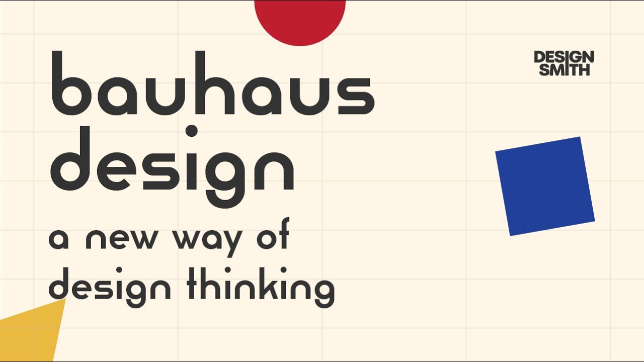
Bauhaus graphic design is a visual communication approach rooted in the Bauhaus school, which operated in Germany from 1919 to 1933. It treats design as a problem to solve, not a surface to decorate.
The school only lasted 14 years and educated no more than 1,250 students, according to UNESCO records. Yet its graphic output reshaped how the entire world thinks about layout, lettering, and printed materials.
At its core, Bauhaus graphic design strips away ornament. What stays is geometric form, sans-serif type, structured white space, and compositions built on function rather than decoration. The primary color palette leans hard on red, yellow, blue, black, and white.
What separates it from, say, Art Deco or other graphic design movements of the same era? Bauhaus refused to separate fine art from functional craft. A poster was given the same intellectual weight as a painting. Walter Gropius founded the school on that exact principle.
And this wasn’t some niche experiment. The global graphic design market was valued at roughly $52.32 billion in 2024, according to NextMSC research. A huge portion of that industry still runs on the foundations Bauhaus laid down a century ago.
Origins of the Bauhaus School and Its Visual Language

Walter Gropius opened the Staatliches Bauhaus in Weimar in 1919. His idea was straightforward (and radical for its time): merge fine arts, applied arts, and technology into a single educational system. No more walls between painting and industrial production.
The school didn’t start with the clean geometric look people associate with it today. Early Bauhaus leaned toward Expressionism. Johannes Itten ran the preliminary course with a focus on mysticism and personal expression. Paul Klee and Wassily Kandinsky brought abstract theory.
Then things shifted.
The Weimar Period and Early Experimentation
Between 1919 and 1925, the Weimar campus was where Bauhaus figured out what it wanted to be. Students worked across woodcut, lithography, etching, and collage. The lettering was handmade, sometimes wild.
I think people forget how messy early Bauhaus actually was. It wasn’t all grids and right angles. Lyonel Feininger’s postcards from this period look nothing like what most people imagine when they hear “Bauhaus.”
The big turn came in 1923 when László Moholy-Nagy replaced Itten. Moholy-Nagy pushed clarity, technology, and universality across every workshop. That shift pulled the school away from craft-based Expressionism and toward the functional, industrial look that defines Bauhaus graphic output.
The Dessau Shift Toward Standardization
Political pressure forced the school out of Weimar in 1925. The move to Dessau changed everything.
Gropius designed the new campus building himself. Glass curtain walls, flat roofs, open floor plans. The architecture matched the design philosophy: transparent, functional, without excess. UNESCO inscribed the Bauhaus sites in Weimar and Dessau as World Heritage Sites in 1996.
Dessau is where Bauhaus graphic design really locked in. Herbert Bayer took over the newly formed typography and advertising workshop. Grid systems became standard. Serif typefaces were abandoned almost entirely. Poster design turned into an exercise in geometric precision.
The school moved once more to Berlin in 1932, but lasted barely a year before the Nazis shut it down in 1933. By then, though, the visual language was fully formed. And when the faculty scattered across Europe and America, they carried Bauhaus principles with them.
Key Designers Who Shaped Bauhaus Graphics

The visual identity of Bauhaus graphic design wasn’t invented by a committee. A handful of specific people built it, each contributing something distinct.
Among the most recognized figures in graphic design history, several came directly from the Bauhaus faculty or student body. Their work in print, advertising, and exhibition materials set templates that still hold up.
Herbert Bayer’s Universal Typeface
Herbert Bayer directed the Bauhaus print and advertising workshop in Dessau starting in 1925. His biggest contribution? The Universal typeface.
It was a geometric font built entirely from circles, straight lines, and simple arcs. No uppercase letters. No serifs. Bayer argued that capital letters were unnecessary, a waste of production time and visual clutter. As he put it, the goal was a single-case alphabet that could function efficiently in a technological society.
The Universal typeface was never actually cast into metal type during Bayer’s time at the school. It existed only as drawings and was used for signage, book covers, and internal Bauhaus publications. But the idea stuck. Its influence shows up clearly in later typefaces like Futura (Paul Renner, 1927) and eventually in digital faces like Architype Bayer (1997).
Bayer later moved to the United States, where he designed corporate branding for Atlantic Richfield Company and worked as art director for advertising agency Dorland. The MoMA called him an “artistic polymath.”
László Moholy-Nagy and the New Typography
If Bayer was the typographer, Moholy-Nagy was the one who rewired how the Bauhaus thought about visual communication as a whole.
He replaced Itten’s mystical approach with a focus on photography, photomontage, and machine-age production. His 1929 statement that typographic communication “must be communication in its most intense form” became a guiding principle.
Moholy-Nagy integrated photography directly into graphic layouts, mixing photomontage with strict typographic structure. This was a break from traditional illustration-based print work. After the Bauhaus closed, he founded the New Bauhaus in Chicago in 1937 (later the Institute of Design at Illinois Institute of Technology), carrying these ideas into American design education.
Joost Schmidt deserves mention here too. His 1923 poster for the Bauhaus exhibition in Weimar is one of the most reproduced examples of Bauhaus graphic composition. Bold geometric letterforms, asymmetric layout, and a tight interplay of form and text.
Josef Albers approached graphics from a different angle. His modular alphabet experiments broke letterforms into interchangeable geometric segments (rectangles, semicircles, quarter circles arranged on a grid). This stencil-based approach treated letters as systems, not individual drawings.
Typography in Bauhaus Graphic Design

Bauhaus typographic practice wasn’t about making text look pretty. It was about making text work harder. Every decision had a functional reason behind it.
The U.S. Bureau of Labor Statistics reported 265,900 graphic designers employed in the United States in 2024. Most of them work with type systems that trace back, whether they know it or not, to ideas tested at the Bauhaus a century ago.
Rejection of Traditional Lettering
Before Bauhaus, German printing was dominated by blackletter (Gothic) typefaces. Ornate, heavy, loaded with calligraphic tradition. The Bauhaus workshop rejected all of that.
Bayer and his students used almost exclusively sans-serif faces. Text was justified with wider spacing between letters and words. There was more contrast between different type sizes to build clear typographic hierarchy.
Bayer’s push to eliminate capital letters entirely was the most radical move. His argument was practical: we don’t speak in capitals, so why write in them? The Universal typeface dropped the uppercase completely.
Influence from Jan Tschichold
Jan Tschichold wasn’t a Bauhaus faculty member, but his 1928 book Die neue Typographie codified many principles that Bauhaus typographers were already practicing. Asymmetric text alignment. Functional use of leading and spacing. Clear hierarchies built through size, weight, and position rather than decoration.
Tschichold’s work gave the Bauhaus approach a published theoretical framework. It spread the ideas to typographers who had never set foot in Dessau or Weimar.
| Bauhaus Typographic Principle | Traditional Approach | Bauhaus Alternative |
|---|---|---|
| Letterform style | Blackletter, serif, decorative | Geometric sans-serif only |
| Case usage | Upper and lowercase | Lowercase only (Bayer’s Universal) |
| Text alignment | Centered, symmetrical | Flush left, asymmetric |
| Visual hierarchy | Ornamental borders, rules | Size contrast, weight, spatial position |
Color Theory and Composition in Bauhaus Graphics

Color at the Bauhaus was not decoration. It was data. Every hue had a job to do, and the faculty built entire theoretical systems around how color and shape should interact.
Kandinsky’s Color-Form Theory
In 1923, Wassily Kandinsky circulated a questionnaire across the Bauhaus community. Students and faculty were asked to assign the three primary colors (red, yellow, blue) to three basic shapes (triangle, square, circle).
The “correct” answers, according to Kandinsky: yellow = triangle, red = square, blue = circle.
He achieved a strong consensus. Whether that was genuine agreement or peer influence is another question (Oskar Schlemmer, for one, disagreed). But the equation stuck. It showed up in Peter Keler’s famous cradle design, in Bayer’s wall mural proposals, and across Bauhaus exhibition materials for years.
Research published in Frontiers in Psychology later tested Kandinsky’s associations using implicit association tests and found no evidence for a universal color-shape correspondence. The theory was likely shaped by Kandinsky’s own synesthesia and the closed feedback loop of the Bauhaus community. Still, as a design framework, it worked. It gave students a shared language for color theory decisions.
How Color Functioned in Print
Limited palettes were the rule. Most Bauhaus graphic work stuck to primary colors plus black and white. This wasn’t just aesthetic preference. Printing in fewer colors was cheaper and faster, which mattered when the Dessau workshop was producing commercial work to fund the school.
Josef Albers, who later published Interaction of Color in 1963, developed his foundational color psychology research at the Bauhaus. His exercises taught students that color is relative. The same hue looks completely different depending on what sits next to it.
Albers’s work proved something practical: you don’t need a huge complementary palette to create visual impact. Tight constraints force better decisions. A red circle on a yellow field reads differently than the same red on black. Bauhaus designers used this deliberately.
According to G2 research, 93% of purchasing decisions are influenced by visual appearance. The Bauhaus figured this out in the 1920s, decades before anyone had marketing data to back it up.
Bauhaus Poster Design and Print Materials

The posters are where all the theory hits paper. Literally.
Bauhaus advertising and exhibition materials were not side projects. They were the public face of the school. Every poster doubled as a statement of principles.
The 1923 Weimar Exhibition Poster
Joost Schmidt’s poster for the 1923 Bauhaus exhibition is probably the single most referenced piece of Bauhaus graphic design. It combines bold geometric letterforms with a structured, clear visual hierarchy, diagonal text elements, and a tightly controlled composition.
No illustration. No photographic image. Just shapes, type, and careful spatial relationships. It looks like it could have been made last year, which says something about how well the graphic design principles hold up.
Commercial and Editorial Work
The Dessau workshop produced real commercial projects. These weren’t academic exercises. Local businesses in Dessau hired the school to produce printed materials as a way to help fund operations.
Bayer’s poster for a 1926 Kandinsky exhibition and his 1927 applied arts poster represent peak Bauhaus typographic execution. Clean sans-serif lettering, diagonal composition, clear emphasis through scale changes.
Bauhaus magazine covers and school catalogs also carried the visual identity forward. These publications used photomontage (Moholy-Nagy’s influence), strict baseline grids, and modular layouts.
After leaving the Bauhaus, Bayer served as art director at German Vogue and later designed the landmark Bauhaus 1918–1928 exhibition at the Museum of Modern Art in New York in 1938, alongside Walter Gropius. That show introduced Bauhaus graphic and industrial design to an American audience for the first time.
IBISWorld data shows there are roughly 415,468 graphic design businesses worldwide as of recent reporting, an 11.4% increase from 2020. The commercial design work that Bauhaus pioneered in Dessau (producing real client projects alongside teaching) created a model that design studios still follow today.
How Bauhaus Graphic Design Influenced Swiss Style and Modernism

The line from Bauhaus to Swiss design is direct. Not a loose inspiration. A direct transfer of people, ideas, and methods.
The International Typographic Style (Swiss Style) emerged in the 1950s and 1960s, built on principles that Bauhaus had already tested: grid-based layouts, functional typefaces, objective photography, and asymmetric composition. Swiss designers refined these ideas into a tighter, more systematic framework.
Research and Markets data shows the corporate identity design market grew from $8.62 billion in 2024 to a projected $9.85 billion in 2025, at a 14.3% compound annual growth rate. The design systems driving that growth (consistent visual standards, type rules, color specifications) all trace back to the Bauhaus-to-Swiss pipeline.
From Bauhaus to Corporate Identity Systems
Paul Rand designed the IBM logo in 1956 using clean lines and bold sans-serif type. The same principles Bayer taught in Dessau.
Otl Aicher (a co-founder of the Ulm School, the Bauhaus successor) created Lufthansa’s visual identity in 1963, along with the pictogram system for the 1972 Munich Olympics. Braun’s product design, guided by Dieter Rams, drew from the same functional aesthetic.
These weren’t isolated cases. According to Wikipedia’s entry on Swiss Style, the universal nature of Swiss graphics “had a fundamental influence on the formation of corporate identity” globally. Large American and Japanese corporations adopted Swiss Style systems because they worked across cultures and languages.
| Company | Designer/Connection | Bauhaus Principle Applied |
|---|---|---|
| IBM | Paul Rand | Geometric sans-serif, grid structure |
| Lufthansa | Otl Aicher (Ulm School) | Modular identity system, pictograms |
| Braun | Dieter Rams / Ulm groups | Form follows function, reductive design |
| Apple | Influenced by Rams/Bauhaus | Geometric clarity, minimal decoration |
The Ulm School as Bauhaus’s Successor
Artsy has called the Ulm School of Design “the most influential school of design after the Bauhaus.” It operated from 1953 to 1968 in Germany.
Max Bill, a former Bauhaus student who studied under Kandinsky and Klee, co-founded the school and served as its first rector. The initial faculty included Josef Albers and Walter Peterhans, both former Bauhaus instructors.
By 1958, Ulm student development groups were working directly with Braun, Lufthansa, and Herman Miller. The school’s “Ulm Model” of design education spread worldwide and shaped how brand identity design is taught today.
Bauhaus Graphic Design in Digital and Contemporary Practice
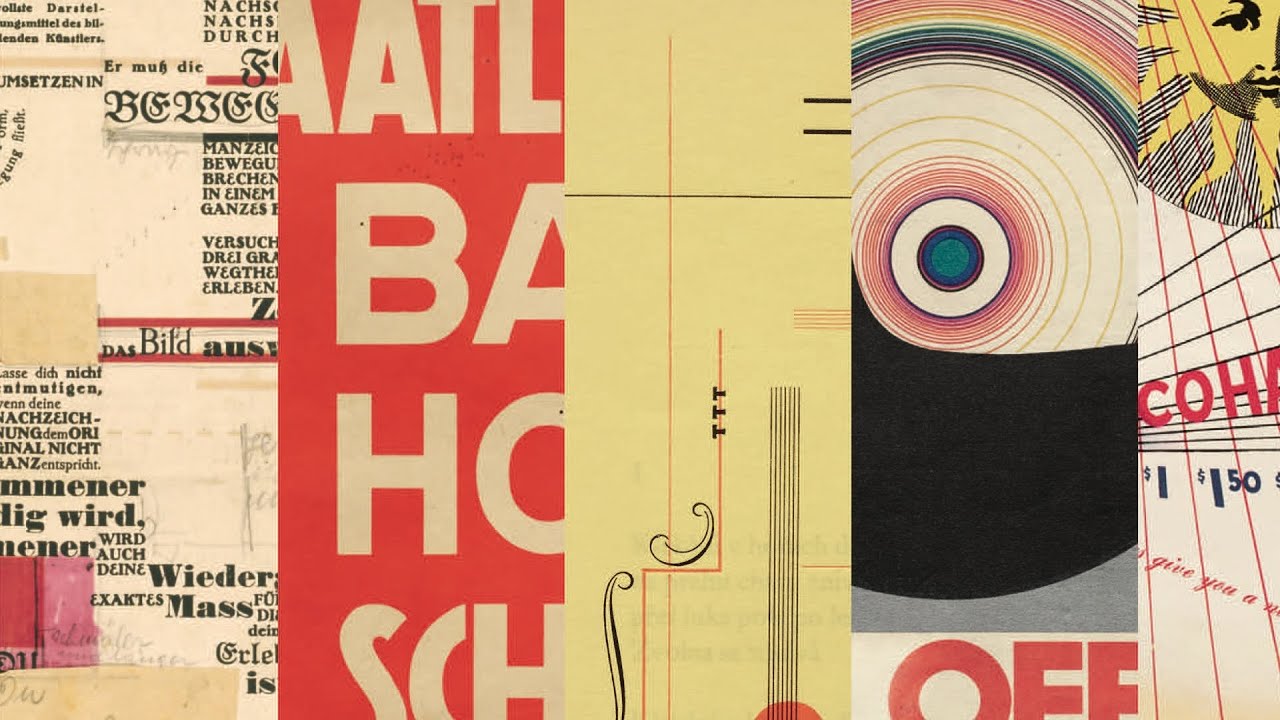
Bauhaus principles didn’t fade with print. They migrated into screens.
Flat design, which took over digital interfaces starting around 2012, pulls directly from Bauhaus and the Swiss Style. Wikipedia’s entry on flat design confirms this: the style “is primarily influenced by the International Typographic Style, text user interfaces, modernism, and the styles emerging from Bauhaus.”
Flat Design and Its Bauhaus Roots
Microsoft’s Metro design language (launched with Windows Phone 7 in 2010 and expanded in Windows 8) was based heavily on the Bauhaus movement, according to Hongkiat. Grid alignment, large typographic elements, and generous negative space made up the entire interface.
Apple’s iOS 7 (2013) stripped away skeuomorphic textures in favor of flat icons and clean type. Google Material Design followed in 2014, applying grid systems and geometric shapes to Android interfaces.
All three of the biggest tech platforms arrived at the same place Bauhaus had been in the 1920s. Functional form. Limited color saturation. No ornament for its own sake.
Bauhaus Influence in UI/UX Layout
Where it shows up:
- Baseline grids in web design frameworks (Bootstrap, Material UI)
- Type scale systems built on modular ratios
- Geometric shape usage in icon design and UI components
- Deliberate whitespace as a structural tool, not empty filler
Cropink data shows 73% of businesses reported increased investment in graphic design compared to the previous year. Much of that spending goes into digital product design where Bauhaus layout principles are the default starting point, whether the designers realize it or not.
Figma, Adobe XD, and Sketch all ship with grid and layout tools that would look familiar to anyone who studied at Dessau. The vocabulary has changed. The underlying structure hasn’t.
Common Misconceptions About Bauhaus Graphic Design

People get Bauhaus wrong more often than they get it right. A few corrections.
“Bauhaus Means Minimalism”
It doesn’t. Bauhaus means function-driven form. Sometimes that looks minimal. Sometimes it doesn’t.
Early Weimar-period work was highly experimental. Expressionist. Handmade. The clean geometric look that people associate with Bauhaus came later, after Moholy-Nagy’s arrival in 1923 and the move to Dessau. Reducing the entire movement to “minimalism” ignores half its history.
Actual minimalist graphic design as a distinct movement came decades later, and while it shares DNA with Bauhaus, the two aren’t interchangeable.
“All Sans-Serif Design Is Bauhaus”
Not even close. Sans-serif typefaces existed well before the Bauhaus school opened. Akzidenz-Grotesk dates to 1898.
What Bauhaus did was give sans-serif type a theoretical framework. Bayer’s Universal typeface wasn’t just a font choice. It was a philosophical argument: that lowercase-only, geometric letterforms could democratize reading and strip away class distinctions embedded in traditional German blackletter.
Using Helvetica on a website doesn’t make it Bauhaus. The typeface has to serve a function within a deliberate compositional system. That’s the difference.
“Bauhaus Was Anti-Color”
Kandinsky distributed color questionnaires. Albers built an entire career on color relationships. Klee painted in full palettes.
Bauhaus used restricted color intentionally, not because the faculty disliked color. Each hue had a purpose. Red meant something different from blue. Yellow occupied a specific position in the shape-color system. Color carried information, not decoration.
| Misconception | Reality |
|---|---|
| Bauhaus = minimalism | Function-driven form, not always minimal |
| All sans-serif is Bauhaus | Sans-serif predates Bauhaus by decades |
| Bauhaus rejected color | Used restricted palettes with assigned meaning |
| Lasted a generation | Only 14 years (1919–1933), 1,250 students total |
How to Apply Bauhaus Principles to Graphic Design Projects

The American Institute of Graphic Arts found that businesses with consistent brand presentation across all platforms can boost revenue by up to 23%. Bauhaus-informed design systems make that consistency possible.
These aren’t abstract ideas. They’re practical starting points for any project.
Building a Layout with Bauhaus Grid Logic
Grid first. Everything else second.
Before placing any visual element, define your grid structure. Bauhaus layouts used modular spacing, where columns and rows create predictable positions for type and image. This is exactly what modern web frameworks do with 12-column grids.
Use asymmetric composition instead of centering everything. Bauhaus designers avoided symmetrical layouts because they looked static. Offset placement creates visual movement and directs the eye through a clear focal point.
Choosing Type and Color the Bauhaus Way
Type selection: Limit yourself to one or two sans-serif families. If you need a second face, pair by contrast (a geometric sans with a humanist sans, for instance). Bauhaus designers didn’t mix five fonts. They worked within tight constraints and let scale and proportion do the heavy lifting.
Color rules:
- Assign specific meaning to each color in your palette
- Keep to primary colors plus neutrals when possible
- Use color contrast as a functional tool, not a decorative choice
Don’t study Pinterest boards labeled “Bauhaus aesthetic.” Study actual Bauhaus output. Look at Joost Schmidt’s 1923 exhibition poster, Bayer’s Kandinsky exhibition design from 1926, and the Bauhaus magazine covers. Those are the real reference points.
According to Digital Silk, 55% of first impressions of brands are based on visual elements. Getting the grid, type, and color right at the system level (the way Bauhaus taught) creates the kind of consistency that makes those first impressions stick.
FAQ on Bauhaus Graphic Design
What is Bauhaus graphic design?
Bauhaus graphic design is a visual communication approach from the Bauhaus school (1919–1933) that prioritizes geometric forms, sans-serif typography, grid-based layouts, and functional clarity. It strips away decorative elements in favor of purpose-driven composition.
Who founded the Bauhaus school?
Walter Gropius founded the Bauhaus in Weimar, Germany, in 1919. His goal was to unify fine art, craft, and industrial production into a single design education system that treated all creative disciplines equally.
Who were the key graphic designers at the Bauhaus?
Herbert Bayer, László Moholy-Nagy, Joost Schmidt, and Josef Albers shaped the school’s graphic output. Bayer created the Universal typeface. Moholy-Nagy introduced photomontage. Schmidt designed the iconic 1923 exhibition poster.
What is the Universal typeface?
Herbert Bayer’s Universal typeface (1925) was a geometric sans-serif alphabet using only lowercase letters. Built from circles, straight lines, and arcs, it rejected capital letters as unnecessary. It was never cast into metal type during Bayer’s time.
How did Bauhaus influence Swiss design?
Swiss Style (International Typographic Style) directly evolved from Bauhaus principles. Max Bill, a former Bauhaus student, co-founded the Ulm School of Design in 1953, bridging Bauhaus grid systems and functional typography into postwar Swiss graphic practice.
What role did color theory play at the Bauhaus?
Wassily Kandinsky assigned primary colors to basic shapes: yellow triangle, red square, blue circle. Josef Albers studied how colors interact relative to their surroundings. Color served as functional information, not decoration.
Is Bauhaus the same as minimalism?
No. Bauhaus means function-driven form, which sometimes looks minimal but isn’t always. Early Weimar-period work was expressionist and experimental. The clean geometric aesthetic people associate with Bauhaus came after 1923.
How does Bauhaus influence modern digital design?
Flat design in Microsoft Metro, Apple iOS 7, and Google Material Design all draw from Bauhaus and Swiss Style principles. Grid systems, geometric icons, sans-serif type, and structured whitespace in today’s UI/UX trace directly back to Bauhaus.
Why did the Bauhaus school close?
The Nazi regime shut down the Bauhaus in 1933, viewing its internationalism and modernist aesthetics as politically subversive. The school had already moved from Weimar to Dessau to Berlin under mounting political pressure throughout the late 1920s.
How can I apply Bauhaus principles to my design work?
Start with a grid structure before placing any visual elements. Limit your typeface selection to one or two sans-serif families. Assign purpose to each color. Strip anything that doesn’t serve a clear function in the composition.
Conclusion
Bauhaus graphic design packed a century of influence into 14 years of operation. From Herbert Bayer’s Universal typeface to Kandinsky’s color-form experiments, the school produced a systematic design language that still drives how we build layouts, choose type, and assign color.
The line from Dessau to the Ulm School to corporate identity systems at IBM and Lufthansa is direct. So is the connection to flat design interfaces across Microsoft, Apple, and Google platforms.
What makes Bauhaus principles durable is their focus on function over ornament. Grid structures, asymmetric composition, and restricted palettes work because they solve communication problems, not because they follow a trend.
The tools have changed. The thinking hasn’t.

Renowned for his expertise in logo design and visual branding, Bogdan has developed a multitude of logos for various clients.
His skills extend to creating posters, vector illustrations, business cards, and brochures. Additionally, Bogdan's UI kits were featured on marketplaces like Visual Hierarchy and UI8.
He also wrote in the past years on sites like Design Your Way, WebDesignerDepot, WPDean, Designmodo, Speckyboy, Slider Revolution, and more.
- Versatile Work Sans Font Pairing for Every Project - 16 September 2026
- Organize Digital Files Like a Pro Before Your Next Client Handoff - 16 September 2026
- How to Set Up a Digital Menu Board: Hardware to Layout - 15 September 2026

Bogdan Sandu is a seasoned designer who has been designing websites since 2008. Renowned for his expertise in logo design and visual branding, Bogdan has developed a multitude of logos for various clients. His skills extend to creating posters, vector illustrations, business cards, and brochures. Additionally, Bogdan's UI kits were featured on marketplaces like Visual Hierarchy and UI8. He also wrote in the past years on sites like Design Your Way, WebDesignerDepot, WPDean, Designmodo, Speckyboy, Slider Revolution, and more.
You Might Also Like


