Two columns of text that don’t line up. Headings with weird gaps underneath. Spacing that feels random from one section to the next. These are signs of a missing baseline grid.
So what is a baseline grid, and why do designers at Google, IBM, and Atlassian treat it as foundational to their layout systems?
A baseline grid is a series of evenly spaced horizontal lines that control where text and UI elements sit vertically on a page. It creates consistent spacing, keeps typography aligned across columns, and gives layouts a sense of visual order that readers feel even if they can’t name it.
This article covers how baseline grids work, how to set one up in tools like Figma and CSS, which grid sizes to pick, and when strict alignment actually matters versus when you can let go.
What Is a Baseline Grid
A baseline grid is a set of evenly spaced horizontal lines that control where text sits on a page or screen. Every line of type rests on one of these lines, much like how ruled notebook paper keeps handwriting straight.
The word “baseline” comes from typography, where the baseline is the invisible line that letterforms sit on. Descenders (the tails on letters like g, p, and y) drop below it, but everything else stays anchored.
Took me a while to actually understand why this matters. When you first hear “baseline grid,” it sounds like something only print designers care about. But the second you try to line up two columns of text and the lines don’t match across columns, you feel it.
The whole point is vertical rhythm. That consistent, repeating pattern of spacing that runs down your layout from top to bottom.
A baseline grid is not the same thing as a column grid or a grid system that divides a page into vertical sections. Column grids handle horizontal layout. Baseline grids handle vertical spacing. They work together, but they solve different problems.
Here’s a quick breakdown of how these grid types differ:
| Grid Type | Direction | Controls |
|---|---|---|
| Baseline grid | Horizontal lines (vertical spacing) | Line height, margins, padding |
| Column grid | Vertical columns | Content width, horizontal placement |
| Modular grid | Both directions | Rows + columns forming modules |
According to iA (Information Architects), roughly 95% of information on the web is written language. If almost everything on a screen is text, then controlling how that text flows vertically is a pretty big deal.
Design systems from Google, Apple, IBM, and Atlassian all build their spacing around a baseline unit. It’s foundational. Not optional.
How a Baseline Grid Controls Vertical Rhythm

Vertical rhythm is the consistent repetition of spacing as you move down a layout. A baseline grid creates this by forcing every text element (and ideally every UI component) to align to a shared spacing increment.
What a Baseline Unit Actually Is
You pick a number. Usually it’s tied to the line-height of your body text.
If your body copy is 16px with a 24px line-height, your baseline unit might be 8px (since 24 divides into 8 cleanly). Or it could be 4px for more flexibility.
Everything snaps to multiples of this unit. Margins, padding, line-heights. All of it.
What Happens When Vertical Rhythm Breaks
Misaligned text across columns. You’re reading a two-column article and the lines don’t sit at the same height. Your eye catches it, even if you can’t articulate why something feels off.
Inconsistent spacing between sections. One gap is 18px, another is 22px, another is 15px. No pattern. The layout just… drifts.
When vertical rhythm holds, the page has a quiet sense of order. Not rigid. Not boring. Just aligned.
A study from Deesignre tested designs built on an 8px grid system against designs with random spacing values. In 72% of cases, users chose the grid-aligned version as more visually appealing. And that was without being told what the difference was.
The Math Behind It
Base unit: Chosen from body line-height (commonly 4px or 8px).
Line-height: Must be a multiple of the base unit. A 16px font at 1.5x gives 24px line-height (divisible by both 4 and 8).
Spacing values: All margins and padding follow the unit. On a 4px grid: 4, 8, 12, 16, 20, 24, 32, 48.
Your mileage may vary depending on the project. But the core idea stays the same: one number drives everything.
Baseline Grids in Print vs. Digital Design
The baseline grid didn’t start on screens. It started on paper, hundreds of years ago.
Where It All Came From
Medieval scribes drew faint horizontal lines before lettering manuscripts. The Lindisfarne Gospels (around 700 CE) used a two-column layout combined with a baseline grid to keep text level and evenly spaced.
Fast forward to the 20th century. Josef Müller-Brockmann published Grid Systems in Graphic Design in 1961, which became the definitive reference for structured layout. Robert Bringhurst’s The Elements of Typographic Style pushed the typographic grid further into mainstream practice.
Both books came out of the Swiss design tradition, also called the International Typographic Style. The Bauhaus movement before it had already established the idea that rationality and functionality should drive visual decisions.
What Changes on Screens
Print baseline grids are rigid. You set the grid in Adobe InDesign or QuarkXPress, and type locks to it. Done.
Digital doesn’t work like that.
Screens have variable viewports. Content is dynamic. A user might resize their browser, switch from desktop to mobile, or bump up their system font size. Your carefully set 8px baseline now has to survive all of that.
On the web, text is positioned by line-height rather than by its actual baseline. That’s a subtle but real difference. As the team at designsystems.com notes, the same basic principle applies, but how the measurement works shifts between platforms.
The result? Most web designers these days follow what I’d call a “baseline-ish” approach. You stick to multiples of your base unit for spacing values, but you don’t obsess over whether every single descender sits on the exact grid line. Close enough, consistently applied, is the realistic standard for responsive layouts.
How to Set Up a Baseline Grid

Setting up a baseline grid starts with one decision: your base unit.
Look at your body text. If your body copy is 16px with a line-height of 24px, that gives you a 24px line-height to work from. A 4px or 8px base unit divides cleanly into 24.
Everything else builds from there. Margins, padding, component heights. All multiples of that unit.
Setting a Baseline Grid in Figma
Figma holds roughly 90% market share among UI designers according to the UX Tools 2023 survey, so this is where most people will set up their grid.
Select your frame. Open the layout grid panel on the right sidebar. Add a grid, then switch the type from “Grid” to “Rows.”
Row height: Set this to your baseline unit (4px or 8px).
Offset: Usually 0, unless you want to shift the starting point.
Gutter: Set to 0 for a true baseline grid (you’re not creating column-style gaps).
Snap your text layers to these rows. Use AutoLayout with margin and padding values that are multiples of your base unit.
A 2023 Forrester study found that Figma customers achieved a 328% ROI on average, with a significant chunk of that savings coming from design consistency and reduced handoff friction. Baseline grids play directly into that consistency.
Applying a Baseline Grid in CSS
CSS doesn’t have a “turn on baseline grid” button. You build it manually through consistent values.
Set your base font size (usually 16px, which is the browser default) and a line-height that’s a multiple of your base unit.
Every spacing value in your stylesheet follows the same system. If your unit is 4px:
- margin-bottom: 16px (4 × 4)
- padding: 24px (6 × 4)
- line-height: 24px for body, 32px for subheadings, 48px for headings
To debug it visually, use the repeating-linear-gradient trick. Add a transparent-to-colored gradient that repeats at your baseline increment. This gives you a visual overlay so you can check if everything actually lines up.
The tricky part: elements that don’t divide evenly into your unit. An image that’s 317px tall, for example. You’ll need to add compensating padding or margin to get the next element back on the grid. This is where the pragmatism kicks in.
Jake Giltsoff wrote in 2024 about how CSS has finally caught up. Two lines of code, using the new cap unit and calc(), can now push text down to the baseline without needing Sass or JavaScript. That’s a big shift from the workarounds designers used for the past 15+ years.
Common Baseline Grid Sizes and How to Choose One
Three numbers dominate: 4px, 8px, and 12px.
Which one you pick depends on what you’re building, how dense your UI is, and what design system (if any) you’re working within.
The 4px Grid
This has become the default in modern product design. Google’s Material Design uses a 4dp baseline grid. IBM’s Carbon Design System follows the same logic. Tailwind CSS uses padding and spacing as multiples of 4 (1 rem = 16px).
A 4px unit gives you granular control. You can hit values like 4, 8, 12, 16, 20, 24. That’s a lot of stops between “too tight” and “too loose.”
The 4px grid works especially well for mobile and content-dense interfaces. When an 8px increment feels too coarse for small components, 4px fills the gap.
The 8px Grid
Simple, fast, less to think about.
Your spacing values: 8, 16, 24, 32, 40, 48. Fewer options, quicker decisions. Most screen resolutions are divisible by 8 on at least one axis, which keeps everything pixel-perfect across devices.
The 8px grid became a standard between 2017 and 2018, popularized by designers like Elliot Dahl and adopted by companies like Google and IBM. It’s still widely used, especially on desktop-focused products.
The 12px Grid
Less common. You’ll see it in some editorial and print design workflows where the body text line-height happens to land on a 12px increment. It creates a wider visible rhythm but gives you fewer fine-tuning options.
How to Decide
| Base Unit | Best For | Trade-off |
|---|---|---|
| 4px | Dense UIs, mobile, complex layouts | More flexible, less visible rhythm |
| 8px | Desktop apps, dashboards, general web | Simpler to follow, less precision for small elements |
| 12px | Editorial design, long-form content | Wider rhythm, limited granularity |
Your body font size and line-height ratio should drive the decision. Start there, not with what’s trendy.
Where Baseline Grids Break Down

Baseline grids are a tool. And like any tool, there are situations where they make things harder instead of easier.
Mixed Type Sizes and Non-Text Elements
You’ve got a heading at 32px, body text at 16px, a caption at 12px, and an icon badge at 20px. Getting all of those to sit cleanly on the same baseline increment? Good luck.
Headings are the biggest offender. If your heading line-height doesn’t fall on a clean multiple of your base unit, everything below it shifts off the grid. The Imperavi UI Typography guide puts it bluntly: the grid creates trouble if you try to fit headings into a baseline multiple of 4 or 8px.
Images, buttons, cards, and other components have their own height logic. An avatar that’s 40px tall next to a text block with a 24px line-height won’t land on the same horizontal lines. You end up adding compensating margins to push things back into place.
Responsive Layouts
A fixed baseline unit that works on a 1440px desktop screen might create awkward spacing on a 375px phone. The relationships between elements shift when the viewport changes.
Some teams use different baseline increments at different breakpoints. Others just accept that strict baseline alignment is a desktop luxury. There’s no consensus here, honestly.
The Purist vs. Pragmatist Debate
Purists want every single line of text, every component, every piece of white space to land on the grid. No exceptions.
Pragmatists use the grid as a guide. They follow it for line-heights, spacing tokens, and major layout decisions, but they let go when optical balance matters more than mathematical precision.
Most working designers land on the pragmatist side. The vertical rhythm guide from Imperavi makes a good point: a baseline grid does not automatically give harmony or create balance by default. It’s just a system for keeping heights consistent. Actual good visual hierarchy comes from contrast, variety, and the relationship between elements.
When to Let Go
Icons, badges, notification dots, and small UI indicators often need optical alignment rather than grid alignment. Something can be mathematically centered but look wrong to the eye. In those cases, trust what looks right over what the numbers say.
Well, at least in my experience. Your mileage may vary depending on how pixel-obsessed your team is.
Baseline Grid and Typography Scale Relationship

A type scale and a baseline grid are two different systems that have to work together. The type scale determines how big your text is. The baseline grid determines how that text is spaced vertically.
Getting them to cooperate is one of the trickier parts of typographic hierarchy.
How Type Scales Work With Baseline Units
A type scale uses a ratio (like 1.25 or 1.333) to generate a progression of font sizes. Start at 16px, apply a 1.25 ratio, and your scale reads: 16, 20, 25, 31, 39.
The problem? Those numbers don’t all divide cleanly into your baseline unit.
A 25px heading on an 8px grid needs a line-height that’s a multiple of 8. The closest options are 32px (tight) or 40px (loose). Neither might feel perfect, and that’s the trade-off you’re constantly making.
Tools like Gridlover and Type Scale help you preview these combinations before committing. The Good Line-Height calculator, built specifically for baseline grids, is another one worth bookmarking.
Making Headings Snap to the Grid
| Element | Font Size | Line-Height (8px grid) | Line-Height (4px grid) |
|---|---|---|---|
| Body | 16px | 24px | 24px |
| H3 | 20px | 32px | 28px |
| H2 | 25px | 32px | 32px |
| H1 | 31px | 40px | 36px |
Notice how the 4px grid gives you more stops to land on. That’s exactly why it’s taken over in UI design, where heading sizes vary a lot across components.
The padding above and below headings is part of the equation too. A common approach: give the heading more space above than below, following Gestalt principles of proximity. The heading should feel connected to the content it introduces, not the content above it.
Material Design’s spacing method uses an 8pt component grid with a 4pt baseline grid for typography specifically because scaling line-heights in pure 8pt increments leaves too few options for different text sizes.
Baseline Grids in Design Systems
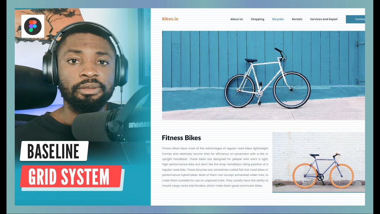
A baseline grid becomes significantly more powerful when it’s part of a design system. It stops being one person’s preference and becomes a shared rule that everyone follows.
The zeroheight Design Systems Report 2025 found that 79% of teams now have a dedicated design systems team, up from 72% in 2024. That growth means more organizations are formalizing spacing decisions rather than leaving them to individual designers.
How Major Design Systems Handle Spacing
Google Material Design: 8dp component grid, 4dp baseline grid. All spacing values are multiples of 4. Line-heights scale in 4dp increments.
IBM Carbon: Uses a 2x Grid system with an 8px mini unit. Leading and spacing derive from this unit across all platforms.
Atlassian Design System: 8px base unit forming the foundation of their space token system. Space.100 equals 8px, Space.200 equals 16px, and so on.
U.S. Web Design System (USWDS): Spacing unit tokens based on multiples of 8px, with additional tokens for smaller sizes. Used across all federal government digital products.
Spacing Tokens and the Baseline Connection
Design tokens have hit mass adoption. The zeroheight report shows token usage jumped from 56% in 2024 to 84% in 2025.
Spacing tokens are where the baseline grid meets code. Instead of a developer guessing “maybe 14px margin here?” they pull a named token that’s already a multiple of the base unit.
- spacing-xs: 4px
- spacing-sm: 8px
- spacing-md: 16px
- spacing-lg: 24px
- spacing-xl: 32px
Wise (the fintech company) uses semantic tokens linked to foundational spacing tokens. Their system separates what the space does (component-default, section-gap) from how big it is. That way, if the base unit changes, every component updates automatically.
Why Teams Without a Baseline Grid End Up Struggling
The Sparkbox 2022 Design Systems Survey found that only 16% of design system teams tracked metrics on their system’s usage. Without measurement, inconsistencies creep in fast.
Skip the baseline grid and you’ll notice it in production. Button heights don’t match across pages. Card components have subtly different padding depending on who built them. Font spacing drifts from one screen to the next.
A shared baseline unit prevents all of that. It’s the “contract” between design and development that keeps vertical spacing consistent without constant back-and-forth.
Does a Baseline Grid Actually Matter for Web Design

This is the question behind the search. Not “what is it” but “should I actually use one?”
The honest answer: it depends on what you’re building.
Arguments For Using a Baseline Grid
Consistency at scale. When ten designers work on the same product, a shared spacing system keeps things from going sideways. Every new screen starts from the same foundation.
Faster design decisions. You’re not debating whether this margin should be 13px or 15px or 17px. It’s 12 or 16. Done.
Easier developer handoff. A Remon Design analysis found that baseline grids make designs easier for frontend developers to read and implement, since spacing values follow a predictable pattern.
Figma data (2025) shows 84% of designers collaborate with developers at least weekly. Predictable spacing reduces friction in every one of those conversations.
Arguments Against Strict Baseline Grids
Matthew Butterick, the typographer behind Practical Typography, has said that baseline grids impose too much rigidity and too much work for too little benefit in book and website layouts. He reserves them for wide multi-column designs where misaligned baselines would actually be distracting.
Responsive layouts make strict grids harder to maintain. Elements resize, content reflows, and a fixed baseline unit can create awkward gaps on certain screen sizes.
There’s also the overhead. Setting up and debugging a baseline grid takes time, especially in CSS. For a simple marketing page or a single-column blog, the payoff might not justify the effort.
The Pragmatic Middle Ground
Most teams land here. Use the baseline unit as a spacing system (all values are multiples of 4 or 8) without demanding that every text baseline literally sits on the grid.
The repetition of consistent spacing values still creates visual unity and rhythm, even if the implementation isn’t pixel-perfect to the baseline.
| Use Case | Strict Baseline? | Why |
|---|---|---|
| Multi-column editorial sites | Yes | Text must align across columns |
| Dense app UIs | Soft grid (4px unit) | Spacing system matters, literal baseline less so |
| Single-column blogs | Optional | Consistent spacing helps, strict grid adds overhead |
| Marketing landing pages | Optional | Visual impact matters more than grid precision |
Delayed Gratification magazine is a good example of where strict baseline grids pay off. Every text element in their layouts aligns to a baseline, with a common technique of halving the baseline increment to create more layout options while keeping the discipline intact.
For most digital products, though, the “soft grid” approach gives you 90% of the benefit with a fraction of the complexity. Stick to your spacing scale, make sure line heights are multiples of your unit, and don’t lose sleep over whether a 40px avatar throws off your text alignment by 2 pixels.
FAQ on What Is A Baseline Grid
What is a baseline grid in graphic design?
A baseline grid is a set of evenly spaced horizontal lines that control vertical text placement. Every line of type sits on one of these lines, creating consistent spacing and alignment across your layout. It’s the foundation of vertical rhythm.
What is the difference between a baseline grid and a column grid?
A column grid divides space into vertical sections for horizontal layout. A baseline grid controls vertical spacing with horizontal lines. Column grids organize content width. Baseline grids organize content height. Most professional layouts use both together.
What baseline grid size should I use?
Start with your body text line-height. Most designers use a 4px or 8px base unit. The 4px grid gives more flexibility for dense interfaces. The 8px grid is simpler and works well for desktop layouts. Pick what divides cleanly into your line-height.
How do I set up a baseline grid in Figma?
Select your frame, open the layout grid panel, and switch the type to “Rows.” Set the row height to your base unit (4px or 8px), offset to 0, and gutter to 0. Then snap text layers to these rows using AutoLayout.
Can I use a baseline grid in CSS?
Yes, but you build it manually. Set your body font line-height as a multiple of your base unit, then apply consistent margin and padding values. Use the repeating-linear-gradient trick to create a visible debug overlay and check alignment.
Why does vertical rhythm matter in web typography?
Vertical rhythm creates a repeating pattern of spacing that makes layouts feel ordered and readable. Without it, text blocks drift into uneven gaps. Readers sense the inconsistency even if they can’t explain it. Consistent rhythm reduces visual noise.
Do I need a baseline grid for responsive web design?
Strict baseline alignment is hard to maintain across breakpoints. Most web designers use a “soft grid” approach instead, keeping spacing values as multiples of a base unit without forcing every text line onto the exact grid. Close enough works.
What is the 8px grid system?
The 8px grid system sizes all UI elements and spacing as multiples of 8 pixels. Google’s Material Design popularized it. It simplifies decisions, scales cleanly across screen resolutions, and creates natural vertical rhythm when used as a baseline unit.
How does a baseline grid relate to a type scale?
A type scale sets font sizes using a mathematical ratio. The baseline grid controls the vertical spacing those sizes live within. Heading line-heights need to snap to grid multiples. Tools like Gridlover and Type Scale help preview these combinations.
When should I skip using a baseline grid?
Simple single-column blogs and small marketing pages often don’t need one. The overhead of setup and debugging may not justify the payoff. Also skip strict alignment for UI elements like icons and badges that need optical centering instead.
Conclusion
Understanding what is a baseline grid gives you a practical framework for controlling vertical spacing in any layout, whether you’re working in Figma, Adobe InDesign, or writing CSS from scratch.
The concept is straightforward. Pick a base unit, make your line-heights and spacing values multiples of that unit, and let the grid handle the rest.
Strict alignment matters for multi-column editorial work. For product design and responsive interfaces, a soft grid approach with consistent spacing tokens gets you most of the way there without the overhead.
The 4px and 8px systems used by Material Design, Carbon, and Atlassian exist because they work. They reduce guesswork, speed up collaboration between designers and developers, and create layouts that feel cohesive.
Start with your body text line-height. Build your spacing scale from there. You’ll notice the difference in your first multi-section layout.

Renowned for his expertise in logo design and visual branding, Bogdan has developed a multitude of logos for various clients.
His skills extend to creating posters, vector illustrations, business cards, and brochures. Additionally, Bogdan's UI kits were featured on marketplaces like Visual Hierarchy and UI8.
He also wrote in the past years on sites like Design Your Way, WebDesignerDepot, WPDean, Designmodo, Speckyboy, Slider Revolution, and more.
- Beautiful Fonts Similar to Poppins You Should Try - 22 October 2026
- Website Redesign: How to Improve Your Website without Losing SEO Rankings - 22 October 2026
- The Coda Logo History, Colors, Font, And Meaning - 20 October 2026

Bogdan Sandu is a seasoned designer who has been designing websites since 2008. Renowned for his expertise in logo design and visual branding, Bogdan has developed a multitude of logos for various clients. His skills extend to creating posters, vector illustrations, business cards, and brochures. Additionally, Bogdan's UI kits were featured on marketplaces like Visual Hierarchy and UI8. He also wrote in the past years on sites like Design Your Way, WebDesignerDepot, WPDean, Designmodo, Speckyboy, Slider Revolution, and more.
You Might Also Like