Most listeners meet a new album as a small square: a row in a playlist, a tile on a phone screen, a notification. The file you hand to your distributor is the same one that has to stand out at a few dozen pixels wide, next to everything else released that Friday. Designing for that reality changes almost every decision, from composition to type.
This guide takes a thumbnail-first approach: the specs to export, how to build a cover that still reads when it is tiny, and where AI tools fit without creating new problems.
Start With the Format, Not the Idea
An album cover is a square, and the delivery file matters as much as the artwork. Export at 3000 × 3000 pixels, in RGB, as a high-quality JPG or PNG. That is the size Apple recommends in its Apple Music Style Guide, and Spotify accepts square artwork between 640 and 10,000 pixels, so one master at 3000 px covers every major platform.
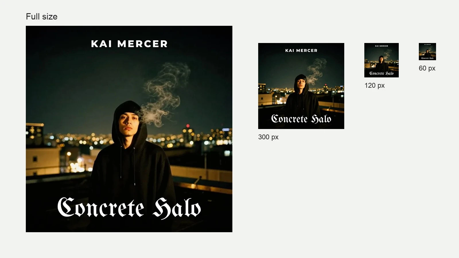
Design at full size, but judge the result small. A quick test: zoom out until the cover is about the size of a fingernail on screen. Whatever you can still read at that size is your real design; everything else is detail for the people who open the full view.
Keep important elements away from the edges. Some apps round the corners, and players often place controls or a progress bar over part of the artwork.
Build Around One Focal Point
At thumbnail size, the eye picks up one shape and one contrast. Covers that depend on several small details turn into texture. Choose a single subject, such as a face, an object, a symbol or a bold block of color, and make it clearly separate from the background.
Value contrast does more work than saturation. A dark subject on a light field, or the reverse, holds up better than two mid-tones fighting each other. Convert your draft to grayscale: if the subject disappears, the cover will struggle in a feed.
Typography: Readable or Absent
Plenty of memorable covers carry no text at all, and that is a legitimate choice. If you include the artist name and title, make them large enough to read at thumbnail size and stick to one or two typefaces.
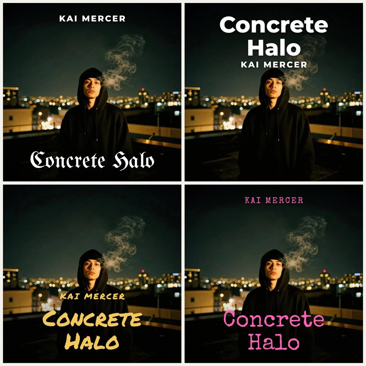
Set the lettering as real type
Place the name and title in your design software rather than asking an image generator to draw them. AI models still misspell words and invent letterforms, and a typo on a released cover is expensive to fix once the record is live.
Leave off what stores reject
Website addresses, social handles, pricing and “new release” stickers do not belong on the artwork. Stores and distributors commonly reject covers that include them, which can push back a release date.
Use Genre Cues, Then Bend Them
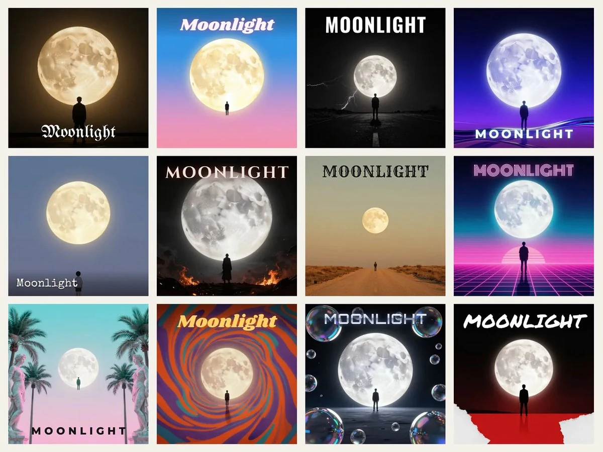
Listeners read genre before they read names. Metal covers lean on dark, intricate illustration; hip-hop often pairs a strong photo with heavy type; ambient and lo-fi favor soft color, grain and texture; synth-pop borrows chrome and neon. Using most of your genre’s visual language helps the right audience recognize the record in a second.
Then change one thing on purpose: an unexpected color, an unusual crop, a material texture, a hand-drawn element. That single twist is what makes the cover yours instead of a template.
Where AI Fits in an Album Cover Workflow
AI image tools are most useful early, during exploration. In a few minutes you can see one idea rendered several ways (different compositions, palettes and illustration styles) and decide which direction deserves real work, instead of committing hours to the first sketch. Treat the output as a strong draft, not the finished file.
The cleanest workflows keep the artwork and the lettering separate. CreArt’s AI Album Cover Maker, for example, generates the illustration from a short description of the music and places the artist name and title as real text on top, so they come out spelled correctly, then exports a 3000 × 3000 file. The same principle applies to any tool you use: let the model handle the image and keep the words under your control.
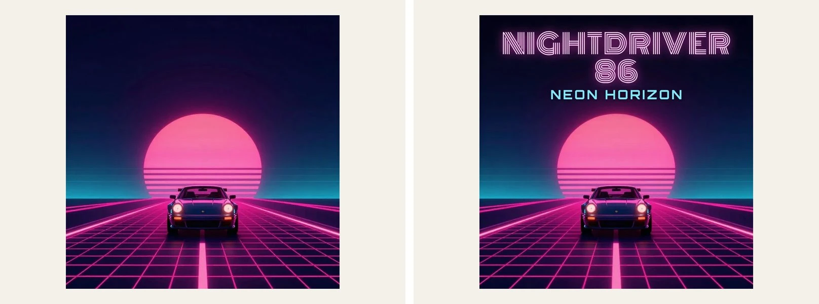
Before sending an AI-assisted cover to a distributor, check it at 100% zoom. Generated images are often created at a smaller size and enlarged, and soft edges, odd hands or smeared details only show up at full resolution. Read the tool’s terms to confirm you can use the output commercially, and avoid prompts that imitate a living artist’s signature style or depict a real person.
A Pre-Release Checklist
- Square, 3000 × 3000 px, RGB, JPG or PNG.
- One clear focal point that survives at thumbnail size.
- Still readable in grayscale.
- Artist name and title legible when small, or left off on purpose.
- No URLs, social handles, prices or stickers on the artwork.
- Checked at 100% zoom for artifacts and soft edges.
- Consistent with the covers of the singles from the same release.
- A layered master file saved for vinyl, merch and future edits.
FAQ on Album Cover Design for Streaming
What size should an album cover be?
Export a square image at 3000 × 3000 pixels in RGB. It matches Apple Music’s recommendation and fits Spotify’s accepted range of 640 to 10,000 pixels, so one file works everywhere.
Does the artist name have to be on the cover?
No. Streaming apps show the artist name and title next to the artwork, so text on the cover is a design decision, not a requirement. If you use it, make sure it is readable at thumbnail size.
Can I use AI to make my album cover?
Yes, as long as the tool’s terms allow commercial use and the image does not copy a real person, a brand or another artist’s work. Use AI for the artwork, set the text yourself or with a tool that adds it as real type, and check the final file at full size before release.
A cover that works small almost always works large; the reverse is rarely true. Design for the thumbnail first, and the full-size version will take care of itself.

Renowned for his expertise in logo design and visual branding, Bogdan has developed a multitude of logos for various clients.
His skills extend to creating posters, vector illustrations, business cards, and brochures. Additionally, Bogdan's UI kits were featured on marketplaces like Visual Hierarchy and UI8.
He also wrote in the past years on sites like Design Your Way, WebDesignerDepot, WPDean, Designmodo, Speckyboy, Slider Revolution, and more.
- Refined Baskerville Font Pairing for Editorial Design - 18 October 2026
- How to Design an Album Cover That Still Works as a Tiny Thumbnail - 18 October 2026
- Why Final Rendering Becomes a Bottleneck in 3D Design Projects - 17 October 2026

Bogdan Sandu is a seasoned designer who has been designing websites since 2008. Renowned for his expertise in logo design and visual branding, Bogdan has developed a multitude of logos for various clients. His skills extend to creating posters, vector illustrations, business cards, and brochures. Additionally, Bogdan's UI kits were featured on marketplaces like Visual Hierarchy and UI8. He also wrote in the past years on sites like Design Your Way, WebDesignerDepot, WPDean, Designmodo, Speckyboy, Slider Revolution, and more.
You Might Also Like