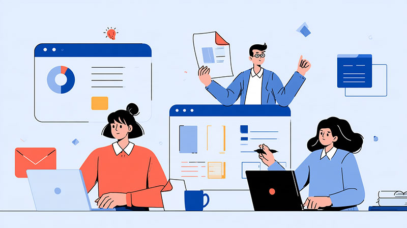
Designing a website for a consumer brand and designing one for a B2B company look similar on the surface. Same grids, same type scales, same component libraries. The difference shows up in who is on the other side of the screen.
A consumer usually makes a decision alone, often in one visit. A B2B purchase is made by a group of people who rarely visit the site together. Each person arrives at a different moment, with a different question, and leaves the moment they can’t find the answer. By the time anyone fills out a contact form, most of the evaluation has already happened without the vendor in the room.
For designers, that changes the brief. The job is no longer to impress one visitor. It’s to give several very different visitors a fast, clear path to the thing they came to check.
The four people reviewing the site
Every B2B deal is different, but most buying groups include some version of these four roles.
The user. The person who will work with the product every day. They want to see it working: real screens, real workflows, honest descriptions of what it does and doesn’t do. Abstract illustrations and stock photos of people pointing at laptops tell them nothing.
The champion. Usually the person who found the vendor and wants to bring it to their team. They need material to sell internally: case studies with recognizable names, clear outcomes, short summaries they can paste into a Slack message or a slide.
Finance. They look for pricing logic and risk. Even when the price isn’t public, they want to understand how the product is billed, what drives cost up, and what a contract looks like.
IT and security. They check integrations, data handling, compliance and documentation. If they can’t find a security page or an integrations list, they assume the worst.
Good B2B website design starts by mapping those roles before a single page is drawn. Once you know who is coming and what each person needs, the sitemap almost writes itself.
The five pages that carry the most weight
1. The product or solution pages. This is where the user decides whether the product fits their day. Show the interface, explain the workflow step by step, and write in the customer’s words, not internal feature names. A designer’s best tool here is restraint: one idea per section, one screenshot per idea.
2. Case studies. The champion’s favorite page. Structure every case study the same way (context, problem, approach, result) so readers can scan them quickly. Put the outcome near the top and make the client’s name and industry visible. A filter by industry or company size helps each buyer find the case closest to their own situation.
3. Pricing, or “how pricing works”. If the company won’t publish numbers, design a page that explains the model anyway: what is included, what scales the cost, and what the next step is. A clear explanation beats a “Contact sales” button with nothing around it.
4. Integrations and security. These pages are often treated as an afterthought, built from a list of logos. Treat them as real content: what connects to what, how data moves, which standards the company follows, and where to find documentation. IT reviewers read them carefully.
5. About and team. B2B buyers are choosing a long-term relationship, not a one-time purchase. Real photos, real names, office locations and a short history make the company feel accountable.
Design decisions that help a buying group
Navigation by role or need, not by org chart. Menus often mirror how the vendor is organized internally. Buyers don’t care. Group navigation around the questions people come with: “How it works”, “Customers”, “Pricing”, “Security”.
Scannable proof everywhere. Logos, short quotes and specific numbers should appear near the claims they support, not only on a testimonials page. A claim with proof next to it does more than two claims without.
Content that can be shared. Champions forward pages. Make sure every important page has a clear title, a summary near the top, and a good preview image when the link is pasted into Slack, Teams or email.
Clear next steps for each visitor. Not everyone is ready to book a demo. Offer lighter actions too: a product tour, a pricing explainer, a security PDF. Each one keeps a different member of the group moving.
A CMS the marketing team can actually run. B2B sites change constantly: new case studies, new integrations, new landing pages for campaigns. If every update needs a developer, the site falls behind the business within months. Model the content (case studies, integrations, team members) as structured collections from the start.
Common mistakes
- Designing only for the homepage. In B2B, many visitors land deep in the site from search, a shared link or an ad. Every page has to explain who the company is and what to do next.
- Hiding the product. Beautiful abstract visuals don’t help the user decide anything. Show the real interface.
- Generic case studies. “We helped a leading company improve efficiency” convinces no one. Names, context and outcomes do.
- Treating security and integrations as legal pages. They are sales pages for one of the most skeptical people in the group.
- One call to action for everyone. “Book a demo” is the right ask for one visitor and the wrong ask for the other three.
A quick checklist before launch
- Can a new visitor tell what the company does and who it’s for within five seconds on any key page?
- Does each of the four roles have at least one page written for them?
- Does every case study show the client, the problem and the outcome?
- Is there a page that explains how pricing works?
- Can marketing publish a new case study without a developer?
- Does every important page have a summary and a share image?
B2B websites rarely close deals on their own. What they do is make sure that, by the time sales gets a call, every person in the buying group has already found the answers they needed. Designing for that group, not for a single imaginary visitor, is what separates a good-looking B2B site from one that actually helps a company sell.

Renowned for his expertise in logo design and visual branding, Bogdan has developed a multitude of logos for various clients.
His skills extend to creating posters, vector illustrations, business cards, and brochures. Additionally, Bogdan's UI kits were featured on marketplaces like Visual Hierarchy and UI8.
He also wrote in the past years on sites like Design Your Way, WebDesignerDepot, WPDean, Designmodo, Speckyboy, Slider Revolution, and more.
- Stussy Font Generator - 16 October 2026
- What B2B Buyers Check on a Website Before They Ever Talk to Sales - 16 October 2026
- 10 Best Shopify Plus Agencies for Ecommerce Design and Development - 15 October 2026

Bogdan Sandu is a seasoned designer who has been designing websites since 2008. Renowned for his expertise in logo design and visual branding, Bogdan has developed a multitude of logos for various clients. His skills extend to creating posters, vector illustrations, business cards, and brochures. Additionally, Bogdan's UI kits were featured on marketplaces like Visual Hierarchy and UI8. He also wrote in the past years on sites like Design Your Way, WebDesignerDepot, WPDean, Designmodo, Speckyboy, Slider Revolution, and more.
You Might Also Like