


A layout where everything looks the same gives the viewer no reason to keep looking. That’s the problem variety solves.
So what is variety in graphic design, and why does it matter so much? It’s the deliberate use of different visual elements, like color, shape, typography, and texture, to create interest across a composition.
Without it, even technically solid work feels flat. With too much of it, everything falls apart.
This article breaks down how variety functions as a design principle, how it relates to unity and contrast, the specific elements that create it, and how to apply it without losing cohesion. Real examples from well-known designers and brand systems are included throughout.
What Is Variety in Graphic Design
Variety is the use of different visual elements within a single composition to create interest and prevent monotony. It’s one of the core graphic design principles, and it sits right alongside balance, contrast, emphasis, and rhythm.
Think of it this way. A layout built entirely from identical shapes, one typeface, and a single color would be technically “unified.” But nobody wants to look at it.
Variety fixes that problem. It introduces differences in shape, color, texture, scale, and type so the viewer’s eye keeps moving through the composition. A ScienceDirect study on unity-in-variety confirmed that both unity and variety positively contribute to aesthetic appreciation, and that designs combining both maximize visual pleasure.
But variety isn’t the same as randomness. Throwing in a dozen fonts and fifteen colors doesn’t make a design interesting. It makes it chaotic. The difference between variety and visual noise is intention.
When variety is done well, every element that differs from the others does so for a reason. A different size draws attention. A shifted color creates a focal point. A contrasting texture separates content zones. There’s purpose behind the differences.
According to Cropink, social media posts with strong visual design receive 650% more engagement than text-only content. That kind of number doesn’t happen by accident. It happens because diverse visual elements catch the eye and hold it.
Visual Elements That Create Variety

Variety doesn’t show up on its own. You build it by making deliberate changes across the elements of design. Some changes are subtle. Others hit hard. Knowing which ones to adjust (and how far to push them) is what separates a good layout from a forgettable one.
Color Shifts
Color is the fastest way to inject variety into any composition. Changing hue, saturation, or value across sections of a design immediately creates visual breaks.
A monochrome color scheme with varied values still reads as “varied.” Meanwhile, a triadic color scheme cranks variety up to a much higher level.
Research from Touro Law, cited across multiple branding studies, shows that a consistent color palette can improve brand recognition by up to 80%. That consistency doesn’t mean sameness. It means controlled variation within a defined system.
Typography Mixing
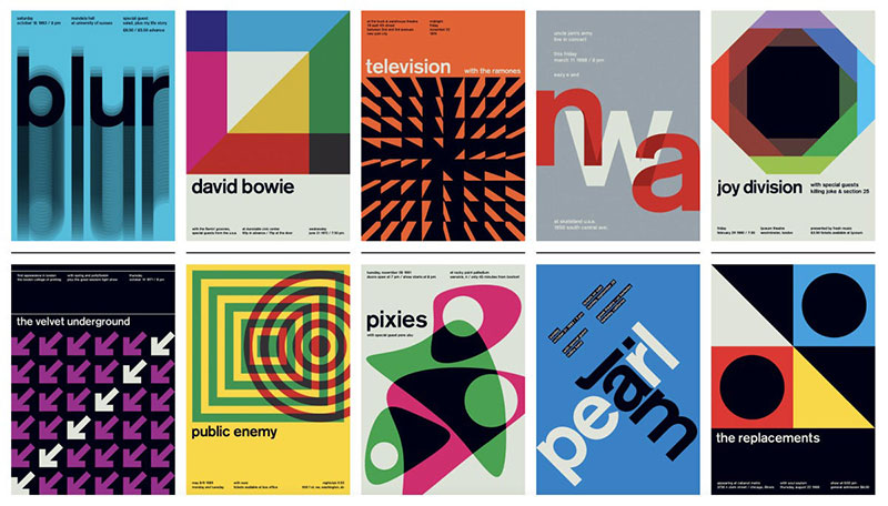
Type is where most designers either nail variety or completely wreck it.
Pairing fonts is one of the most direct ways to add visual diversity. Combining a bold display font for headlines with a clean sans-serif font for body copy creates an immediate sense of range.
Then you layer on weight changes, size differences, and adjustments to leading and tracking. Each shift adds another layer of visual interest.
Took me a while to learn this the hard way, but more than three typefaces in one project almost always looks messy. Two is usually enough. Your mileage may vary, but that’s been my experience.
Shape and Form Differences
Mixing geometric shapes with organic forms produces strong variety. A layout full of perfect rectangles feels rigid. Drop in a circle or an irregular blob, and suddenly the whole thing has more energy.
The psychology of shapes matters here too. Circles suggest softness and community. Triangles imply direction and tension. Using different shapes together within a layout keeps the viewer engaged because the brain processes each one differently.
Texture and Spacing
Texture variation (rough against smooth, matte against gloss) adds a tactile quality that’s underrated in screen-based design. Even digital textures, like grain overlays or paper-like backgrounds, introduce variety that flat color alone can’t.
And white space plays a bigger role than people give it credit for. Varying the spacing between elements creates rhythm and breaks up predictable patterns.
How Variety and Unity Work Together
You can’t talk about variety without talking about unity. They’re two sides of the same coin, and honestly, neither works well without the other.
Too much unity, boring. Too much variety, chaos. That’s the whole tension right there.
A study published in Acta Psychologica found that unity is the dominant factor in aesthetic appreciation, but that it also makes variety possible. Designers who built in unity first and then layered variety on top scored the highest ratings for visual appeal. Variety without that foundation just confused viewers.
| Condition | Visual Result | Viewer Response |
|---|---|---|
| High unity, low variety | Clean but predictable | Boring, eyes glaze over |
| Low unity, high variety | Energetic but scattered | Confusing, no clear path |
| Balanced unity and variety | Cohesive and dynamic | Engaged, keeps scanning |
Google’s logo doodles are a textbook example. The company changes its logo constantly through playful illustrations, animations, and styles. Massive variety. But the letterforms, the colors, the positioning on the page stay recognizable. That’s unity holding everything together while variety keeps users interested.
The practical takeaway is this: build your structure first. Establish your grid system, pick your color palette, and set your type rules. Then start breaking those rules in small, controlled ways. That’s where variety lives.
Variety vs. Contrast in Design
This trips people up constantly. Contrast and variety are related, but they’re not the same thing.
Contrast: the difference between two specific elements placed side by side. Light against dark. Big next to small. A serif font paired with a sans-serif.
Variety: the range of different elements across the entire composition. It’s about how many types of differences exist, not just how strong any one difference is.
You can have a design with extremely high contrast and very low variety. Think of a black-and-white minimalist design with a single typeface. The contrast between black and white is strong. But the variety across the composition is minimal.
Flip it around, and you can also have high variety with relatively low contrast. A layout using five muted pastels, three different type weights, and mixed photography styles would have tons of variety, but each individual difference is gentle rather than dramatic.
| Concept | Scope | Example |
|---|---|---|
| Contrast | Between two elements | Black text on white background |
| Variety | Across entire composition | Mixed fonts, shapes, colors, textures |
Contrast is one tool you can use to create variety. But it’s not the only one. Repetition with slight changes, shifts in scale and proportion, and mixing illustration with photography all build variety without relying on stark contrast.
The question you should ask: does my layout look interesting because of one big difference, or because of many different elements working together? The first is contrast. The second is variety.
Types of Variety in Graphic Design
Variety isn’t a single technique. It shows up in different dimensions of a composition, and recognizing each type helps you apply it with more control.
Variety in Color
Going beyond a single-tone palette introduces energy. A complementary color scheme creates strong variety between opposing color theory positions. Analogous colors offer a subtler range.
According to G2, 81% of businesses worldwide use graphic design in their communications. Color variety is typically the first thing those businesses reach for when they want to stand out.
Variety in Form
Photography alongside illustration. Abstract shapes mixed with realistic imagery. Vector graphics paired with hand-drawn elements.
Mixing different visual media within a single layout is one of the quickest ways to build variety. It signals to the viewer that there’s more to explore because the visual language keeps shifting.
Variety in Layout
Asymmetry is variety’s best friend in page composition. Breaking the grid, shifting column widths, and placing elements off-center all create variety in how the layout itself is structured.
This is different from just changing the content. The container changes too.
Variety in Content Hierarchy

Not every section of a design should feel equally weighted. Visual hierarchy already does this to some extent, but variety takes it further.
Some sections might lead with a massive image. Others lead with a bold headline. A third section might be text-heavy. This variation in how information is prioritized keeps the viewer from developing a “scanning autopilot” where they stop paying attention because the structure is too predictable.
Subtle Variety vs. Dramatic Variety
Subtle variety: small changes in weight, size, or tone. You feel the difference more than you see it. A shift from 400 to 600 font weight. A background that goes from pure white to a barely-there warm gray.
Dramatic variety: bold shifts in style, scale, or medium. A full-bleed photograph followed by a stark typographic section. A sudden switch from structured columns to a single centered element.
When you need the viewer to keep moving smoothly, subtle variety does the job. When you need them to stop and pay attention, dramatic variety grabs them. Most strong compositions use both, just at different points.
Variety in Different Design Disciplines
Variety doesn’t play the same role in every area of graphic design. The medium changes how much variety is appropriate, and where it shows up.
Editorial and Magazine Design
Magazines are where variety gets to breathe. Spreads shift rhythm page to page. One opening might be a full-bleed photograph. The next, a dense text layout with pull quotes.
David Carson’s work on Ray Gun magazine in the 1990s pushed variety to its extreme. Every spread was visually different from the last. Different typefaces, different grid structures, sometimes no grid at all. It was a high-variety, low-unity experiment that redefined what graphic design movements could look like.
By contrast, Swiss design operates on the opposite end. Tight grids, limited typefaces, structured layouts. Variety exists, but it’s extremely controlled.
Brand Identity Systems
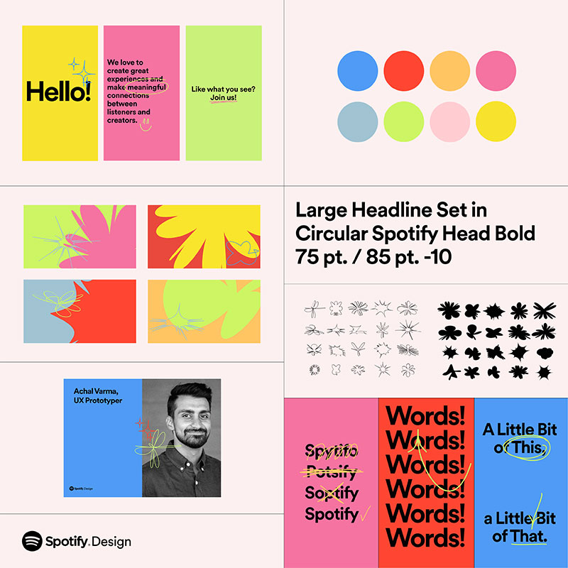
Building a visual identity means finding the line between consistency and flexibility. Brand guidelines set the unity. Then variety appears in how those guidelines get applied across different formats and contexts.
Spotify is a good example. The brand’s core colors, type system, and duotone photo treatment stay consistent. But campaign to campaign, the visual execution shifts dramatically. Colors rotate, photography styles change, layout structures adapt to different platforms.
Forbes data shows that consistent brand presentation across platforms can increase revenue by up to 23%. That consistency isn’t about making everything look identical. It’s about controlled variety within a system.
Web and UI Design
In web design, variety helps prevent something called “banner blindness,” where users mentally tune out repeating layouts because they’ve already predicted what comes next.
Card-based layouts, component variations, and responsive breakpoints all introduce variety into the user experience. Google Material Design does this well, offering a system of flexible components that look different depending on context but still feel connected through shared movement patterns and spacing rules.
Packaging Design

Packaging design uses variety at the product-line level. A brand might sell ten flavors, and each package needs to feel different enough that shoppers can quickly find the one they want. But they all need to read as part of the same family.
NextMSC’s 2024 market research valued the global graphic design market at $52.32 billion, with packaging design representing nearly 19.1% of that total. It’s a huge segment, and variety is the primary tool that makes product differentiation possible on a shelf.
How to Apply Variety Without Losing Cohesion

This is where things get tricky. Everyone understands variety in theory. Actually pulling it off without the whole layout falling apart? That’s a different skill entirely.
The safest approach: build structure first, then break it. Set up your baseline grid, lock in your color harmony, and define your typographic hierarchy. Those become the guardrails. Variety happens inside them.
Limit your variables. Change one or two things at a time, not everything at once. If you shift the typeface in a section, keep the color consistent. If you introduce a new color, keep the layout structure the same.
There’s a quick test that works surprisingly well. Squint at the layout. If nothing stands out, there’s not enough variety. If nothing connects, there’s too much.
According to G2, 85% of organizations have brand design guidelines, but only 30% actually enforce them. That gap is exactly where variety spirals into chaos. Without enforced rules, individual designers make different choices, and the result is randomness instead of intentional variety.
Common Mistakes When Adding Variety

The “font soup” problem: using four or five fonts in one layout. Creative Bloq’s typography guidelines recommend sticking to a maximum of three. Two is usually better.
Style shifts without purpose: changing visual direction mid-layout just because it “feels different.” Every shift should have a reason. If you can’t explain why a section looks different, it probably shouldn’t.
| Mistake | What Happens | Fix |
|---|---|---|
| Too many typefaces | Visual clutter, no hierarchy | Limit to 2–3 font families |
| Random color additions | Breaks palette cohesion | Pull from established color system |
| Ignoring audience expectations | Confuses rather than engages | Match variety level to context |
| No unifying element | Design feels disconnected | Keep at least one constant anchor |
Airbnb’s design system handles this well. Their layouts vary dramatically between property listings, experience pages, and editorial content. But the brand style guide keeps the font psychology, spacing rhythm, and color relationships locked down.
Examples of Variety in Well-Known Design Work
Looking at how famous graphic designers handle variety is one of the fastest ways to understand the principle in action. Theory only gets you so far.
David Carson and Ray Gun Magazine
Carson threw out the rulebook. Every spread in Ray Gun used different typefaces, different grid structures, different approaches to image placement. One famous spread set an entire interview in Zapf Dingbats, making it completely unreadable on purpose.
It was variety pushed to its absolute limit. And it worked, at least for that specific audience and era. The magazine became one of the most influential examples of postmodern design thinking in print.
Swiss Style as the Opposite End
Minimal variety. Maximum control.
The International Typographic Style (rooted in Bauhaus design traditions) relied on strict alignment, limited typefaces (often Helvetica alone), and mathematical grid structures. Variety existed, but in micro-doses. A size change here. A weight shift there.
Massimo Vignelli’s work for the New York City subway system is the classic reference. One typeface. Limited colors. Tight spacing. Yet the system guides millions of people daily without feeling monotonous.
Google Material Design
Google Material Design sits somewhere between Carson and Vignelli on the variety spectrum. The system defines a huge library of flexible components (cards, buttons, navigation patterns, gradient treatments) that look different depending on context.
A music app using Material Design looks nothing like a banking app using the same system. That’s variety at the component level, held together by shared proximity rules, color psychology standards, and consistent motion behavior.
Cropink research from 2025 shows the global graphic design industry was valued at $45 billion in 2024, with Canva, Adobe Photoshop, and Figma remaining the top three design tools. All three platforms offer component-based systems that make controlled variety easier to achieve at scale.
How Variety Affects User Experience and Communication
Variety isn’t just about making things look good. It directly changes how people process information and interact with a design.
The Gestalt principles of perception explain part of why this works. Our brains naturally group similar things together (similarity) and separate things that look different (figure-ground). Variety takes advantage of that wiring. When an element breaks a visual pattern, the brain flags it as worth paying attention to.
Scanning and Information Processing
MoldStud research indicates that effective visual grouping can improve comprehension by up to 50%. Variety in layout structure, like alternating between image-led and text-led sections, helps the brain reset and re-engage with each new block.
Without that variation, readers develop what researchers call “scanning autopilot.” They stop actually reading and just skim in predictable patterns, missing key information along the way.
Guiding the Viewer’s Eye
Variety controls attention. A sudden shift in color, scale, or framing tells the viewer “this part matters.”
A poster where everything is the same size communicates nothing about priority. Change one element’s size, shift its color, or isolate it with negative space, and suddenly the hierarchy is clear.
Nielsen Norman Group found elements with strong visual contrast can be noticed 70% faster than those blending into the surrounding layout. Variety, at its core, is the mechanism that makes those differences visible.
Preventing Disengagement
An Infolinks study found that 86% of consumers experience banner blindness, largely because banner ads follow predictable visual patterns. The same principle applies to any design. When a layout becomes too repetitive, users tune it out.
Variety is the antidote. It keeps the brain in active processing mode rather than passive scanning mode. Every time the visual pattern shifts, the brain has to re-evaluate what it’s seeing, which keeps attention levels up.
Forbes data shows that 42% of online shoppers form their opinion about a website based entirely on its overall design. That opinion is shaped by whether the layout feels fresh and engaging (good variety) or flat and forgettable (not enough of it). In social media design, motion graphics, and editorial design, variety is what separates content that gets shared from content that gets scrolled past.
FAQ on What Is Variety In Graphic Design
What is variety in graphic design?
Variety is the use of different visual elements within a composition to create interest. It involves changing things like color, shape, texture, and font spacing to prevent a design from feeling repetitive or flat.
Why is variety important in design?
Variety keeps the viewer engaged. Without it, layouts become predictable and the audience stops paying attention. It works alongside unity to make compositions feel both cohesive and visually interesting.
What is the difference between variety and contrast?
Contrast is the difference between two specific elements placed next to each other. Variety refers to the range of different elements used across an entire composition. Contrast is one tool that helps build variety.
How do you create variety in a design?
Change your colors, mix typefaces, vary shape sizes, and shift spacing patterns. Use different visual media together, like photography with illustration. The key is making intentional changes, not random ones.
Can a design have too much variety?
Yes. Too much variety without a unifying structure creates chaos. The viewer can’t find a visual path through the layout. Strong color wheel relationships and consistent spacing help keep things grounded.
What is the relationship between variety and unity?
They’re counterparts. Unity holds a composition together while variety makes it worth looking at. Good design balances both. Too much unity is boring. Too much variety is confusing. You need the tension between them.
What elements of design are used to create variety?
Color, variable fonts, shape, texture, scale, and spacing all contribute. Shifting any of these elements across sections of a layout introduces visual diversity and keeps the viewer’s eye moving.
How does variety affect user experience?
Variety prevents scanning fatigue. When layouts vary their structure, users stay in active reading mode instead of skipping sections. It improves information processing and helps guide attention to key content areas.
What are some examples of variety in graphic design?
David Carson’s Ray Gun magazine used extreme variety across every spread. Google’s logo doodles show variety within a consistent brand. Spotify’s campaign visuals shift style while maintaining core identity elements.
How is variety used in brand identity systems?
Brands use brand identity design systems that define fixed rules (colors, type, spacing) while allowing flexibility in execution. Variety appears in campaign-level decisions while the core visual identity stays anchored.
Conclusion
Understanding what is variety in graphic design comes down to one thing: knowing how to make intentional differences work together. It’s not about throwing in random changes. It’s about controlled diversity within a clear structure.
Every element you shift, whether it’s kerning, color contrast, shape, or x-height in your type choices, should serve the composition. Not just decorate it.
The best design work, from Brutalist design layouts to polished brand identity systems, uses variety to guide attention, prevent visual fatigue, and keep audiences engaged.
Start with your rules. Then break them with purpose. That balance between visual unity and creative variation is what separates forgettable layouts from work that actually holds someone’s attention.

Renowned for his expertise in logo design and visual branding, Bogdan has developed a multitude of logos for various clients.
His skills extend to creating posters, vector illustrations, business cards, and brochures. Additionally, Bogdan's UI kits were featured on marketplaces like Visual Hierarchy and UI8.
He also wrote in the past years on sites like Design Your Way, WebDesignerDepot, WPDean, Designmodo, Speckyboy, Slider Revolution, and more.
- Canva vs PowerPoint: Which Is Better for Presentations? - 22 September 2026
- How to Install Fonts on Mac (Step-by-Step Guide) - 20 September 2026
- From Mockup to Code: How AI-Augmented Development Speeds Up the Design Handoff - 19 September 2026

Bogdan Sandu is a seasoned designer who has been designing websites since 2008. Renowned for his expertise in logo design and visual branding, Bogdan has developed a multitude of logos for various clients. His skills extend to creating posters, vector illustrations, business cards, and brochures. Additionally, Bogdan's UI kits were featured on marketplaces like Visual Hierarchy and UI8. He also wrote in the past years on sites like Design Your Way, WebDesignerDepot, WPDean, Designmodo, Speckyboy, Slider Revolution, and more.
You Might Also Like


