

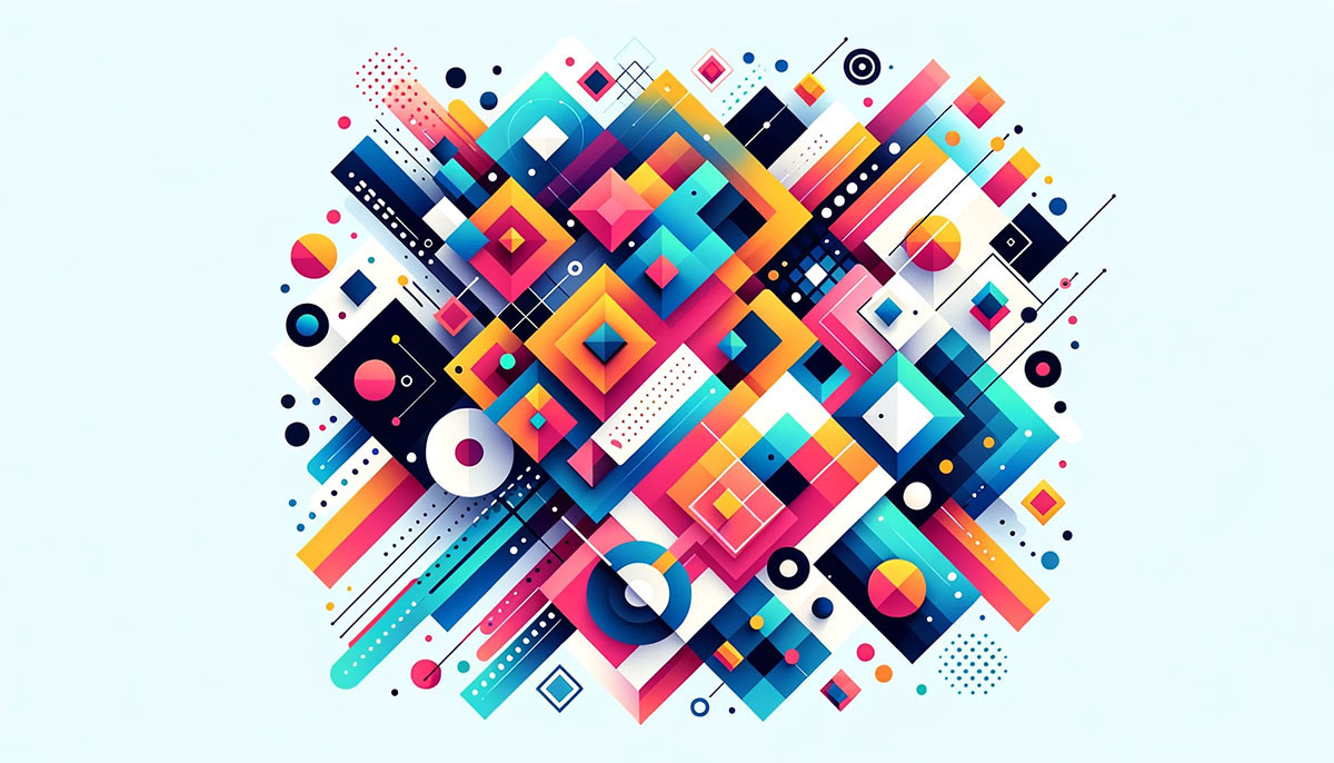
A circle feels safe. A triangle feels sharp. You didn’t learn that from a textbook. Your brain decided it in milliseconds, long before conscious thought kicked in.
The psychology of shapes studies how geometric forms trigger emotional and cognitive responses in people. It draws from Gestalt psychology, neuroscience, and decades of visual perception research to explain why certain shapes make us feel trust, tension, or calm.
This article breaks down how the brain processes shape, what circles, squares, and triangles actually communicate, and how those associations play out in logo design, architecture, user interfaces, data visualization, and advertising. Whether you’re designing a brand identity or just curious why rounded buttons get more clicks, this is the guide.
What Is the Psychology of Shapes

The psychology of shapes is the study of how geometric forms trigger specific cognitive and emotional responses in people. It sits at the crossroads of cognitive psychology, visual perception, and design theory.
The idea that shapes carry meaning isn’t new. It started with the Gestalt principles of the early 20th century, when Max Wertheimer, Kurt Koffka, and Wolfgang Köhler proposed that the human brain perceives visual information as whole forms rather than isolated parts.
That single idea changed how we think about visual communication. Your brain processes shape before it processes color or text. A circle registers as “complete” before you’ve consciously decided to look at it.
This isn’t the same as color psychology, which focuses on how hues affect mood and decision-making. Shape psychology is about structure, geometry, and spatial relationships. The two often work together, but they operate through different perceptual channels.
Took me a while to really get that distinction. For years I treated shape and color as the same bucket of “visual stuff.” They’re not. The brain has separate pathways for each.
Why Shape Matters Before Anything Else
Pattern recognition is hardwired. Infants recognize basic shapes like circles and squares before they can speak.
By the time we’re adults, these associations run deep. We don’t think about why a triangle feels more aggressive than a circle. We just feel it. That automatic response is what makes shape psychology so useful for anyone working with design elements.
According to Psychological Science, logos with simple, clean shapes are more likely to be remembered and create a positive impression. This lines up with the idea that our brains prefer familiar, easy-to-process forms.
How the Brain Processes Geometric Forms

The ventral visual pathway (sometimes called the “what pathway”) handles shape recognition. It runs from the primary visual cortex to the temporal lobe, and it’s responsible for identifying objects based on their form.
What’s interesting is how fast this happens. The brain makes snap judgments about an object’s contour in under 100 milliseconds. This is preattentive processing, meaning it happens before you’re consciously aware of what you’re looking at.
A 2007 fMRI study by Moshe Bar and Meital Neta at Harvard Medical School found that the amygdala shows significantly more activation for sharp-angled objects compared to curved ones. The increased activation wasn’t tied to a “liking” response. It was tied to the presence of sharp angles themselves, suggesting an implicit threat signal.
That finding matters. It means your emotional reaction to a shape isn’t just cultural conditioning. There’s a neurological component underneath it all.
The Bouba-Kiki Effect and Cross-Modal Perception
One of the most replicated findings in shape perception research is the bouba-kiki effect. First documented in the 1920s and later expanded by V.S. Ramachandran and Edward Hubbard in 2001, it shows that people consistently match rounded shapes with the nonsense word “bouba” and spiky shapes with “kiki.”
A 2024 psycholinguistic study with 164 participants found that 87.2% associated the rounded shape with “bouba” and the spiky shape with “kiki.” The same participants then designed brand materials for fictional products named “Bouba” and “Kiki,” and 87.2% aligned their designs with their initial shape associations.
A major 2022 cross-cultural study published in Philosophical Transactions of the Royal Society B confirmed the effect holds across cultures and writing systems. Preference rates across all studies average around 88%, with some populations (Tamil speakers, American college students) reaching 95 to 98%.
This isn’t just a party trick. It’s evidence that shape-meaning connections are partially built into our perceptual systems, not entirely learned.
Gestalt Grouping and Shape Completion
The brain doesn’t need a complete shape to recognize one. That’s the Gestalt principle of closure at work. Your visual system fills in gaps automatically.
Other grouping principles, like proximity and similarity, determine how you perceive collections of shapes. Elements placed close together get grouped mentally. Elements that look alike get grouped too.
A 2025 study published in Applied Sciences used controlled experiments with circular objects to show that the interaction between size and distance has a significant influence on how people perceive visual hierarchy. Overlapping structures produced the strongest hierarchical cues, outperforming both tangential and separated arrangements.
Emotional Responses to Circles, Squares, and Triangles

Each primary geometric form carries a distinct emotional charge. These aren’t arbitrary associations. They come from decades of perceptual research and cross-cultural observation.
| Shape | Primary Associations | Common Use |
|---|---|---|
| Circle | Unity, completeness, softness, community | Social platforms, food brands, community orgs |
| Square / Rectangle | Stability, order, reliability, structure | Finance, tech, corporate identities |
| Triangle | Direction, energy, tension, hierarchy | Sports, innovation, navigation cues |
Circles have no beginning or end. That’s not poetic. It’s geometry. And it’s precisely why the brain reads them as symbols of wholeness. They’re the most common shape used for logo backgrounds, profile images, and progress indicators.
Squares and rectangles dominate our built environment. Screens, windows, doors, cards. Their right angles feel safe and intentional. Microsoft’s square-based logo communicates exactly what you’d expect: reliability and structure.
Triangles are trickier. Orientation changes everything. An upright triangle pointing up reads as stable (think of a pyramid). Flip it, and it suddenly feels risky, unstable. Point it to the right, and it becomes a “play” button or forward arrow.
Curved Shapes vs. Angular Shapes
Bar and Neta’s 2006 study, published in Psychological Science, established that humans prefer curved visual objects over angular ones. Participants viewed images for just 84 milliseconds and still consistently rated curved forms as more likable.
Their follow-up fMRI work showed bilateral amygdala activation for sharp-angled objects, supporting the theory that angular contours trigger an implicit threat response. The brain doesn’t wait for context. It reacts to the shape itself.
But there’s a wrinkle. Leder, Tinio, and Bar (2011) found that emotional valence can override contour preference. People preferred curved versions of objects only when those objects had neutral or positive associations. For objects with negative emotional valence (like snakes), the curve advantage disappeared.
So shape preference isn’t absolute. Context matters. But in the absence of strong emotional content, curves win. At least for most people, most of the time. Your mileage may vary.
Shape Psychology in Logo and Brand Design
WiserNotify data shows that 81% of consumers need to trust a brand before they’ll consider buying from it. A Custom Neon survey found that 26% of adults are more likely to trust a business if its branding or logo is familiar.
Shape is doing a lot of heavy lifting in that trust equation, whether people realize it or not.
How Brands Choose Their Shapes
Circular logos: Pepsi, Target, and Starbucks all use circular forms. These logo design principles lean into approachability and community. The circle says “we’re inclusive” without a single word.
Angular logos: Deutsche Bank’s square-within-a-square communicates precision and financial stability. Mitsubishi’s three-diamond mark uses triangular geometry to suggest dynamism and interconnected strength.
Hybrid approaches: Google’s logo uses a rounded sans-serif font that softens its tech-company edges. Airbnb’s “Bélo” symbol combines curves with subtle geometric structure, communicating both warmth and reliability.
Custom Neon research reveals that 66.8% of logos among the top 250 companies are asymmetrical. That finding goes against the standard design advice that symmetry is always preferred. Turns out, many brands break symmetry deliberately to stand out.
Startups vs. Legacy Brands
There’s a pattern here that’s worth noticing. Startups tend to favor rounded, soft shapes. They need to feel approachable and non-threatening to build initial trust.
Legacy brands, especially in finance and industry, lean rectangular and angular. They’ve already earned trust. Now they need to communicate authority and permanence.
Embryo’s research notes that 55% of a brand’s first impression is visual. When you’re building a visual identity from scratch, shape selection isn’t secondary. It’s the foundation everything else sits on.
Shapes in Architecture and Spatial Psychology

Vartanian et al.’s 2013 fMRI study, published in the Proceedings of the National Academy of Sciences, showed that curvilinear interior spaces were more likely to be judged as “beautiful” than rectilinear ones.
Viewing curved rooms activated the anterior cingulate cortex, a brain region tied to emotional processing and reward. Pleasantness accounted for nearly 60% of the variance in beauty ratings. The preference for curves in architecture isn’t just taste. It has a measurable neural signature.
We spend roughly 90% of our time indoors, according to the National Human Activity Pattern Survey. The shapes that surround us in those interior spaces affect how we think, feel, and perform.
Rectangles and Cognitive Order
Office spaces lean heavily on rectangular grid systems. Right angles create predictability. Cubicles, conference tables, screen layouts. Everything lines up.
That’s not accidental. Rectangular environments promote focused, structured thinking. They reduce visual noise and support task completion. But they can also feel rigid and uninspiring if overdone.
Curves and Stress Reduction
A complementary EEG study by Banaei et al. (2017) found that rooms with curvilinear contour engaged the anterior cingulate cortex during 3D virtual reality walkthroughs. This lines up with Vartanian’s fMRI results and provides converging evidence across two different neuroimaging methods.
Zaha Hadid’s curvilinear architectural forms, like the Heydar Aliyev Center, demonstrate this principle at scale. The flowing lines aren’t decorative. They change how people move through and experience the space.
Frank Lloyd Wright understood something similar with his organic architecture philosophy, using rounded forms to blur the boundary between built and natural environments. These aren’t just aesthetic choices. They influence wayfinding, stress levels, and overall spatial comfort.
Cultural Differences in Shape Meaning
Shape associations aren’t universal, even if the bouba-kiki effect suggests some baseline cross-modal tendencies exist. The 2022 Royal Society study found that certain languages, including Mandarin Chinese, Turkish, Romanian, and Albanian, showed lower-than-50% matches for the standard bouba-kiki associations.
That’s a reminder. Culture filters perception.
Sacred and Spiritual Geometry

Mandala traditions: In Hindu and Buddhist practice, circular mandala forms represent the universe’s structure. The circle here isn’t just “friendly” or “approachable.” It’s cosmic and spiritual.
Islamic geometric art: Hexagonal and octagonal patterns in Islamic architecture communicate infinity through mathematical repetition. The shapes carry theological meaning that’s entirely absent from their Western commercial use.
These aren’t minor differences. A circle in a Starbucks logo and a circle in a Tibetan mandala activate different meaning systems entirely, even though the geometry is identical.
Regional Design Preferences
Western corporate design tends to favor rectangles and straight lines for authority. East Asian branding more frequently incorporates circular and organic motifs.
But even within those broad strokes, there’s variation. Japanese minimalist design uses negative space and geometric simplicity in ways that differ dramatically from, say, Scandinavian minimalism, even when both use similar basic shapes.
Albertazzi et al.’s 2013 cross-cultural research on shape-emotion mapping confirmed that while some shape associations (circles = pleasant, angles = tense) appear across many populations, the intensity and specific emotional vocabulary attached to those shapes varies by cultural background.
When you’re working with brand identity design for international markets, this matters. The shape language that builds trust in Munich might not land the same way in Mumbai.
Shape Psychology in User Interface and Web Design

Shape decisions in web design aren’t just about aesthetics. They directly affect how people interact with digital products.
A 2023 study published in the Journal of Consumer Research by Biswas, Abell, and Chacko found that rounded CTA buttons generate 17% to 55% more clicks than sharp-cornered ones. Across eight experiments, curved digital elements consistently outperformed angular alternatives.
That’s not a minor difference. That’s conversion rate territory.
Rounded Corners and Perceived Clickability
A 2025 eye-tracking study published in MDPI’s Behavioral Sciences journal tested buttons with five different corner radii. Buttons with moderate corner radii attracted the most visual attention, while completely angular buttons received the least attention and were least preferred.
Apple’s iOS and Google’s Material Design both favor rounded corners for interactive elements. This isn’t coincidence. It’s shape psychology applied at scale.
Forbes data suggests that well-designed UI can increase conversion rates by up to 200%, and better UX design can push that to 400%. Shape is a big piece of that puzzle.
Sharp Edges and Content Hierarchy
Cards and containers: Rectangular card-based layouts dominate modern visual hierarchy in interfaces. The sharp boundaries signal “this is a distinct piece of content.”
Navigation panels: Sidebar menus and top bars use rectangular forms to establish structure. Users expect straight lines in navigation because they map to the grid-based mental model of digital space.
Data containers: Tables, forms, and input fields rely on right angles to separate data points clearly. Rounded inputs can feel softer, but too much curve reduces the perceived seriousness of data entry.
Shape and Readability in Typography
Letterform geometry affects reading speed and tone perception. A serif font carries angular, structured shapes that communicate formality and tradition.
Rounded typography reads as friendlier. That’s why brands targeting younger audiences often use circular letterforms in their brand typography. The shape of the letters is doing the same psychological work as the shape of the logo.
Shapes in Data Visualization and Information Design

Shape selection in charts, graphs, and icons directly impacts how accurately people interpret information. Get the shape wrong, and you mislead your audience without intending to.
A PMC research paper examining visualization pitfalls in scientific publications found that the pie chart is the most misused graphical representation across published research. Size-related errors were the most common category of visualization mistakes.
Why Pie Charts Feel Intuitive but Often Mislead
Pie charts use circles. Circles feel whole, complete, and unified. That’s exactly why people like them.
The problem? Humans are bad at comparing angles and areas. When a pie chart has more than three or four slices, most readers can’t accurately judge relative proportions. A 2025 SAGE journal study by Hill confirmed that bar charts outperform pie charts for comparing relative changes between segments.
Best practice suggests keeping pie charts to two or three categories maximum. Anything beyond that, and you’re fighting against how the brain processes circular shapes.
Rectangles and Accurate Magnitude Comparison
| Chart Shape | Strength | Weakness |
|---|---|---|
| Circle (pie/donut) | Shows part-to-whole relationships | Poor for comparing similar values |
| Rectangle (bar/column) | Accurate magnitude comparison | Less engaging visually |
| Line (trend) | Shows change over time | Can obscure individual data points |
| Triangle (funnel) | Shows sequential reduction | Limited to narrowing processes |
Bar charts use rectangular shapes, and rectangles are where the brain excels at comparison. Length is easier to judge than angle. That’s a direct application of how visual cognition processes geometric forms.
Icon Shape Conventions
Otto Neurath’s Isotype pictogram system, developed in the 1930s, proved that simplified geometric shapes communicate across language barriers. Modern icon design still follows these graphic design principles.
Circular icons suggest actions (play, record, call). Square icons suggest content (photos, apps, files). Triangular icons suggest direction or warnings. These conventions are so embedded that breaking them creates confusion, not creativity.
Shape Manipulation in Advertising and Persuasion

Advertisers have been using shape psychology long before anyone called it that. Every layout decision, from the shape of a product container to the directional cues in a print ad, is calculated to direct attention and influence purchasing behavior.
An Ipsos global consumer survey found that 72% of consumers believe product packaging design plays a key role in their purchasing decisions.
Product Packaging and Perceived Value
Raghubir and Greenleaf’s elongation bias research demonstrated that consumers perceive taller containers as holding more volume than shorter ones, even when the actual capacity is identical. Think about shampoo bottles or energy drink cans.
More recent research from NYU Shanghai and Nanjing Agricultural University introduced the stability heuristic: consumers judge stable shapes as heavier than unstable ones. And in many product categories, perceived heaviness signals quality.
Sung (2021) found that packaging with a shape significantly different from the standard draws greater consumer attention. Toblerone built its entire brand identity around a triangular box. That shape isn’t just distinctive. It signals premium quality.
Directional Shapes in Ad Layouts
Arrows and triangles guide the viewer’s eye toward the product or call-to-action. This is movement in design at its most direct.
Curved paths slow the eye down and encourage browsing. Luxury brands often use flowing, curved layouts because they want you to linger, not rush.
Rectangular frames isolate the product and create a clear focal point. The sharper the boundary, the stronger the separation between product and background noise.
Background Shapes and Subconscious Framing
Background shapes in advertising design affect product perception without conscious notice. A product placed on a circular background feels friendlier. The same product on a square background feels more professional.
Retail shelf placement also plays a geometry game. Products at eye level get the most attention, but the shapes of shelf dividers, price tags, and point-of-sale displays all contribute to how shoppers perceive value and contrast between options.
How to Apply Shape Psychology in Visual Communication
Knowing the theory is one thing. Actually applying it without creating contradictory signals is where most people trip up.
Matching Shape to Message Tone
| Intended Tone | Primary Shape | Use Case |
|---|---|---|
| Trust and reliability | Squares, rectangles | Banking, insurance, legal |
| Warmth and community | Circles, ovals | Social platforms, nonprofits |
| Energy and urgency | Triangles, angular forms | Sports, tech startups, gaming |
| Elegance and calm | Organic curves | Luxury, wellness, hospitality |
This looks simple on paper. The tricky part is combining shapes without sending mixed messages. A financial app that uses circular buttons everywhere might feel approachable, but it might also undermine the perception of seriousness that banking requires.
Combining Multiple Shape Types
Most real-world designs use a mix of shapes. The key is establishing a dominant shape language and using secondary shapes for accent.
Apple does this well. Their product design is primarily rectangular (devices, screens, windows) with rounded corners softening the edges. The secondary circular elements (home button era, clock, control center toggles) add approachability without undermining the structural authority of the rectangular base.
When you look at your mood board, check whether the shape language is consistent. If you’re mixing aggressive triangles with soft circles without a clear hierarchy, the composition will feel confused. Not wrong, exactly. Just unsettled.
Testing Shape Effectiveness
Eye tracking: The eye-tracking equipment market grew from USD 913.6 million in 2023 and is projected to reach USD 4.9 billion by 2030, according to market research. That growth reflects how seriously companies take visual attention testing.
A/B testing: Split-test shape variations on buttons, icons, and layout containers. The Journal of Consumer Research study on rounded buttons showed measurable click-through differences, and those findings came from controlled A/B methodology.
User research: Qualitative feedback catches what quantitative data misses. Sometimes a shape “performs” well in click rates but creates a brand perception problem that only surfaces in interviews.
Common Mistakes to Avoid
- Overusing circles everywhere because they’re “friendly” (they lose impact through repetition)
- Ignoring the shapes created by white space and negative space around your content
- Assuming shape preferences are universal when your audience spans multiple cultures
- Treating shape as decoration instead of as a functional communication tool
Shape psychology isn’t about picking the “right” shape from a chart. It’s about understanding what your audience’s brain does with the shapes you put in front of them, and making sure those automatic responses align with what you’re trying to communicate.
FAQ on Psychology Of Shapes
What is the psychology of shapes?
It’s the study of how geometric forms affect human emotion, cognition, and behavior. Rooted in Gestalt psychology and visual perception research, it explains why circles feel safe, triangles feel tense, and rectangles feel stable.
Why do humans prefer curved shapes over angular ones?
Bar and Neta’s research showed that angular contours trigger amygdala activation linked to threat detection. Curved shapes bypass that response, registering as safer and more pleasant. The preference appears across cultures and age groups.
How do shapes affect branding and logo design?
Shapes communicate brand personality before any text is read. Circular logos suggest community and warmth. Rectangular logos signal stability. Triangular marks convey energy. Shape selection directly influences consumer trust and brand recall.
What is the bouba-kiki effect?
It’s a cross-modal phenomenon where people consistently match rounded shapes with “bouba” and spiky shapes with “kiki.” About 88% of people across cultures show this pattern, suggesting shape-meaning associations are partially hardwired.
Do shapes influence web design and user experience?
Yes. Rounded buttons generate significantly more clicks than angular ones. Card-based rectangular layouts create clear content hierarchy. Shape choices in UI directly affect user flow, task completion, and conversion rates.
How does shape psychology apply to architecture?
Curvilinear interiors activate brain regions tied to positive emotion and reward. Rectangular spaces promote structured thinking. Research by Vartanian et al. showed people judge curved rooms as more beautiful than rectilinear ones.
Are shape associations the same across all cultures?
Not entirely. While some associations (curves = pleasant) appear broadly, specific meanings vary. Circular mandala forms carry spiritual significance in Buddhist traditions that’s absent from Western commercial use of the same shape.
What role do shapes play in data visualization?
Shape selection determines how accurately readers interpret data. Bar charts (rectangles) allow precise magnitude comparison. Pie charts (circles) feel intuitive but mislead when they include more than three categories.
How do advertisers use shape psychology?
Through packaging geometry, directional layout cues, and background framing. Taller containers are perceived as holding more volume. Triangular elements direct the eye. Curved backgrounds make products feel more approachable.
Can shape psychology be measured and tested?
Yes. Eye-tracking technology, A/B testing, and fMRI studies all measure shape responses. The eye-tracking market is projected to reach $4.9 billion by 2030, reflecting growing investment in understanding visual attention patterns.
Conclusion
The psychology of shapes isn’t abstract theory. It’s a practical framework backed by fMRI data, eye-tracking studies, and decades of cognitive research that directly affects how people respond to visual communication.
Every geometric form carries weight. Circles reduce perceived threat. Rectangles build structural trust. Triangles create directional energy. These responses happen in milliseconds, well before conscious evaluation.
From logo psychology and packaging geometry to UI button design and architectural interiors, shape selection influences consumer behavior, spatial perception, and aesthetic preference at a measurable level.
The bouba-kiki effect alone shows that shape-meaning associations cross cultural and linguistic boundaries. That’s not opinion. That’s replicated science.
Use shape with intention. Test what you build. Let the data confirm what the research predicts.

Renowned for his expertise in logo design and visual branding, Bogdan has developed a multitude of logos for various clients.
His skills extend to creating posters, vector illustrations, business cards, and brochures. Additionally, Bogdan's UI kits were featured on marketplaces like Visual Hierarchy and UI8.
He also wrote in the past years on sites like Design Your Way, WebDesignerDepot, WPDean, Designmodo, Speckyboy, Slider Revolution, and more.
- Versatile Work Sans Font Pairing for Every Project - 16 September 2026
- How to Set Up a Digital Menu Board: Hardware to Layout - 15 September 2026
- The Arc Browser Logo History, Colors, Font, And Meaning - 14 September 2026

Bogdan Sandu is a seasoned designer who has been designing websites since 2008. Renowned for his expertise in logo design and visual branding, Bogdan has developed a multitude of logos for various clients. His skills extend to creating posters, vector illustrations, business cards, and brochures. Additionally, Bogdan's UI kits were featured on marketplaces like Visual Hierarchy and UI8. He also wrote in the past years on sites like Design Your Way, WebDesignerDepot, WPDean, Designmodo, Speckyboy, Slider Revolution, and more.
You Might Also Like


